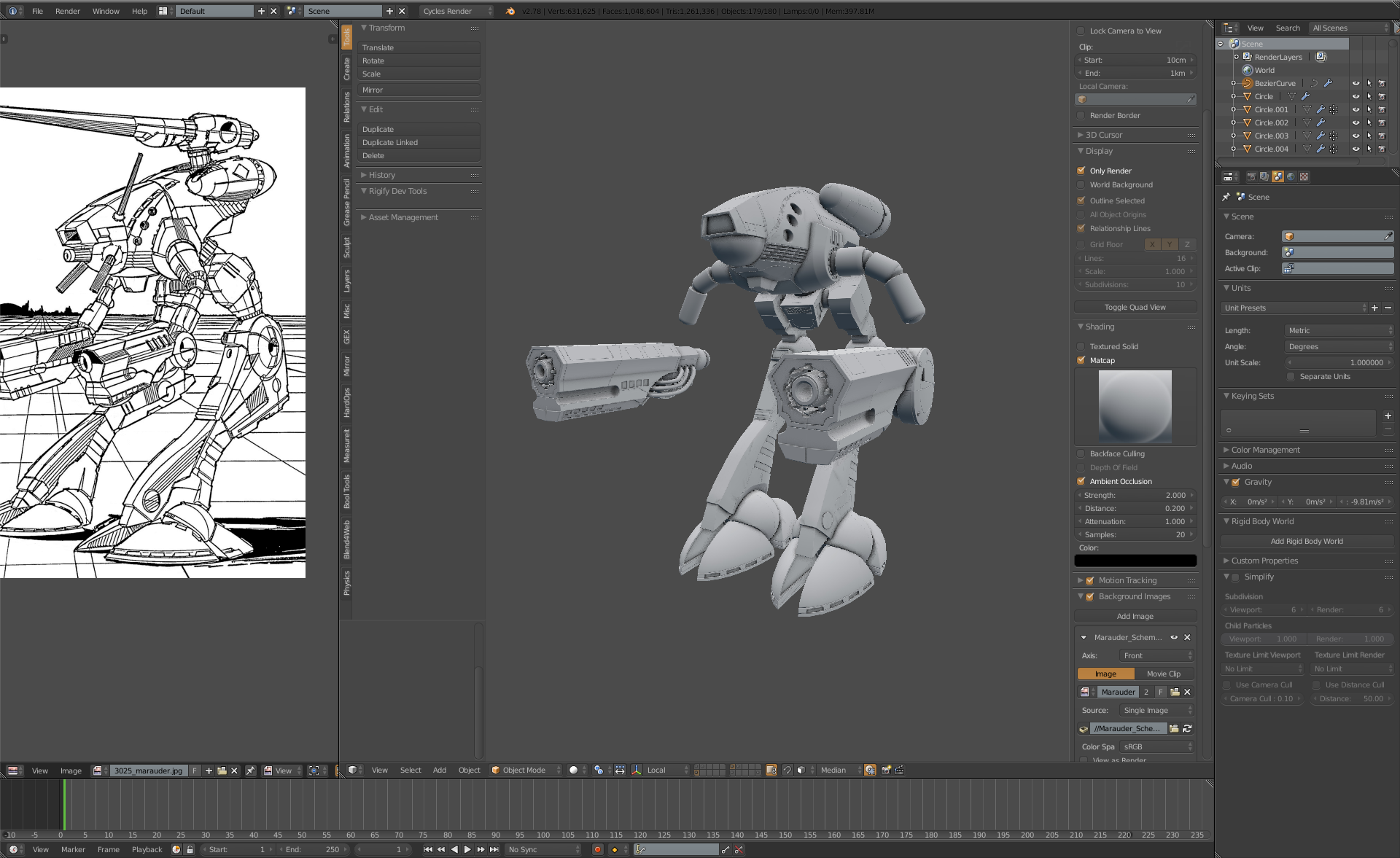
Been too busy with actual intern work, which I can't show just yet. Haven't forgotten this project though, and now had time to do some work on it. redid the canopy since the previous version just wasn't good enough and I've come bit more in ways of using hardops and booleans.
aye, i agree t, and we had nice chat in discord about this. :) good stuff!
#93
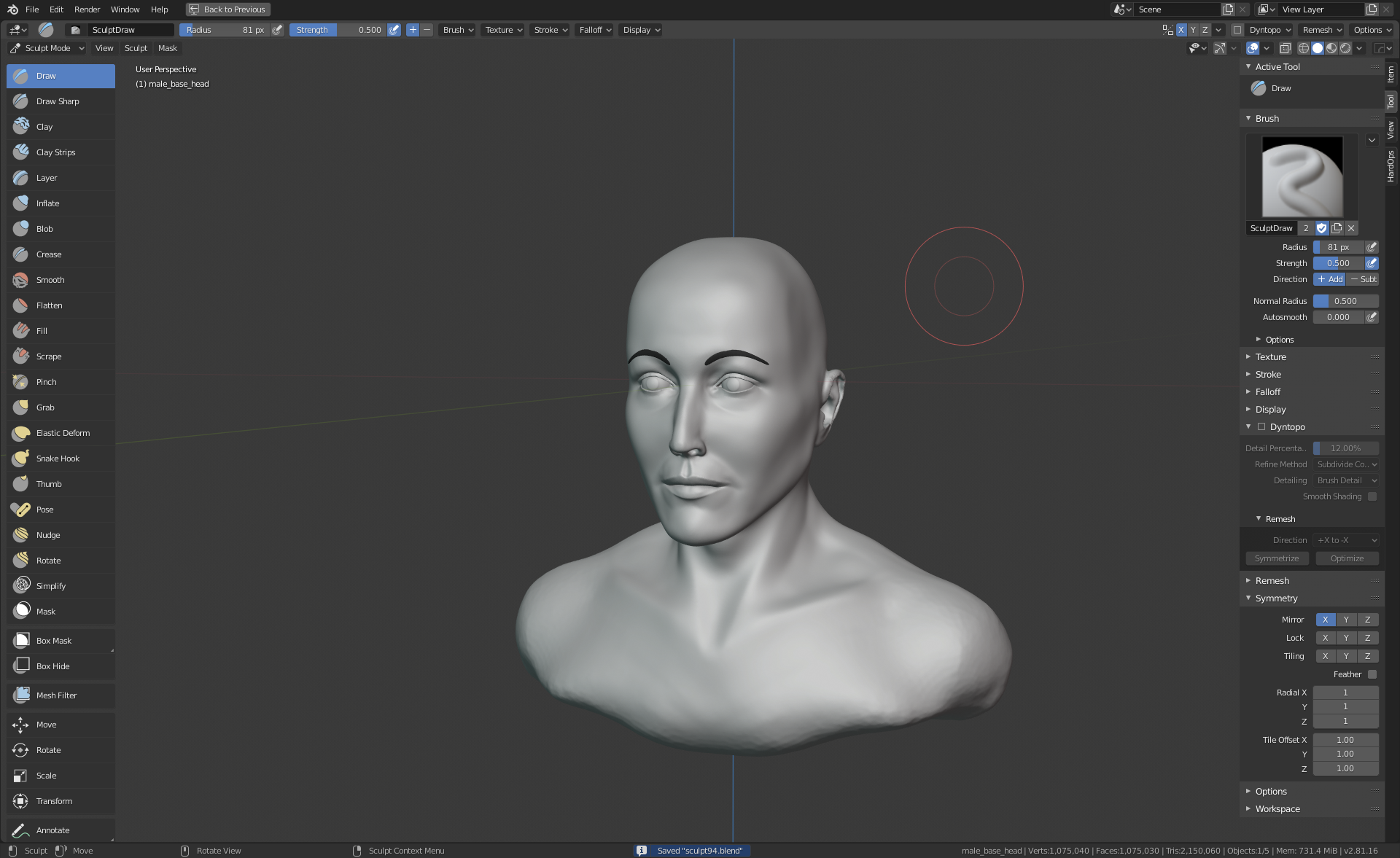
changing proportions. female faces are lot harder than male one that you can just get the axe out and hack the stuff in. :P
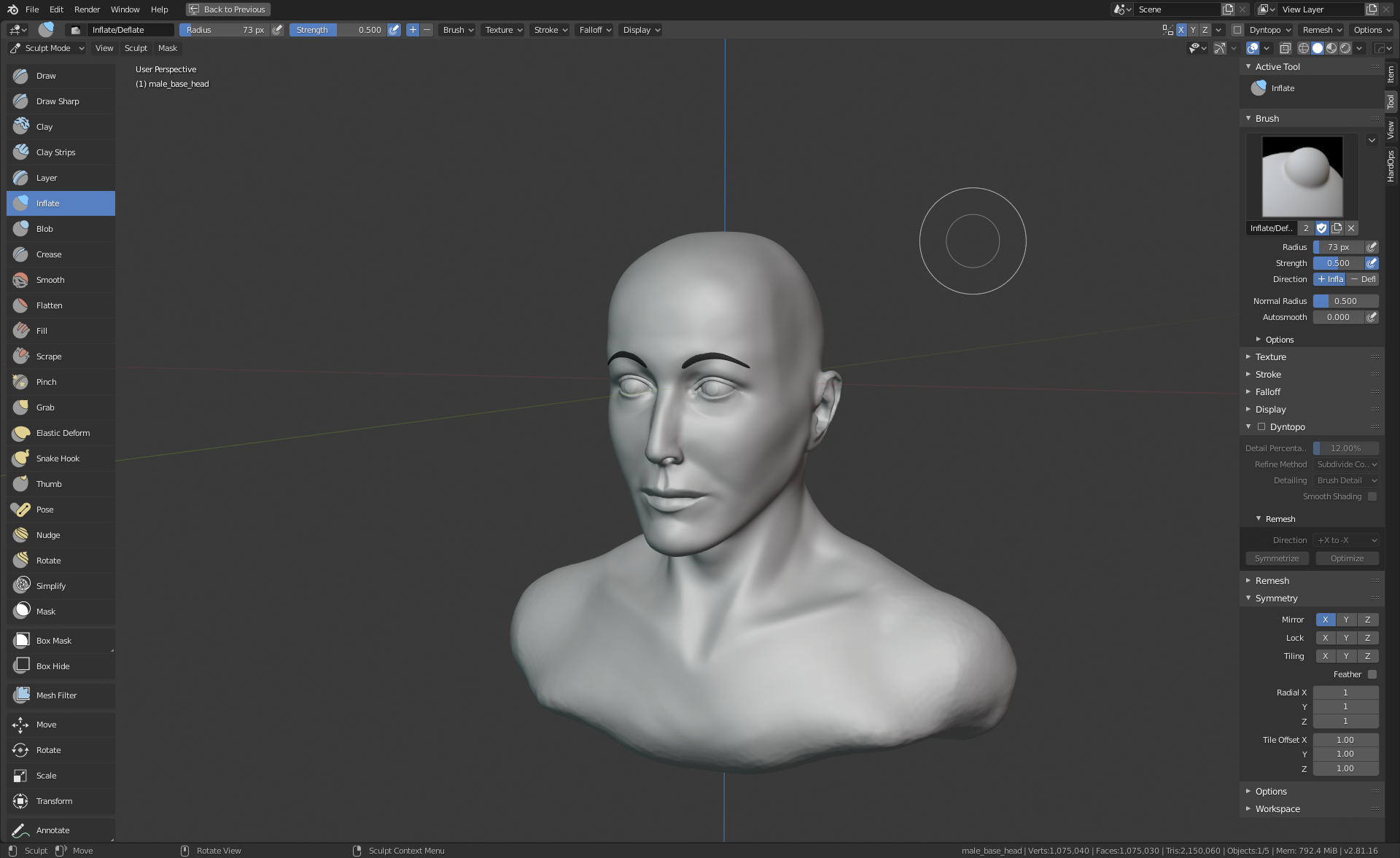
#94 continuin with likeness. not gonna say who the actress is though. :)
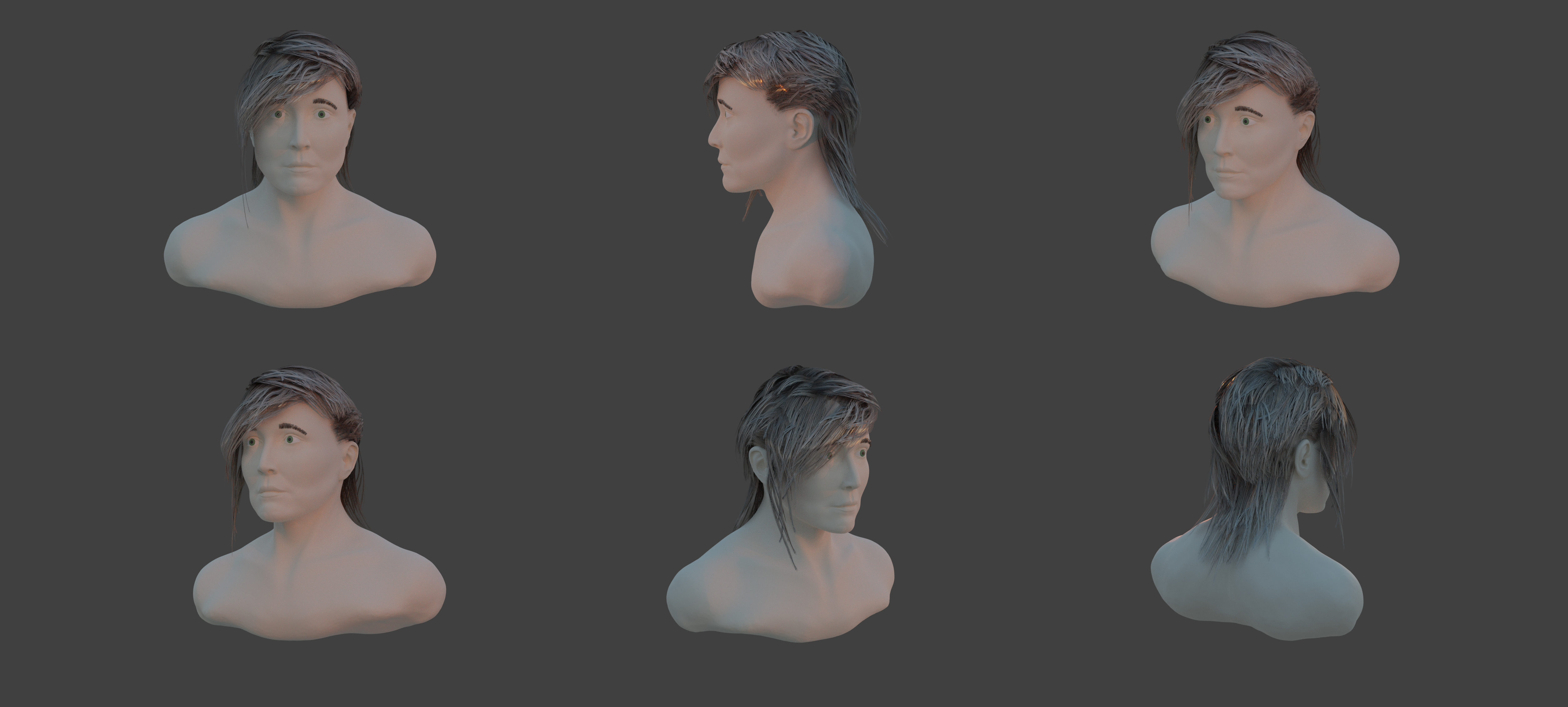
#96 getting into hair cards on top of tweakin the model. :)
the enviromentlight was too strong.
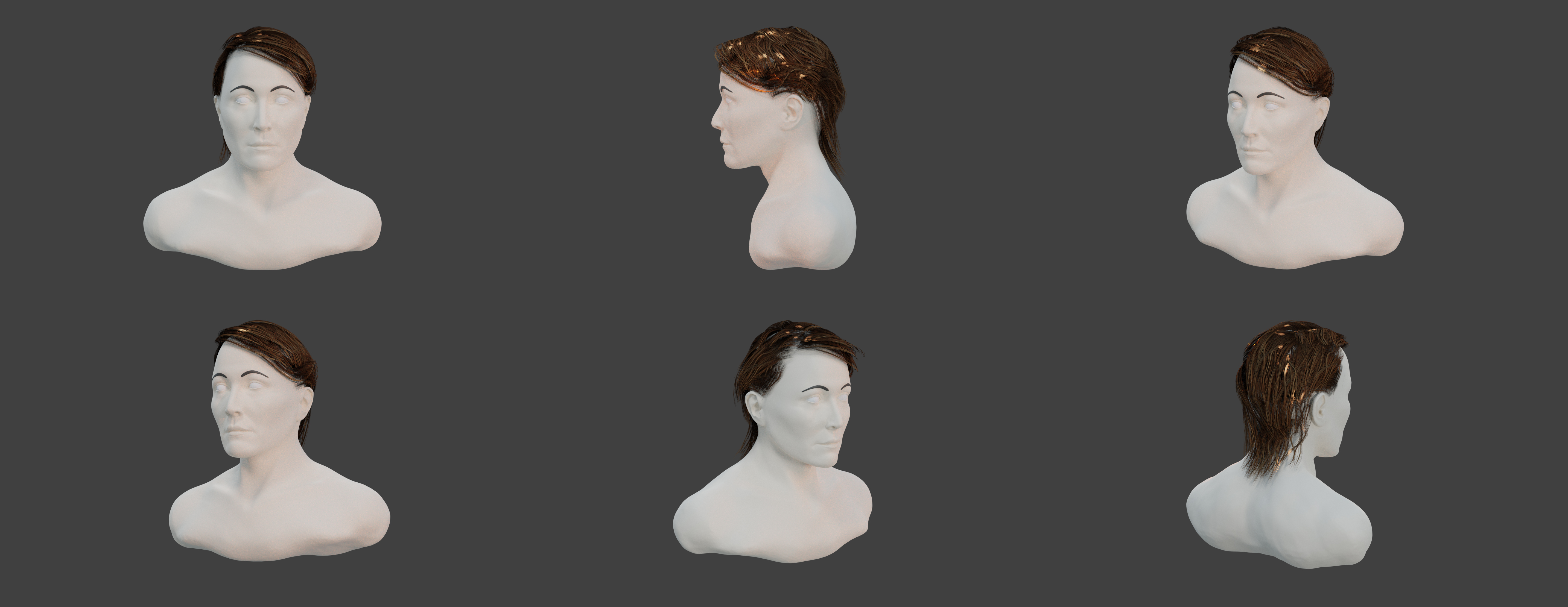
#98
still not happy with the form of the face now that i look the renders. and hair needs lot more work. skin detail haven't even bothered to start yet since the form isnt where i want it to be.
#100 wow.. hundred days has gone. atleast it looks more human than the first one. :)
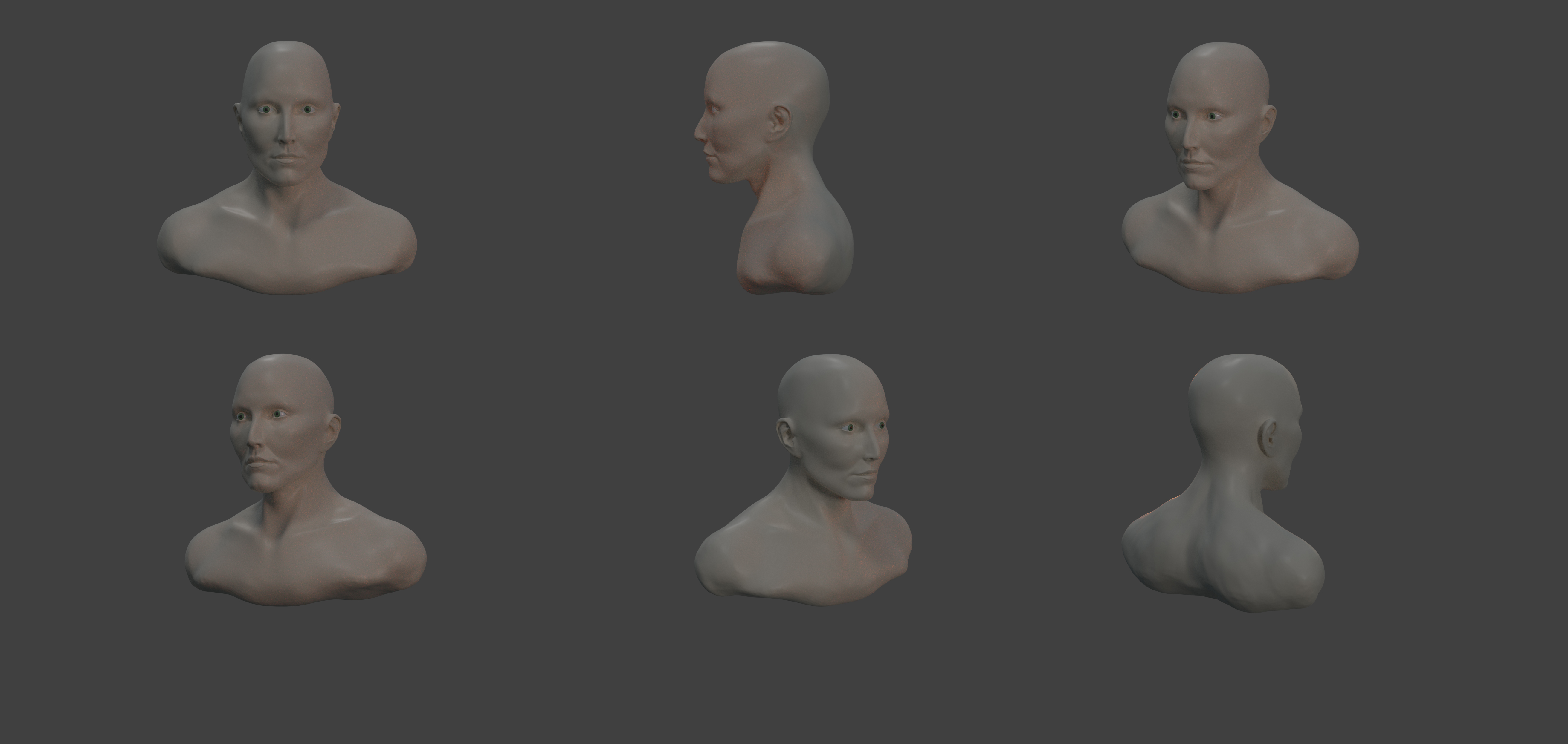
This is pretty awesome. And youve been sculpting heads for 100 days straight...thats really cool. I didnt start studying heads yet, but maybe I can still give you some feedback, for what its worth :D
I think the the whole sculpture is a bit too bulky for a female. Especially the the trapezius muscle. And pecs.The deltoid muscle also has a front part that orginiates at the clavicle,i think thats what makes the pecs seem so huge. 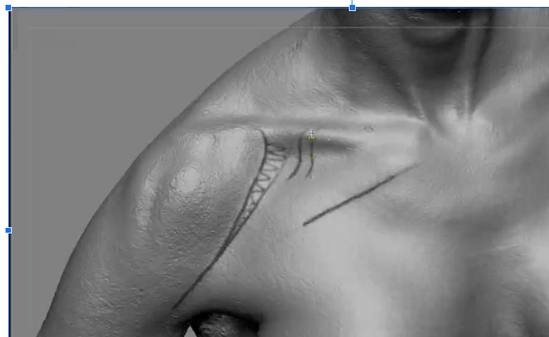
This is a screenshot of a scan. You can see the deltoid is covering almost a third of the clavicle. Then there is a small gap and then the pectoralis starts. But the next third is of the clavicle is protruding like this, even though there is a pec over it, its because this part of the pec is really thin (unless the person is really muscly). Its more like blanket draping over the bone here. The meaty part of the clavicle head is really only at the centermost third.
As for the head itself, I think the jaw is a bit too wide and the cranium is too narrow in the back of the head. The plane on the side of the head is from the teporal region of the skull, but further to the back, the head gets wider again. If you look at photos or sculpts of bald women, the cranium is always wider than then jaw. From what im looking at right now, its generally even wider than the cheek bones. So generally its the widest part of the head and then the head gets narrower towards the bottom.
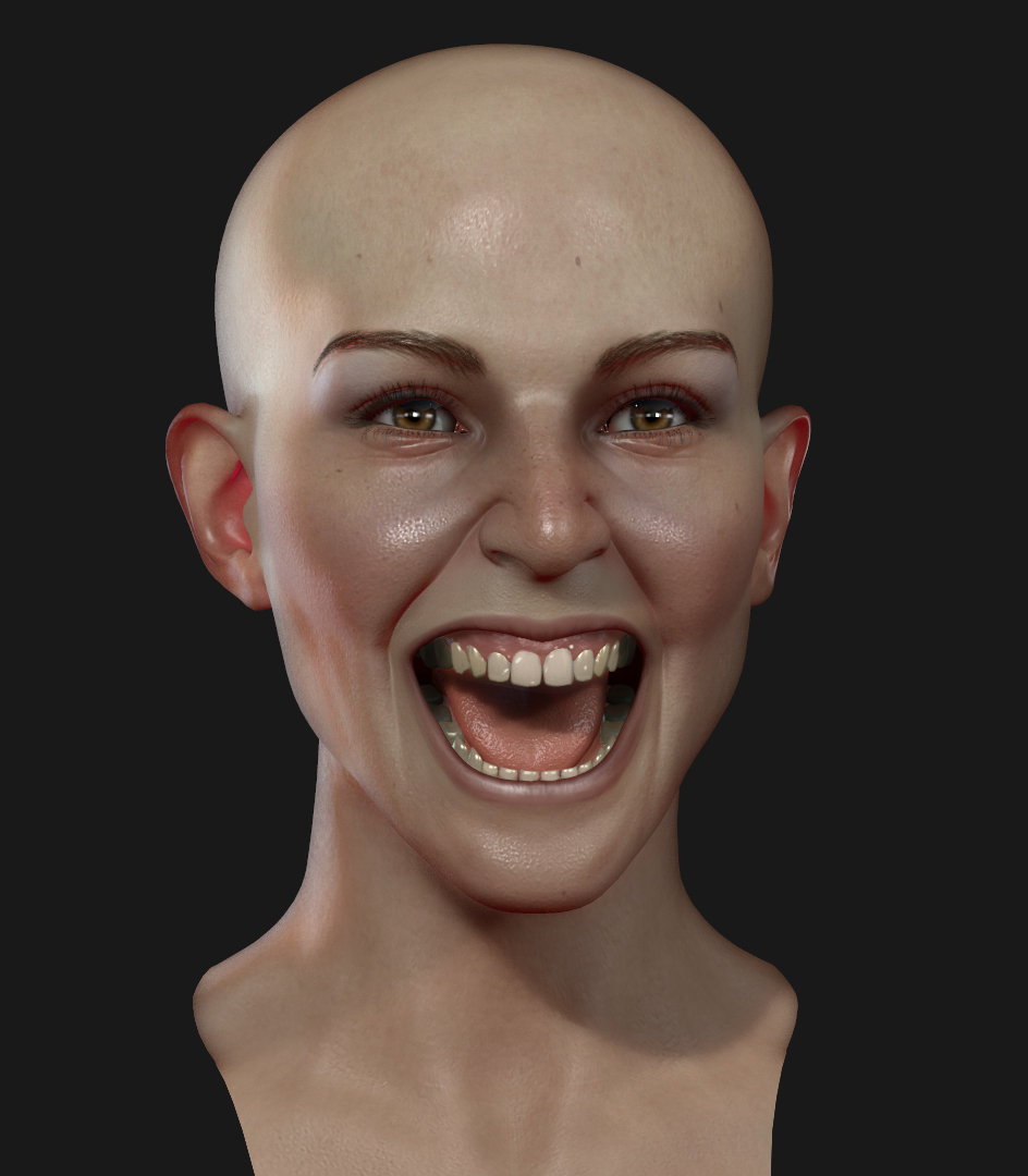
thanks for the feedback, will use it to best i can. yeah, the below face portion is something i haven't focused at all really, have to change that portion and make it less bulky. and everything else aswell, it doesnt look the real person i'm using for reference, that i can see. just have to keep going until it does. :)