Fore- and middle-ground nature Assets:
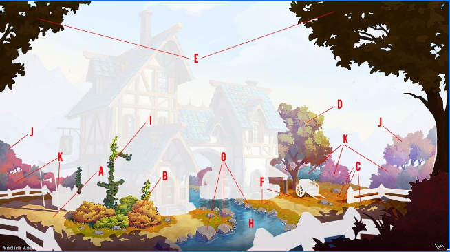
B: FG Bushes ** G: Rocks *
C: FG Flowers * H: Creek **
D: FG Tree A *** I: Ivy **
E: FG Tree B *** J: MG Trees ***
F: FG: Grass *** K: MG Bushes ***
This is a safe place to ask your questions and, if you are lucky, get answers.
Jokes allowed. Suggestions welcome.
![]() blanchsb created a Discord channel; it is a join at will and use at your own risk situation.
blanchsb created a Discord channel; it is a join at will and use at your own risk situation.
These invites expire in 7 days. Should be enough time for all who wish to join. Other invites should be available afterwards if there are stragglers.
Invite to the Rules Channel: https://discord.gg/w2HJ76bR
Text Channel Invite Link: https://discord.gg/PEEKK44h
AV Channel Invite Link: https://discord.gg/HkUgUcnK
I'd say, look at the artwork and let that inspire you:

The short shadows suggest that it is summerly... but it's art, not stylized realism...there are definitely flowers that do not fit in this scene, but do not feel too restricted to what might realistically grow here.
It has been said, that Melvin the magician sells his spices here, that get transported over the water by a whale???
Hey, i Just finished some basic meshes for rocks. I'm sorry for being inactive there was some confusion in which asset i requested. these rocks have only one solid color and have BASIC normal maps that i applied when i was bored and did some sculpting. let me know your though on my first homework submission.
EDIT. Can everyone who is working on rocks comment on this post. I think it would be better if we combined our knowledge to make the single best rocks possible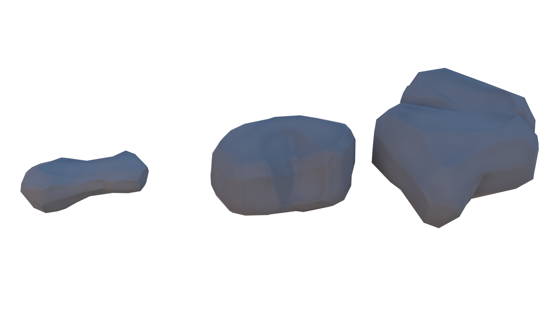
How can I get these nice gradations from darker to lighter colour without lightning, only nodes??
https://cgcookie.com/questions/14265-collab2021-wip-dyoc?page=1#answer-51469
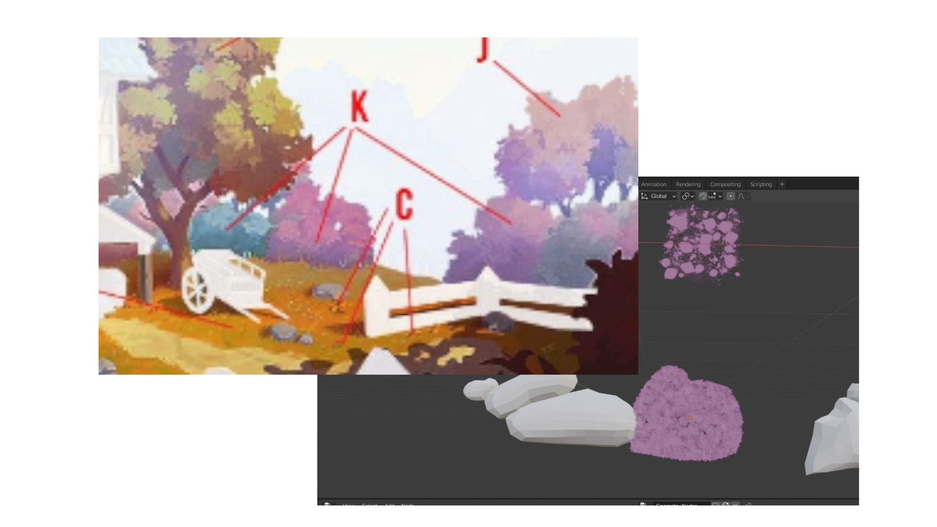
now that looks cool :D
glowing bush in the dark , melvin sure do know how to create awesome potions for special effects :D
instead of watering the plants he is giving some extra potions with strange things to spice up the whole area
Hi the3dbanana, I'm not in the rock team, but I have something interesting for you guys. Try check this tutorial.
Nice, the edges in linear are still sharper then compared with the smooth one
That is a fun comparison between the two. It is nice to have these visuals to really understand what is happening.
Hey folks,
im not sure how we are expected to tackle the Grass this Week. Since we have no Locator based Item but a more dynamic one heavily dependant on the Ground Plane im really not sure how to go further.
![]() spikeyxxx Do you have an idea?
spikeyxxx Do you have an idea?
How about working together on this?
I think our approaches are more or less close so maybe we can join forces so the result might be better than anybody of us could do alone.
The grass is indeed dependent on the ground, but we can refine the technique that we wanna use, so that it can be applied to the ground plane, when that is ready...it also depends on the objects that are on the grass (not the flowers), like rocks and cart...
I wouldn't want grass blades intersecting with those objects, so we need a system that can easily adapt to objects in/on the grass.
The ground plane is the least of our problems, as we could even use Shrinkwrap, when we would have ready patches...or apply the Particle System or Geometry Nodes directly to the ground....
So I hope to get it in a state, that as soon as someone gives me a ground and rocks etc., I can 'apply' the grass where it should be.
I would hand-paint the colors, but leave that for next week, when Texture Painting is planned.
Of course we could work together on this. I did all those tests that you did and the worst result was with 'grass cards', especially on the edges!
But like I mentioned, there are large areas, that only seem to give the illusion of grass, without any actual blades..at least that is my idea and it would be not too taxing on the scene, polygon-wise....
I don't know if this would be of any help to your team or not, but I came across this just recently on Instagram.
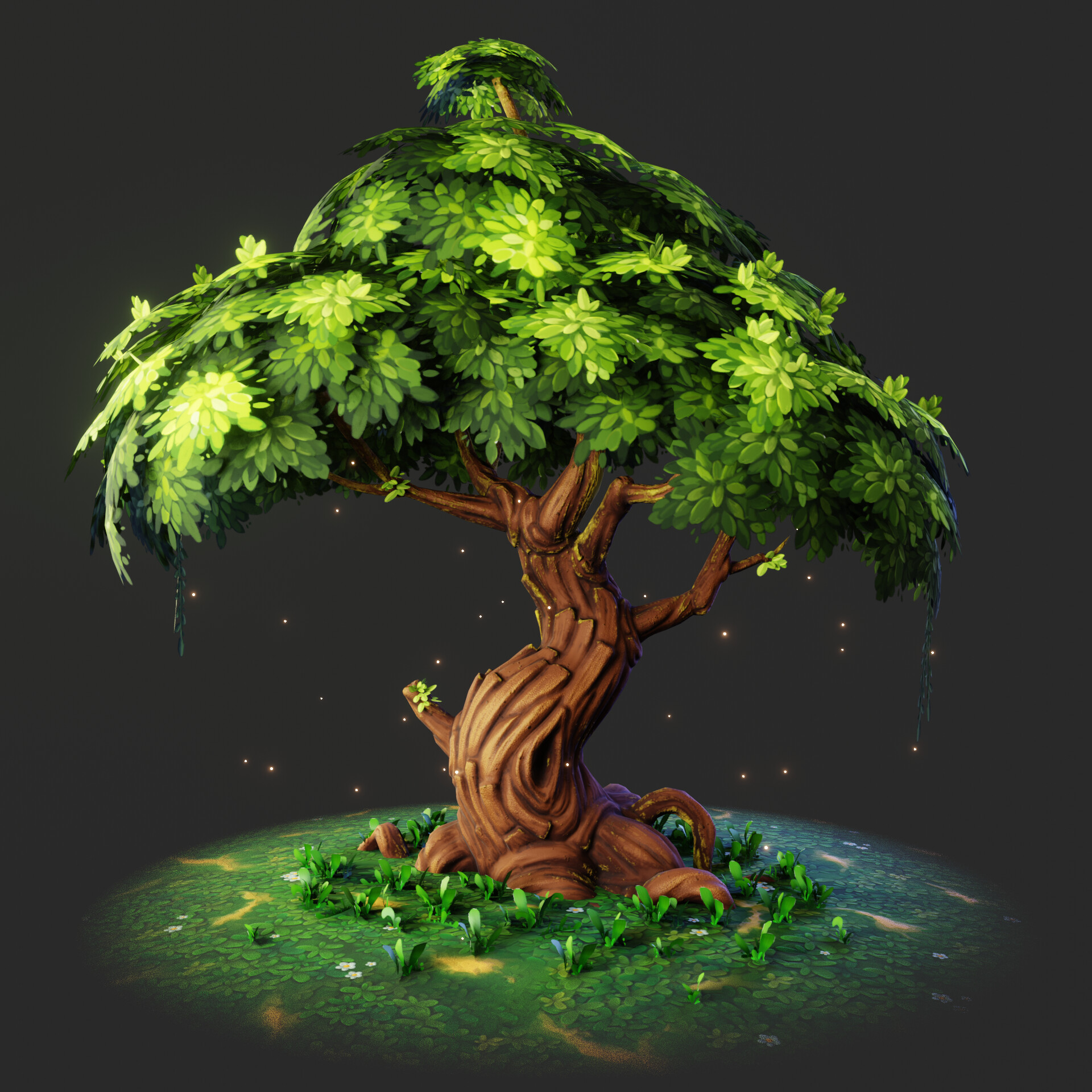
I know that it's far more hyper-stylised than what the Collab is aiming for (so ignore the trunk be all means), but I thought that this might be a helpful visualisation of what Kent @theluthier meant in the 2nd Live Stream by breaking up the shape of tree's silhouette with a few smaller leaves. Hopefully this will useful to some of your team. Keep up the astounding work. ![]() spikeyxxx
spikeyxxx ![]() wardred
wardred
Details about the artist this picture can be found here: https://blenderartists.org/t/stylized-tree/1294621
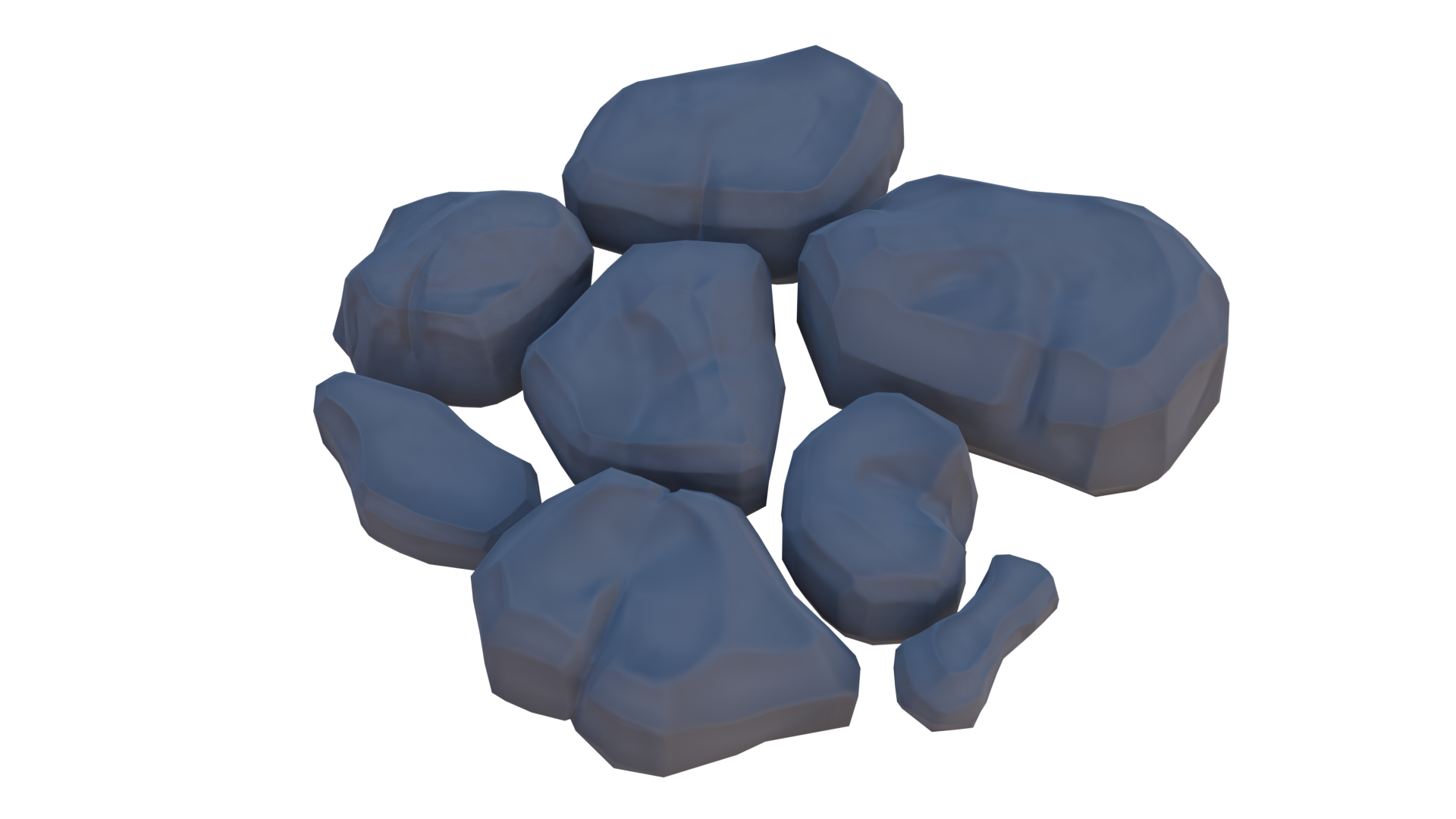
Anyone like my rocks? Please Critique as much as possible. Like, do I need more detail or anything.
I just have to say I feel validated in my confusion if ![]() spikeyxxx doesn't even know what's going on with these methods 😅
spikeyxxx doesn't even know what's going on with these methods 😅
I'm really glad to see you both teaming up. Spikey is exaclty right about how to approach the grass: Until the ground is finalized, you two developing a good system of applying beautiful grass to any surface is ideal.
Also for week 2 I'd like to see some refinement of the style of grass to get a bit closer to the art. Sorry I haven't given stylistic feedback to you yet ![]() spikeyxxx - You must be in the last ~30% of submissions.
spikeyxxx - You must be in the last ~30% of submissions.