Fore- and middle-ground nature Assets:
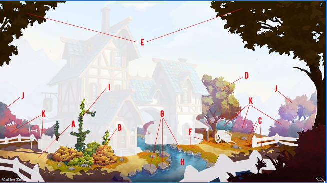
B: FG Bushes ** G: Rocks *
C: FG Flowers * H: Creek **
D: FG Tree A *** I: Ivy **
E: FG Tree B *** J: MG Trees ***
F: FG: Grass *** K: MG Bushes ***
This is a safe place to ask your questions and, if you are lucky, get answers.
Jokes allowed. Suggestions welcome.
![]() blanchsb created a Discord channel; it is a join at will and use at your own risk situation.
blanchsb created a Discord channel; it is a join at will and use at your own risk situation.
These invites expire in 7 days. Should be enough time for all who wish to join. Other invites should be available afterwards if there are stragglers.
Invite to the Rules Channel: https://discord.gg/w2HJ76bR
Text Channel Invite Link: https://discord.gg/PEEKK44h
AV Channel Invite Link: https://discord.gg/HkUgUcnK
People keep getting this wrong; 201 is much more interesting and beautiful than the boring old 200:
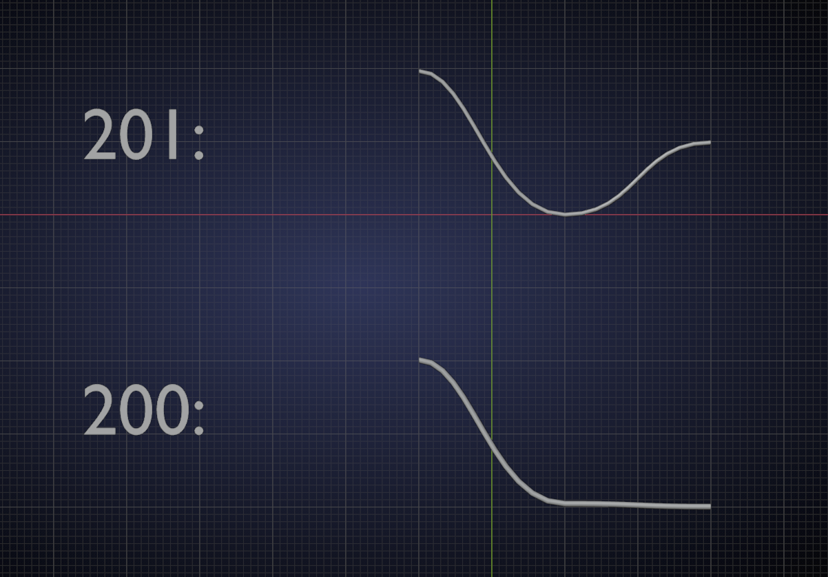
So, no worries, Adrian, you didn't ruin anything; you only made it better ;)
Here's my attempt on the MG bushes after Kent's live stream last Thursday.
![]() ketre Wow! These look spectacular! That was a really good live stream. I enjoyed watching the process of making these bushes.
ketre Wow! These look spectacular! That was a really good live stream. I enjoyed watching the process of making these bushes.
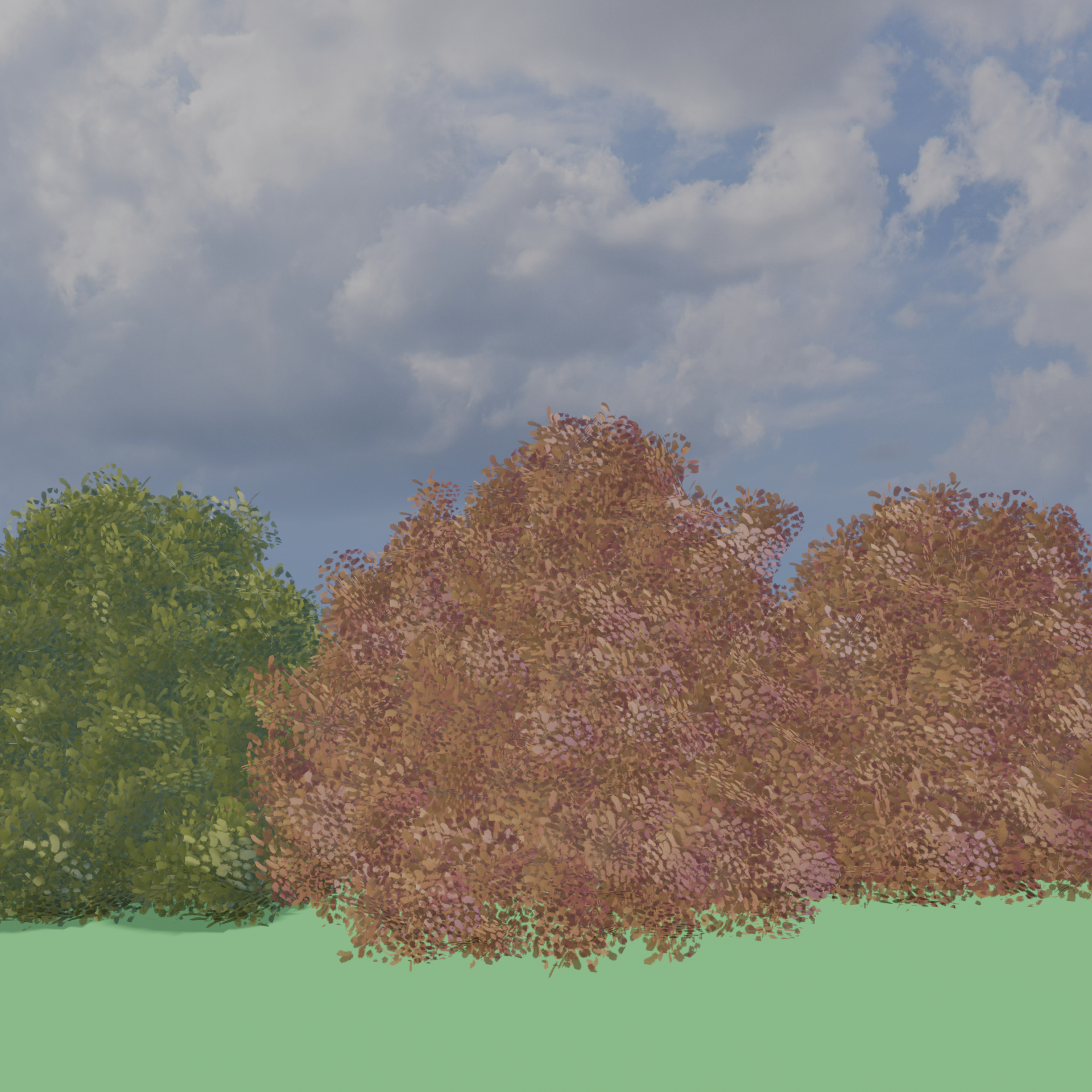
Finally got some proper leaf orientation and shading going. Thank you @theluthier for Thursday's stream. I may have a bit more to do with the shader's, but I'm pretty happy with how this is turning out.
I have a couple questions.
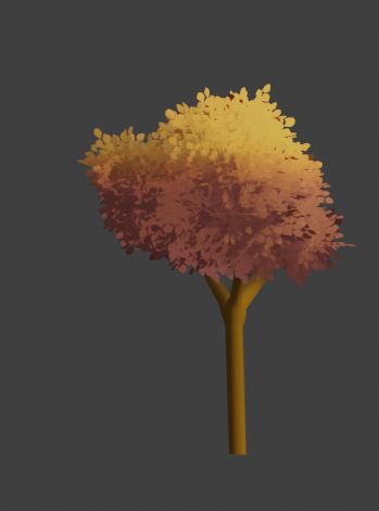
I have two clumps of trees. The clump on the right has the red/gold contrast below. The clump on the left is almost entirely red. Should I adjust the shader a bit for that clump and do a second tree? (I've been advised that my trees are meant to be instanced and not individuals.)
Also, there's almost no variation in the trunks in the artwork. Should I leave the trunks a plain brown like this, or actually try to put a subtle bark on them?
Nice Flowers! Not sure if it will be noticeable but all the centers are the same yellow. You could try giving them some variation of color.
Whoops, meant my original reply to be to the overall thread.
![]() ketre - Your bushes are looking good! One of the trickiest things I found with this method is getting enough crease definition to get defined shadows. Did you go with individual spheres and shape them, or did you go for more of a single object that you shaped? I ended up going with individual spheres and joining them into one object.
ketre - Your bushes are looking good! One of the trickiest things I found with this method is getting enough crease definition to get defined shadows. Did you go with individual spheres and shape them, or did you go for more of a single object that you shaped? I ended up going with individual spheres and joining them into one object.
![]() wardred That tree is looking amazing. I would like to lend my opinion about the detail of the trees. I like how you are matching your model to the artwork. I feel that this is the ultimate goal and would try to stick to your original plan. On the other hand, Kent did mention that if one wanted to showcase their work with a higher level of detail then a case could be made for the bark texture.
wardred That tree is looking amazing. I would like to lend my opinion about the detail of the trees. I like how you are matching your model to the artwork. I feel that this is the ultimate goal and would try to stick to your original plan. On the other hand, Kent did mention that if one wanted to showcase their work with a higher level of detail then a case could be made for the bark texture.
aartifact This style of creating bushes and trees is so painterly. I love it. Keep up the great work!
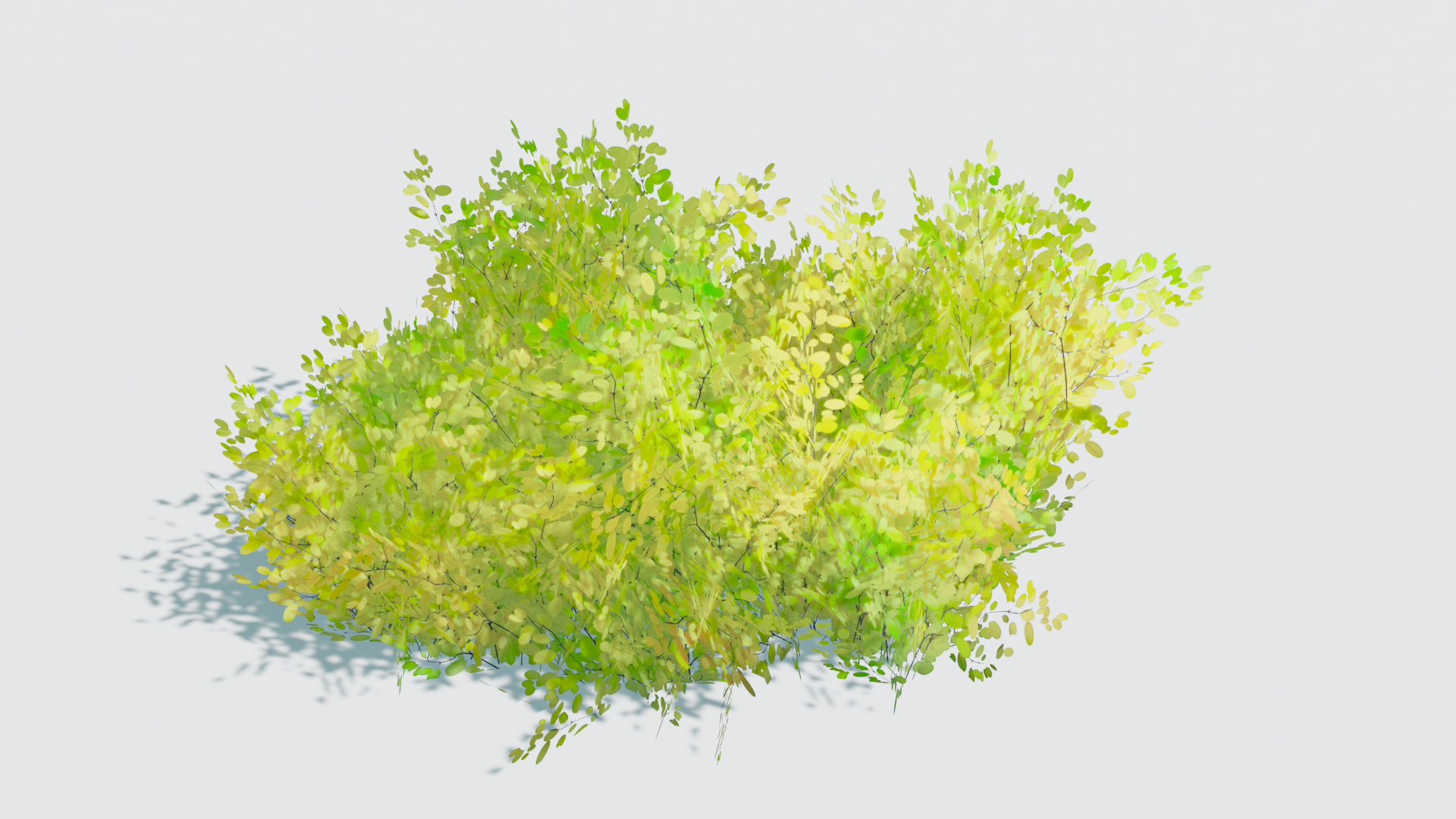
Hey Nature Peeps, an update on my foreground bushes: seeking more defination and lower poly counts, I deviated a tiny bit from my earlier approach and came up with this:
Not only am I super happy as to how its turning out, using GN to distribute the alpha leaves card results in a triangle count of 2! (The 2 extra triangles in the stats above are for the floor plane)
The above render is with basic diffuse texture only. Yet to dig into the materials.
I have finished my bushes, waiting for implementing =)
It was a long way, but i achieved my goals to have fun and learn new cool stuff.
