Moving over the thread from the other site. Didn't have a lot of things on there, so it should be easy.
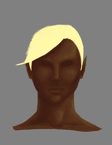
Hi guys. It's been a few years since I've drawn anything seriously, and now I have a DND group with a diverse cast of characters as inspiration. My first project is my half-elf hexblade. Here's a rough face concept with base colors laid down. Feel free to really rip into my art as I need to learn how to handle tough critiques as well as know where I'm weak.

I need to make the ears less pointy as I forgot I was a half-elf. Also, can't seem to quite get that spiky punk hair I want, but I'm sure it'll work itself out in iterations.

Working on the hair, trying to see if I can get it how I want it to be. Been playing around with the chalk brush and I really do like it. My facial proportions might be off, like maybe need to lower the nose just a touch or just redo the nose entirely.
Critiques are welcome.
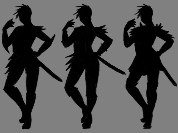
Armor concept silhouettes.

Found a posture online (terrible, I know, but needed something quick). I like the asymmetrical spikes along the figure more; brings an interesting movement and balance to the overall figure. Think I'll focus on pointy elements throughout the armor since the character can be a bit abrasive lol.
yyukinoh1989 Thanks!
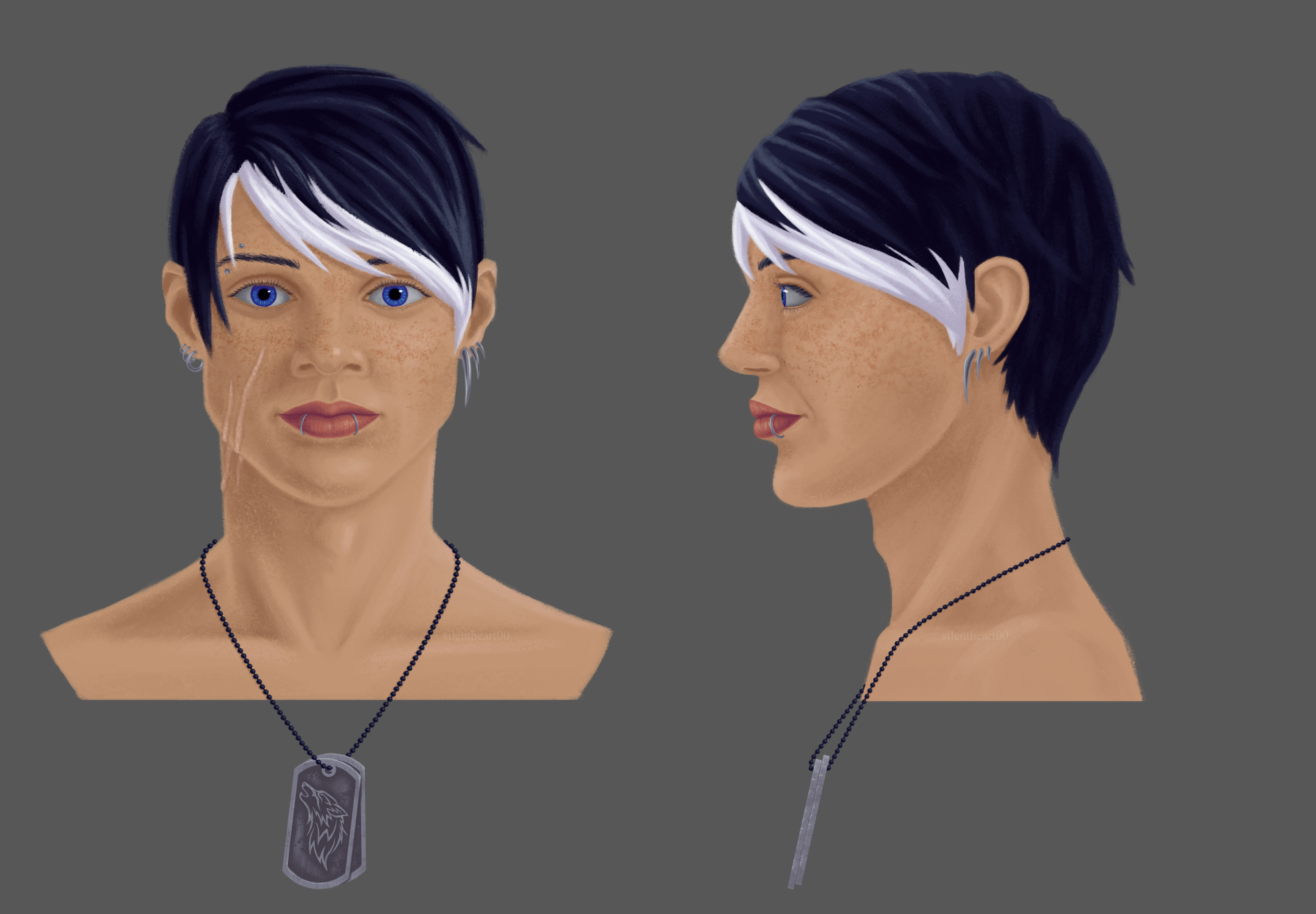
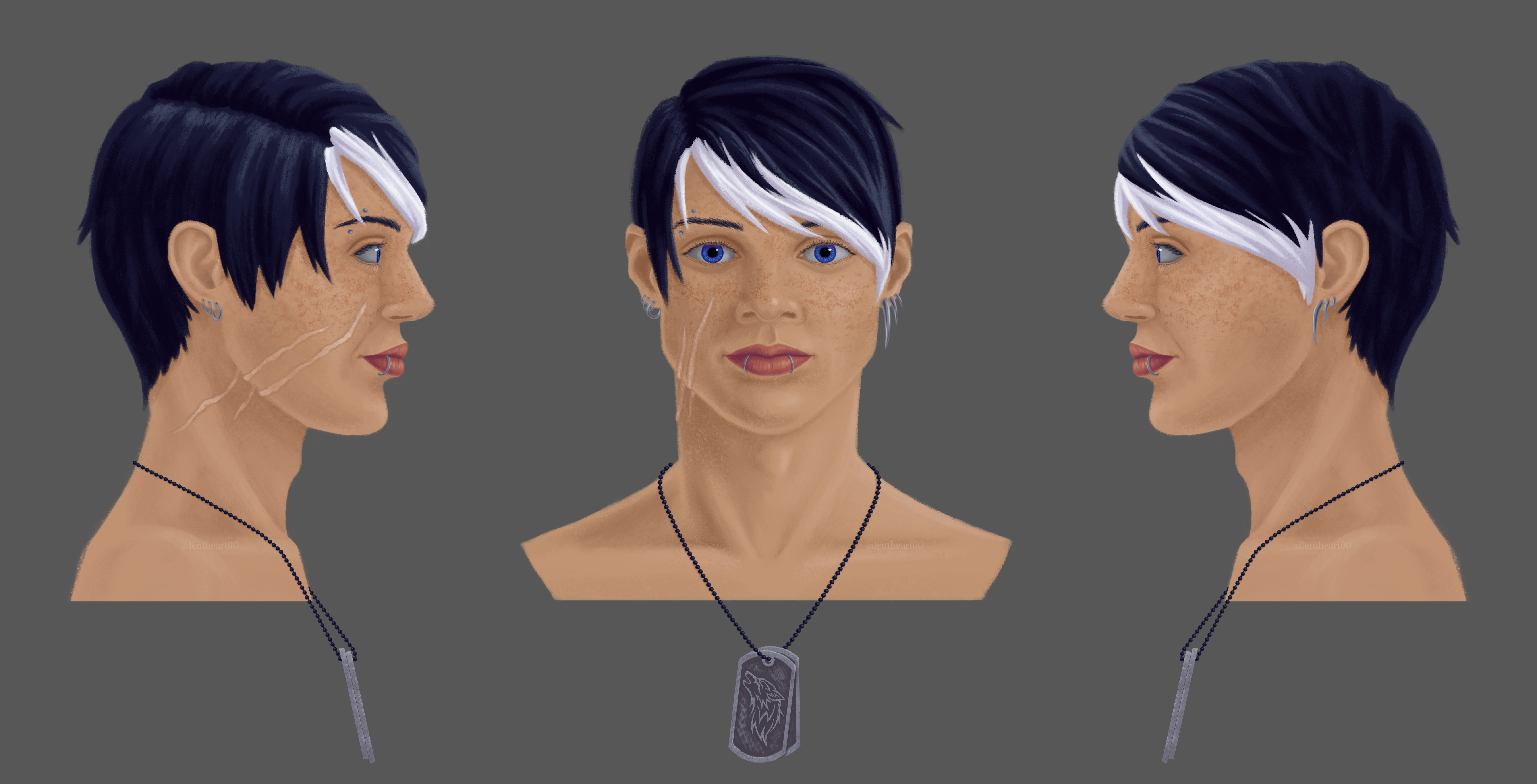
Finished one side, should be fairly easy to get the other side. Should think about what to do after this. Probably go back to my DND character and flesh out her outfit, repeat with the others.
Male jewelry is pretty understated compared to female jewelry, so I tried to keep it less flashy but still balancing the warm skin and the cooler jewelry and hair.

![]() silentheart00 great work the result is really good . the other side indeed should not be too hard :) . love the designs you make :D
silentheart00 great work the result is really good . the other side indeed should not be too hard :) . love the designs you make :D
![]() silentheart00 Nice side view! Also love the jewelry, and the hair of course. This is my favorite of the characters you did so far!
silentheart00 Nice side view! Also love the jewelry, and the hair of course. This is my favorite of the characters you did so far!
![]() silentheart00 His hair makes him unique, it's something that stands out in a good way, something you remember. The color of his eyes really pop. His freckles and the way he's looking at you suggest he is a nice guy, but his scars suggest there is more to his story. Mysterious. The jewelry compliment his overall look. Everything is just coming together real nice, complimenting each other, making for an interesting character 😊
silentheart00 His hair makes him unique, it's something that stands out in a good way, something you remember. The color of his eyes really pop. His freckles and the way he's looking at you suggest he is a nice guy, but his scars suggest there is more to his story. Mysterious. The jewelry compliment his overall look. Everything is just coming together real nice, complimenting each other, making for an interesting character 😊
ssmurfmier1985 Thanks. Good to see my instincts are going in the right direction, I guess lol. It also helps to have someone besides myself to look at the character and tell me their thoughts; helps me to know if what I want to communicate is there or not in the design.
Done! Woohoo!
Hazard in all his busty glory lol. Now, to go back to Kilyn and design her friggin' outfit!

![]() silentheart00 it's really interesting since each design is unique. They all are characters where you thought about. Like adding freckles, juwelery, the hair what always is really amazing done, also the eyes always are so well done. Like Miranda also mentioned you notice sometimes like with the scar he had been trough something, like we think we know him but then again not since it's also some mystery to guess or find out what happened. How he got that.its really fun to see you make designs and I look forward to the clothing.
silentheart00 it's really interesting since each design is unique. They all are characters where you thought about. Like adding freckles, juwelery, the hair what always is really amazing done, also the eyes always are so well done. Like Miranda also mentioned you notice sometimes like with the scar he had been trough something, like we think we know him but then again not since it's also some mystery to guess or find out what happened. How he got that.its really fun to see you make designs and I look forward to the clothing.
![]() silentheart00 Good work. One thing that seems weird to me is his jaw in profile. Kinda seems smooth compared to the front view.
silentheart00 Good work. One thing that seems weird to me is his jaw in profile. Kinda seems smooth compared to the front view.
By the way, do you still (or are you going to) draw full characters like in the first page?
![]() silentheart00 nice work, but there are some visible anatomy mistakes.
silentheart00 nice work, but there are some visible anatomy mistakes.
1. Sternocleidomastoid muscle should go from sternum and clavicle to place right behind the ear, not behind the neck.
2. Chin profile should not be the same as jaw profile because of suprahyoid muscles.
3. The clavicle is too straight in my opinion, it should be more like a cupid's bow.
That's just my observation though, not like I'm an anatomy expert or something.
@drgnclw It was hard to find a side view for the reference, so I did my best guess. And yes, that's going to be my next project: expand out into more full body stuff.
![]() nekronavt Hmm, this would've been helpful earlier in my process to correct those mistakes, but I'll keep that in mind in the future.
nekronavt Hmm, this would've been helpful earlier in my process to correct those mistakes, but I'll keep that in mind in the future.
![]() silentheart00 Well dang, don't think I've ever popped into here. Naturally being very inexperienced when it comes to 2D I can't really offer any appropriate critique but I'll definitely be keeping a close eye on this thread, looking forward to what else you put out there!
silentheart00 Well dang, don't think I've ever popped into here. Naturally being very inexperienced when it comes to 2D I can't really offer any appropriate critique but I'll definitely be keeping a close eye on this thread, looking forward to what else you put out there!
![]() thecabbagedetective Heh, thanks. Maybe my WIPs can help you. I'm more than happy to critique your stuff, too, so if you decide to make a sketchbook I'll take a look =]
thecabbagedetective Heh, thanks. Maybe my WIPs can help you. I'm more than happy to critique your stuff, too, so if you decide to make a sketchbook I'll take a look =]