Moving over the thread from the other site. Didn't have a lot of things on there, so it should be easy.
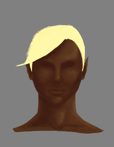
Hi guys. It's been a few years since I've drawn anything seriously, and now I have a DND group with a diverse cast of characters as inspiration. My first project is my half-elf hexblade. Here's a rough face concept with base colors laid down. Feel free to really rip into my art as I need to learn how to handle tough critiques as well as know where I'm weak.

I need to make the ears less pointy as I forgot I was a half-elf. Also, can't seem to quite get that spiky punk hair I want, but I'm sure it'll work itself out in iterations.

Working on the hair, trying to see if I can get it how I want it to be. Been playing around with the chalk brush and I really do like it. My facial proportions might be off, like maybe need to lower the nose just a touch or just redo the nose entirely.
Critiques are welcome.
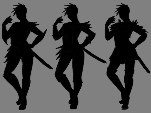
Armor concept silhouettes.

Found a posture online (terrible, I know, but needed something quick). I like the asymmetrical spikes along the figure more; brings an interesting movement and balance to the overall figure. Think I'll focus on pointy elements throughout the armor since the character can be a bit abrasive lol.
I should've mentioned, this is a redesign of an old video game character I had an idea for a loooooong time ago. Since it's an old character, I did the Draw This Again exercise. It's great to say I have improved quite a lot in that time, the last few months especially.
Her name is Chaos, and I should develop a background for her at some point. Maybe once I'm done drawing her side views lol
![]() silentheart00 well now that is some great improvement. Trough the hairstyle is different I love the new one a lot. Look forward to some more cool designs :)
silentheart00 well now that is some great improvement. Trough the hairstyle is different I love the new one a lot. Look forward to some more cool designs :)
yyukinoh1989 Thanks! With the redesign, I'm updating her look a little bit, adding some extra things that will hopefully help with her character.
![]() silentheart00 I love how you make the eyes and hair a bright color. It looks great.
silentheart00 I love how you make the eyes and hair a bright color. It looks great.
![]() silentheart00 Dude, you've improved A LOT in a couple of years. Nice job! I really like your stuff, very colorful, somehow it pleases my eyes 😊 Keep up the good work!
silentheart00 Dude, you've improved A LOT in a couple of years. Nice job! I really like your stuff, very colorful, somehow it pleases my eyes 😊 Keep up the good work!
Now for side views!

I think that eye may be too far back in the side view, so I'll fix that.
![]() silentheart00 Awesome, more Chaos goodness!! Looking forward to the refined version 😊
silentheart00 Awesome, more Chaos goodness!! Looking forward to the refined version 😊
![]() silentheart00 hey nice progression! I really like her 😊 Since I know you always want to learn, I wanted to mention that on her left side view (which would be the image on the right that is her left), the eyes look a bit tense, a bit like she is staring (how I'm explaining well enough what I mean). If you look at the front view she has a very relaxed pose, beautiful look, but the side view gives of a more tense vibe. That could be something to adjust, if you want to take this further, but if you want to move on that's okay too of course 😉 New stuff is usually a learning boost more than tweaking. And this is a beautiful piece something to be very proud of!
silentheart00 hey nice progression! I really like her 😊 Since I know you always want to learn, I wanted to mention that on her left side view (which would be the image on the right that is her left), the eyes look a bit tense, a bit like she is staring (how I'm explaining well enough what I mean). If you look at the front view she has a very relaxed pose, beautiful look, but the side view gives of a more tense vibe. That could be something to adjust, if you want to take this further, but if you want to move on that's okay too of course 😉 New stuff is usually a learning boost more than tweaking. And this is a beautiful piece something to be very proud of!
Keep up the good work 😄👍🏻
ssmurfmier1985 Fair enough. I can see maybe it's a little more intense on that side. This model had a flatter face, so maybe that's what is contributing to it. Dunno. Thanks for the feedback.
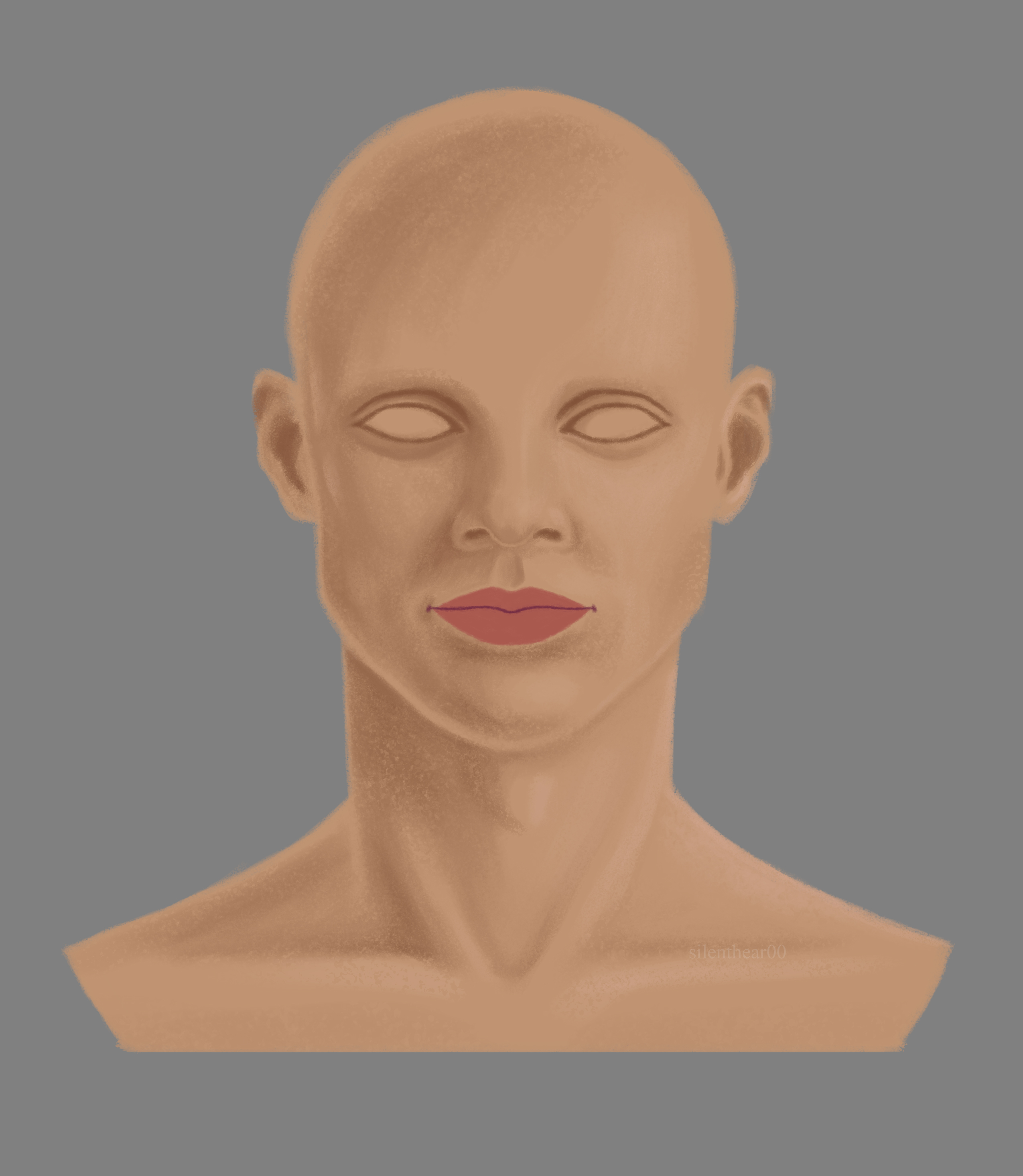
Things popped up, didn't get very much done, but here's a small update.

Not sure I'm set on the lip color, might desaturate it more. Not even sure about the skin color, either, maybe a touch too orange. Eh, we'll see what shakes out with the rest of the elements.
![]() silentheart00 nice work. This would become a male right? I think saturating the lips would be better then. Wonder how he will look :D
silentheart00 nice work. This would become a male right? I think saturating the lips would be better then. Wonder how he will look :D
yyukinoh1989 Yep, totally a dude. I'll play with the lip colors more, see if I can find one I like more.
Happy Belated Thanksgiving, everyone! I'm thankful for this wonderful community.
Here's a closeup of the lips, which look better after adding some detail.

It's mildly annoying to see my two best monitors are slightly off in color to each other, so yay. Everything looks reddish on my best monitor while on my second best it's more orangy. Oh well, that's technology for you, right?
![]() silentheart00 great work. That are some nice details on the lips. For me the most inner is more orange tintes. And outer part is more reddish colored for me. It looks really good. I look forward to the rest
silentheart00 great work. That are some nice details on the lips. For me the most inner is more orange tintes. And outer part is more reddish colored for me. It looks really good. I look forward to the rest