Hi there!
Welcome to my Polybook where I will post my current work in progress.
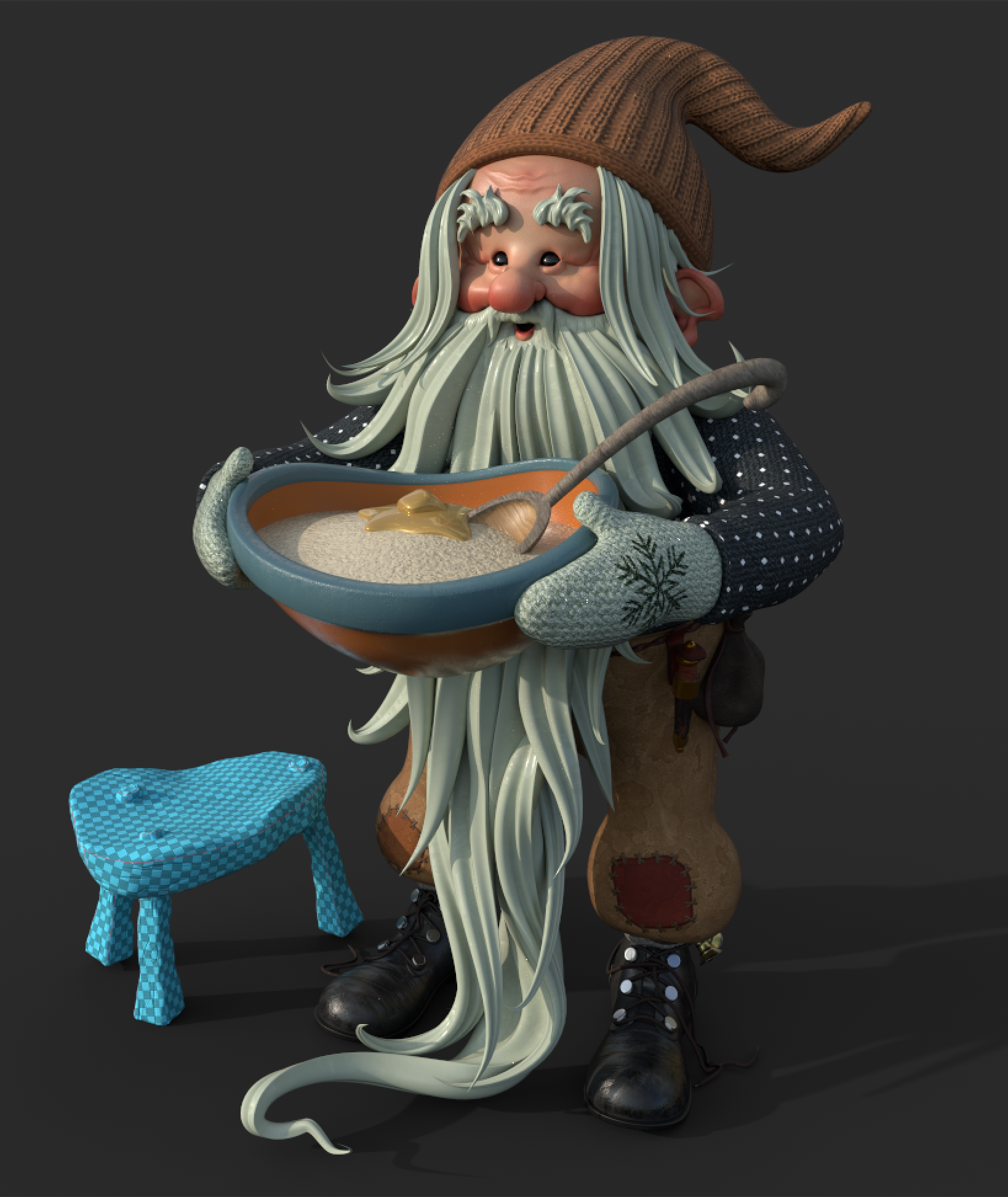
A little update on this guy!
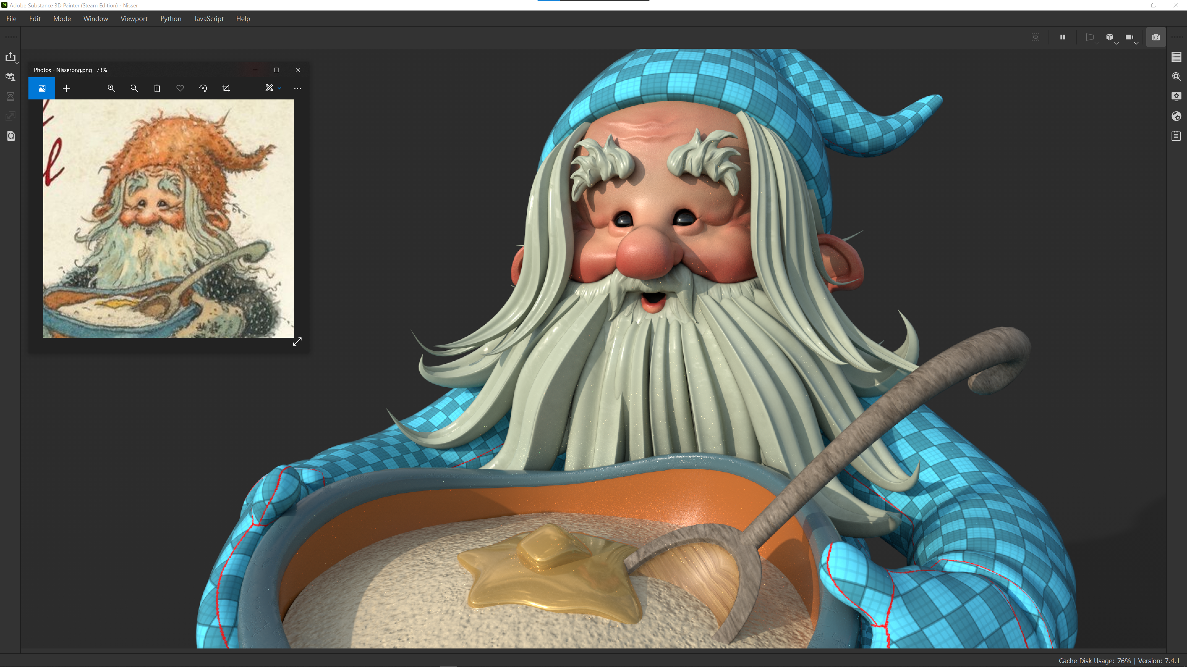
I've painted some colours onto his face and tried to capture the redness on his cheeks, nose and ears.
I didn't do too much to the hair apart from colour it and added some AO. Also played around with the roughness here to add a little more interest.
Made a quick pass on the bowl and contents, I'll come back and add something here - maybe it needs a bit more dirt or something to roughen it up as it's quite clean.
I worked on his shoes a too - I tried to keep it quite simple and to the artwork style, I'm quite happy with the way they are looking.
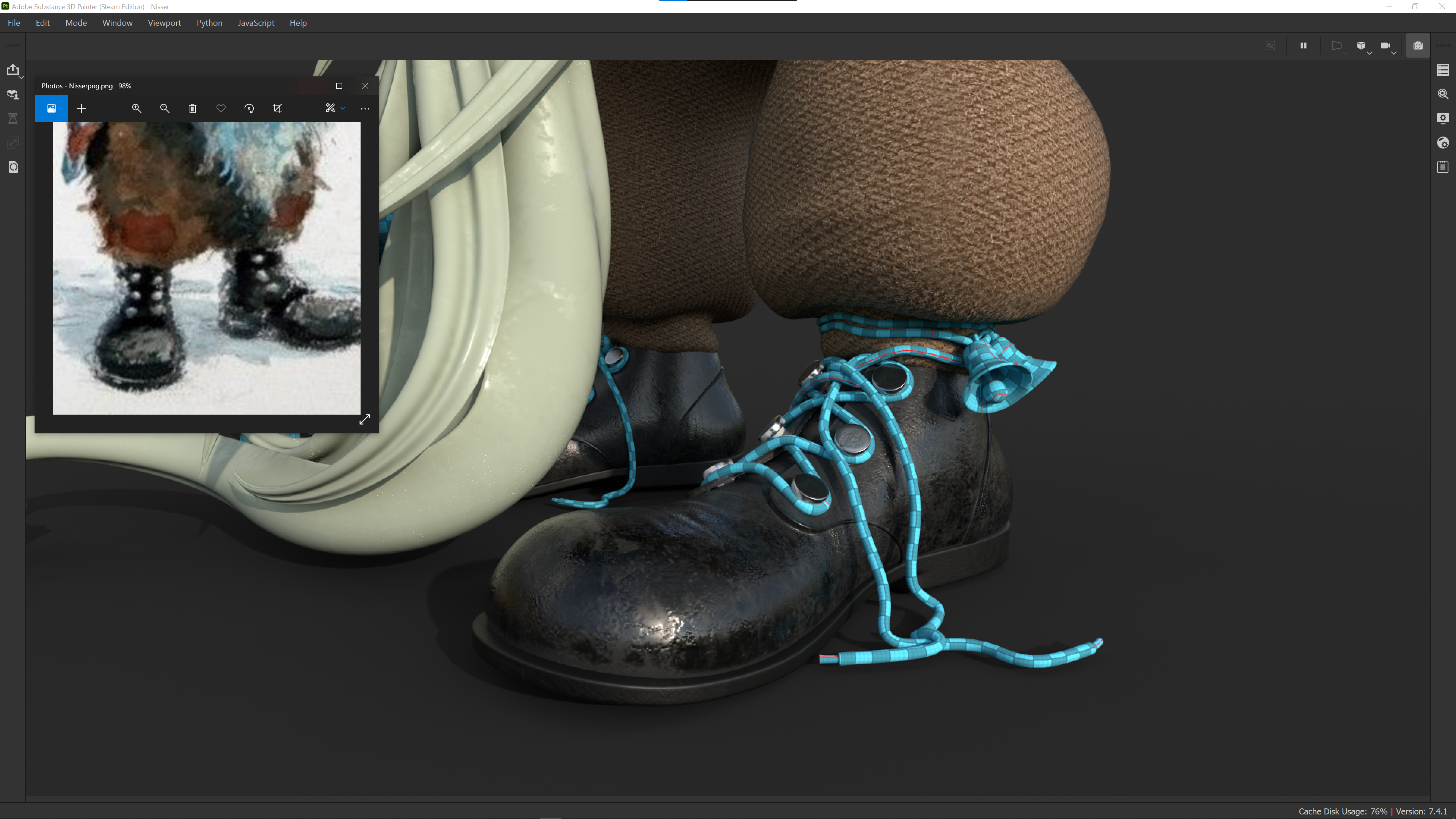
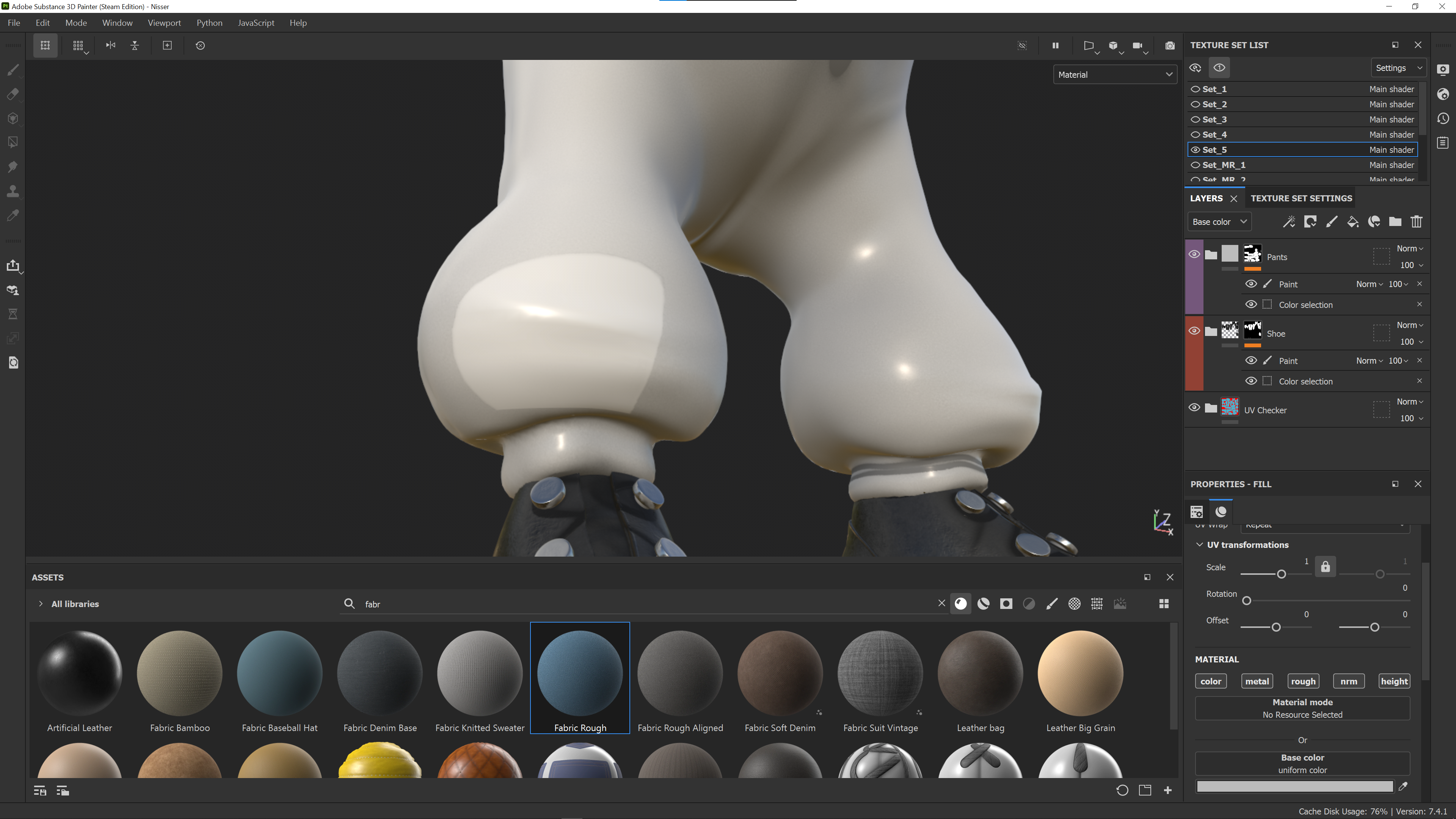
I spotted a couple of problems with my UV's 👀 One is on the underside of the sole of the shoe, there's a tiny gap showing but I'm probably just going to ignore that given where it is! The other is on his pants - that shape is actually the pocket from the rear - how did I do that? 😅
So I might go back and rebake that texture set, or....... now that I look at it - I could use it to my advantage and turn it into a patch, as I do see that in some of Kjell's art - will need to think about it.
Great job with the makeup on the face,
The shoes look great, maybe a little shiny, considering they are quite scuffed.
And I love the blue chequered PJ's.
Yes! Thanks for that feedback @adrian2301 it's much appreciated!
The PJs are only placeholders unfortunately but now you mention it, they would make a great costume 😅
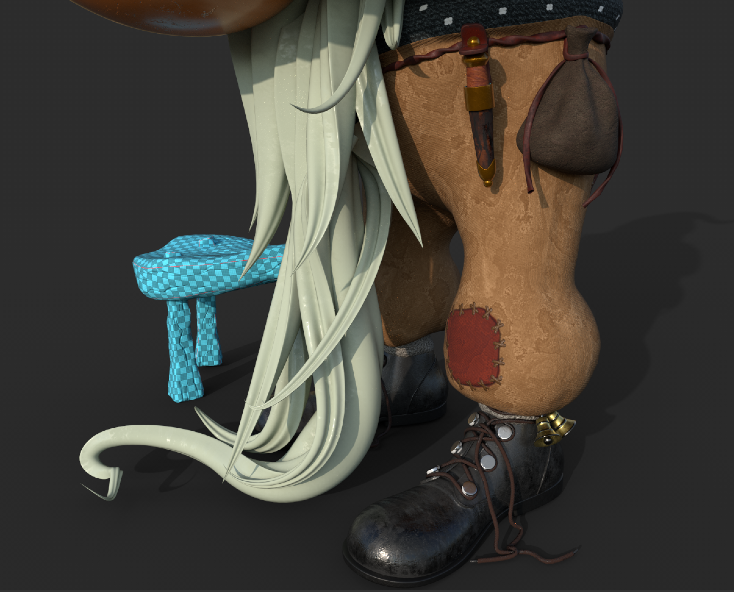
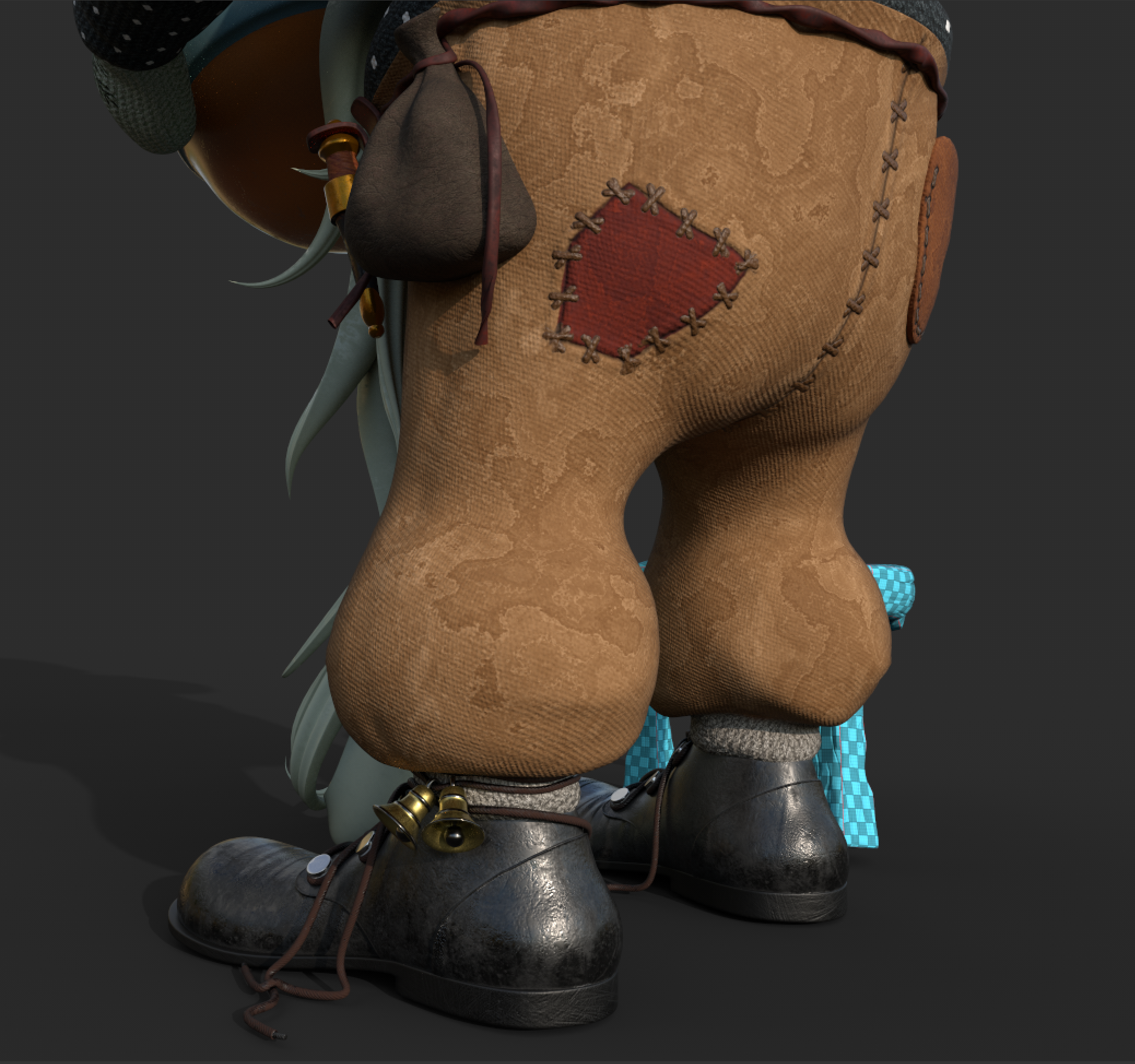
Some more progress, I've spent a bit of time on the pants trying to make them look nice. I had to bite the bullet and go back to correct the UV's, my lazy plan was not going to work! 😅 I did like the idea of patches though, so went ahead with that in a few places.
Shoes are still too shiny! I'm going back to those next, and wanted to add a little more detail there - possibly some stitches.
I'm not really loving the wool on the hat because of the way it twists near the top I think - but I'm having a bit of trouble figuring out how to make that look good - will have to experiment a bit more here.
It's definitely coming along though, I think the overall look is headed in the right direction.
PS - if you're following my thread I do apologise for spamming a bit these last couple of days 😃
Looks great already Keith!
The hat is indeed a strange thing; I have never knitted anything in my life, but I think one way to do this is basically knit a triangle:
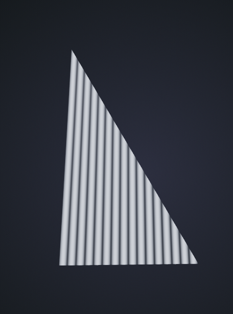
practically, you'd probably use more seams, by the looks of it this one has 3 (or 4) seams, not going all the way to the bottom:
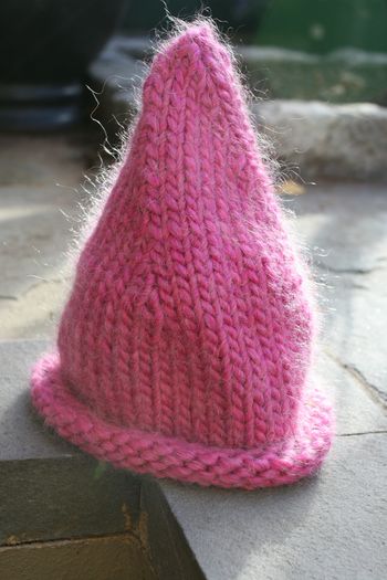
I have never knitted anything in my life
Haha me neither! 😅
Thanks Spikey, that triangle shape would definitely work - I think you are spot on there! I've also been experimenting with using a slightly different fabric pattern - that's also giving me a nice looking hat! It's definitely a challenging shape to texture, surprising actually - I thought it would be very simple!
Looking great! Really coming together now.
I'm hoping to get into doing some characters at some point next year. Did you learn most of your process through cgcookie? Any courses that you found particularly helpful?
Hey thanks for the comment ![]() jammingammon !
jammingammon !
I'm looking forward to seeing what characters you will make - did you start a polybook yet, I'd like to follow it if you did.
Yes I did learn most of my 3D skills from the CG Cookie guys, for sure they have some of the best courses in my humble opinion. Thinking back, a couple of stand outs for me would be the Sculpting Melvin course - it's nice and beginner friendly (not sure what level you are right now with sculpting?) I don't think I'd sculpted anything useful before that course and I learned so much.
Another one of my absolute favourites would have to be sculpting the Wrangler. It's probably a bit more intermediate but it is absolute gold - my sculpting really did improve after that.
Melvin - https://cgcookie.com/exercise/sculpting-melvin
Wrangler - https://cgcookie.com/course/sculpting-the-wrangler
Both of these courses are probably a bit old now and use earlier versions of Blender - but if you can get past that hurdle the techniques that Kent shows are invaluable.
Another one that levelled me up is the creature sculpting course from Zach Reinhardt @ CG Boost. It's quite a long one, but well worth the time investment!
For texturing in Substance I found this course from Jonathan really useful - there's some great tips in there.
https://cgcookie.com/course/the-blender-substance-texturing-workflow
Substance/Adobe also have some great training vids on Youtube.
Whew, that got a bit long winded - Hope it helps you out though! 😅
Thanks ![]() beefkeef . I appreciate the detailed advice. I have a "progress" thread, if that counts as the same thing as a polybook. I'm using it mostly to track my course progress, though I hope to start a separate thread with custom projects, when I get a bit more into those. I did a few of the cgcookie competitions this year, to try to get into the habit of doing my own stuff, instead of just mindlessly following tutorials, but its a long process to get from ground zero to where I want to be (or at least to a respectable point along that path). My progress thread is here, if you're interested. I'd be happy to hear any feedback you have to give, I plan to update it again soon: https://cgcookie.com/questions/15004-jammin-s-blender-progress
beefkeef . I appreciate the detailed advice. I have a "progress" thread, if that counts as the same thing as a polybook. I'm using it mostly to track my course progress, though I hope to start a separate thread with custom projects, when I get a bit more into those. I did a few of the cgcookie competitions this year, to try to get into the habit of doing my own stuff, instead of just mindlessly following tutorials, but its a long process to get from ground zero to where I want to be (or at least to a respectable point along that path). My progress thread is here, if you're interested. I'd be happy to hear any feedback you have to give, I plan to update it again soon: https://cgcookie.com/questions/15004-jammin-s-blender-progress
I did complete the two Fundamentals of Scuplting courses.. the old one used the melvin exercise, and in the newer one, you create a stylized shark. I think they went fairly well. I'd like to think that scuplting is my best skill, lighting and texturing is more what trips me up. lol. The Wrangler course looks pretty interesting, I missed that one and started on the Intro to Character Modeling (the pilot) course a couple weeks ago, talk about old (and long) courses. I think I'll try out the Wrangler one after that. Do you know if Kent goes into retopology at all in that course? That's one of the bigger sticking points for me at the moment.
Anyway, sorry to steer your thread off course, and thanks again for taking the time to give me advice!
I'm still chipping away at this guy when I'm not at work and here's a little update.
I've added more details to the knife and his little pouch - I tried to make that area more interesting. Also added some stitches and seams to the shoes.
I changed the pattern on the gloves to better reflect the artwork and also added a dusting of cinnamon to the porridge (Norwegians like that). I changed the texure of the hat too - I think it looks a bit better now.
Back in Blender I've added some basic lighting - I'll try and improve that a bit more next time! Also added some fluffyness to his clothes, not sure if that will work on Sketchfab but that's OK - I'm happy just having the hair on my beauty renders.
I'm thinking about adding some planks of wood for the floor? I know it's straw in the artwork but I've got a deadline to keep here! 😅
in fact I might pinch some of them from my treasure chest project and see how they look.
Still some work to do but the end is in sight now I feel! 👍
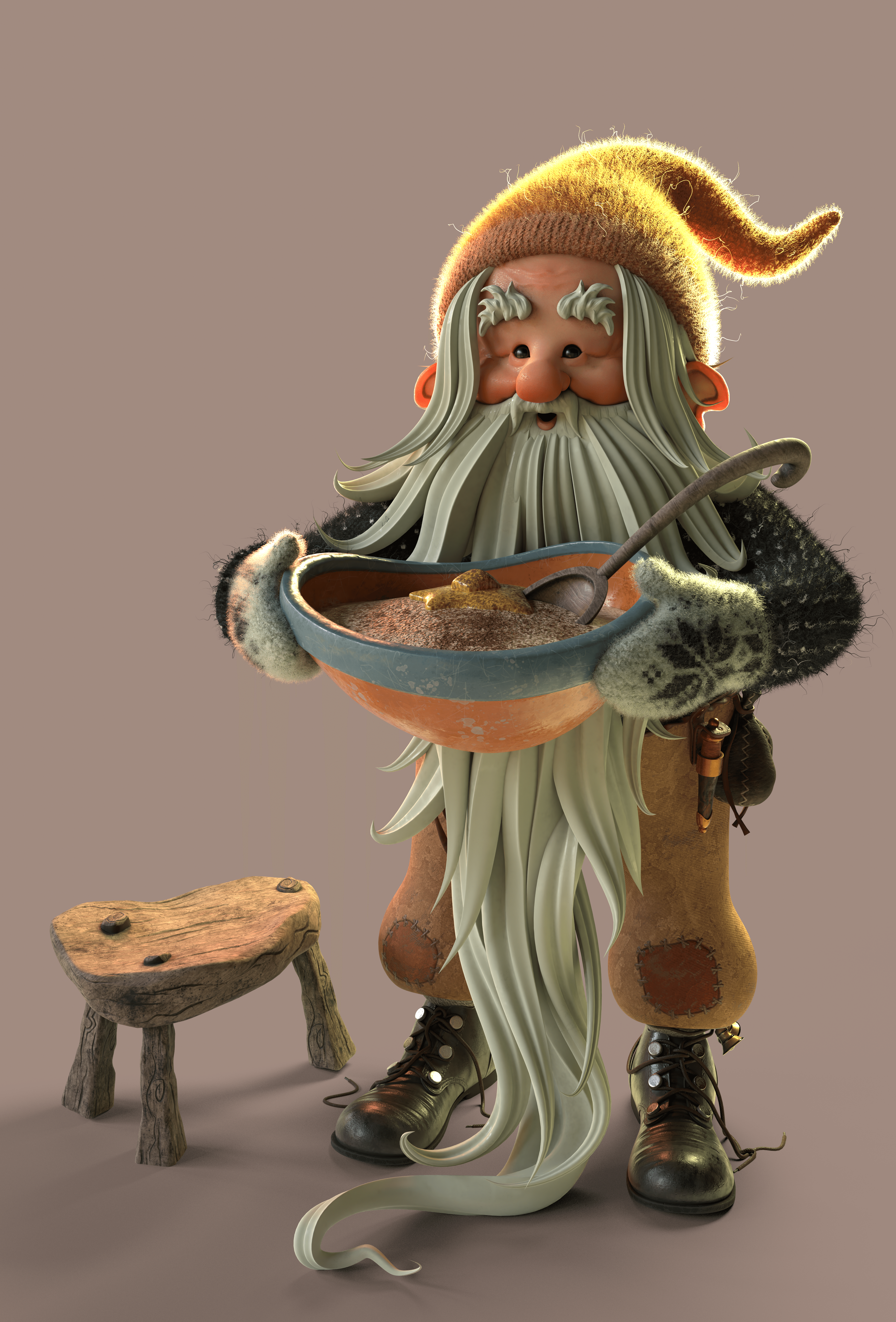
I really like your textures, Keith. Sometimes it feels like I can zoom in and zoom in and zoom in and then I see atoms)
And that porridge looks way better now too!
Thanks Michael I appreciate that! I just love getting close up and trying to add in some small details, it's kind of nice for the viewer to discover them as they look closer! 👍
Here's the final renders from this project. I like to render them in Blender with a transparent background and then take it into Photoshopp. Here it's nice to add a gradient with a contrasting colour. Also played with the colour/contrast to make it pop a bit and added a bit of dust and noise as finishing touches.
About the floor - I tried pinching the wood floorboards from my treasure chest project but I didn't like how that wood looked against the wood I used on the stool. Also, that was taking me away from the artwork and I didn't want to do that if I could avoid it.
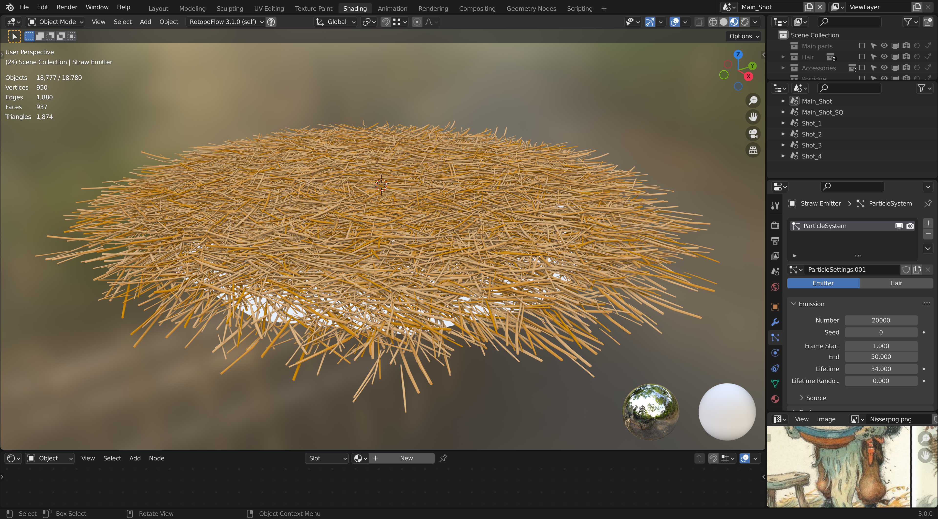
I created a few pieces of low res straw and put them in a collection, then used a particle emitter to give me a random stack of straws. The only problem doing it this way is that I couldn't find a way to bring that into Sketchfab as there are so many pieces of straw ("only" 20,000) or so 🤪 If I try to convert them to a mesh my PC cant handle it so not really sure how best to get around that! Can something like this be baked onto a low res mesh somehow?
Not the end of the world, but as Michael mentioned it would definitely be nice to have that in the Sketchfab version!

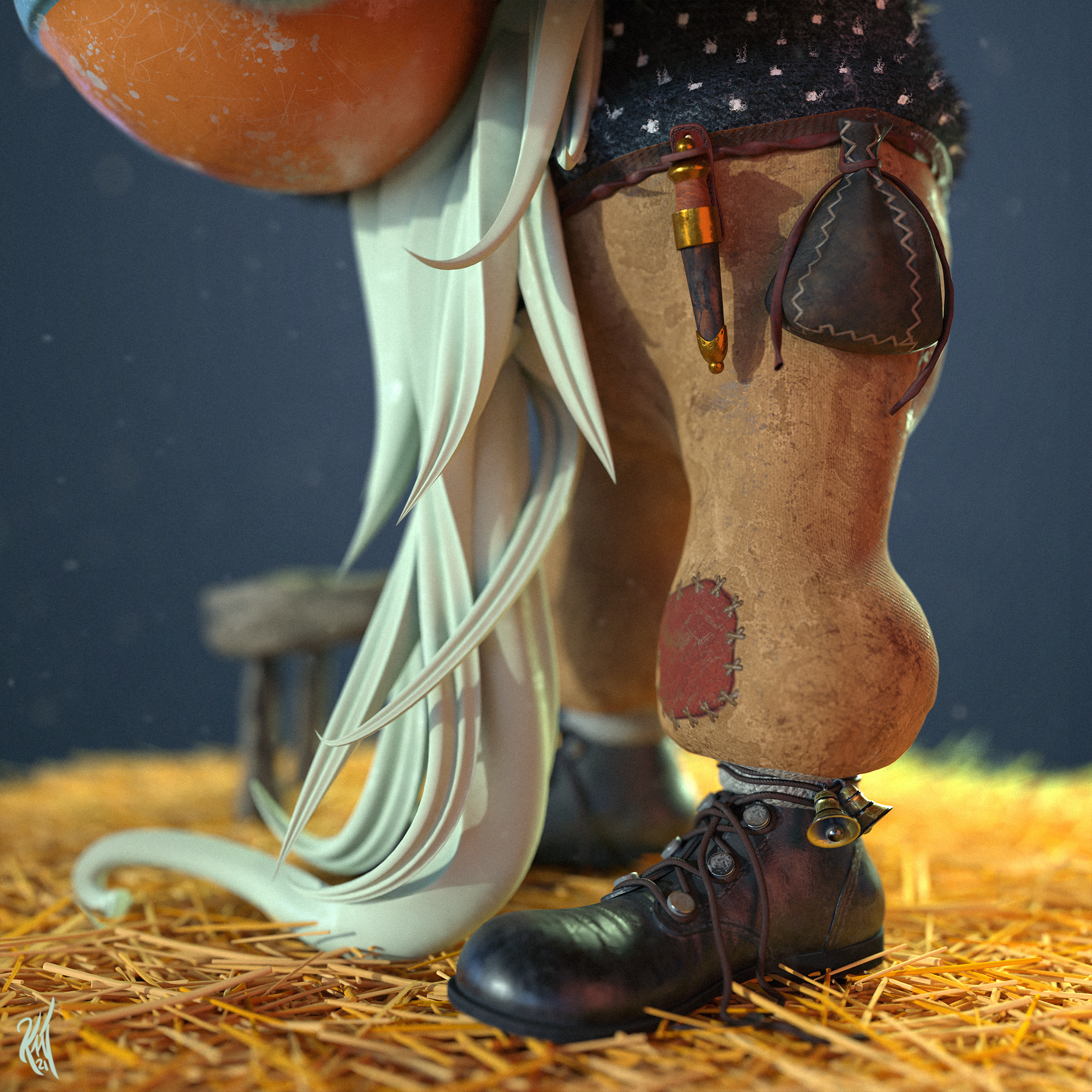
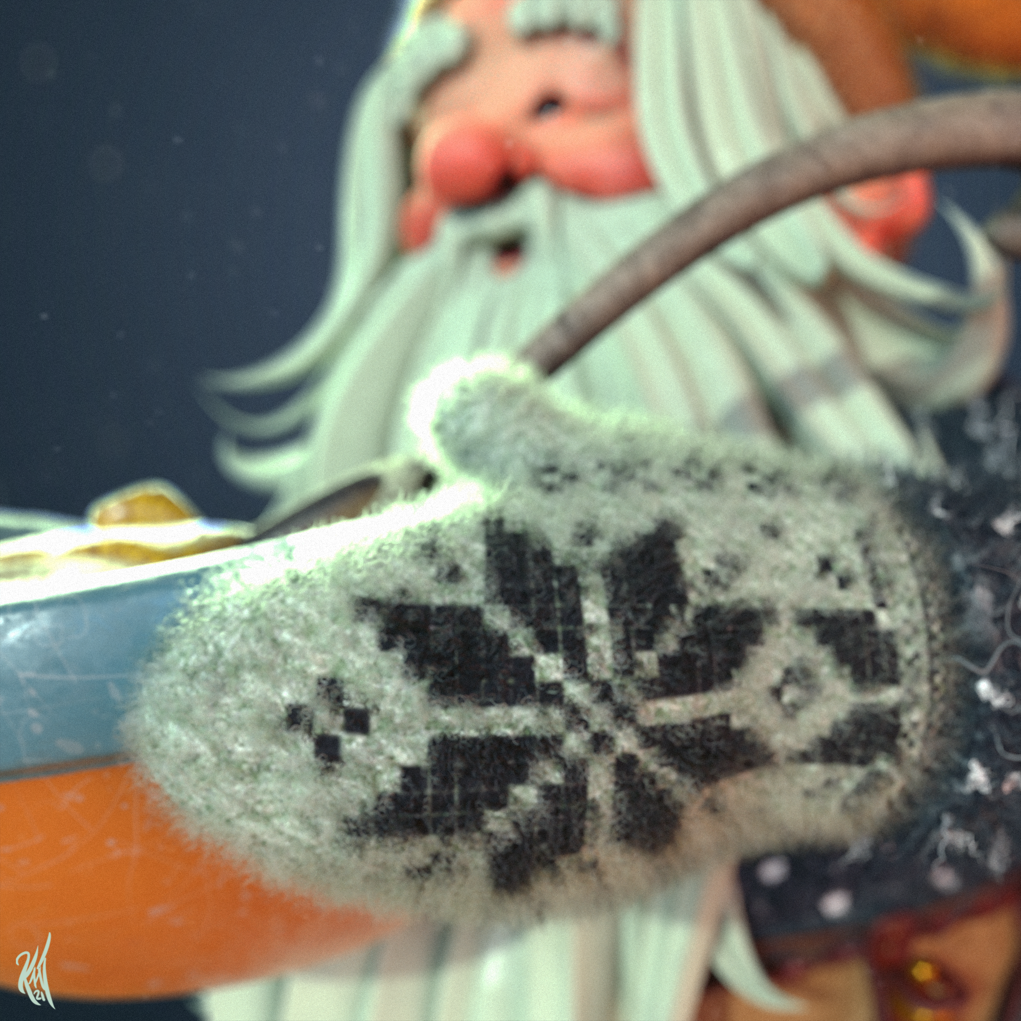
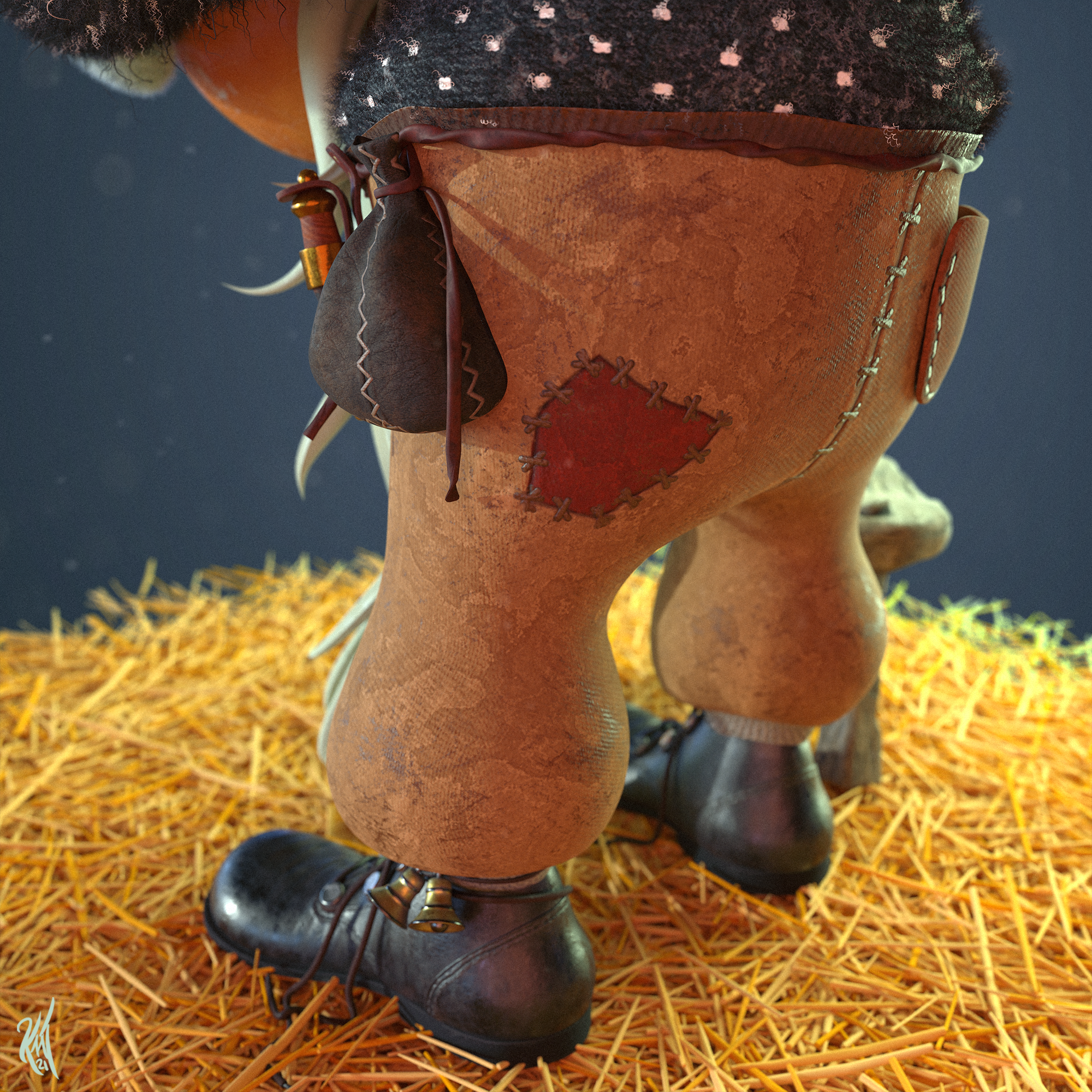
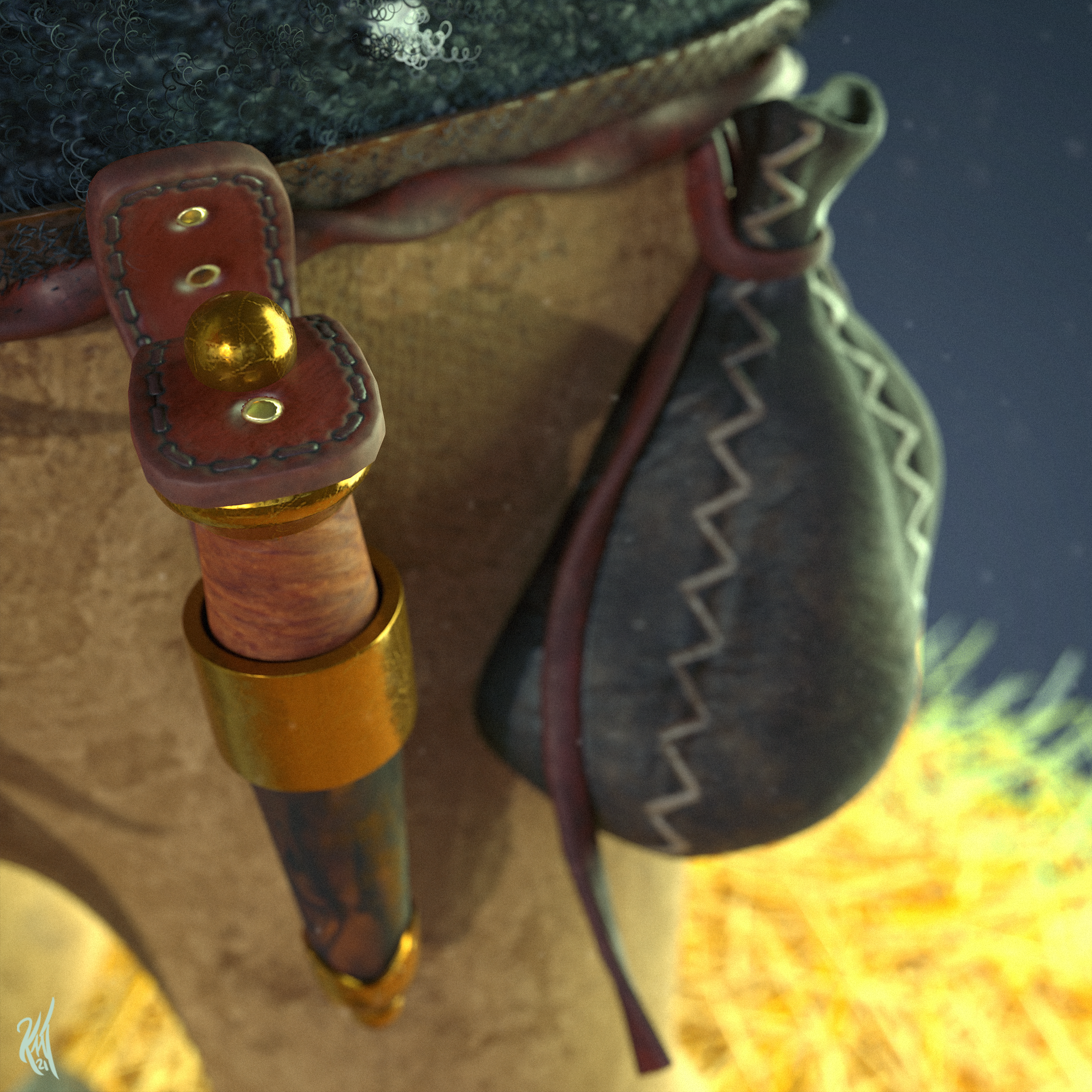
![]() beefkeef I really love that sweater, gloves and cocoon on his head) reminds me of Dune for some reason.
beefkeef I really love that sweater, gloves and cocoon on his head) reminds me of Dune for some reason.
Great!
As for these straws -- why don't you fake it with textures? Just make a plane and texture it with a really neat high res texture set. Use alpha-channel on the rim. Maybe play around with displacement too.
Cause even if you bring all these 20 000 straws up to the scene I think there will occur some weird clippings / intersections with shoes anyway. Plus all these straws will add so much visual noise.
Keep the focus on a gnome and leave the floor as simple as possible. Just enough to be a solid representation of the ground.
Hope that helps, Keith)
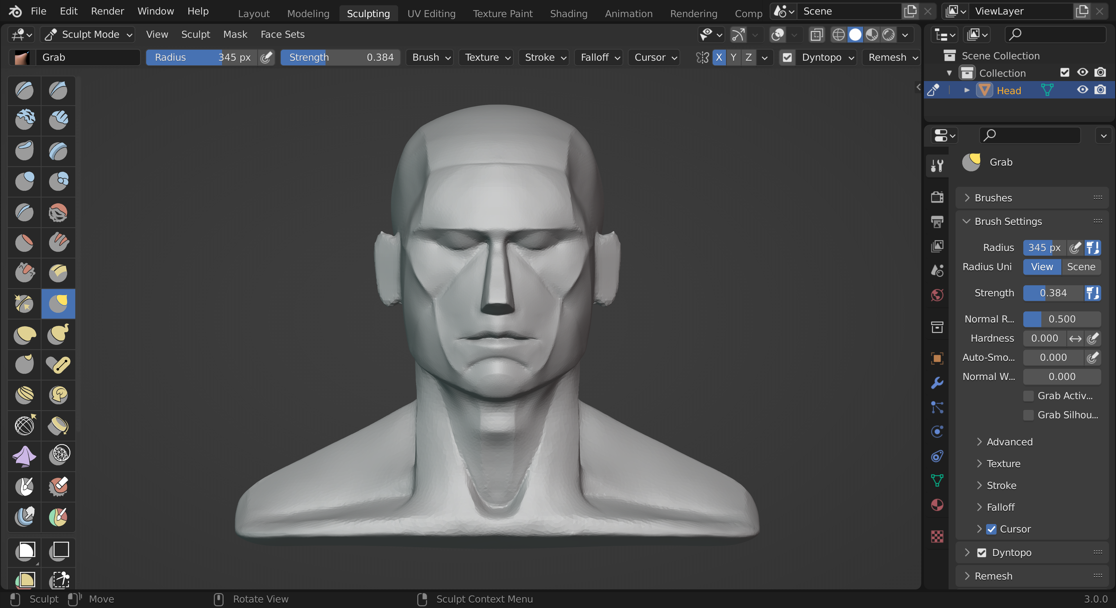
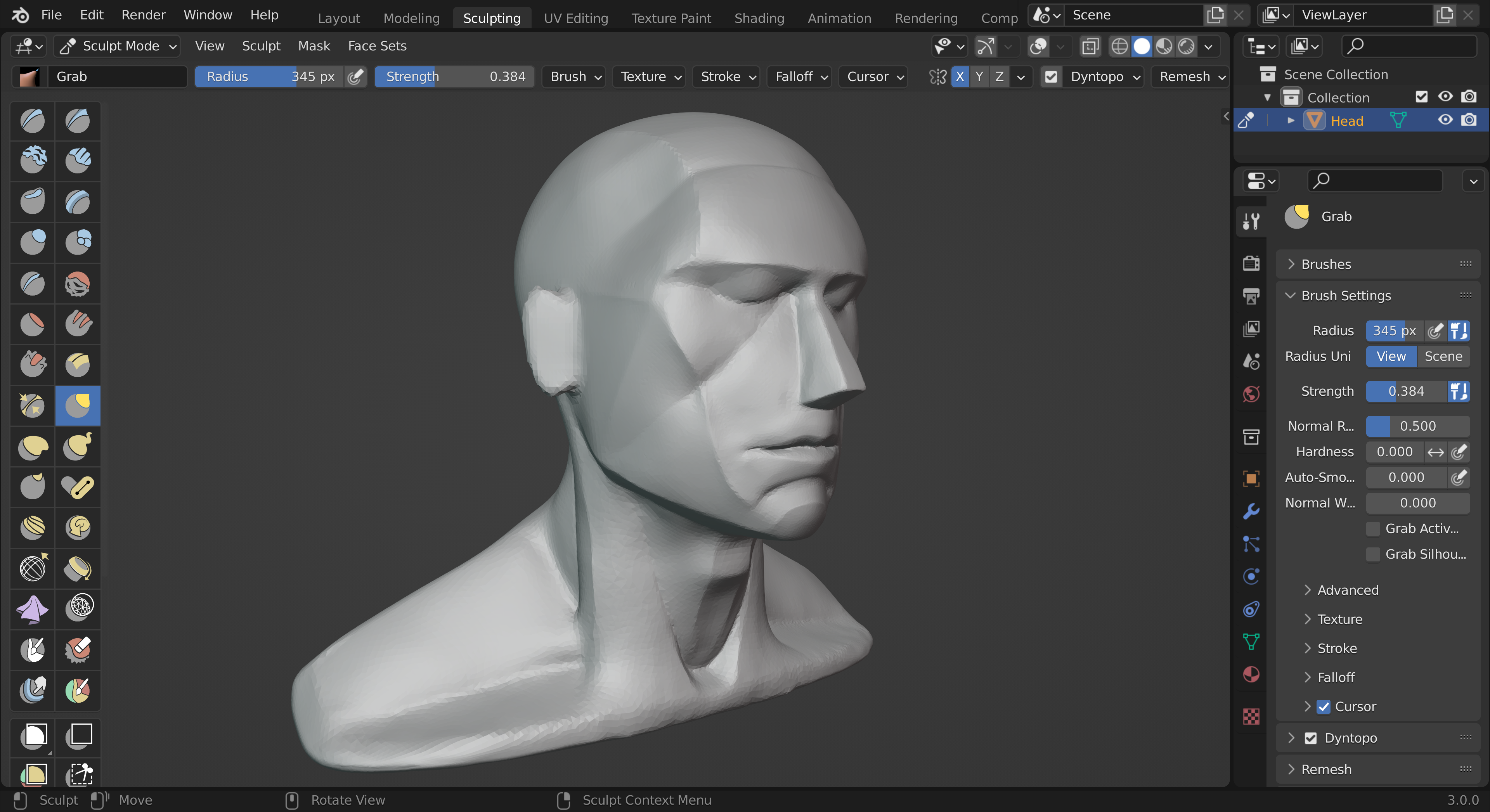
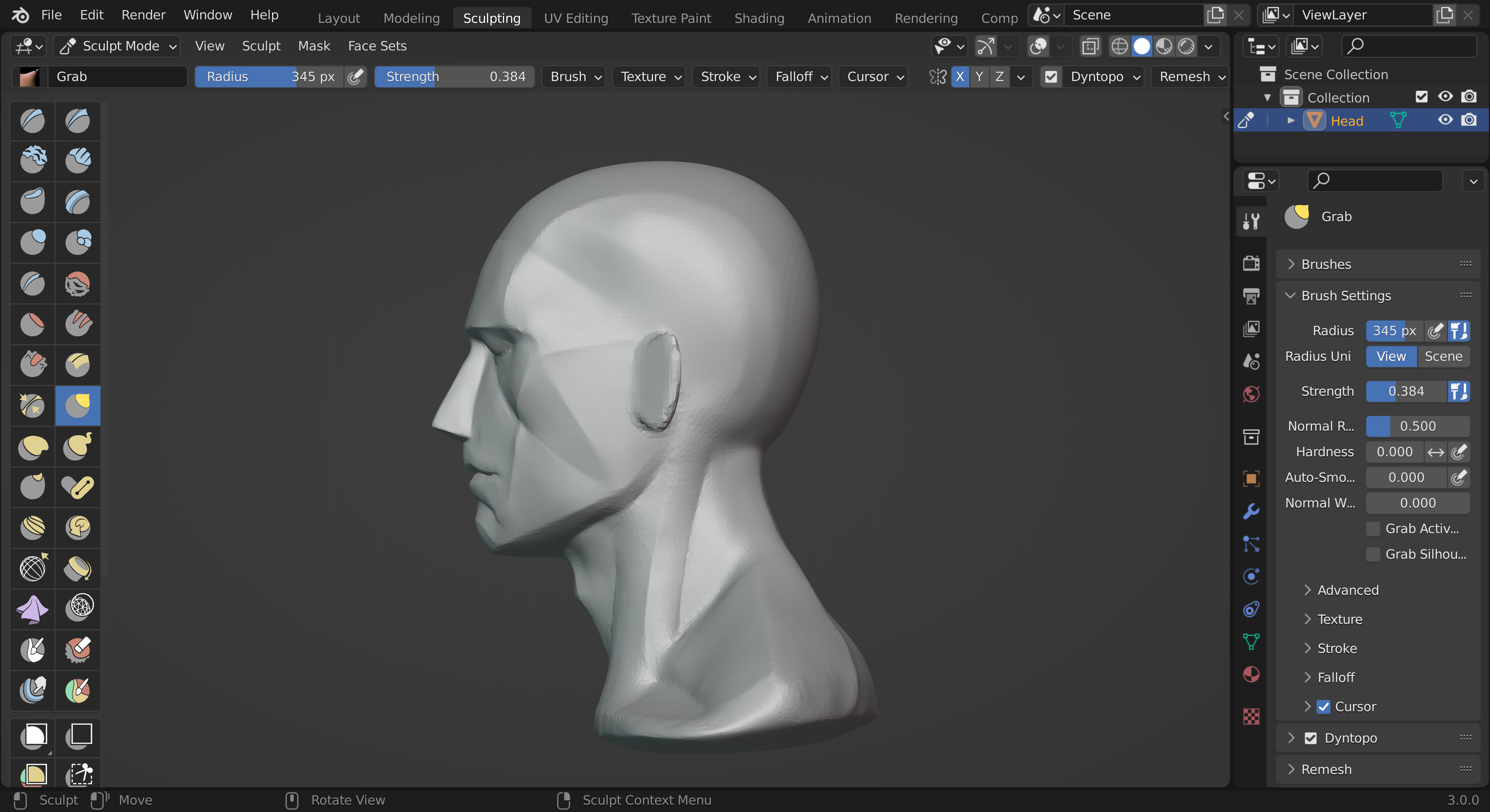
Finally I've got around to starting Kent's Epic course, I 've watched the first chapter a couple of times over the Xmas break - so I'm gonna jump in and have a go now! Not expecting my first attempt to be any good, but it should be fun 👍
Here's some WIP after lesson 2
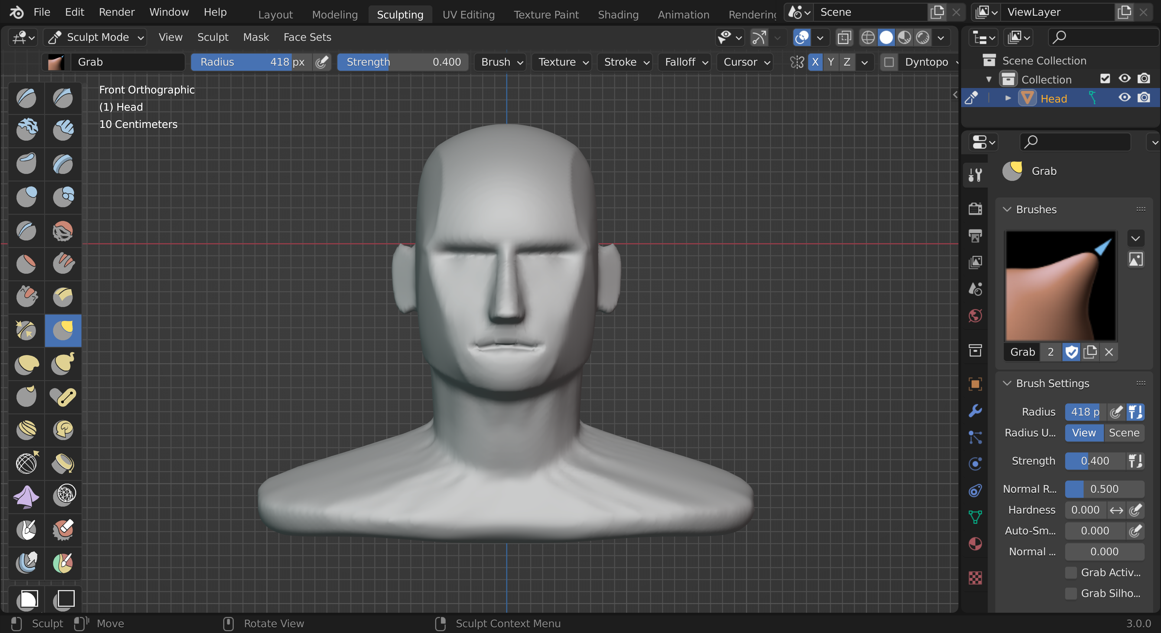
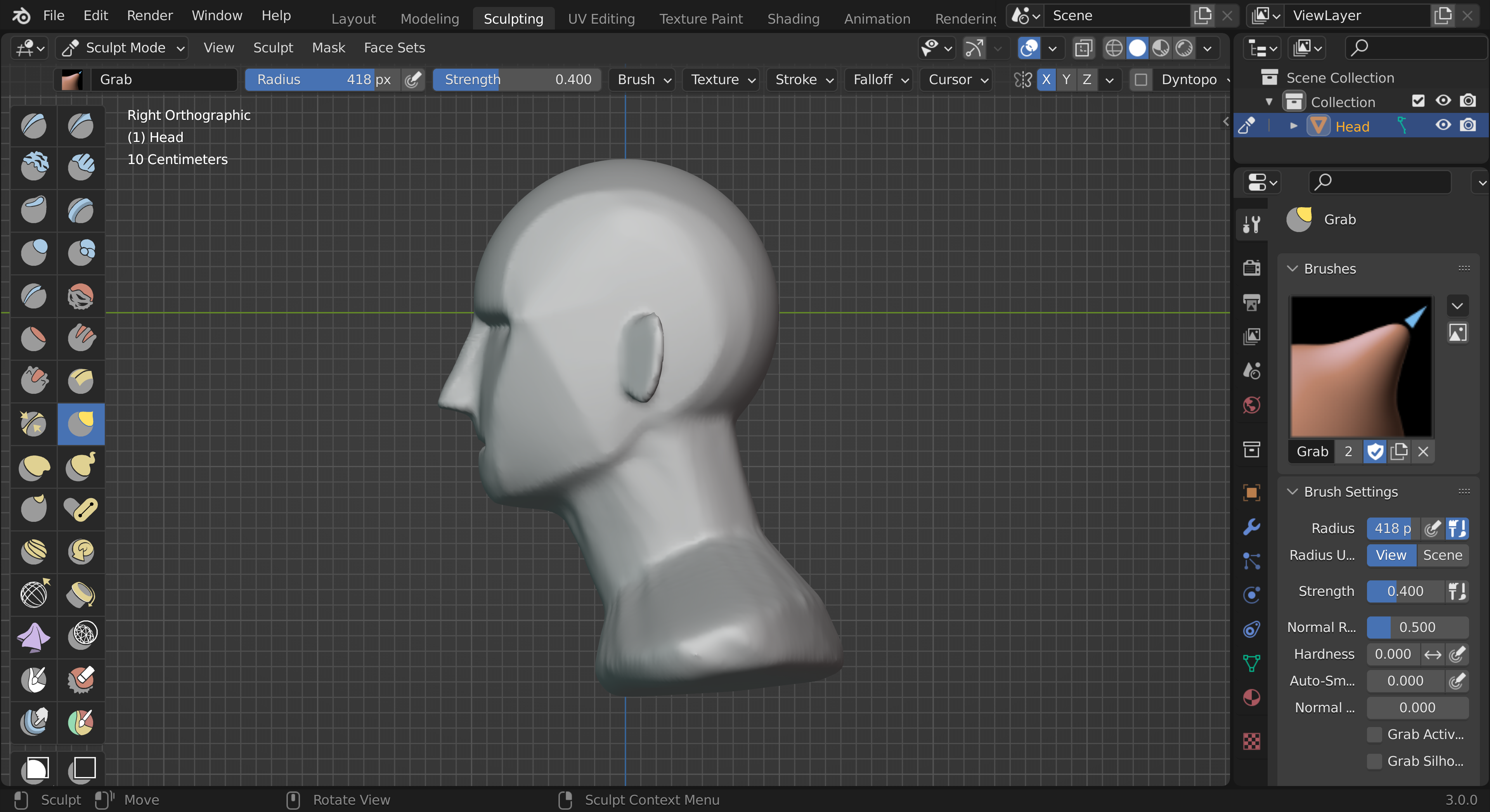
Looks like this thread is going to be a constant spoiler alert for me :) I haven't even unzipped these files yet! But I wish you luck, Keith.
Thanks Michael! You're in for a real treat when you do get around to looking at this course - I'm really enjoying it so far!
Only a little time this evening but managed to progress to the next lesson. Very challenging to keep things planar - I just want smooth things purely out of habit! Must resist for now!! 😅
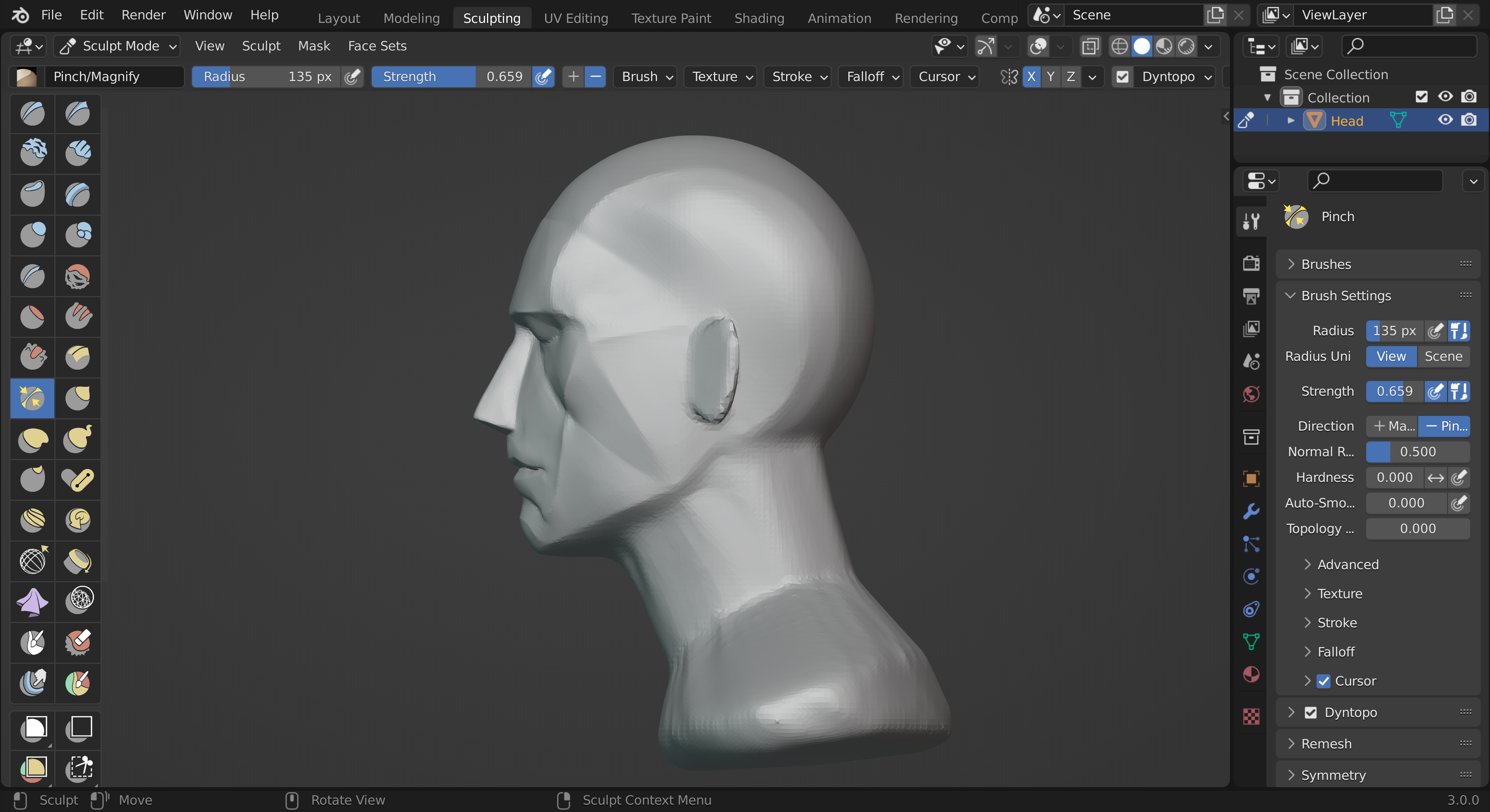
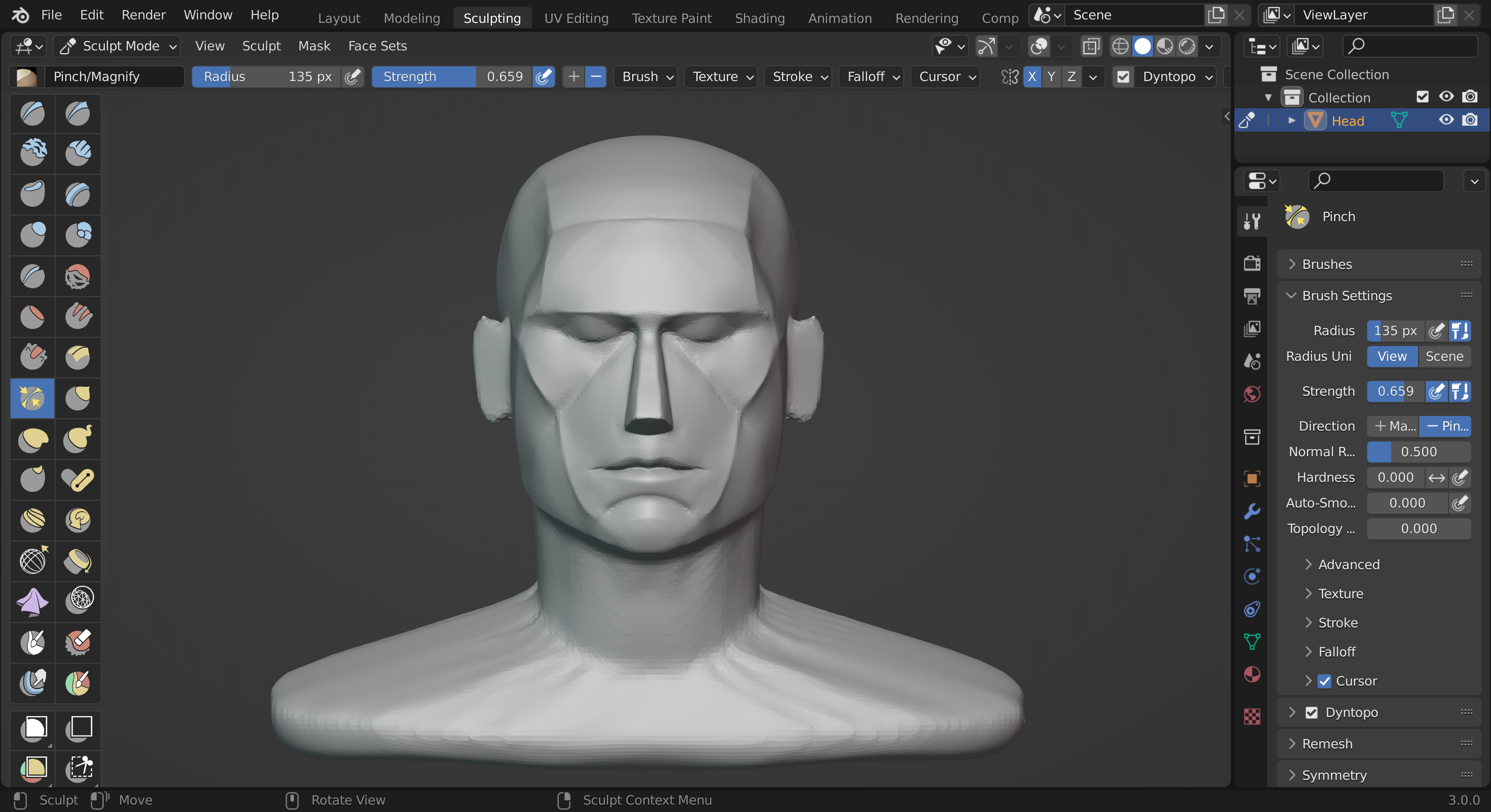
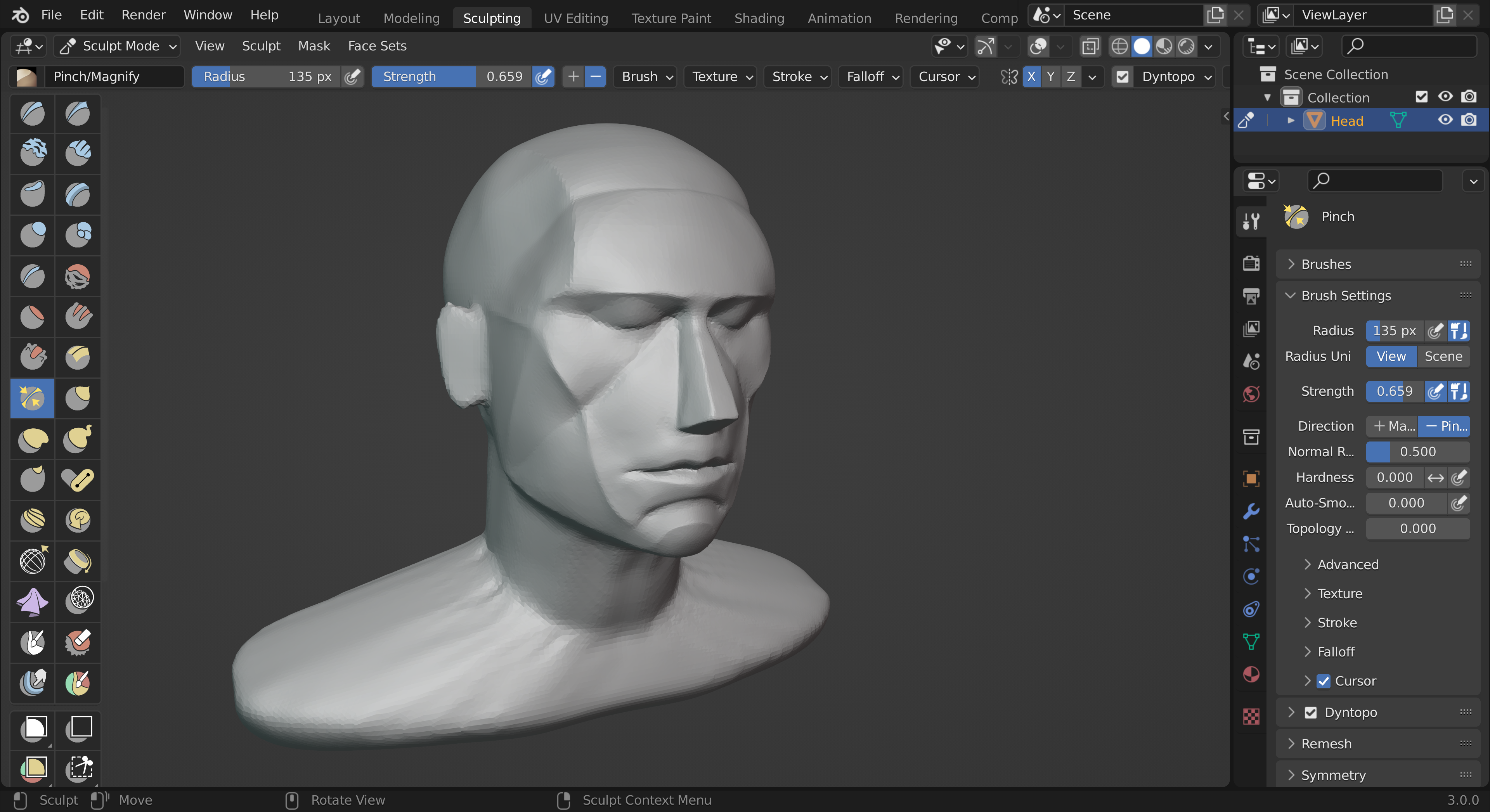
A little bit more spam from me after lesson 4 😅
That was working on the neck which was very interesting. I am starting to understand the benefit of having a good grasp of the underlying anatomy and how those structures are formed.
Still a challenge to keep things planar, but what great fun!
