Starting this so I can keep myself accountable. I want to get better at 3D modeling and I need an external force to keep me going.
Nothing spectacular, but it's something. The first modeling exercise: https://skfb.ly/68ExD
Oh, goodness, it's been a while. More progress on the mind flayer, so close to being done with the sculpt. Debating how to add the cape and the sculpt will be done.
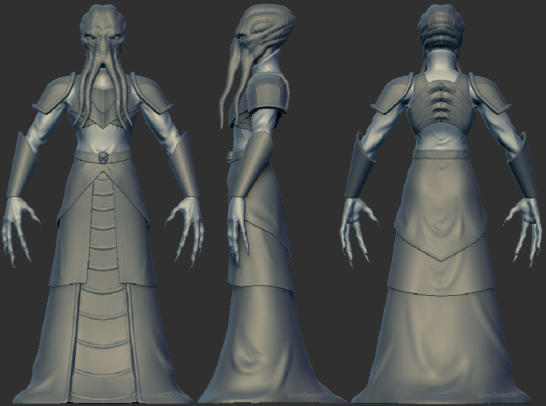
![]() blanchsb Thanks! The goal is to retopo, texture, and have this running in real-time in Unreal 4. Stretch goal would be to maybe put this in a light pose so it's not so static, but we'll see lol
blanchsb Thanks! The goal is to retopo, texture, and have this running in real-time in Unreal 4. Stretch goal would be to maybe put this in a light pose so it's not so static, but we'll see lol
Huh, did they swap the forum around again?
Finished with the sculpt, beginning the retopo process as well as adding in the last hardsurface elements.
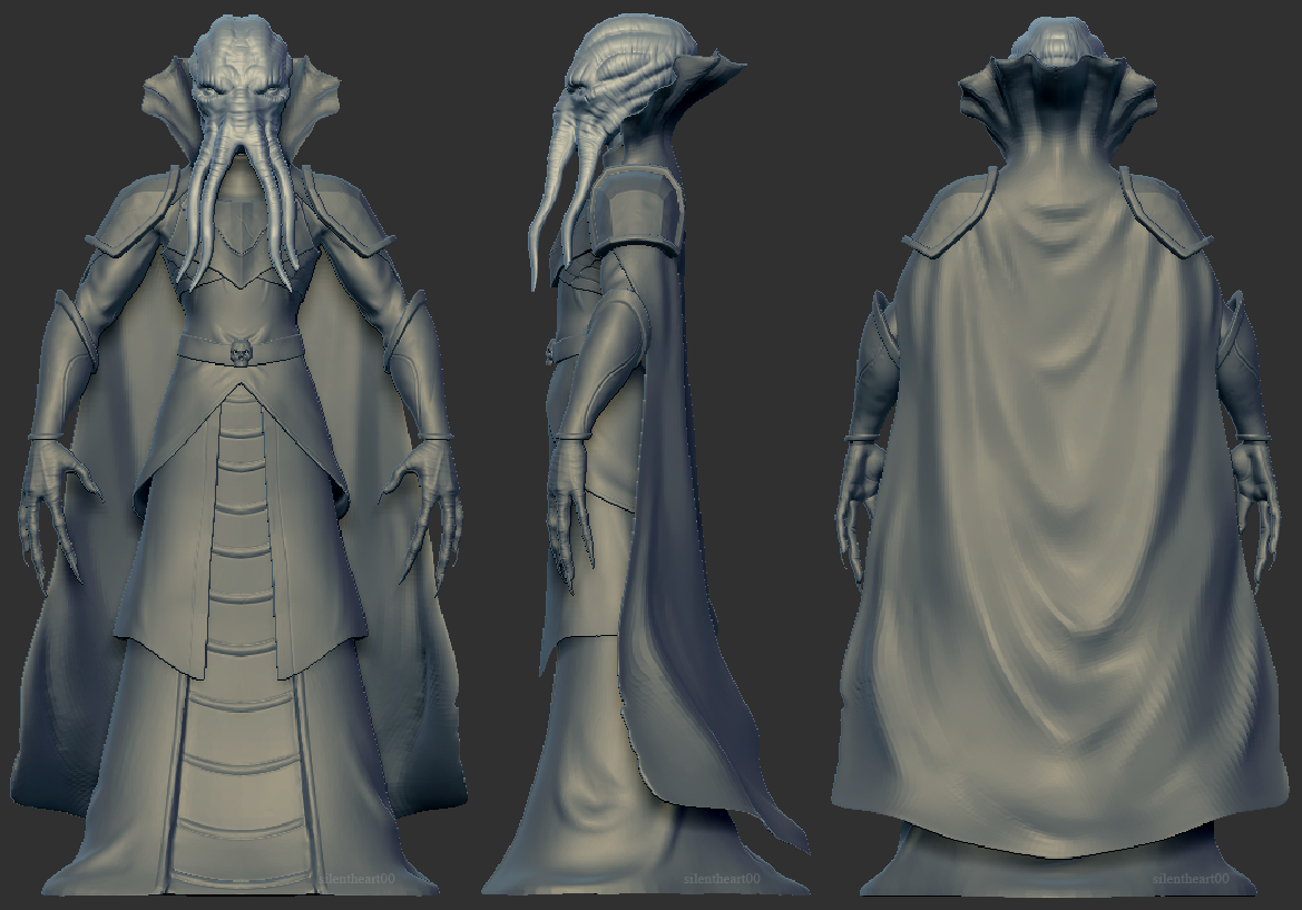
Yeah they must have. I was just getting used to it showing my newest content first too!
Very cool look ![]() silentheart00. Interesting how the pauldrons cover the cape. Is this going to be animated? If so I wonder how that interaction is going to be?
silentheart00. Interesting how the pauldrons cover the cape. Is this going to be animated? If so I wonder how that interaction is going to be?
Awesome! That is one good looking tentacle thingy :)
glad they did change it, prefer things starting on one and ending where they end. :)
![]() blanchsb I was not intending for this to be animated, but I could look into it. And that's what the concept had for the pauldron/cape interaction, so I didn't think too much of it. But, I should think about it and at least make it look believable. I will give it some thought.
blanchsb I was not intending for this to be animated, but I could look into it. And that's what the concept had for the pauldron/cape interaction, so I didn't think too much of it. But, I should think about it and at least make it look believable. I will give it some thought.
![]() louhikarme & aarev Thanks!
louhikarme & aarev Thanks!
I didn't mean it was inaccurate. I just would think it would probably be harder to animate. Now that I am looking at it more though I think it is hugging the body a little closely on the back (can be seen from the side view). I think the draping cloth look is spot on though.
Oh, I think I understand what you mean about animating the cloth and pauldrons. I think I would paint 100% of the pauldrons' weight to the shoulder bone and then have a partial weighting on the cape for the areas affected and then maybe some bones down the cape unless I can find a better way of animating it (since this is a real-time character and I'm still learning lots).
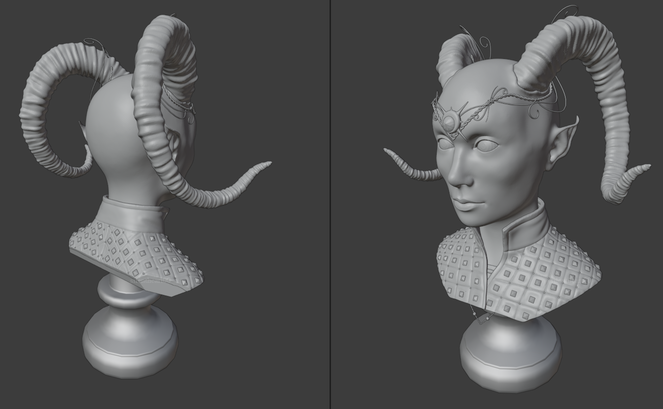
Hello, been a while. Noodling with another character as an excuse to check out 2.9's new stuff. I'm pretty impressed so far, but haven't dived very deep yet.
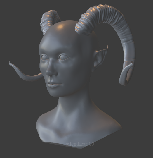
No, actually. It was the Crease and Draw brushes. I completely forgot there were cloth brushes! I'm checking that out!
I'm experimenting with Blender's spline tools. Better than before, but still a bit limited. What I do like though is the Curve modifier. Don't remember if it's always been there, but it's cool to experiment with now.
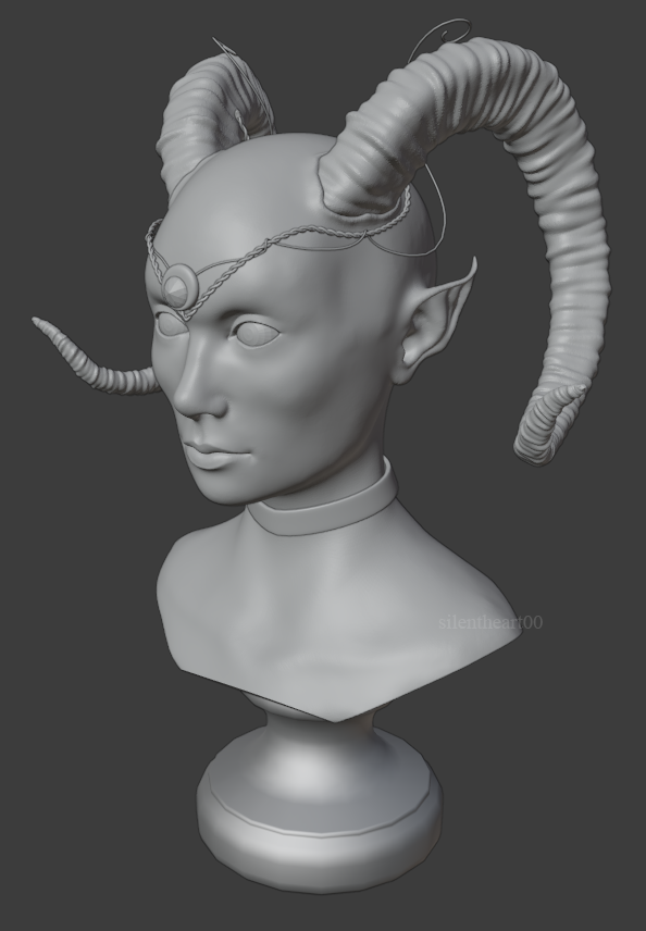
Well, jewelry is a bit more complicated than I thought. That seems to be the usual when trying something new, heh. Getting there, though.
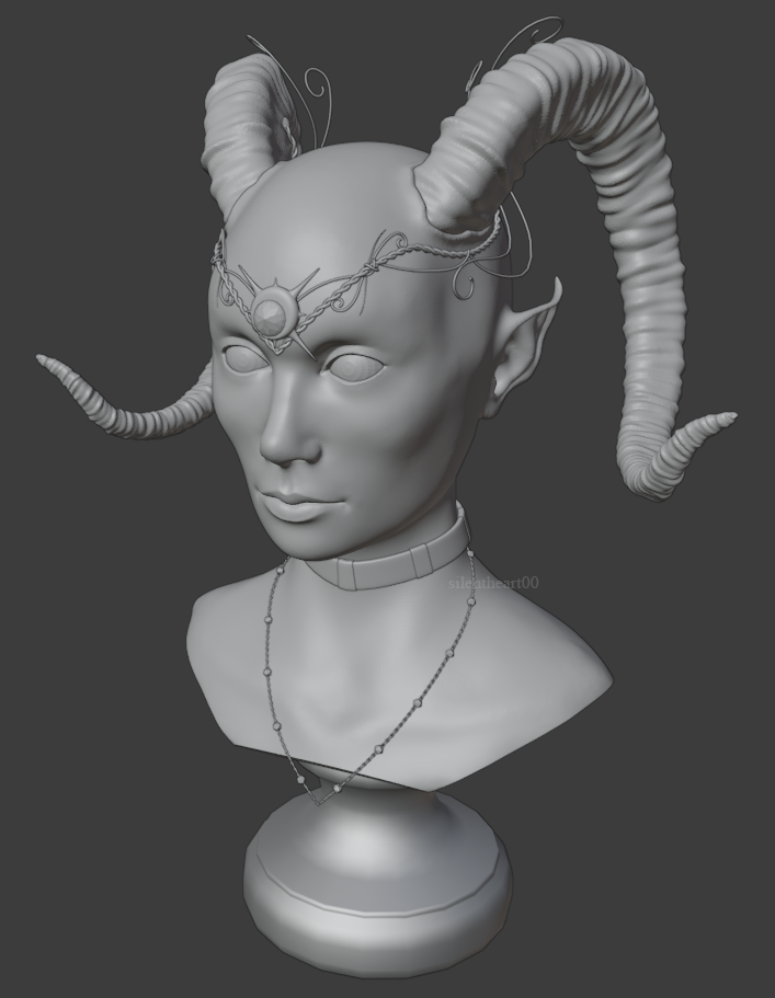
So.... many..... details....
Getting there. Wanted to add the armor to help it feel a bit fleshed out. There are a few more jewelry pieces to add and then the hair.
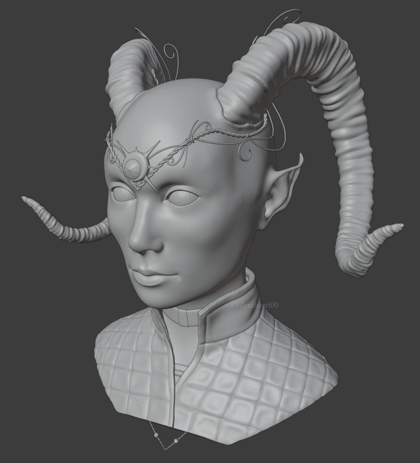
Alrighty, some more work done here. The repetitive elements were a lot, but using a combo of the Curve modifier and Mirroring for the symmetric parts saved time and looked nicer than if I were to place them all by hand.
