Starting this so I can keep myself accountable. I want to get better at 3D modeling and I need an external force to keep me going.
Nothing spectacular, but it's something. The first modeling exercise: https://skfb.ly/68ExD
![]() spikeyxxx I will have to rely on you experience with this, I’m basing my observations on the basses I’ve owned / currently own, which aren’t this sharp but have a similar shape. With those you would see them.. but I guess it would be different for guitars / more sharp models 😅
spikeyxxx I will have to rely on you experience with this, I’m basing my observations on the basses I’ve owned / currently own, which aren’t this sharp but have a similar shape. With those you would see them.. but I guess it would be different for guitars / more sharp models 😅
Well, I’ve taken a good look at my bass, and while it looks badass as well, the shape is nothing alike! My bad.. guess this is proof we need to use reference while modeling ey? You can’t trust your memory at all 😉
ssmurfmier1985 you can google images of for instance a Gibson SG...
(And yes, memory is a tricky thing. I knew the second strap holder wouldn't be visible on this model, but I double-checked anyway...)
![]() spikeyxxx dang, it’s all the way on the backside.. cleverly hidden I would say. No way you could see that from this angle. Sorry Silent, my bad!
spikeyxxx dang, it’s all the way on the backside.. cleverly hidden I would say. No way you could see that from this angle. Sorry Silent, my bad!
ssmurfmier1985 a bit before your time, but you can see it clearly here as well (Dutch classic):
This was made with splines and a spline cage, something I'm not familiar with at all, and using something called smoothing groups. Yes, the edges are sharp and it's most definitely from the smoothing groups (only allowed to use 2). It's a different way of modeling and I can see its uses, but maybe not my go-to.
And yeah, missed that detail. But, it is what it is.
hey there silent :D
long time i have been here.
you sure did growed a lot . amazing work .
i love those details you made on the guitar . and the character is great too .
keep it up :)
Phew! Got some time to work on personal projects now. Been trying to understand anatomy more, but it doesn't come up a lot in my studies (just a lot of hardsurface), so there are things I know I forgot. Here's a rough proxy of my current DND character, Kaeria.
 I'm pushing towards realism, so let me know where I can improve!
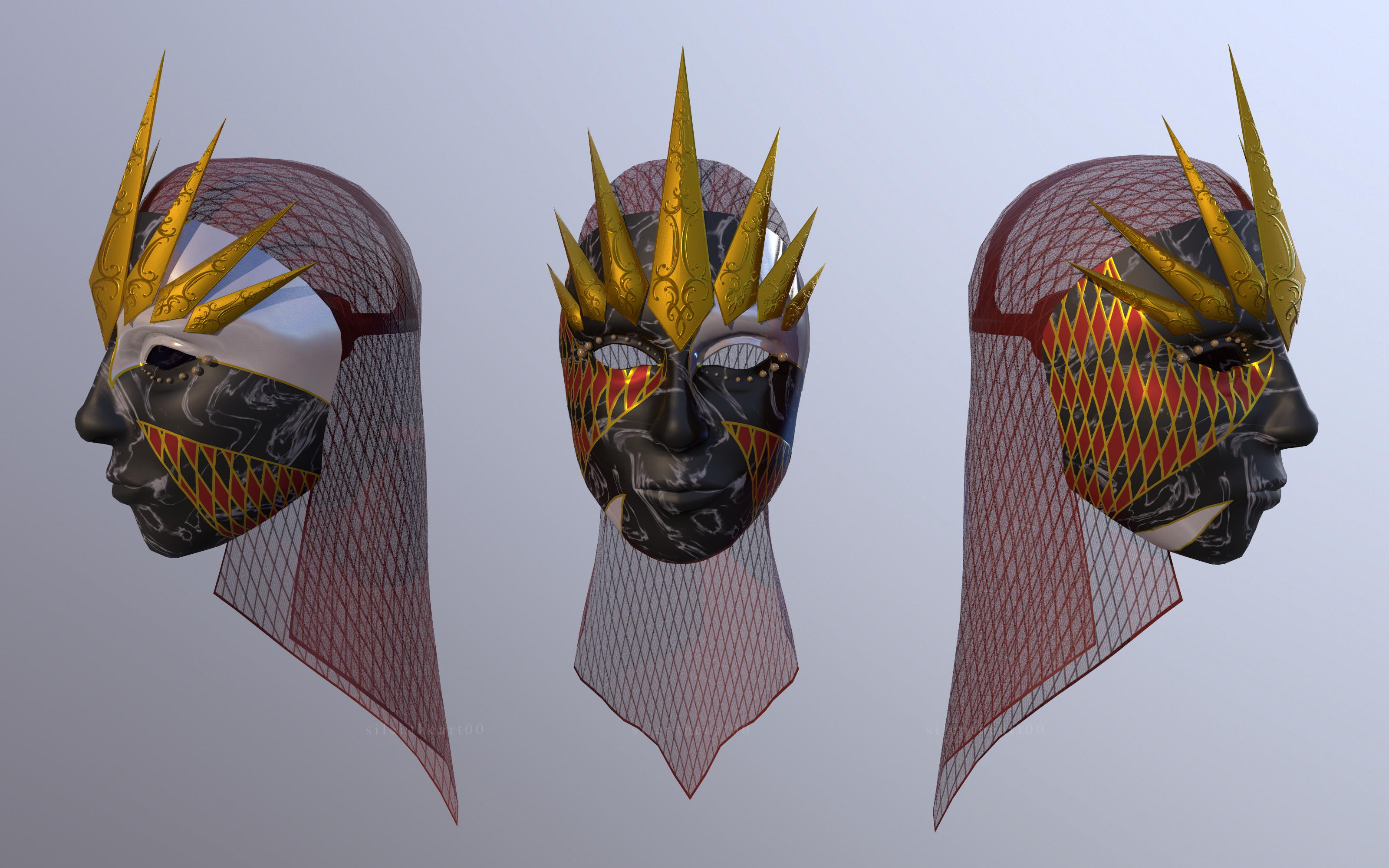
Here's a concept for a mask. There are a lot of details I'm thinking of putting in the model, but this is the general idea. This is a texture heavy assignment, so some minimal modeling and lots of texture work.

Here's the final mask. I did not get to the fun baubles, like the beads in the veil, because the point of this was to focus heavy on the texture work, which was all done from the ground up in Photoshop, a process I'm not very comfortable with, so I focused hard on it. I think I did a pretty damn good job despite variables. Could this be better? Yes, but it's pretty damn good for where I am now.

Hey there! Long time no talk! School is keeping me busy, as well as new developments in the world. Stay safe, everyone!
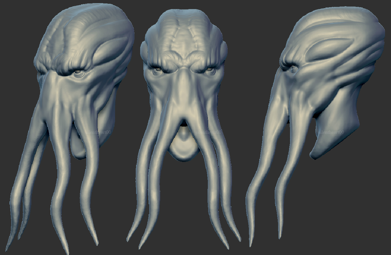
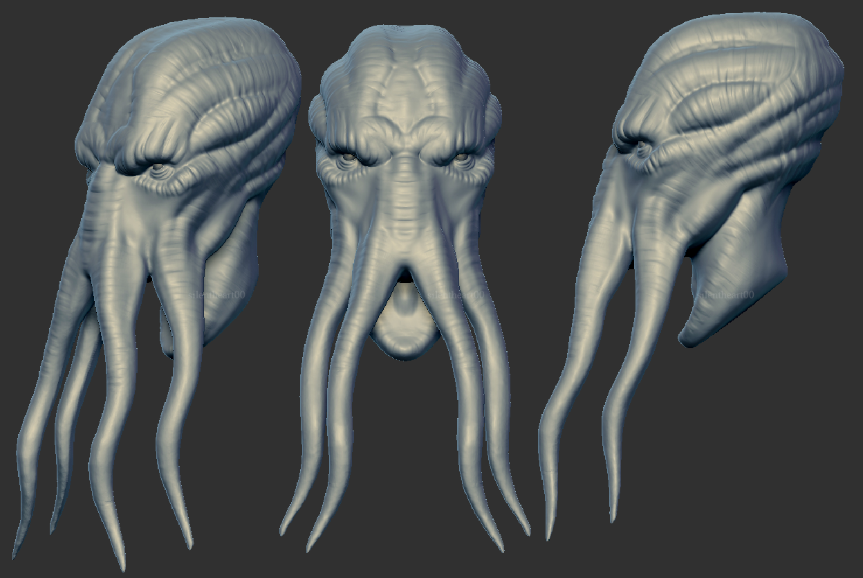
For one of my classes, I'm creating a mindflayer based on the DND 5th edition image. I'm excited to create something like this and to push my skills even further than before!

I am pretty happy with this, maybe could possibly push it a little more (like adding a different texture to the smooth sections so it's not as smooth) but I can live with this. On to the next part!

Ooo, this new reply format is weird lol. But that's cool. Don't have to dredge to the last page anymore.
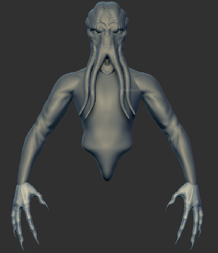
More work on the mind flayer. Getting closer. Figuring out how to model the armor has been interesting, trying to figure out how to mesh the hardsurface techniques with the organic sculpting. I think I have an idea, just hope it doesn't take me much longer.

ow and i tought i posted on a wrong way xD looking great already ;D