Becoming great at anything requires constant practice and that is especially true with 3d modeling. If you're here it's probably because you want to become a better digital artist. I myself want to improve my 3d modeling and texturing skills and that means I need to model a ton in order to become better.
Building a consistent habit is the path to becoming great and with that I wanted to provide a challenge to anyone else here who wants to join me. The challenge will be to model one new 3d model daily for 30 days.
The goal of this is not to create amazingly realistic models, but to get you practicing your modeling skills daily. You are not competing with anyone here but yourself.
Each day this post will be updated with the object to model based on that week. Below are the rules and guidelines to make this more interesting:
Themes
To make this more interesting, every week will focus on one theme. Each theme will represent a set of 7 objects that are relatively easy to model, but each have unique elements to them to challenge you in different ways.
The themes for the next 4 weeks include: Home, Weapons, Props, Nature
Rules
Submissions
Post a rendered image of your completed model. While texturing won't be required, it is highly encouraged.
HOME (June 1 - June 7)
For this week we'll focus on objects found around the home. Typically these objects are relatively easy to model and reference. You are free to get as creative as you want with these as long as you modeling what is requested for that day.
June 1 - Sofa
June 2 - Lamp
June 3 - Book Shelf
June 4 - Coffee Table
June 5 - Lounge Chair
June 6 - Shag Rug
June 7 - Floor Speakers
Week 1 is Done! Congrats on making it through the first week of this modeling challenge. On to week 2.
WEAPONS (June 8 - June 14)
For this week we'll focus on creating hand held weapons. Think melee weapons. These usually have a mixture of primitive and complex shapes. You may use sculpting during these models, and some may actually require it to achieve the look you want.
June 8 - Axe
June 9 - Combat Knife
June 10 - Spear
June 11 - Shuriken
June 12 - Spiked Bat
June 13 - Sickle
June 14 - Nunchucks
PROPS (June 15 - June 21)
This week will be focused on props you might commonly see in games or background scenes. These can be reused to add "filler" to an environment. These props mostly reside outside.
June 15 - Barrels
June 16 - Tires
June 17 - Filled Trash Bags
June 18 - Concrete Barrier
June 19 - Shipping Container
June 20 - Dumpster
June 21 - No Object
June 22 - No Object
Vegetation
This week will be focused on organic plants and objects you'd find out in nature. Think of these as natural props.
June 23 - Grass Clumps
June 24 - Rocks
June 25 - Flowers
June 26 - Bushes
June 27 - Hollow Log
June 28 - Vines
June 29 - Trees
CHALLENGE COMPLETED
This officially ends the challenge, technically it's 29 days but we have another challenge starting up on Monday so use Sunday as a way to gather reference photos and start your next modeling challenge with vehicles!
Thank you for everyone that participated in this challenge. Some objects were easy, others were challenging and I hope you learned some new tips and techniques. This challenge was about keeping a habit going and learning some new techniques and use different tools to create something you may not have otherwise. It was great seeing all the new renders on a daily basis. Good or bad, you've created something and that's what matters. See you all in the next challenge!
I've got myself another cylinder-on-a-cylinder situation. Help?
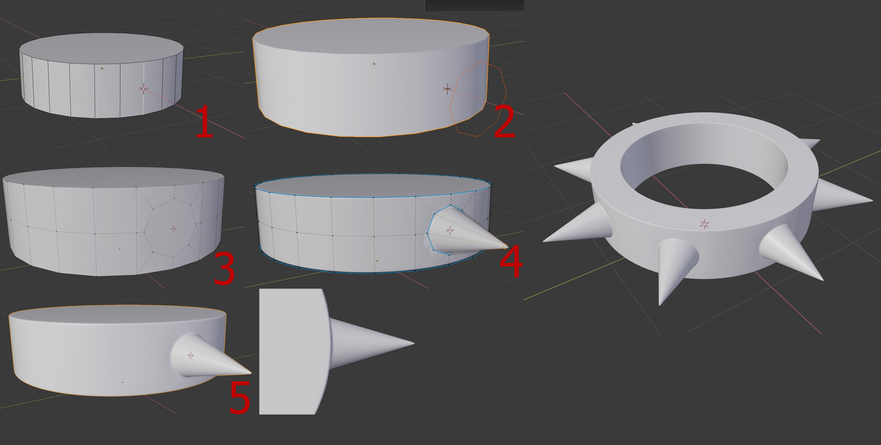
![]() williamatics So things like these, especially with a sub-d modifier, can be really tricky. You need to plan out the amount of vertices your cylinder will need to support your spikes. I wanted 3 edge loops to support one of my spikes, as that gives me 8 verts to make the spike with. There are a number of ways to do this, but here I chose to insert another 8-sided circle. I line it up against my cylinder object's central edge, and knife project it onto the cylinder. Add a center edge loop, connect everything nicely. I'm not using an additional holding edge because I'll be using a bevel modifier set to weight, so I can create my holding edges in that way. The blue lines means its got a bevel weight to it. After the bevel just throw a subsurf on it. It worked out pretty nicely.
williamatics So things like these, especially with a sub-d modifier, can be really tricky. You need to plan out the amount of vertices your cylinder will need to support your spikes. I wanted 3 edge loops to support one of my spikes, as that gives me 8 verts to make the spike with. There are a number of ways to do this, but here I chose to insert another 8-sided circle. I line it up against my cylinder object's central edge, and knife project it onto the cylinder. Add a center edge loop, connect everything nicely. I'm not using an additional holding edge because I'll be using a bevel modifier set to weight, so I can create my holding edges in that way. The blue lines means its got a bevel weight to it. After the bevel just throw a subsurf on it. It worked out pretty nicely.
Hope this helps.
Hello William, I am not sure if I understand your question correctly and where you want help.
I also have the problem that my English is not so good to explain it to you well and clearly.
I really have to improve my English ;)
Basically you can set loop cuts and then reinforce the rings by extrude or with bevel.
Also the inset tool works well in some situations.
It depends on the model.
You can also select and extrude individual faces. "extrude individual"
Depending on the model you might have to scale with Alt-S.
With the Loop-Tool (AddOn)- you can change vertices to a circle and scale it
You can select a face-loop for the ring and use "P" separate by selection.
Many of these tools from the Mesh-Modeling-Fundamentals are useful Tools
A simple Screenshot
That my quickly ideas so far. Perhaps this will help you as an idea.
PS: numbernine posted at the same minute. I recommend to follow this explanations :)
I did not care of the subsurf and there will be problems with sharpening the edges. Sorry for this
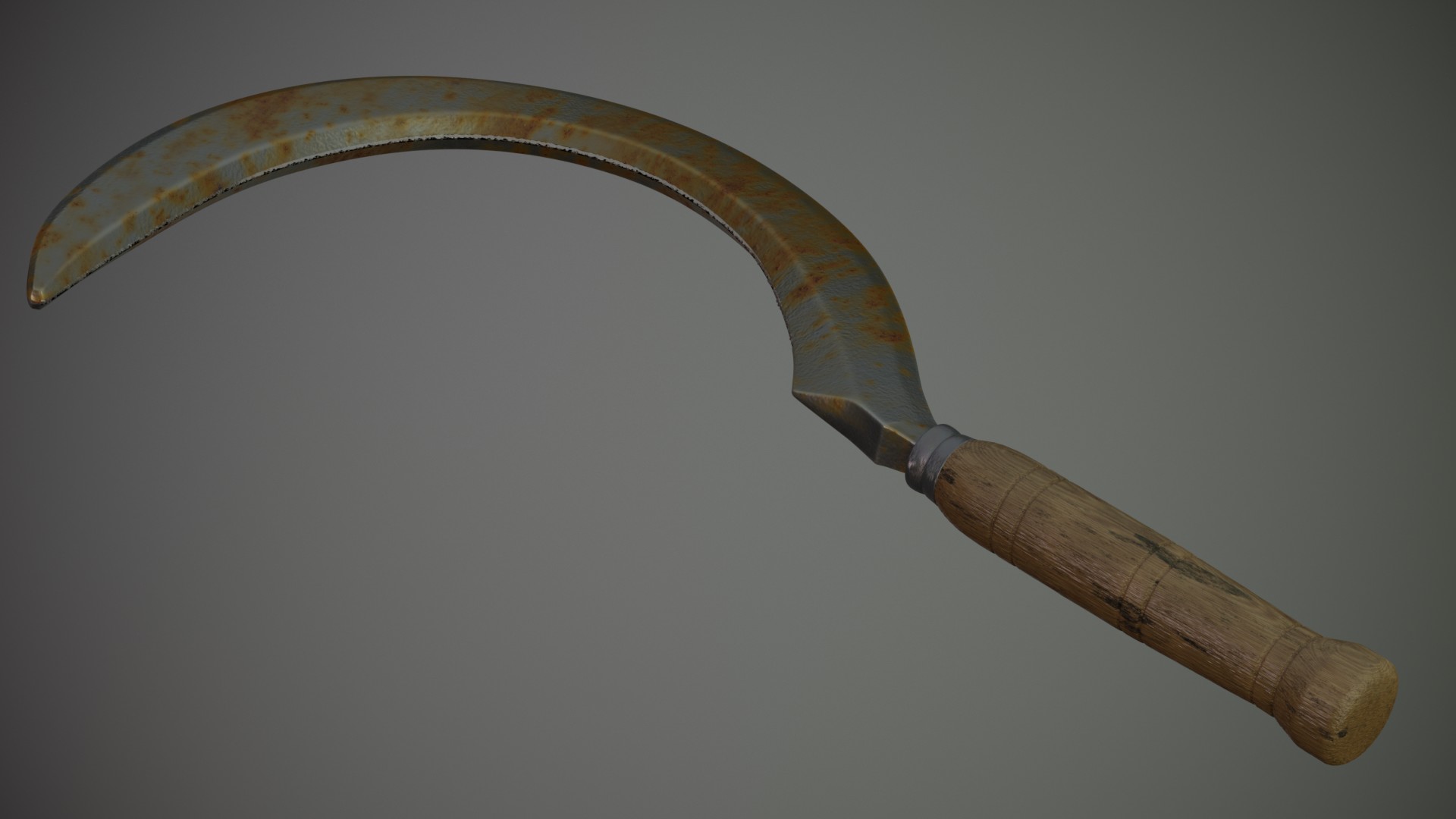
Tried for rust, but definitely turned out to be blood. Learned how to paint a mask in the image editor and tried to use a tablet, both definitely added to the never ending list of things I still need to practice on. Time to do other things. Anyone know any good lighting tutorials?
Here it is. Next topic on my growing list are sharp edges ;)
I am happy with this as a result for one day.
Here's my submission for today; as this took me hardly any time to model (thanks to Jonathan's daily exercises!), I decided to spend some time on texturing and shading, to give this a bit of a worn look, contrary to my so far squeaky clean renders in this thread.
Love the other renders, by the way; you're all doing great!
![]() williamatics Here's another trick (I waited on purpose to pose this, because I think you should try Numbernine's way first!):
williamatics Here's another trick (I waited on purpose to pose this, because I think you should try Numbernine's way first!):
this is what I do when I find myself in a situation, where I know, the shape I want, but can't figure out the topology.
Let me use your case as an example: I would make the ring, the put a cone through the ring, where it's supposed to be.
Then go into object mode and use snapping, maybe in combination with the shrinkwrap modifier, Then place edge rings where you need them (around the connecting 'circle', one on the ring and one on the cone, also around the edge of the ring ), then finish your topology by connecting everything and extruding towards the point of the cone.
Once you have your topology in place, you can disable snapping (and apply the shrinkwrap) and even delete the 'mould'.
Now that you have two edge rings around the connection of the ring and the spike, you can easily add edge loops on either side of the connecting 'circle' and then scale the edge loop between then in, so that the spikes are sitting on top of the ring and it's not one piece.
I hope this makes sense to you;)
ttanya53 blender gurus new lighting series might be worth a watch
https://m.youtube.com/playlist?list=PLjEaoINr3zgH9vCr47kSS5W8PEJBNIiwK
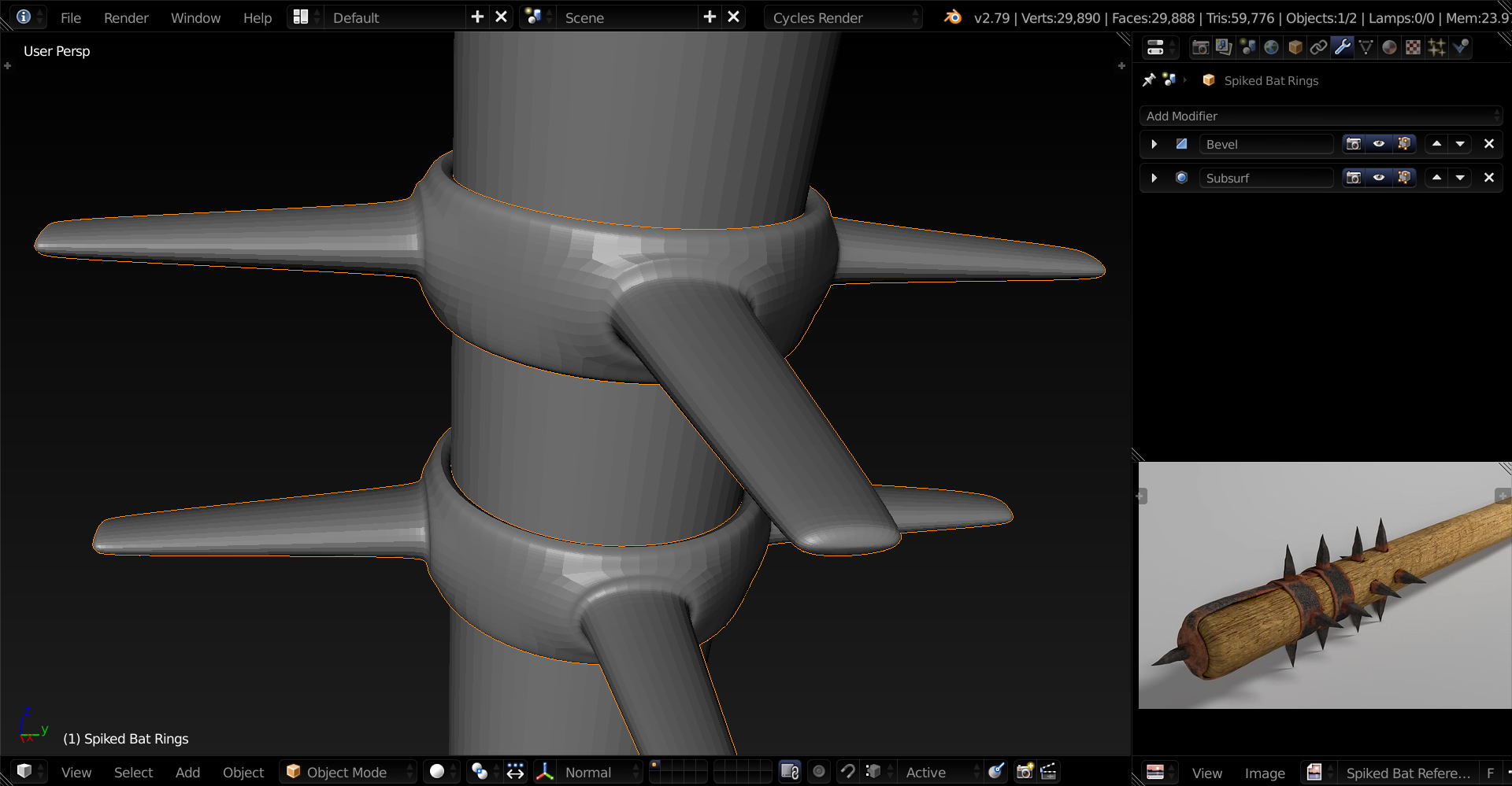
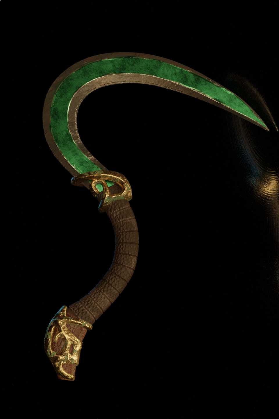
Literally have to run out of the house in two minutes. Some of the ornaments on my reference were actually quite complicated that I had to resort to sculpting. The top one is looking okay, bottom not so much. For so much rushing I'm still pretty happy!
Thank you, ![]() numbernine , mmonaloren , and
numbernine , mmonaloren , and ![]() spikeyxxx for your answers. The are very helpful. Mona Loren, your English is great.
spikeyxxx for your answers. The are very helpful. Mona Loren, your English is great.
Here is my render for today:
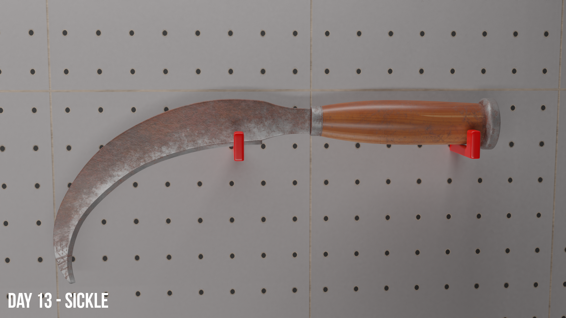
Put it through Substance Painter again. Only issue is I don't know how to properly use a metallic + smoothness map in Blender. I'm used to using the texture output for Unity, so maybe I need to try something specific to Blender's maps.
Long day, but I had to get this in. I got the inspiration from a grim reaper pic. I didn't use the sub-surf this time (haven't liked how my previous models looked with a sub-surf so I decided to do without it on this one). I like it without the sub-surf, I just smoothed it. Tried lighting again today.
PS. When should you use the sub-surf and when should you not? Or is it a matter of preference for each individual?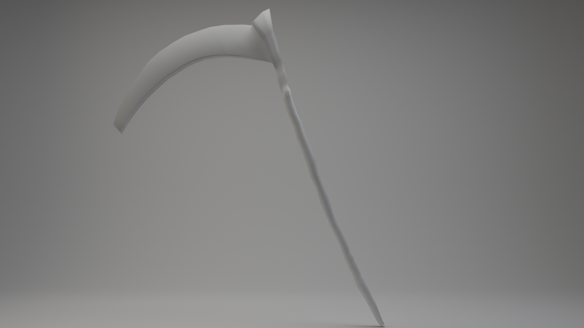
cciku-karugi I always use a subdivision surface modifier. It makes the model look a lot smoother.
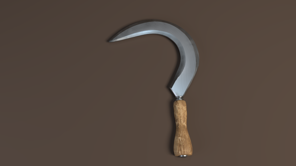
Just a small gardening tool, but I wouldn't want to face it in a fight.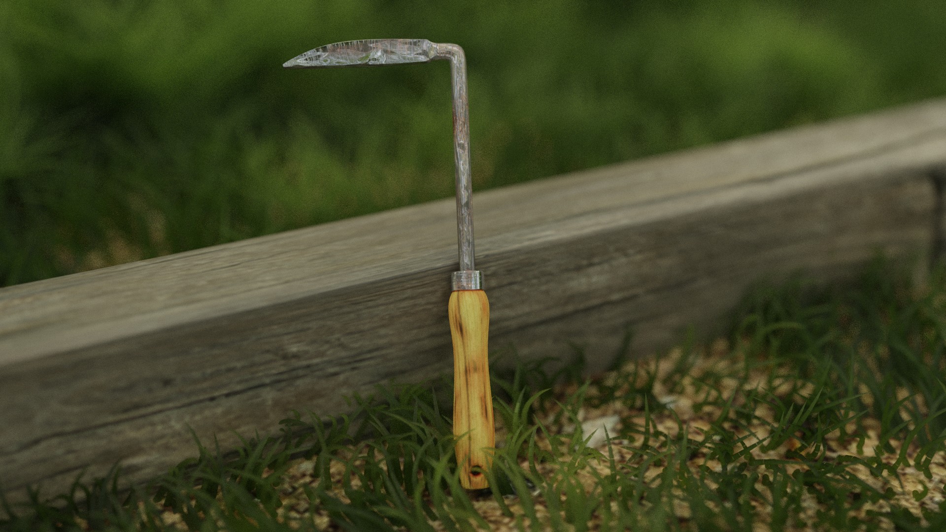
For the first time in this challenge, I have sculpted! I also tried to replicate a crack that was in the reference image.
