My homework thread for the October 2018 Class.
Week 1 Submission: Page 2
Week 2 Submission: Page 5
Week 3 Submission: Page 8
Week 4 Submission: Page 9
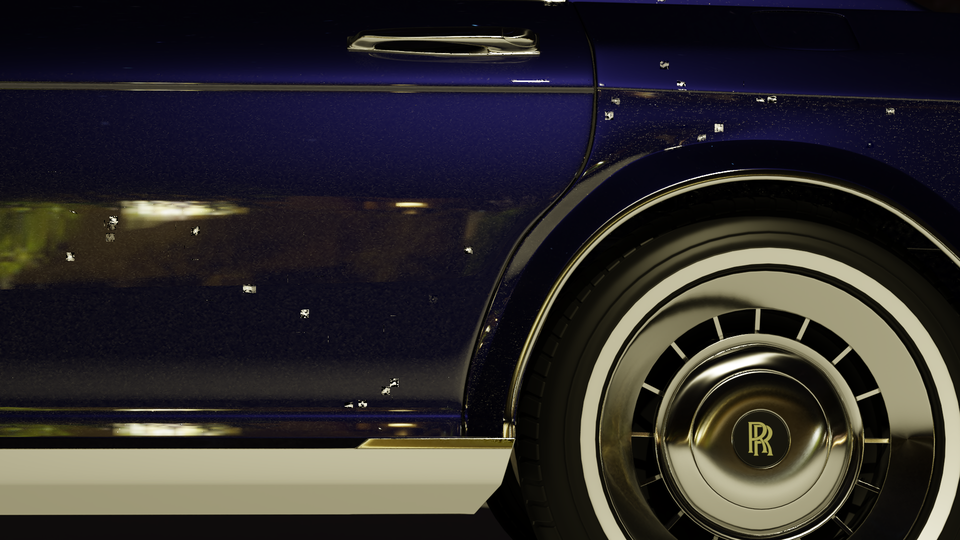
Here we go again! Being my two weakest areas this is something I have certainly been looking forward to. Not only on what new things I learn but what old techniques I can improve. So I present to you Aaron Rudderham: Remastered Edition! Basically using the lessons I will learn from this class I'll be revamping my older projects, possibly making them portfolio-worthy. I've done this with my Nintendo Switch already (which you can see here) but hopefully by the end of the class I'll have bettered them all!
This also includes the odd one or two projects which never got published, and some which I'm *very* looking forward to get back to...
![]() thecabbagedetective What a great idea to use this class / workshop as an opportunity to better your old art pieces! Looking very forward to your lighting experiments and awesome renders 😄
thecabbagedetective What a great idea to use this class / workshop as an opportunity to better your old art pieces! Looking very forward to your lighting experiments and awesome renders 😄
Day 1 done!
Well the homework this week is a tad awkward considering I've already done it (being some of the first stuff I did on this site, actually), but I do intend to redo it for this week's homework. You can check out my shader exercise here and my lighting exercise here. Though looking at the homework throughout the month this month's class doesn't seem nearly as time consuming as the others, so I'll be spending most of my time doing the whole Remastered thing and working on a new project (well, "new", been working on it for a bit now). Here's a teaser of that, using some tricks picked up in the previous stream:
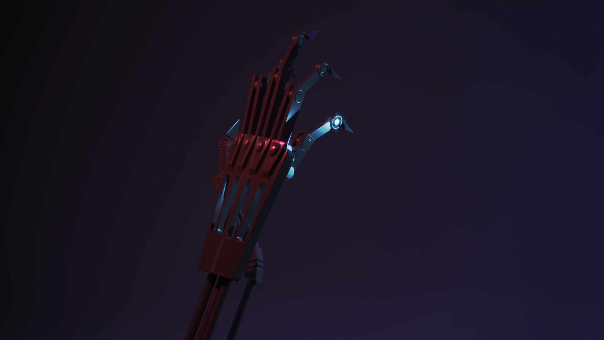
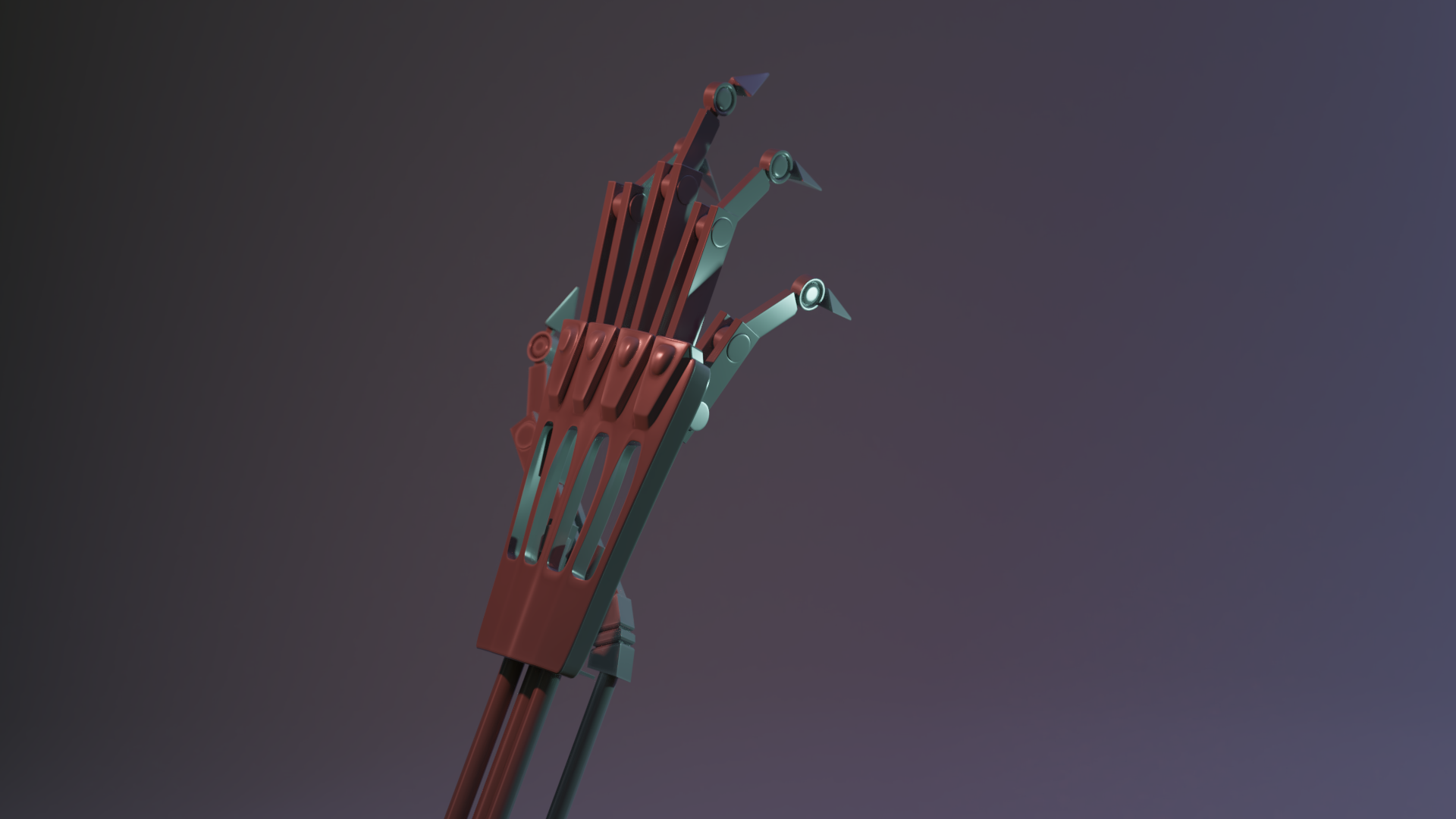
Here it is without compositing effects:
And here's the compositor node setup in case any of yous are interested:
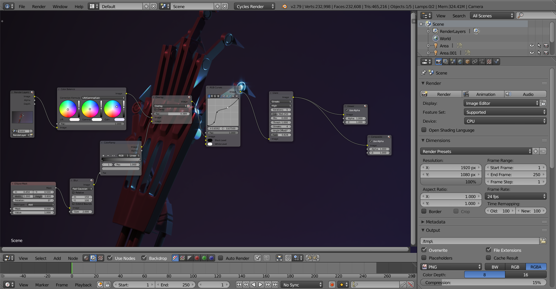
I feel the contrast between the two lamps could be stronger, but maybe I could do that by ramping up the Filmic Log contrast? Could be worth a try when I wake up. With that said I'm done for the day so good luck to you all and lets create some awesome stuff over the coming weeks!
ssmurfmier1985 ![]() silentheart00 I'll certainly do my best not to disappoint, the feeling is mutual!
silentheart00 I'll certainly do my best not to disappoint, the feeling is mutual!
![]() thecabbagedetective That's a pretty cool effect, certainly looks a lot more appealing 😄
thecabbagedetective That's a pretty cool effect, certainly looks a lot more appealing 😄
![]() thecabbagedetective Your exercises look good. Not much to critique there.
thecabbagedetective Your exercises look good. Not much to critique there.
Do you have fresnel on that hand? Can't quite see it in the nodes if it is there. I do like the mood you've achieved.
![]() silentheart00 Just the base 1.45, think I should've changed it? Thanks for the feedback!
silentheart00 Just the base 1.45, think I should've changed it? Thanks for the feedback!
![]() thecabbagedetective You could experiment a bit. It is a subtle effect, though, so use your best judgement.
thecabbagedetective You could experiment a bit. It is a subtle effect, though, so use your best judgement.
![]() thecabbagedetective Nothing to feel awkward about, my guy. Having done the assigned exercises is not a problemo. I'm happy to re-reward you for it. I like that you're going beyond the assignments and doing your own S&L project this week.
thecabbagedetective Nothing to feel awkward about, my guy. Having done the assigned exercises is not a problemo. I'm happy to re-reward you for it. I like that you're going beyond the assignments and doing your own S&L project this week.
I like your [Terminator] arm so far. The post-processing adds some cool flare to the render. Perhaps a touch dark imo, but that's a small note.
One thing I think you're running into is where the model only takes up like 20% of the entire image. In other words it's a lot of background. Similar to what I ran into with the crab claw where I shrunk the vertical resolution to eliminate wasted background. I recommend that you turn this into a portrait render to better eliminate the wasted horizontal space:
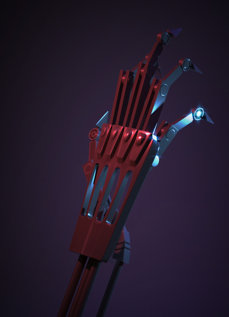
@theluthier Thanks! I'm so used to the standard resolution I never think to alter it, I'll be changing that now. I intend for the whole "Remastered Edition" thingy to be consistent throughout the month, but I'll hopefully at least have one piece per week to show.
Day 2 done!
I'll write this out when I wake up, because it's nearing 7 AM and when I had written it all out Chrome decided it wanted to crash and I'm at risk at falling asleep at my desk so good "night" all and I'll see yous tomorrow.
![]() thecabbagedetective Yeesh, what's up with Chrome lately? Seems to be crashing with long posts.
thecabbagedetective Yeesh, what's up with Chrome lately? Seems to be crashing with long posts.
![]() thecabbagedetective grrrr chrome! Good"night" Aaron, we will hear about it later 😊
thecabbagedetective grrrr chrome! Good"night" Aaron, we will hear about it later 😊
Day 2 done for realsies!
Right, this is what I had to say yesterday:
Okay, first thing's first, right after the stream this is the first ad I get on the first video I watch. Coincidence? I'll let you be the judge...

Didn't get much update worthy stuff done today, though I did tweak my teaser, with both a combination of advice and my own curiosity so here's what I got now, an improvement I feel:
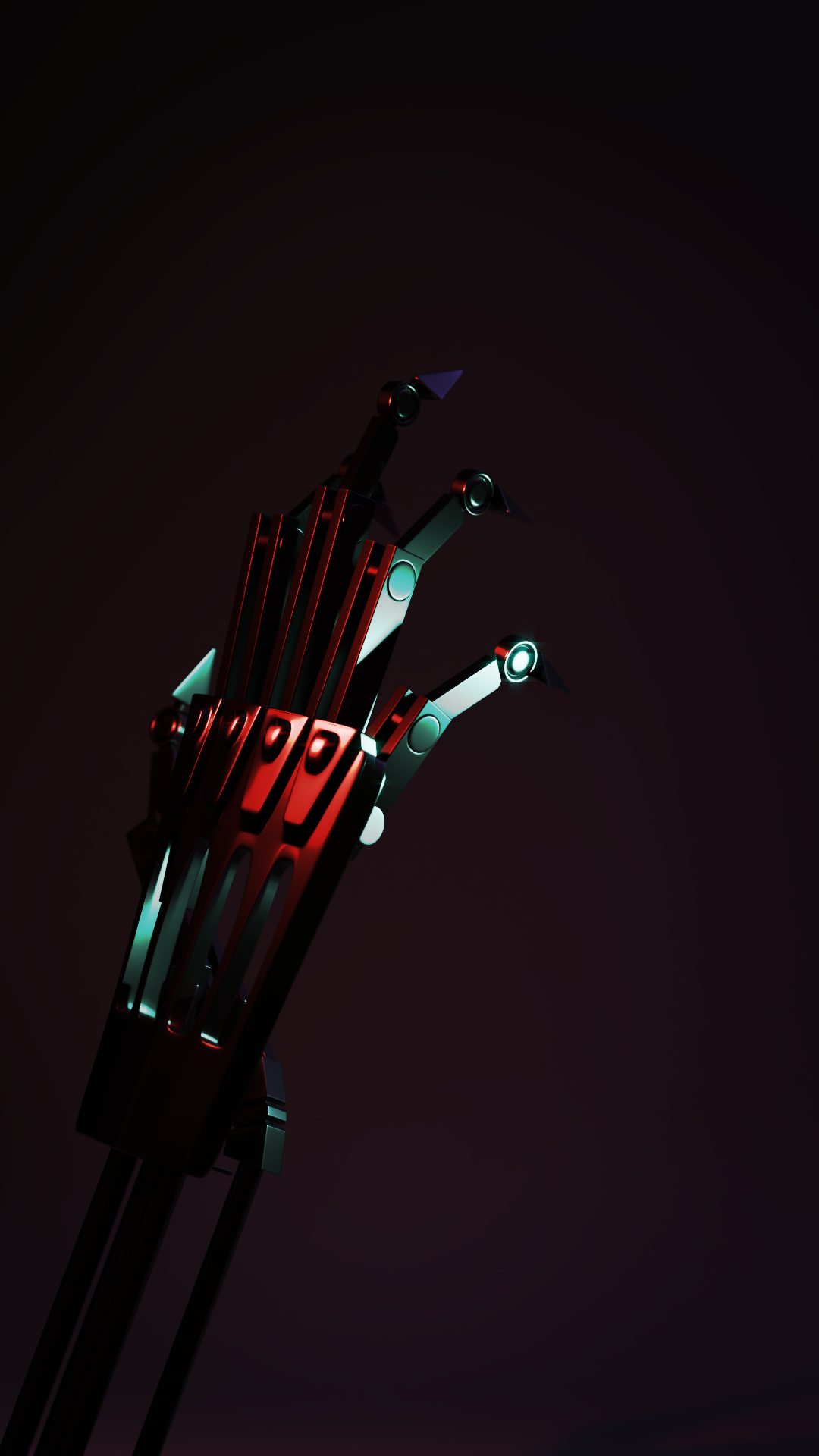
Though now I feel it blends a bit too much into the background, hmm... I'll allow you guys to be the judge on that one. With that being said a good day to you all and happy blending!
I'll have to give my third day update in the morning due to rendering. I won't lie though, with this class, the contest, and some paid projects... I'm gonna be busy...
![]() thecabbagedetective Hi Aaron, I love the colors and the mood but indeed you can't see the subject anymore it's wayyy too dark.. so I think you have too compromise the mood a bit and lighten things up so we can see the main subject, 'cause would be a shame if we can't see all the hard work you put into it 😊 You could alternatively try a harsh rim light behind the whole hand? Maybe that would help it stand out so you can keep things darker, though you should lighten it up anyway imo so we at least can see all the details/parts of the model like the fingertips, arm and the left side of the hand. But maybe a rim would make it so that you have to lighten it up less than without, so you can keep the mood you're after.
thecabbagedetective Hi Aaron, I love the colors and the mood but indeed you can't see the subject anymore it's wayyy too dark.. so I think you have too compromise the mood a bit and lighten things up so we can see the main subject, 'cause would be a shame if we can't see all the hard work you put into it 😊 You could alternatively try a harsh rim light behind the whole hand? Maybe that would help it stand out so you can keep things darker, though you should lighten it up anyway imo so we at least can see all the details/parts of the model like the fingertips, arm and the left side of the hand. But maybe a rim would make it so that you have to lighten it up less than without, so you can keep the mood you're after.
ssmurfmier1985 Cheers for that! Welp, back to the .blend file it seems. Atleast I know what I'm doing now. Thanks again!
![]() thecabbagedetective I agree with some of Miranda's critiques. Some areas are a touch dark and kind of losing some details there.
thecabbagedetective I agree with some of Miranda's critiques. Some areas are a touch dark and kind of losing some details there.
![]() thecabbagedetective it looks really good but maybe add a real soft light in front and what sure could help is the rim light I think that might let it stand out more
thecabbagedetective it looks really good but maybe add a real soft light in front and what sure could help is the rim light I think that might let it stand out more