My homework thread for the October 2018 Class.
Week 1 Submission: Page 2
Week 2 Submission: Page 5
Week 3 Submission: Page 8
Week 4 Submission: Page 9
Nice job, Aaron! The limo looks really nice. Only thing I notice is it looks like the car paint has a bit of a dirt pass on it, but the chrome on the tires seem clean in comparison.
On the color match, I think you did a really great job. I think the key in yours might be either slightly stronger or slightly closer, but otherwise, they look really close!
![]() gradyp Aha, I knew something was amiss! Rerendering now, thanks for pointing that out. Appreciate the feedback as a whole!
gradyp Aha, I knew something was amiss! Rerendering now, thanks for pointing that out. Appreciate the feedback as a whole!
Is anyone else noticing a lot of visual discrepancy between the viewport and the render result in 2.8? Tried rendering the limo in cycles for a laugh and the final result doesn't look remotely the same. Same with Eevee but it seemed worse with Cycles somehow.
![]() thecabbagedetective I haven't noticed an extreme difference when I rendered the toy truck with Cycles last week, I think. And my renders with Eevee look almost identical as in the viewport just a bit clearer after rendering. Maybe the build you using has a weird bug or something?
thecabbagedetective I haven't noticed an extreme difference when I rendered the toy truck with Cycles last week, I think. And my renders with Eevee look almost identical as in the viewport just a bit clearer after rendering. Maybe the build you using has a weird bug or something?
ssmurfmier1985 Probably related to the limo originally being a 2.79 file, buncha weird stuff seems to happen when you do that.
![]() thecabbagedetective Aaron your vehicle render and especially the Eevee version that is some magical. Without any exaggeration, itself the angle is very effective
thecabbagedetective Aaron your vehicle render and especially the Eevee version that is some magical. Without any exaggeration, itself the angle is very effective
![]() csehz Well dang, that's very high praise, you're very kind! Increasing the focal length on the camera did wonders.
csehz Well dang, that's very high praise, you're very kind! Increasing the focal length on the camera did wonders.
![]() thecabbagedetective A bit late. Good work, man, and I totally feel you on doing your best =]
thecabbagedetective A bit late. Good work, man, and I totally feel you on doing your best =]
Quick question: making a character for both this week's homework and the Pumpkin contest. Seeing as it's a still render would it be wiser to use cloth physics to make the clothing (basic shirt, jeans, etc) or use Sculpt Tools and use the mask tool to extrude bits of clothing and then sculpt wrinkles?
Also, another quick question: do you guys think my limo is portfolio worthy? Or should I put more details into it?
![]() thecabbagedetective Your portfolio should only contains your best artwork: only you can decide if as of today this is your best. That means a portfolio is a living document, constantly evolving.
thecabbagedetective Your portfolio should only contains your best artwork: only you can decide if as of today this is your best. That means a portfolio is a living document, constantly evolving.
It should also be inline and reflects your general style.
In this case, my opinion is that
1/ It's among your best work I've seen!
2/ I can recognize your style in it.
Stuff to consider:
- Add an AO or Clay render with the mesh turned on
- The interior: you either spend more time detailling, or hide it with having tainted windows and darker interior. Actually I would change the interior mood to something more in line with the global atmosphere of your render: maybe some executive vibe: quite dark interior with some bright screens/LED lamps: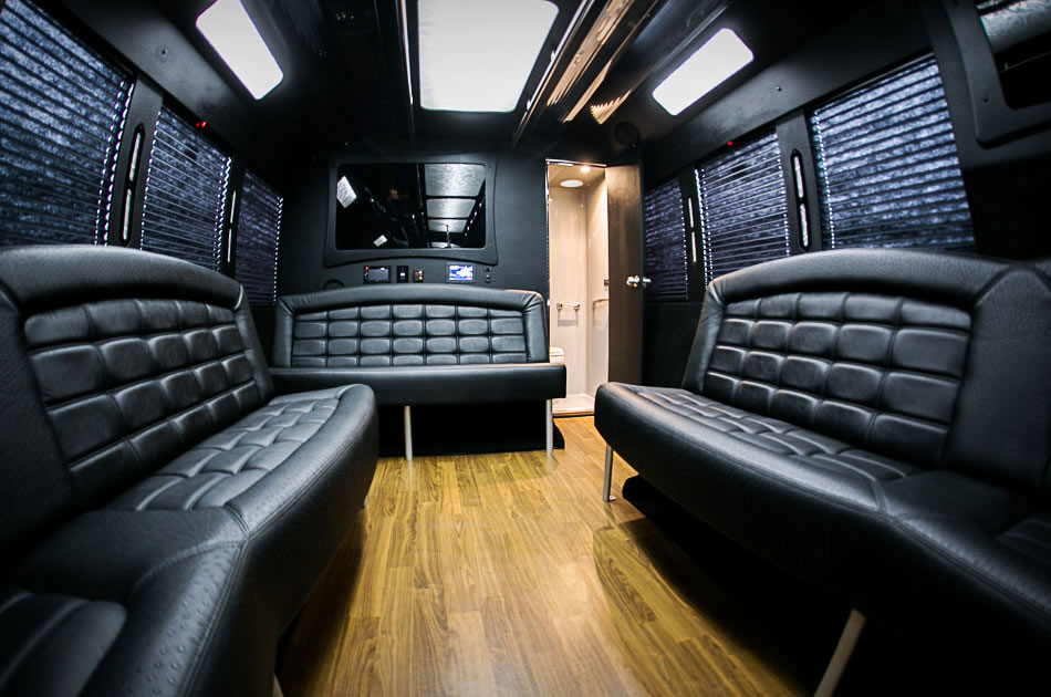
It's a matter of taste of course :)
![]() thecabbagedetective You just never cease to give these assignments 110% effort. I gotta give you a A++ because the quality of S&L including textures for both renders, which was not expected. Good stuff dude.
thecabbagedetective You just never cease to give these assignments 110% effort. I gotta give you a A++ because the quality of S&L including textures for both renders, which was not expected. Good stuff dude.
As far as including your limo in your portfolio, Thibaut offers excellent feedback and I affirm the opinion that this is some of the best finalized work I've seen from you. Considering that, I'd say yes put it in your portfolio! The only suggestion I can make is that you revisit your road material to look less low-res/blurry, more realistic. Check out Mahir's road for reference and maybe he'd share some insight.
![]() tbrbn Thanks for the answer! You're certainly correct about the portfolio being everchanging, so I'll certainly keep that in mind. I also appreciate both the compliments and the feedback, so thanks for that too! I'm curious though, what is my style? 'Cause I don't consciously go for a specific approach so I'm curious what makes my style lol.
tbrbn Thanks for the answer! You're certainly correct about the portfolio being everchanging, so I'll certainly keep that in mind. I also appreciate both the compliments and the feedback, so thanks for that too! I'm curious though, what is my style? 'Cause I don't consciously go for a specific approach so I'm curious what makes my style lol.
@theluthier Daaaaaaayum, thank ya kindly! Very much appreciated!
Definitely gonna put the limo in my portfolio after a couple of tweaks. It's odd though, the road is a 6k texture. Guess going higher would help? Maybe there's more to it than that? Only one way to find out...
Debated about whether I should post this in either this thread or my Halloween thread but considering I'm concentrating on it for this week specifically I thought it'd be best to post it here.
So I'm trying to model some jeans and I was curious if these wrinkles look convincing? Or if not, what I could improve? To confirm this is the ankle.
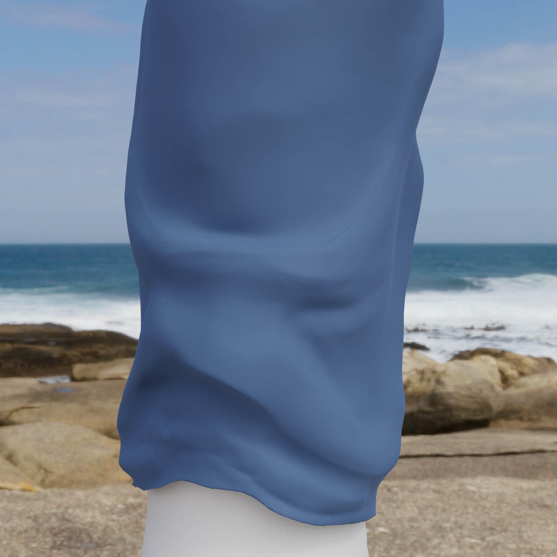
Materials are nowhere near final fyi, just something I put on it so it wasn't a boring white.
Full disclosure, pretty much everything you're going to see from me in the next week is also going to be related to my contest entry, so if any of the judges come across thread it's probably best not to give critiques (which I won't lie, pains me to say lol) as that'd be rather unfair. For now though I hope this gives you something to go on and that you can tell me if I'm heading in the right direction. Happy Blending!
![]() thecabbagedetective Since I'm not a judge I can respond 😬
thecabbagedetective Since I'm not a judge I can respond 😬
Looked at some photos of jeans and I think the bottom rim (or however it's called -> the stitched edge) is rather stiff and straight with jeans, the wrinkles start above that. Googling some photos will help. Other than that it looks like a solid start, very convincing wrinkles, so great job! 😄👍🏻