My homework thread for the October 2018 Class.
Week 1 Submission: Page 2
Week 2 Submission: Page 5
Week 3 Submission: Page 8
Week 4 Submission: Page 9
![]() silentheart00 Cheers man! Never even though about that possibility, but I appreciate you bringing it to my attention.
silentheart00 Cheers man! Never even though about that possibility, but I appreciate you bringing it to my attention.
![]() thecabbagedetective Very interesting work this week, Aaron :D like how that character is coming along. and overall, I think it's a pretty good job on the light match. I think there's several things that affect the size of the shadow.... the size of the lamp, and it's strength. In Cycles, I'm not seeing anything else that can affect the shadows than those two on the light. In Eevee, though, the softness and the thickness I think can be used to vary the shadow's intensity.
thecabbagedetective Very interesting work this week, Aaron :D like how that character is coming along. and overall, I think it's a pretty good job on the light match. I think there's several things that affect the size of the shadow.... the size of the lamp, and it's strength. In Cycles, I'm not seeing anything else that can affect the shadows than those two on the light. In Eevee, though, the softness and the thickness I think can be used to vary the shadow's intensity.
![]() gradyp Ta very much! I'm using Cycles at the mo. Maybe I should've tried Blender Internal lol.
gradyp Ta very much! I'm using Cycles at the mo. Maybe I should've tried Blender Internal lol.
Not really related but here's a gun I'm working on. Still got more details to add but I'm liking it thus far. Full disclosure, related to the pumpkin thingy:
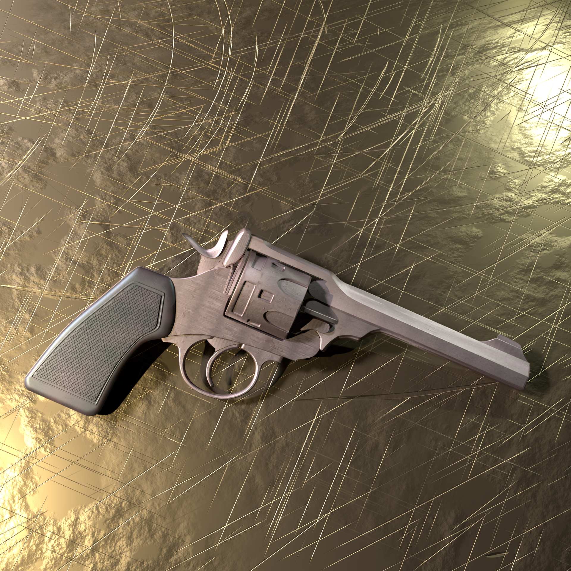
![]() thecabbagedetective well now you sure nailed that pumpkin. I really love it. The full scene is so great. Truly beautifull done. Also good lightning match. But I think there are some lights a bit too bright. Not sure but it's something minor. And you're gun looks great too already love the details on it
thecabbagedetective well now you sure nailed that pumpkin. I really love it. The full scene is so great. Truly beautifull done. Also good lightning match. But I think there are some lights a bit too bright. Not sure but it's something minor. And you're gun looks great too already love the details on it
![]() thecabbagedetective I love it how you put the effort to write the story. That pumpkin head looks pretty cool even in it's awkward A-pose. In my screen the first (darker) version looks better. It feels more scary and he's seen so well thanks to the rim light.
thecabbagedetective I love it how you put the effort to write the story. That pumpkin head looks pretty cool even in it's awkward A-pose. In my screen the first (darker) version looks better. It feels more scary and he's seen so well thanks to the rim light.
The lighting match looks also nice. You could've made the Goblin more bright yellow like Pikachu since it's so strong element in the goal image.
![]() swikni Glad to hear you like the story elements, I always try to add a bit of context. Interesting that you prefer the darker one, with me my mind changes on which is best every 10 minutes so I appreciate some concrete direction.
swikni Glad to hear you like the story elements, I always try to add a bit of context. Interesting that you prefer the darker one, with me my mind changes on which is best every 10 minutes so I appreciate some concrete direction.
You're absolutely right about the goblin. In fact, you're so right I'm gonna change it, rerendering now. Thank you for your feedback, I'll always appreciate it!
EDIT: Or at least I will when I get up, because the power felt like cutting out mid render and I'm too tired to do it again.
Really cool to see you rolling on your pumpkin contest project! As you said I don't want to be unfair and give you a pointed critique, but I will say that your current previews are pretty dark. Too much hard work is going to waste by not being visible.
Keep up the good work, Aaron! Can't wait to see how it turns out. It's a B from me in terms of lighting and shading, A+ for effort though, no question.
I like your light match choice. It's a very bold stylized render. An interesting one to emulate. The overwhelming impression I get from your match is "too blown out". But then when I look at the source I totally see where you were getting that from. However in the source it feels like less an issue and more of an aesthestic. With yours it feels like a "just tone the lights down a bit" kind of issue. Here's a couple thoughts:
Anyway, it's still a solid effort. Another B+ in my gradebook 👍
@theluthier Damn, well thank you for your honest feedback, I certainly appreciate it.
Dunno why but my lighting is so inconsistent, sometimes it's like the car where it's like "😙👌 Mwah, beautiful," whereas sometimes it's like this where it's like "What the hell are you smoking?". Just need to learn to make my characters "seeable" whilst also keeping a dark, shadowy atmosphere. The only way is up though, eh? Let's keep going.
![]() thecabbagedetective I definitely think it's trickier to light dark and creepy character renders *well*. Don't be discouraged. The challenge sharpens us. You got this, sir 👊
thecabbagedetective I definitely think it's trickier to light dark and creepy character renders *well*. Don't be discouraged. The challenge sharpens us. You got this, sir 👊
@theluthier Aw hell yeah. We only improve by doing, and I got no intentions of stopping now. Sure it bums me out a bit because this is what I want to do most but that's not gonna make me any better, is it?
Still have a few more things to do but this is what I have so far, I apologise for the low resolution but I just wanted to get it rendered this side of the century.
I recognise some problems, like being too overbearing with the wallpaper texture, and the pointiness value for the borders, making them looked tattered and worn, but so far I like what I got, and hope to improve it tomorrow.
Usually I'd share my shaders and whatnot but considering the amount here (and their simplicity) I'll just upload the .blend file when I'm done so you can poke around, but if there's a specific material you wanna see just shout.
I also experimented with the mirror and trying to get the blown out light to reflect and after doing what is likely some unnecessary backward ass ostentatious way I managed to get it. I'm too tired to show how right now but if any of yous are interested just yell at me a bit and I'll show how when I'm awake.
Well, that's it for me for today, have a good day and happy Blending!
EDIT: Looking at this more I notice I went rather OTT on quite a few other aspects as well... oh well, more things to improve upon!
![]() thecabbagedetective Its a great start! After some fine tuning this will be EPIC 😁
thecabbagedetective Its a great start! After some fine tuning this will be EPIC 😁
![]() thecabbagedetective Looks goood! I love the golden decoration theme.
thecabbagedetective Looks goood! I love the golden decoration theme.
Homework Submission Week 4
Welp, better late than never!
I think it's somewhat dawned on me that perhaps having a class and a competition in the same month wasn't the wisest decision, but hey no one forced me to enter it, so this is on me lol. Well, this is what I managed to get done:
Kinda wish I had the time to create my own scene but I still like what I got done. Tried adding some simple imperfections like dust but not sure how well they're showing through.
Now, for the light match! Whilst I love the premise of this exercise by the time I get my main part of the exercise done along with the competition I find I don't have enough time to do them proper justice, but I'll let you guys be the judge of that.
So this week's example was supplied by a Karalina Shaibak, so go show them some love, and they're supplying me a render of a jade dagger, so here we gooooo. Goal:
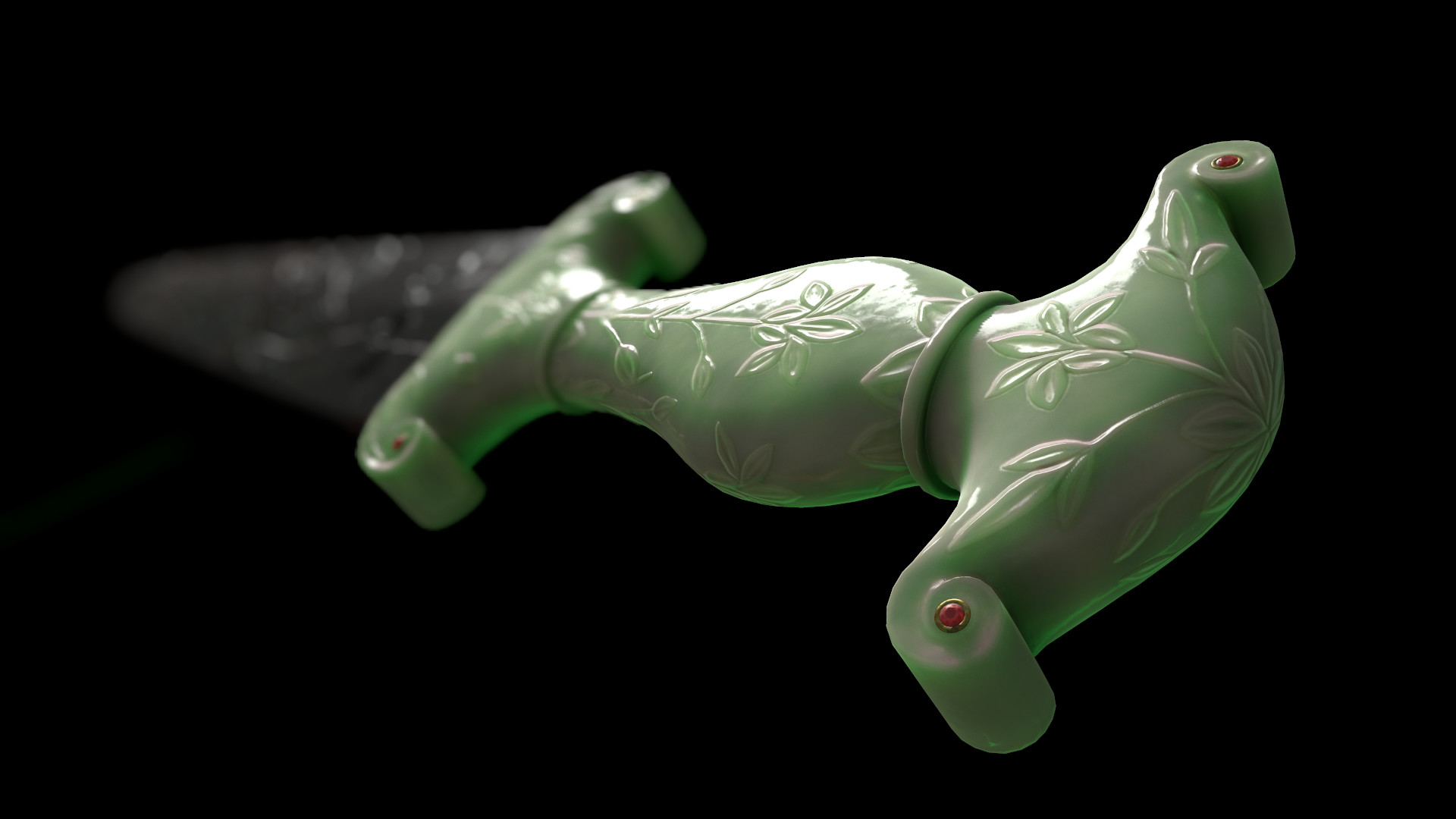
Result:
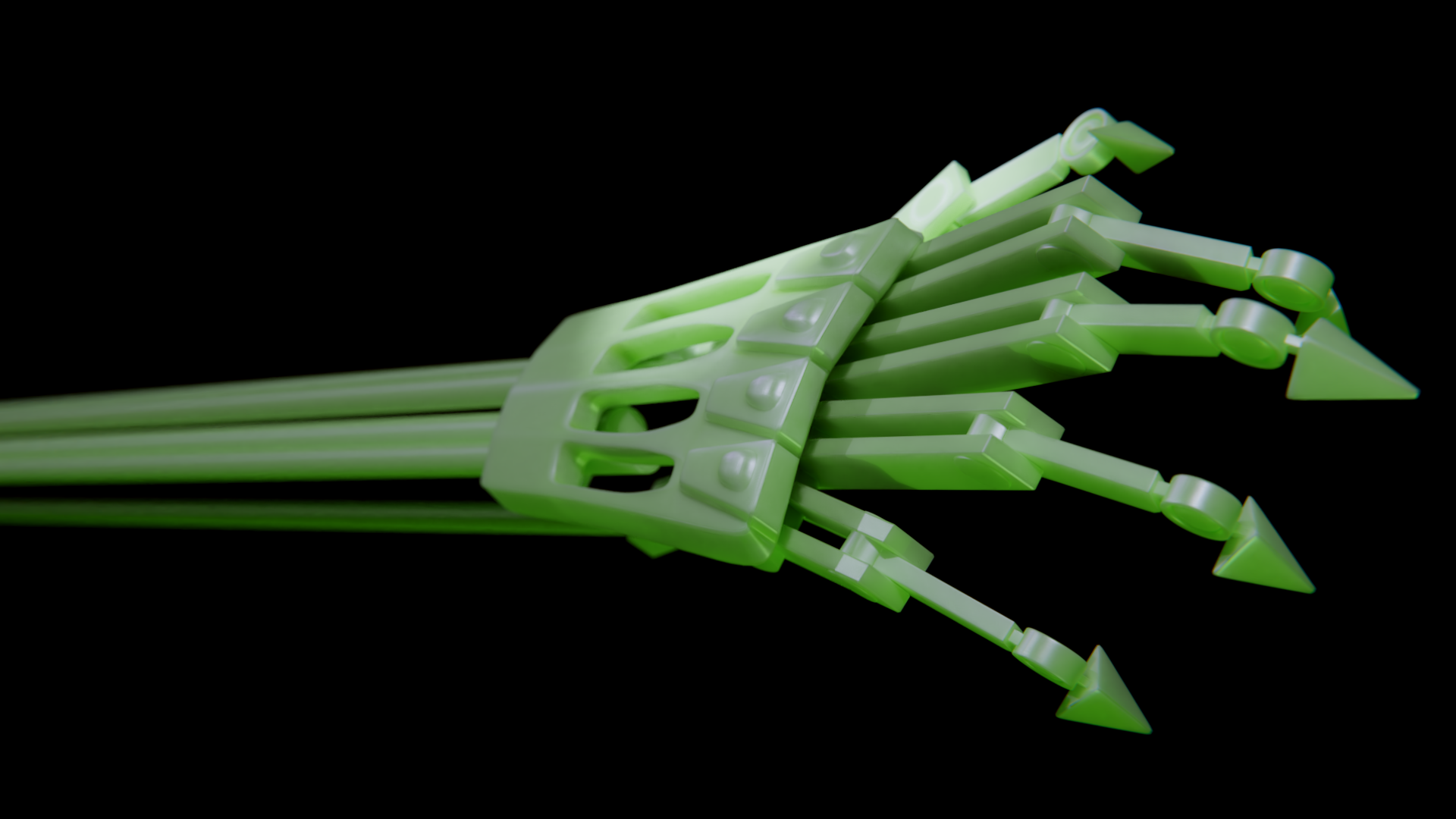
Yeah I don't particularly think a SSS-laden material such as jade really suits a robotic arm but quite frank;y I hadn't a model even remotely similar. The biggest thing I can criticize is the weaker DoF, it's not something I'm particularly experienced with so I did the best with the knowledge I had. Also trying to do the light green tint underneath wasn't happening, maybe by cranking up the SSS? Also something I'm not experienced with.
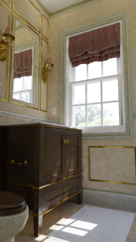
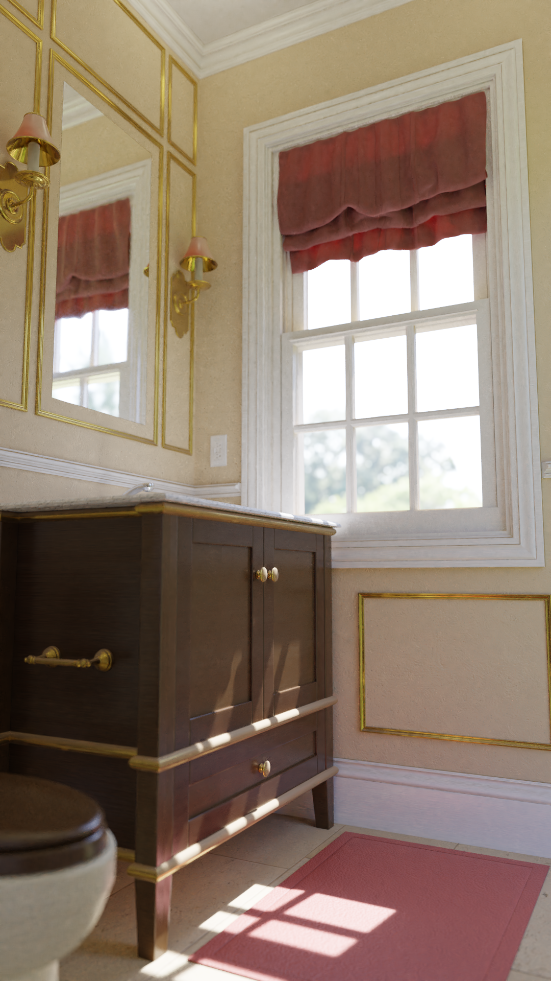
Well, as promised, here's the .blend file for the bathroom scene if any of yous wish to pick it apart. Now if you'll excuse me I have more work to attend to, so happy blending and I'll see you around!
![]() swikni Cheers! Hopefully the final thing lives up to that as well.
swikni Cheers! Hopefully the final thing lives up to that as well.
![]() thecabbagedetective That bathroom is beautiful!! Well done Aaron 👏🏻
thecabbagedetective That bathroom is beautiful!! Well done Aaron 👏🏻
Light match is pretty good 😊 I think the source has a reddish tint and your green ha a bit more punch, but overall good attempt.
Yeah contest and class at the same time is a bit much isn't it? I should also get back to my pumpkin.. you did A LOT of wickedly AWESOME work this month though, in class and for the contest, so great job! 😄👍🏻
![]() thecabbagedetective That style of the bathroom is awesome, you have great talent to render luxury kind of things, as your limousine had such one too.
thecabbagedetective That style of the bathroom is awesome, you have great talent to render luxury kind of things, as your limousine had such one too.
And as usual you have energy also to run other projects at the same time :D