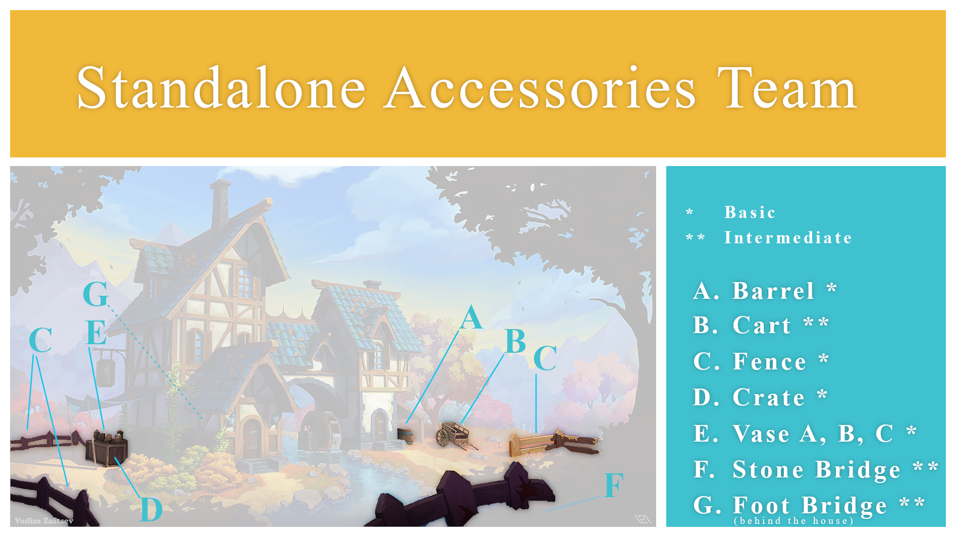
Useful Links
Google Spreadsheet for Assignments (up to about 3 contributors for each asset)
Basic Instructions for getting started
https://cgcookie.com/questions/13975-collab2021-hq-stylized-fantasy-environment?page=4#answer-49989
The Collab 2021 Google Drive Folder with all Images, Scenes and Textures for this Project
https://drive.google.com/drive/folders/1AVZsRvZeZBmMRx4quFqC6yzG-42SbuQ0
File Sharing and Library Linking explained by Kent Trammell @theluthier on the basis of the 2020 „Backhoe“ Collaboration
https://cgcookie.com/questions/12591-backhoe-collaboration-file-sharing-library-linking
If you wish to automatically synchronize your Google Drive Account with your Computer’s Hard Drive, you can download the Google Drive App here
https://www.google.com/drive/download/
Instructional video by ![]() blanchsb on how this Synchronization works referencing the 2020 „Backhoe“ Collaboration
blanchsb on how this Synchronization works referencing the 2020 „Backhoe“ Collaboration
I just signed up to do the fence... I imagine the biggest challenge will be following the contour of the ground. Any suggestions on how to begin?
Thank you, ![]() amblender, for your team name proposal 👍. We can collect proposals and then vote in the team the next weekend.
amblender, for your team name proposal 👍. We can collect proposals and then vote in the team the next weekend.
@createtaiwan I'd suggest making the post and railings separately so that it's easier to make variation of them.
Maybe 3 or 4 different posts and 4 railings, rotating them to avoid repetition.
Probably make that 2 fence posts (4 different sides) and 3 railings (either rotating on the Z (up) axis or along the railings length).
No sorry @createtaiwan I just looked at the artwork again. Make that 3 fence posts. The ones in the picture are more like planks so that means that there's only really 2 different side variations to play with. Apologies.
Welcome to the team, Dave 😀! I would start with the fence in the sunlight at right:
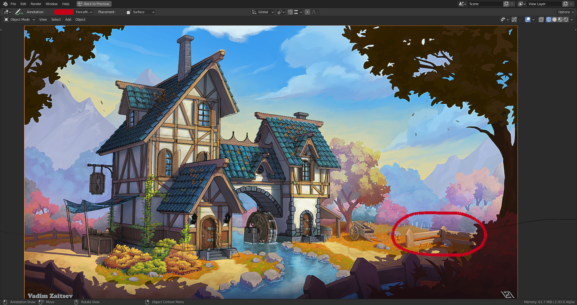
It's relative close and therefore detailed and it shows at least one complete fence element. I think, the fence can help later forming the landscape by looking at the angles between the fence and the ground. I would first model these elements so that they roughly match the shape in the artwork and then align with the camera's perspective. With the house blocked out by Kent and aligned with the artwork you can orbit around the objects and check whether their relative positions in the 3D scene make sense. When I blocked out the house last month, I often had the problem that objects looked well aligned with the artwork from the camera's perspective but bad when seen from a different angle.
Okay, thanks ![]() duerer and
duerer and ![]() vincav81. I grabbed a file from the Google server called <spice-venders-house_ASSEMBLY (1).blend> which I assume has the camera placed at the right spot. I will use that as my starting point. Looks like the fence does something strange around the back side of the house... maybe one of the horizontal planks is loose or something?
vincav81. I grabbed a file from the Google server called <spice-venders-house_ASSEMBLY (1).blend> which I assume has the camera placed at the right spot. I will use that as my starting point. Looks like the fence does something strange around the back side of the house... maybe one of the horizontal planks is loose or something?
And one more quick question... I think Kent gave an official file naming scheme last night, but I didn't get a screen shot in time. Does anyone here have that info?
@createtaiwan First here's a quick sketch of how the rear fence ends. By no means topographically correct to the scene, of course.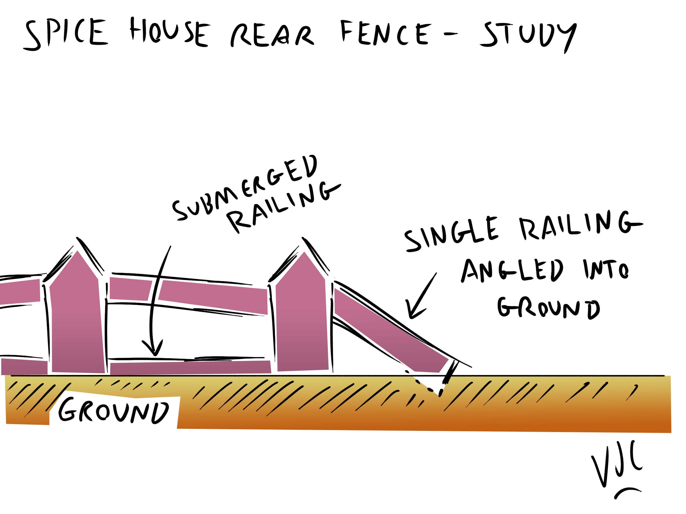
@createtaiwan And here's the screenshot of Kent's naming convention slide.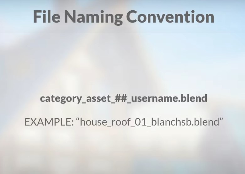
I am also seeing that the part of the fence in the foreground on the right has different proportions in terms of the distance between posts than the other three visual sections. Rather than make them consistent, I will follow Vadim's art as closely as possible since that seems to be the overall point.
Maybe our beloved spice vendor decided that the fence posts ought to be closer together when there is a shaper curve to the landscape?
I want to do the crate and already have an idea how to do it. I will upload a picture during the day
@createtaiwan @theluthier I think that this might be one of those cases where we may have to apply some artistic interpretation. Below is my rough interpretation how the right ( of camera view) Foreground Fence may over and around an unseen hill/hillock.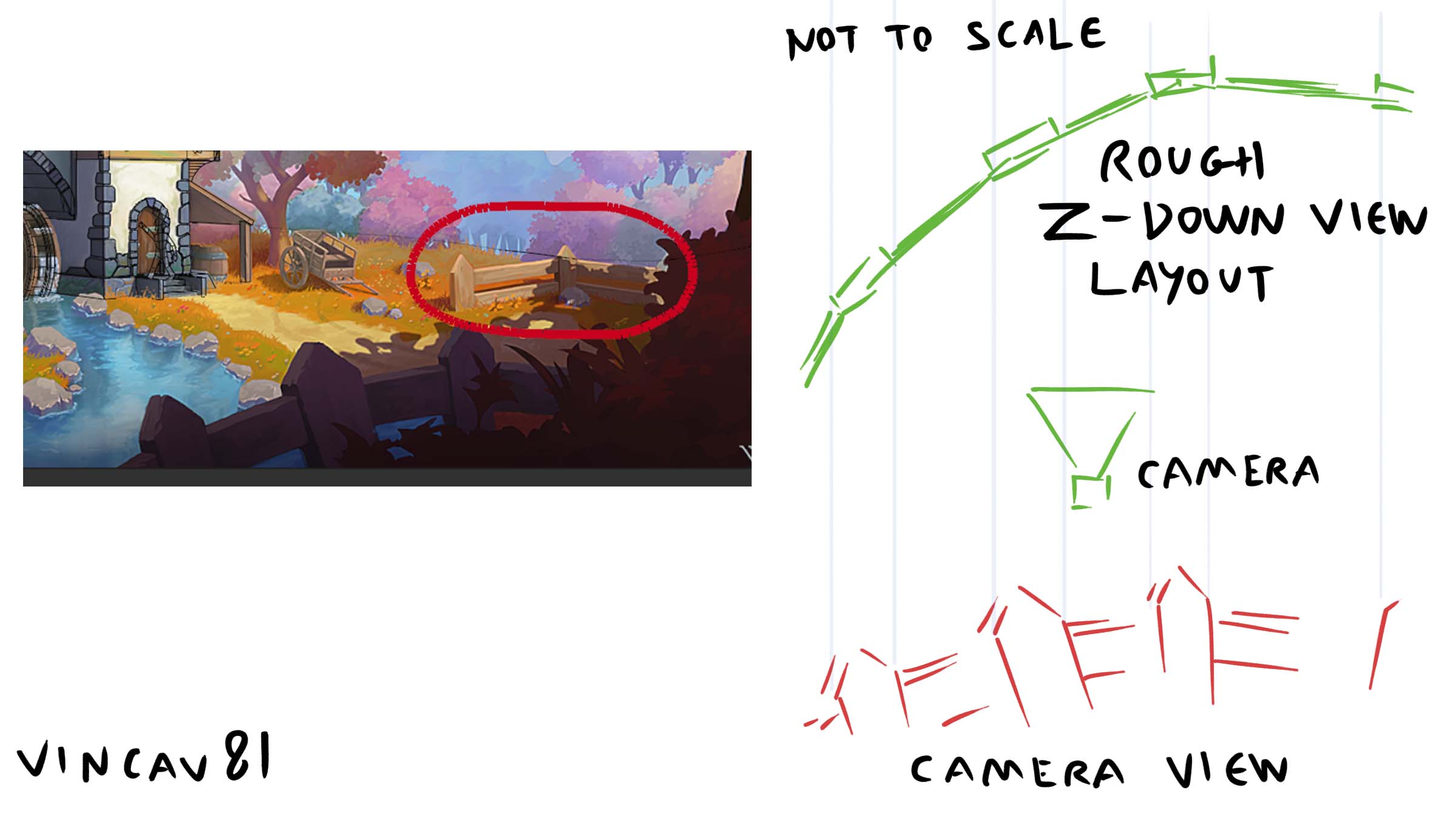
Looks good to me. The fence railing could possibly have some subtle bending/curving to them. At the moment, to me, they currently seem a bit to perfect/ridged.
But it would be wiser to continue setting out the rest of the fencing in the scene and wait for Kent's @theluthier input/grading either next week or in your personal WIP Homework thread.
Here are some examples of what I mean by curving and bending the fence railings. @createtaiwan


Great! I will add some bend to them. I have been object data (there are four unique planks) so would it be best to use a cage to bend them at the object level?
[Q] BTW, for the homework we are turning in on Sunday before midnight, were we supposed to upload our .blend file to our WIP thread or just a clean screen shot of our assets?
@createtaiwan For the homework question I would suggest asking Kent @theluthier about that in the main Collab forum thread, or ask ![]() duerer here in this one.
duerer here in this one.
If the planks have enough geometry to warp, then yes use a Lattice Object/cage to adjust them (but you could probably also do the bending in the Sculpting part next week) and then Apply the Lattice. I may be wrong, but I think the aim is to make the assets whole(?) and not with modifiers left one that will slow down the viewport in the combined .blend file.
These are just my guesses, so I strongly suggest that you ask ![]() duerer opinion on what would be the best workflow for your part of the Collab.
duerer opinion on what would be the best workflow for your part of the Collab.
For anyone else in the Standalone Accessories Team working on the cart, here are some reference images to give us an idea of what a real looks like and the picture with the man on the milk cart should help to give a better idea of how big the cart should be inside the Collab scene.


Some examples of wooden cart wheels:


And this cart is a bit closer in general shape to the cart in the Artwork:
