Useful Links
Google Spreadsheet for Assignments (up to about 3 contributors for each asset)
Basic Instructions for getting started
https://cgcookie.com/questions/13975-collab2021-hq-stylized-fantasy-environment?page=4#answer-49989
The Collab 2021 Google Drive Folder with all Images, Scenes and Textures for this Project
https://drive.google.com/drive/folders/1AVZsRvZeZBmMRx4quFqC6yzG-42SbuQ0
File Sharing and Library Linking explained by Kent Trammell @theluthier on the basis of the 2020 „Backhoe“ Collaboration
https://cgcookie.com/questions/12591-backhoe-collaboration-file-sharing-library-linking
If you wish to automatically synchronize your Google Drive Account with your Computer’s Hard Drive, you can download the Google Drive App here
https://www.google.com/drive/download/
Instructional video by ![]() blanchsb on how this Synchronization works referencing the 2020 „Backhoe“ Collaboration
blanchsb on how this Synchronization works referencing the 2020 „Backhoe“ Collaboration
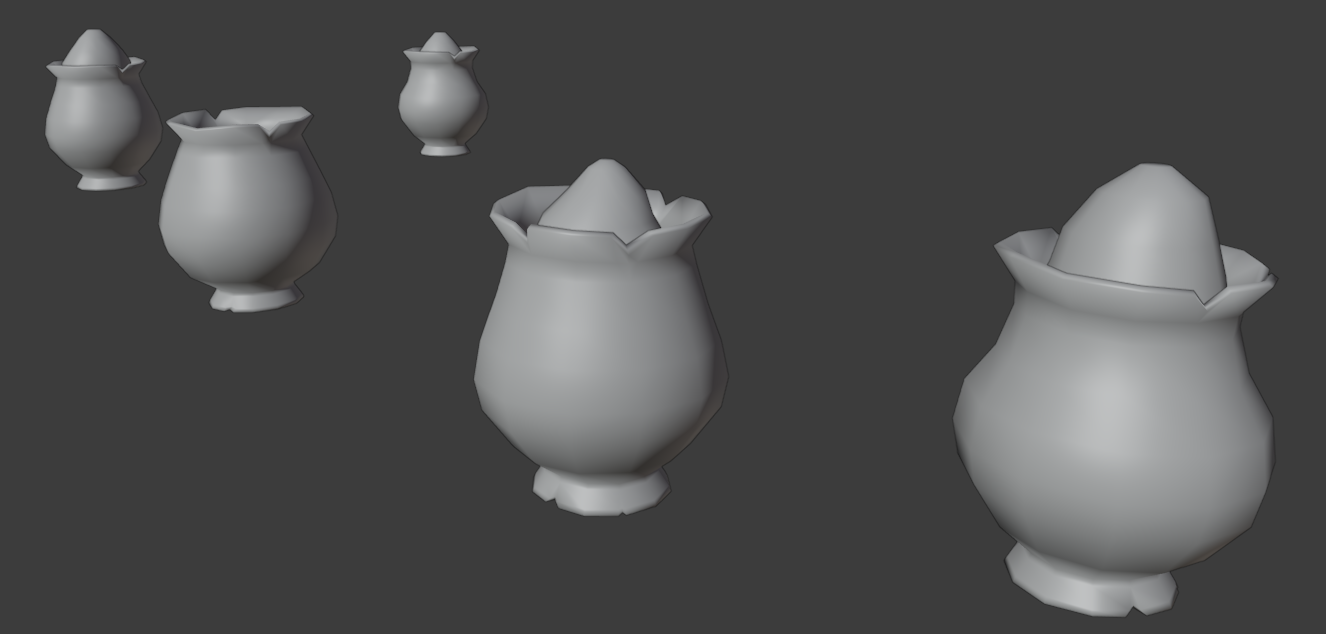
Hi ![]() duerer , Ive done a few shapes of the vase, I did have a go yesterday in texturing them, but tbh they looked a bit bland. So, I've decided to stop here for now and try texturing them again maybe later today. I know that I have signed up only for Vase C, but I thought maybe we can chose one of these. they are all slightly different in shape. I also took your advice on shading them smooth, so thanks for that tip.
duerer , Ive done a few shapes of the vase, I did have a go yesterday in texturing them, but tbh they looked a bit bland. So, I've decided to stop here for now and try texturing them again maybe later today. I know that I have signed up only for Vase C, but I thought maybe we can chose one of these. they are all slightly different in shape. I also took your advice on shading them smooth, so thanks for that tip.

![]() williamatics Could you fix the problem with the files? If nothing else helps, use this file here so that you can at least blockout your crate today and submit your homework with a screenshot as described by Kent @theluthier here in #Announcement2 (scroll down until the orange frame). But we need to fix the problem with Google Drive. So please ask @theluthier .
williamatics Could you fix the problem with the files? If nothing else helps, use this file here so that you can at least blockout your crate today and submit your homework with a screenshot as described by Kent @theluthier here in #Announcement2 (scroll down until the orange frame). But we need to fix the problem with Google Drive. So please ask @theluthier .
Just slapped together a few images from my week 1, had a lot of fun and great vibes working with everyone.

![]() duerer, I have just submitted my homework for the cart. Would you mind reviewing it? Specifically, do you have any feedback or comments to provide?
duerer, I have just submitted my homework for the cart. Would you mind reviewing it? Specifically, do you have any feedback or comments to provide?
https://cgcookie.com/questions/14229-collab2021-wip-splat21
I have seen some of the other cart modelers have put in bolts. I didn't thinking to keep the poly count down. Do you have any advice if such detail should be added?
Cheers
Splat
![]() amblender Did you try it with "Auto Smooth" and a different threshold angle?
amblender Did you try it with "Auto Smooth" and a different threshold angle?
@Blanchsb told me it could be my screen shading. When i use Lookdev Mode in the 3d viewport it looks much better
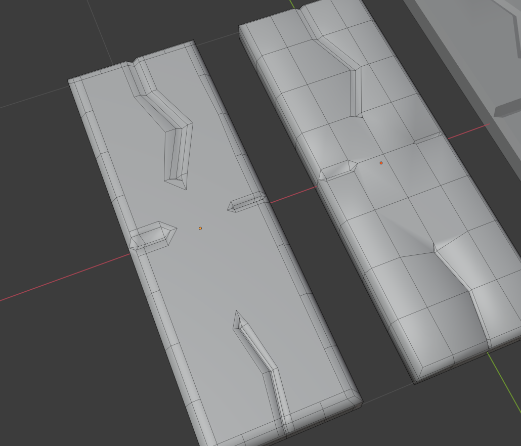
![]() amblender, try reducing extra vertices. I was seeing the same thing that you are experiencing. Here is how I resolved it. From the board example below, I had six rows of loops and six columns of loops. After putting in my cracks and dings, I Dissolved any extra vertices. Especially for a low poly project, I view this step as housekeeping. I probably have more of this type of clean up on all my objects. Hopefully this helps.
amblender, try reducing extra vertices. I was seeing the same thing that you are experiencing. Here is how I resolved it. From the board example below, I had six rows of loops and six columns of loops. After putting in my cracks and dings, I Dissolved any extra vertices. Especially for a low poly project, I view this step as housekeeping. I probably have more of this type of clean up on all my objects. Hopefully this helps.
Since nobody else has said it let me be the first - wow, this is coming along really nicely!
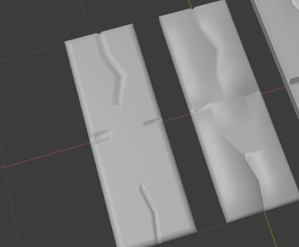
I've done some tests:
 File is here.
Lookdev Mode makes it look a little better but it also depends on the light strength. I'm wondering what @theluthier or @jlampel would do 🤔?
I'm not sure how Kent went about it in the course, so there could be a better solution here, but I would probably just add an extra edge loop in the flat area around each cut so that the smooth shading isn't trying to blend with a face that's far away. Since the rest of the area is flat and there are n-gons anyway, it could just be one big n-gon, but that's up to you.


Thanky you, @jlampel , this makes perfect sense 😀! One more question, @jlampel, do n-gons and especially that big one have a negative effect on textures, especially normal textures?
Do we have a final team name yet? (I voted, but not very partial to any name - I think both Shabby Chic and The Stan Dalones would be fine) ![]() duerer
duerer