Useful Links
Google Spreadsheet for Assignments (up to about 3 contributors for each asset)
Basic Instructions for getting started
https://cgcookie.com/questions/13975-collab2021-hq-stylized-fantasy-environment?page=4#answer-49989
The Collab 2021 Google Drive Folder with all Images, Scenes and Textures for this Project
https://drive.google.com/drive/folders/1AVZsRvZeZBmMRx4quFqC6yzG-42SbuQ0
File Sharing and Library Linking explained by Kent Trammell @theluthier on the basis of the 2020 „Backhoe“ Collaboration
https://cgcookie.com/questions/12591-backhoe-collaboration-file-sharing-library-linking
If you wish to automatically synchronize your Google Drive Account with your Computer’s Hard Drive, you can download the Google Drive App here
https://www.google.com/drive/download/
Instructional video by ![]() blanchsb on how this Synchronization works referencing the 2020 „Backhoe“ Collaboration
blanchsb on how this Synchronization works referencing the 2020 „Backhoe“ Collaboration
Sorry for the intrusion, I'm spying on the opposition.
You should go with Stan Da'Lone, he was a famous CG artist back in the early 1900's
![]() duerer In theory, no, but I've had n-gons cause warped UV unwraps before, so I would triangulate it or at least make enough connections so that there aren't any concave shaped n-gons before texturing.
duerer In theory, no, but I've had n-gons cause warped UV unwraps before, so I would triangulate it or at least make enough connections so that there aren't any concave shaped n-gons before texturing.
@adrian2301, ahh yes, CG artists were indeed quite rare in the early 1900's. Thank you for sharing this fun fact.
![]() amblender, as you may recall I had the same problem as you are describing. For me, I believe the culprit is that I had proportional editing turned on when I lowered the crack verts into the wood. Let's explore this. In the image below, I selected the highlighted vert and lowered it (G-Z) with proportional editing turned on. This is an exaggeration, but notice that the two verts above it were also lowered.
amblender, as you may recall I had the same problem as you are describing. For me, I believe the culprit is that I had proportional editing turned on when I lowered the crack verts into the wood. Let's explore this. In the image below, I selected the highlighted vert and lowered it (G-Z) with proportional editing turned on. This is an exaggeration, but notice that the two verts above it were also lowered.

Select a face in another part of the board and press Shift-G (the Select Similar pop-up menu will be shown) and select Normal. The faces around the top crack are not on the same Normal plane as the rest of the board's original height.
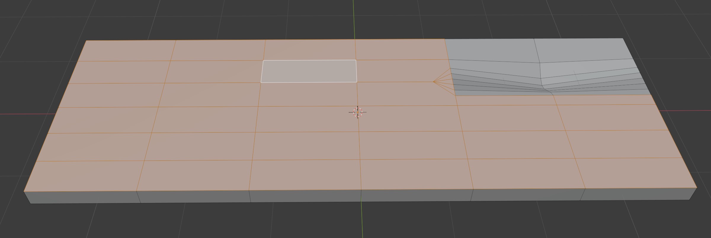
I don't doubt there are many ways to solve this problem. Here is one. Select the outer loop of the crack plus the offending additional vert that is highlighted.
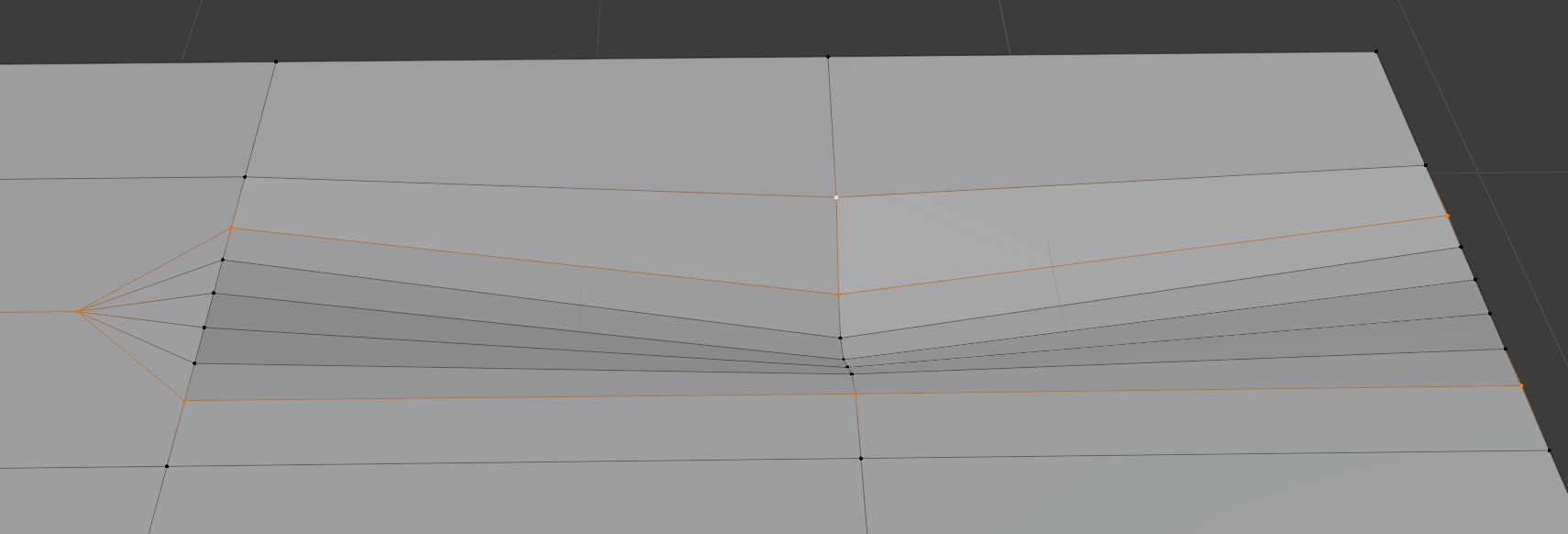
Bring them to the same height by S-Z-0.
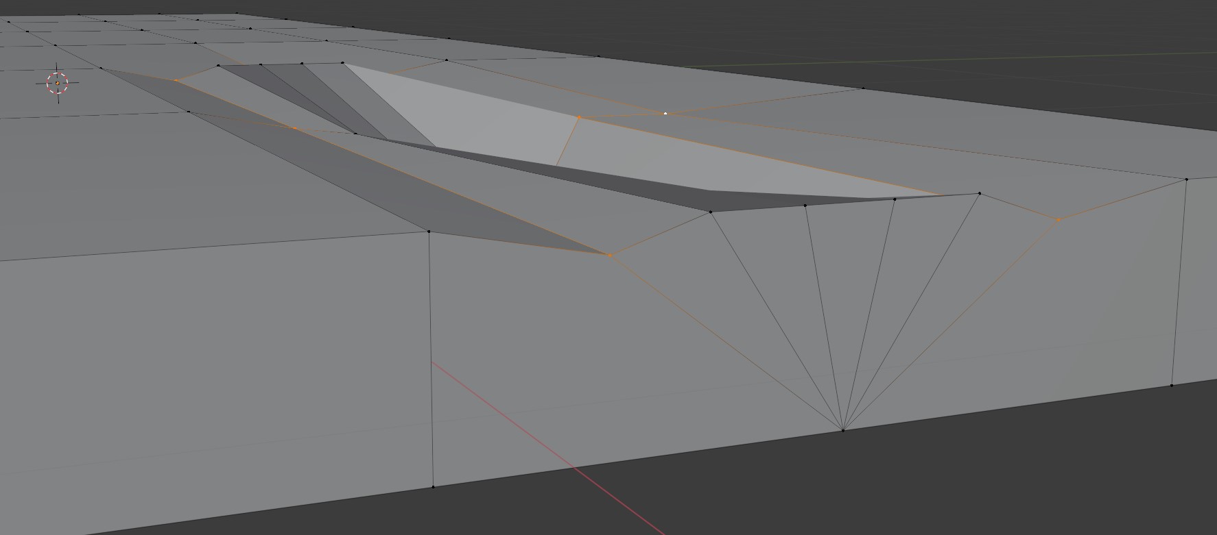
Then G-Z and snap to a vert that represents the original height of the board.
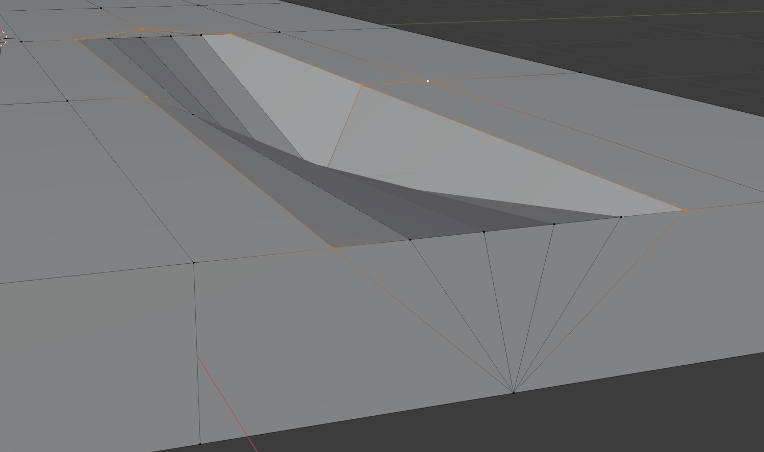
To test your success, select a face and hit Shift-G and select Normal.

@jlampel is essentially recommending keeping the extra verts in a workflow like this to prevent warped UV unwraps. Sounds like a best practice.
Hope this helps.
For my cart, I plan to review all my boards with this issue in mind. Best practices sure are making me add more verts into this low poly project. For future boards that I make with cracks, I will either turn off proportional editing or if I use it I will make sure the verts in the outer loop of the crack are not affected.
Since we had a head-to-head race between "Shabby Chic" and "Stan Dalones" with 7 votes for each, I asked Kent @theluthier and he especially likes "The Stan Dalones". So, this will be our team name 😀.
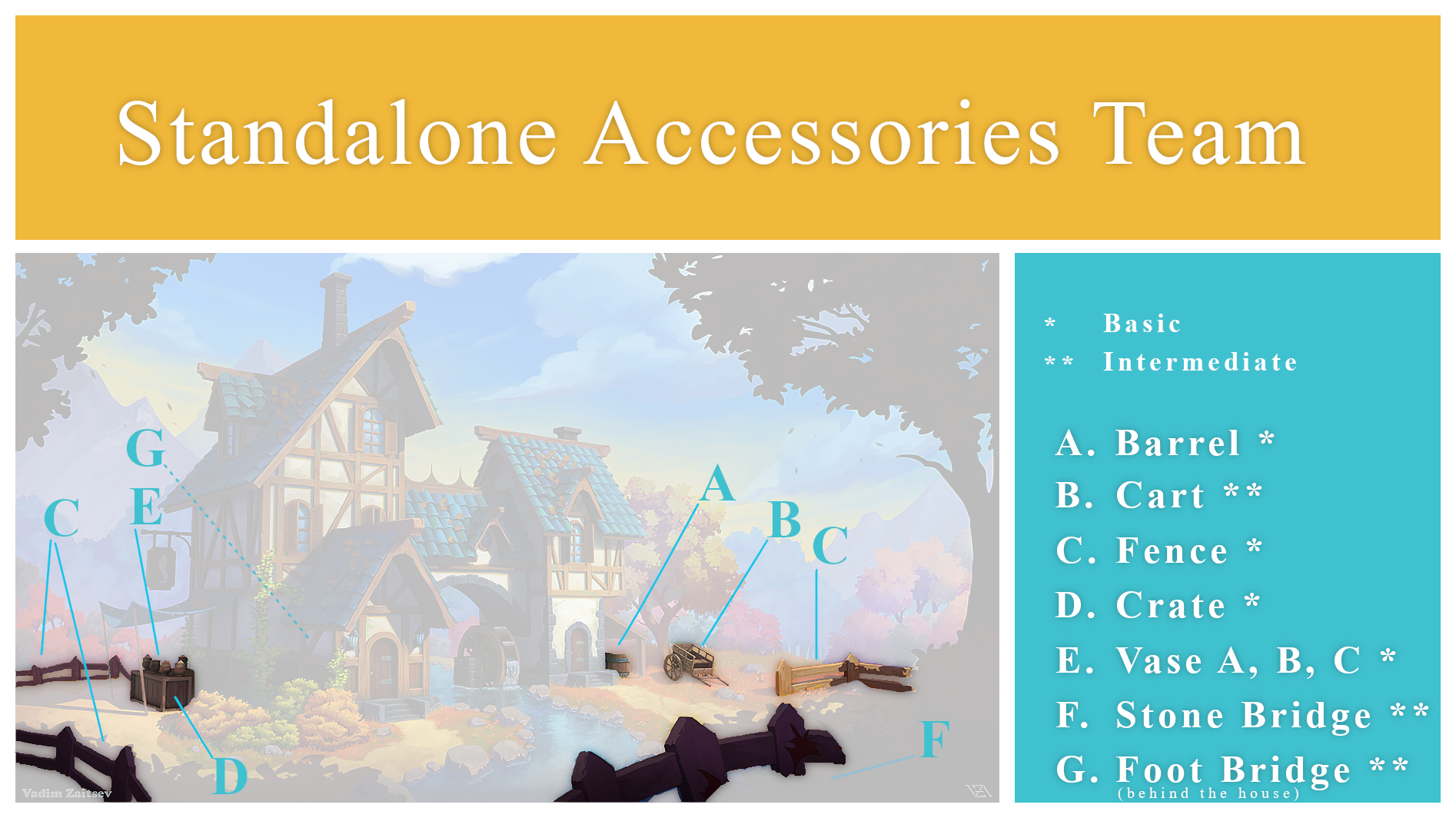
hey, great job everybody ford the first week. I peeked at the WIP threads and put together a small team poster to celebrate this week, hope you like it.
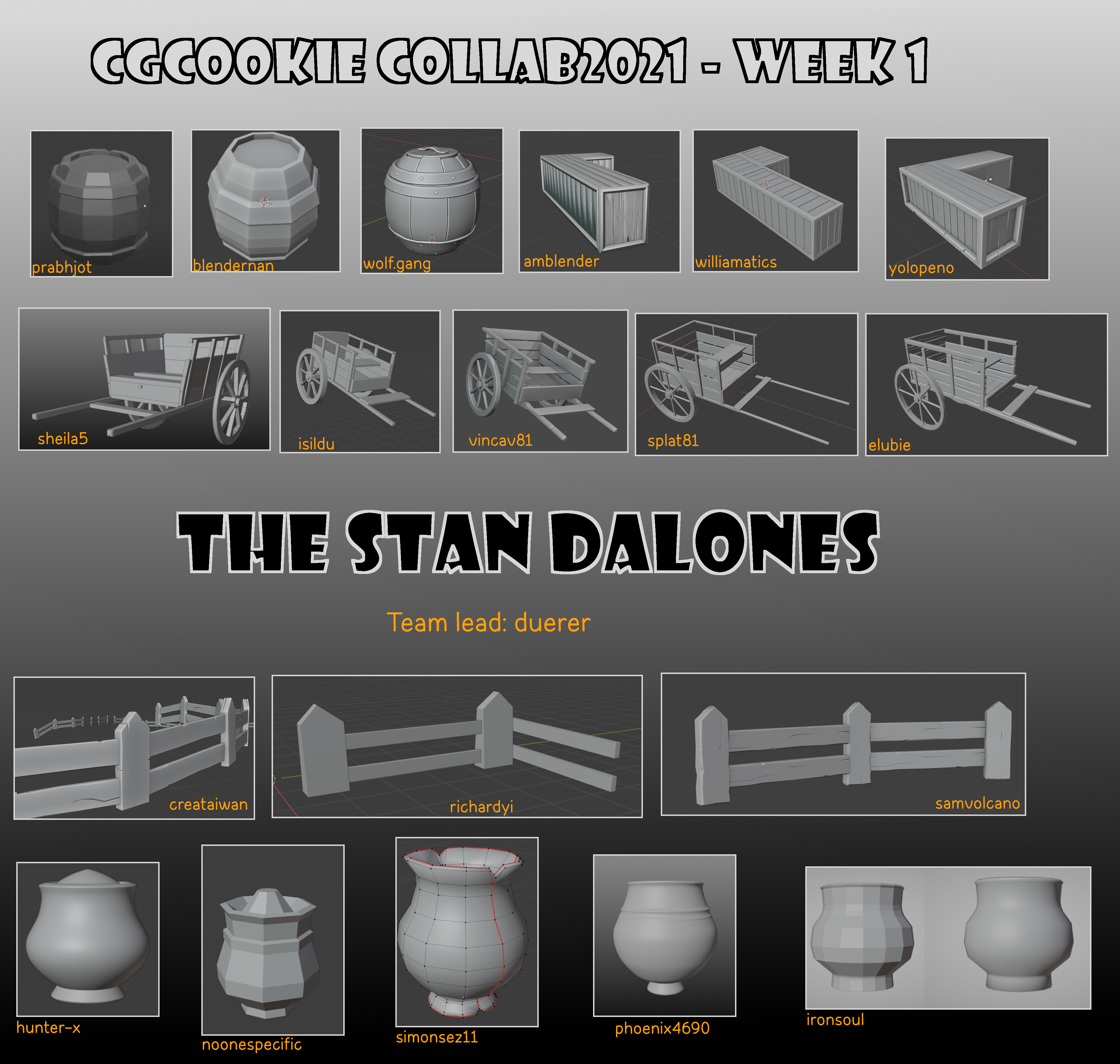
Now, the team name is "Kent-approved" 😀👍!
The 23 team members of the "STAN DALONES":
[updated April 15th with links to the WIP threads of each team member]
[updated April 27th for the new team members cclementk, ![]() dostovel and tthe3dbanana
dostovel and tthe3dbanana
working on the stone bridge and the foot bridge]
@createtaiwan WIP
@samvolcano WIP
@adrian2301 and ![]() splat21 I think, we have to rewrite the history books about CG and I'm sure, with all our combined creativity, we'll make this quite impressive 😉😁!
splat21 I think, we have to rewrite the history books about CG and I'm sure, with all our combined creativity, we'll make this quite impressive 😉😁!
Extra XP points for coming up with the winning name? Just wondering...
great overview love this :) handy to see the progress of every member
Very nice! It's cool to see the different interpretations from people working on the same asset without having to tab between multiple different WIP threads.
Currently planning out how I want to balance sculpting and shading for details on my vase - clay pots tend to have a relatively uniform shape so the sculpted detail would probably consist of chips/cracks or the occasional mark when removing it from the pottery wheel, while stuff like the horizontal bands around the surface from the sculpting process might be easier to do procedurally rather than manually.
On a similar note, how closely do we want to synchronise the styles for the vases at this stage of development? Everyone going for the same style would match the concept art, but might result in slight differences standing out more than if they weren't intended to be exactly identical.
I can't clearly recall if it was you ![]() duerer who suggested a Loki(?) Easter egg in the Spice Vendor scene in the 1st Collab Live Stream, but anyway here is a very short list of some relevant runes for anyone interested in such things. Either to be cut on standing stones or in hidden tree trunks.
duerer who suggested a Loki(?) Easter egg in the Spice Vendor scene in the 1st Collab Live Stream, but anyway here is a very short list of some relevant runes for anyone interested in such things. Either to be cut on standing stones or in hidden tree trunks.

And because my brain can't let go, here is a standing stone concept. Obviously would be in Vadim's colour palette if modeled. Similar colours as the rocks I mean. The red is mostly to help see the carved detail.
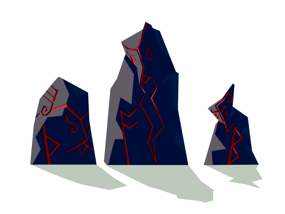
And while I'm still on this Easter egg fixation, there is always the far simpler option of some one modelling Loki's mask from The Mask(1994) floating down the stream or hidden inside the house. ![]() dostovel So that would give you 2 Easter eggs in 1 object:
dostovel So that would give you 2 Easter eggs in 1 object:
Loki and Jim Carrey.

Hopefully know my mind can rest and return to more important things 🙄