Useful Links
Google Spreadsheet for Assignments (up to about 3 contributors for each asset)
Basic Instructions for getting started
https://cgcookie.com/questions/13975-collab2021-hq-stylized-fantasy-environment?page=4#answer-49989
The Collab 2021 Google Drive Folder with all Images, Scenes and Textures for this Project
https://drive.google.com/drive/folders/1AVZsRvZeZBmMRx4quFqC6yzG-42SbuQ0
File Sharing and Library Linking explained by Kent Trammell @theluthier on the basis of the 2020 „Backhoe“ Collaboration
https://cgcookie.com/questions/12591-backhoe-collaboration-file-sharing-library-linking
If you wish to automatically synchronize your Google Drive Account with your Computer’s Hard Drive, you can download the Google Drive App here
https://www.google.com/drive/download/
Instructional video by ![]() blanchsb on how this Synchronization works referencing the 2020 „Backhoe“ Collaboration
blanchsb on how this Synchronization works referencing the 2020 „Backhoe“ Collaboration
( I hate it when people say: 'Everything has Fresnel', while that is nonsense; Fresnel is a property of light! Almost nothing has Fresnel. Only light 'has' Fresnel 😂
Precise observation, ![]() spikeyxxx 😀! Do you remember these guys - I don't know from which CG Company they were - playing some bank robbers in some kind of commercial where one of these men presses a bank employee onto the stone floor and says:
spikeyxxx 😀! Do you remember these guys - I don't know from which CG Company they were - playing some bank robbers in some kind of commercial where one of these men presses a bank employee onto the stone floor and says:
"Do you see it? Everything has Fresnel!" I probably couldn't laugh about this in such a situation and especially would rather think at how I could escape than reflecting about Fresnel.
Yes, ![]() spikeyxxx, you've understood my ambiguity here 😁! I first wanted to write something like "contemplating" or "meditating", but "reflections" are much better 😉😁!
spikeyxxx, you've understood my ambiguity here 😁! I first wanted to write something like "contemplating" or "meditating", but "reflections" are much better 😉😁!
![]() elubie We will have to vote here in the team about it this weekend so that we have a team name before next week's livestream.
elubie We will have to vote here in the team about it this weekend so that we have a team name before next week's livestream.
So far the name proposals from team members:
1) Shabby Chic
2) All Access(ories)
3) Shabby Fresnel Chic
So I guess we'll be putting the cart before the horse... Sorry. Someone had to say it.
Ok, then we have:
1) Shabby Chic
2) All Access(ories)
3) Shabby Fresnel Chic
4) The Stan Dalones
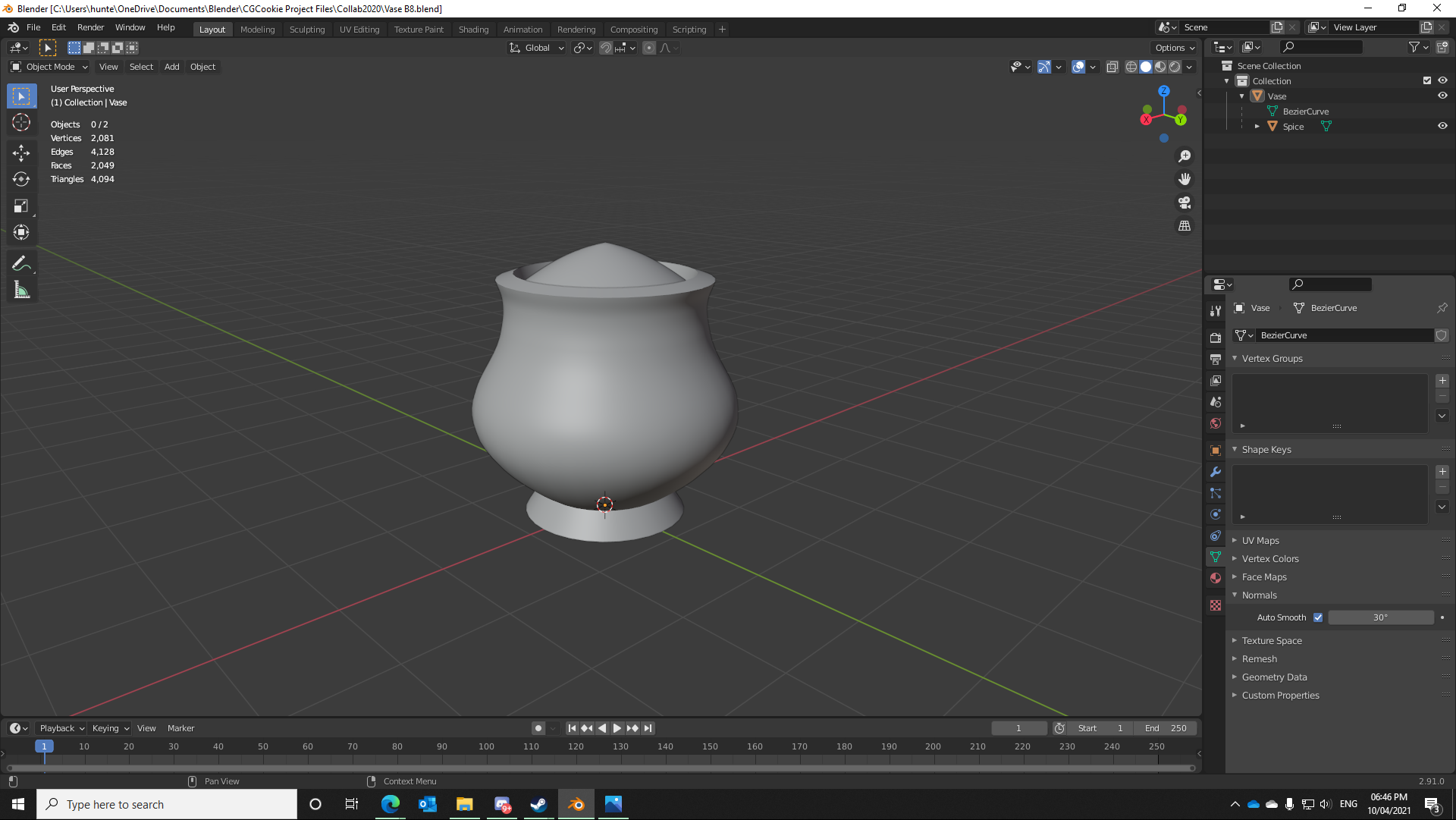
This is where I'm at with my vase so far; tried a few different ways of shaping it and ended up going with a Curve to define the silhouette, then Screw and Solidify modifiers to produce the mesh followed by some manual tweaks and optimisations. I'm reasonably satisfied with the general shape relative to the reference image, though I haven't decided yet if I want to bevel the sharp edges slightly and/or try to reduce that vertex count a bit further. Got a bit of a headache this afternoon so I'll probably sleep on it and make any tweaks based on feedback tomorrow before submitting the final version for review.

![]() amblender This looks great 👍! Go ahead with the cracks and blemishes!
amblender This looks great 👍! Go ahead with the cracks and blemishes!
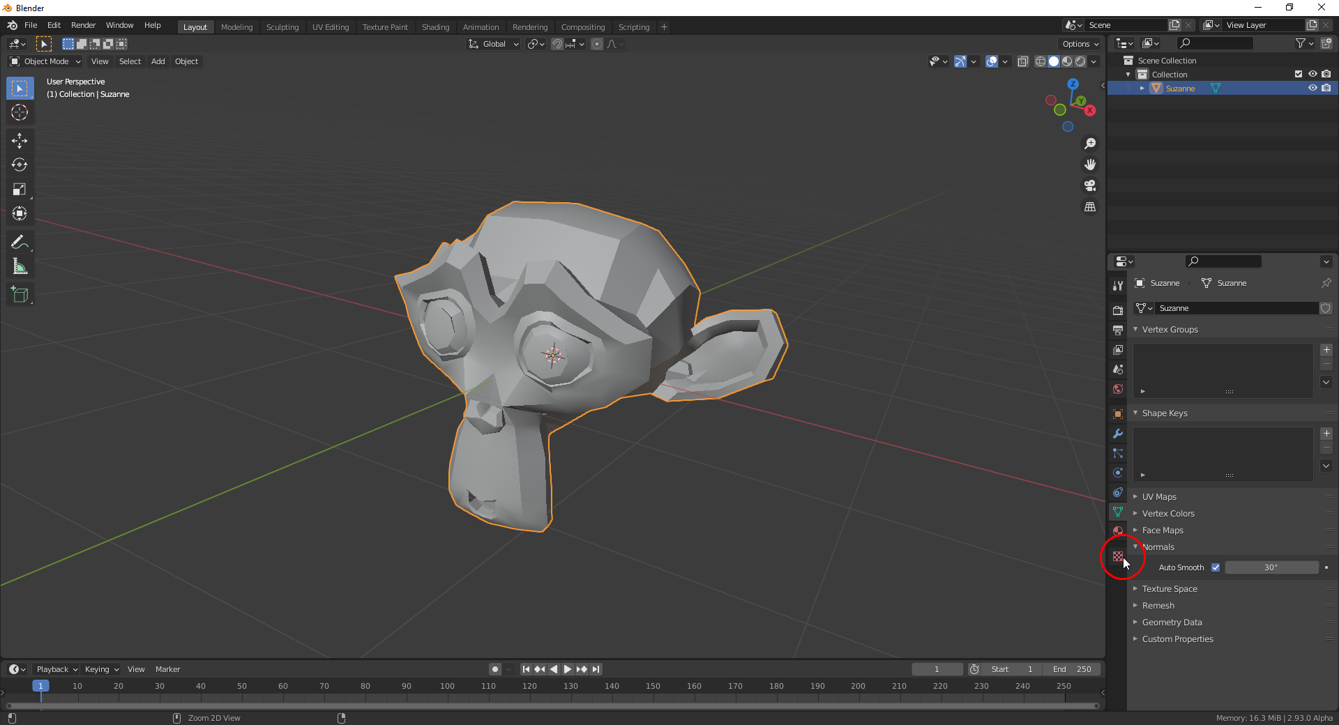
PS: Did you activate "Smooth Shading"? Maybe turn on "Auto Smooth" ("Normals" panel in the "Object Data Properties" tab):

I did turn auto smooth on, did most modelling similar to the treasure chest tutorial. I still need to define which edges are sharp, that should improve the look
I'll put my vote behind Shabby Chic,
because I that that's the shortest and easiest of the options for Kent to remember in the stream.
![]() amblender Yes, it's just this dark shading in some areas, especially the dark triangles on the longest side of the crate in your last screenshot which looks a little bit odd. But this should be an easy fix. Again: Great work 👍!
amblender Yes, it's just this dark shading in some areas, especially the dark triangles on the longest side of the crate in your last screenshot which looks a little bit odd. But this should be an easy fix. Again: Great work 👍!
Thanks, @vincav , for your vote 😀! Now I'll ask the others who haven't already voted, for their choice.