I wanted to track my progress so I wrote this. I am a complete beginner right now, I hope things will change. This is the low poly rocket from the course for beginners.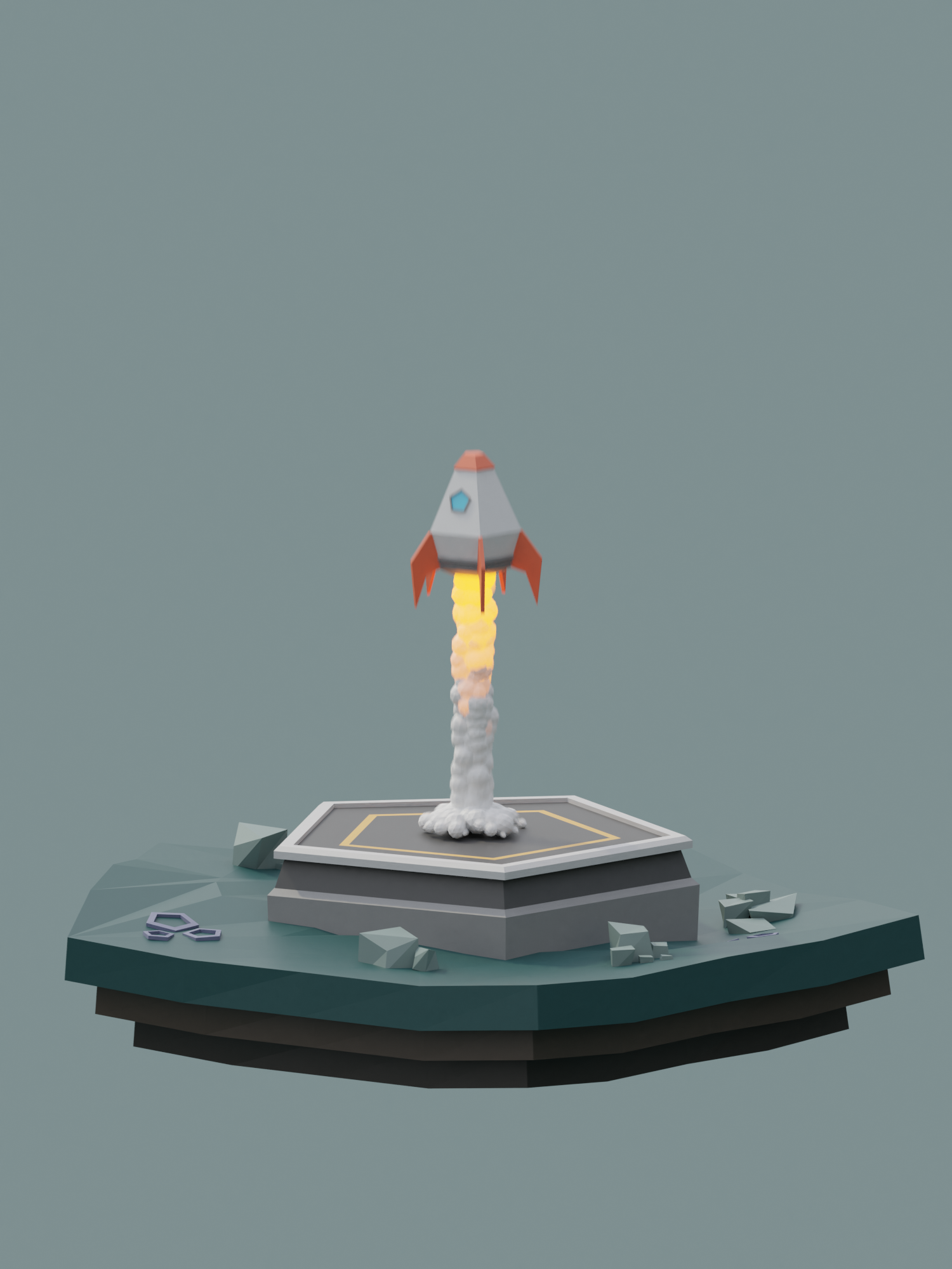
I tried to do a sculpture based on this image. I wanted to retopologize it, but at some point, I got stuck and gave up.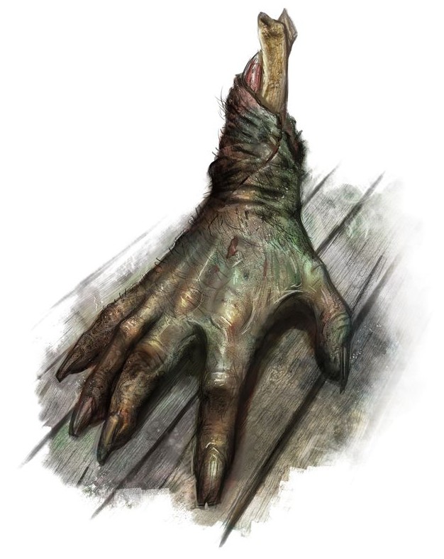
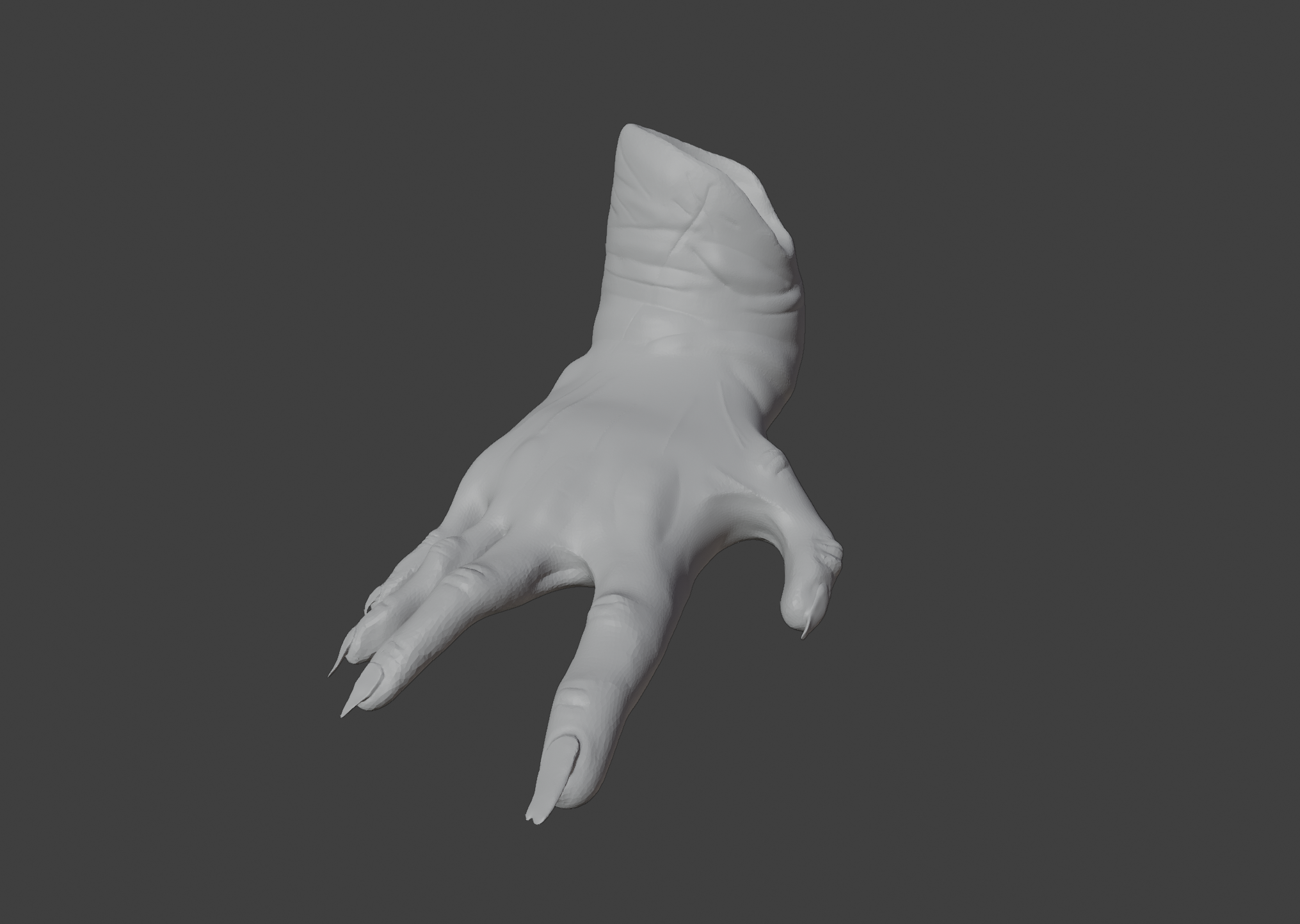
Great work , this looks really nice. Something about the thumb feels off to me though, like it is a bit small/thin in proportion to the rest of the hand.
To be fair, it is a merit of the original designer. I simply copy the components of the tanks piece by piece since it's really easy to find blueprints on the internet, especially concerning world war 2 vehicles.
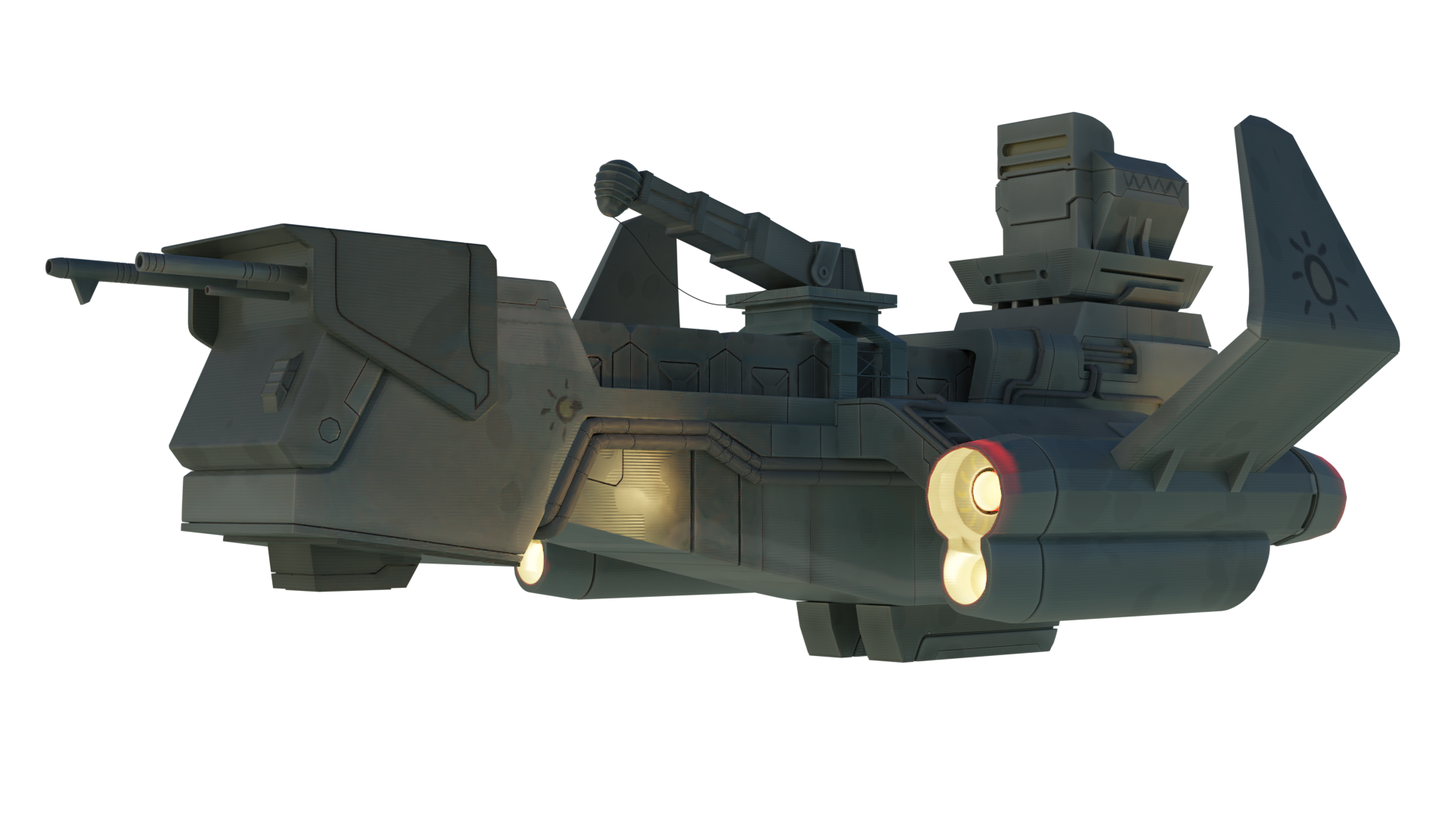
The modelling looks great but I think you could work into the texturing a lot more - it looks very washed out and there isn't much variation in the shaders in terms of roughness and metallic , glossiness etc - the whole thing seems to just have one basic diffuse shader across the whole ship, try to mix it up a little. Also , maybe make the lights more intense in the engines and add some bloom in post processing? Lastly , there are some small blue lights between the front guns and on the wing edges that you missed - adding them would help with the variation. Keep up the good work, hope this helps :)
I tweaked the parameters a little bit, I think the texture was washed out due to low contrast in some node of the material. Tell me what you think
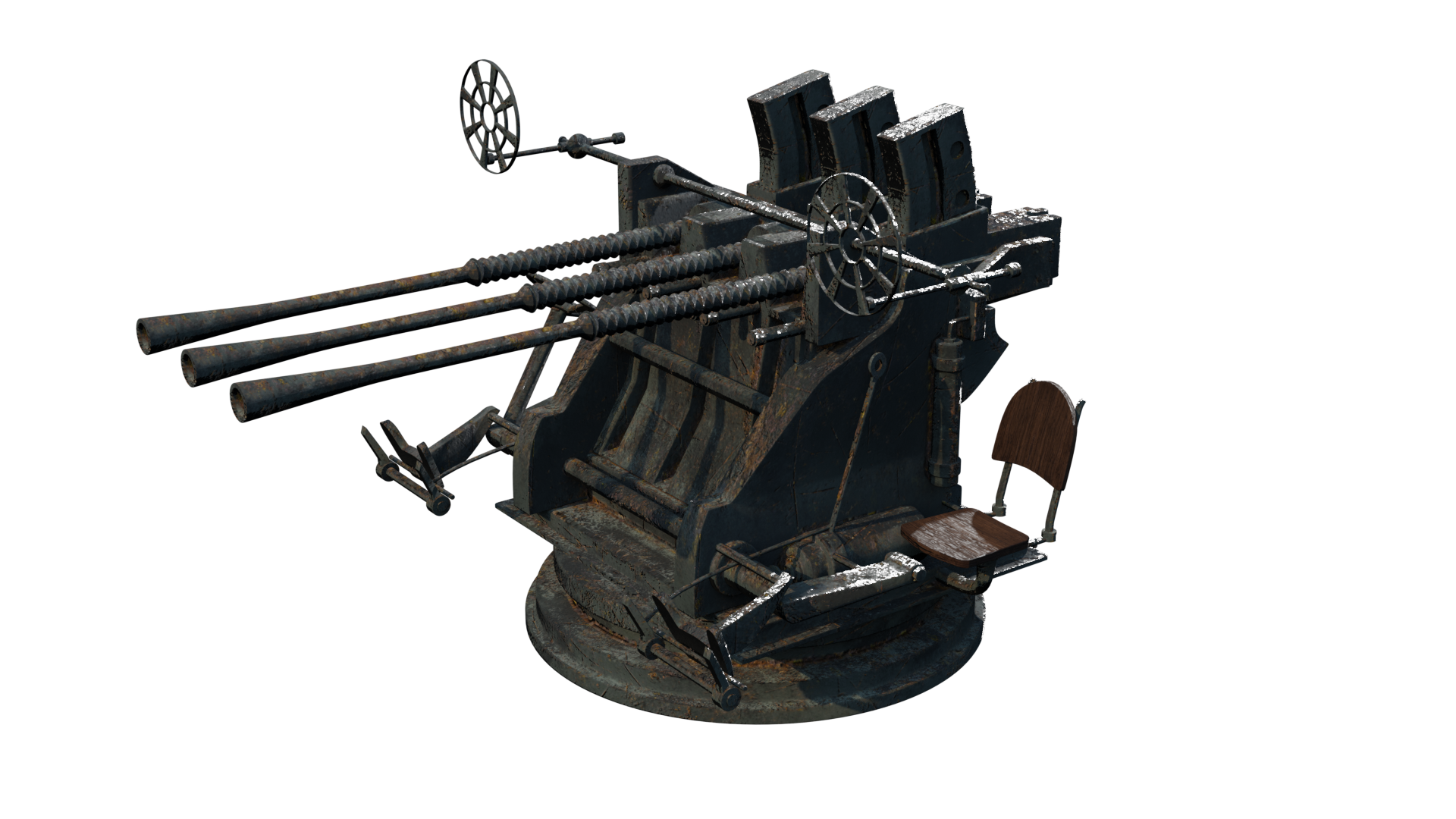
I made this anti-aircraft, I spent a significant amount of time on the materials and UV, I think this looks pretty good.
