I published a collection of my light match .blend files, as was discussed during the class. You're welcome to reference those if you'd like. Also here's links to the reels ![]() shiennar put together:
shiennar put together:
CLASS ANNOUNCEMENT #4 (Oct 31, 2018): Class is officially over! Please check the closing post and don't forget to fill out the questionnaire 🙇🏻♂️
CLASS ANNOUNCEMENT #3 (Oct 9, 2018): Grades for week 1 homework are recorded. Feel free to keep an eye on this spreadsheet (BC4-1810 tab at the bottom) throughout the month. Please let me know if I miss anything!
CLASS ANNOUNCEMENT #2 (Oct 3, 2018): 4 mighty Citizens have heeded the call to become Volunteer Assistants (VA's). They are: ![]() silentheart00,
silentheart00, ![]() thecabbagedetective,
thecabbagedetective, ![]() csehz, and
csehz, and ![]() galledark. This means that between the 5 of us, there should always be a helpful presence both in this homepage thread and your individual homework threads throughout the month. Thank you VA's!
galledark. This means that between the 5 of us, there should always be a helpful presence both in this homepage thread and your individual homework threads throughout the month. Thank you VA's!
CLASS ANNOUNCEMENT #1 (Oct 1, 2018): Class is officially in session! Check the syllabus below for Week 1's focus and assignments. Begin watching the pre-recorded courses if you haven't already and I'll see you tomorrow at the first Live Event! 💡
Welcome to the CGCookie Class: Shading & Lighting with Blender! The art of shading and lighting your Blender scenes and models can make or break your renders. It's a very important - even enlightening - skill to develop as a 3D artist.
This "Class" format invites all Citizen members to focus together on a particular topic/skill for a month. Participation looks like this:
WHEN? The class will take place from October 1st - Oct 30th.

Abstract: There are some core concepts to lighting and shading (S&L) that need to be understood first. Things like global illumination, render engines, shaders, materials, and node networks some of the things we will be over-viewing this first week. I
Goal of the Week: Familiarize (or re-familiarize) ourselves with core S&L concepts.
Pre-recorded course to watch:
Week 1 Live Event (Remember to RSVP)
Homework:
 Abstract: The Eevee render engine is the latest and greatest rendering tech in Blender and we're going to stretch its legs for week 2. The subject is going to be a sports car, but any vehicle will do. After all many of us spent this past June modeling vehicles and we're eager to get them lit and pretty!
Some topics we'll cover along the way include materials like car paint, rubber, metal, and leather along with HDRI environment lighting.
Pre-recorded courses to watch:
Week 2 Live Event (Don't forget to RSVP)
Homework:

Abstract: Character lighting is a very intentional art and how to do it well is often a mystery. This week we'll look at how to develop striking character renders, build simple materials that accentuate your model, and even the concept "painting" you character with light for surreal effects.
Pre-recorded courses to watch:
Week 3 Live Event (Don't forget to RSVP)
Homework:

Abstract: Arch viz rendering is often a coveted skillset among lighten enthusiasts. This week we're looking at lighting interior architecture for realism, featuring natural outdoor light from windows and artificial light from light fixtures. We'll also explore creating the necessary materials for our interior.
Pre-recorded course to watch:
Week 4 Live Event (Don't forget to RSVP)
Homework:
This thread is reserved for CG Cookie Citizens that are participating in the "Shading & Lighting with Blender" class. Its purpose is to serve as central communication for all participating Citizens (excluding Hobby plan Citizens) to ask Kent and fellow participants questions and to post homework. As the instructor of the class, Kent will be monitoring this thread on a daily basis (especially Mon-Thurs) throughout the month of October to review homework and answer questions.
Free members are welcome to observe the thread but please respect that communication and participation is reserved for Citizens.
Woohoo! 2-3 weeks before Blender 2.8 Alpha 3 Beta!
https://code.blender.org/2018/10/blender-2-8-beta-and-roadmap/
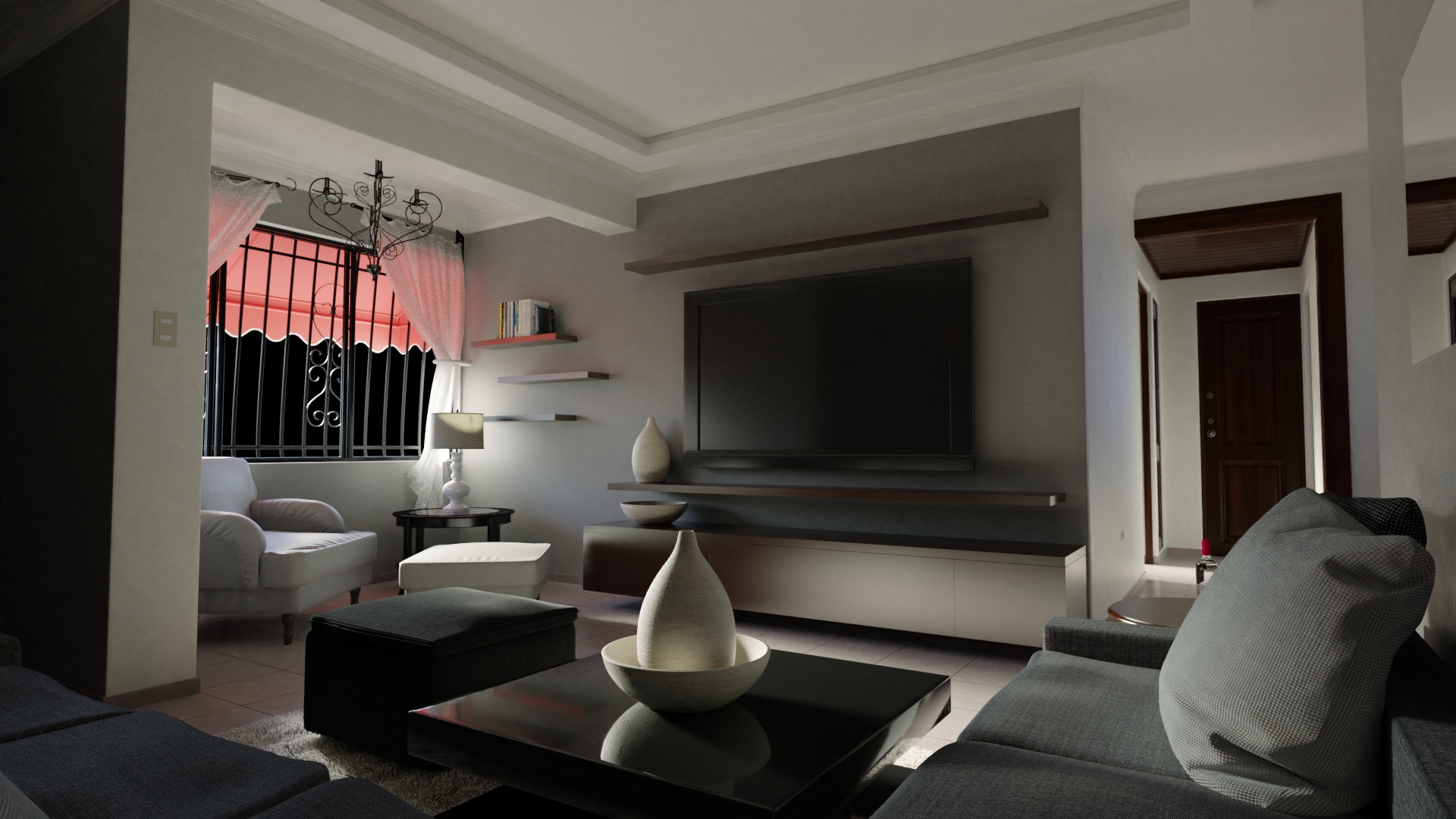
@theluthier Here's the render I had made with the furniture, I'll try to make it better for the homework because I haven't been able to figure out what is wrong with it. It probably is the lighting but it can also be the aesthetics, that is bad decoration maybe? perhaps the materials on the assets. Also Blender was giving me a hard time at rendering.

This is a render without the assets, lighting feels cleaner.

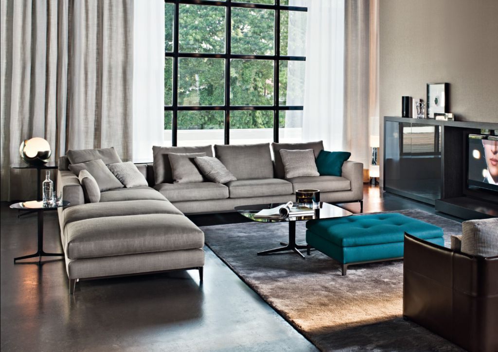
And this is what I'm aiming at, that clean, white subtle light and realistic feel in the image

![]() dostovel I can kinda see what you mean about darkening upon adding furniture. Still I don't think it's unrealistic. Perhaps lightening the furniture would help. Make it a light grey couch instead of dark grey; same for the ottoman.
dostovel I can kinda see what you mean about darkening upon adding furniture. Still I don't think it's unrealistic. Perhaps lightening the furniture would help. Make it a light grey couch instead of dark grey; same for the ottoman.
Also what are your bounces up to? Using the "full global illumination" preset should brighten up significantly if you're not using it already.
@theluthier It's at full global illumination, 128 bounces all over. Denoising makes it look all smooshy and sploshy, so I was going to bump up the samples really high so denoising doesn't have to work so hard.
Maybe I'm being too hard on myself, but I think it looks really bad. I'm aiming at the quality of the renders you showed on the presentation. I'm going to start the scene from scratch, take out all the furniture, re-think the interior decoration and re-think the lighting and check the materials as well as Blender settings.
@theluthier there is "45" instead of "Week2" written in a spreadsheet
![]() dostovel I really think the S&L is NOT the problem with your render. I think it's the architecture style and decor. Everything I showed in the presentation is intentionally decorated as if for a magazine. Looking at your render I classify it as a very realistic but generic apartment. It reminds me of where I lived in college. Nothing against apartments like this but is it something you'd find in a decor or architecture magazine? Not likely.
dostovel I really think the S&L is NOT the problem with your render. I think it's the architecture style and decor. Everything I showed in the presentation is intentionally decorated as if for a magazine. Looking at your render I classify it as a very realistic but generic apartment. It reminds me of where I lived in college. Nothing against apartments like this but is it something you'd find in a decor or architecture magazine? Not likely.
That's the big issue imo. Let the "magazine factor" guide your archviz efforts.
@theluthier well I started blocking and position the main lights, lets see how far can I take it into realism then

@theluthier Alrighty, I'll put the efforts to try and get the feel of "wow look at this place, let's get outta here, this guy is surely doing something illegal" lifestyle apartment look.
![]() dostovel well damn. Just look at that. It's amazing. Don't think it's bad I asked 4 people here and all of them loved them. Really don't think it's bad. It's really great. At least I love what I am seeing
dostovel well damn. Just look at that. It's amazing. Don't think it's bad I asked 4 people here and all of them loved them. Really don't think it's bad. It's really great. At least I love what I am seeing
yyukinoh1989 Thanks Yukino. I guess there's no other way with art than to always be unhappy with what you do becuase you're the one that made it. Maybe it's the only way to get better and better.
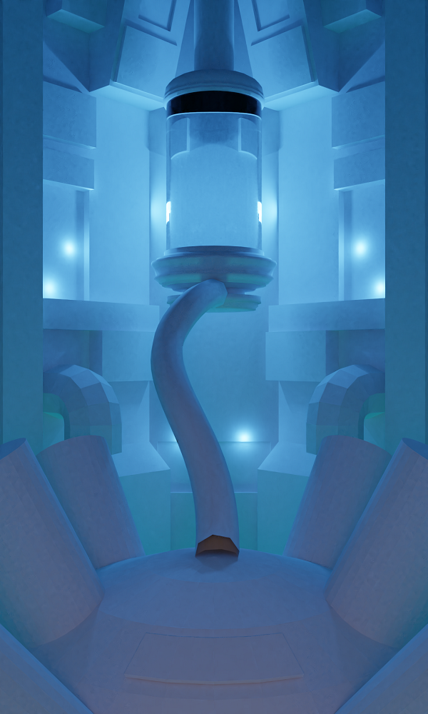
Hey ![]() n647 is that from Final Fantasy 7? where Sephiroth was kept or somewhere along those lines?
n647 is that from Final Fantasy 7? where Sephiroth was kept or somewhere along those lines?
@theluthier Glad you liked them :D
(weird... seems the issues some were having last week are still going on... that tag didn't show up in my notifications.)
mmalhomsi wow that's a good question! Hadn't thought about that yet..
With my 'real' camera I would pick my 50mm for close ups of certain details and my 35mm for a wide angle shot to get the whole room in the photo (while standing with my back against a wall to get the most in 😛). But you get some distortion with the wide angle lens and I don't think Blender has a correction function for that like Lightroom has for instance? So I'm very curious what @theluthier would pick for a 3D scene, guess totally different 😬 Also I never really photographed interiors so what do I know? 😜
"
ssmurfmier1985 thank u for ur answer :) i m modeling my "blender corner " at home and i'm using true world scale in my scene , but i'm having hard time setting my camera angle and focal length ! i know Nothing about photography :(
mmalhomsi Cool idea!!
There are lots of videos on YouTube which can get you up to speed in no time 😀
A list of common settings:
Focal length
F-stop
Note that I am just an amateur photograph hobbyist, so I'm at no expert at all, not even close! These are just some values I've learned through observation and have come to like throughout the years. Hopefully they can give you a starting point.