I have been directed into the world of art by God himself, but I have not been practicing enough to actually get good at it. When I saw The Habits of Effective Artists by Andrew Price, I knew that I had finally found a way to force myself to fulfill the command and get rid of my laziness. I will start fresh in this polybook, where I will upload my Blender progress daily. Each day, I will create stuff with Blender, draw, develop games (probably not with Unity), and compose music. Eventually, I will use those skills to create movies and games. I will make sure all of my goals have a direct purpose, which I will publicly announce.
May we all fruitfully produce many beautiful works of art.
-Williamatics
I'm beginning to second-guess my decision to make the bricks a texture. Perhaps it should be adobe/mud/plaster instead. What do you think?
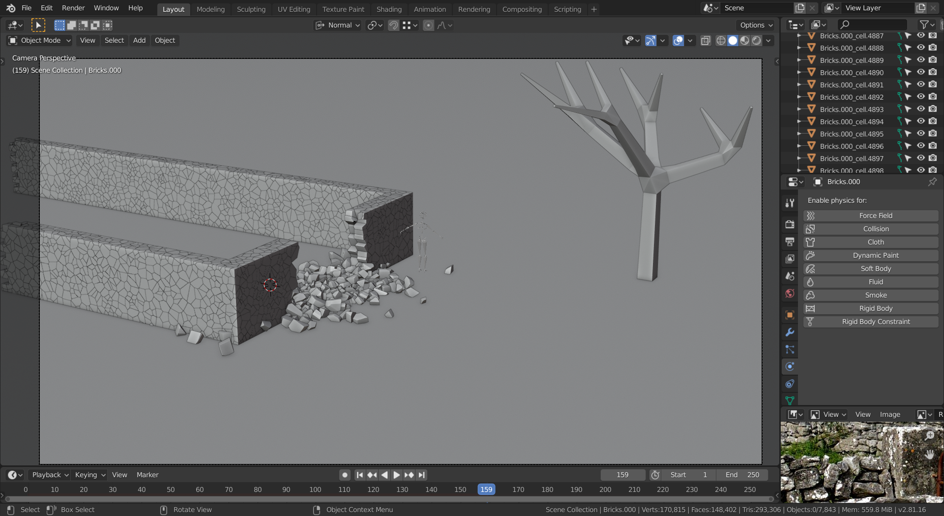
Don't do it instead, do it in addition to. Maybe have a gradient that starts from the bottom one material and is another one at the top.
How would that work? I find it hard to imagine a wall that is bricks at the bottom and adobe at the top...
Sorry, I was thinking of something different.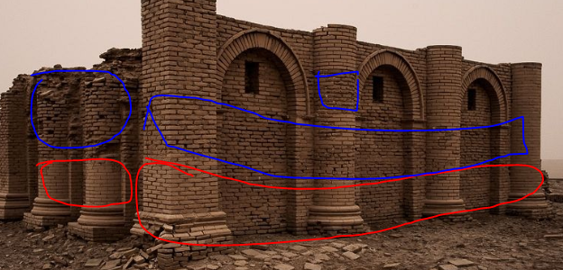
I was thinking you could do it like this, where it's smoother at the base, then around where it collapsed and higher up it has less mortar keeping it together.
Maybe this can help you get started with the cracks. It's just a basic set up, you can easily create a mask, so the cracks aren't all over the place. Add some color variation. Some small dents and a larger scale, slight 'waviness' to the surface, etc...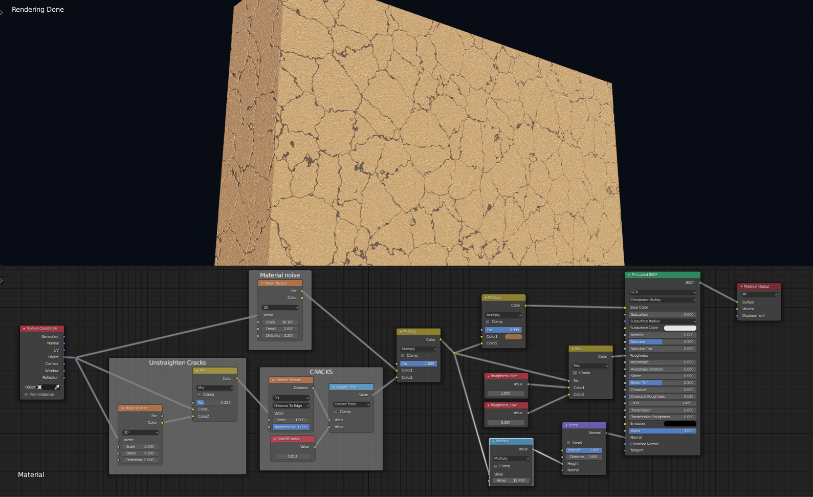
I'm trying to make it look good around the edges, but for some reason pointiness doesn't do anything. Do you know why?
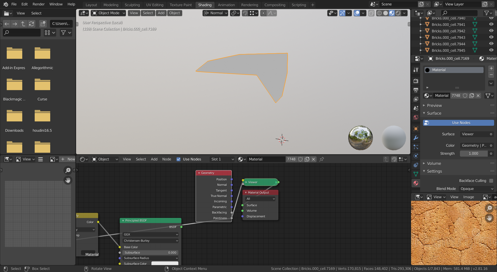
Hi William, Pointiness doesn't work with Eevee (yet). Material Preview Mode also uses Eevee.
Now I see what you are talking about. That makes more sense to do it that way.
How, then, can I keep it from looking like this? (Other than rendering it dozens of times to check whether I got the values right.)
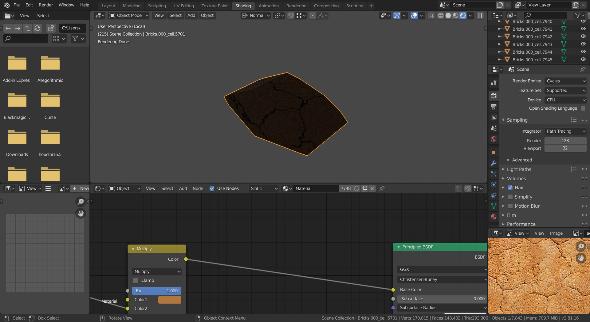
HI William, make sure your lighting is right first. I'd use an outside HDRI from HDRI Haven for instance.
The material doesn't look too bad from what I can see, but light is missing. (Maybe you only have a grey World, even with a Point Light added won't give an accurate picture.)
I'm talking about the lack of respect for edges the material has.
As much as I hate to say it, I give up. I've been working on this for way too long with no results. I'll try one project per week and see how that goes.
Which course should I take next? I know what almost everything does, but I'm bad at actually making things look good.
I just realized I've been working on the jellyfish for more than a week...
I can't get the sky texture to look right. It always either looks like this:
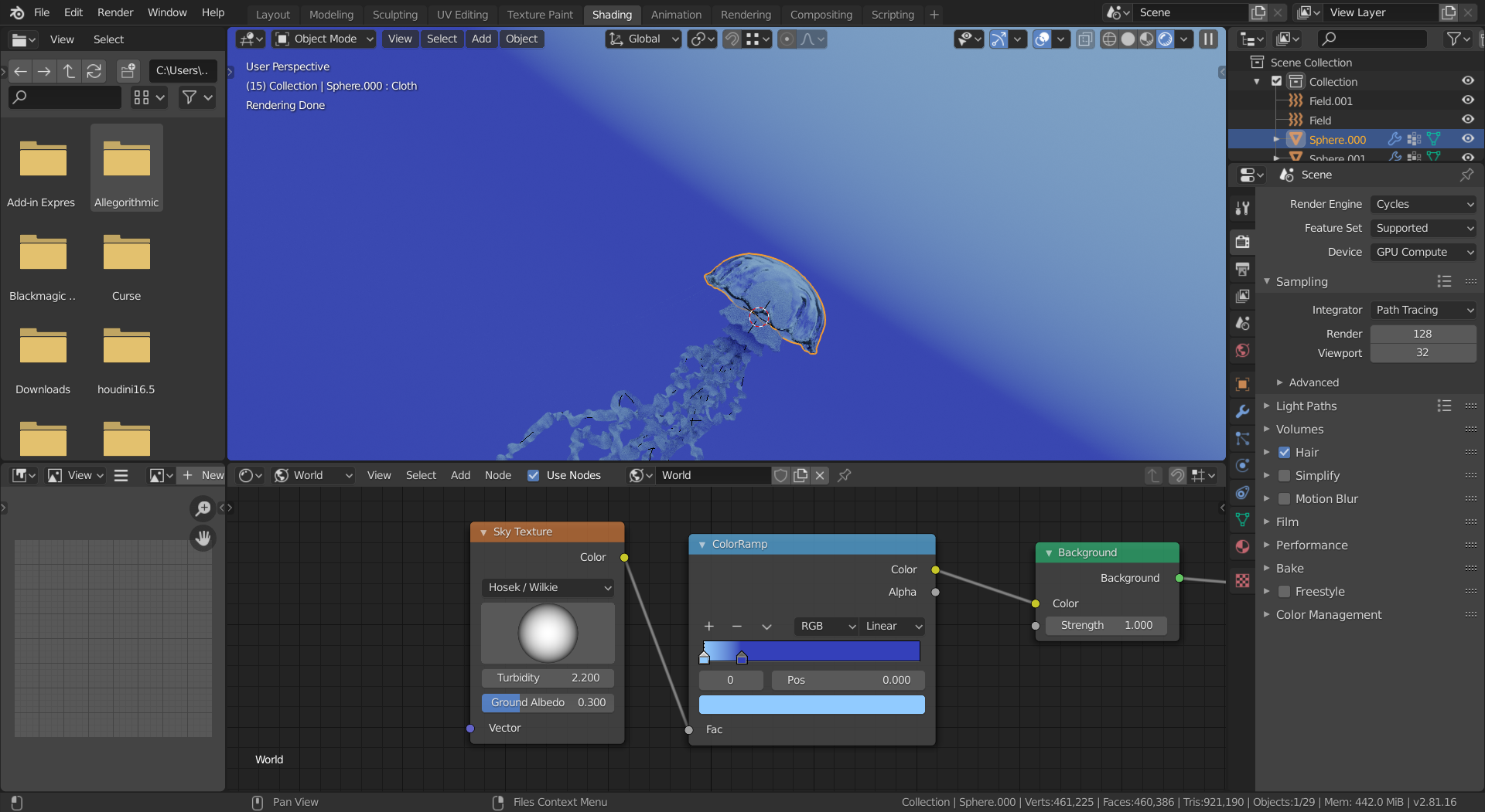
Or like this:
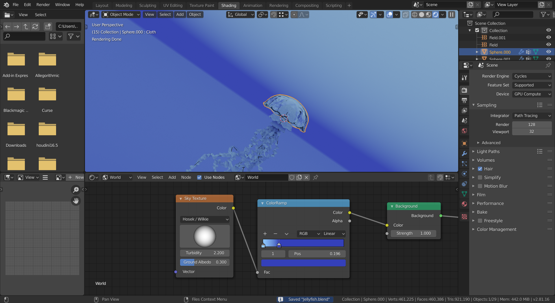
I've decided to enter the CG Boost competition. The theme is "library". I gathered a bunch of reference images and set up the general layout of the scene.
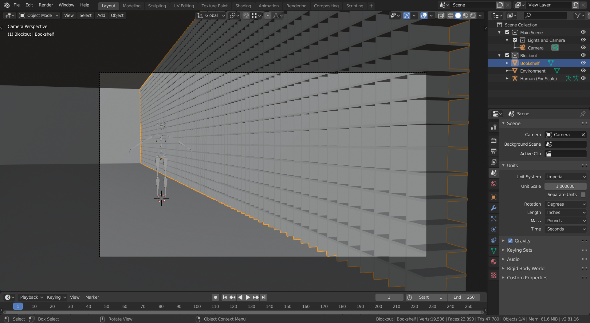
Next I will add detail to the bookshelves. However, I don't know exactly how to do it or where to start. It looks way to even right now, but I don't want it to look chaotic. I want it to look ancient.
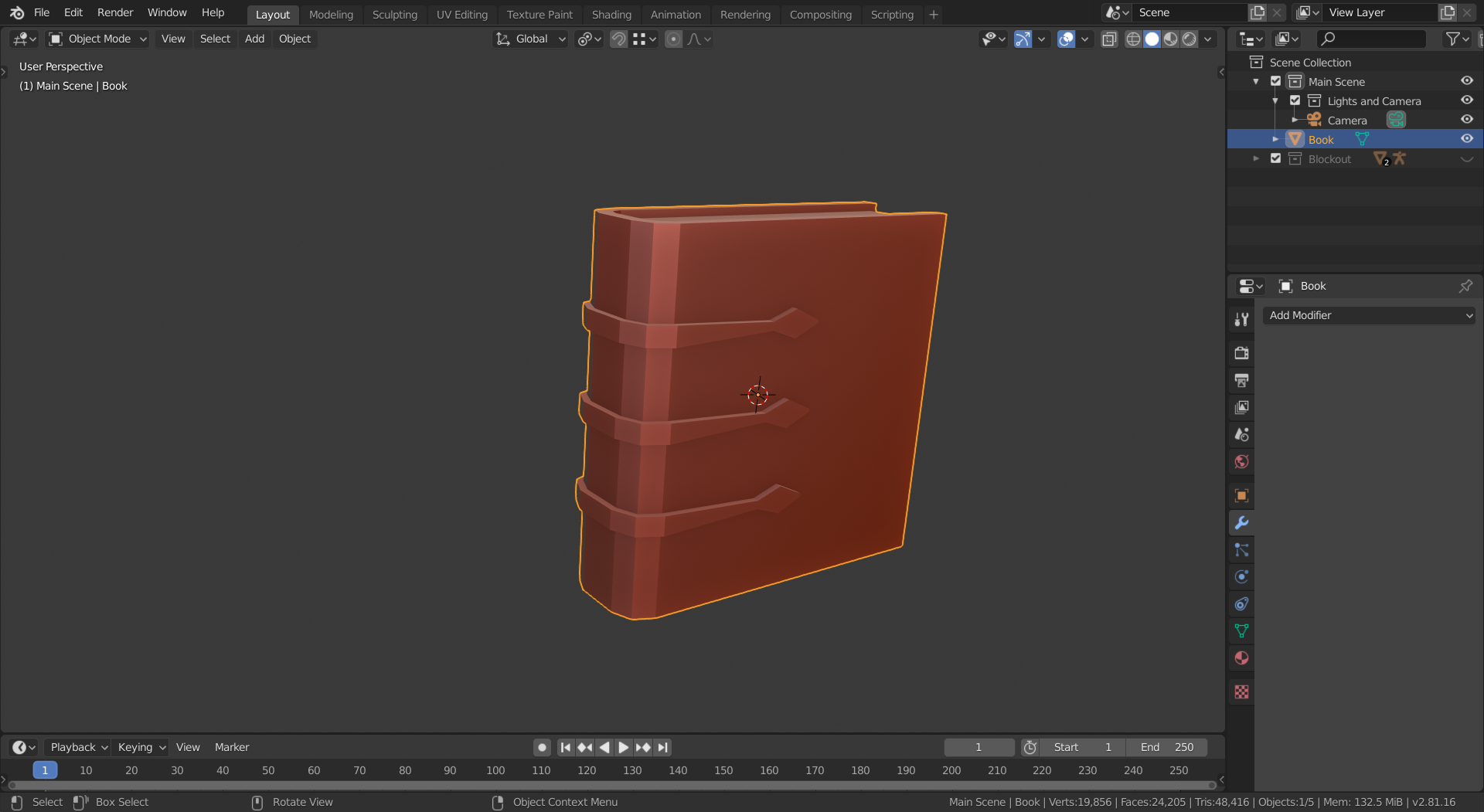
Since I couldn't figure out how to make the bookshelves, I made a book.
Hi William, the desk seems rather small compared to the chair; the seat of a chair would normally be around 40 by 40 cm and that would make me estimate the top surface of the desk about 40 by 60 or 70 cm and that is not a lot for a writing desk...
(A propos writing desk??? In a library??? Well, it's your artwork, so make what you like, of course!!!)
Also you'll probably need more than one book in a library, a lot more than this even:
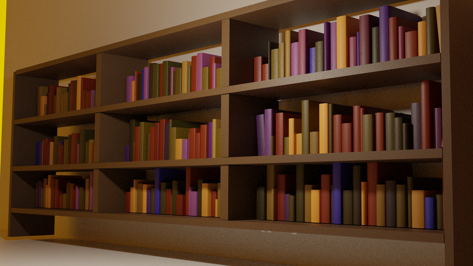
(Sorry, I was just trying out how I would make many books in a relatively easy way...)