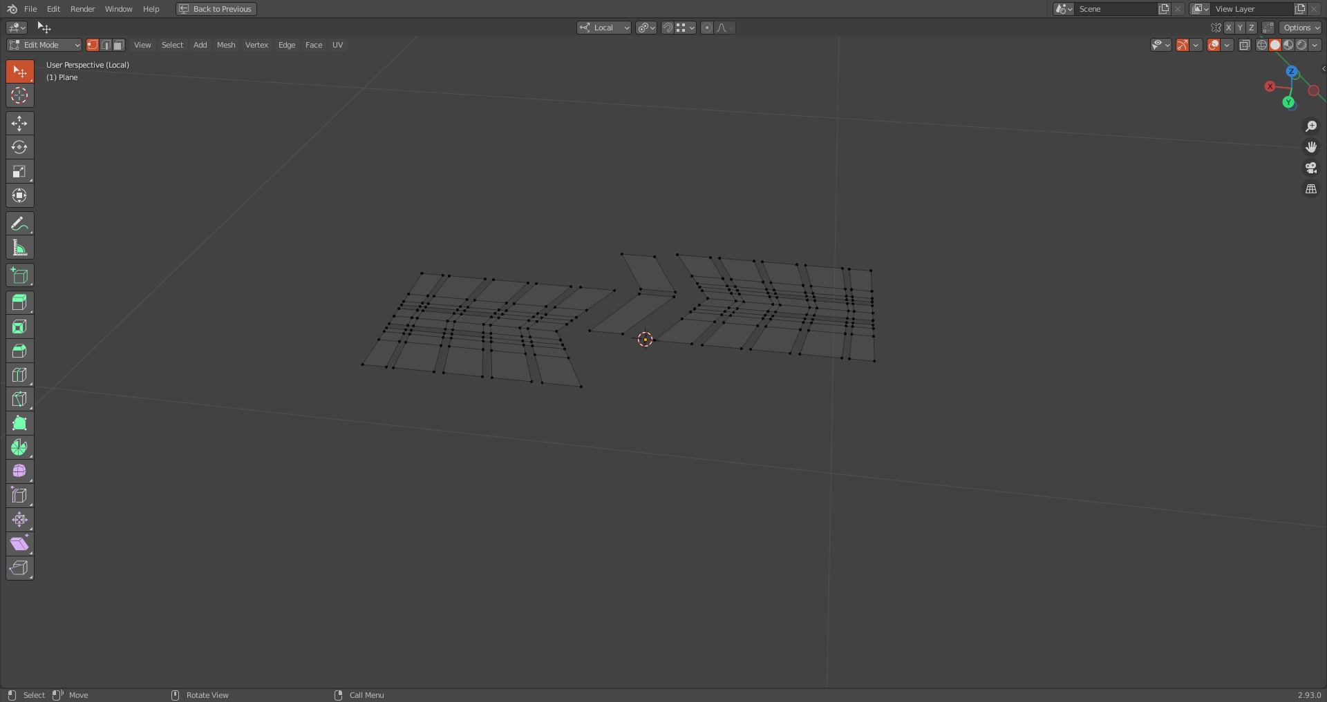
Hello there, welcome to my beginner Polybook. Let's hope it will be a long and learning journey with you here!
![]() otowa Those tiles take over the scene because, well, they take over the scene haha. There's too many of them in that last render and my eyes struggled initially to focus like they could on your previous posting of the table. I like the low poly feel. I think the tires could use some more 'tire rubber' and cut up higher into the table side wall up and forward/back but otherwise I think this looks awesome. I also think the lighting can be toned down a little.
otowa Those tiles take over the scene because, well, they take over the scene haha. There's too many of them in that last render and my eyes struggled initially to focus like they could on your previous posting of the table. I like the low poly feel. I think the tires could use some more 'tire rubber' and cut up higher into the table side wall up and forward/back but otherwise I think this looks awesome. I also think the lighting can be toned down a little.
![]() blanchsb Thank you for your input. Well, for the moment, there's only a few tables, and no walls, so the tiles will diminish in visual cluttering when more assets will be there, I guess. As for the lighting, it's kind of a placeholder for the moment, helping me to understand if the general style works.
blanchsb Thank you for your input. Well, for the moment, there's only a few tables, and no walls, so the tiles will diminish in visual cluttering when more assets will be there, I guess. As for the lighting, it's kind of a placeholder for the moment, helping me to understand if the general style works.
Started working on the small assets, now that most of the big ones are done...
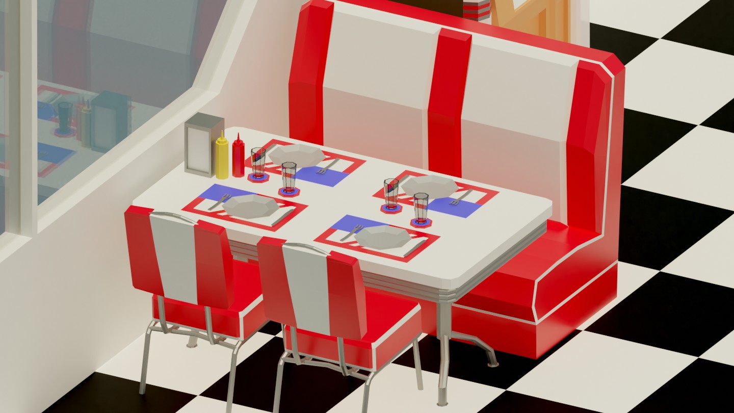
![]() otowa I figured you were adding more to the scene. Looking great though. I like the small assets on the table. Ketchup!
otowa I figured you were adding more to the scene. Looking great though. I like the small assets on the table. Ketchup!
One of the last WIP I'll share here I think, before diving to the final details.
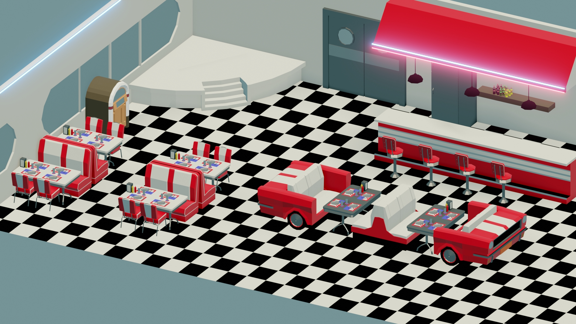
![]() otowa Jukebox! One other side comment I think. Maybe randomize the smaller assets just a little. It is easy to tell that the ketchup mustard and napkins are all on one side of a table. Unless you are going for a symmetry theme it would make it feel a little more unique to switch those up just a little.
otowa Jukebox! One other side comment I think. Maybe randomize the smaller assets just a little. It is easy to tell that the ketchup mustard and napkins are all on one side of a table. Unless you are going for a symmetry theme it would make it feel a little more unique to switch those up just a little.
The use of space in this wip is much better.
Due to personal stuff, I've not been able to Blender much these days. However, my boss (I work in science), who knows I do some 3D modeling, asked me if I could make a logo for an upcoming project...
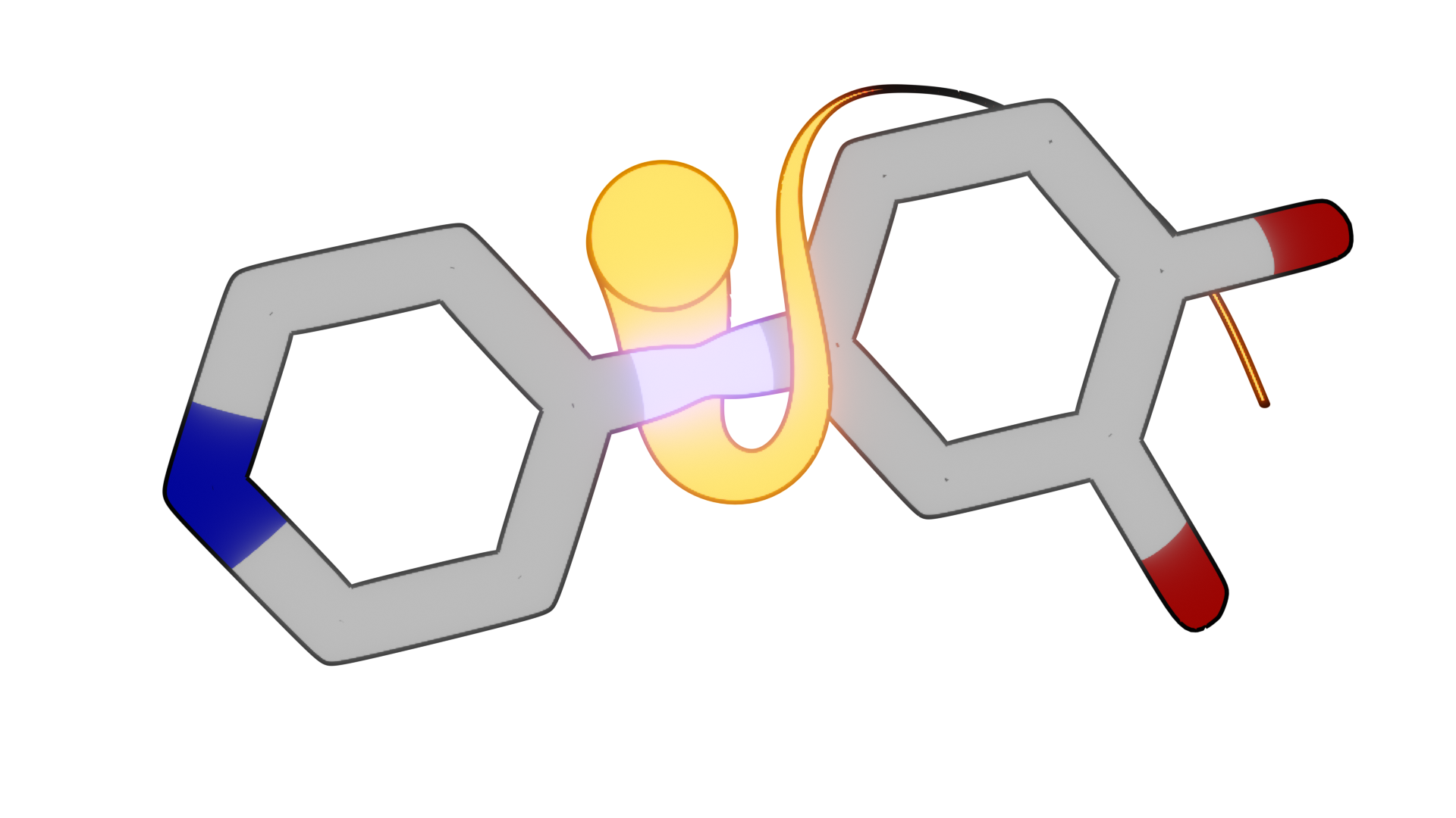
It stills need some refinement, but I'm close to the final version...
OK, so back to my Blender stuff, and specifically my low poly American Diner.
Got a little more progress, but I start to feel kind of stuck now...
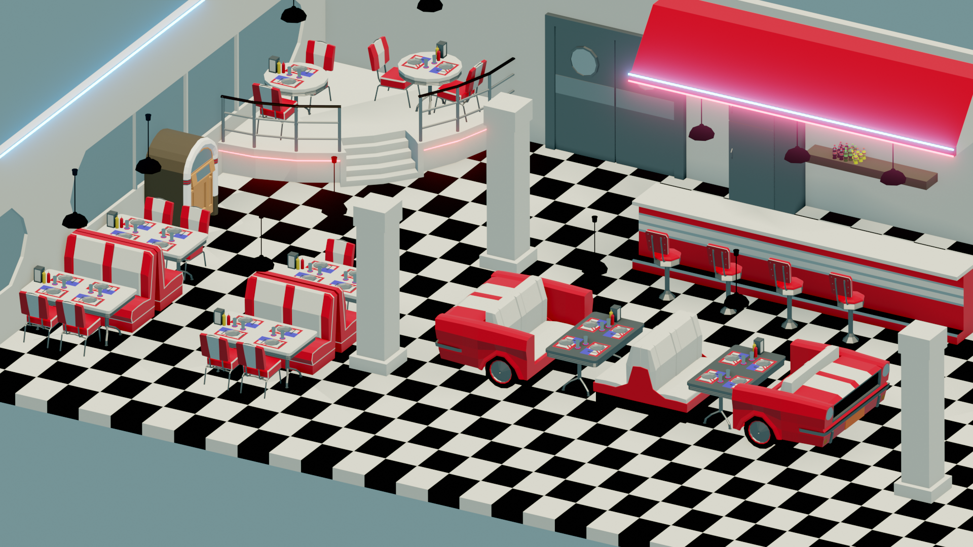
Wow... I'm back.
These last weeks/months have been pretty crazy at work... But fantastic outcome made it worth it.
Anyway, I'm back to Blender. I hope more regularly.
I started tweaking my Diner, hope to get it finally done before Christmas.
Changed wall colors, lights, added tiles on the platform, starting working on the furniture behing the counter...
I'll change the part above the counter to a prices display I think, add lots of things on and behind the counter, and prepare props for decorating walls and pillars...
I hope my fellow american modellers won't hate me for the over-simplifaction of their license plates for the sake of this project...
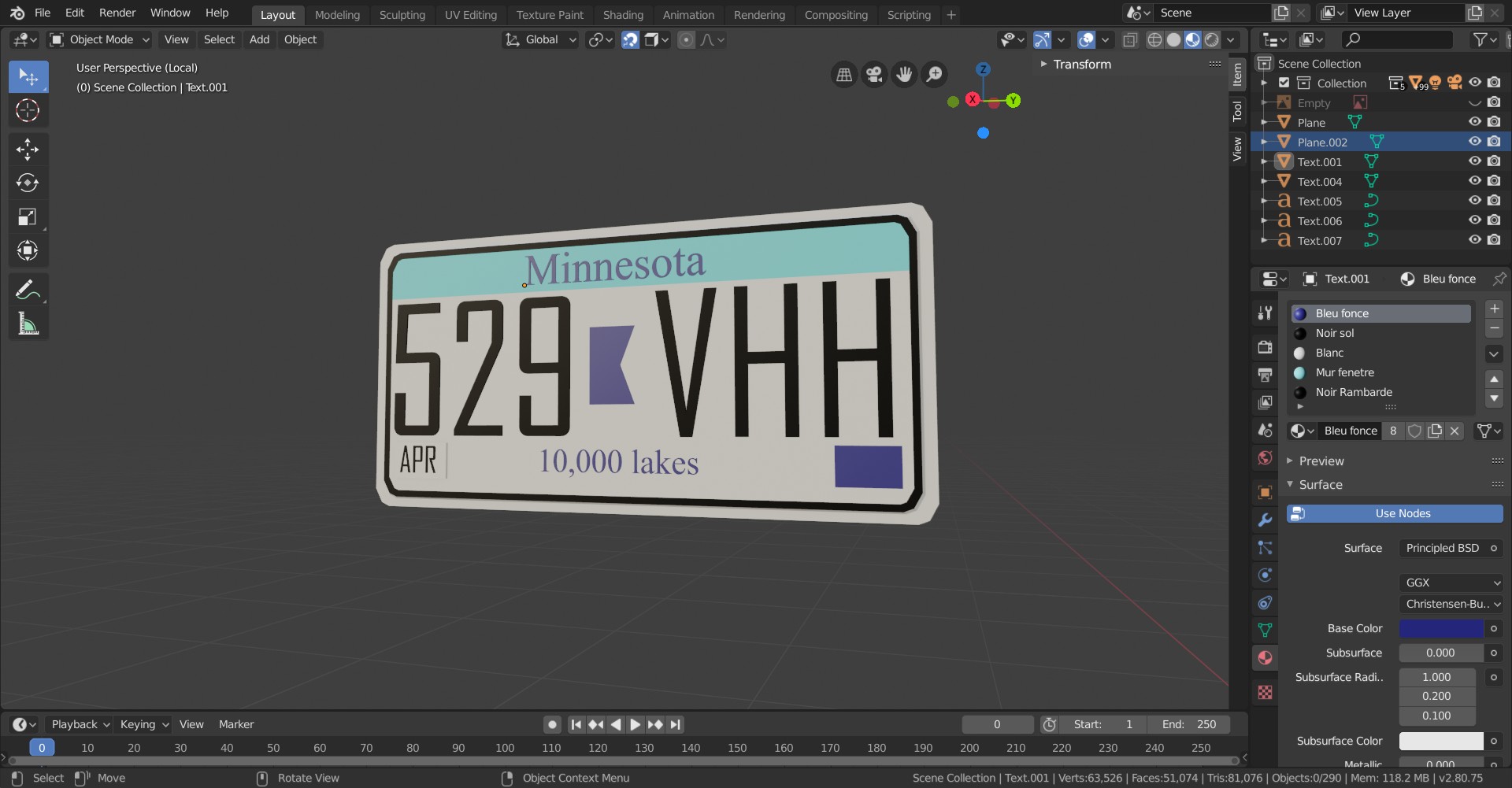
Today I took a step forwared by cutting the walls and the ground so it fits in the frame, as this type of low poly render should...
Thinking about furnitures to fill the empty spaces... Hmm...
The counter part is where there is the most job to do....
Eevee test :
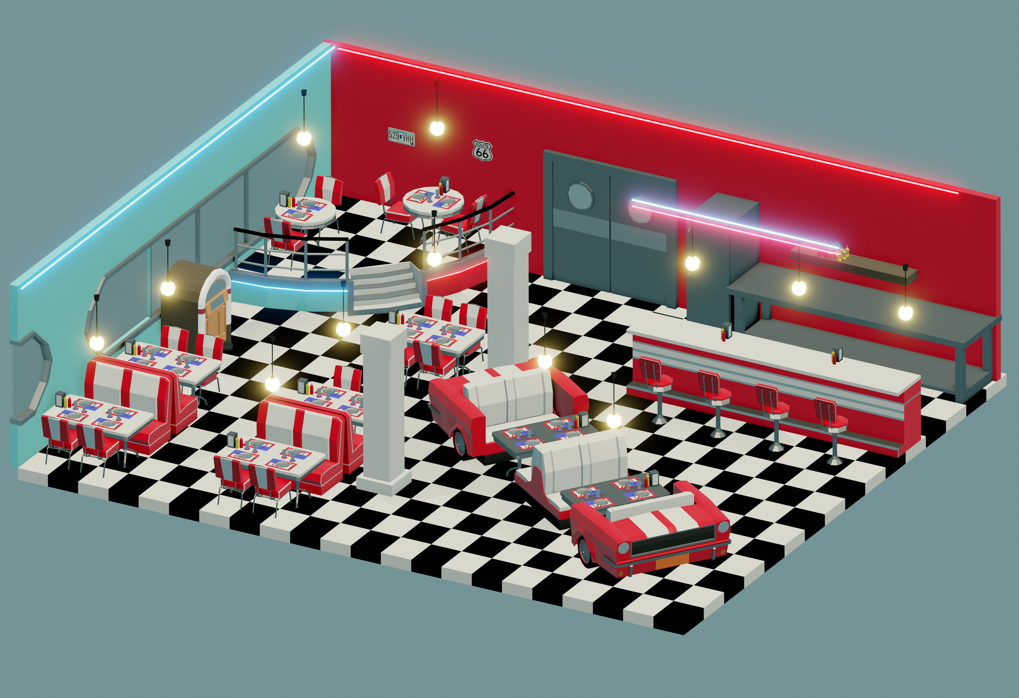
Cycles Test :
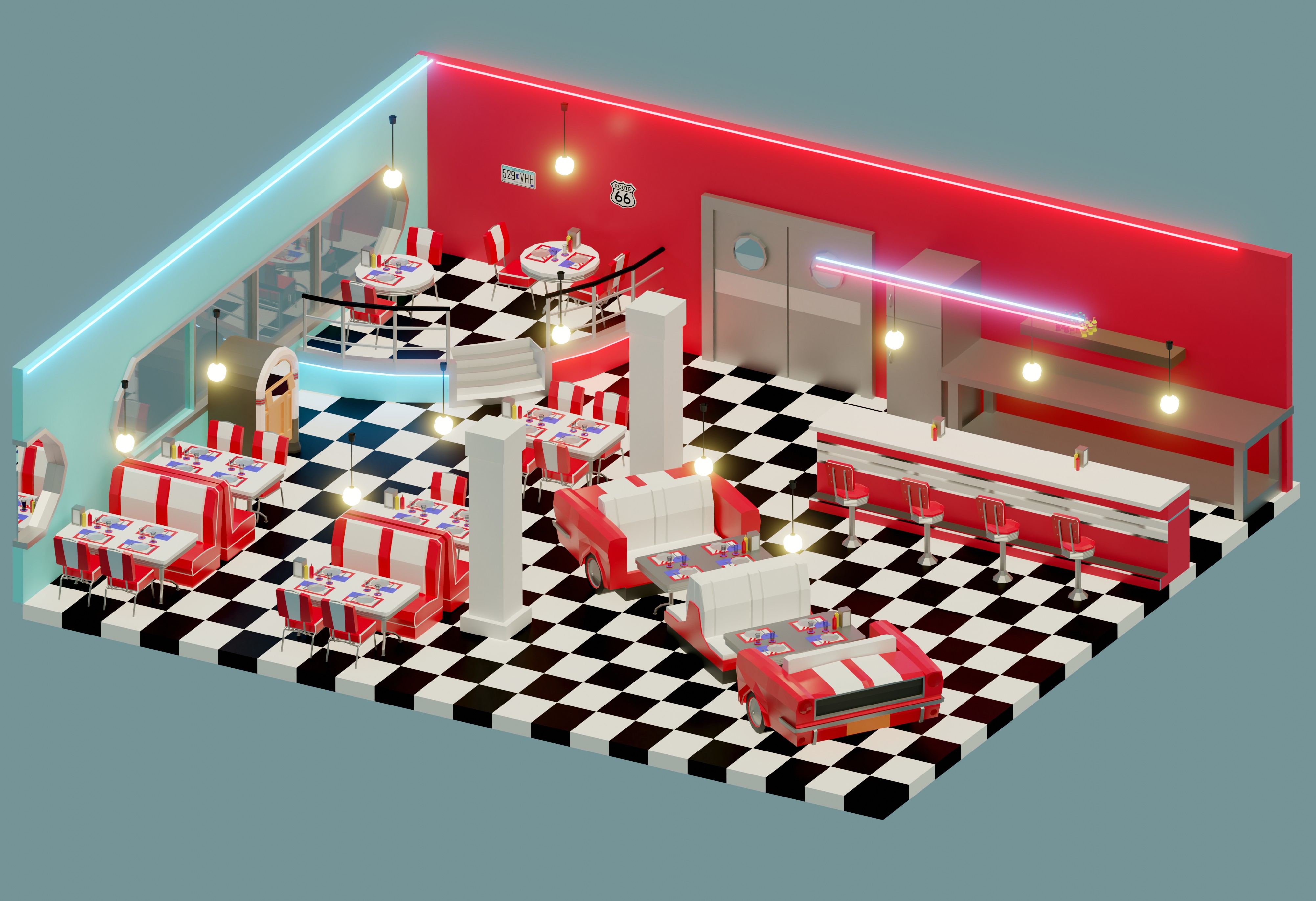
Today, in this new episode of "things that have been modeled with way too much effort", please welcome : The fully modeled prices display!
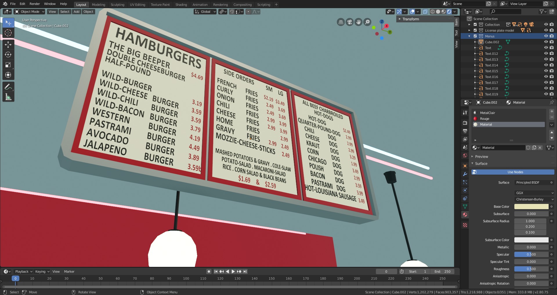
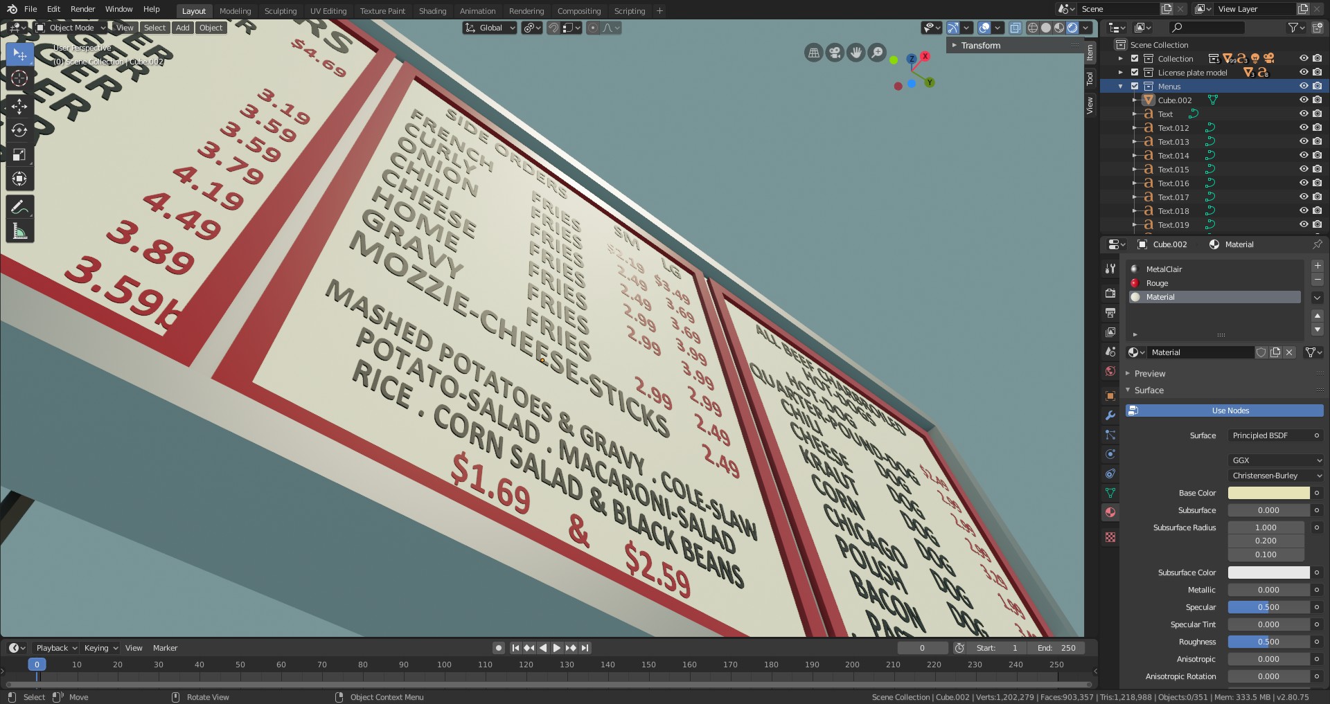
Getting some more things done before going out for New Year's Eve...
Still some decorative props needed... I'm awfully late. I need to be over with this project by the end of the week...
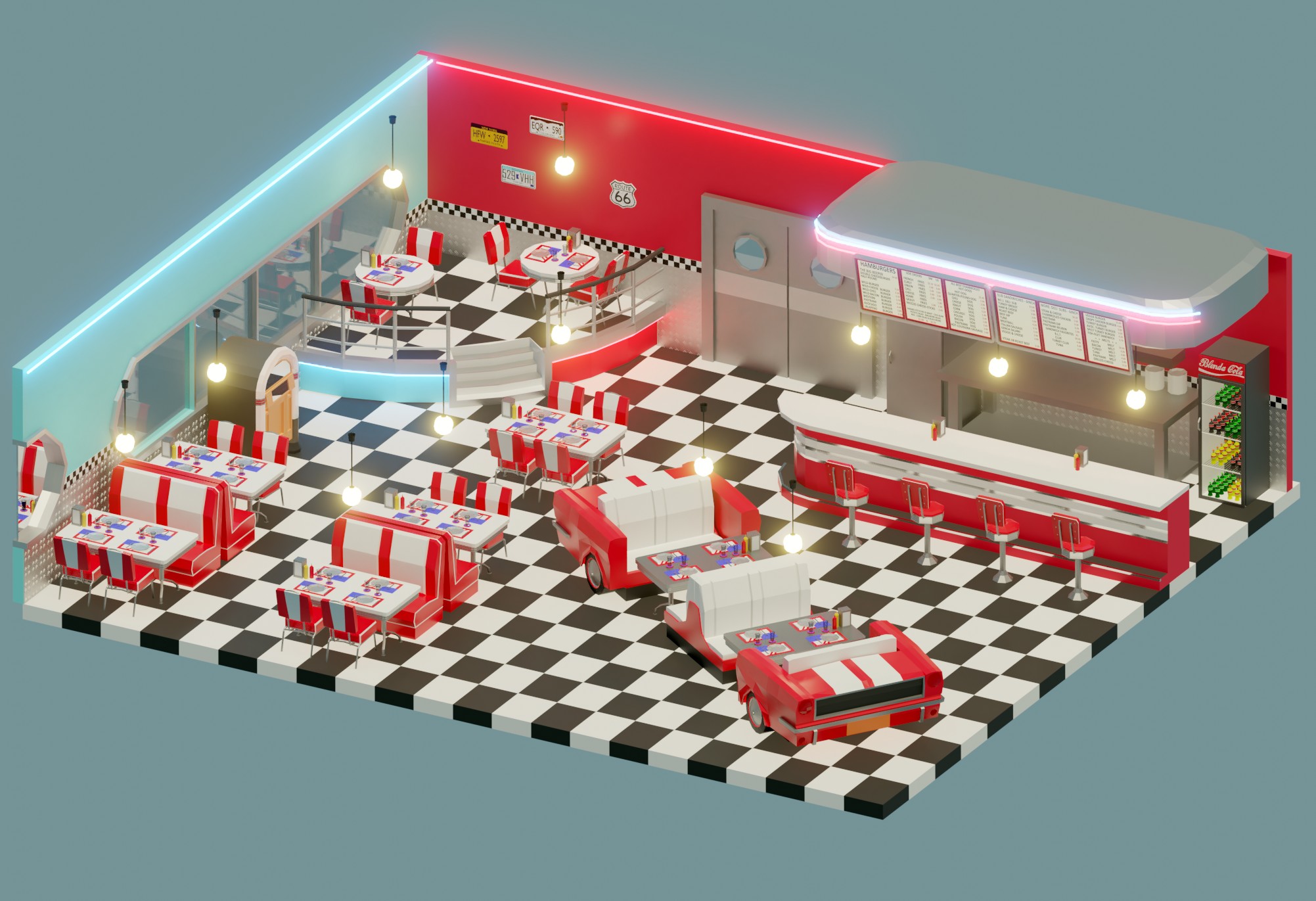
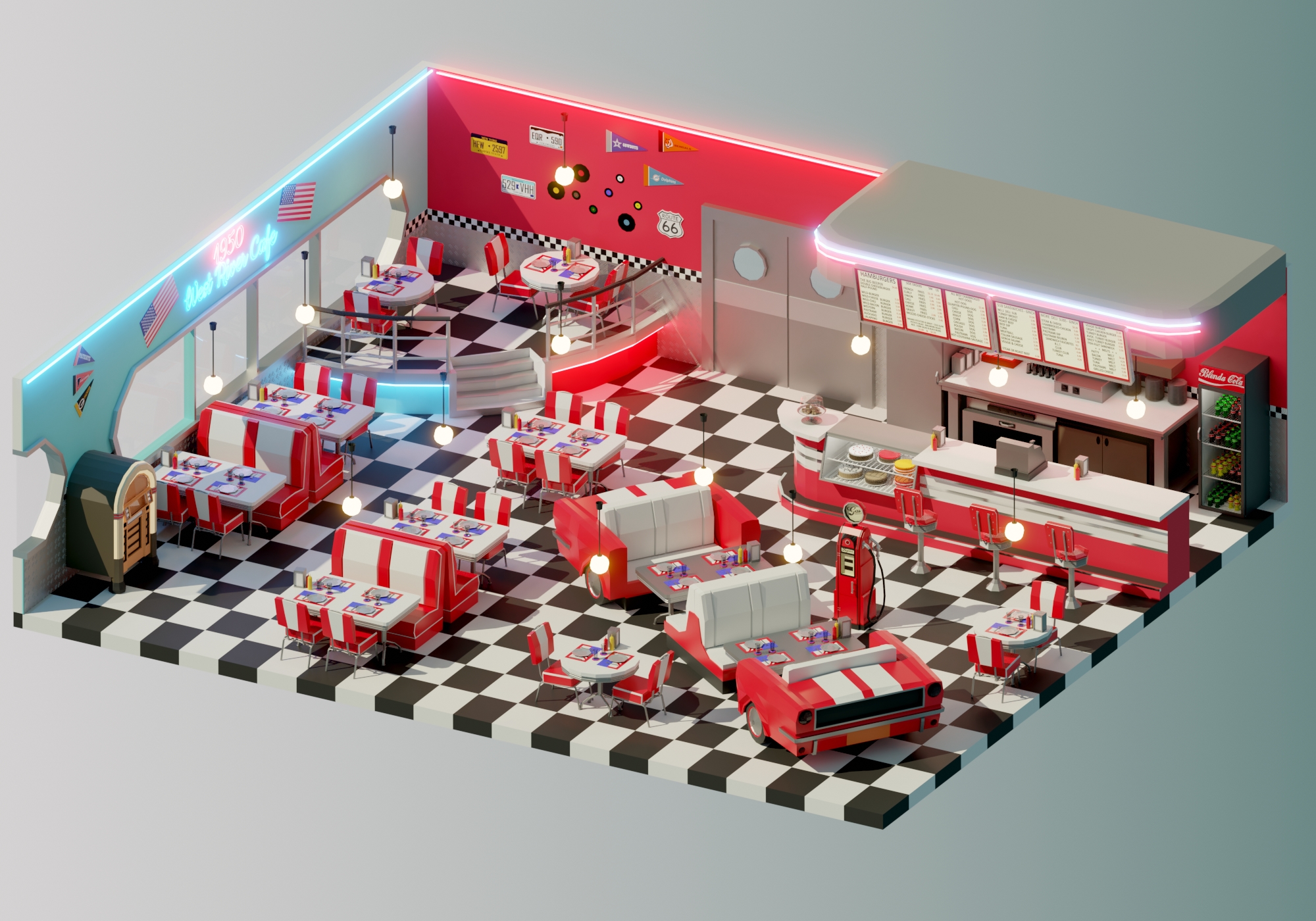
Low Poly American Diner - Finale
As my first low poly project, it was very interesting, but very time consuming too.
NEW PROJECT
Now that the low poly scene is done, it's time to start a very different project. I've wanted to try to reproduce a 2D complex model for quite some time.
The model is the Filigree Familiar illustration from the trading card game Magic The Gathering. The illustration is by Izzy Medrano. (https://www.artstation.com/izzymedrano )
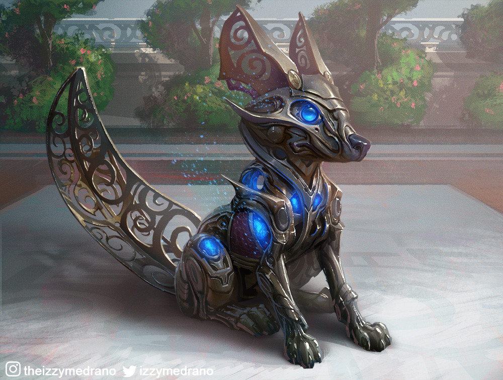
Let's see how this goes.
Ok, I'm halfway through the head work.
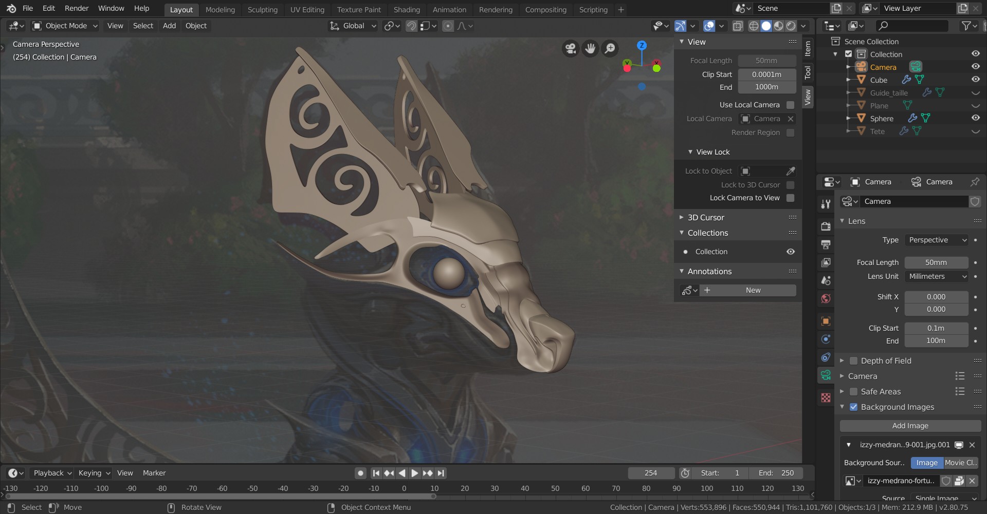
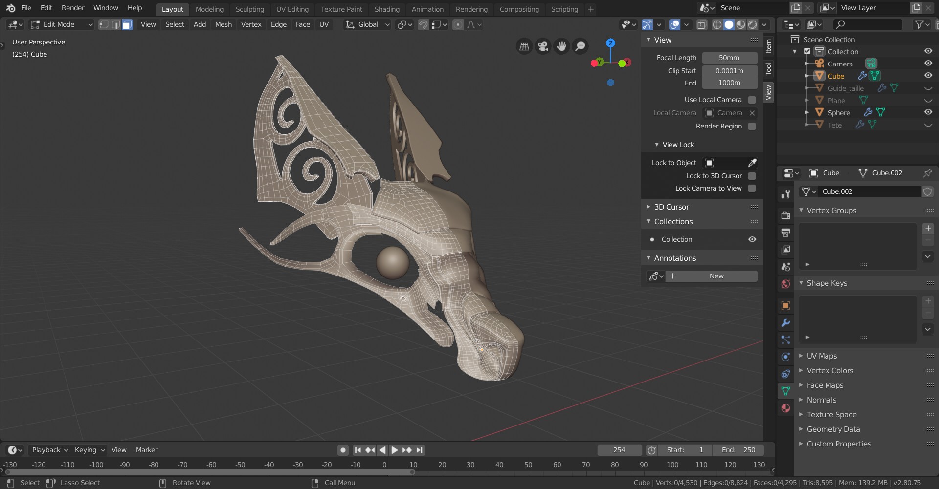
It's definitively a complex piece.... And I did quite some mistakes on the way, in terms of mesh density, and in my general workflow, but it's getting better over time. Good Exercise.
After months of nothing, I'm back to Blender.
To remove some of the rust, I decided to go through tutorials. I completed the Eevee industrial realistic render a few days ago.
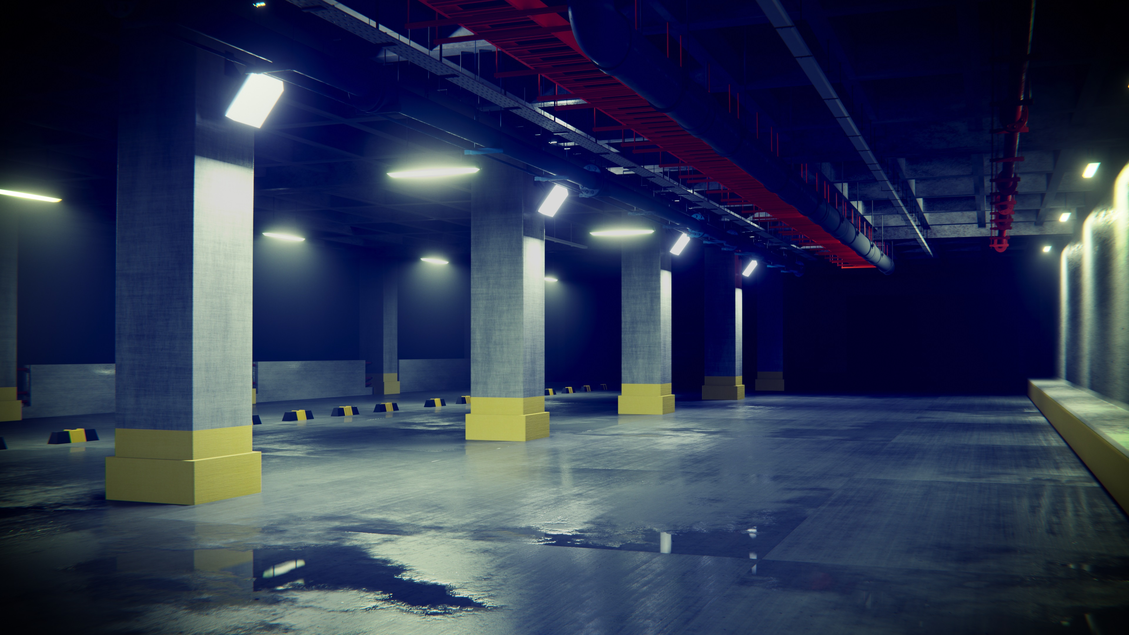
I'm now working on the modeling tutorial for Post-Apocalyptic vehicle, and I decided to go with something a little special regarding the car model choice...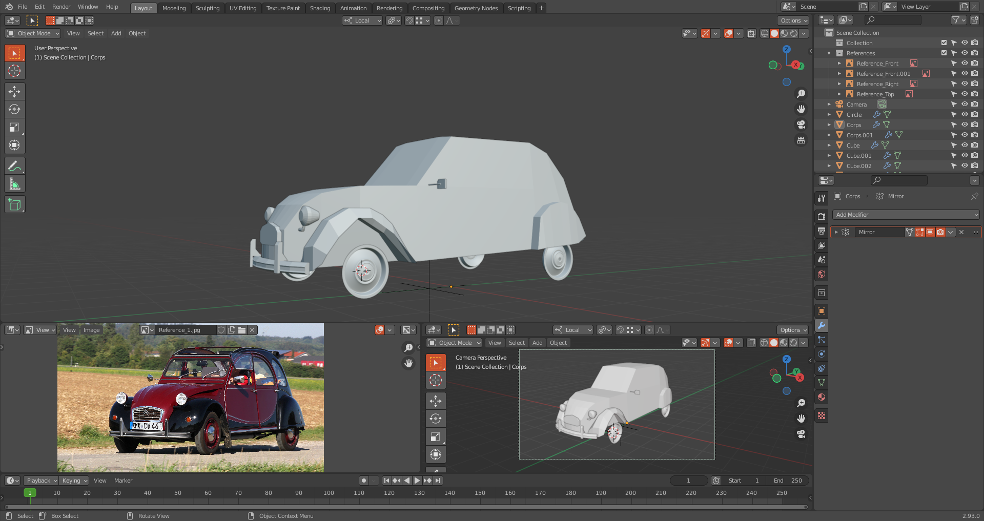
The previous mechanical/magical fox project is, I guess, dead during my hiatus from Blender. RIP little beast. Maybe one day I'll come back to you.
Help needed!!
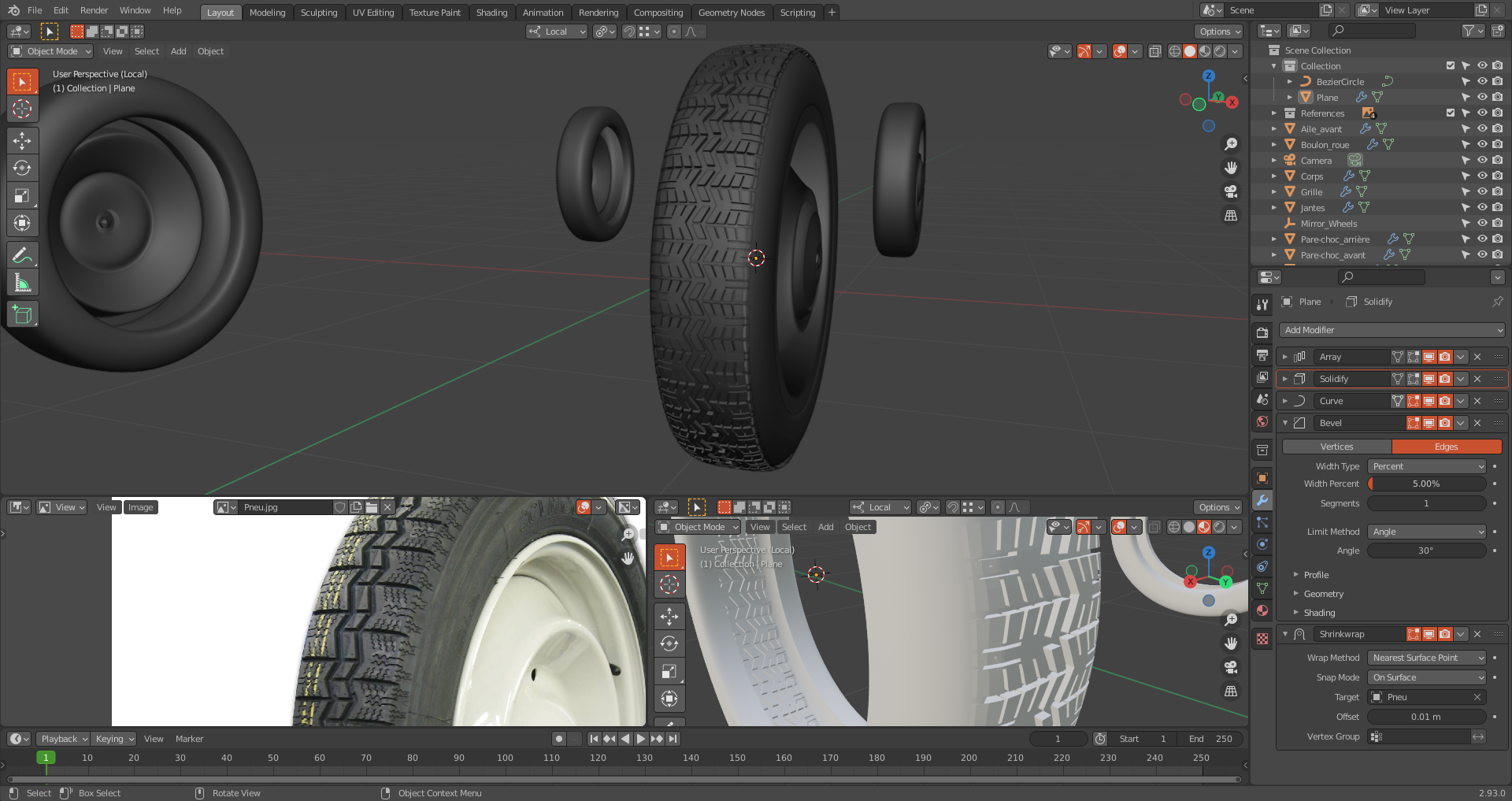
Hello people. I'm currently trying to use the post apocalyptic vehicle modeing course by @jonathanwilliamson , and I have a problem with the tire part (https://cgcookie.com/lesson/modeling-the-tires)
As you can see, the tire part is almost complete, but I have a weird behaviour on the outer side of the tread, where it seems to go... back to the center? (I'm not even sure).
Any ideas?
This is what it looks from afar.
This is what the "outer side" part looks like upclose.
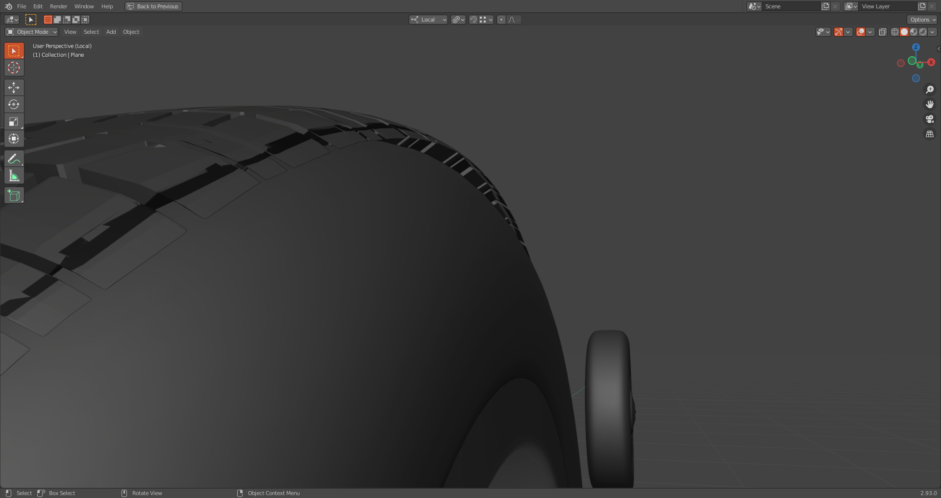
So far, my tread model is completely flat for information.
