Hello there, welcome to my beginner Polybook. Let's hope it will be a long and learning journey with you here!
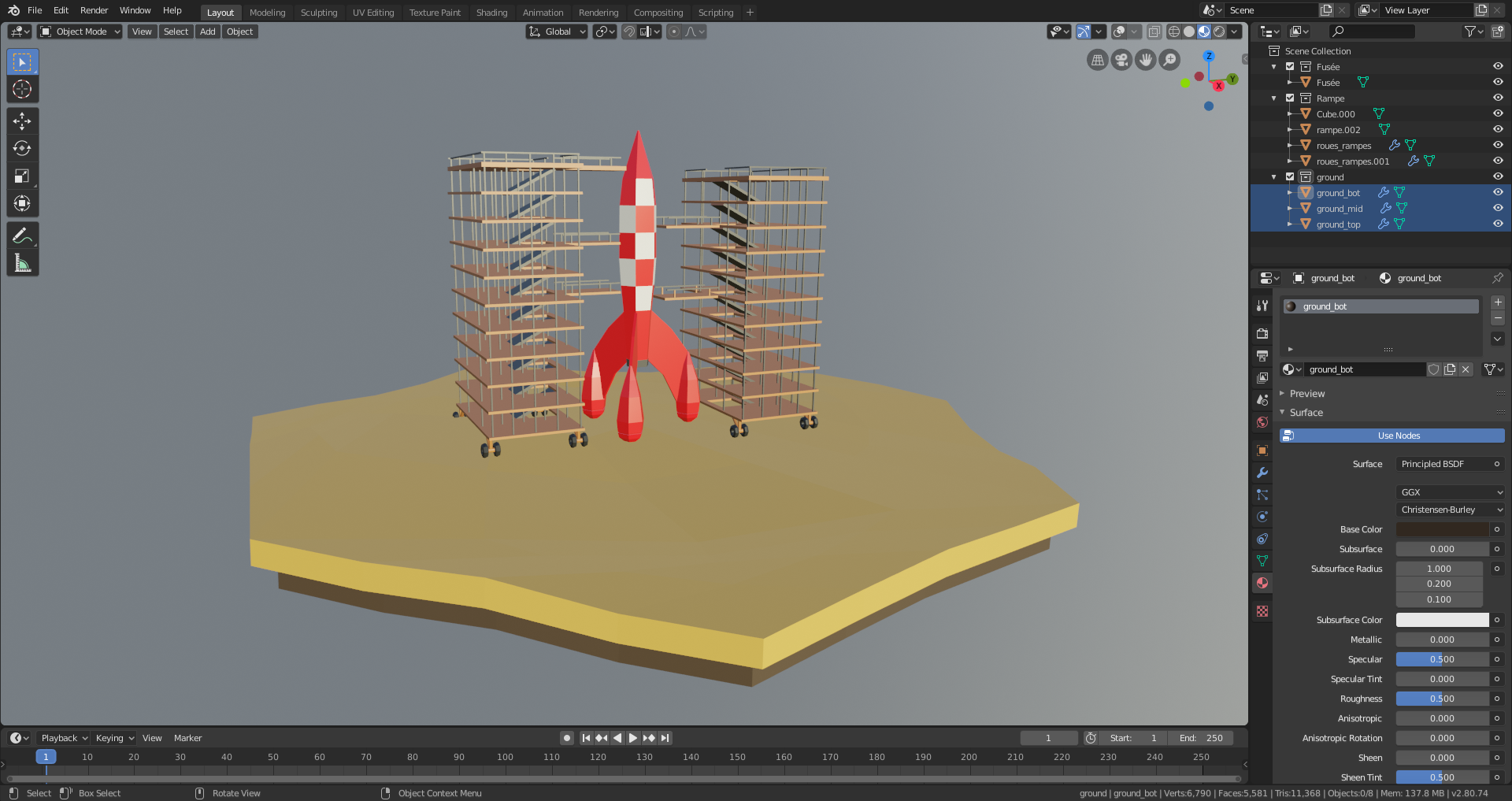
I decided to give the Low Poly rocket launch tutorial a go, with a personal take on it.
Almost done with the modeling parts, rocks and other assets on the ground incoming.
I stuck to the orignal drawing from Hergé. The launch pads may be too complex for low poly. I may remove them. (They won't appear on the animation anyway).
![]() spikeyxxx because of his hair of course Spikey, and because we Dutch people are weird with translations ;)
spikeyxxx because of his hair of course Spikey, and because we Dutch people are weird with translations ;)
Pretty much done with the modeling and preparing the animation. Now let's go for some smoke simulation!
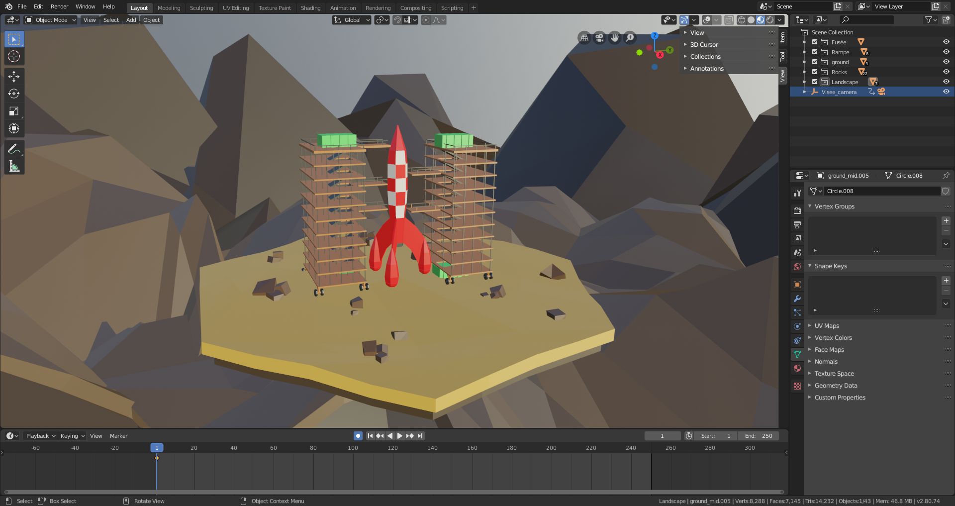
I finished it!
It was really nice and pretty simple tutorial, and in a way it made me think about trying some low poly modeling.
As said previously, I'm in a low-poly vibe now because of the rocket tutorial...
Let's get started...

I realize I will need A LOT of small details, but I'm commited to it. And damn, I never thought it could be that fun to do low poly.
I had fun, making a bus stop! A bus stop!
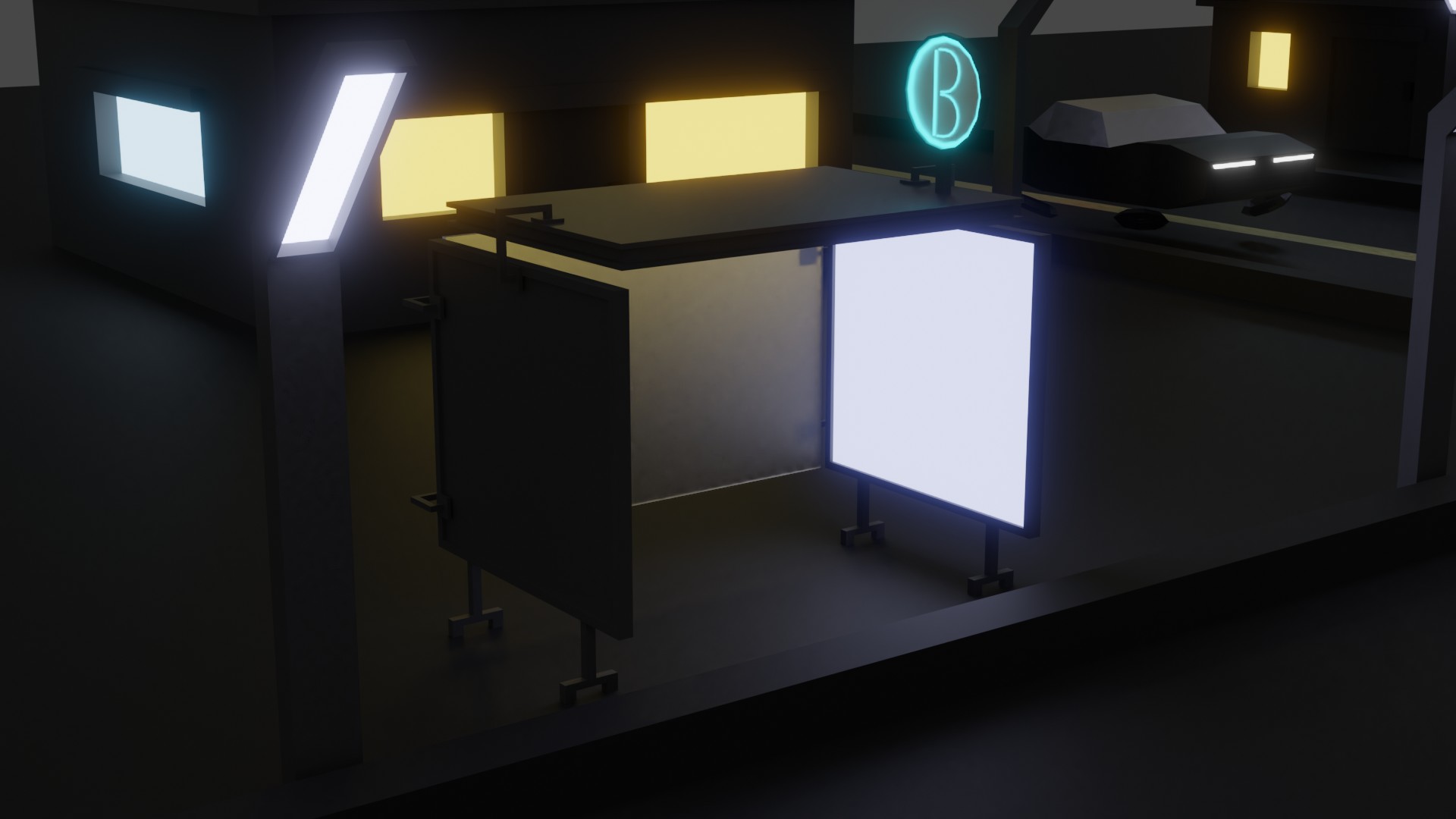
![]() otowa nice work. keep in mind with small details, that if you don't plan on zooming on them on the shots, keep them even simpler and suggests the form what they are. helps to sell the pic, but you dont get overworked on stuff no one will see up close.
otowa nice work. keep in mind with small details, that if you don't plan on zooming on them on the shots, keep them even simpler and suggests the form what they are. helps to sell the pic, but you dont get overworked on stuff no one will see up close.
Hmmm... I start to think I'm not going anywhere with that...
I think I'll give up on that one. I did not get what low poly is, in a way...

So, as mentionned previously, I gave up on my small city. The main reason is : I need to understand what "low poly stylised" really is.
I decided to start all over, with a different aim, and a different direction :
-No more a big scene, I'm aiming for an interior scene (American 50s dinner).
-I did not start by laying out the whole scene, but I started by focusing on low poly asset design.
-No fancy lighting from the start.
-Use of orthographic view, and don't forget the final size of the asset on the render.
-REFERENCES IMAGES, DAMN!
Let's go :
Asset 1 : Dinner table, bench and chair
Reference
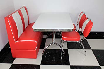
Render 1

Render 2

Render for approximation of final size
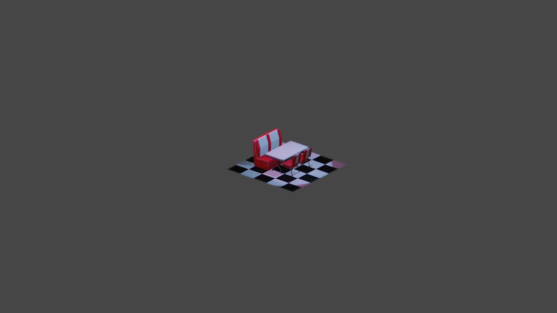
Looks ok to me. Maybe not "stylized" enough?
What do you guys think?
![]() otowa I like it :)
otowa I like it :)
Whether it’s stylized enough.. it depends on personal preference (there are many sorts of stylized) and the other diner assets you create (they have to fit together). But like I said, I like it.
At least my understanding is you will create the whole diner, asset by asset, but please correct me if I’m wrong.
Keep going!
ssmurfmier1985 Yes, that's the idea, so I can try to keep the style under control, compared to what I did previously.
![]() otowa yes, if everything matches up in style it will look like a cohesive scene :) and you can always tweak the style later if you want to try stuff out, but I think it fits the style you’re going for
otowa yes, if everything matches up in style it will look like a cohesive scene :) and you can always tweak the style later if you want to try stuff out, but I think it fits the style you’re going for
Getting some more assets done. Jukebox not done in terms of material and the car may need some love near the wheels I guess...
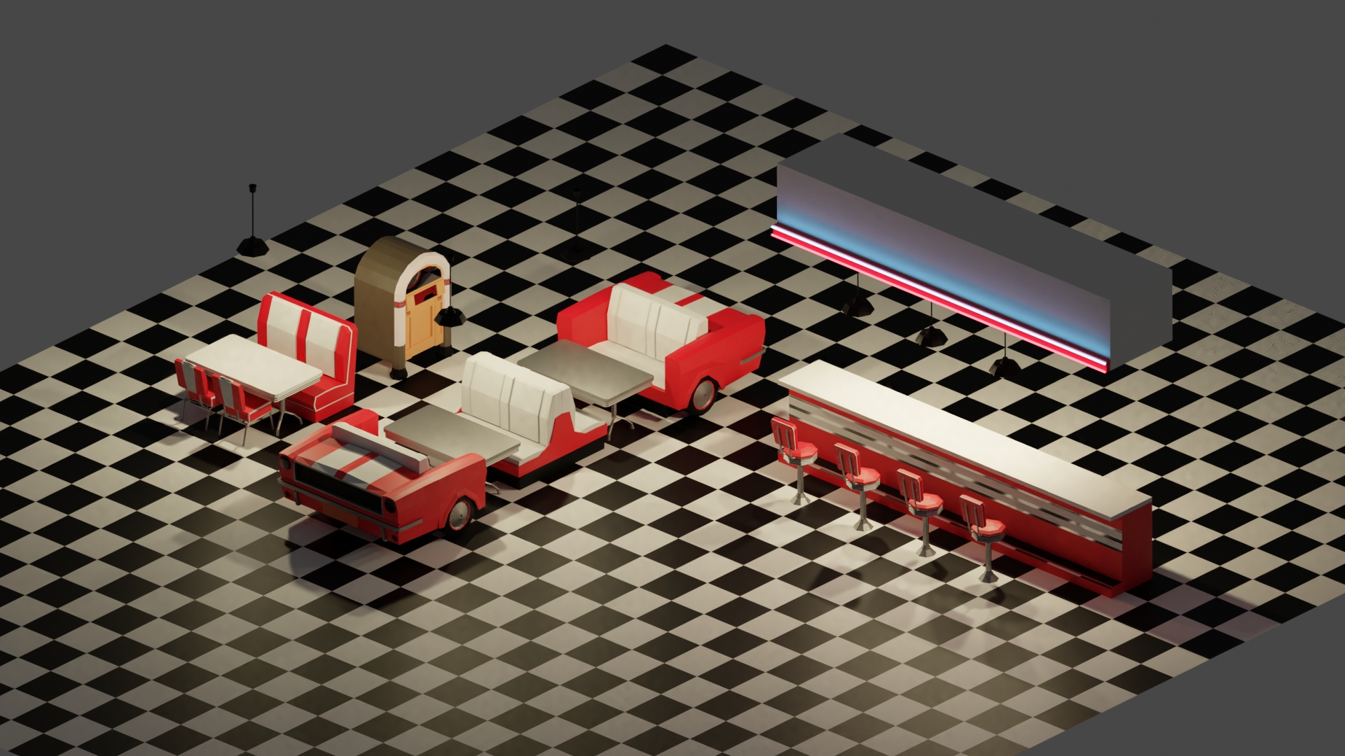
![]() otowa I understand if it's too late to change this, but to me it doesn't look low-poly enough.
otowa I understand if it's too late to change this, but to me it doesn't look low-poly enough.
![]() williamatics As fat as modeling go, yes I think I won't make radical changes as for now. The lighting will also have to change radically for the final scene though...
williamatics As fat as modeling go, yes I think I won't make radical changes as for now. The lighting will also have to change radically for the final scene though...