This is the thread where all my sketches and WIPs will be posted in :)
I want to finish chapter 1 of the treasure chest tutorial first and will start to post progress for my homework afterwards.
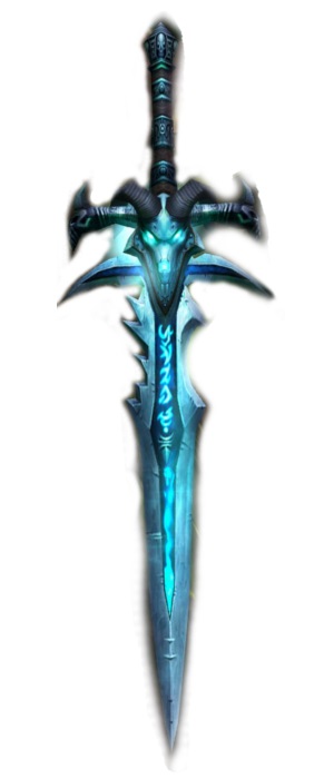
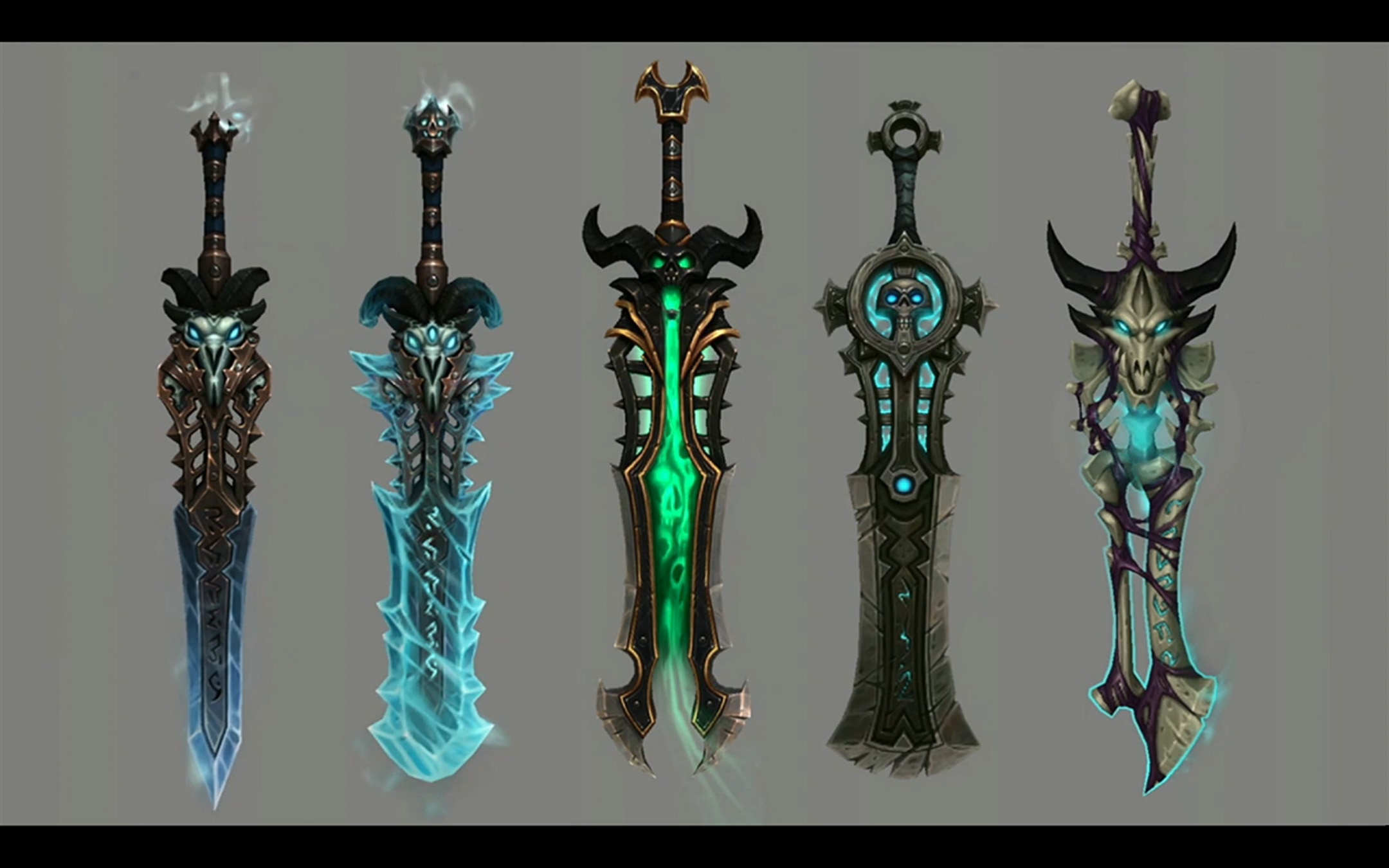
I decided to model the sword and I want to make it in a WOWish style.
Some deathknight runeswords I want to use as reference:
@theluthier Thanks for the feedback, Kent!
I wanted to paint a hammered texture for the sword first and skipped the part were I should add color varieties. Painting the texture didn´t work and I forgot to add the variations. I really need to be a bit more mindful x_x
I will try to adjust my textures according to your critique points :)
![]() silentheart00 No problem, silent! Due to workstress, I also have a lot of difficulties keeping up with looking at everyone´s homework and not to mention commenting on it....
silentheart00 No problem, silent! Due to workstress, I also have a lot of difficulties keeping up with looking at everyone´s homework and not to mention commenting on it....
Thank you very much! :)
Here´s what I have so far :)
I´m not very satisfied with the bump on the sword/blade and I still have to make the adjustments Kent mentioned along with other stuff, like the chain of the mimic.
Feedback is appreciated!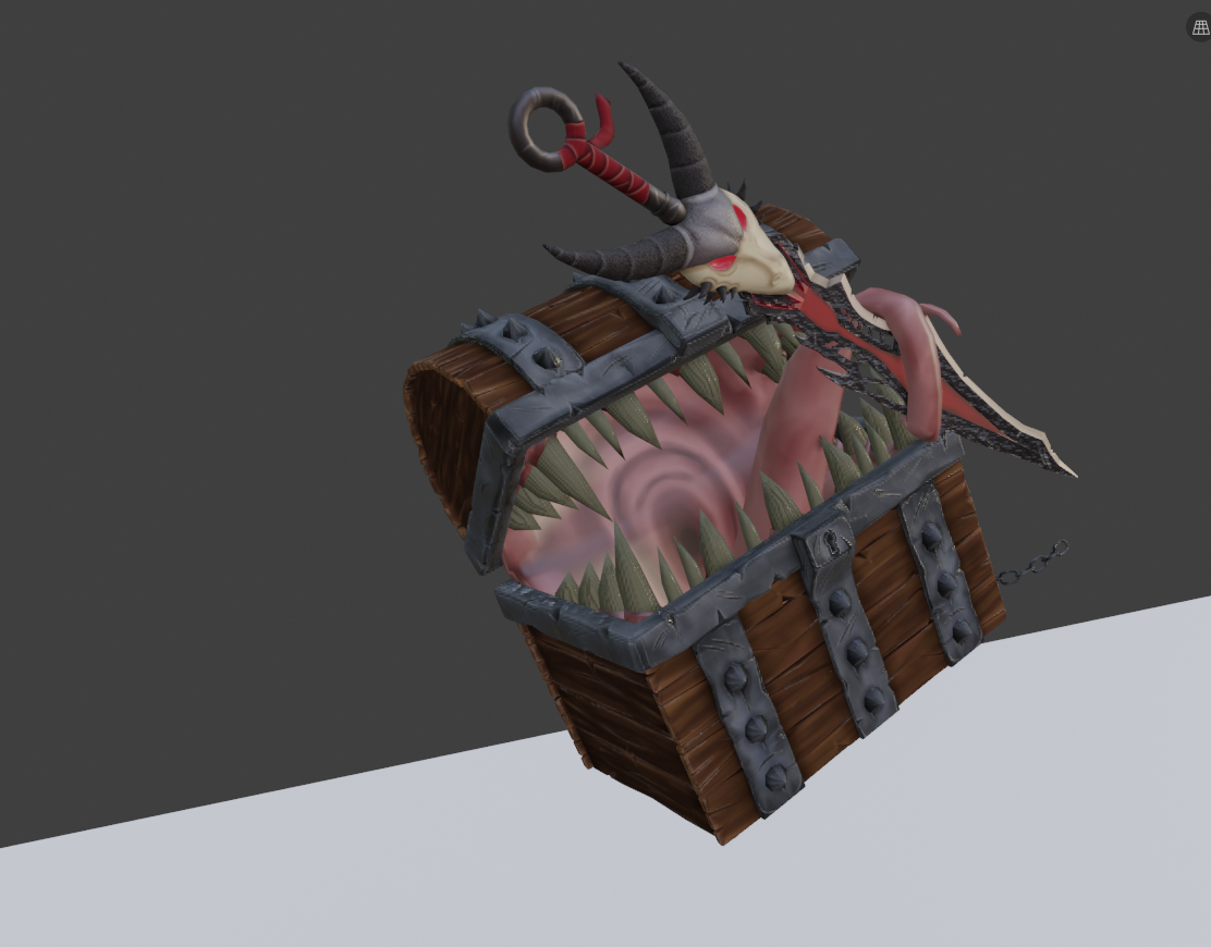
@fide I've never played Darksouls, so I wasn't expecting this, but I really like it!
Great texture painting!
Maybe a bit more saturation on the tongue and inside of the mouth? (Some SSS...)
And there is a bit of intersection where the tongue raps around the sword and one of the teeth seems to be penetrating the tongue....
Maybe the bump on the blade is just a bit too strong, I don't know.
Generally it looks great so far!
Keep up the good work!
@fide you captured the essence of the mimic perfectly, where’s my sword when I need it?! 😛
I think it would look great if the base of the teeth have some build up grime on it. You know, from eating hollows and never brushing his teeth 😉
I do think your right about the bump on the sword I think it is a bit too strong.
Also, something to try out, I love your jumping chest composition! But I think it would look better if the chest is on the left side of the picture. Because it’s ‘looking’ to it’s right so giving it some room to look usually gives it a bit of breathing room and guides the viewers eyes better, usually that results in a more pleasing picture. At least that’s my experience from when I did a lot of photography. All up to you of course if you like it on the right that’s perfectly fine too 😊
this isl rooking great, love the teeth and the tongue, the texture paint inside the chest really help to sell it, I think with some good lighting would look very nice
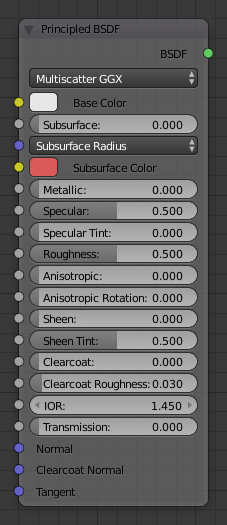
on the fleshy material make it with a lot of specular with a noise or voronoid to give it like speckles where light reflect and maybe play with the clearcoat on the principle shasder too
Every dungeon has to have a mimic :) Looks great, and lots of helpful feedback posted!
![]() spikeyxxx Thank you very much! Yeah, the mouth and tongue need to be more saturated. I don´t know how to make SSS though :/
spikeyxxx Thank you very much! Yeah, the mouth and tongue need to be more saturated. I don´t know how to make SSS though :/
I will take a double look at the tongue. After fiddling around a bit, I thought it wraps around nicely, but I might have missed something!
ssmurfmier1985 Yeah, I´ll add some grime to the teeth! A friend of mine also suggested to make them dirtier :)
Don´t worry, that´s not the shot I´ll use for the final composition :) I´ll adjust the position so it -hopefully- looks pleasing once I´m done with everything!
![]() n647 Thank you very much! I want the mouth to look shiny and wet and will add a texture similiar to the one I added to the horns of the skull. Playing with the clearcoat is a nice idea, I´ll try this!
n647 Thank you very much! I want the mouth to look shiny and wet and will add a texture similiar to the one I added to the horns of the skull. Playing with the clearcoat is a nice idea, I´ll try this!
![]() williamatics No, it´s mostly inspired by Darksouls and my Dungein and Dragon experience with mimics D: I didn´t know that there were mimics in Terraria as well
williamatics No, it´s mostly inspired by Darksouls and my Dungein and Dragon experience with mimics D: I didn´t know that there were mimics in Terraria as well
@fide https://m.youtube.com/watch?v=4H5W6C_Mbck I believe SSS is briefly discussed in this video how to turn it on in the principled shader
Basically you turn it on in the principled shader (it’s at the top called ‘subsurface’) and pick a subsurface color to shine through
In Eevee you also have to turn it on in the render settings
Homework Week 3 Submission
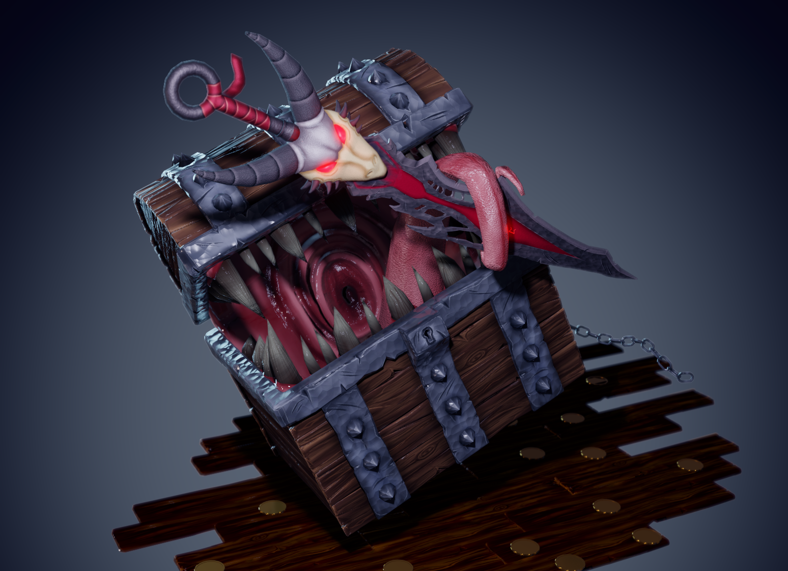
I really had a blast this whole course, learned A LOT and am really proud of my result :D
Thank you very much for the class, Kent! I´m looking forward to the next one!
(The CGC coin wasn´t displayed correctly, so I made those quick coins. I just wanted to add them to have a touch of another color in my scene)
@fide This is just amazing. The sword itself looks great, I love both its design and textures, but the chest steals the show. Great job!