This is the thread where all my sketches and WIPs will be posted in :)
I want to finish chapter 1 of the treasure chest tutorial first and will start to post progress for my homework afterwards.
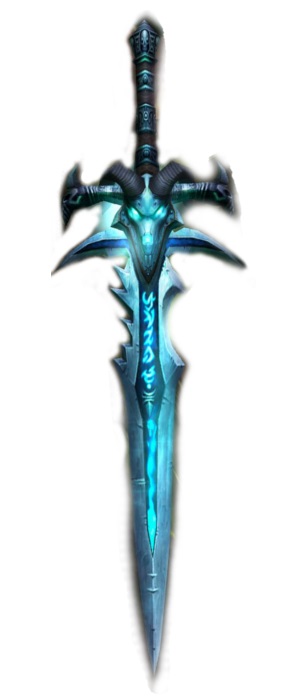
I decided to model the sword and I want to make it in a WOWish style.
Some deathknight runeswords I want to use as reference:
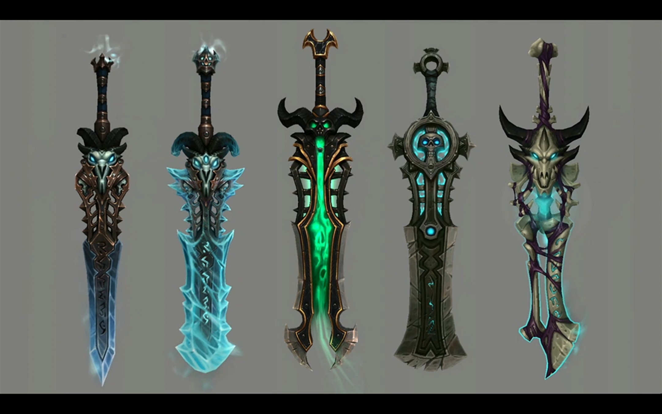
Love that you created your own concept art with your own style
I love the chest and your concept art is breathtaking! You definitive increase my ambitions!
I need some help :/
How do I get rid of these? I always thought those only appear when I have Ngons ....
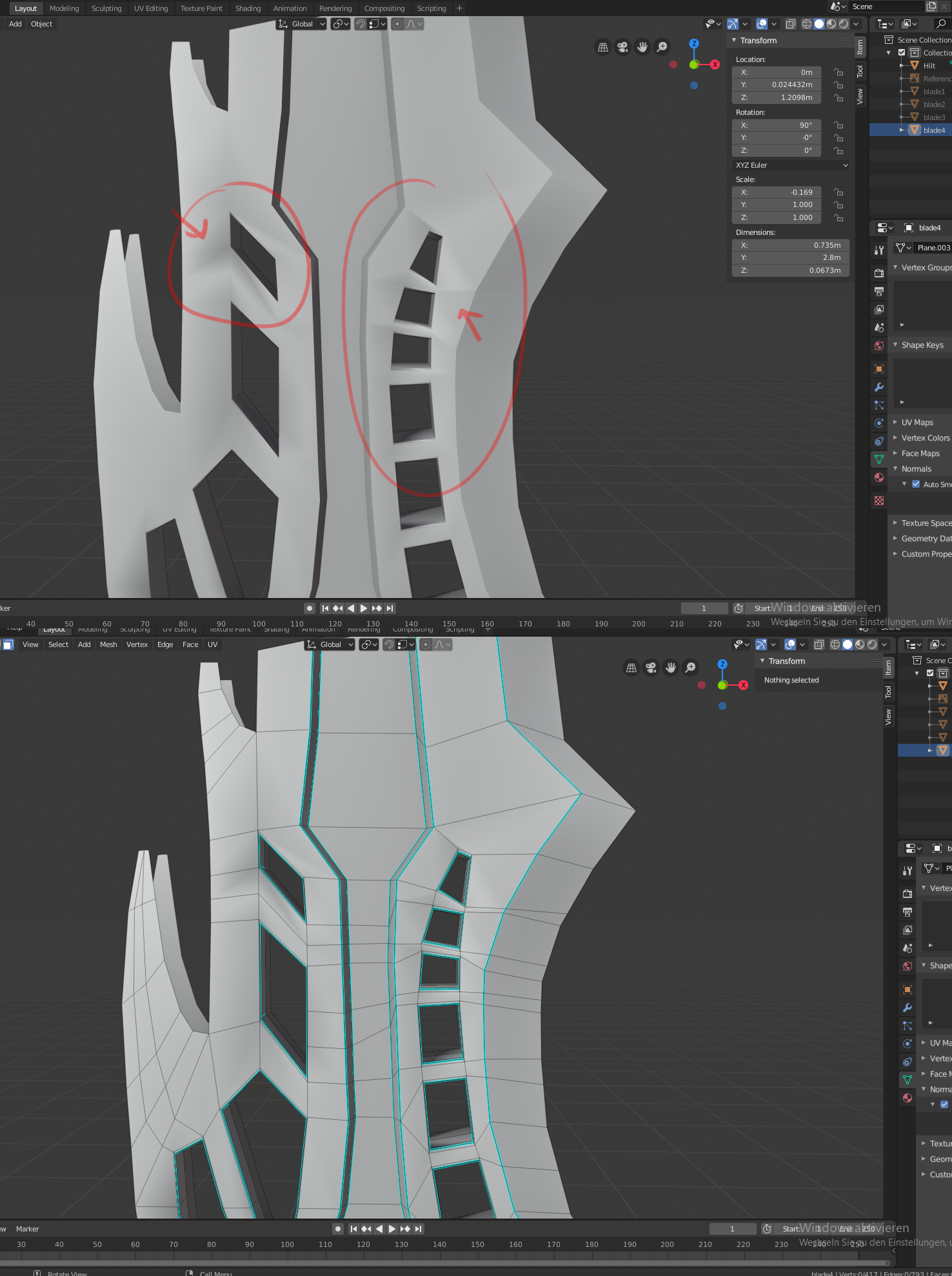
@drgnclw I removed double vertices and I think that the faces are planar, but I´ll double check that again. Thank you!
@drgnclw the faces are planar :/
I made a retopology and the exact same issue occurs as soon as I extrude the faces to fill the space between the gaps :/
SOLVED: The retopologized piece now looks as it should!!
The blade now looks as it should (without the detailing work which I will do on sunday) and now I started with the dragon skull. I scupted it first and will do a retopology of it. Mirroring didn´t work during sculpting, so I just deleted the left side, since I will mirror the right side anyway
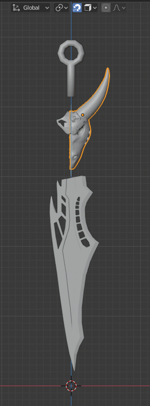
@fide Love it, especially the skull. Never sculpted before myself so I'm always baffled when somebody can use it
Homework Week 1 Submission
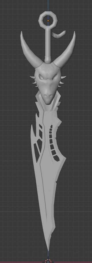
Making the dragon head and figuring out how to make everything look connected were really hard, but I think it looks decent enough for now. I scrapped and changed some ideas while modelling. I made the part beneath the dragon head more square so it´s easier for me to connect it to the blade for example.
I just added a few dents to the sword since I want to paint the majority, since is easier for me :)
@fide Sorry for the belated grade. Your custom sword design turned out great! I like that it's clearly inspired by the illustrations you posted at the start but it's still a unique design in the end. Completing the treasure chest and the sword as well you have earns you an A+ in my book.
I only have 2 notes to offer:
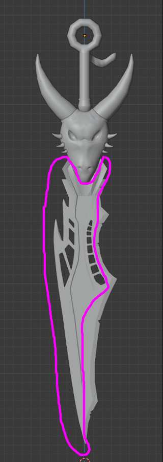 Personally I find the two themes fighting each other in the design. I'd recommend maybe de-straightening the hole cutouts, possibly bevel them unevenly as well. Then add the same dents and dings from the right side to the left.