This is the thread where all my sketches and WIPs will be posted in :)
I want to finish chapter 1 of the treasure chest tutorial first and will start to post progress for my homework afterwards.
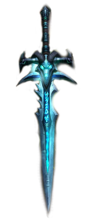
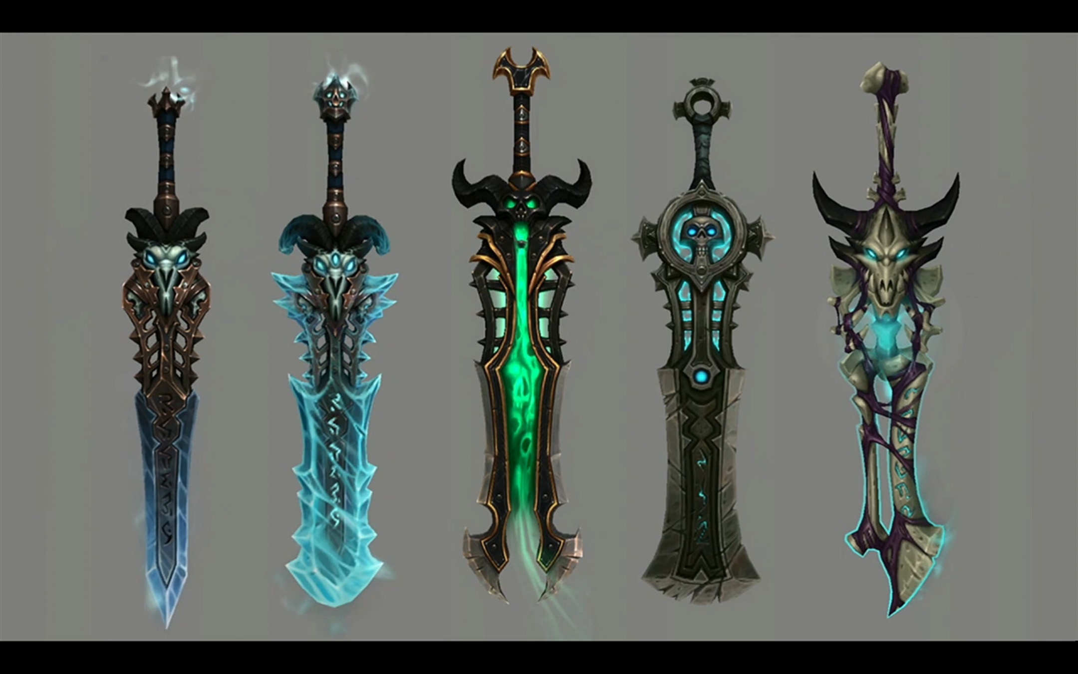
I decided to model the sword and I want to make it in a WOWish style.
Some deathknight runeswords I want to use as reference:
@theluthier No need to apologies, there are a lot submissions to be graded and I understand that it takes time!
Concerning your notes:
Thank you for the feedback!
![]() silentheart00
silentheart00 ![]() jack07
jack07 ![]() cruento ssmurfmier1985 jjamesley
cruento ssmurfmier1985 jjamesley ![]() spikeyxxx
spikeyxxx
Thanks to all of you and sorry for replying this late. Work´s a bit stressful right now x_X
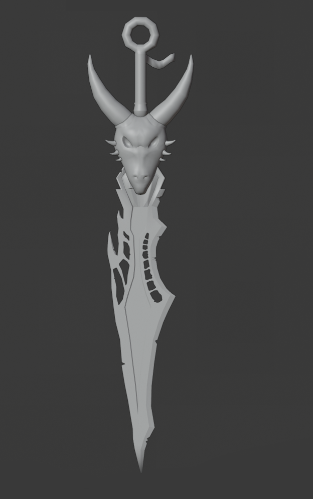
I try to give the sword a more handmade look, so the designs don´t clash anymore. I´m not completely done, but I have to go to work.... I try to finish it once I´m home
After I´m satisfied with how it looks, I´ll start with the treasure chest course and texture the chest first before I try to texture the sword.
I planned to do it like this:
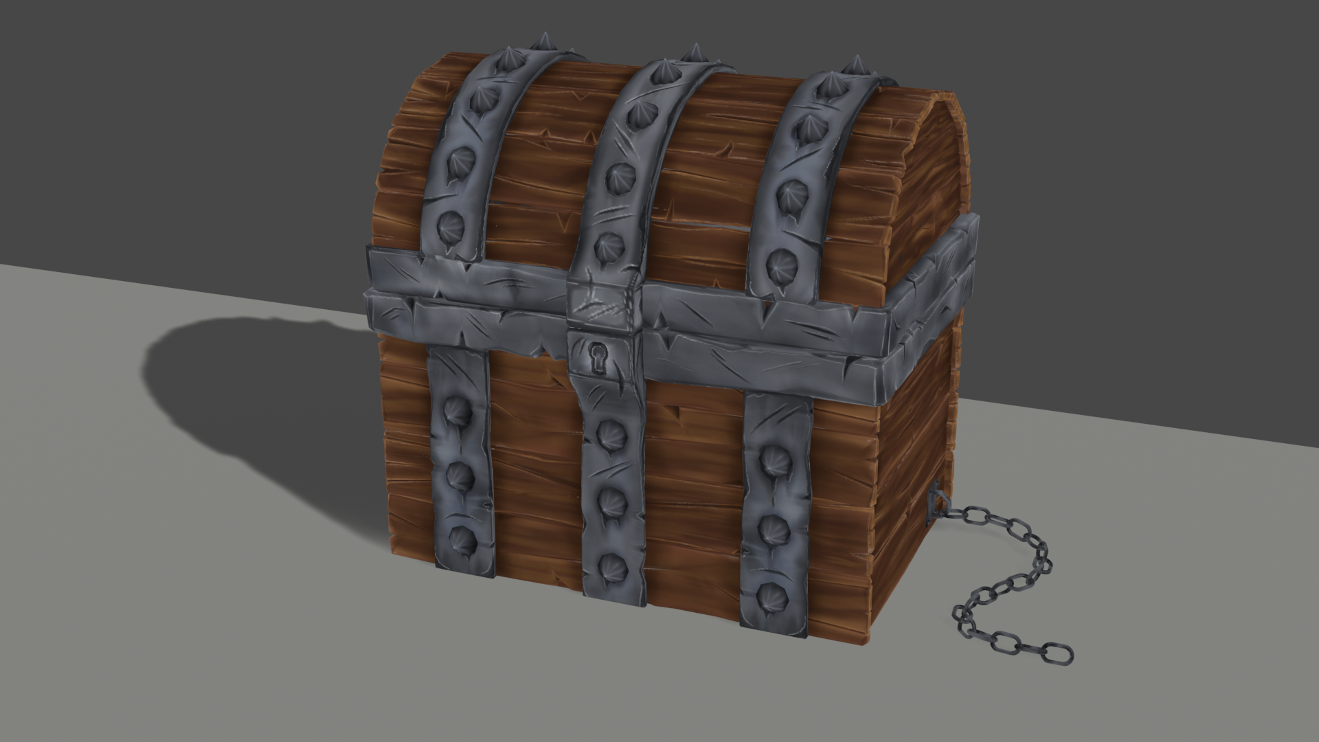
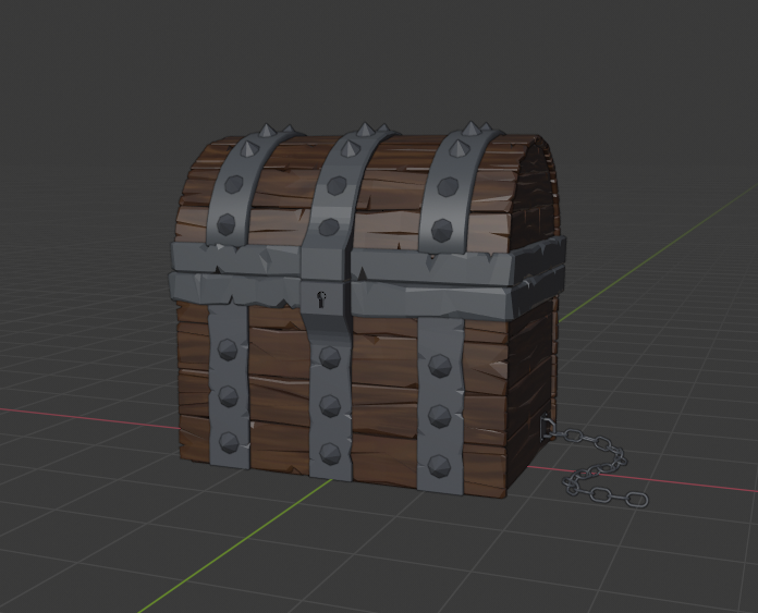
The bad news is that I wasn´t able to finish the treasure chest today. The good news is, I only have to work tomorrow morning and am free till tuesday! I should be able to finish everything in time :3
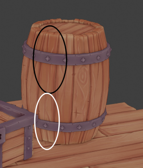
Here´s how the chest looks so far!
@fide Nice paint job on the wood!
Just a bit of faceting on the middle 'ring' and some small issue of black spots around the keyhole ( those spots are only visible when you zoom in quite a lot, so no big thing!).
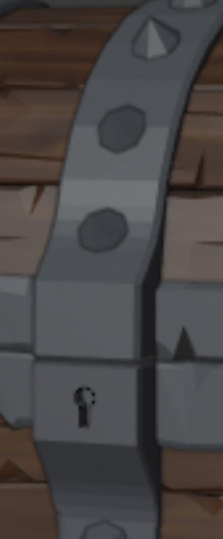
![]() spikeyxxx Thank you! I dind´t notice those dots. Do you know what this could be? I haven´t touched the metal parts yet, besides adding the base color with the fill tool
spikeyxxx Thank you! I dind´t notice those dots. Do you know what this could be? I haven´t touched the metal parts yet, besides adding the base color with the fill tool
@fide Maybe that's because of the fact that you use edge and cavity detection, but didn't treat the middle metal parts as round?
It's like the faceting on the bend geometry, I guess.
![]() spikeyxxx it were some duplicated, floating vertices and I didn´t notice them :´D I removed them and now everything is fine! Thanks for pointing them out
spikeyxxx it were some duplicated, floating vertices and I didn´t notice them :´D I removed them and now everything is fine! Thanks for pointing them out
I like the look of that! Great job on that chest!
Just the spikes look a bit of to me, due to the faceting, but maybe that is intentional?
Good luck with the sword!
Homework Week 2 Submission
I tried to paint a hammered texture for the blade, but failed. I do like the overall look though :)
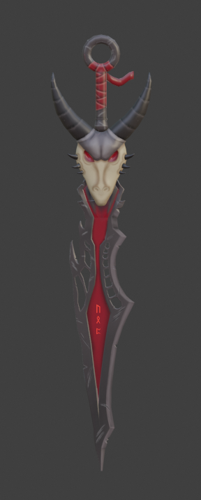
@fide your painting skills are showing, this is the most awesome sword ever! Beautiful work! 👏🏻😄
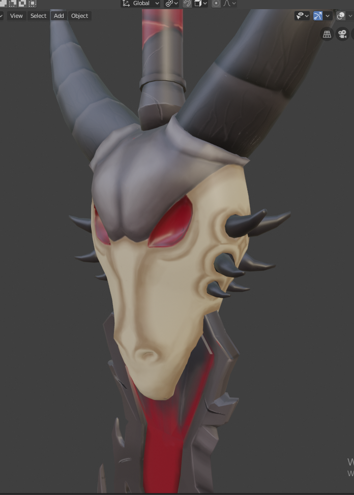
@fide Wow! This came out great, I especially like those little details you painted on the horns!
Are those runes on the blade based on real ones, or are they your own design?
@fide Nice paint job. Did a double take when I realized the wrap on the handle is painted detail. Very nice!
ssmurfmier1985 Yeah, my painting skills are my stronger side and compensate some of my modelling weaknesses. But I want to stop to rely on my painting too much. It feels a bit like cheating :´)
Thank you very much!
@ghujelk Thank you! Details make such a huge different and I love to paint them :D
Those are real viking runes runes. The first is for "strength", second is "Inheritance" and last is "Destiny"
@fide Wow, Ingrid! I really like to see how hard you went at the chest texture detail. I find that most people, including me, tend to be shy about adding distinct details in the texture. But you did it and did it well. Really nice job!
My only note on the chest is that I think the wood specifically could benefit from some broad gradients. Take this example from n647:
Notice how one side of the board is notably darker and the other side notably lighter. I find these broad gradients add a lot of appeal.
Your sword looks good too! Only one note there: The colors read more solid than with varied tones like the treasure chest. Here's what I mean:
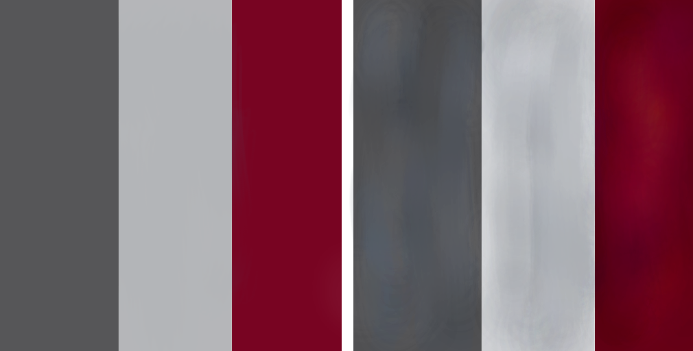
The left is solid colors and the right is the same colors but broken up with various subtle tonal varieties. Generally they look the same but the right is more painterly and more interesting. Your treasure chest has this kind of variety all over but the sword had it some places (like the grey piece between the horns) but a lot of it feels more like solid colors.
Still you've done great work this week earning an A+ 👏