The story goes, that when admiral Nelson was shot at the battle of Trafalgar, it was decided to bury him at land and to conserve his body, it was put in a barrel of rum. Now the ordinary seamen didn't know about this and went on with their custom to drill a small hole in the barrel and suck out the rum through a straw.
Since then, in sailor's slang, rum is called 'Nelson's blood'.
I've been using Blender for about six years and still have never modelled a barrel; time to change that.
![]() spikeyxxx This is looking really great. The floor looks fantastic. Good decision to repaint. The post and supports look solid. The contrast with the "new"er crates to the weathered floor/walls is good but might be a tad too clean considering the number of grimey hands that had to move them there. The wear on the stairs works well but the color on the railing looks random. Nice color on the metal bands on the barrel. I'm sure you'll clean up that rum/wine/blood when we do materials. Look forward to seeing this finished and lit well. Nice job.
spikeyxxx This is looking really great. The floor looks fantastic. Good decision to repaint. The post and supports look solid. The contrast with the "new"er crates to the weathered floor/walls is good but might be a tad too clean considering the number of grimey hands that had to move them there. The wear on the stairs works well but the color on the railing looks random. Nice color on the metal bands on the barrel. I'm sure you'll clean up that rum/wine/blood when we do materials. Look forward to seeing this finished and lit well. Nice job.
@ghujelk Thanks Jake!
For the floor boards, I just selected them all in Object Mode. Went to Object > Transform > Randomize Transform and slightly randomized the rotations...
Each stair step has a Lattice Modifier to slightly bend the front middle, especially the top.
In the painting I emphasized that by lightening and desaturateing those areas, although I do think it's a bit too exaggerated;)
ccthulusan Thanks a lot John!
The crates are not so much supposed to be newer, as made of different wood. Some woods (like oak) darken more when ageing than others (like pine, for instance).
Everything will get dust and grime added in the shaders. This is only the pure colour information.
I agree that the stairs don't look that good, but I decided not to re-paint them as well. Same goes for the walls;)
The metal bands come out really well, when also plugged into a Bump node; then you can really see the rust!
But, that's the shading part....
![]() spikeyxxx Cool, and I like the spikes on the bands of the barrel! I don't know if I'm sold on the red color of the rum though or maybe that's blood?
spikeyxxx Cool, and I like the spikes on the bands of the barrel! I don't know if I'm sold on the red color of the rum though or maybe that's blood?
![]() spikeyxxx This is an active thread! You're doing all kinds of work this month, as a participant and a VA. Good stuff, spikey 👍
spikeyxxx This is an active thread! You're doing all kinds of work this month, as a participant and a VA. Good stuff, spikey 👍
I like to see the evolution of the wood textures. You listened to good suggestions and applied accordingly. I really like that the floor, crates, and wall/stair boards have unique wood types. The major challenge I see before you is how to avoid all the wood blending together.
I hadn't really thought of it till seeing your textured version - the fact that 95% of the scene is wood. So my initial thought was "man that's a lot of wood. So much so that the model is a little lost in it. BUT I think that's just how the pure textured version is going to be at this point.
So I think that your shading a lighting could do a lot for your scene. Unfortunately I don't have anything recorded about this kind of stylized interior lighting, but here's some reference images that should help:
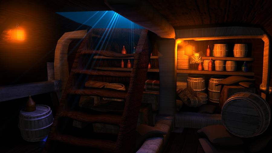
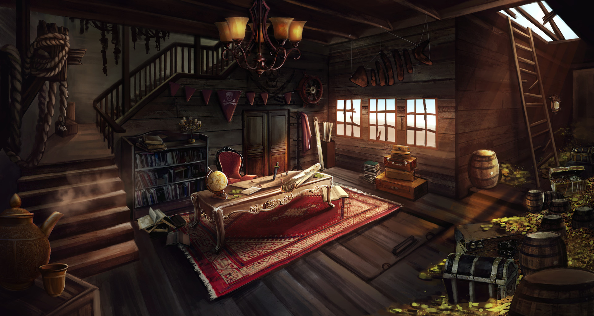
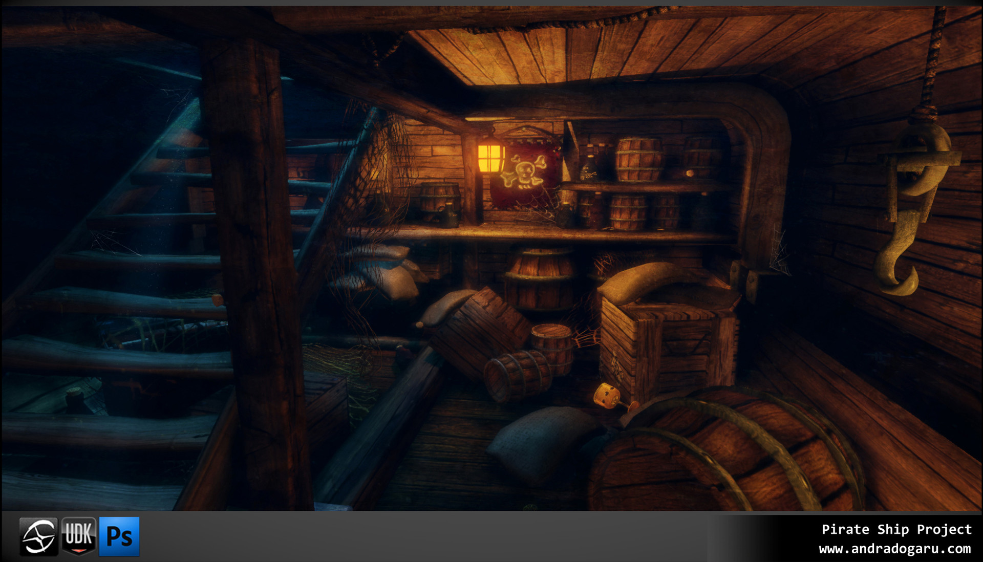
Strong and bright key lights (whether blue moonlight from a stairwell or a warm white from sunlight, bright orange candle light) and deep shadows will do a lot for the atmosphere of the scene. Also the overwhelming wooden presence won't be so consistently lit the way it is currently (or "unlit" being the better term).
You've definitely earned an A for week 2 and I'm excited to see what happens this week!
@theluthier Thanks a lot Kent!
Those images really help; I was a bit worried about how to light this;)
![]() spikeyxxx Sorry, I'm late to the party. Good work, spikey! Looking forward to the shaders!
spikeyxxx Sorry, I'm late to the party. Good work, spikey! Looking forward to the shaders!
![]() silentheart00 Thank you silent!
silentheart00 Thank you silent!
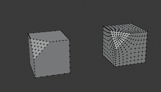
Struggled way too much to get decent Dirty Vertex Colors!
Subdivide just didn't work, because it doesn't subdivide N-gons. The Subsurf Modifier (set to Flat) did the job.
Started shading and lighting...
Lighting in Eevee is quite the challenge for me!
Here's a first render:
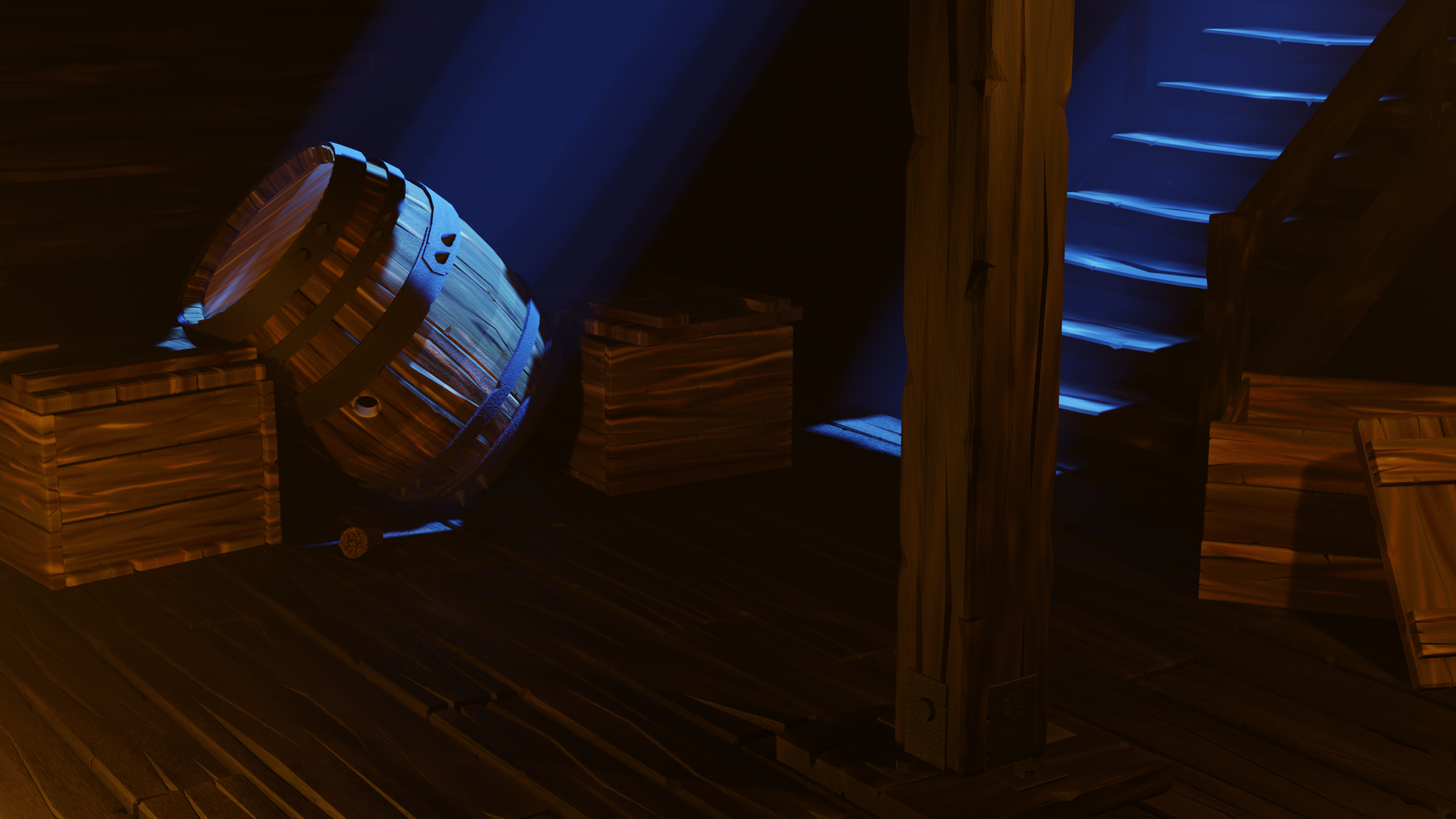
I don't know what to think of it...
Certainly not final;)
![]() spikeyxxx good start. what you can do is add hdri texture to the world to bring up the overral ambient light, and give it more light. you can alway darken the picture if its too bright, but going other way around is harder.
spikeyxxx good start. what you can do is add hdri texture to the world to bring up the overral ambient light, and give it more light. you can alway darken the picture if its too bright, but going other way around is harder.
![]() louhikarme Thanks Kaj, I wiil give it a try, but as this is an interior with only two holes, where the light comes in, and that's moonlight and coming from 'above' I don't know if that will have a lot of effect...
louhikarme Thanks Kaj, I wiil give it a try, but as this is an interior with only two holes, where the light comes in, and that's moonlight and coming from 'above' I don't know if that will have a lot of effect...
Well, I guess I can 'open up' the sides...
I'll try that, thanks again!
![]() spikeyxxx hdri will help on the ambience. it will crack through and bring up the overral levels. which helps in compositing to dial it back down. also you can add lights inside and not open up the sides, for all in purposes, there could be lantern behind the camera that lights the insides aswell. if you look the references Kent put they have lot of ambient light and shadows.
spikeyxxx hdri will help on the ambience. it will crack through and bring up the overral levels. which helps in compositing to dial it back down. also you can add lights inside and not open up the sides, for all in purposes, there could be lantern behind the camera that lights the insides aswell. if you look the references Kent put they have lot of ambient light and shadows.
![]() louhikarme The whole scene is inside a cube, so I'll have to open up the sides (of that cube), otherwise the HDRI won't have any effect...
louhikarme The whole scene is inside a cube, so I'll have to open up the sides (of that cube), otherwise the HDRI won't have any effect...
![]() spikeyxxx not sure i understand, but you have cube around the planks and other stuff? if that's the case, why? i'm interested what that would do?
spikeyxxx not sure i understand, but you have cube around the planks and other stuff? if that's the case, why? i'm interested what that would do?
![]() louhikarme That is because otherwise too much 'sunlight' shines through the planks. I wouldn't mind a bit of environment shining through, on the contrary, but with Eevee the ('sun')light seeps through way too extreme...
louhikarme That is because otherwise too much 'sunlight' shines through the planks. I wouldn't mind a bit of environment shining through, on the contrary, but with Eevee the ('sun')light seeps through way too extreme...
Any way, this is with an HDRI:
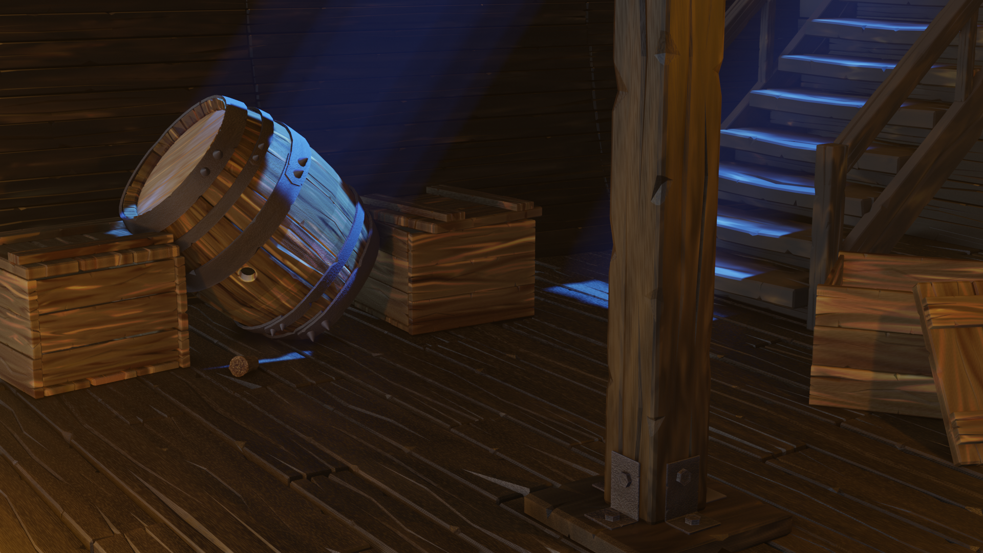
and I like it a lot better!
Not perfect yet, but closer;)
Thanks again Kaj!
![]() spikeyxxx I would definitely use an HDRi to get realistic reflections (do you have screen space reflections turned on?), so maybe opening op the cube but use an interior one? And then a light through the staircase to simulate the moon like you already have and the orange light to simulate lamps works well too, so that’s good already :)
spikeyxxx I would definitely use an HDRi to get realistic reflections (do you have screen space reflections turned on?), so maybe opening op the cube but use an interior one? And then a light through the staircase to simulate the moon like you already have and the orange light to simulate lamps works well too, so that’s good already :)
Maybe keep the hdri low to only get reflections and a little bit of ambient light, and using an additional area light or two (one blue and one orange) for the rest of ambient lighting, on which you then turn all shadow casting off so it only contributes to the lighting. Definitely use volumetrics and turn soft shadows on that will up the ambience a lot.
Just some thoughts ;)
ssmurfmier1985 Thanks, I already did most of that, apart from the aditional area lights and soft shadows;)
(Just now...)
I'll try that!
![]() spikeyxxx what you can do with the light shining through is that you set the hdri transparent during render time, then in compositing have dark background. that way you can have depth in the wall planks aswell.
spikeyxxx what you can do with the light shining through is that you set the hdri transparent during render time, then in compositing have dark background. that way you can have depth in the wall planks aswell.
the pic looks lot better now.
![]() spikeyxxx I saw it :)
spikeyxxx I saw it :)
You can also add a cube map and bake reflections to get better ones. Those are not real-time but since this is a still render it works nicely.
Also a thought maybe a noise texture in the volumetrics to get some floating dust?
![]() louhikarme No, unfortunately I can't. It's not the HDRI shining through, I wouldn't mind that, it's the 'sun'!
louhikarme No, unfortunately I can't. It's not the HDRI shining through, I wouldn't mind that, it's the 'sun'!
Soft shadows, higher density volumetrics and slightly desaturated blue light:
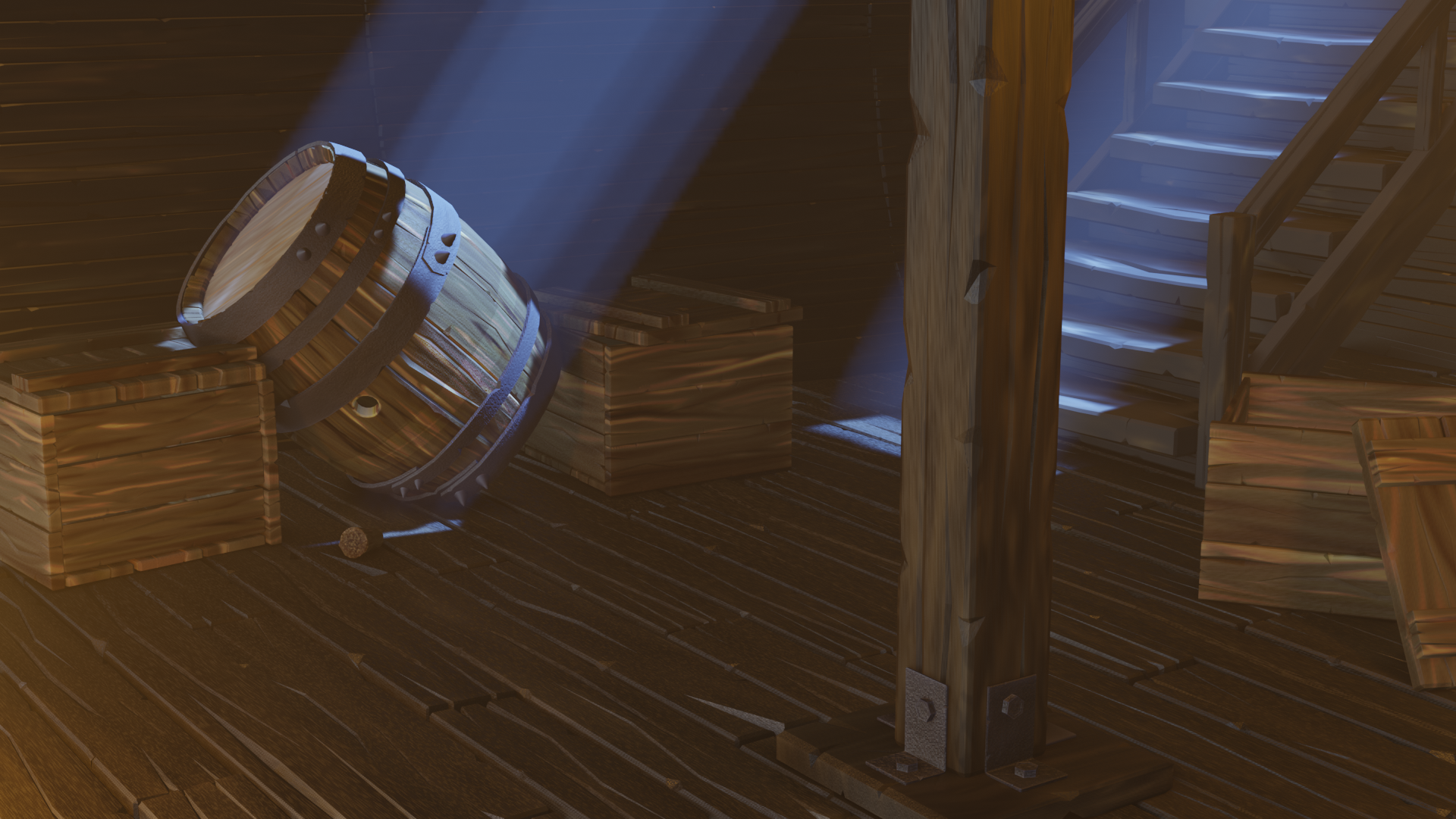
Hmmm....