Long time member and fan of CGCookie, seriously studying Blender and CG art. This is my polybook, where I'll be sharing works-in-progress and things I learn as I practice modeling and shading and related Blender wizardry.
Current project as of October 2021: 1957 Chevrolet passenger car.
MODELING FINISHED!
Sorry I didn't give a progress report last night; I had finished all but a couple of details on the engines, but didn't want to post an unfinished screenshot so close to the finish line. Today I finished those last details, and gave the whole model a look-over to see if I missed anything (and I had, so a couple more little bits were added here and there). But now it's all done. And I'm just about exhausted, mentally!
So, screenshots. Bon appetit:
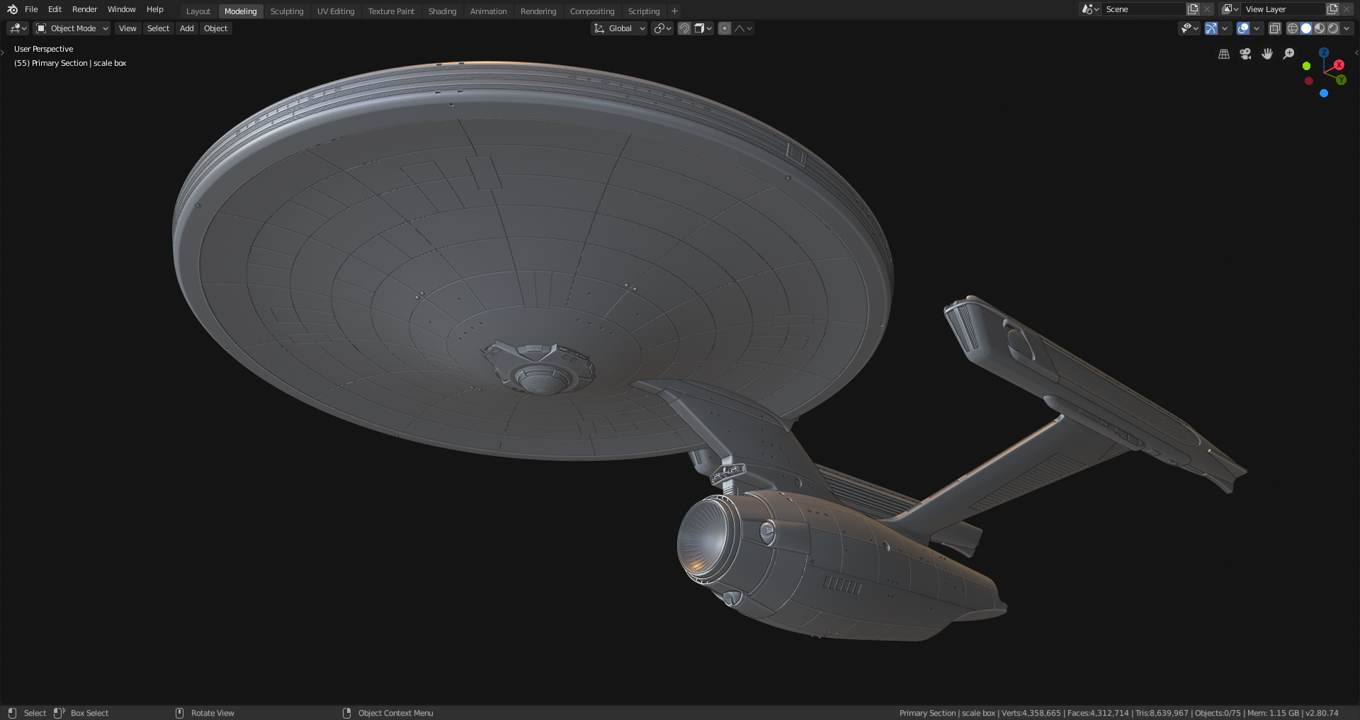
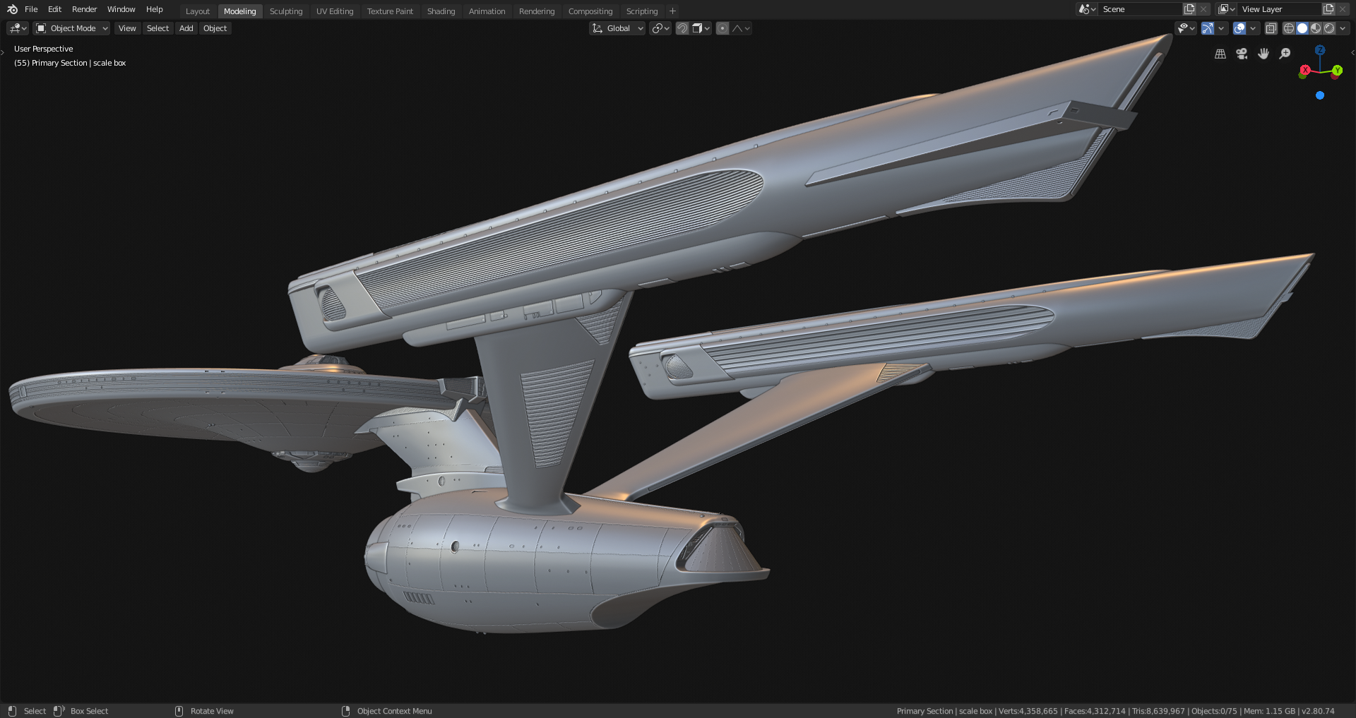
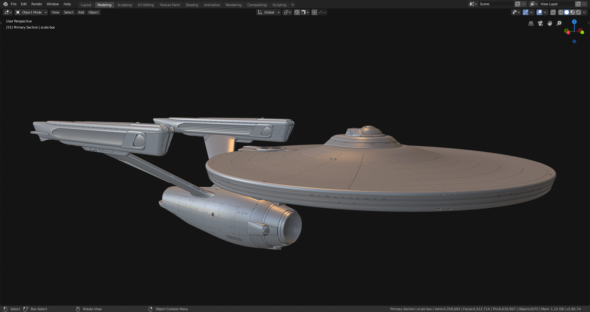
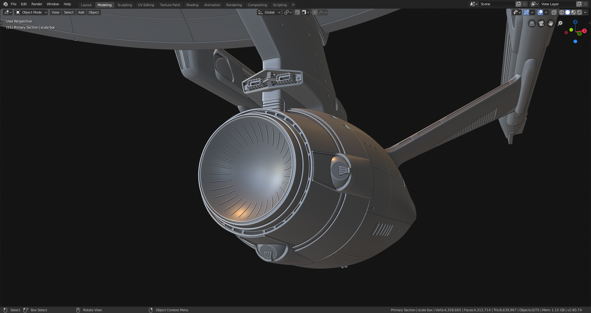
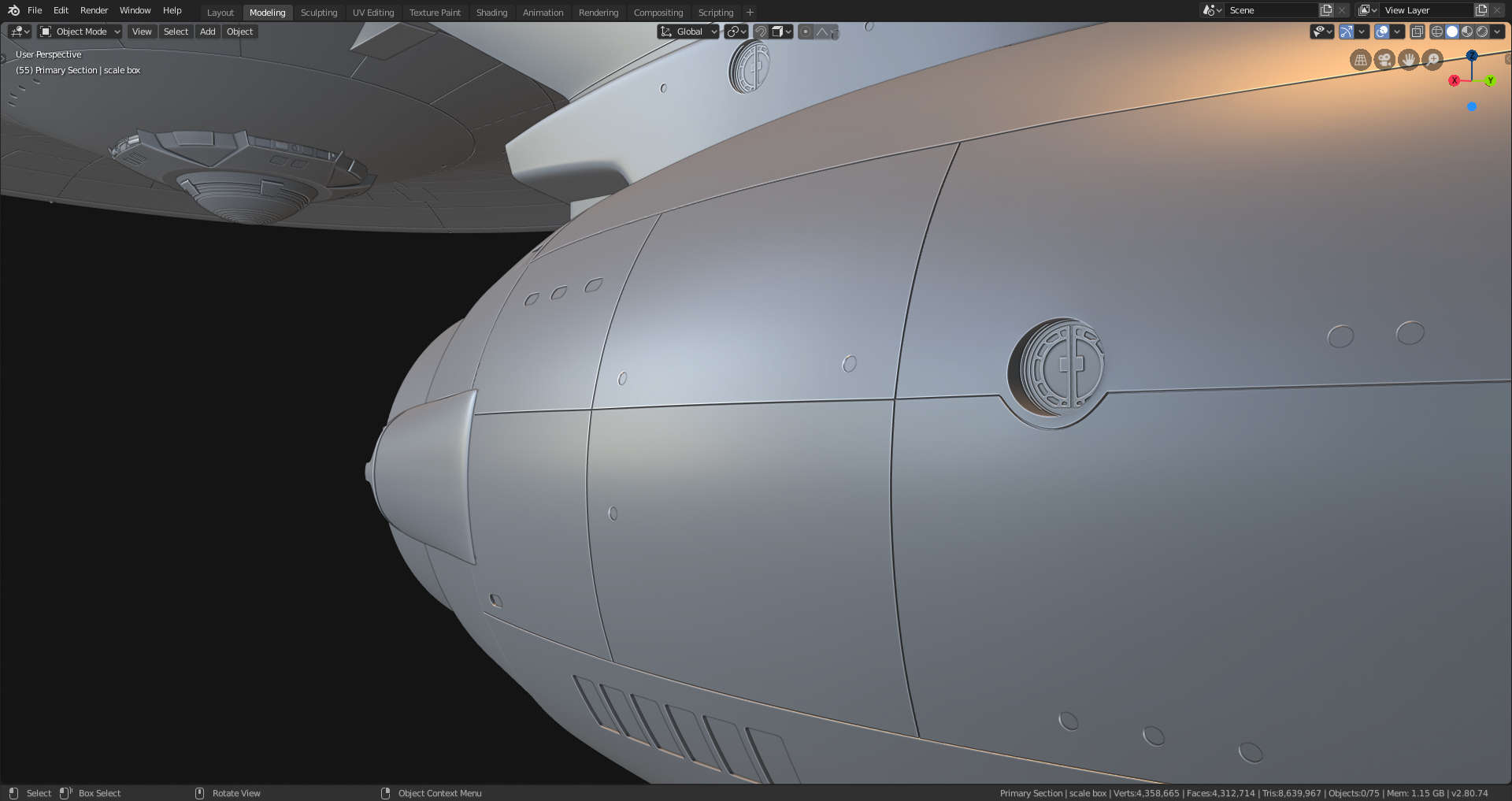
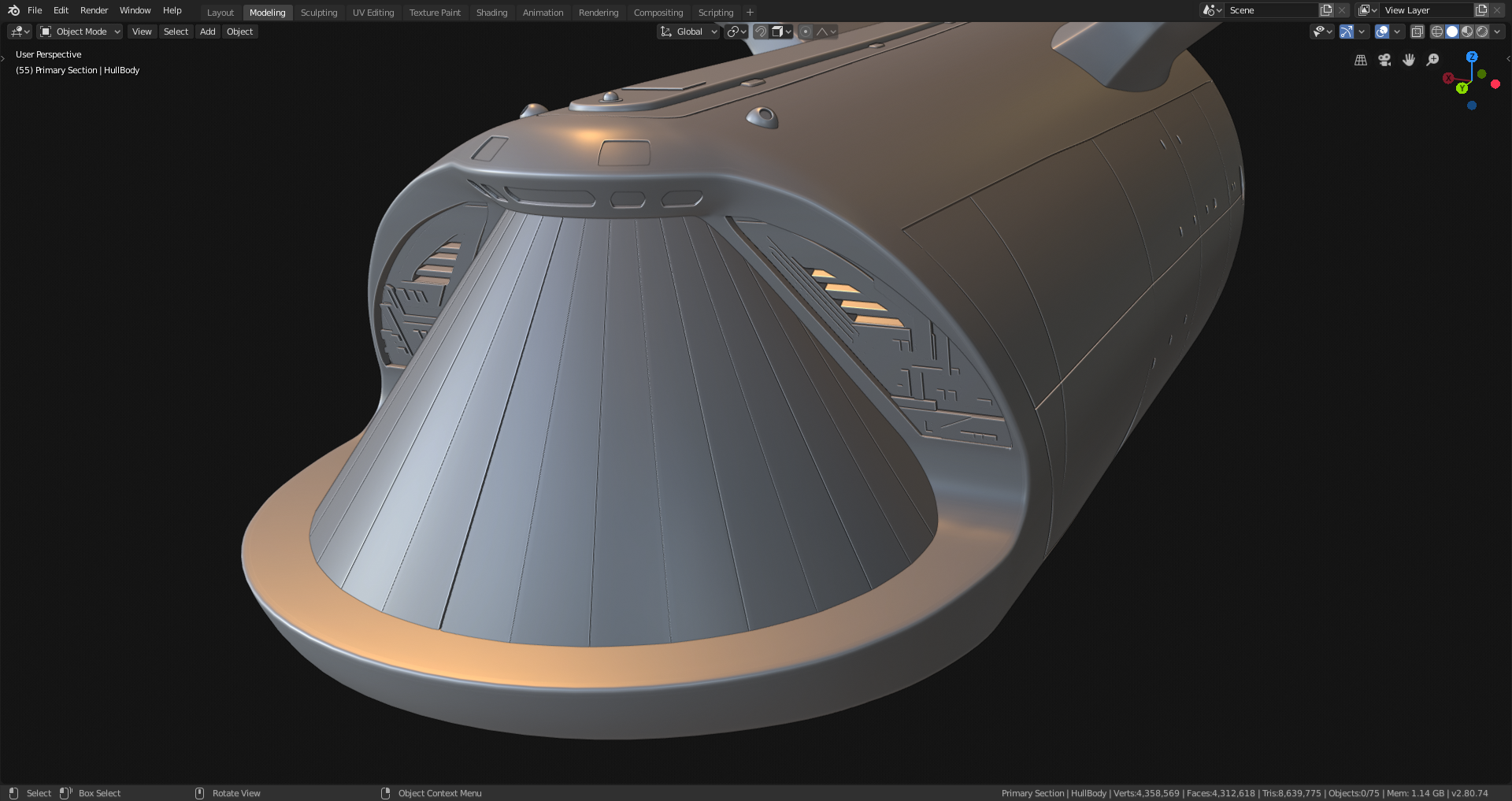
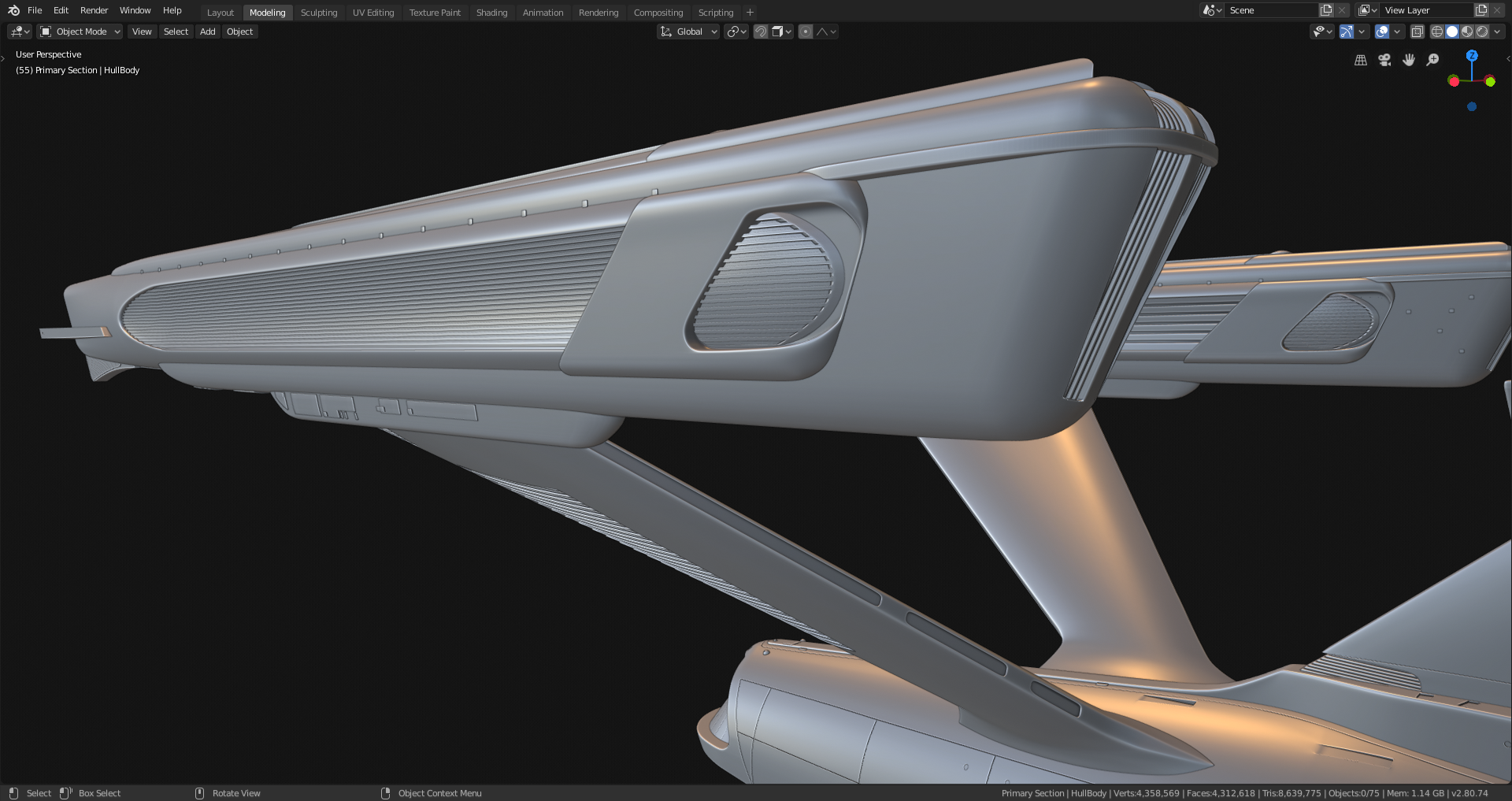
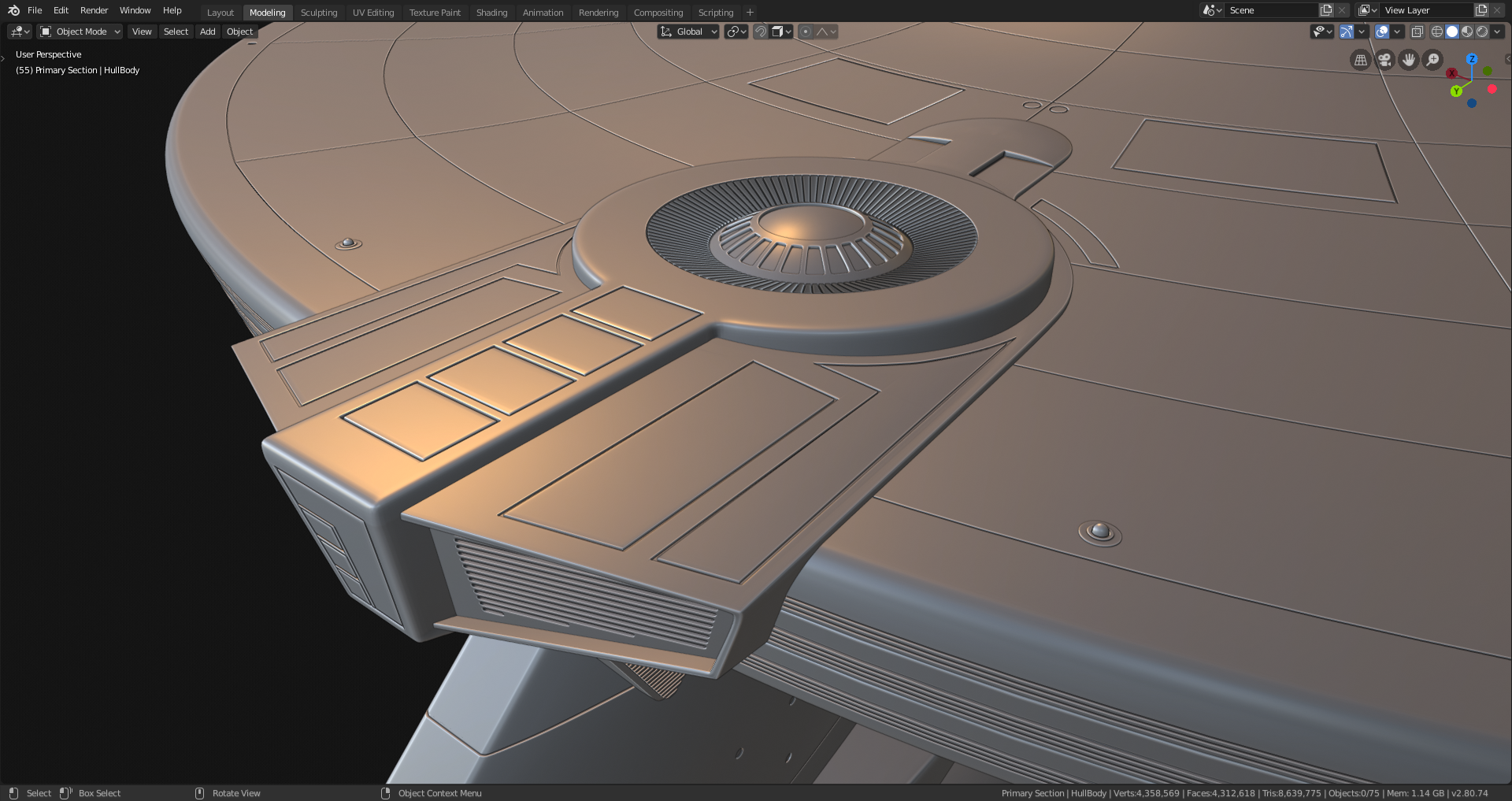
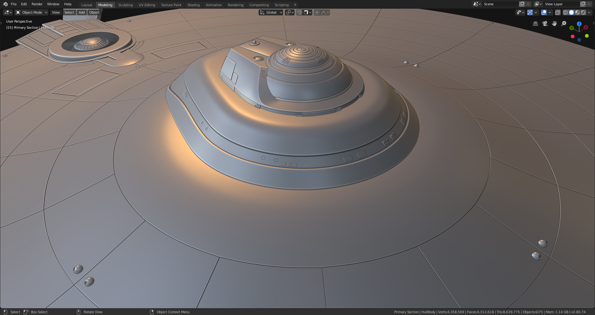
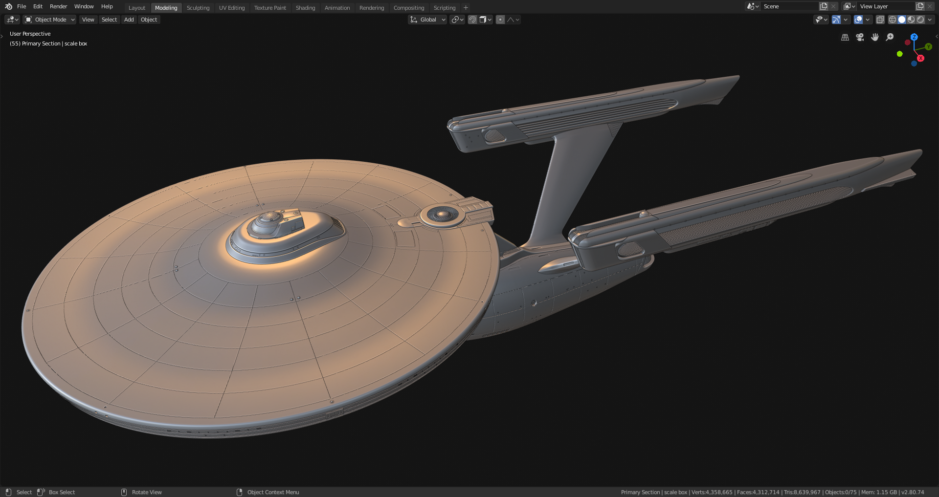
Right-click Open Image to see the full size pics as always.
4.3 million polys. I'm thinking maybe I should've picked something a little less complex for my contest project. Is it too late to pick something else?
All right, now it's time to break out the Node Editor.
![]() jakeblended The modelling looks absolutely fantastic!
jakeblended The modelling looks absolutely fantastic!
I can 'feel' your exhaustion, but it's more than worth it!
Have fun in the Shader Editor;)
Here's a progress-so-far render.
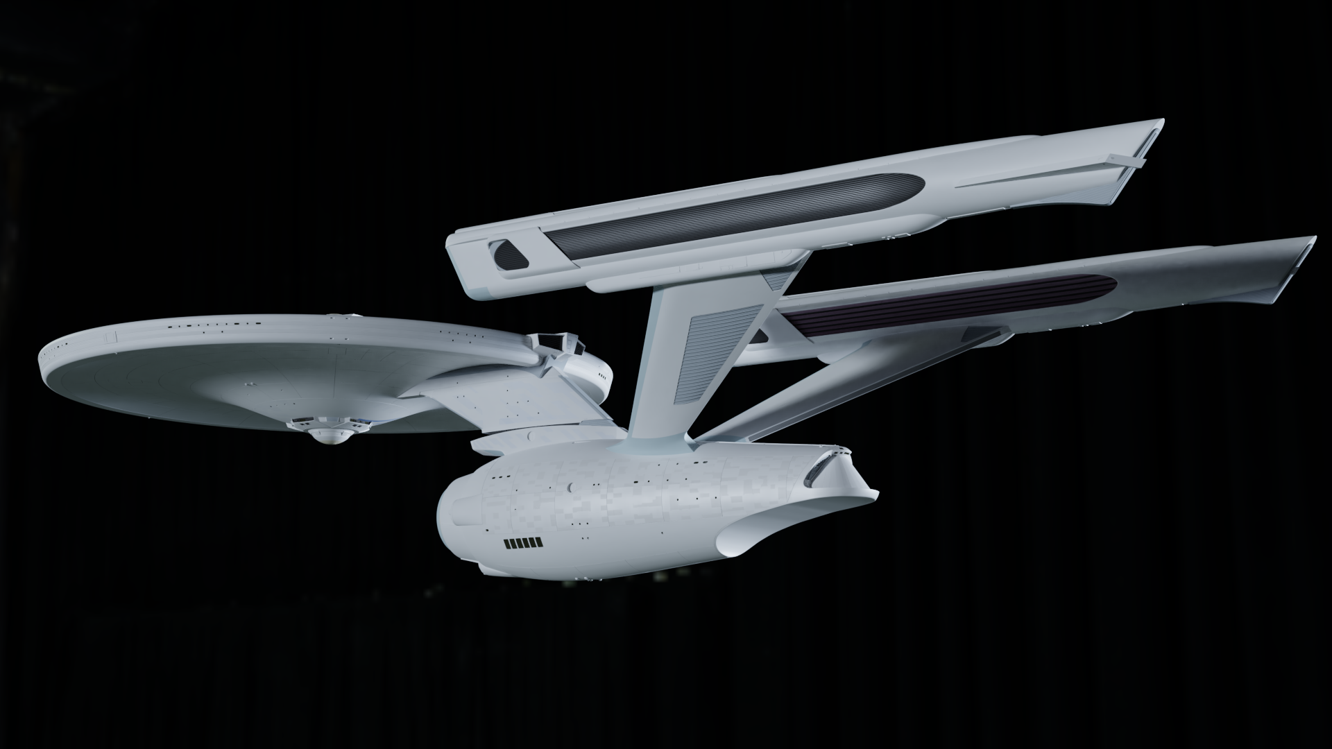
Today I managed to get most of the solid-color, i.e. non-texture-using, materials done. Of course I might still adjust them a bit between now and then end. Right now I'm working on that textured paneling you can see on the side of the lower hull here (you may need to embiggen the image); it's tedious work. Right now I've got most of the dish done, all of the neck and about half the lower body. The engines and struts will get some too. I may need to play with the color ramp a little more, because the paneling on the side there is three colors of gray, but in this Cycles render it only looks like two - it's really difficult to see the mid-tone I guess I'll have to darken it, but I don't want to overdo it - color-wise, this needs to be very subtle. The bigger effect is specular - I'm using the texture not just for albedo, but as a specular map as well, so the panels give some nice eye-catching reflections depending on the light angle.
Here is the same effect highlighted on top of the saucer. I added a half a whisker of bump to this particular location to help sell it, you'll probably need to embiggen to see it:
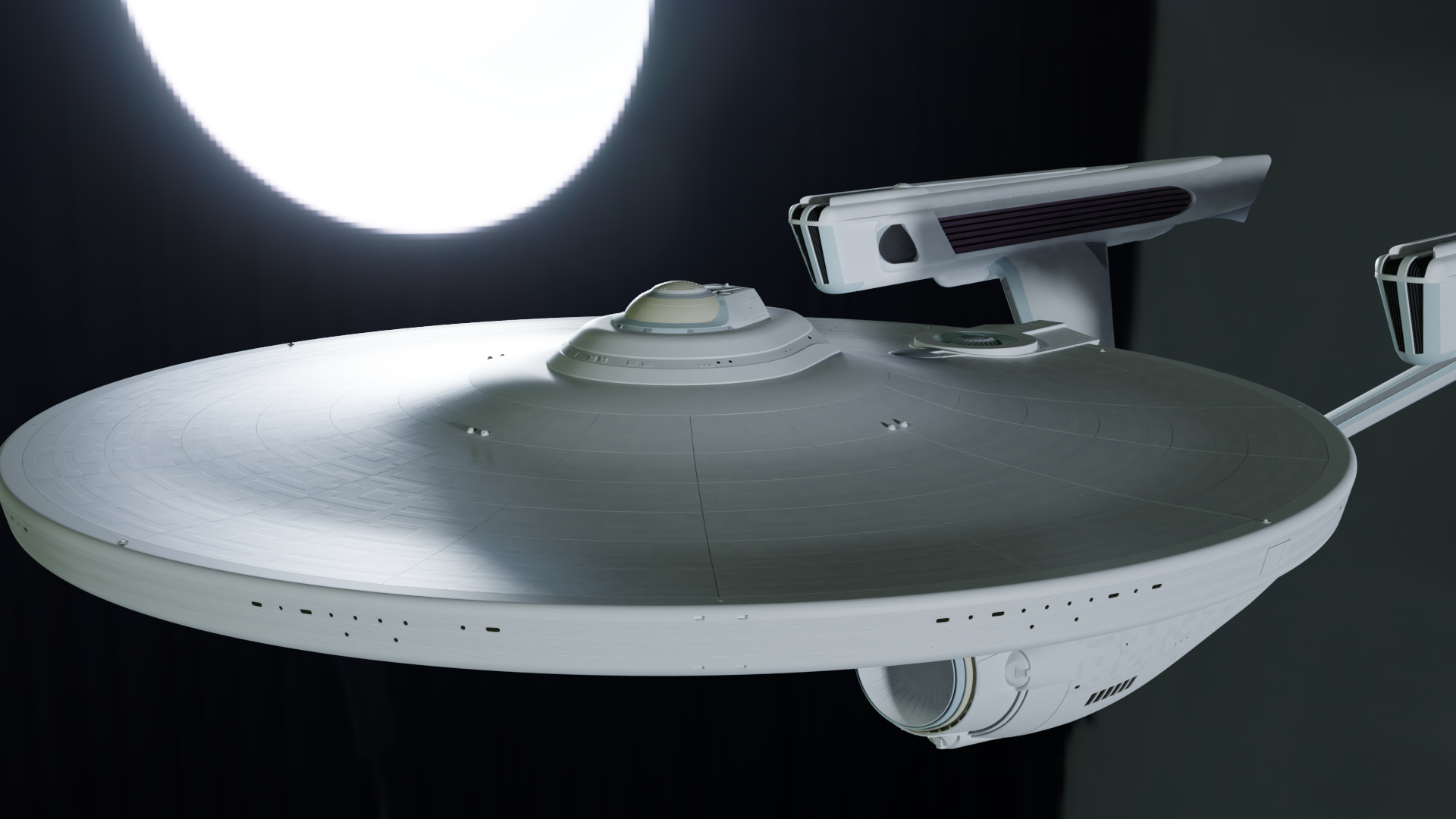
Not sure yet whether I want to keep the bump or go with just specularity by itself.
Oh, also - you notice there on the rim, that one of the Booleaned windows isn't showing up in the render? Yeah I don't know what that's all about. It's not the only one either. And the same thing happens with Eevee; the Booleans all show up perfectly in the viewport but when I make an actual render, some of them are missing. I'm afraid I may need to bite the bullet and apply some of those Booleans. But I'll mess around with that business after I'm done with all the shading and texturing.
![]() jakeblended in the outliner, check the filter that shows which part are rendered. and then check the boolean parts that they are also shown in render. happened few times for me when i had booleans in different collection and then collection itself was disabled in render time.
jakeblended in the outliner, check the filter that shows which part are rendered. and then check the boolean parts that they are also shown in render. happened few times for me when i had booleans in different collection and then collection itself was disabled in render time.
![]() louhikarme Thanks - but that's not it. I already made the render where I forgot to turn the right things on/off for rendering, ha. But this is different - all of the windows in each "set" are part of the same Boolean object. So if any of them show up then all of them should. Weirdness.
louhikarme Thanks - but that's not it. I already made the render where I forgot to turn the right things on/off for rendering, ha. But this is different - all of the windows in each "set" are part of the same Boolean object. So if any of them show up then all of them should. Weirdness.
![]() jakeblended that is weird. one thing to test is to set the viewport setting same as render and see if that does duplicate the issue.
jakeblended that is weird. one thing to test is to set the viewport setting same as render and see if that does duplicate the issue.
All right, so I have some bad news and some neutral news.
The bad news is that I won't be finished in time for tonight's midnight deadline for the live critique.. I accepted this day before yesterday already, and relaxed my pace somewhat. I tried hard as I could to make it in time, but them's the breaks.
The neutral news is that work continues and I'll be finished in plenty of time for the contest deadline. Yesterday and today was spent finishing what hull detail I'm willing to do for the time being, and also creating some decals in GIMP and applying them. Part of creating them entailed doing research and chasing down some materials like the correct fonts, which took more time than I imagined it would've. But at any rate, got 'em done and sticking 'em on.

I've got most of them on, but still a few more to go. Once they're all on, it'll be time to work on lighting. Not scene lighting, mind you - the model's own lighting. The thing is lit up like a Christmas tree. There's lit windows, and navigation lights, and flood-lighting illuminating parts of the hull. And a couple of independently glowy bits on top of it. I played a little with lighting such a part while taking a break from the decal tedium, and it did take a little while to achieve this effect:
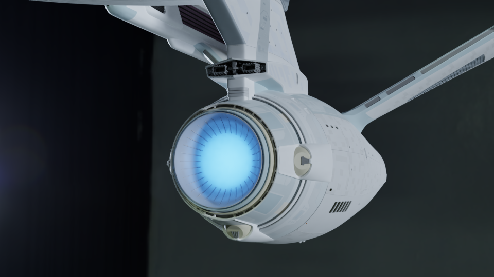
Still, I don't expect too much trouble (famous last words). I think I can have MOST of the lighting done by tomorrow. Once all the decals are on and the lighting is done I'm going to take care of that annoying missing-boolean problem, and then the model will be completely finished for the purposes of this project, and it'll be time to make an actual scene with it finally!
All right! It was a slog but I finished off the decals and I think I'm happy with the lighting now too. Here's some lighting tests:
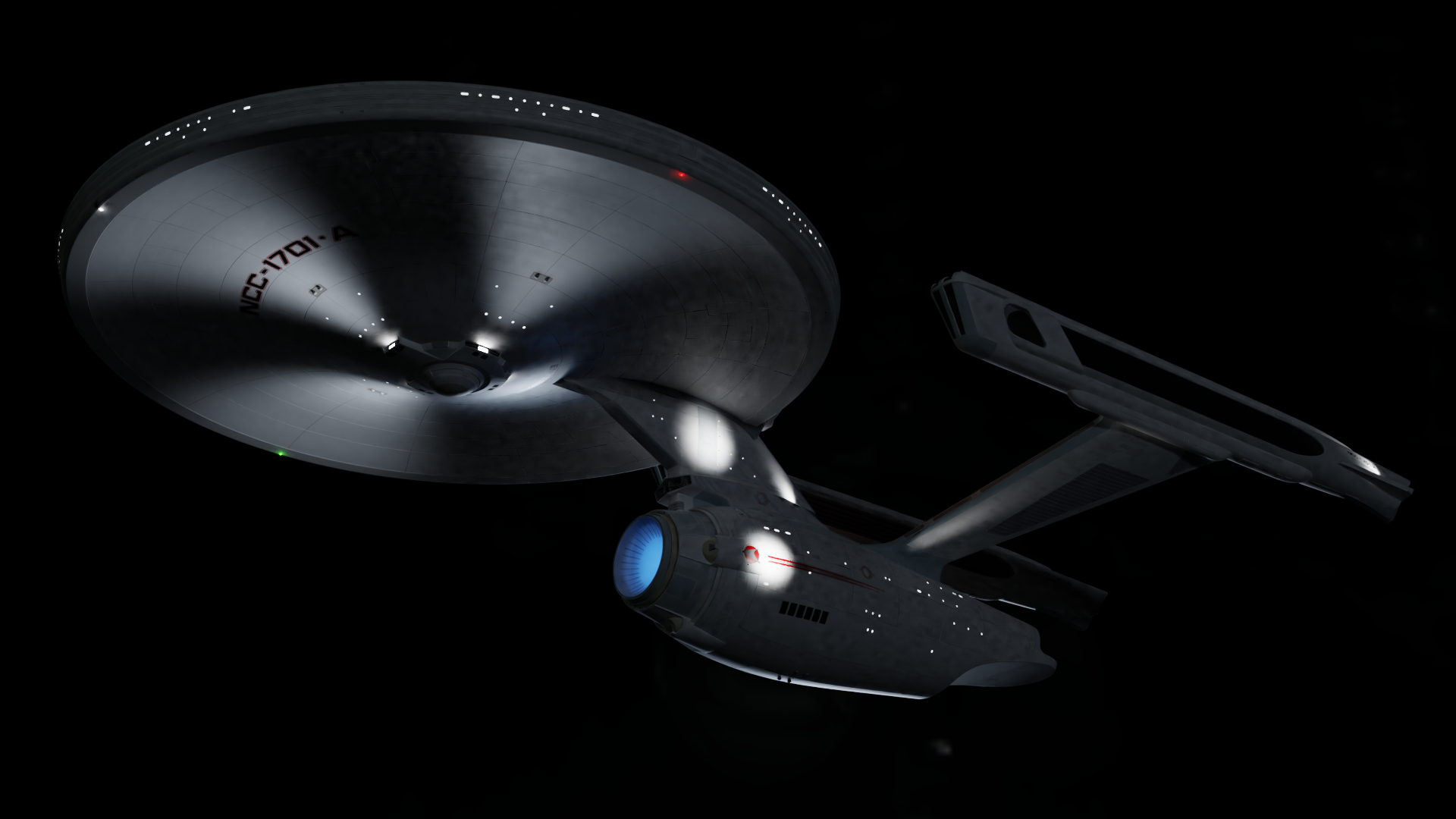
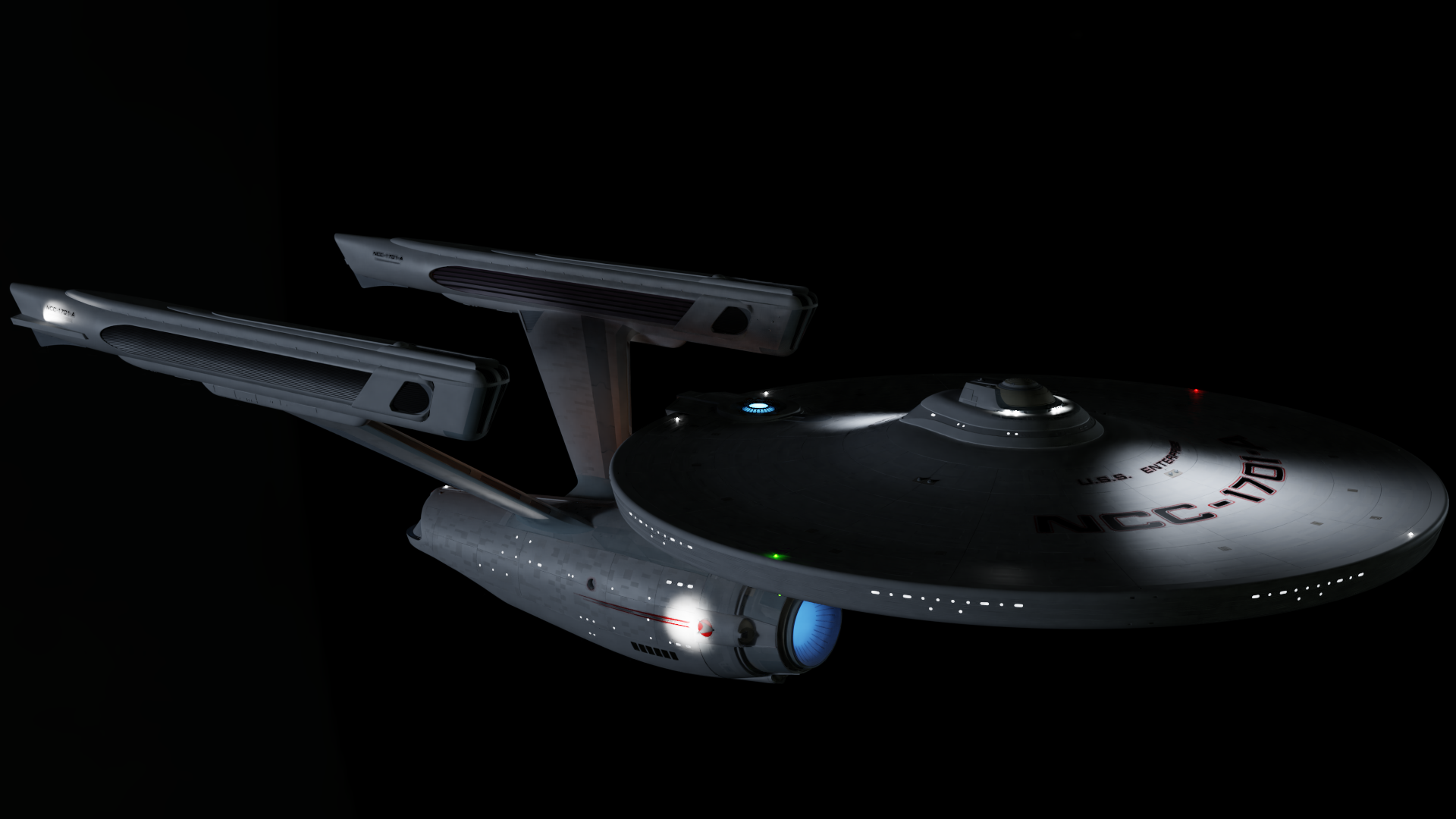
Yeah, I like that.
It's pretty straightforward; the smaller "bulb" lights around the edges of the hull are just emission shaders on the mesh; area lamps around the bottom of the bridge and inside/shining through the translucent blue widgets; and then spotlights a plenty. The windows are also emission shaders on mesh, and I plugged a noise texture through a color ramp into the light strength to create the vague illusion of some random "stuff" behind the windows, like corridors or people or whatnot - although it looks like it was set too subtle to really show up in these renders (I swear it was easier to see when the windows were the only thing lit on the model), so I'll have to tweak that a little. The illusion breaks down too much in the larger windows though, like those at the bottom, and the large windows on the back of the bridge. In the movies, models of interior sets are placed behind those big windows in compositing; I had no time to make such things, so I just have to leave those windows dark - for now.
Okay so tomorrow, I fix that one missing rim window, and then I think I can go ahead and start on my scene. I'm thinking a planet, some colorful nebular jazz....we'll see.
![]() jakeblended to me it looks too dark. depending on the background you are going. consider addin more ambient to show more what is in the shadows aswell. like usually on the shows the ships were highly visible.
jakeblended to me it looks too dark. depending on the background you are going. consider addin more ambient to show more what is in the shadows aswell. like usually on the shows the ships were highly visible.
however it looks great. just a tad too dark.
![]() louhikarme Oh yes, for certain! I brought the lights down on purpose for these renders because I wanted to test the ship's own lighting. The finished render will have plenty of environmental lighting - probably some nice colors too, if I can manage the "nebula" concept I'm thinking of. I just recently saw some social media posts by a Blenderer who was working out how to make some procedural nebulas, and managed some pretty good results and shared his methods, so I see a lot of potential there.
louhikarme Oh yes, for certain! I brought the lights down on purpose for these renders because I wanted to test the ship's own lighting. The finished render will have plenty of environmental lighting - probably some nice colors too, if I can manage the "nebula" concept I'm thinking of. I just recently saw some social media posts by a Blenderer who was working out how to make some procedural nebulas, and managed some pretty good results and shared his methods, so I see a lot of potential there.
![]() jakeblended aye, ther are actually few if you search eevee nebula in youtube https://www.youtube.com/results?search_query=eevee+nebula
jakeblended aye, ther are actually few if you search eevee nebula in youtube https://www.youtube.com/results?search_query=eevee+nebula
those have good stuff in them to make your own.
![]() louhikarme Composing the nebulas in Eevee is going to be fun. Unfortunately the final render itself is going to have to be Cycles; Eevee is a no-go for this one it turns out. On the other hand, much is so similar between Eevee and Cycles now that whatever I compose in the former should work out well in the latter. It's not perfectly one-for-one; when making those spotlights for instance, there was a very marked difference between how they looked between the two; in Cycles the lights had to be much smaller and moved much closer to the hull to look the same as they did in LookDev mode (which is Eevee), and as you can imagine this took a whole lot of render-regioning and adjusting over and over again - it was time-consuming, and although I got the lights exactly how I want them in Cycles, unfortunately in LookDev they don't look nearly as great anymore.
louhikarme Composing the nebulas in Eevee is going to be fun. Unfortunately the final render itself is going to have to be Cycles; Eevee is a no-go for this one it turns out. On the other hand, much is so similar between Eevee and Cycles now that whatever I compose in the former should work out well in the latter. It's not perfectly one-for-one; when making those spotlights for instance, there was a very marked difference between how they looked between the two; in Cycles the lights had to be much smaller and moved much closer to the hull to look the same as they did in LookDev mode (which is Eevee), and as you can imagine this took a whole lot of render-regioning and adjusting over and over again - it was time-consuming, and although I got the lights exactly how I want them in Cycles, unfortunately in LookDev they don't look nearly as great anymore.
Why these differences? And why is Eevee a no-go for this project? Well it's both for the same reason, and it's really my fault unfortunately. The problem is the scale of the ship. Our CGC instructors always tell us how important it is to build to the correct scale. It's not something I neglected per-se; the ship is built exactly to the measurements defined by the plans I used, including the correct scale. The problem - lol - is that those plans are for a 100-inch-long 1:120 physical studio filming model. So my great big starship is actually only just over 8 feet long. Some of those details I modeled are less than a millimeter long or thick.
Normally this wouldn't be a serious problem; if they could take an 8-foot practical model and make it look the right size on a movie screen I shouldn't have any trouble doing the same thing. That was my thinking when I started, and it's still valid to a point. What I didn't realize then, but I have learned since, is that Eevee's lighting system has serious trouble working as well at micro scales like this. Take these early lighting tests I did in both Eevee and Cycles:
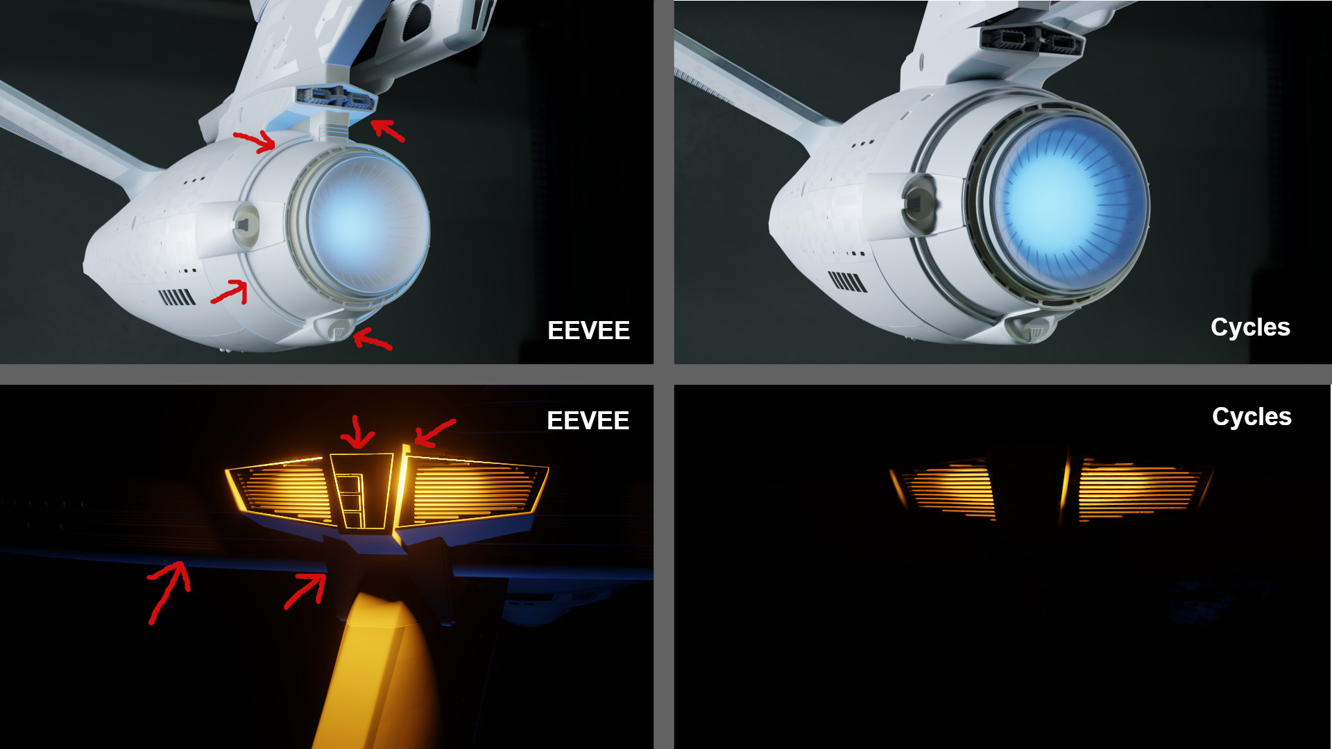
Look at how much light just seems to be spilling right through what should be solid objects and illuminating surfaces it shouldn't in the Eevee renders. I've tried everything to remedy this in-place, including adding thickness to some surfaces which didn't have it, and adding more mesh objects around the light with the hope of occluding it, sort of like making light-boxes to prevent this kind of spillage on physical models. Nothing worked. Researching this problem, I learned that apparently if a surface is thin beyond a certain threshold, Eevee just can't "see it" for the purpose of deciding whether it should be casting a shadow. The only fix is to add more thickness to the object or scale your whole scene up until the mesh is "thick" enough to start occluding light. Again, this is only a problem you'd ever encounter when working at very very small scales, like I unfortunately am with the details of this model.
Obviously adding thickness won't work for me; there's only so much I can add before things start visibly clipping through other things, and it's not enough to actually fix the lighting problem, so it's just needlessly adding to the poly count. Scaling the whole thing up would probably solve my problem, but I'm actually afraid to do that; scaling things up will almost certainly play havok with some of my modifiers, especially Booleans, of which there are multitudes. Plus the project is so big at the moment, in terms of the memory size, number of objects, the poly count, and other factors. Making all the invisible stuff visible so that I can scale it will add enormously to the already huge poly count, and then trying to scale it all up at once....well, my poor old computer might get right up off the stand and walk out on me. And that's before I get into objects that don't scale the way mesh does, like light objects, which I'd inevitably have to fix by hand. Not only repositioning but redoing all the intensity, size, radius settings, etc. I don't want to take the risk or invest the time and effort this close to the challenge deadline. So Cycles it shall be!
That said, I do have some post-challenge plans for this project. But I'll get into those later.
![]() jakeblended one thing to remember that you can render background nebula in eevee and the model in cycles and then combine them. you don't have to have one render that does everything. especially if you are adding volumetrics.
jakeblended one thing to remember that you can render background nebula in eevee and the model in cycles and then combine them. you don't have to have one render that does everything. especially if you are adding volumetrics.
![]() louhikarme Yep, that's exactly the plan. Earlier this evening I practiced with a simple scene; I was indeed able to render a foreground object(s) in Cycles and alpha it/them over a background rendered in Eevee. I did this all in one session of Blender, going straight from the renders into the compositor; it involved creating a Linked Scene set to use Eevee, and turning the appropriate collections on and off in each Scene. Although in retrospect I suppose it would be much, much simpler to just render and save the background separately as an image and import that image back into Blender when compositing, since I don't really need any special passes from it. The nebula is far in the background, so my foreground objects won't be casting any shadows or reflections on it, and that's a very good thing since, I've learned, it is currently impossible to Holdout objects in Eevee!
louhikarme Yep, that's exactly the plan. Earlier this evening I practiced with a simple scene; I was indeed able to render a foreground object(s) in Cycles and alpha it/them over a background rendered in Eevee. I did this all in one session of Blender, going straight from the renders into the compositor; it involved creating a Linked Scene set to use Eevee, and turning the appropriate collections on and off in each Scene. Although in retrospect I suppose it would be much, much simpler to just render and save the background separately as an image and import that image back into Blender when compositing, since I don't really need any special passes from it. The nebula is far in the background, so my foreground objects won't be casting any shadows or reflections on it, and that's a very good thing since, I've learned, it is currently impossible to Holdout objects in Eevee!
To create my backdrop, first I made a procedural star-field for the background. You can make one really easily by plugging a noise texture and a color ramp into your background material, like so:

Plug the noise texture and color ramp as the factor into a mixRGB node with black and white as the mix colors, and use the color ramp to crush down both your blacks and whites until an infinite starry sky magically appears! Use the usual math tweaks to brighten the stars as desired, and play with the color ramp to control the star density. The noise texture on the bottom simply adds a smidgen of color variation to the stars, which is completely optional.
Next, I had to make the nebula. Making one of these from scratch was beyond my knowledge, but it just so happens that over the last several days a Blender user on Twitter named Brent Patterson (@brentpatterson) has been posting screenshots of his experiments in creating spectacular Hubble-like images of nebulae in Eevee with procedural volumes, and what he's come up with so far was just the ticket for me. Look him up, he's shared some node-trees. It's a little complicated, but after you've set up the nodes, playing with the math values, emission strength, colors, and mapping to create amazing-looking nebula is addicting, it's like a game! Anyway, build the material, stick it on a cube, and scale as needed and voila:
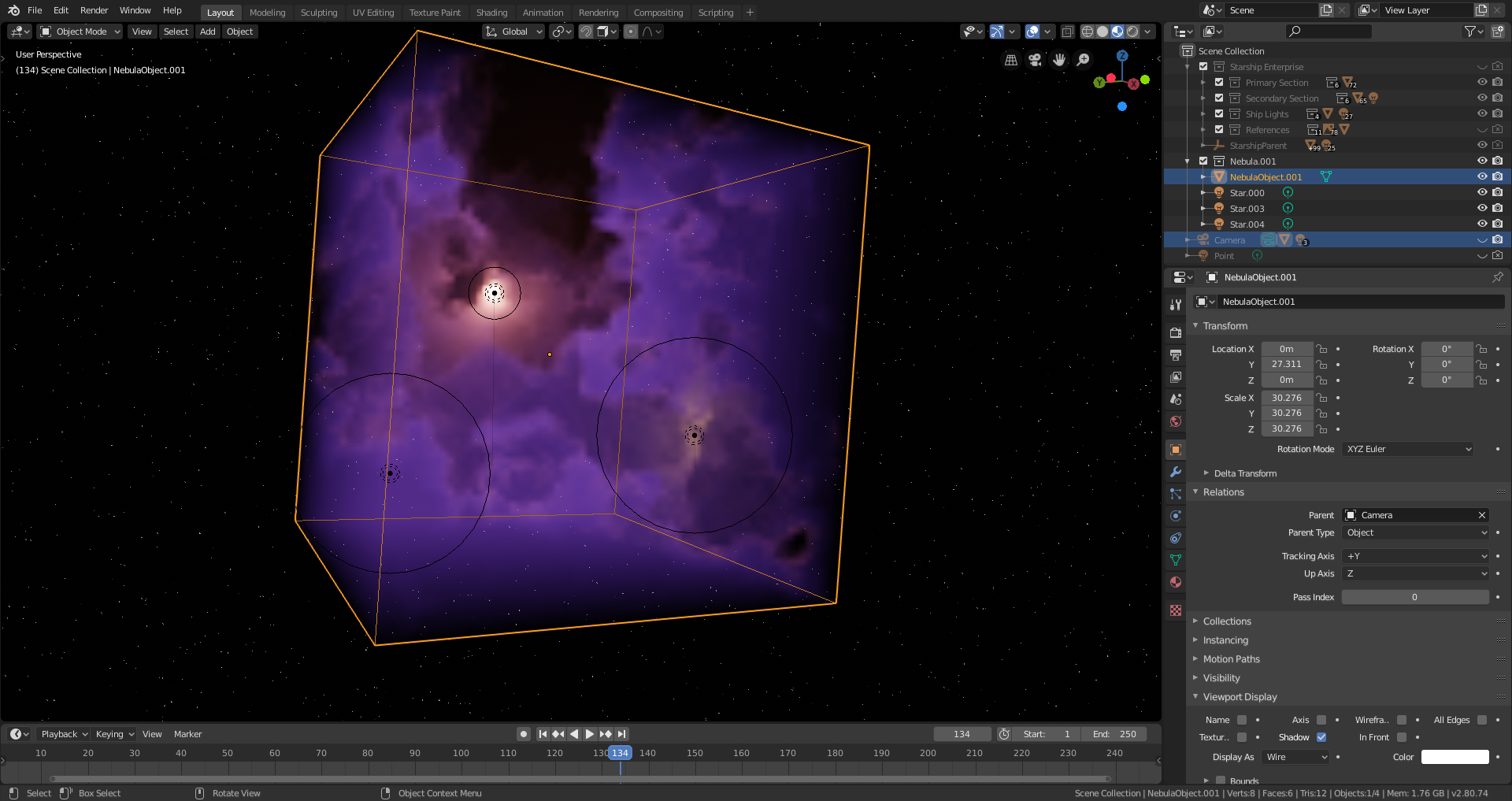
A couple of strategically-placed point lights with different colors and strengths gives the effect of embedded stars and adds more interest. I scaled back the contrastiness of the nebula though; I wanted it to look great, but I didn't want it overpowering my subject.
Next, I had to deal with positioning. I parented every single part of the ship, visible and invisible, to an empty that I wanted to use to "pose" the ship for the shot. Unfortunately this turned out to be too impractical, with even the slightest changes of rotation taking half a minute or more to actually be applied in the viewport - I suppose my computer really needs more RAM, because it has been suffering badly under the load of the completed spaceship model. So I decided to leave the ship where it is, and parent my nebula object and its embedded stars to the camera instead, after making sure to frame them in my shot exactly as I wanted them. This worked beautifully - I could pan and rotate the camera easily to view the ship from any angle, and the "background" nebula was always perfectly framed behind it. Perfect!
Finally, since the ship was much too far from the nebula object to be taking any indirect light from it, I placed a couple of point lights around it and colored them to approximate the nebular color.
With everything done, and after a couple of test renders, I kicked off the final Cycles render of the ship with the nebula turned off and the background transparent, and let that run overnight. Noob tip: if you're making a render with several passes and you want to save all the passes for later use in the compositor, save your render as an OpenEXR Multilayer file. You can then import it into the compositor as an image and all the passes will be intact and ready to use.
This afternoon, I did the (much quicker) Eevee render of the background and nebula without the ship. Then I opened the compositor, imported the ship as explained above, and alpha'd it over the background. In the compositor I fuzzed the transition between the two images up a bit so the ship didn't look like a pasted-on cutout, then tweaked my ship and nebula colors this way and that. And then it was FINALLY FINISHED!
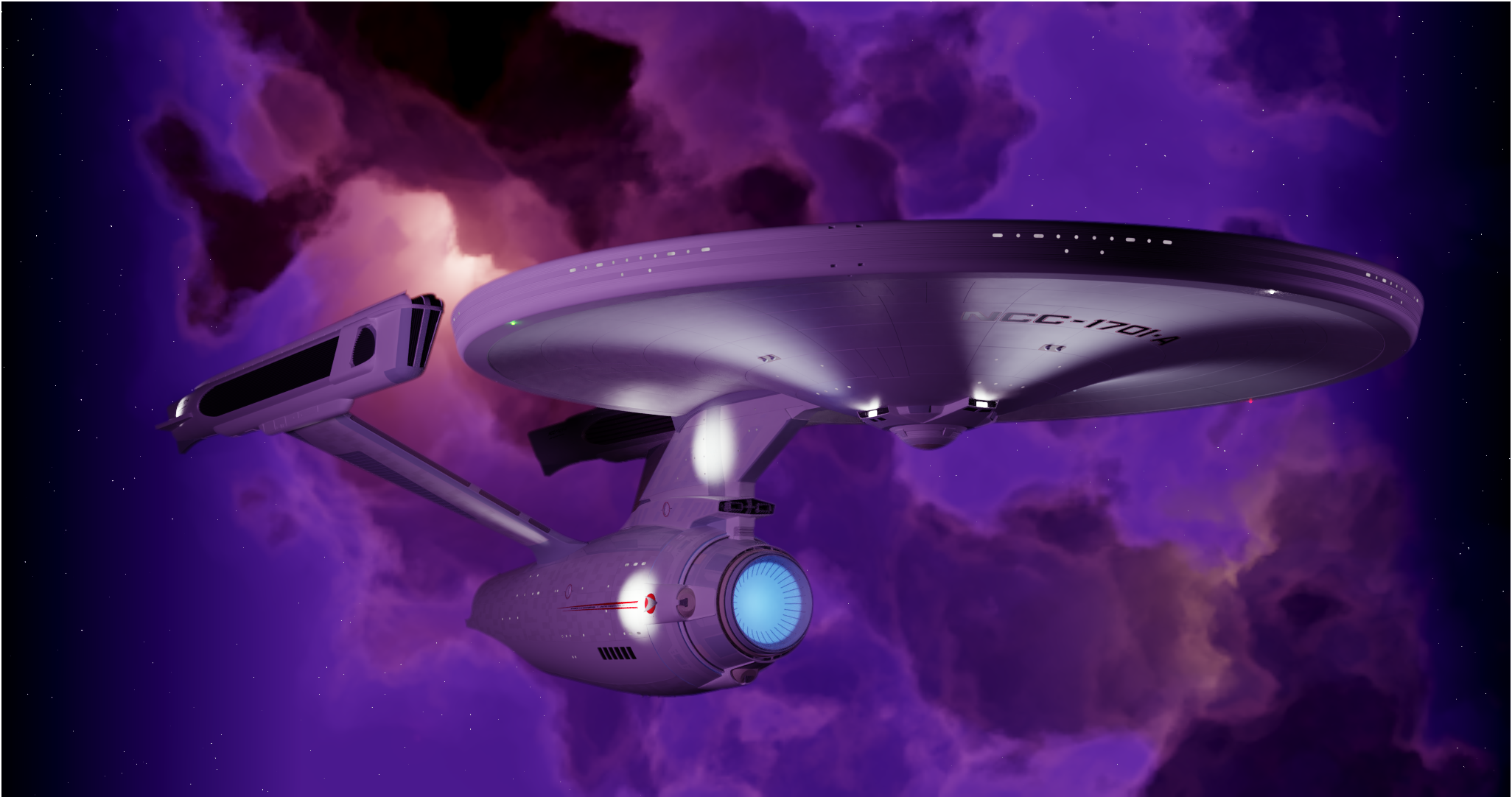
And I am done for this month I'm afraid, lol
![]() jakeblended Those details man.. and that nebulae.. awesome job Jake! You’ve done a lot of work this month 😊👍🏻
jakeblended Those details man.. and that nebulae.. awesome job Jake! You’ve done a lot of work this month 😊👍🏻
ssmurfmier1985 Thanks! I've been enjoying the last couple of days relaxing....it's almost boring after going full-bore for almost a whole month, lol. But Kent's class starts next week, so I'm just going to take the whole weekend I think.
![]() jakeblended awesome work Jake! and timely post. was battling with smoke sim and dust effect on my shot. i had seen brent nebula, but had forgotten it. so after few tweaks on his node setup, gettin the dust effect i wanted. cheers. :)
jakeblended awesome work Jake! and timely post. was battling with smoke sim and dust effect on my shot. i had seen brent nebula, but had forgotten it. so after few tweaks on his node setup, gettin the dust effect i wanted. cheers. :)