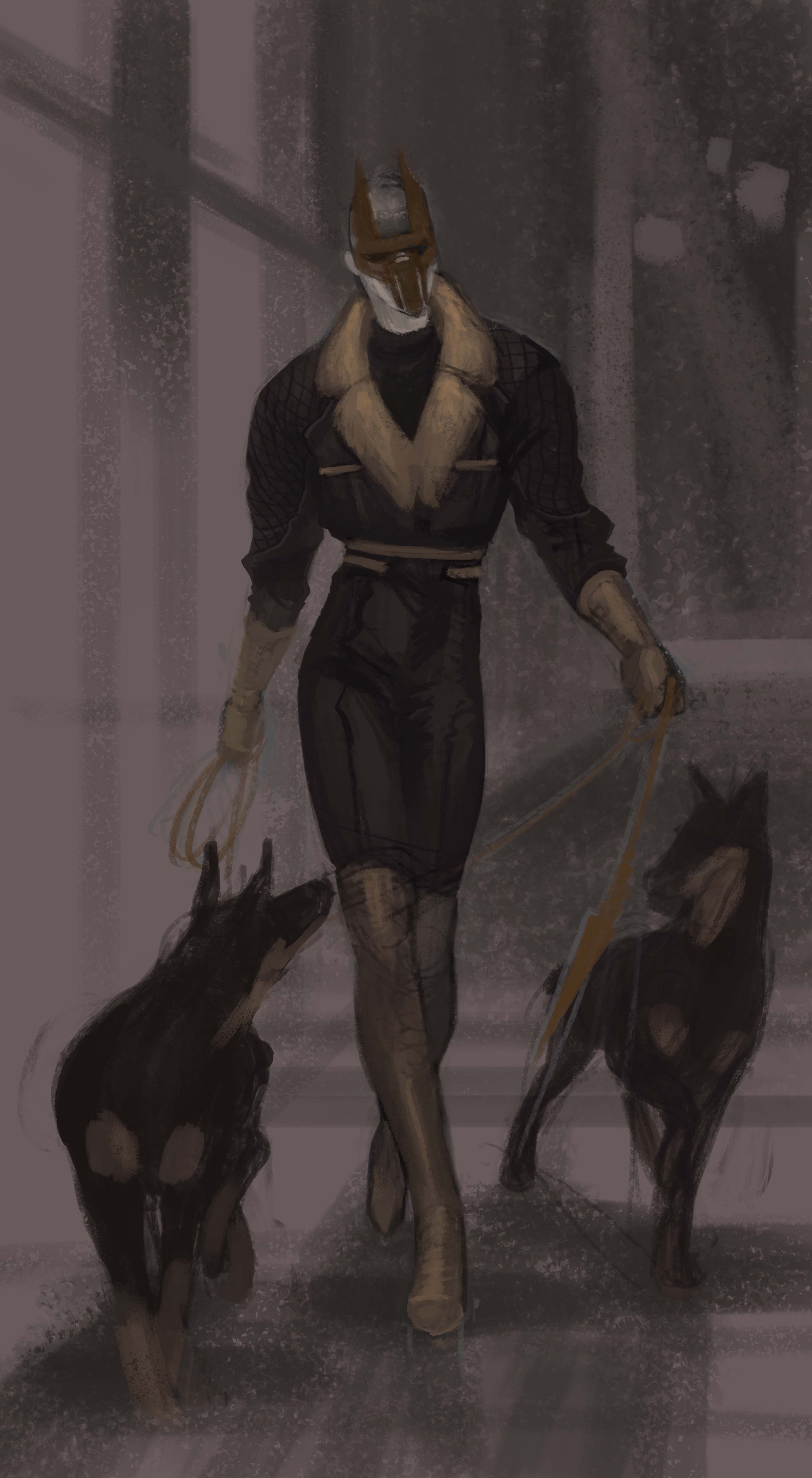
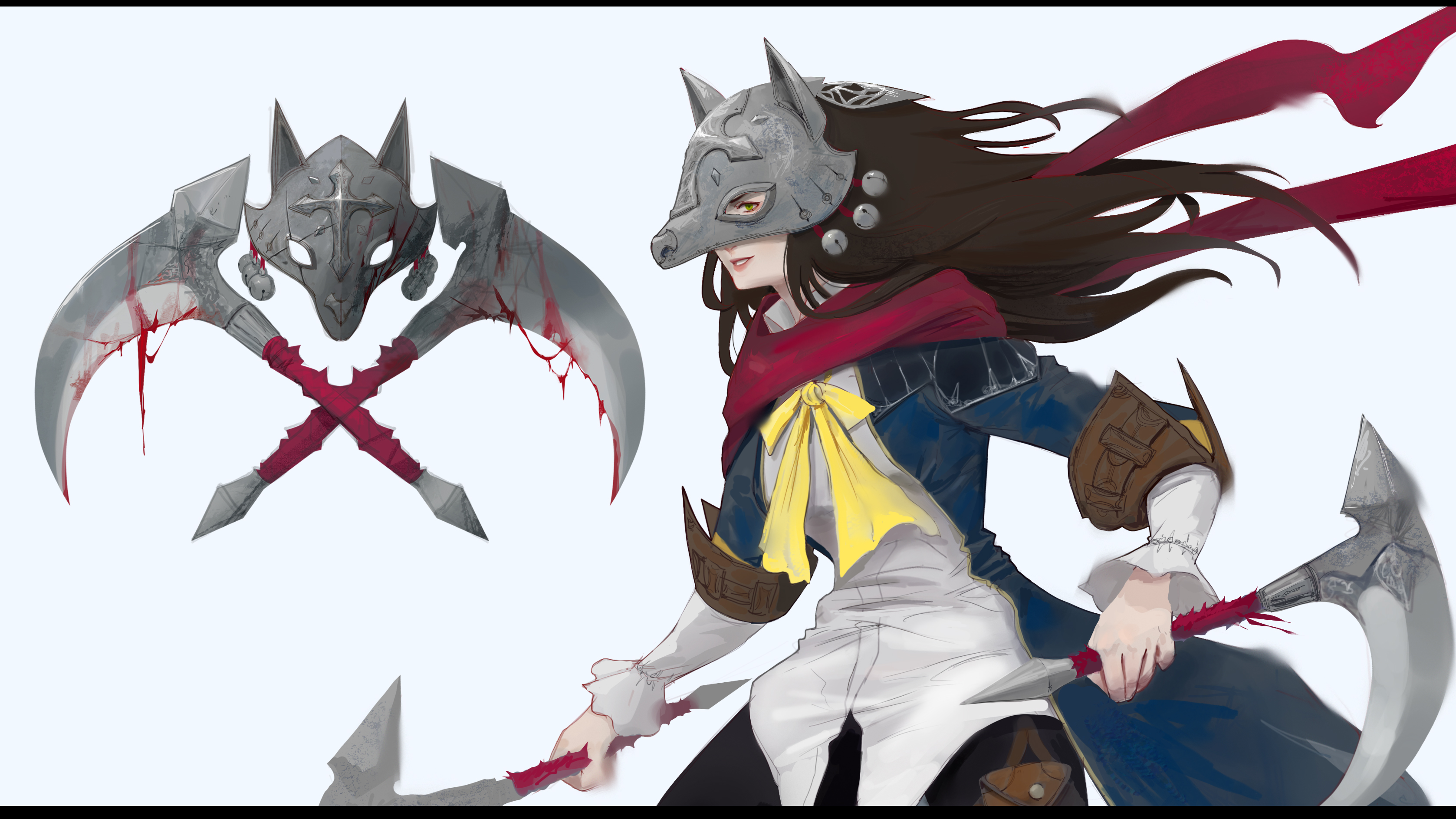
@Gordana Really like your last doodle ! But I can guess the bottles background will take you forever to finish ^^'
Otherwise I really like the 3rd image (guy alone), but his weapon dart not so much. And the sort of 1920' fashion costumes (on the other designs) is really cool, and sure those cute masks.
@JerryChu Your 1st design look stylish...but maybe it needs some weight on his shoulder to be more interesting ? Could be a floaty coat or something. Weapons look pretty cool too.
Hahah, I'll do my best to avoid those bottles (not have them as much). I'm gathering refs of some night clubs at the moment for that purpose xD
O yea, 1920's, I was reading Baccano novel recently, plot taking place in 1930's focusing on local gangs in NY, so that has pretty strong influence. :3
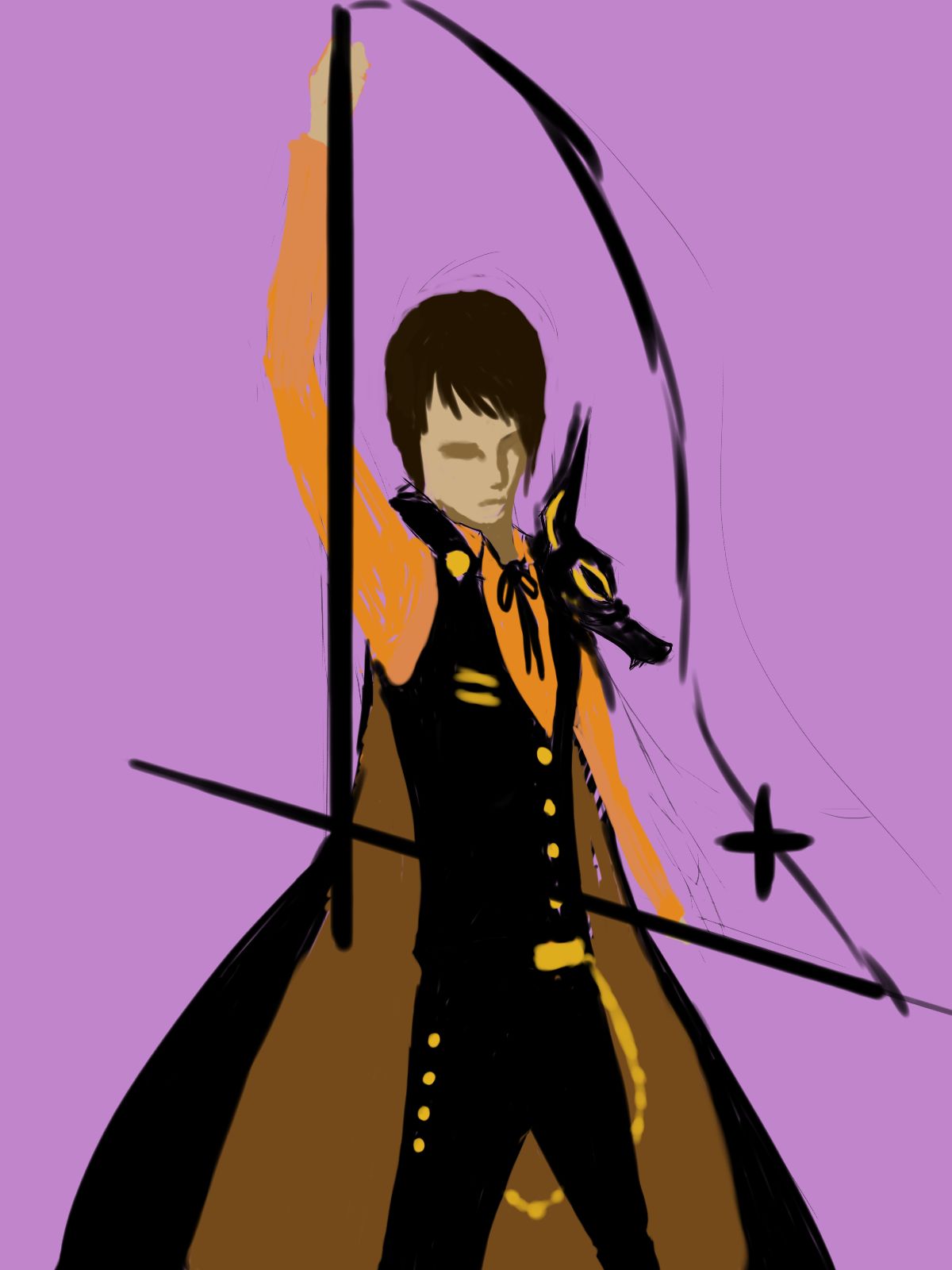 Thanks for the point it out, I think I might have a solution to that =)
Hey guys!
I have a question about the Kay-9 contest.
I was thinking about doing a character with a Foo dog mask. Is that still valid?
;)
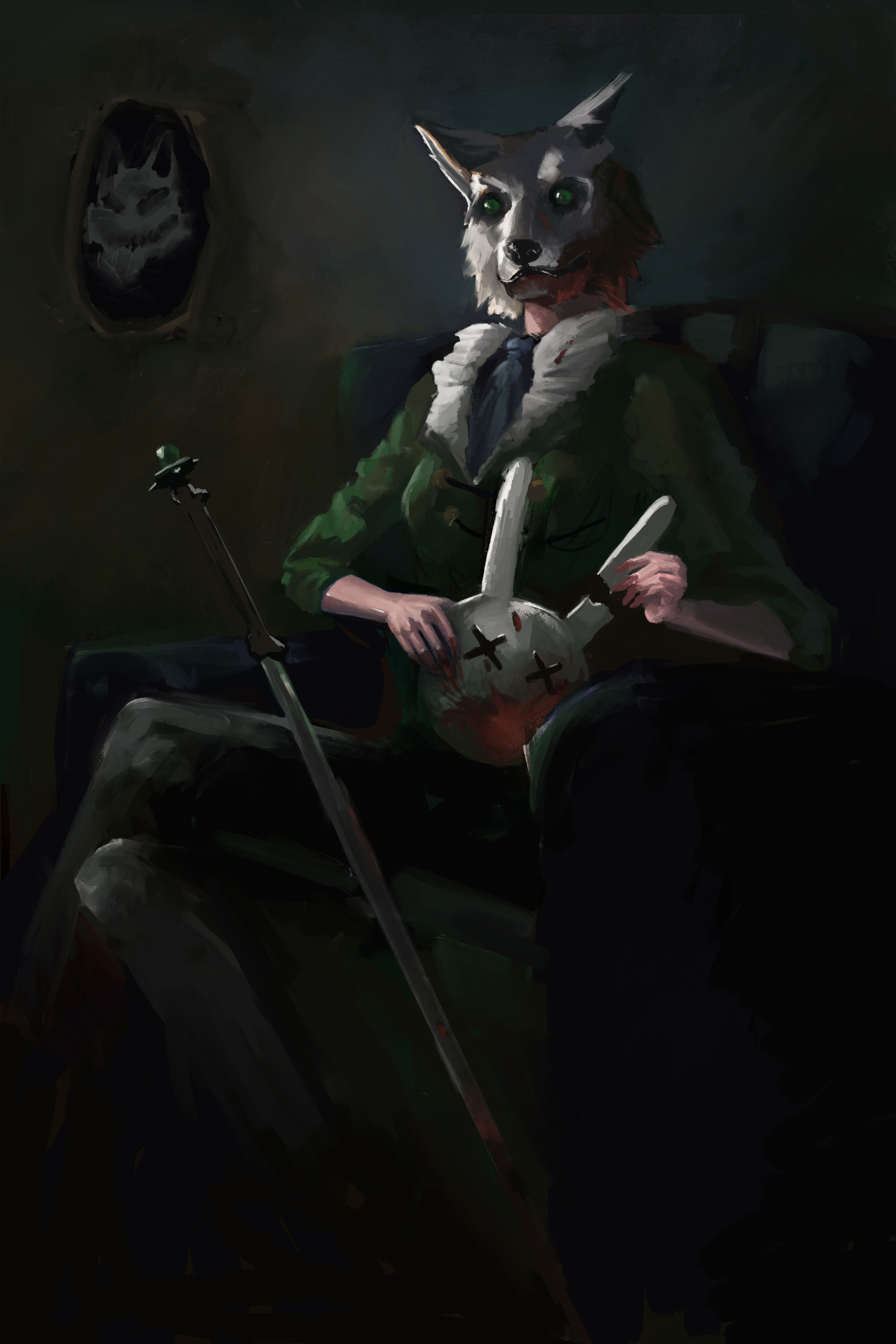
I finally got my final comp, I will be finishing this one. I am still usuree about my hand-painting skills but I think it looks good enough for now.
Greetings! :D
Im not sure why it looked so small in the entries' page. But whatever :D Here's my entry! I thought I'd share it here :)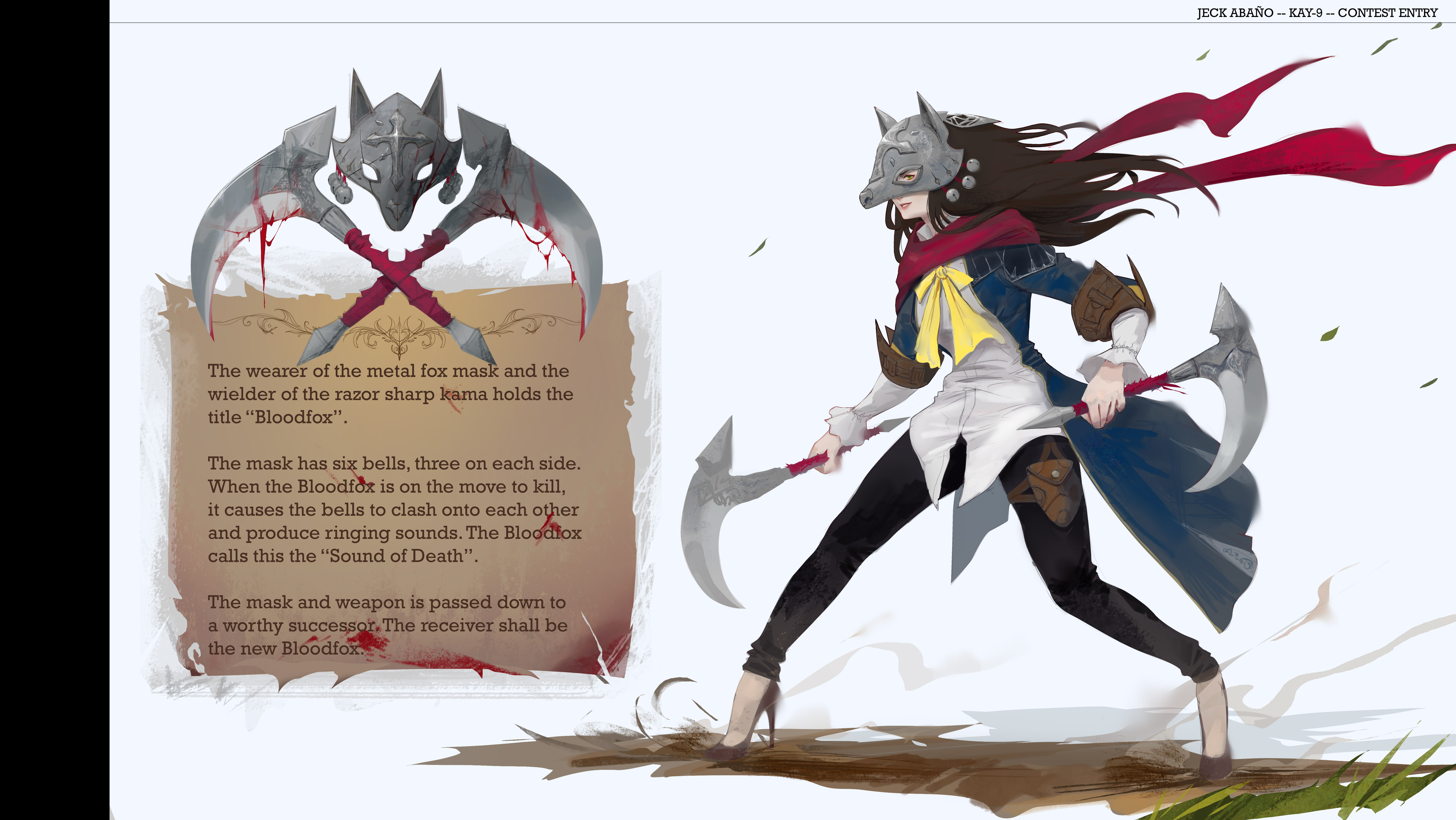
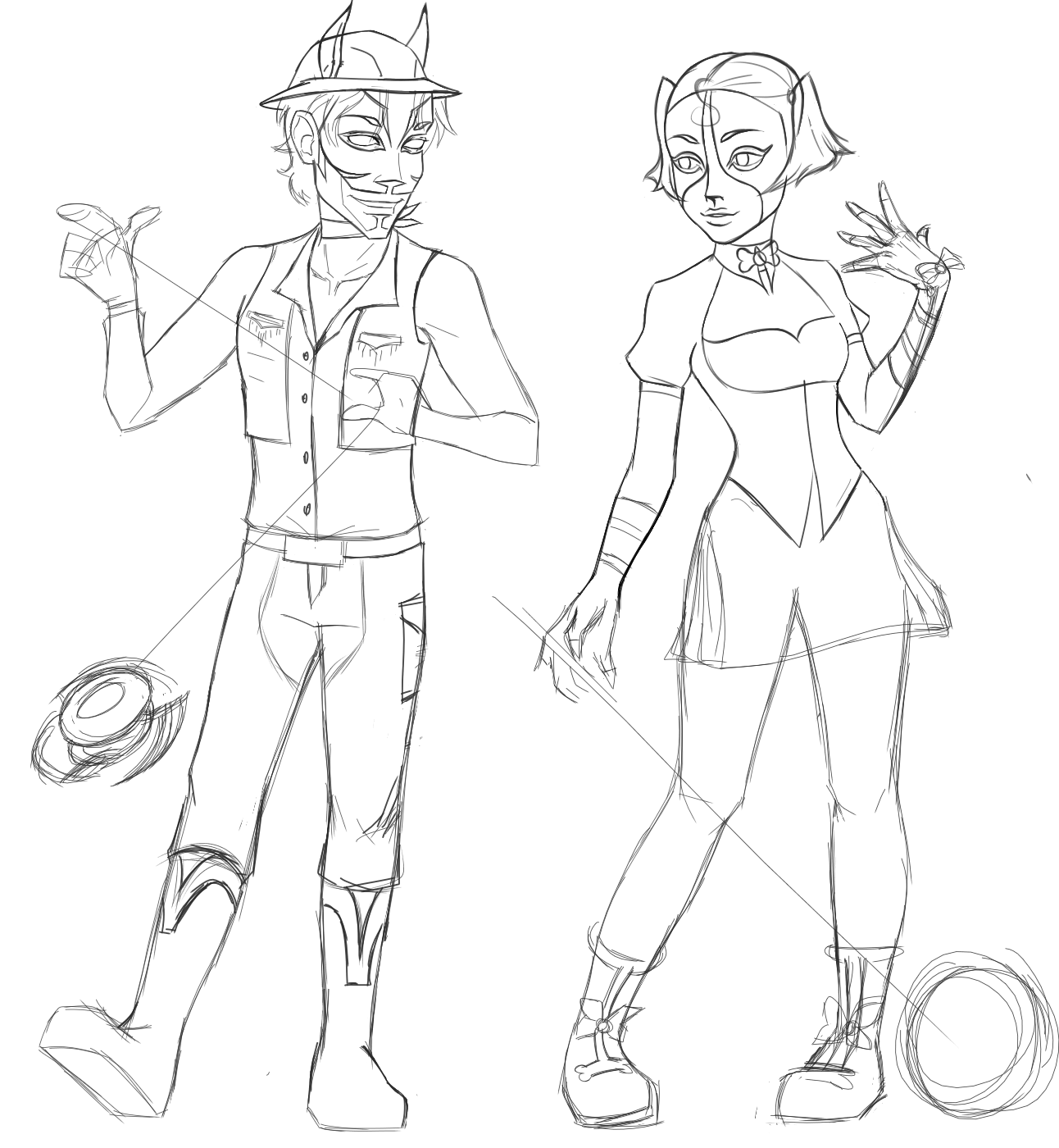
I decided to do another character and his name is spot. I redesigned my other female character who I've decided to name Oreo because she was born from two black parents but due to having vitiligo she was born mostly white with black spots on areas of her body including a big one around her left eye. It also affected her hair giving her streaks of white in her hair. For the guy, his weapon is a yo-yo which can eject blades- additional info will be given in their bios. I need to work on their poses, they look weird. I want something more dynamic and expressive. Any feedback/ opinion would be greatly appreciated. Thank you.
My current progress. ^^
Is this too bloody for the contest or is it still in the okay zone?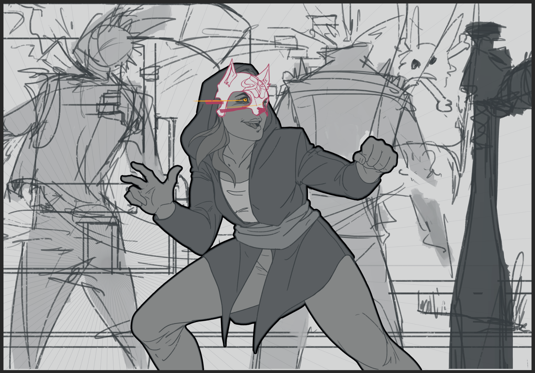
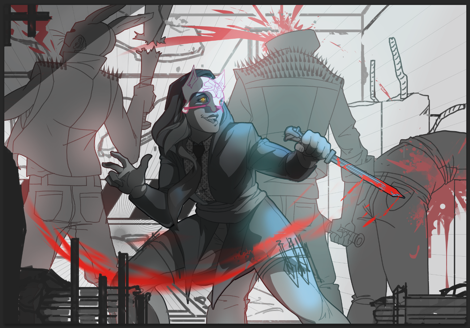
To Lauren- I really like the vibe of your work, it is very similar to what i did. Keep up the good work.
To Penn Animus- Awesome just beautiful man i dig it, i love it... And i like it too.
Hey everyone, i just submitted my entry and wanted to share some of the process with everyone.
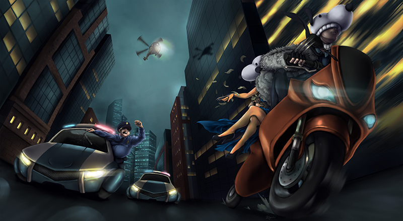
(This is the final version i chose to submit.)
Originally i wanted to illustrate a male Goofy and female Snoopy chasing a Battered Bunny. However, the composition was too boring and predictable for me.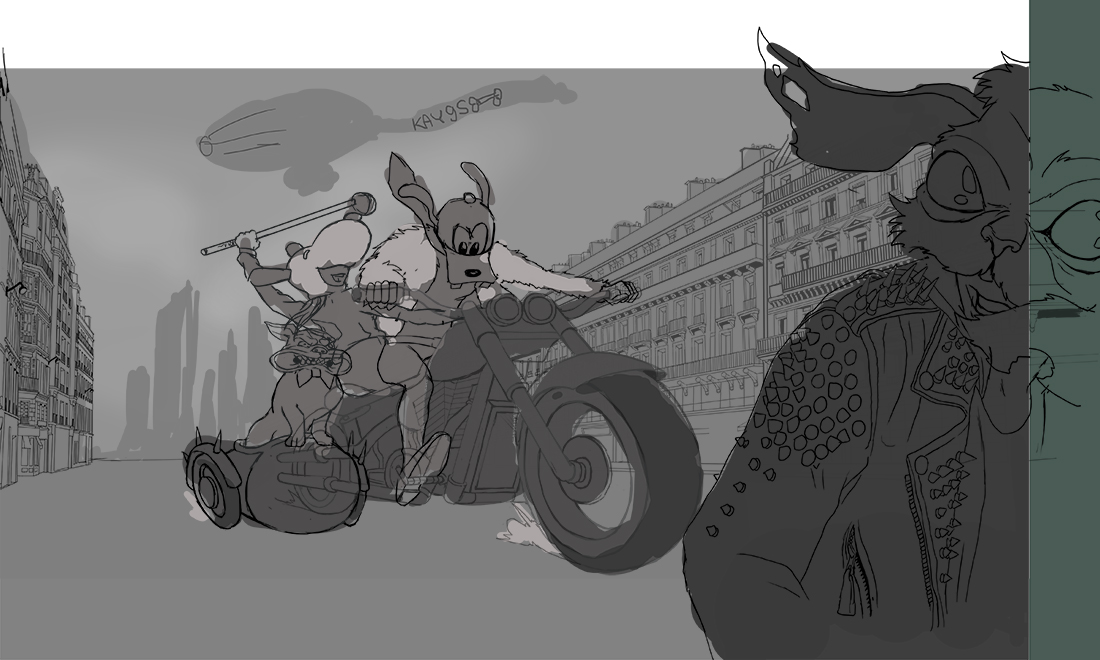
(it was painful to stop this, since i was already two weeks into the challenge at this point)
I scraped the idea and sketched out a more dynamic scene, with no rabbit but law enforcement chasing the culprits (now both in Snoopy masks).
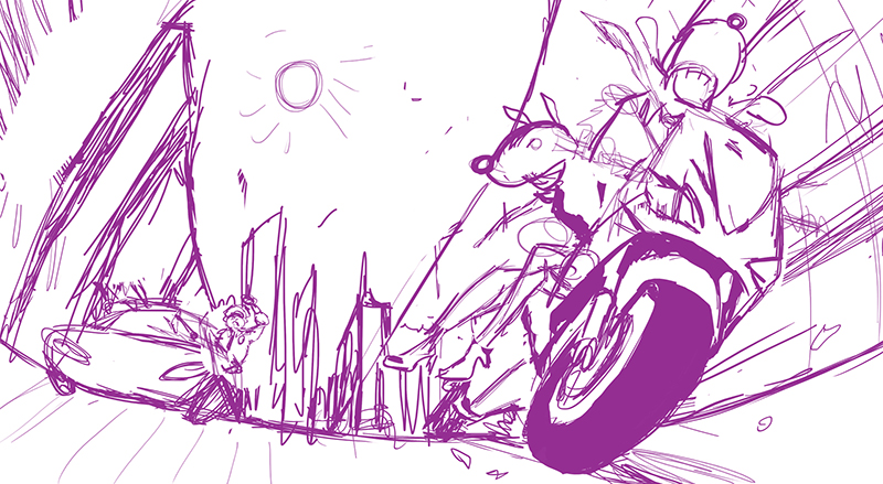
(sloppy sketch, pink is my go-to)
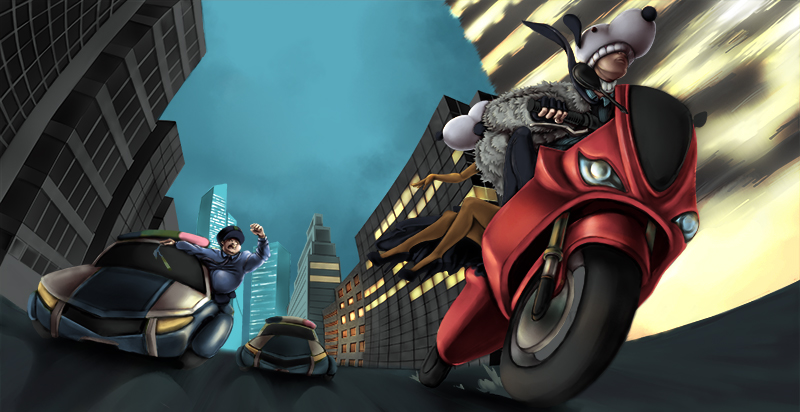
(basic colors, working with curves layer masks for shadows and light)
Overall this was completely out of my comfort zone, and even though many things are wrong with the illustration, I am proud of the challenge. Everything was made in Photoshop.
Hi all! New guy here! Here's my first sketch.

Then I figured I change the head a bit and add the chosen mask.
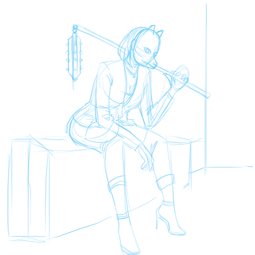
Dunno if I can make it in time. But I'm hoping I'll be able to submit my final work. Maybe I'll tweak the design more if I can. :)
Hello. Just wanted to share a crop of billnyedoggoguy from my wip. Bye now.
Dog on a cat walk, just jumping on the bandwagon here lol ... although comments and critics welcome!