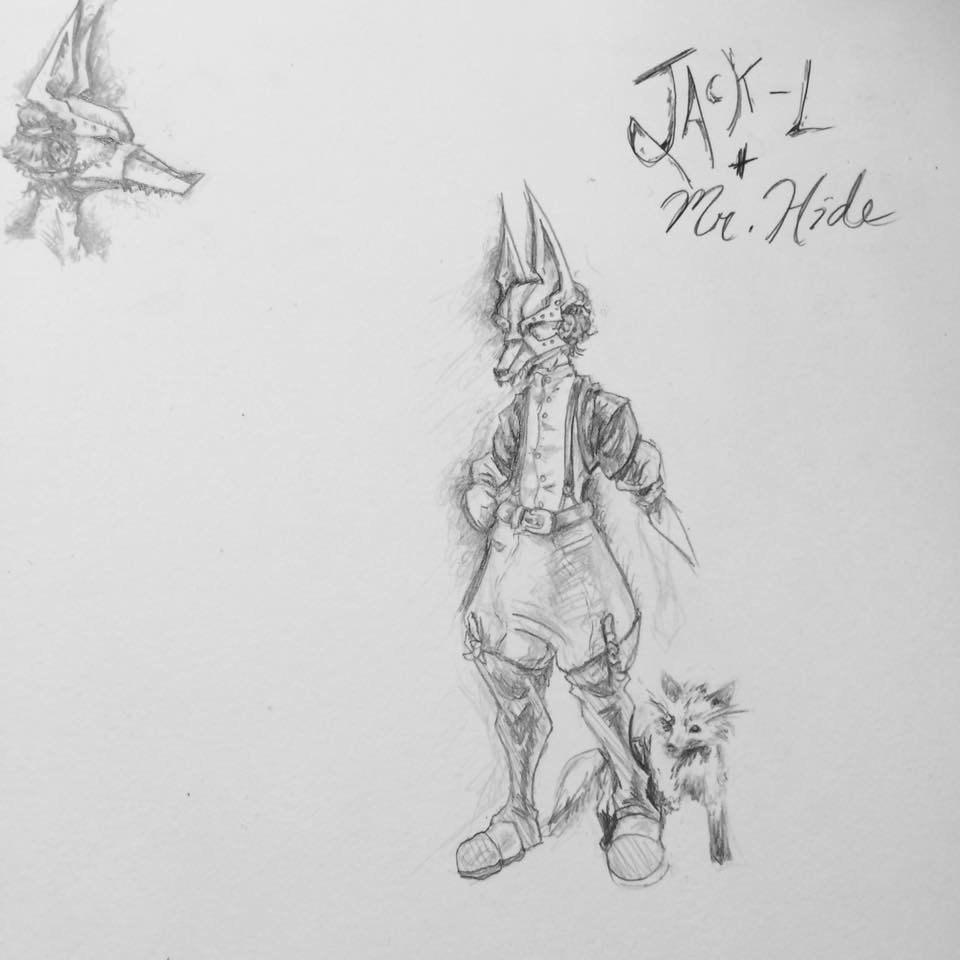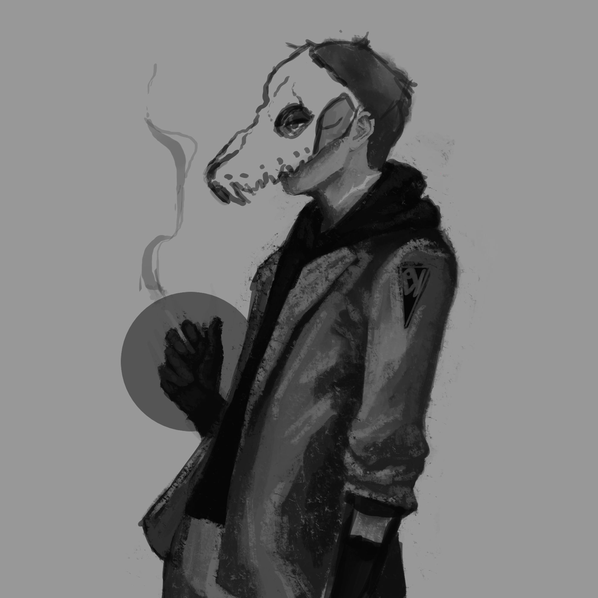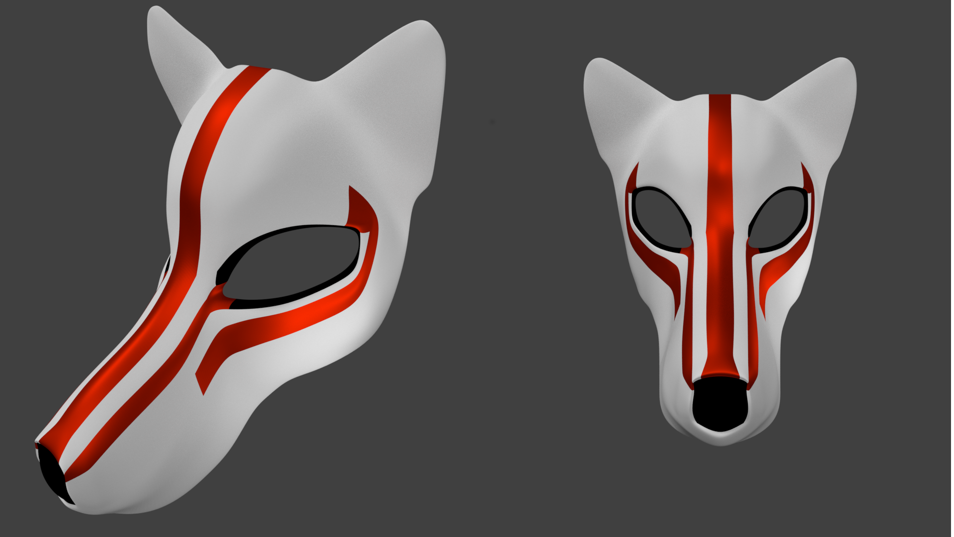
I have my character(s) figured out and his story. Im now just playing with designs on how to make him fit in my style while hitting all the requirements. :)

I could use any sort of critiques on this. But, this is the first character design...I might post the next one later. ( also...for some reason when I saved it the image flipped...oh well)
I really like his mask! The texture and detail looks really good so far. His pose does seem a little stiff and slightly stretched. Try having his back angled slightly more from his hips. You would probably see a little more of his arm hidden behind his body. And don't cut off that hand in the front show it and be proud. That's all I got. Keep it up!
Is there a specific reason the KAY-9 is spelled the way it is, as opposed to simply K-9? Would it be frowned upon to use K-9, or K9, instead?
Thanks ffaithfulimagination! The pose has been throwing me off. I'll try what you suggested! Thanks :)
Okay. I'm having issues with the other hand....I tried taking some reference photos but it just doesn't seem right. I want to make sure that the police baton was visible but it still feels like the weapon is "hidden"
I'm coming from the field of blender than concept.
Here's my first approach.
I've got a lot of sketches of the character. I'm doing a Japanese woman.
But trying one that fits both formal attire as shown and oriental culture is a bit challenging.

This is a really cool take on in. It's great that it's a security camera that's showing us these criminals. Really makes it meta, but in the best kind of way.
Maybe don't have the weapon straight down by her side. You could possibly even point it at the viewer. Are you doing more than one piece? I would honestly work on one and make it amazing.