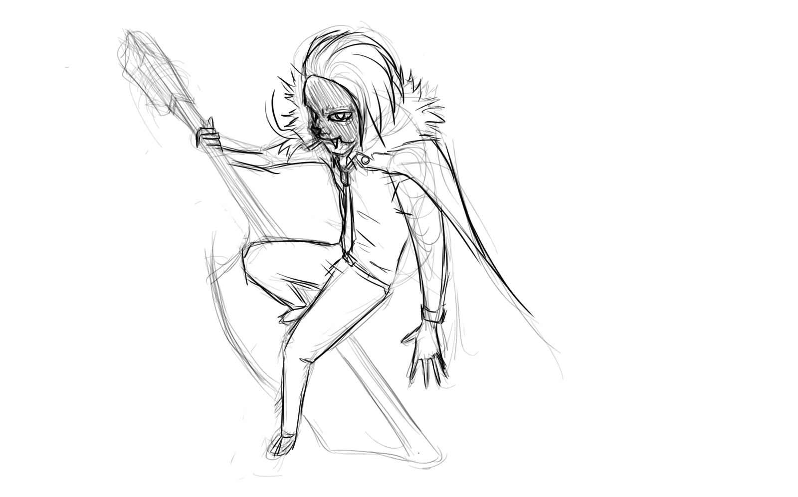
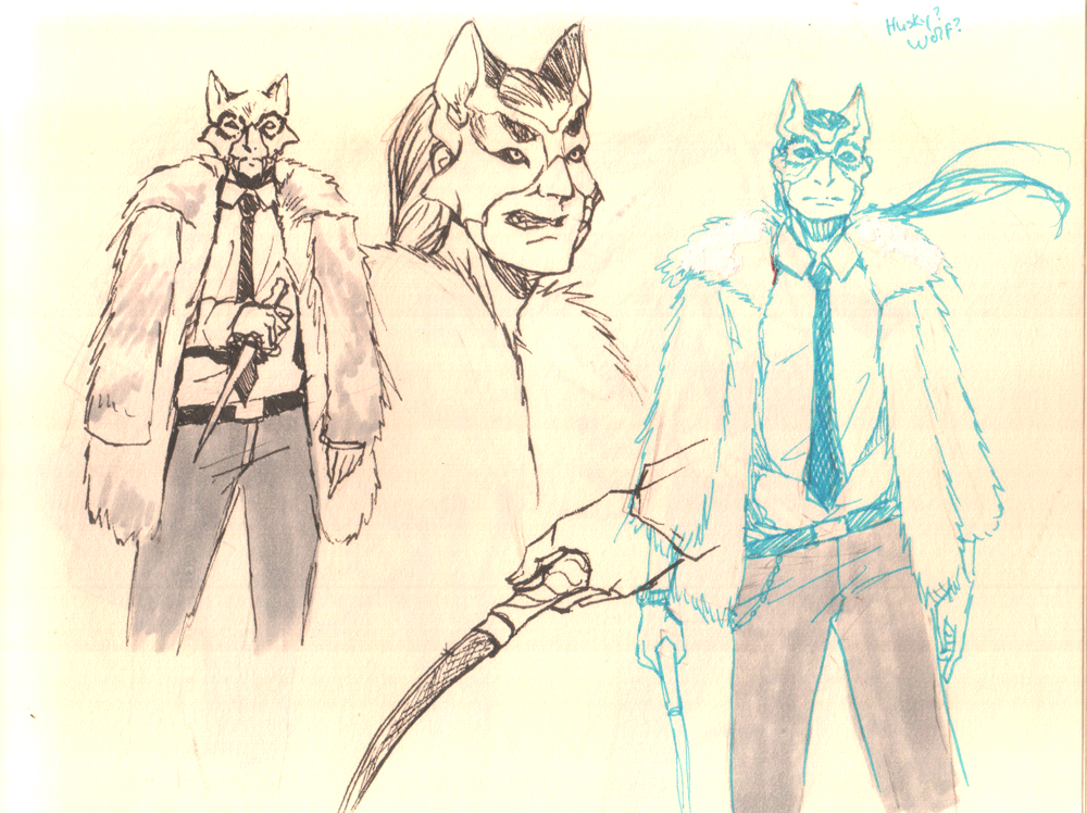
I think I've finalized my outfit or at least the mock up of the direction I want to go with it (I'm pretty sure I'm gonna end up adding a bunch of little details). Gonna start working on a pose/composition and move right along to my final piece.
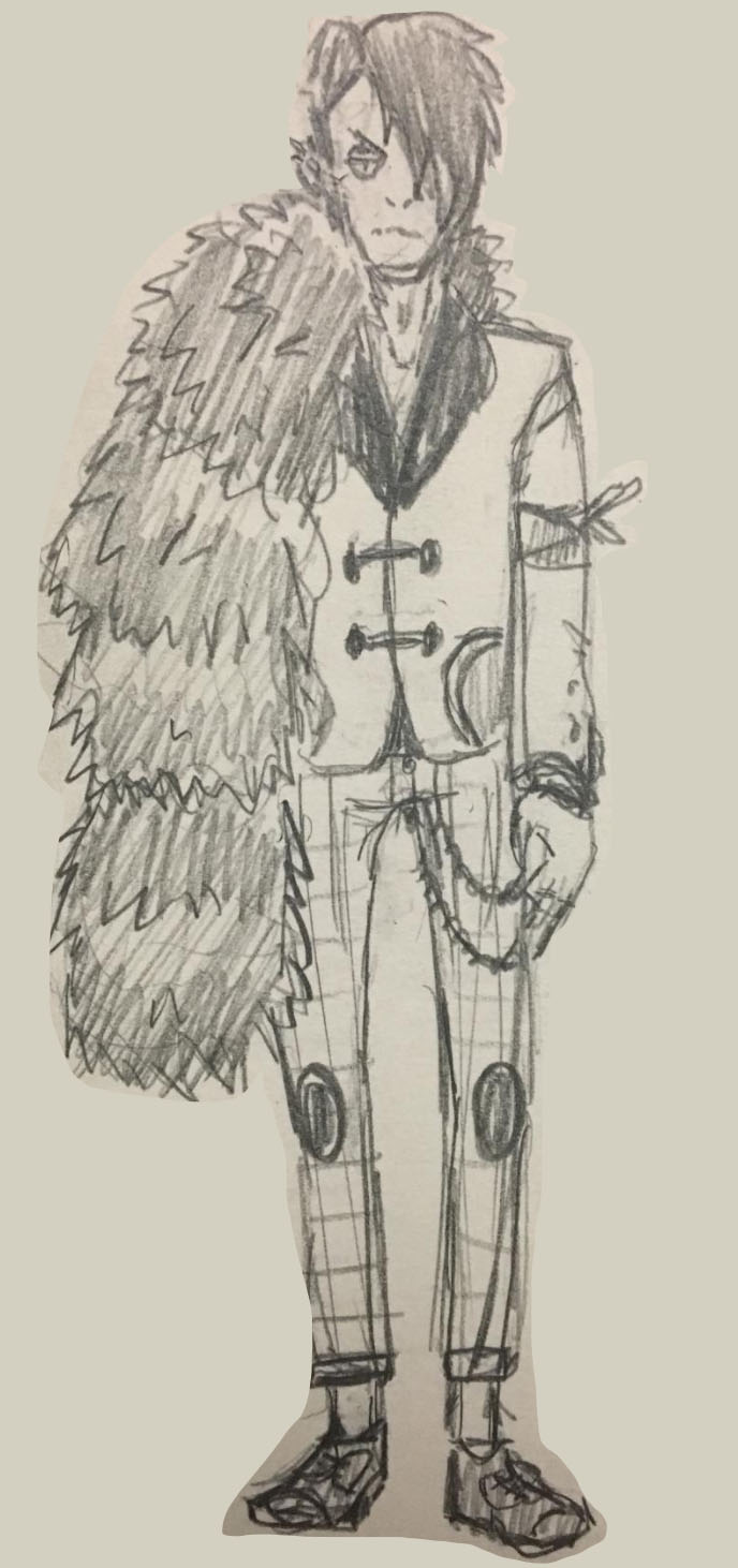
September is turning out to be busier then I thought, but I finally started on mine xD
Been just brainstorming so far, I hope I get solid concept by the end of next week :)
I definitely want to build on what I had last year for Battered Bunnies 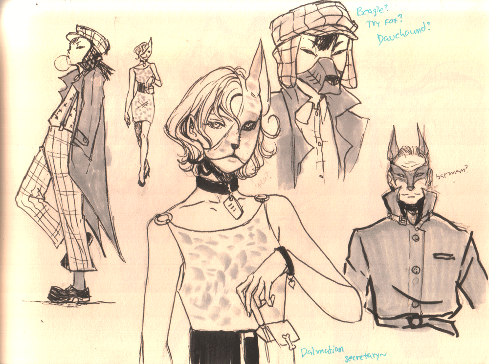
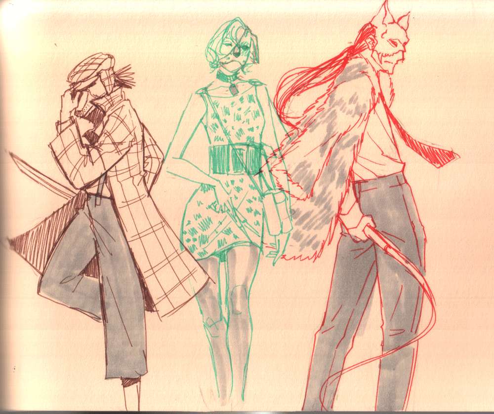
Mock up of the angle I chose. Added wall texture and anti battered bunnies graffiti.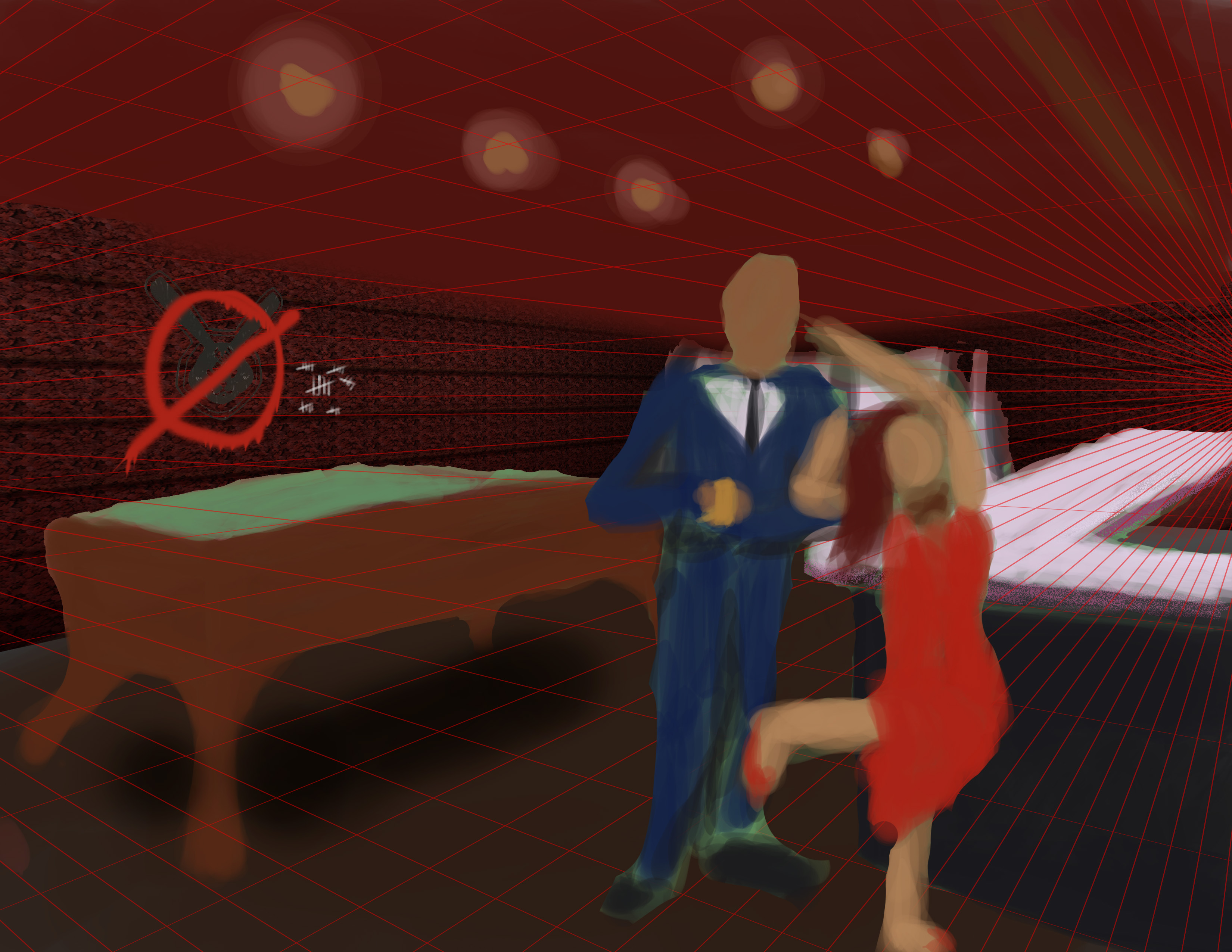
Damn, I might not even be able to submit my other entries, all my backups got corrupted while I was switching my system over to a different distro ;-; I'm currently trying to recover my data.
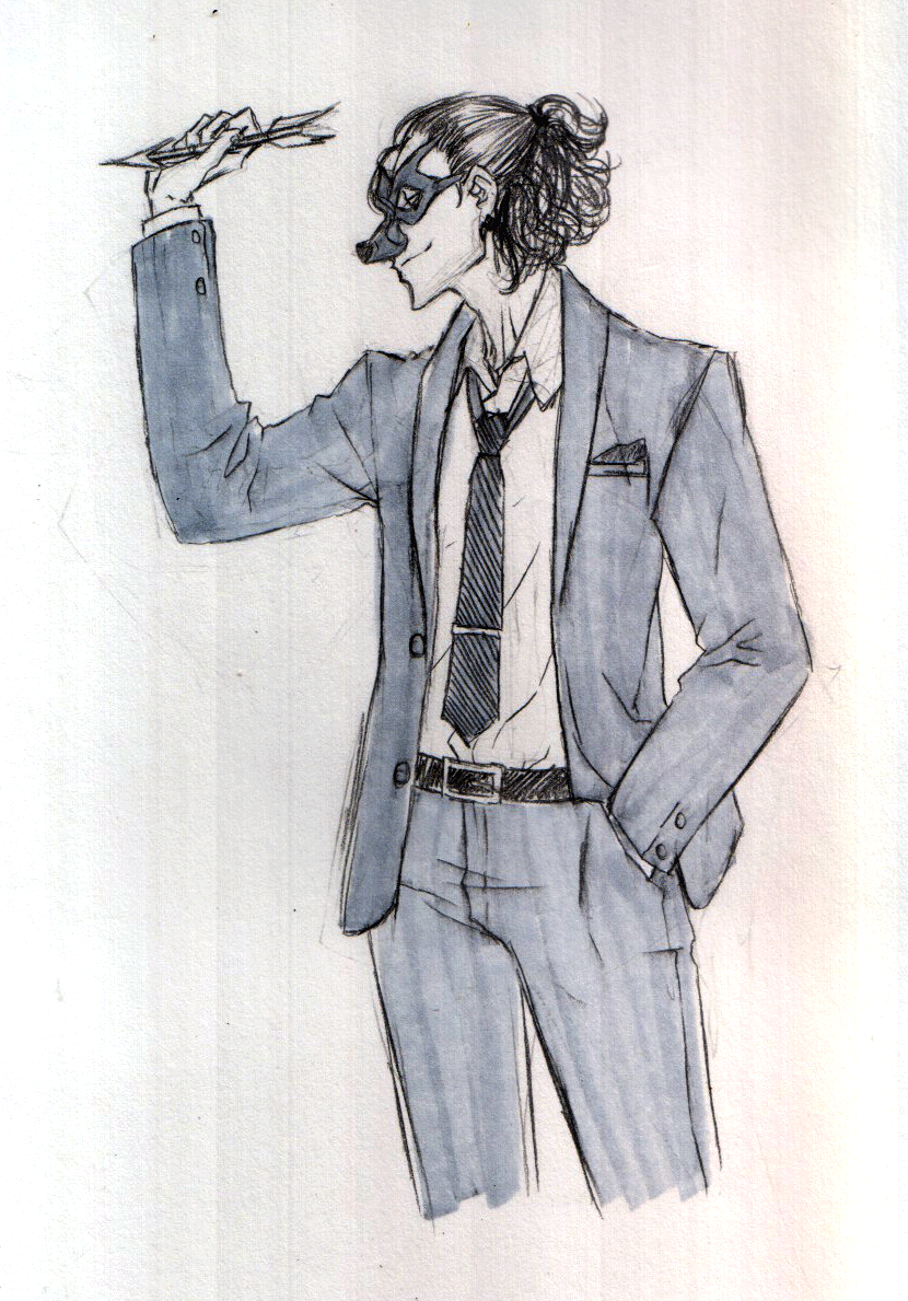
Hey y'all. So for this challenge I decided to do lots of pre-sketches before I head into the illustration. Anyhow, here's my poodle lady. The mask turned out more wicked then I intended, but I like it.
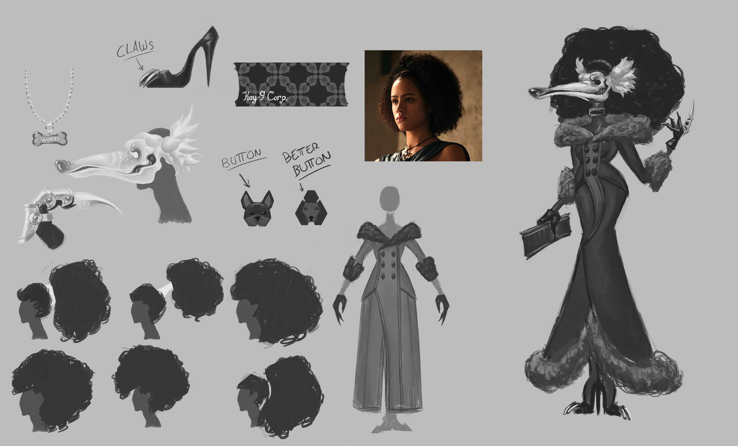
This one was an attempt to see how it goes with a full design of the character.
The character is great, poorly drawn and not filtered the image but fits what was I looking for.
I'm thinking about a better clothing. This drawing took me way too long.
I hope I'll make a better one next time.
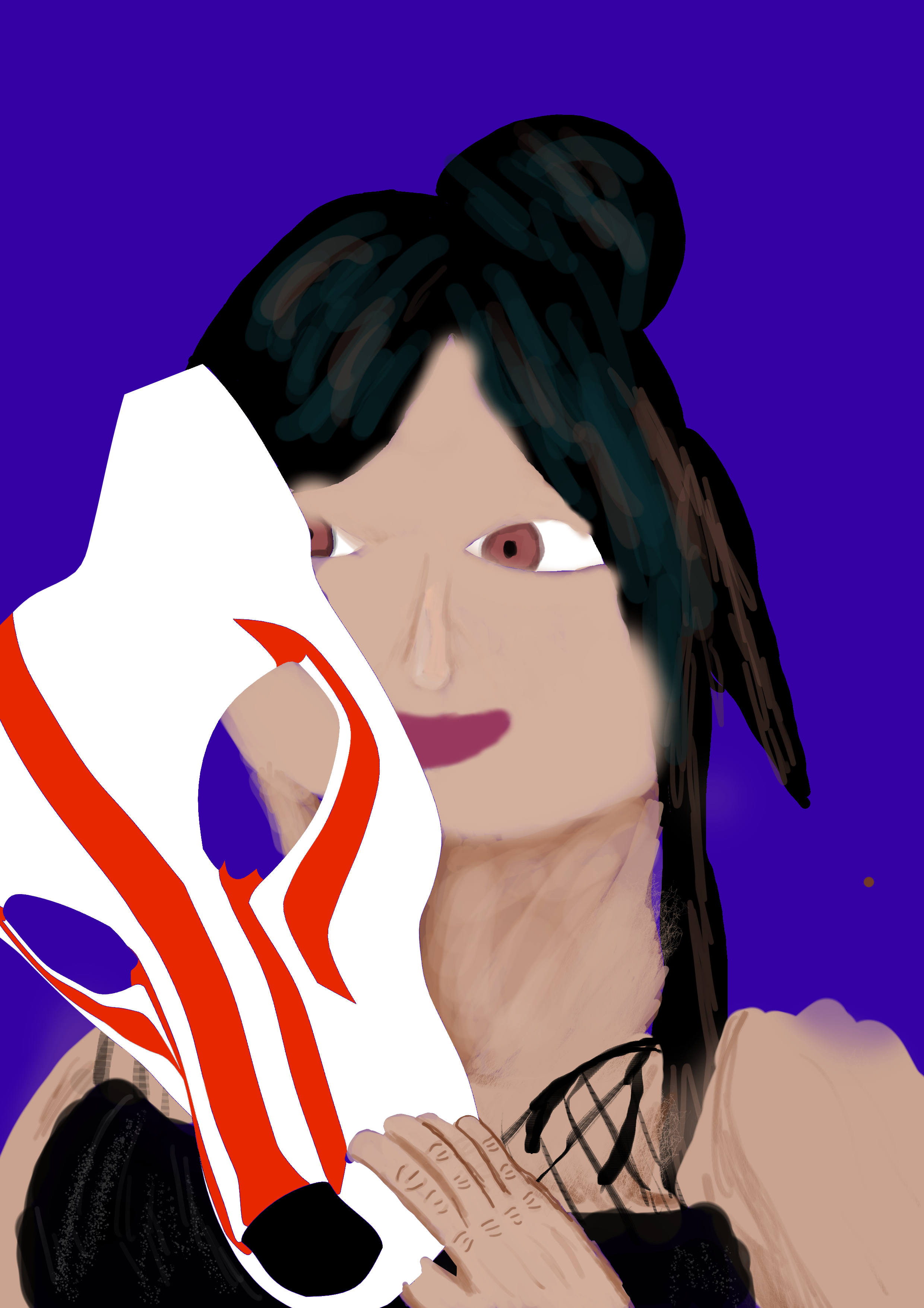
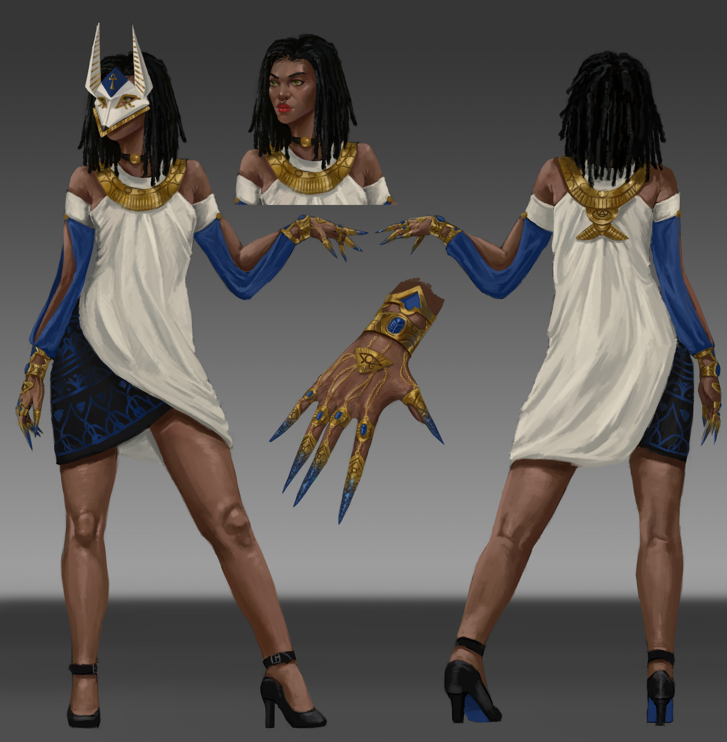
Hello! here is the design that i will use for the entry in the contest, as for the canidae i choose Anubis (which is not strictly a canidae >.< , hope i'm not too much out of context!) , so that's why there is more of an egyptian theme, anyway if you have suggestions or critique feel free to give them^^
having a hard time managing drawing with my work schedule, heres a few fun sketches for inspiration. 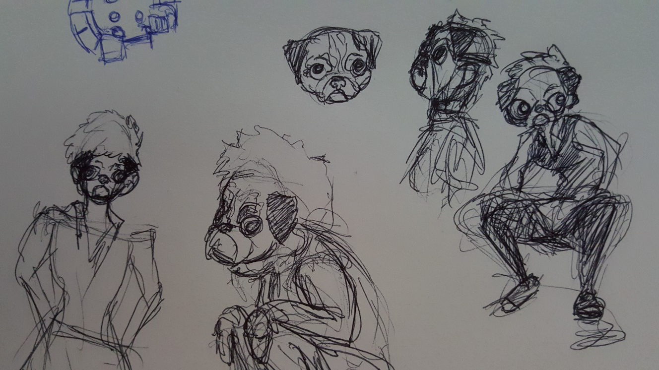
Just a sketch so far.
I'm thinking of making her canine a hyena.
I might make her have vitiligo too, Maybe.
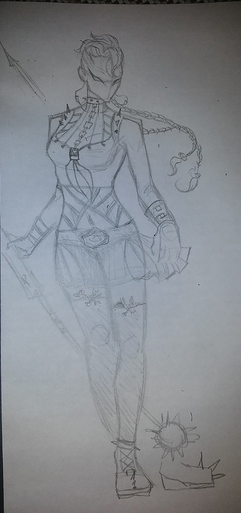
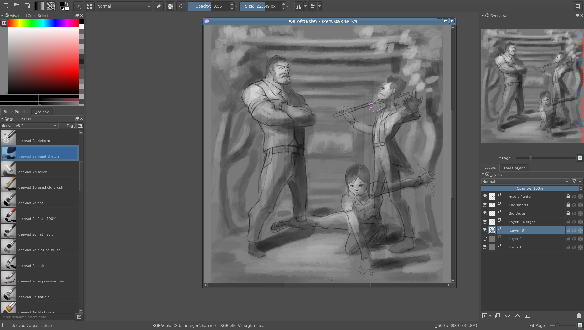
Just getting rough idea for composition and value study I haven't into painting mask yet, I wanna get your guy's feedback
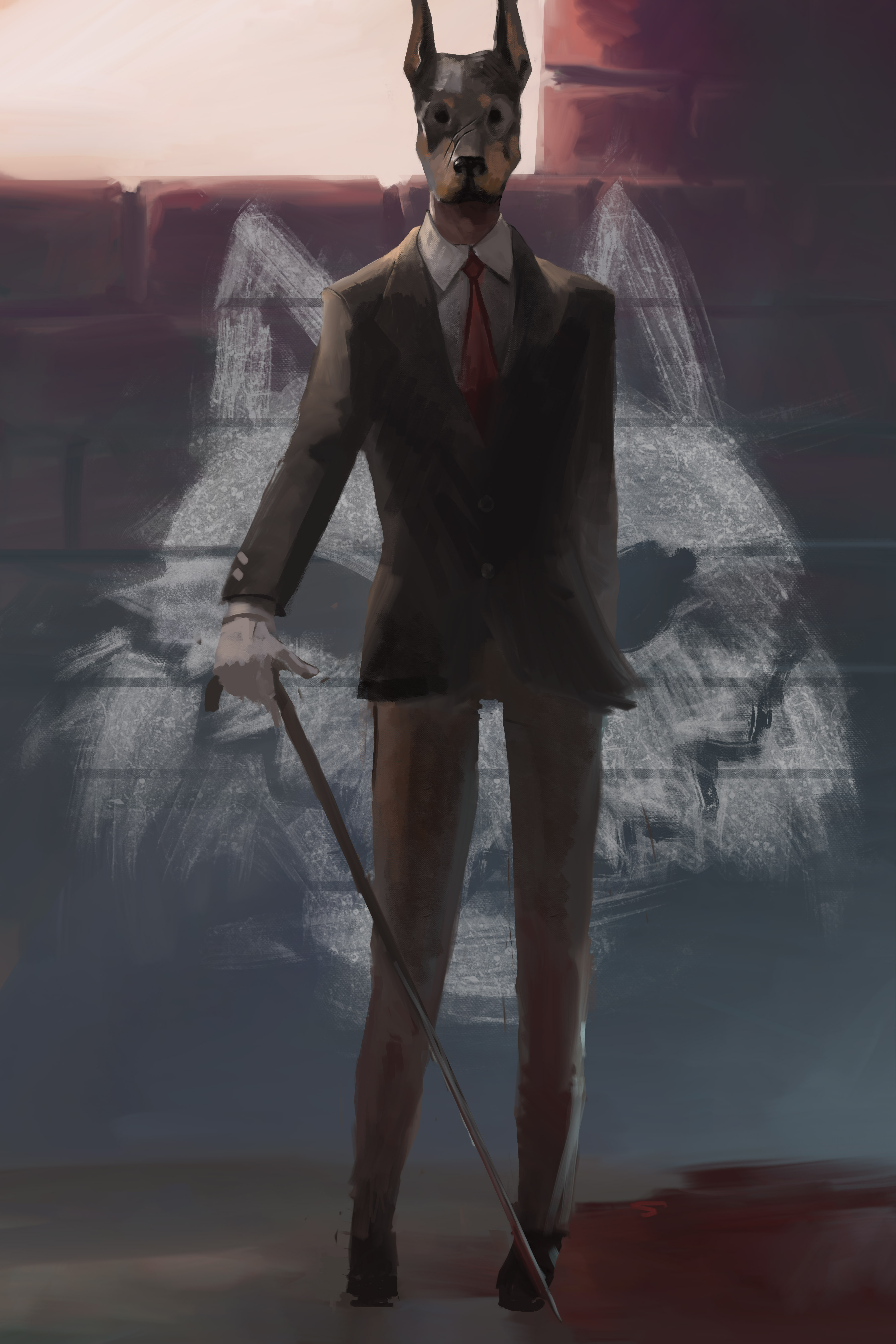
Here is my first attempt of the concept. It turned out too basic (boring) so I will be starting again :D
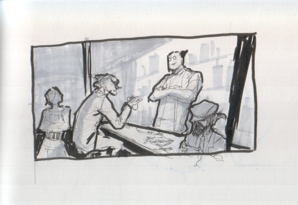
Hi! I would maybe suggest you change up composition for a bit. It seems to me like standard/rectangular format would work better for what (I think) you're going for.
It would allow you to utilize the depth of space you indicated here better and rearrange character in more dynamic way. When they are like this it seems like they are all crammed in one line like the're posing awkwardly for a photo xD If you place them more into the space like I put on the right, it's just seems more dynamic.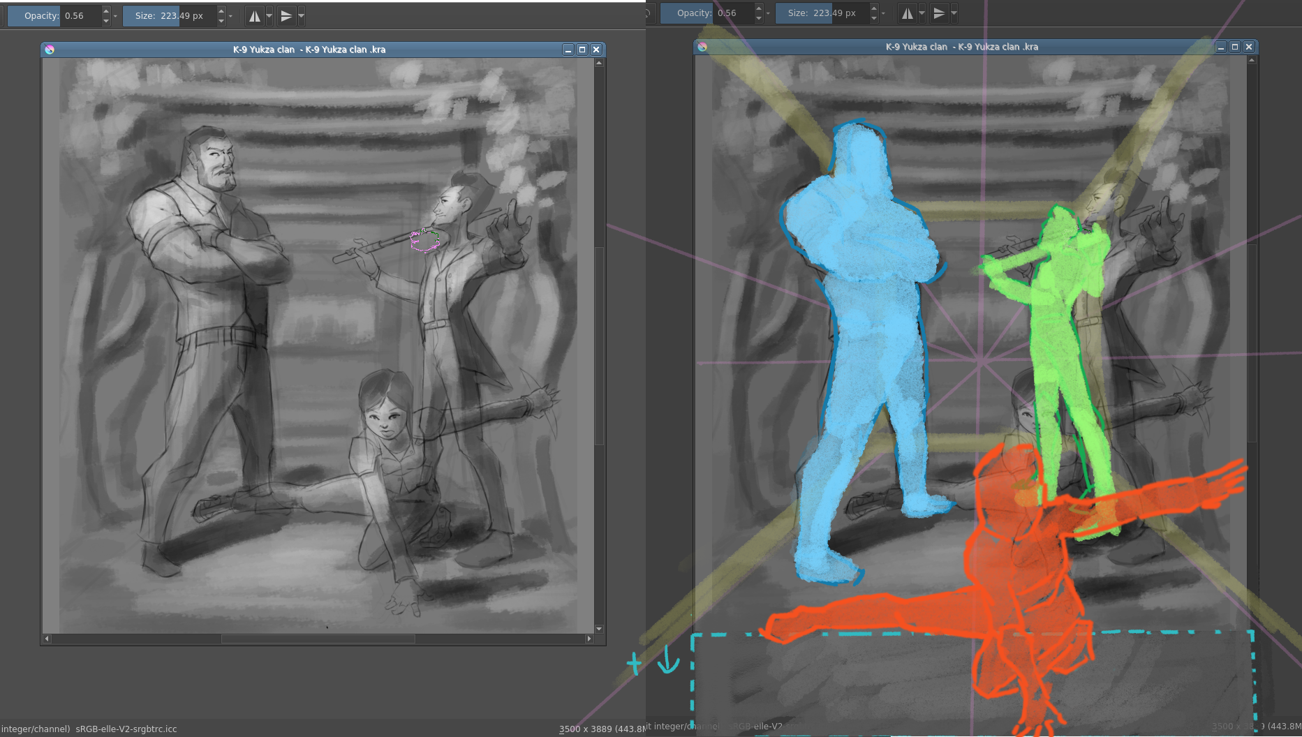
Basic and boring = great foundation to develop something interesting. Can't wait to see what you come up with. This may seem basic but it tickles imagination ;) (you may be onto something with that cane)
Aa~ it's bit quiet in here :D Oh well, from the past experience it gets the wildest near the end anyway :p
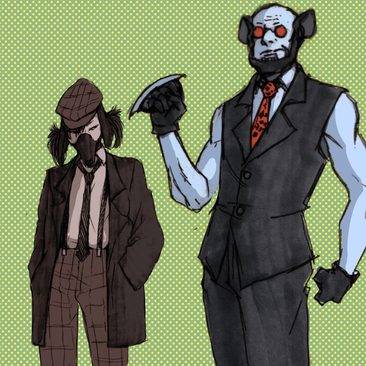
I was getting better feel of my characters more in meanwhile and I have base for what my possible final image might be, so I'll be working on establishing my final comp for next week. And their weapons. I have idea what they might be, but I still have to design them :3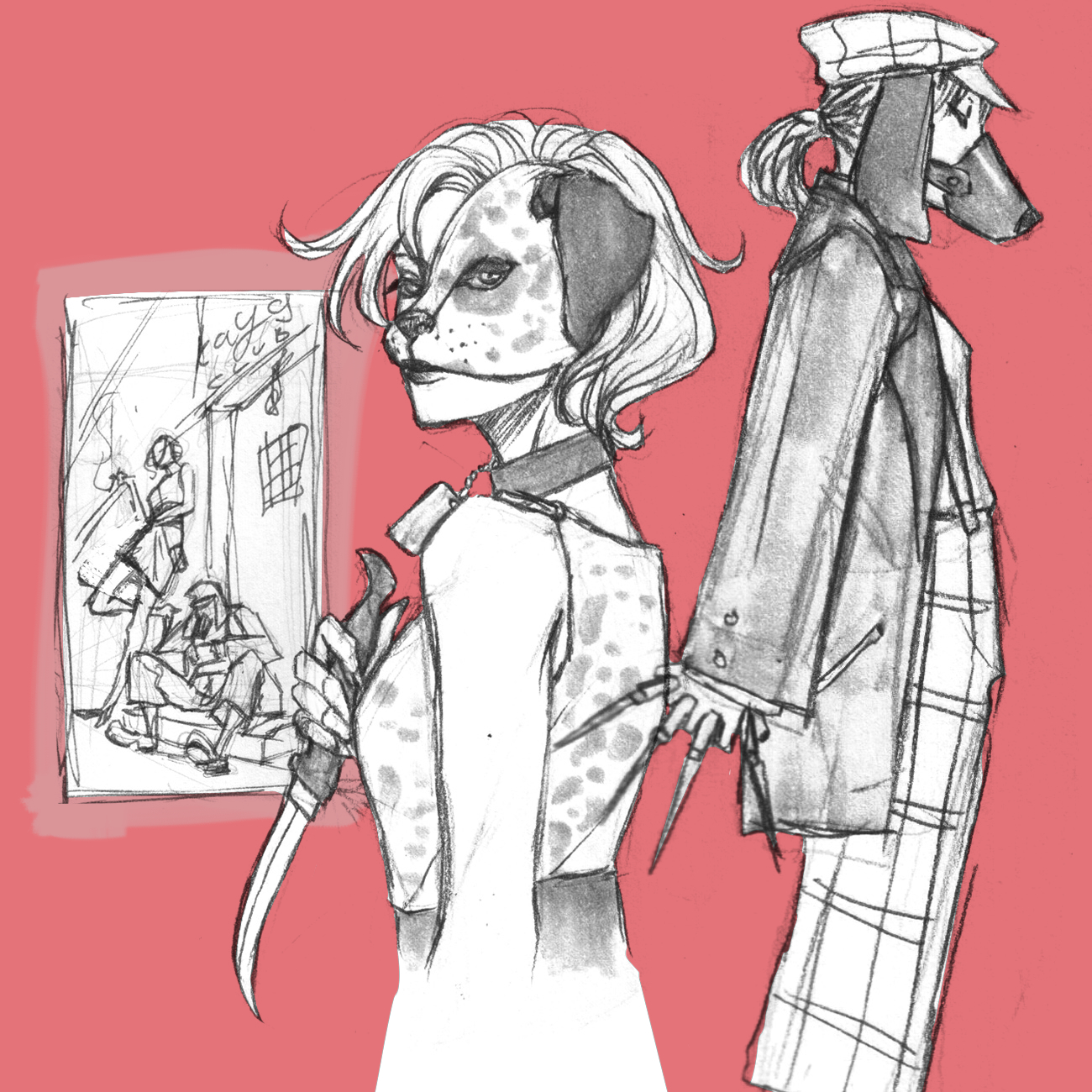
HI guys!~ I made a youtube playlist of sorts!! I'm posting it here so ya'll can maybe get some IDEAS! let me know what you guys think about my selection..
P.S. I'm hoping I have a clear up of time to really work on this so I can try entering.. but if not I hope everyone else gets to a finished point! :)
You have some really cool ideas there, canta wait to see them finished :D.
I specially love the first comp in the little rectangle, there is something about it...
cheers!!
Here is what I have so far.... looks like some part of the concept is already used xD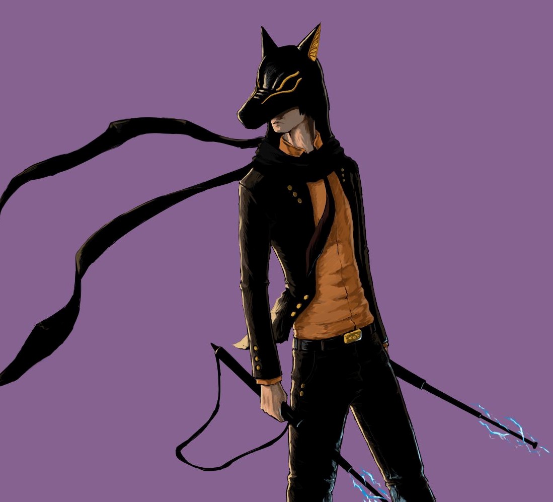
Here is some scrap ideas
