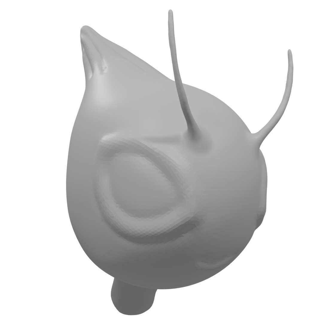
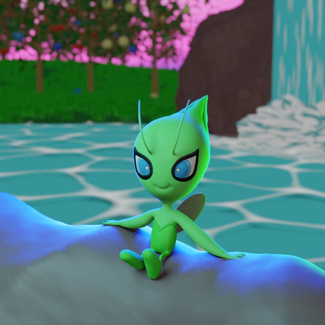
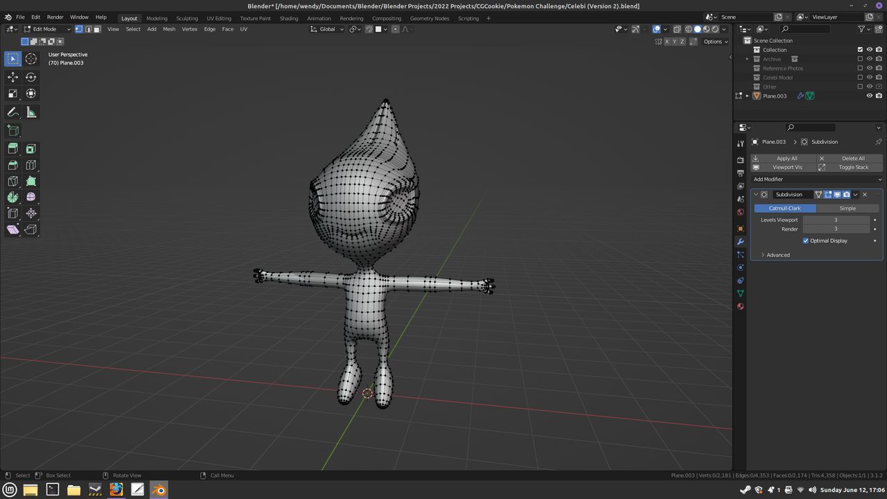
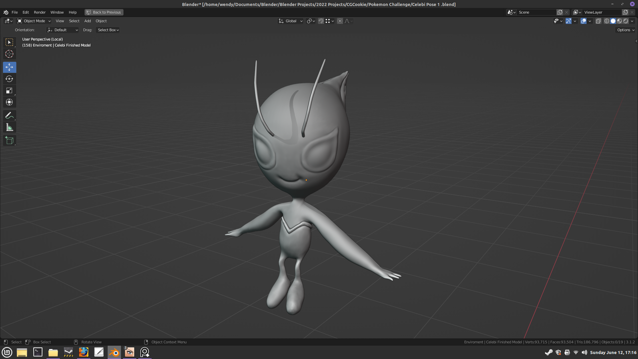
All of my instincts tell me not post until I've finished my model. It scares me to post this because then it becomes real. Then I HAVE to finish it rather then just quietly give up and move on to a new project when I hit a bump. This is my base sculpt of Celebi. I never really learned the basics of sculpting. I jumped in feet first trying out the HUMAN course. (I can make it all the way to the Oscar Statue.) Other than that though, I don't have a lot of experience using sculpt mode. Guess this will force me to actually learn the basics. Gotta learn em all!

it's really building up to something very beautiful.I'd love to chill with this little Pokémon, great work and good luck with the last tweaks!
Try adding the Neon Lights to the Blue Hour scene. The rim lighting from the Neon lights may make the character and the rock edges pop. Keep it up, this is looking great!
@notcostanza Here it is. What do you think? Lighting isn't my strong suit. Is there to much going on with the lighting? Is it distracting? (If you have a moment, could I get your opinion on the lighting for my scene, @theluthier, please? )
The blue is a little too different from the rest of the scene. Maybe set the color of it to one of the sky colors behind the character. It is always trial and error for me. Hopefully Kent will drop some lighting knowledge.
I just realized that @theluthier is one of the judges. He may not be able to help me with the lighting until the challenge is over.
And.....again....
Sorry to beat a dead horse but.....what do you think of the new model? Feedback would be GREATLY appreciated. CAN you actually tell a difference? Does it look better or worse. What can I do to make it better? (Thanks for taking the time to read this. )
New Version (WIP)

Old Version