First one is a sofa I made with the help of a tutorial.
It´s not perfect, but overall I´m satisfied.
Any tips on how to make the render look more realistic?
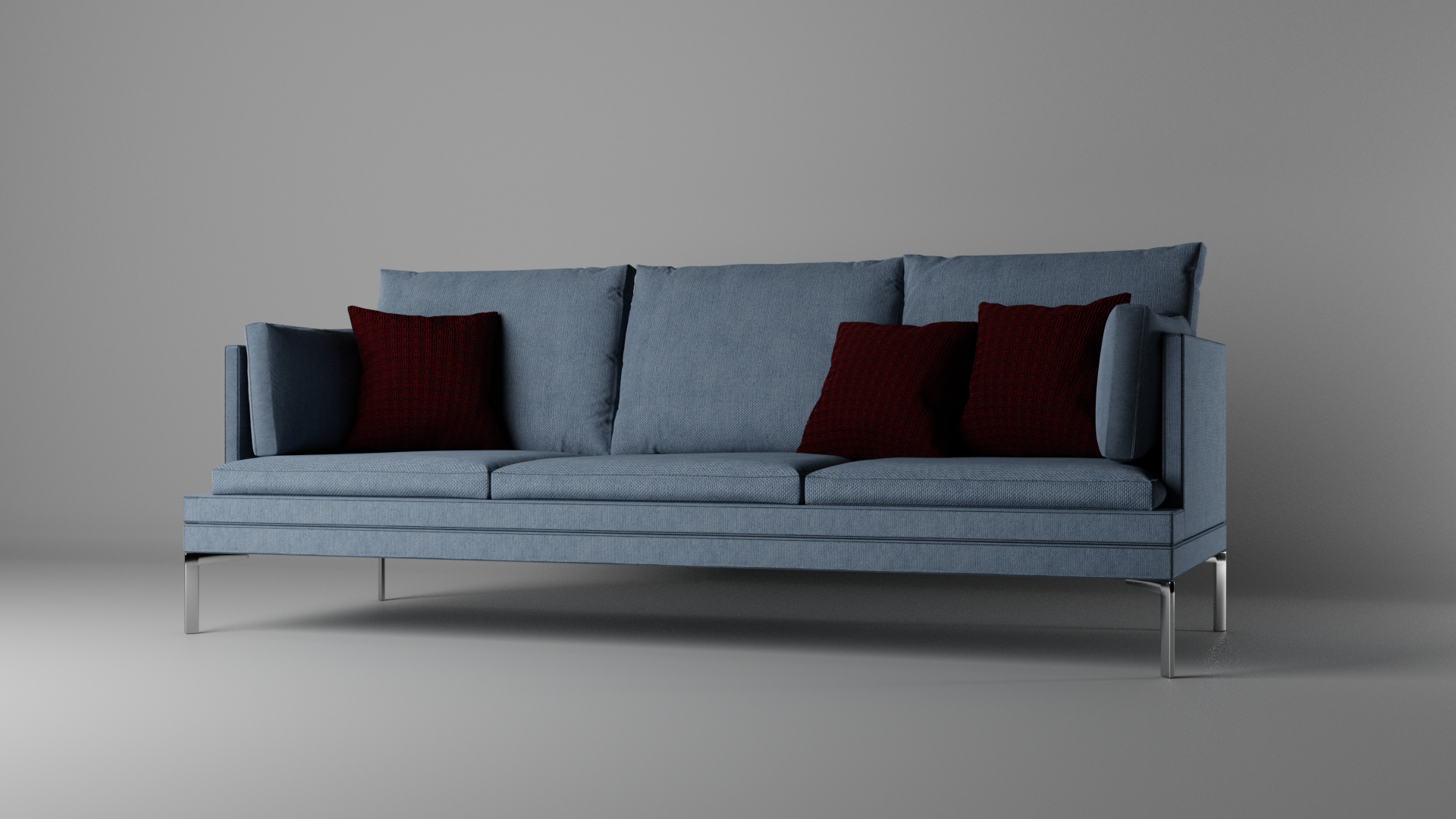
Already looking great 👍, especially the cushions, the fabric textures and the lighting! I would just edit the proportions. Imagine three persons sitting on that sofa: The seating surface could be lifted a little bit and the arm supports could be thicker. The "feet" of the sofa seem to be too thin given the weight of the sofa and the maximum number of persons who can sit on it. A reference person built from mesh primitives could maybe help getting the proportions right. I know this can be tricky and it's certainly easy saying for me. I hope this helps and I'm looking forward to your future renderings 😀.

![]() duerer Thanks for the feedback! I made the seating a bit thicker and the sofa looks a lot more comfy now :D The feet are a bit broader as well. I didn´t want to change the arm support since it´s really close to the source image. The human model is 1.75m and I think the proportions of the sofa are right. I used blueprints while modelling, so I would be suprised if they were off.
duerer Thanks for the feedback! I made the seating a bit thicker and the sofa looks a lot more comfy now :D The feet are a bit broader as well. I didn´t want to change the arm support since it´s really close to the source image. The human model is 1.75m and I think the proportions of the sofa are right. I used blueprints while modelling, so I would be suprised if they were off.
Anything else I could do? :)
This looks fantastic! I've been meaning to run through that tutorial as well, the cloth work is something I'm not familiar with yet. I don't have anything to add, the proportions look right and appears very comfortable! Keep pushing forward!
With the model, it looks really cool! Now the eyes have a reference to judge the proportions better. I'm still convinced that the arm supports are too thin for their purpose, but if the designer wanted it like this, then it's totally okay for you to model them with this thickness. If I met the designer I would have something to tell him about comfort 😉😁. The cushions nevertheless are really inviting to take a seat 😀.
PS: Did you create the model yourself?
![]() antonioc Thank you very much :) Making furniture is pretty fun, you should try it!
antonioc Thank you very much :) Making furniture is pretty fun, you should try it!
![]() duerer The cushions on the side are for the comfort :D
duerer The cushions on the side are for the comfort :D
No, I didn´t creat the model. I used "Body Chan and Body Kun" from the Turbosquid site. Those are two rigged models which are normally meant to be used as drawing reference :)
Hey there :)
My current work in progress is this bust. I wanted to improve my skills modeling human heads, since I never did this before -or at least never suceeded when trying.
I sculpted the head and made a retopo. The hair is made with curves and is pretty much finished for now.
Now I´m going to work on the head some more, texture it, give her eyelashes and proper pupils. I also wanna try to give her furry animal ears, since she is based off of one of my drawings - the one with the said fox girl :)
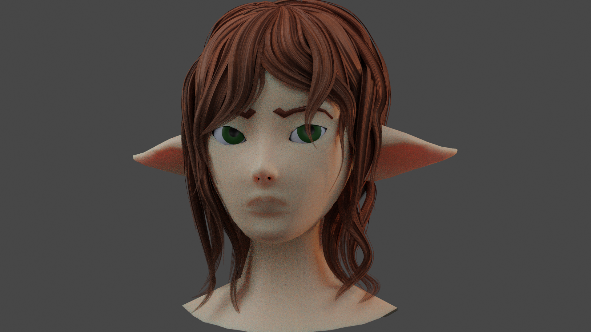
I tweaked my retopo quiet a bit and started with texture painting :)
I´m making veeeery slow progress, since I´m only able to spend 1 hour every other day on it, university is pretty stressful this year D:
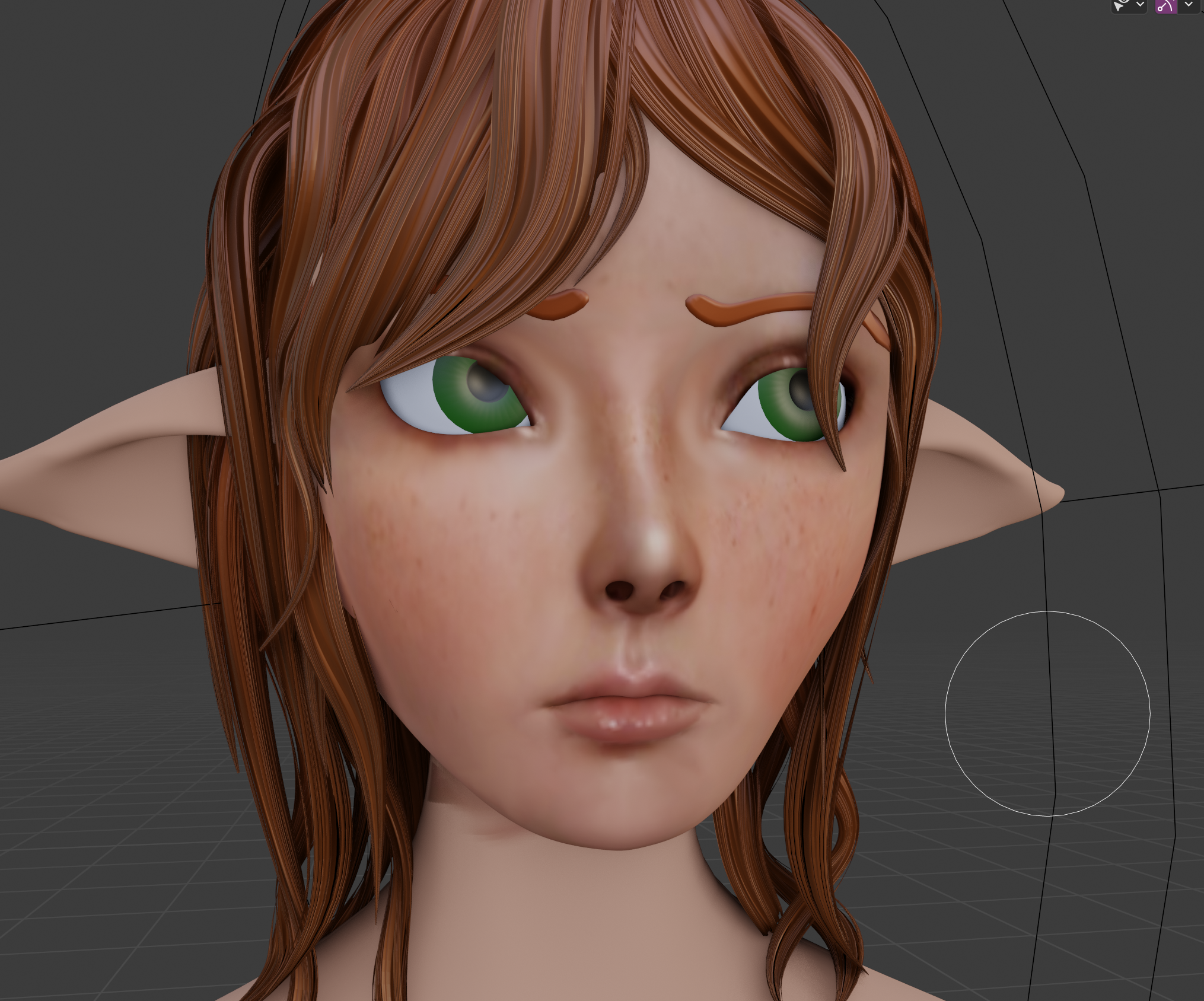
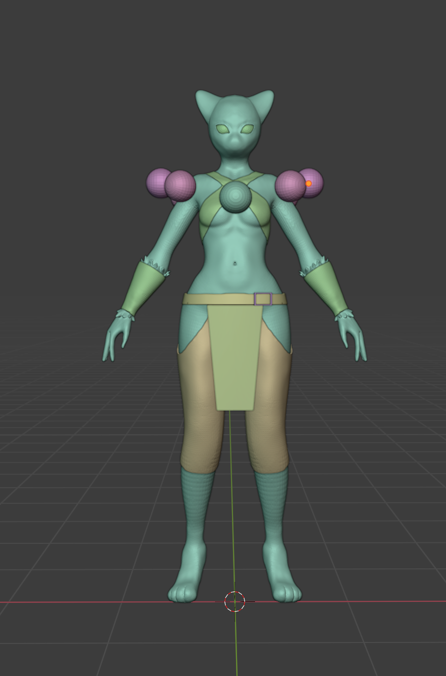
My current WIP based on this concept by Amini101 :)
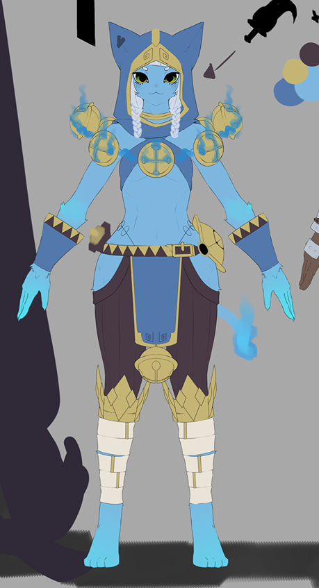
I´m still trying to figure out what´s the best way translating her face to 3D... I think I´ll take a more stylized approach
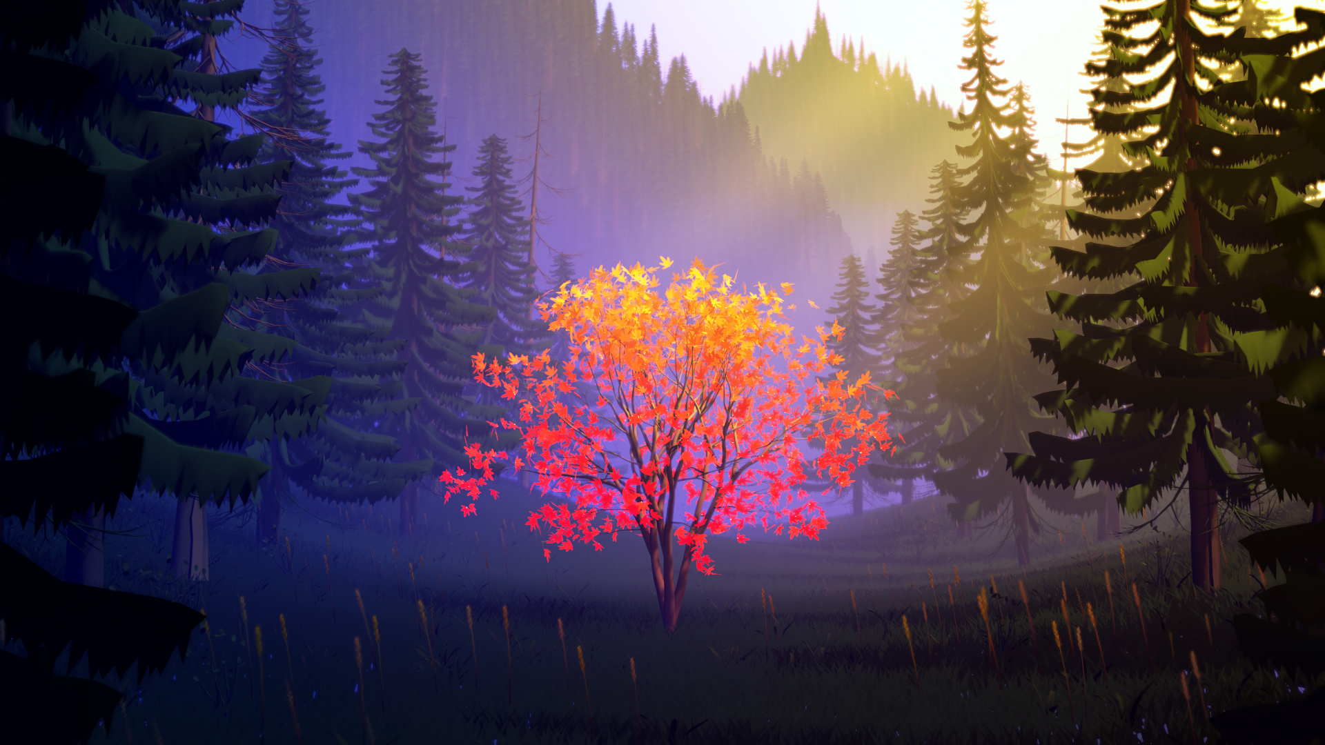
Took a break from Minoo, the cat, and followed the stylized 3D forest course :)
I pretty much followed the course and will make my own version later for the exercise submission!
Hey there :D
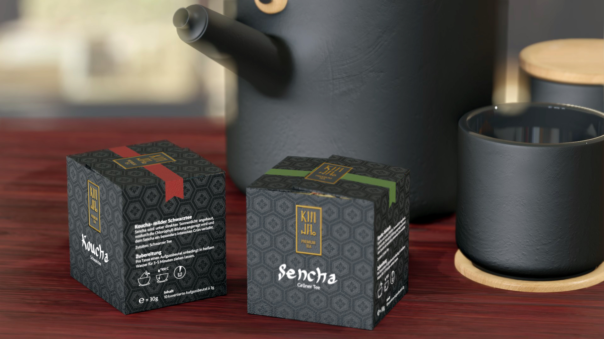
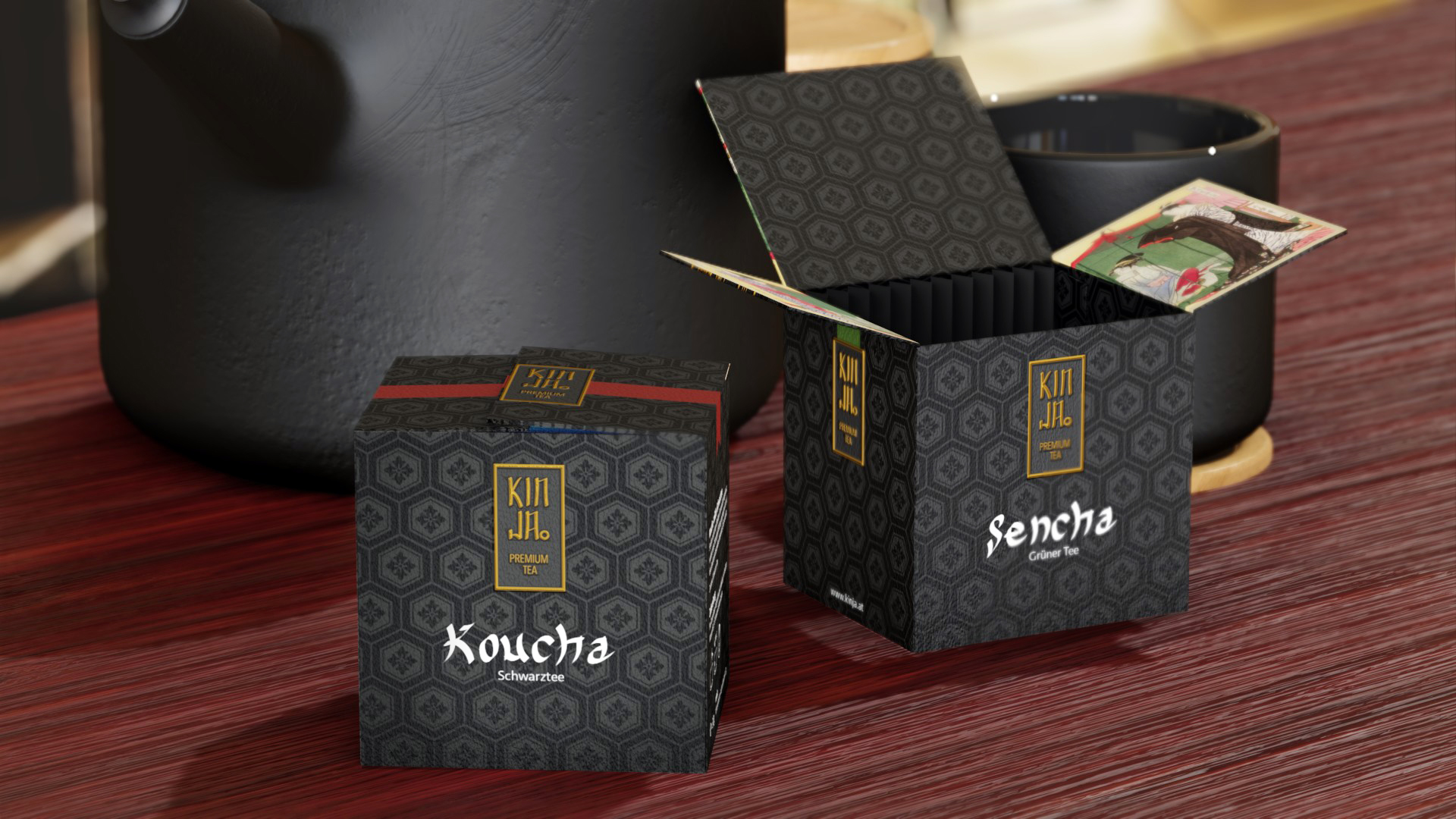
I was finally able to utilize Blender for an university project! :D
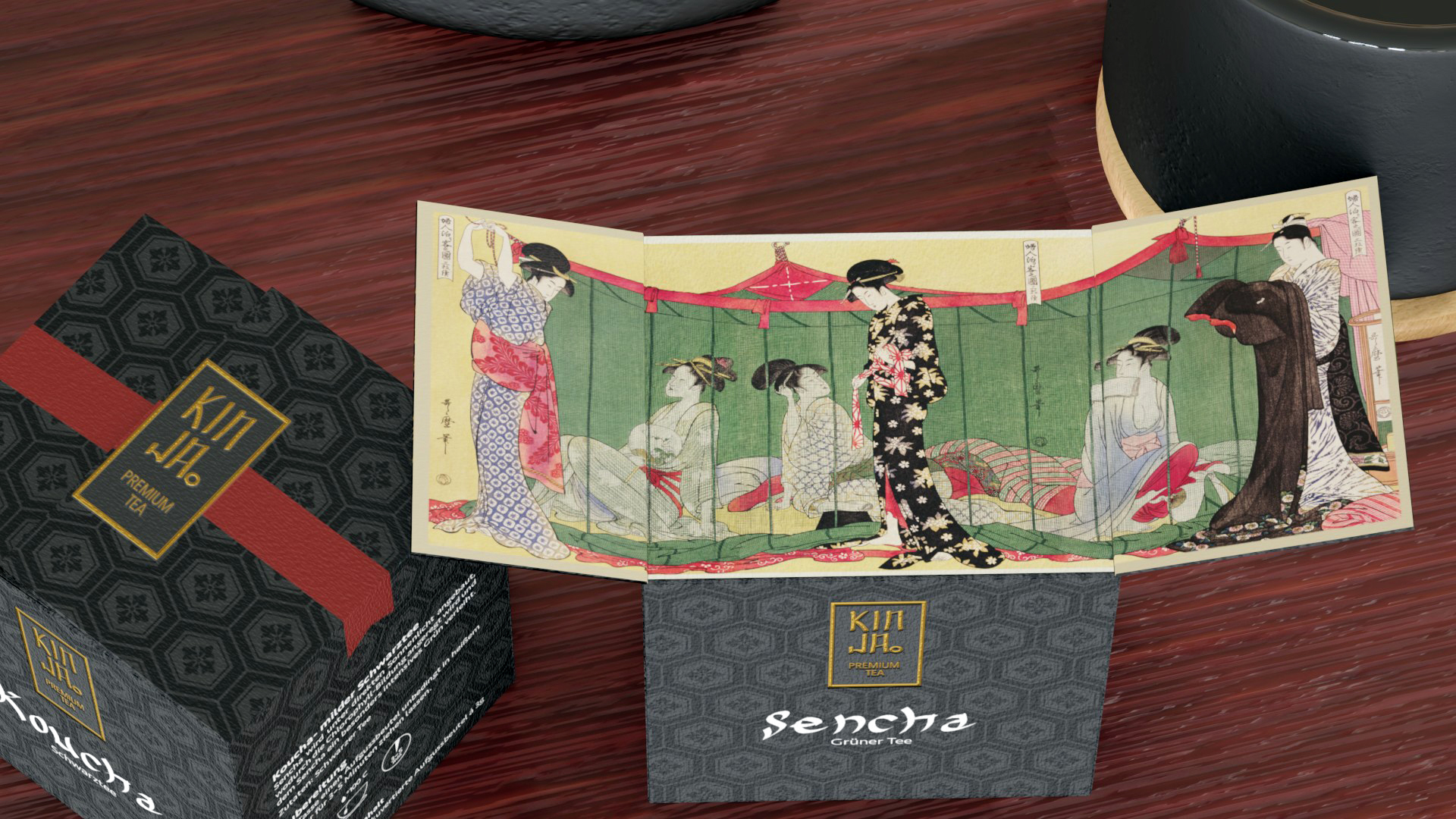
We had to make a branding and packaging design for tea and make packshots. Since erverything is online right now, presentation included, I asked if I can make my package in Blender instead of crafting it by hand.
I also made a turntable and demonstration how the package opens :)
This looks great, we'll done!
I'm also following that course at the moment it's really good!
Thank you :)
It was really fun and I was able to utilize some things I never worked with before
Thank you!
The pot wasn´t made by me. It was a free model from Blendswap. I made the packaging model and the "table". The table is just a plain with some wood texturel with bump map and rough map :)
I thought the presentation would be a bit nicer with a bit of scenery instead of showing the packs in front of a white background.
No, the rectangle is not correct, but I don´t know what caused it either... I moved the Sencha package, but the rectangle didn´t go away....