really great looking sofa, and as they mentioned that human reference do help to have a clear idea how it looks with a human in the sofa.
wonderfull work on the model and texturing :D
as for Body Chan and Body Kun are they free to use ? they sure are handy for proportions :D
well done, it looks really great.
for the upper lip is it supposed to look dark?
i really love that fabric (is it done with procedual texturing ? )
then you have those ears , looking so nice , kinda want to touch them :D
the skin and eyes texturing also are great.
and then we have that hair :D great work again , did you make use of hair particles or some other way for that result?
overall a really great work you created. just lovely =D
i look forward to see more
really nice concept to work with, and agian youre result so far is amazing. i love how you did that fur effect around the gloves.
cant wait to see this getting finished :D
great forest, love those sunbeams and then the focus on that wonderfull brightcollored tree .
great work, i also noticed that little spot with some lightning (this make it looks like its somehow floating above the table :p)
guess i should drink some of that :D
is the box connected well with the table ? or maybe a certain light course is causing that spot of light?
but again great work on the scene, its wonderfull and fun how there can be formed an image when folding the parts to close the box :D
yyukinoh1989 Hey Yukinoh! Thank you very much :)
Body Chan and Kun are CC-0, so they are free to use!
Here´s the Link:
The model is based off my drawing of Fox-girl. She´s wearing black lip stick on the top lip!
Yes, I used procedual texture for the fabric :) I got some diffuse, roughness, normal and displacement textures from a site which offers free pbr materials and adjusted the size rotation and so on for the shirt.
Thank you! I used a real face as base for the skin texturing, to make it look more natural. It´s basically a mixture of using the picture of the face as stencil and handpainting.
The hair is made out of curves with a special shader which make it appear to have strands at the end. I used this tutorial for it : Hair from Curves and special hair shader .
Thanks for the praise! I´m really proud of the model myself :)
thank you , this can help a lot when modeling objects like a kitchen , livingroom, bathroom....
you really can be proud of it :D hope when my character is finished it will look as good as this :D
yyukinoh1989 even when I move the box into the table, the little spot of light remains. It only dissappears, when I close the right or back tab of the box .... I really don´t get why it´s happening D:
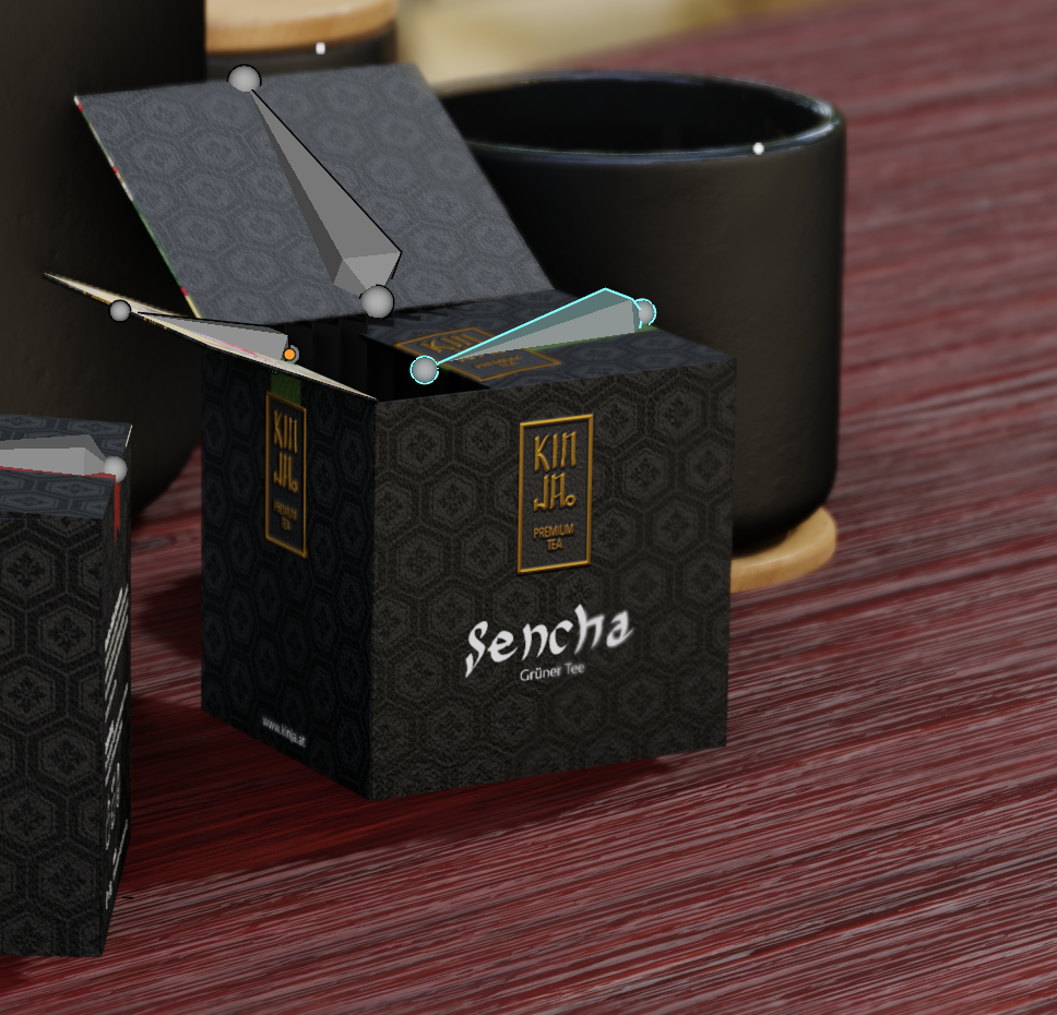
buuuut! Lucky for me, the "mood shot" wasn´t what was important for the project. The design and ideas behind the packaging itself were and my teachers really liked it :D
yyukinoh1989 I bet it will! You can achieve sooooo much with good texturing
yyukinoh1989 I love this character a lot, that´s why I asked Amini if I´m allowed to use it :D
It might take a while till she´s finished.... still got a lot of other more urgent stuff to do right now D:
be sure to focus on the urgent stuff now, trough i really look out to the end result :D
keep up the great work :D
that indeed is strange xD
but most important thing is that the teachers loved the result , and that indeed is amazing :D
Hey,
the normals are facing inwards, because I had issues with the textures when they were flipping outside.
But I just flipped the normals after I read your comment and the light square still remained. I also applied all the modifiers, but nothing changed. The issue must be somewhere else...
@fide this is Eevee you are using probably.
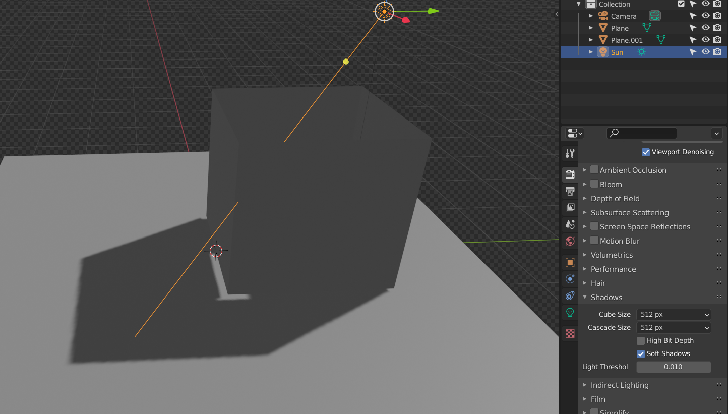
Look at the Cascade Size in the Shadows Settings:
default:
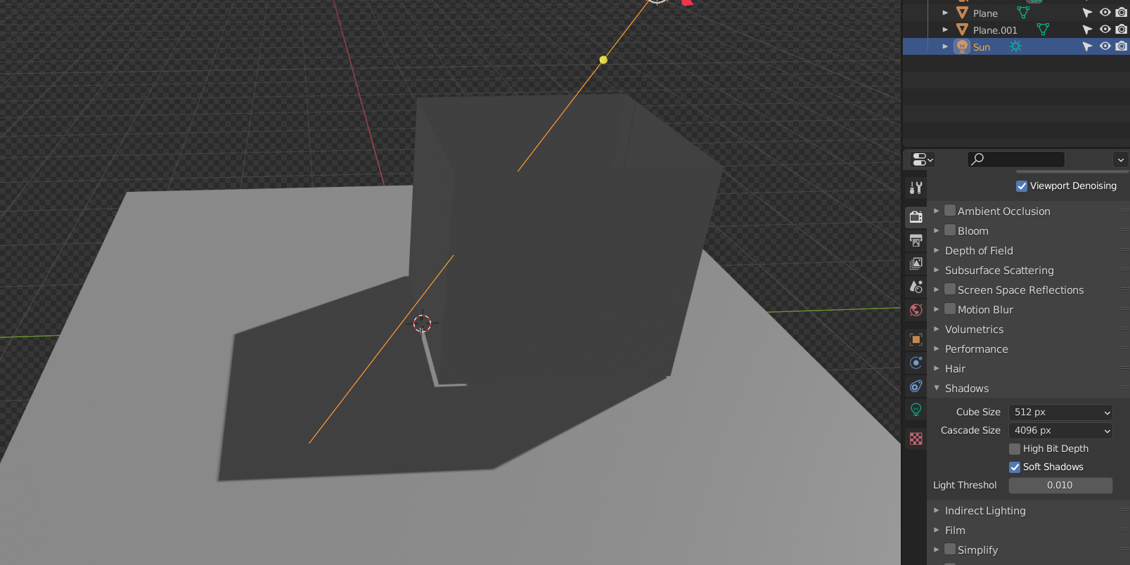
High res:
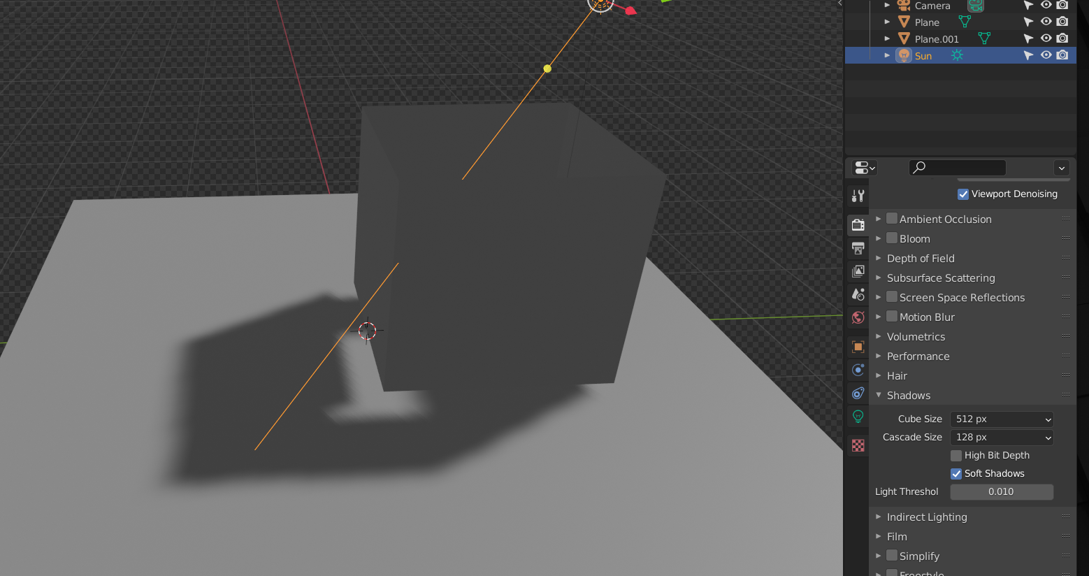
Even worse:
I'm not an Eevee user, but @jlampel has mentioned this and also how to fix these issues. I think it was in his Fundamentals of Lighting course, but I'm not sure.
Yeah, that´s eevee. Setting the cascade Size up to 4k does nothing in my case besides making the shadow look sharp instead of soft.
I need to check out the Fundamentals of Lightning course anyway, so maybe I find a solution in there :)
Thanks for helping!
First off, beautiful packaging! I would definitely buy that tea.
As for the shadow, check out how far away it starts from the mesh:
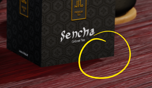
To fix that, turn the light's Bias setting down. It may solve the other problem as well.
Here's the chapter Spikey is thinking of, hopefully the three lessons on shadows will clear everything up. Switching Over to Eevee - CG Cookie
@jlampel
Hey there!
Thank you very much :D
Changing the bias setting didn´t do anything, but checking "contact shadows" in the light´s settings did the trick!
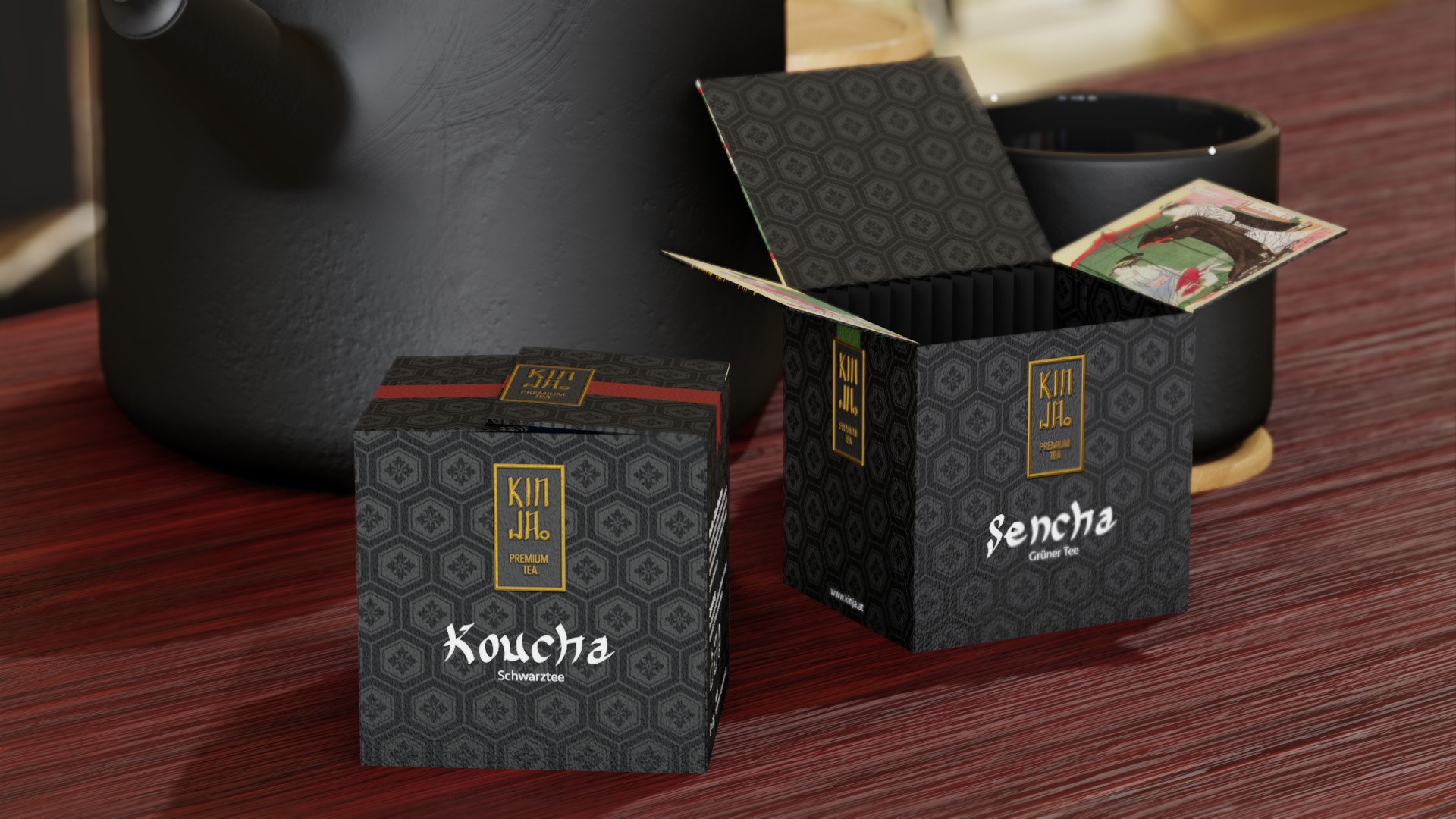
Thanks everyone for the help!