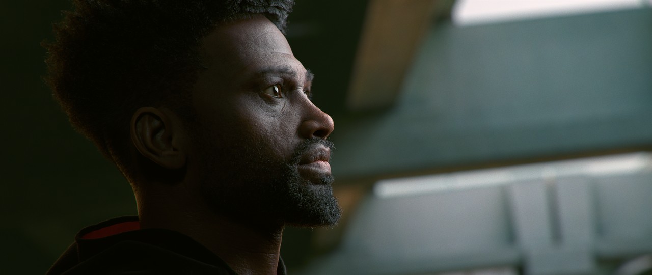
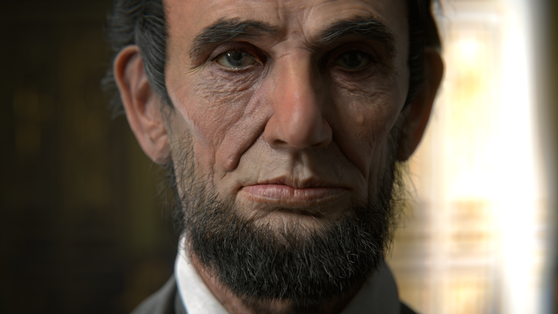
Last, but absolutely not least, chapter 5 wraps up HUMAN with lighting and presentation. At this point the hard part is done - creating our portrait asset and all the intricate pieces it entails. Lighting is the easy part. And it’s a lot of fun if you ask me!
We’ll begin with a standard 3-point light setup, which is great for learning the primary principles of key, fill, and rim lights. Then we’ll explore 6 common studio portrait setups. These are easy to learn a lot about as they come directly from long-established photography techniques:

We will also implement effective post-processing treatment with Blender’s compositor. Adding subtle effects like film grain, chromatic aberration, a vignette, as well as color manipulation can do a lot for making a render feel photo-realistic.
Next we will explore scene lighting to inject interesting context to our portrait renders. Studio lighting is great for isolating focus on a face but it can get a bit boring and feel unrelatable. With scene lighting we will create the illusion of our character being on-location. After all this is far more common in photographs than studio lighting so it can help with believability.
More renders is better than fewer!
Given the amount of hours I’ve spent on my portrait asset - and the hours you have or will spend on yours - it’s only justified that we take our time lighting for maximum result. Personally I have a ton of fun at this final stage and I make sure to explore several variations. I highly recommend you do the same. Do it for the practice, do it to maximizing quality, and do it for closure of the project. You won’t regret doing more renders than fewer renders!


If you're new to lighting in Blender I highly recommend watching the Fundamentals of Lighting Course first.
1. Can you point me to more information about portrait studio setups for photographers?
This is my favorite video on the subject, from John Gress!