I'm excited to join the CGCookie community to push myself further into the realm of 3D! My progress may not come from a 100% beginner level, but having something to keep track of where I'm going seems extremely helpful. I've completed a few tutorials on YouTube provided by Blender Guru and Grant Abbit and decided to come to CG Cookie for more focused learning. I'm definitely serious about honing 3D skills for various applications, namely VFX and video work. If I could get some 3D models into games one day, that'd be pretty fun too!
For this log, I'm going to keep track of anything I've created by means of CGCookie.
I'm starting the Fundamentals of Modeling course and I've completed the exercise in primitive modeling. My example here:
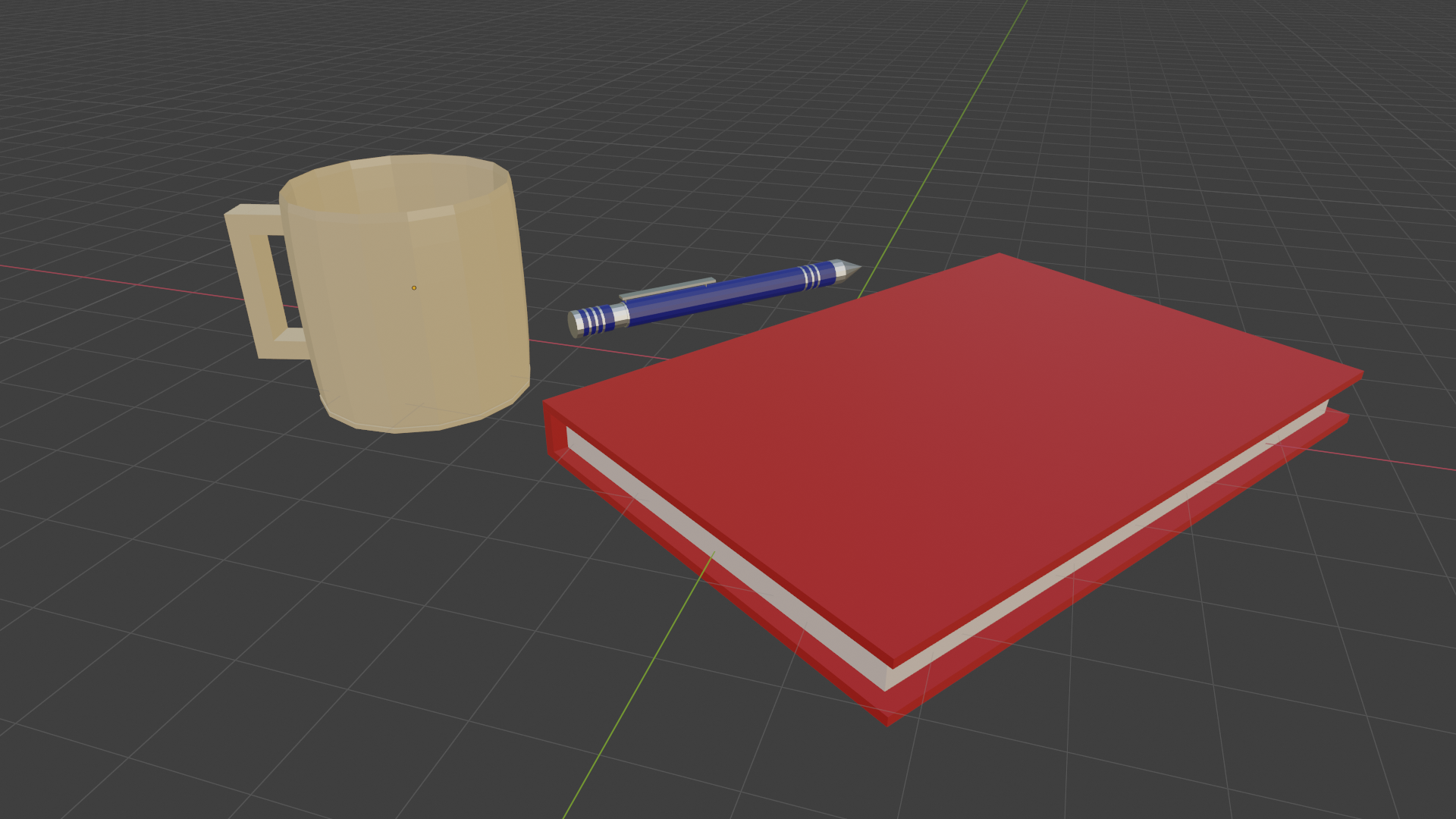
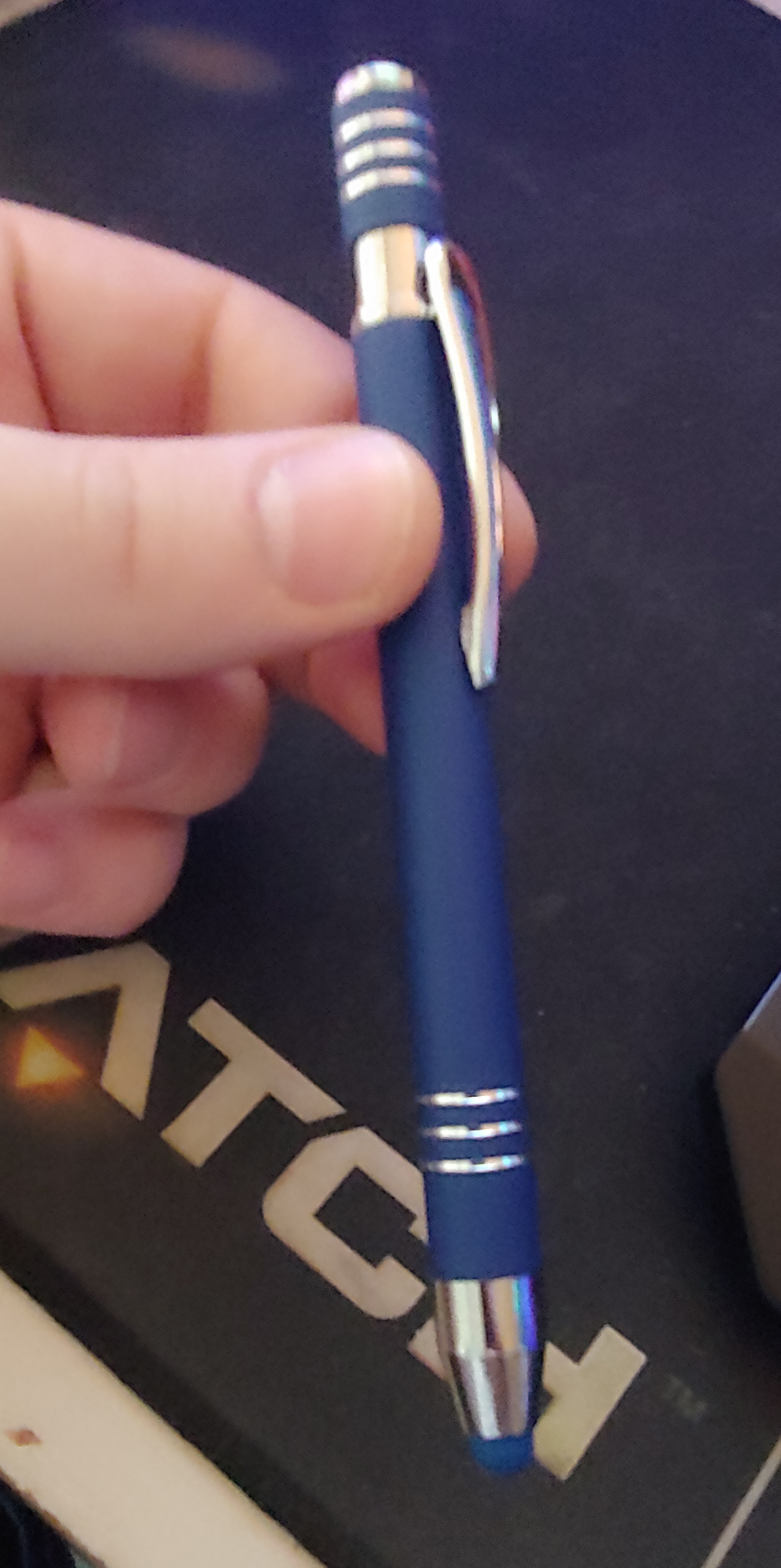
I based the pen off of one of my stylus-pens as seen here:
Oh, I like this!
Multiple objects, nice colors, simple, but very effective notebook and the pen is just gorgeous!
Welcome to CGCookie!
Looking forward to seeing more.
Thank you for the encouraging words! I'm super excited to keep going, this stuff is definitely fun.
![]() antonioc That looks great. I think we can expect to see some really good content from you in the coming days! "Welcome to da Cookie"
antonioc That looks great. I think we can expect to see some really good content from you in the coming days! "Welcome to da Cookie"
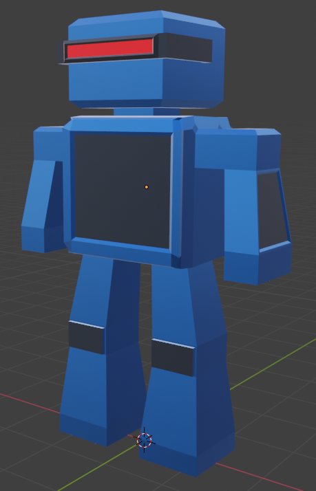
I decided to give a go at making a robot in the Fundamentals of Modeling course. I wanted to add a bunch more detail, but I liked the simplicity far more. I was going for a music-bot kind of thing. Definitely fun to put together!
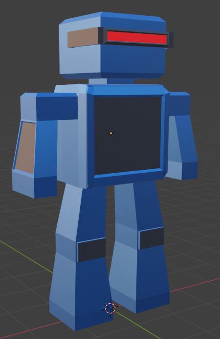
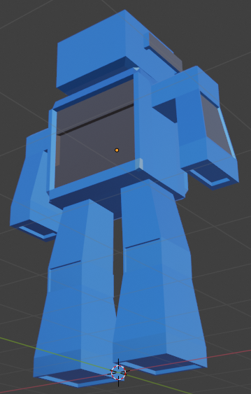
Thanks everyone! Your encouragement means a lot! Keeping a steady pace.
I took my time really playing with all of the tools today. After replicating the crate in the Fundamentals of Modeling course, I decided to make my own to put some things to the test. I think I made it a little too busy, but I definitely learned a lot with maneuvering the various tools and how they play together. Here's my crate!
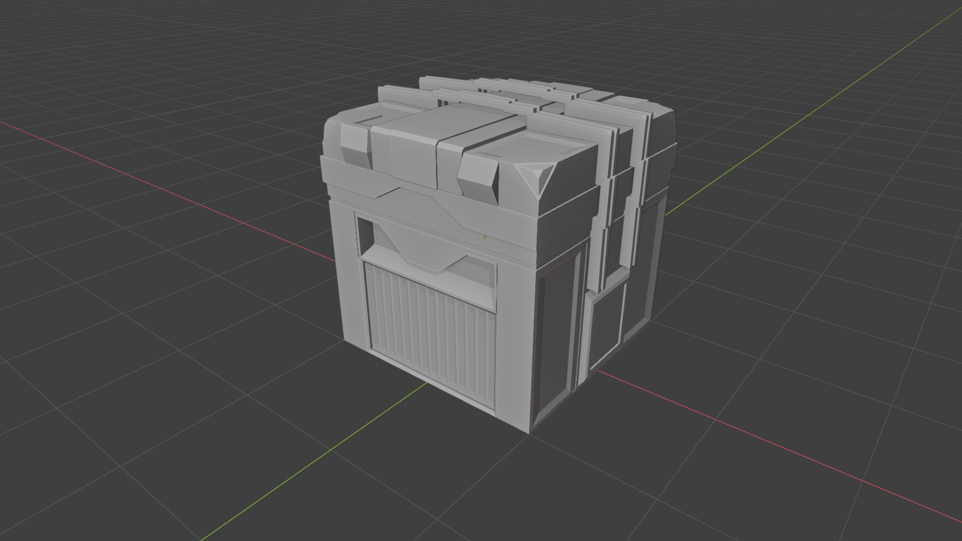
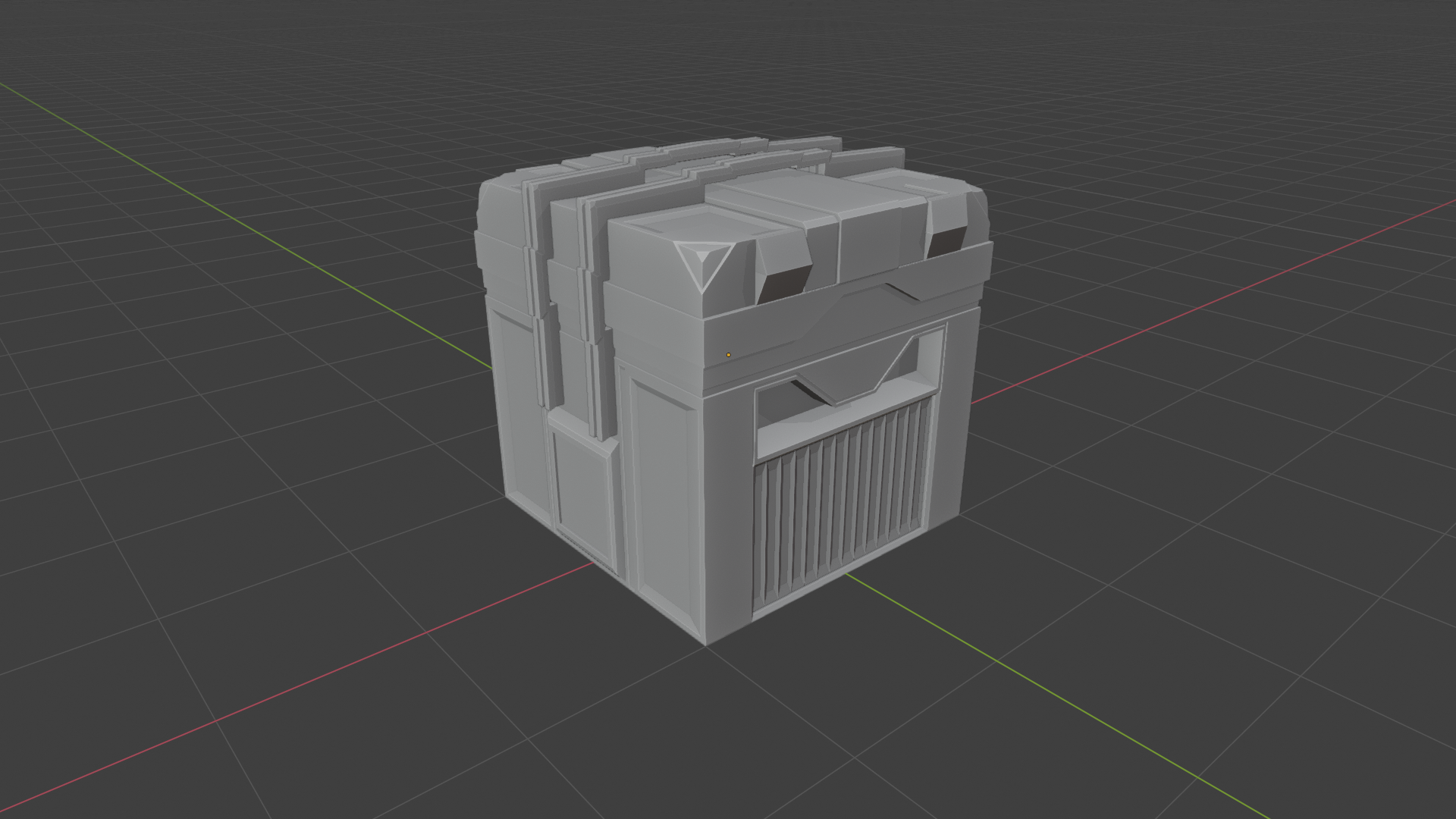
|I think I made it a little too busy,
I don't think it looks too busy, but why don't you look at a really sweat guy, who knows what he's talking about; coffee/ Blender expert 'Gleb Alexandrow'
https://www.youtube.com/watch?v=qMH_J_vcoqE&list=PLa1F2ddGya_9XER0wnFS6Mgnp3T-hgSZO&index=6&t=0s
Wow! This is incredibly eye opening. I've always understood this concept with colors and composition for video work, but I've never considered it on the basis of objects. Thanks for sharing this! I'm definitely going to practice that concept moving forward.
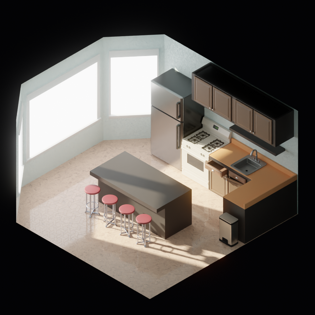
It's been a while since I've posted an update on my progress, so I figured I'd upload something now! I'm working on the room assignment slowly in-between working from home and other projects. I decided to create a kitchen. I like all of the little objects found in a Kitchen's setting and it could be some good practice. I'm pretty happy with it so far!
I haven't textured the countertops yet. I plan to add a kitchen table and some chairs, and more various items of course! Taking my time with this is extremely helpful in learning pitfalls and troubleshooting.
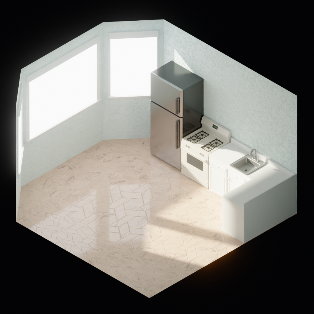
Thank you! I really want to make this something I'm happy with rather than to just satisfy the assignment. I'm excited to get more progress on it!
While I do love the detail the colors are making the overall look feel "washed out" if that makes sense. And the tile pattern on the left side of the room seems different. Is that intentional?
Otherwise this is looking really solid ![]() antonioc!
antonioc!
I think some ambient occlusion baking would help this pop a lot. Or perhaps some dirty vertex baking.
I plan on focusing more on colors much later in the process, but I do agree with you. Colors and textures right now are there to give me a feel for things as I build the room. I honestly just slapped a texture on the floor to get started, haha! I think it's just a UV mapping issue and the normal map is too heavy. Thanks for the feedback ![]() blanchsb!
blanchsb!
![]() spikeyxxx Absolutely! I do that in nearly every medium I work with, even in video or music. Sort of pre-visualization to a degree, haha.
spikeyxxx Absolutely! I do that in nearly every medium I work with, even in video or music. Sort of pre-visualization to a degree, haha.
I was able to get more time and added more to the Kitchen! The colors are not final, I just wanted to be able to visually separate the objects in the render. Not sure how I feel about browns in this one. The Island is blocked out for placement, but I plan on detailing it a bit more. I also scaled down the room's walls a little bit.
Starting to get pretty comfortable with Blender! It feels great being able to figure things out like this.
