Hello everyone! I've been enjoying my time on CGCookie these first two months, this is my first time touching the forums over here. Not sure if I wanted to start a polybook over here, I currently just upload all my (work-in-)progress pics somewhere else. However, I would like to start incorporating feedback from others on my projects. Is it recommend that I do all of this in a single polybook or is it better to make separate posts? I feel like it'd be easy for a single thread to slide down into obscurity, but I may be wrong about that!
I'm currently doing an exercise to model a first-person gun; I've decided to design my own watergun, but making a design from scratch is tough! I do want to improve at coming up with my own designs, so I've come up with some ideas and I'd like to hear your thoughts and ideas! It's still early days, but I intend to do a lot of iterative design and maybe eventually even make a nice portfolio piece.
The idea for my watergun is that it's cobbled together from household parts, but combined with some more whimsical magical / witch-like elements. It's supposed to feel a bit like it's been put together by a young girl, though it doesn't have to be too grounded. I have a moodboard but I'm pretty sure a lot of those images are copyrighted in some way so I won't post them here
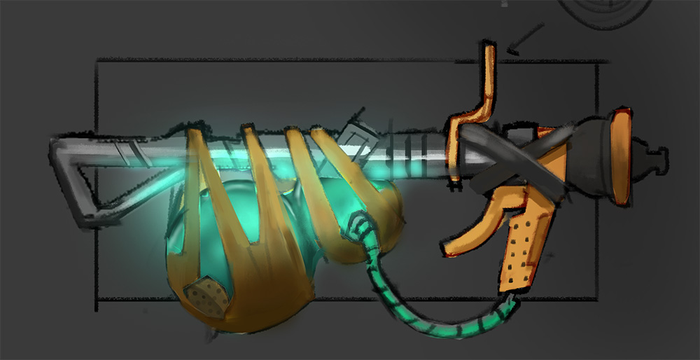
Some sketches (vacuum cleaner parts + hose + flask / watertank)

And my rough blockout so far (everything is placeholder), blocking it out in 3D actually gives me a lot more ideas than just the sketches
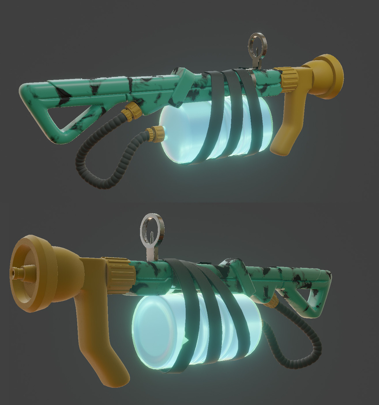
I'm not too displeased with my idea so far, but it can be improved by tons! I'd like to incorporate a lot more whimsical elements, like old potion flasks etc; make it more cute, too!
Thanks for reading, and don't be afraid to comment -I'd love to hear your thoughts, good and bad.
I always intended to put some cool surfer dudes 'n gals into my scene. I figure the backstory is that while out riding some gnarly summer waves they accidentally discovered some ancient lost ruins. With some of these details added in I'm getting a clearer picture of what props I need to make.
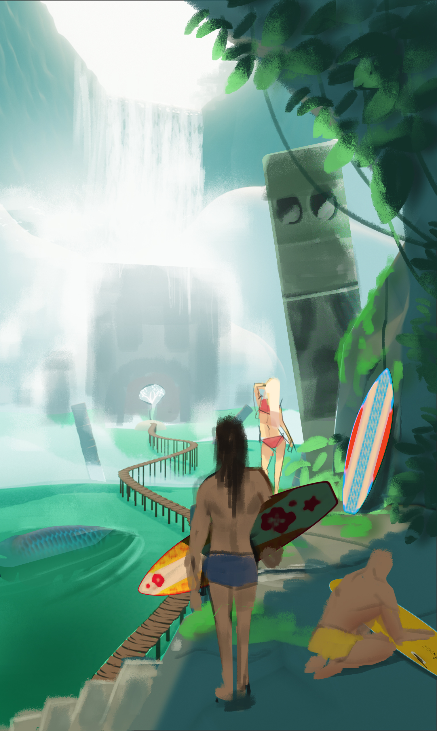
![]() numbernine I like the feel you're going for, but the person right front and center has become the focus point for me. It's distracting away from what's happening in the distance where the boardwalk leads and weakening the overall piece. Maybe you could place some on the boardwalk heading towards the thing in the center.
numbernine I like the feel you're going for, but the person right front and center has become the focus point for me. It's distracting away from what's happening in the distance where the boardwalk leads and weakening the overall piece. Maybe you could place some on the boardwalk heading towards the thing in the center.
![]() silentheart00 I appreciate all the comments I'm getting so far, so thanks for that btw. I do check out a lot of people's threads as well but I should take the time to comment some more so I'll start doing that :)
silentheart00 I appreciate all the comments I'm getting so far, so thanks for that btw. I do check out a lot of people's threads as well but I should take the time to comment some more so I'll start doing that :)
Anyway, did a very quick little rebalance of things to get the composition working better. I think that very soon I'll start working on the actual 3D scene.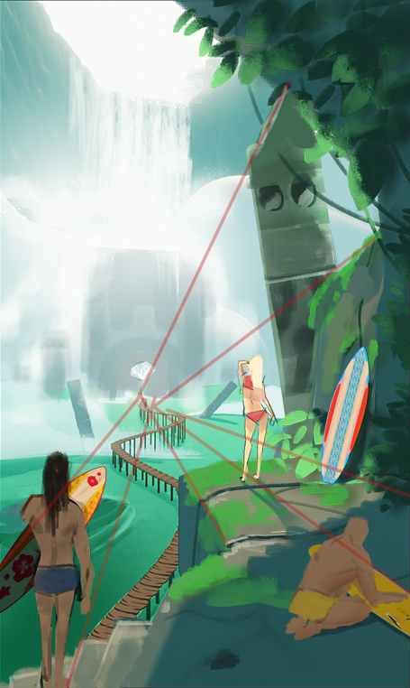
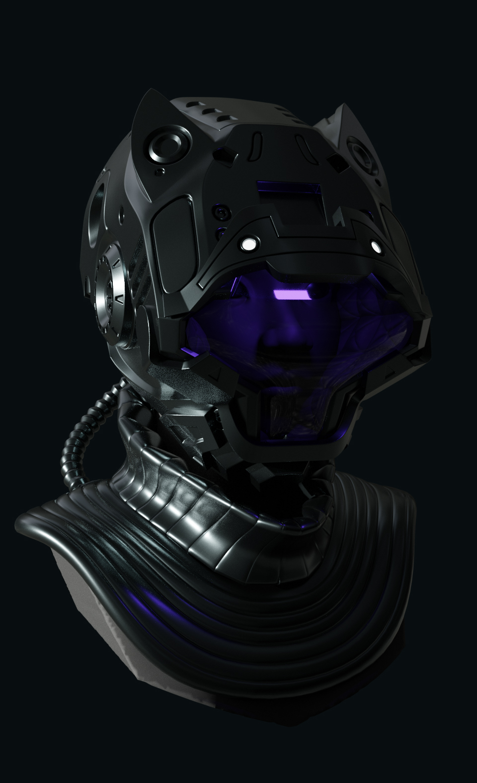
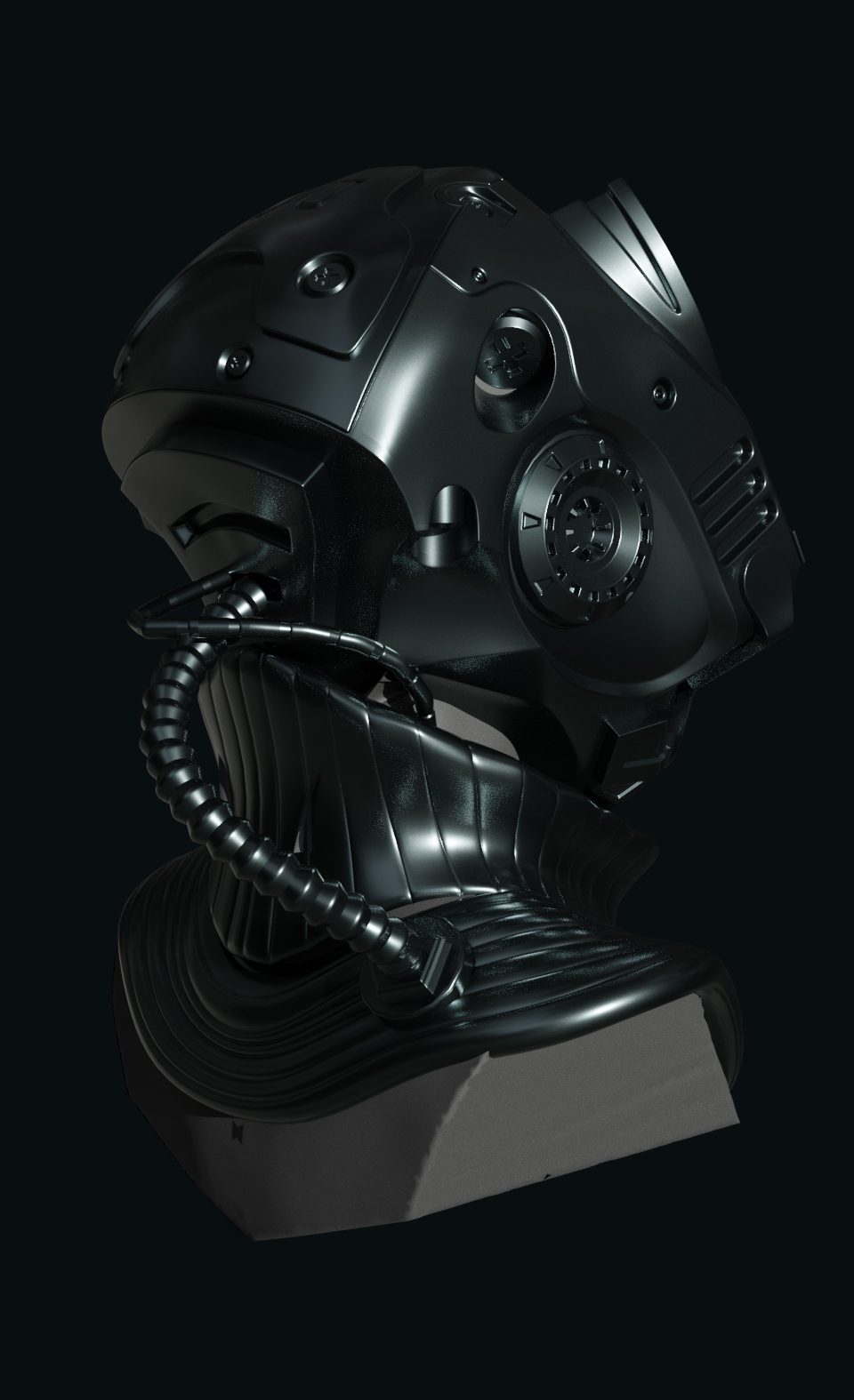
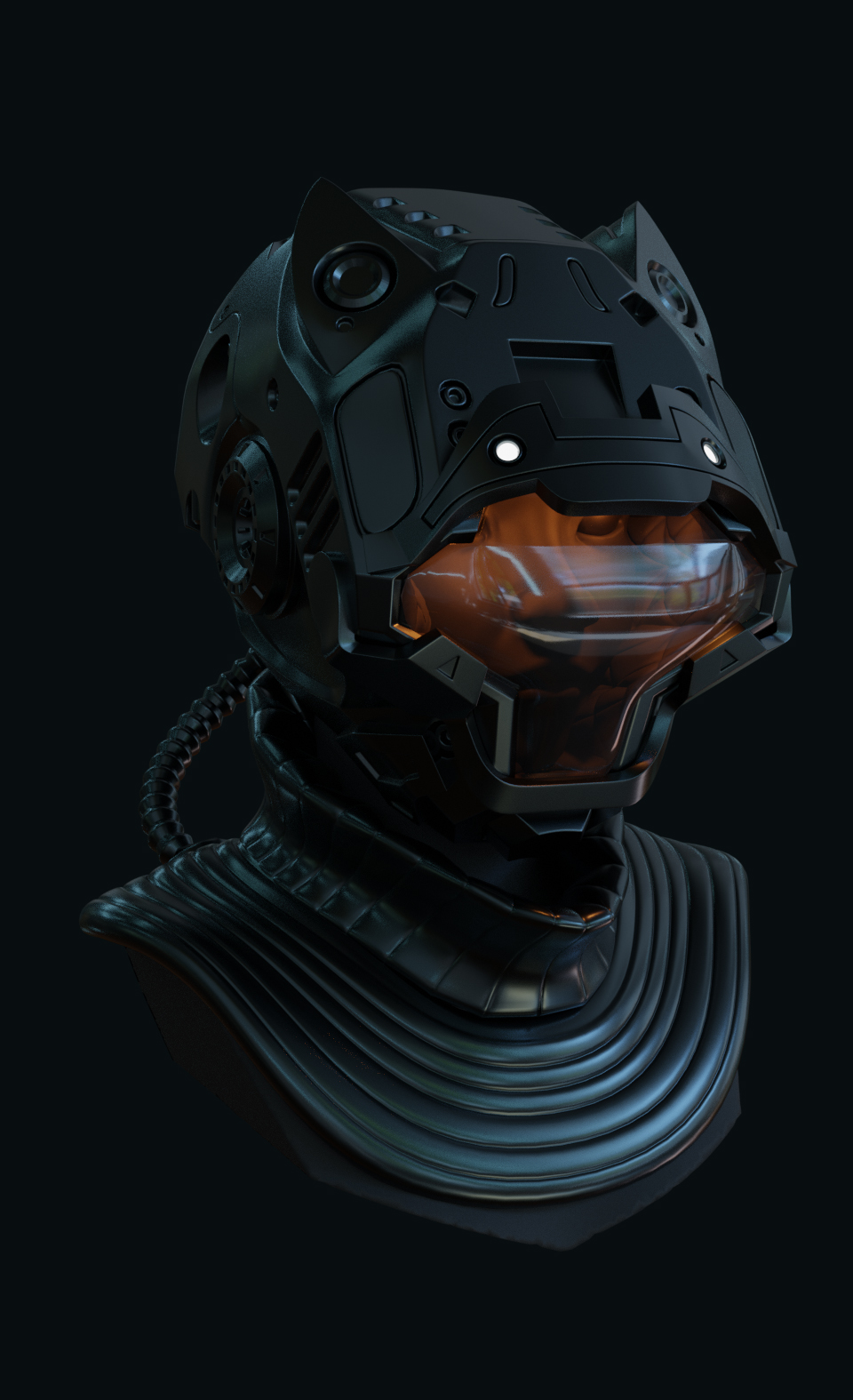
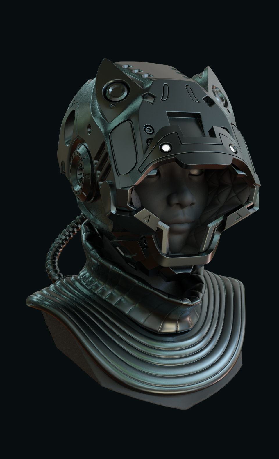
Still alive! I only have time to work on my own 3D stuff in the late hours, so it's all a tad slower these days. Anyway, I have been keeping up almost every day. I''ve actually got 2 or 3 little projects that I think worked out pretty well, but recently I've finished the 'Sci-Fi Helmet' course and I think it turned out pretty alright. Hard-surface sculpting is definitely tricky and so was the retopology, but I'm pretty pleased with how it turned out. I feel like if I were to take another shot at doing a similar helmet I could take it even further.
