Hello everyone! I've been enjoying my time on CGCookie these first two months, this is my first time touching the forums over here. Not sure if I wanted to start a polybook over here, I currently just upload all my (work-in-)progress pics somewhere else. However, I would like to start incorporating feedback from others on my projects. Is it recommend that I do all of this in a single polybook or is it better to make separate posts? I feel like it'd be easy for a single thread to slide down into obscurity, but I may be wrong about that!
I'm currently doing an exercise to model a first-person gun; I've decided to design my own watergun, but making a design from scratch is tough! I do want to improve at coming up with my own designs, so I've come up with some ideas and I'd like to hear your thoughts and ideas! It's still early days, but I intend to do a lot of iterative design and maybe eventually even make a nice portfolio piece.
The idea for my watergun is that it's cobbled together from household parts, but combined with some more whimsical magical / witch-like elements. It's supposed to feel a bit like it's been put together by a young girl, though it doesn't have to be too grounded. I have a moodboard but I'm pretty sure a lot of those images are copyrighted in some way so I won't post them here
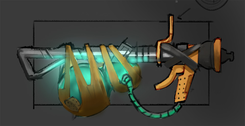
Some sketches (vacuum cleaner parts + hose + flask / watertank)

And my rough blockout so far (everything is placeholder), blocking it out in 3D actually gives me a lot more ideas than just the sketches
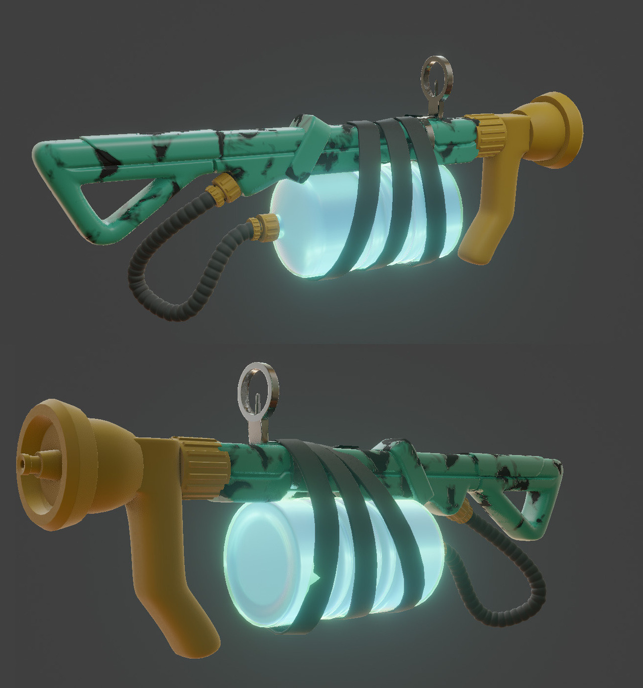
I'm not too displeased with my idea so far, but it can be improved by tons! I'd like to incorporate a lot more whimsical elements, like old potion flasks etc; make it more cute, too!
Thanks for reading, and don't be afraid to comment -I'd love to hear your thoughts, good and bad.
![]() spikeyxxx Yeah, it seems that one of the toes did not bool correctly (even though I checked) and I haven't been able to fix it, so I've just left it in there for now.
spikeyxxx Yeah, it seems that one of the toes did not bool correctly (even though I checked) and I haven't been able to fix it, so I've just left it in there for now.
A fun fact that I discovered when booling (in this case Union) is that the absolute dimensions, not scale, of your object matters. Originally my model was about 1,65 meters / blender units tall as that was the height of my reference. When I started booling objects it would rarely go well, until I scaled my model about by about a factor of 5. At those dimensions,nearly all the bools worked perfectly without a hitch. It's probably due to the distances becoming too small in whatever algorithm booleans use behind the scene.
![]() numbernine Cool stuff - I also dig your Object #2, the mushroom on a skull :)
numbernine Cool stuff - I also dig your Object #2, the mushroom on a skull :)
Been participating in the daily model thread. I don't plan on following every single day (want to spend some time on the character too) but it's pretty fun.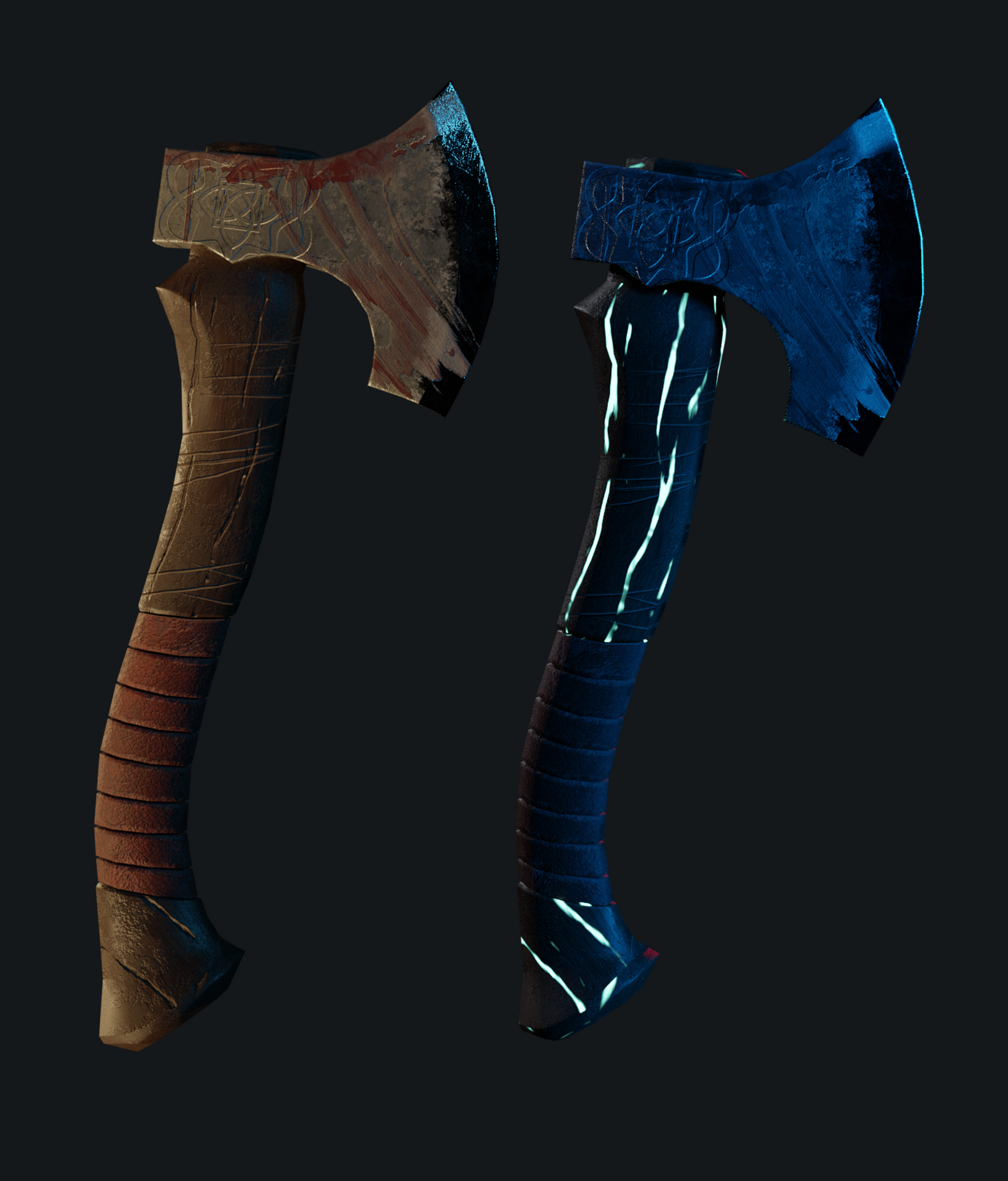
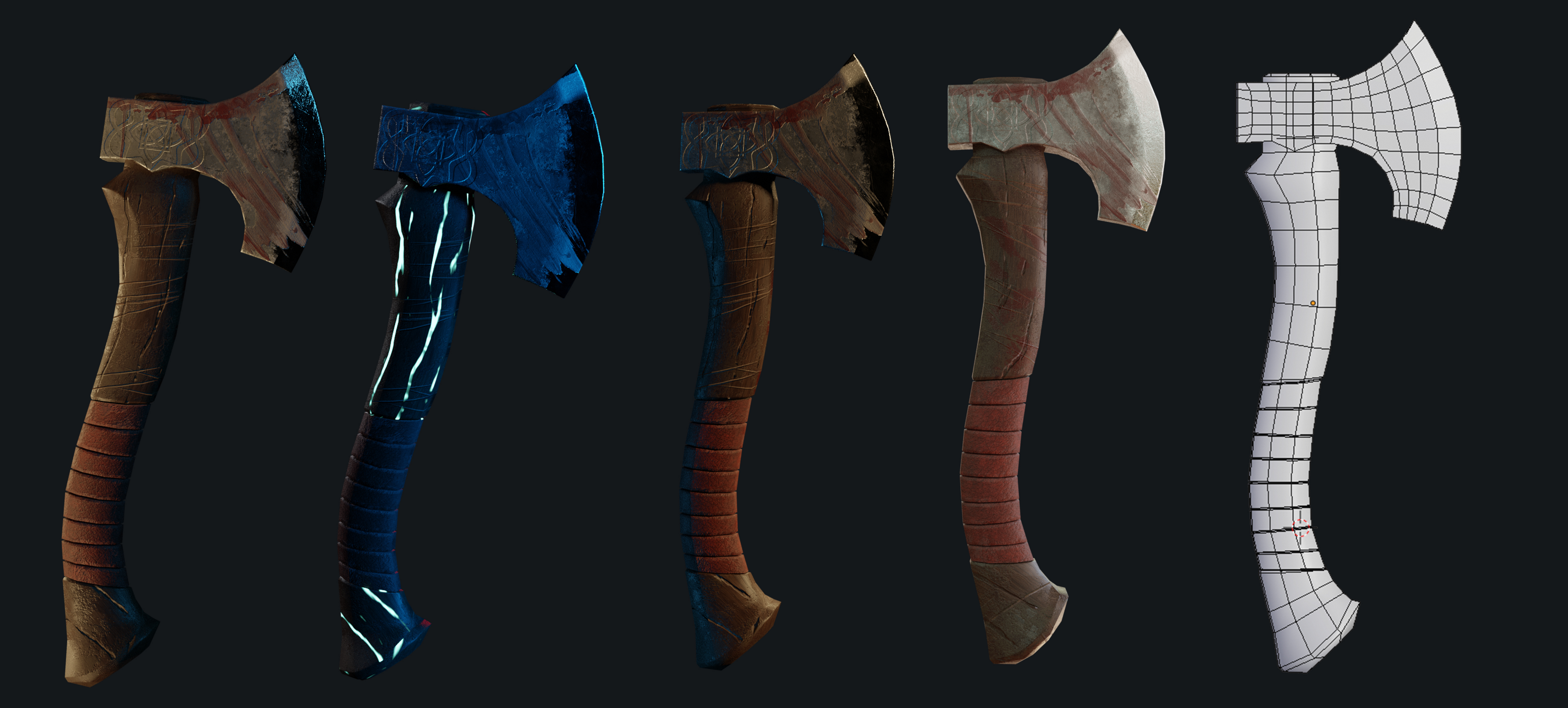
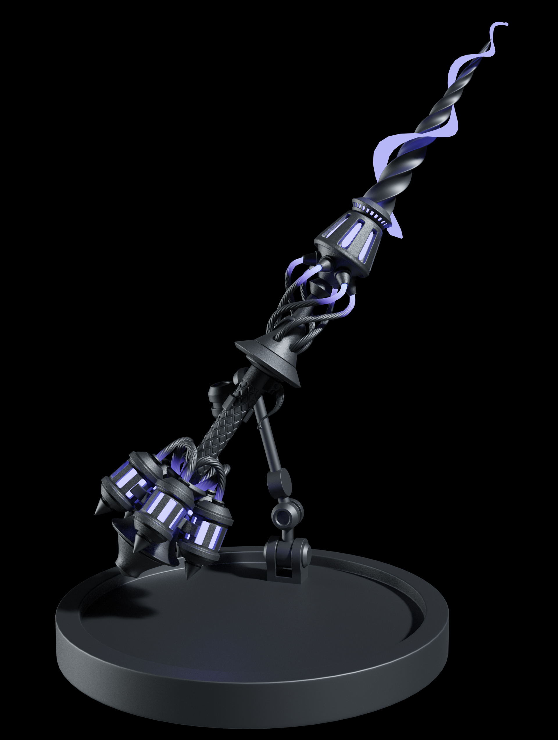
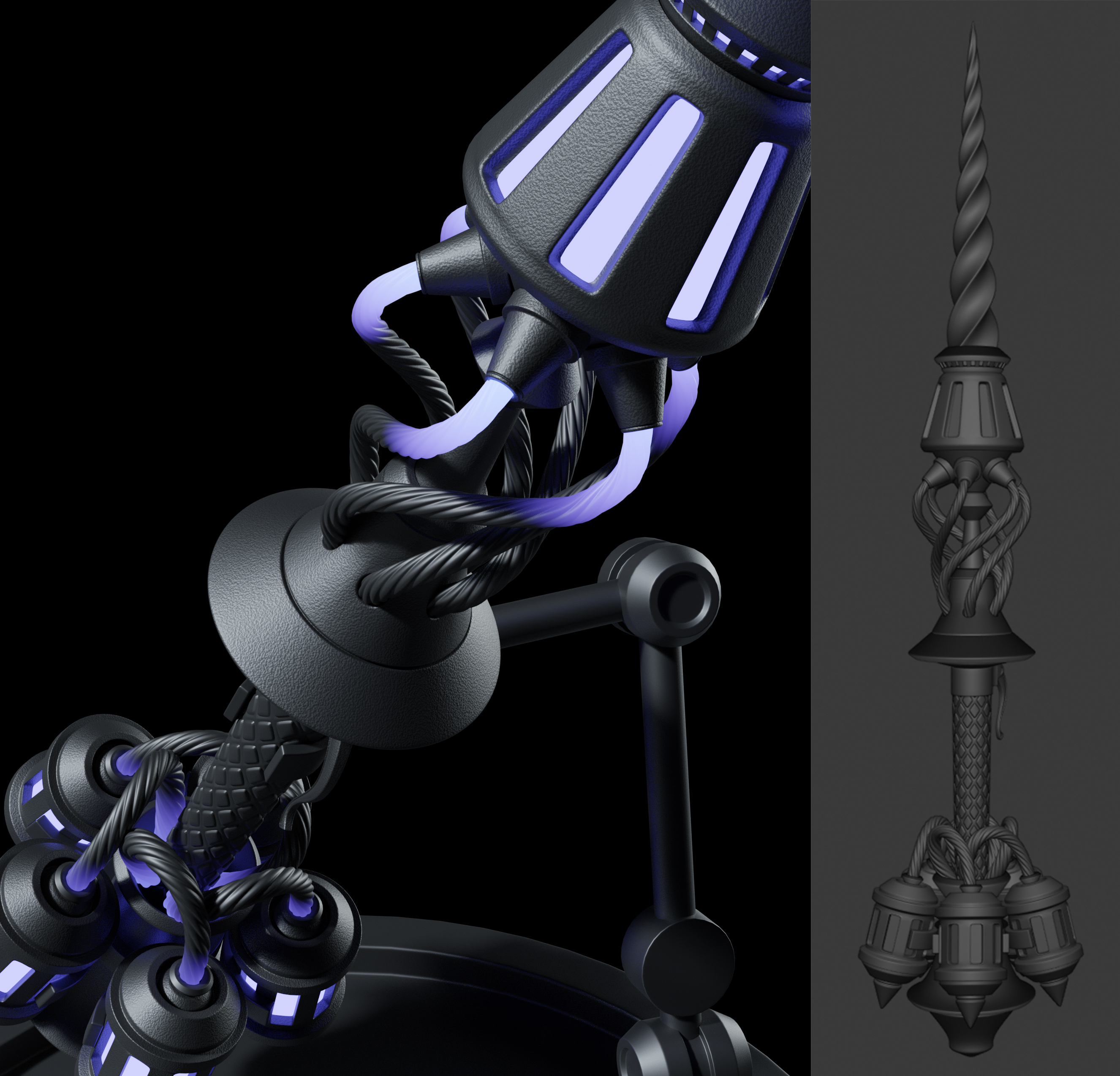
Some good news is that I've somehow managed to get a paid internship position at an architectural bureau where I'll be helping to make renders of interiors / exteriors of various projects. I'm psyched, but also kind of scared. We'll see!
That does mean I'll be posting less frequently since I'll be busy with work / learning new software other than Blender, but I intend to keep making Blender stuff in my spare time! Here's something I started today. Based on 2D artwork by Samuel Youn
![]() numbernine Congrats on the internship! From what you posted so far, you definitely have some chops. Good luck!
numbernine Congrats on the internship! From what you posted so far, you definitely have some chops. Good luck!
(WIP)Doing more sculpts based on art that inspires me. I want to improve my technical skills foremost instead of getting stuck trying to think up of my own designs. Does anyone have a tip concerning eyelids? I've always had trouble getting them right, mostly because some of the folds where the creases overlap are very tricky to pull off. I know that a good way to get nice creasing is to use 'subdivide edges' and the inflate brushes, but I find it hard to control in a delicate area such as the eyelids.
![]() numbernine Wow, congrats on the internship! Well deserved! You'll do great :)
numbernine Wow, congrats on the internship! Well deserved! You'll do great :)
![]() numbernine congrats on your internship and I hope you enjoy it and learn a lot of cool new stuff 😊👏🏻
numbernine congrats on your internship and I hope you enjoy it and learn a lot of cool new stuff 😊👏🏻
ssmurfmier1985 @jlampel
Thanks for the kind words!
Just watched the first stylized eevee environment stream. Drew myself up a bit of a quick concept of the feeling I was going for. I want to have a lot of it blocked out and at least one prop done for next week's stream.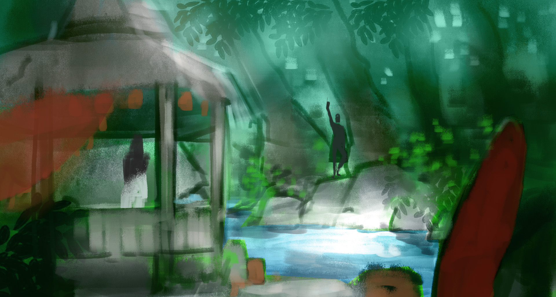
I landed on a scene and composition idea for the simple eevee environment challenge. Currently just playing around with a lot of things, trying all kinds of wacky things to see if I can stumble upon something nice. I still need to work out the theme and design a bit more, then move on to categorizing all the props that need to be made.
![]() numbernine That looks great, except I can't tell what that thing on the top is. Is it a tornado or a waterfall?
numbernine That looks great, except I can't tell what that thing on the top is. Is it a tornado or a waterfall?
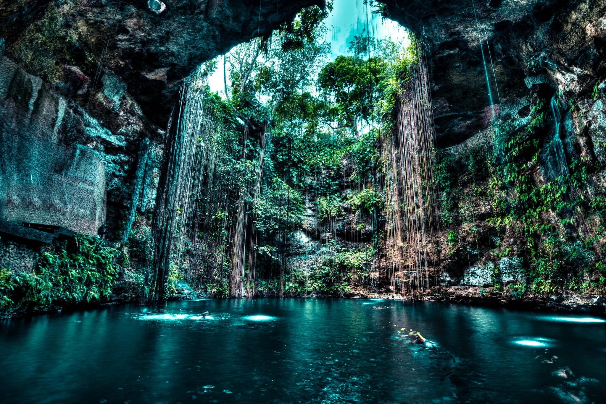
I do need to work on making that a bit more clear. The scene started as a giant cenote, so the original scene was originally inside a giant cylinder with a hole in it where the sun could shine through. Putting a giant waterfall back there actually sounds really dope, wonder how I didn't think of that; totally stealing that idea, thanks :D
![]() williamatics
williamatics
A cenote is something like this
And 'dope' can mean many things. Apparently the origins behind dope meaning something like 'cool' or 'awesome' started in the the 80's rap scene. I learned something myself today.
Threw in a quick placeholder waterfall; it actually looks really fitting.
![]() numbernine that waterfall in there looks really dope 😉
numbernine that waterfall in there looks really dope 😉
I think your human you added in front distracts from the overall composition though.. first my eyes were drawn to the back where the awesome environment is taking place, because the standing human is looking at it / leading lines / open space which acts as breathing room to enjoy in the glorious vastness and awesomeness. Now however, the human in front is big, looks the wrong way, and makes it so as I don’t know where to look... just my opinion do with it as you see fit 😊