It's that time again: Time to get your Blender projects ripped to shreds by the best critics in town!
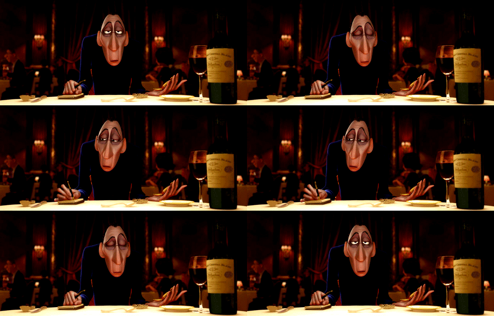
I mean....If you would like a critique from *humble* Blender heads, Kent Trammell and Jonathan Lampel , to help push your stuff to the next level, please submit one of your projects to this thread. It can be a model, environment, texture work, a shader, animation - anything created with Blender.
The stream will start at 2pm eastern US time on Tuesday, February 26th. It's ideal if submitters can participate in the stream. However if you want to get a critique but won't be able to participate in the stream live, that's OK. We'll still review your project and you can watch the recording later.
NOTE: All active Citizen members have access to watch this live critique stream and submit art to be critiqued.
pprocyonlotor That sculpture is really impressive! The textures aren't that good, though - they look too plasticky.
Here is a short animation I made after being inspired by Kent Trammell's icicle stream and the winter weather around me: 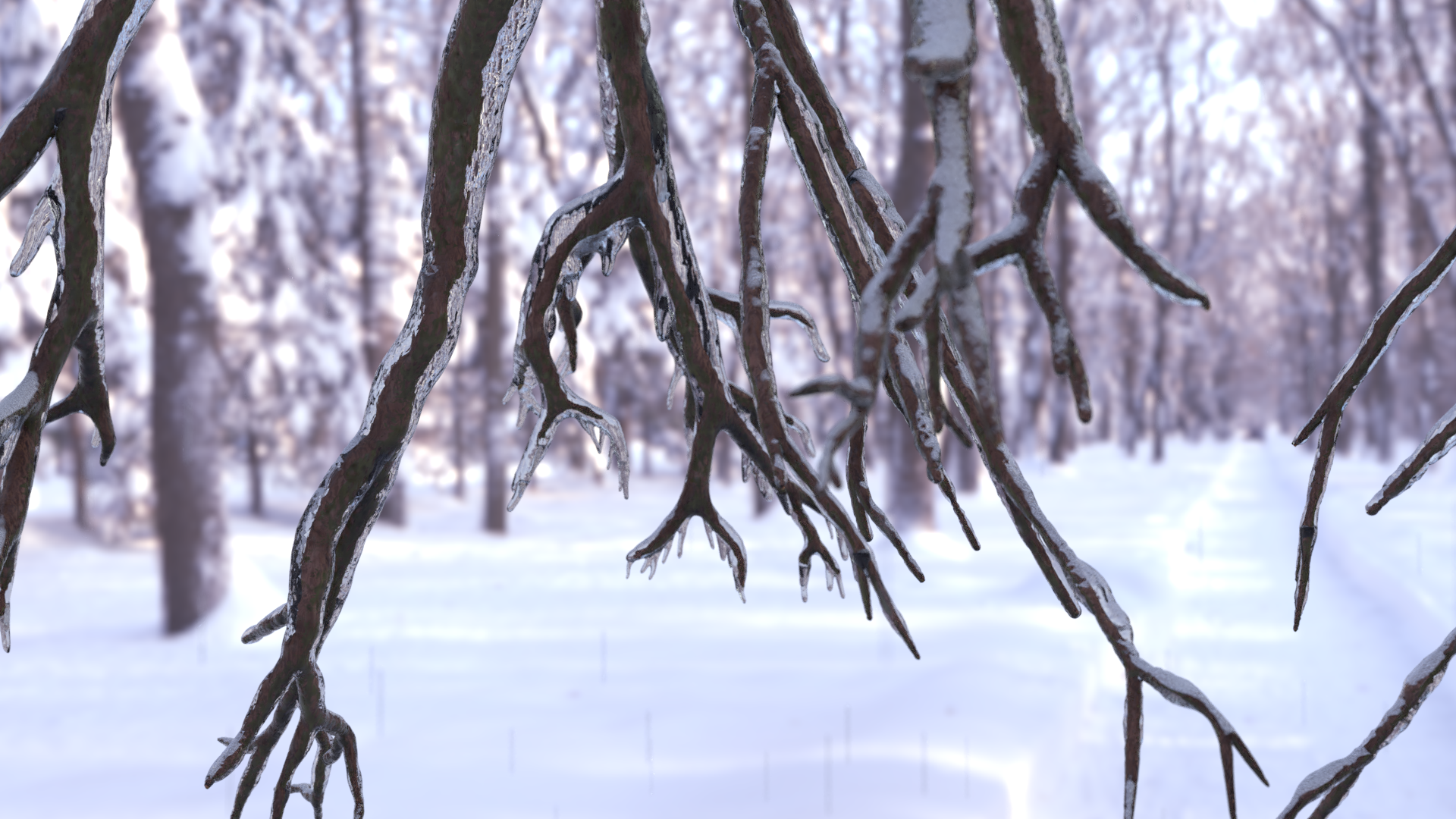 My goal was a realistic tree render. All of my textures are completely procedural, and my hdri lighting and background from hdrihaven here was the only thing I didn't make. I won't be able to attend the live stream, but if this gets featured in the video, I'd love to re-watch the stream and receive your critiques then. I'm specifically looking for input on:
A. the snowy ice material on the tree. Do you have any ideas to make this more realistic? I have two meshes (one for the tree and a larger one for the ice) on top of each other, with a separate material for each.
B. The general layout and composition. This is one thing I didn't spend much time on, as I was eager to finish the scene. Any input on improving the appeal of the scene while keeping it relatively simple?
C. Any other input you may have for improving this project. : )
I'm very much a beginner, and I hope to learn a lot from your critiques on even this simple project.
I'm submitting my first character for an overall critique of it. I created some simple materials so that individual pieces are distinguishable. The orange piece is a gambeson, the dark blue one on top of it is a mail shirt and the brown one around the neck is mail neck protection. The lines at the ends of the mail pieces are going to be stitched leather bands (There are two on each arm of the shirt and they will have fabric in between)
The wrinkles on the clothing are not final. I will redo them properly after retopo.
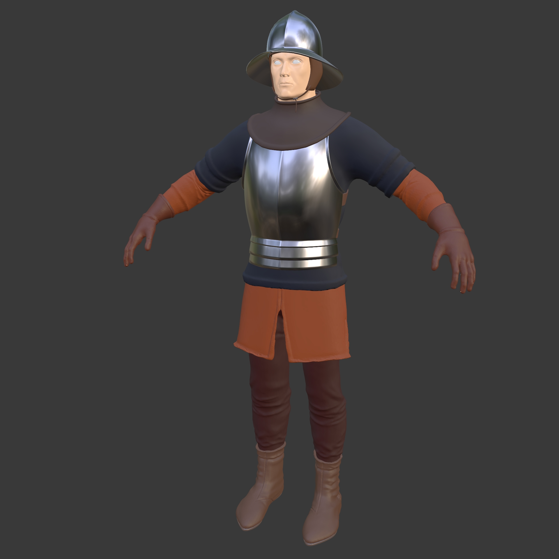
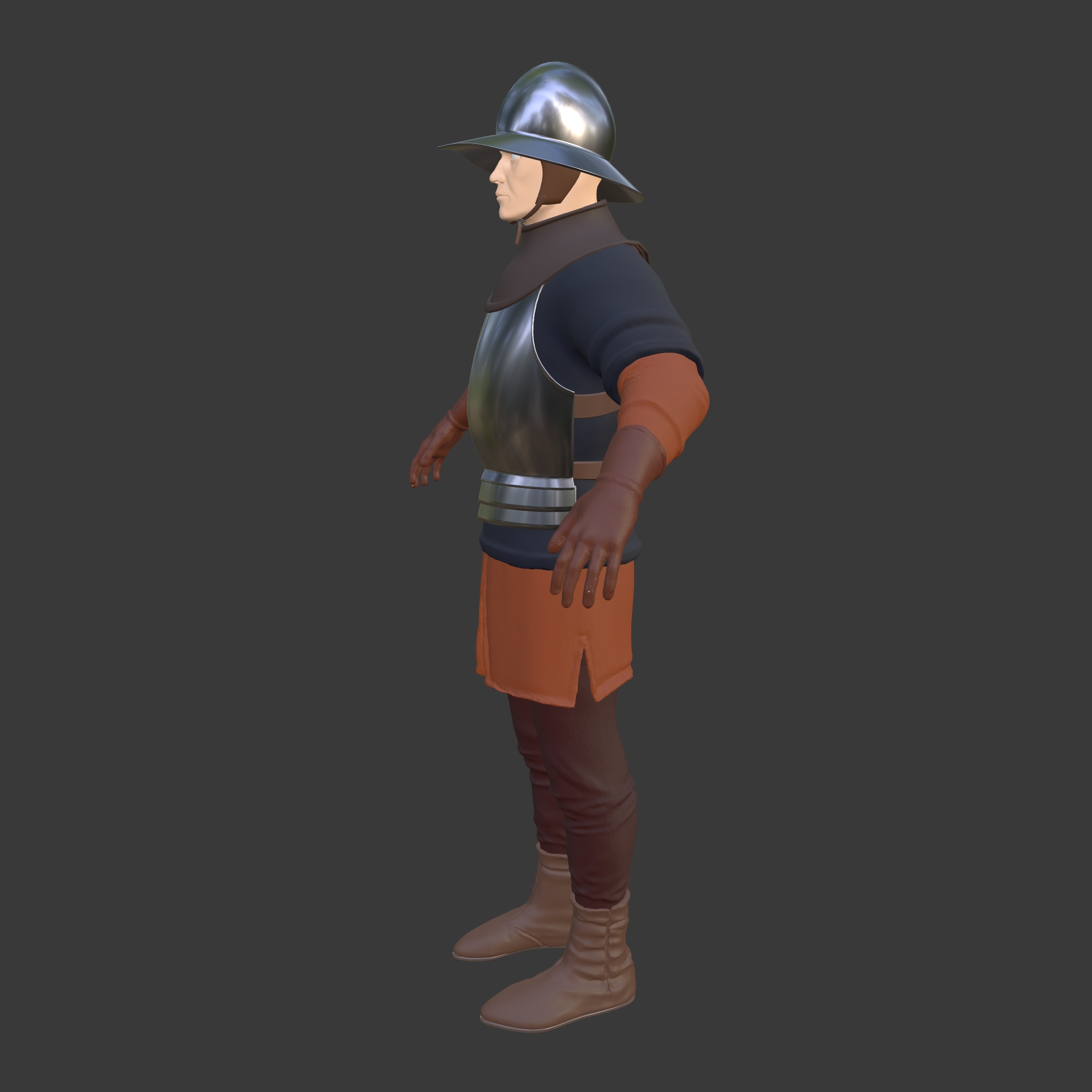
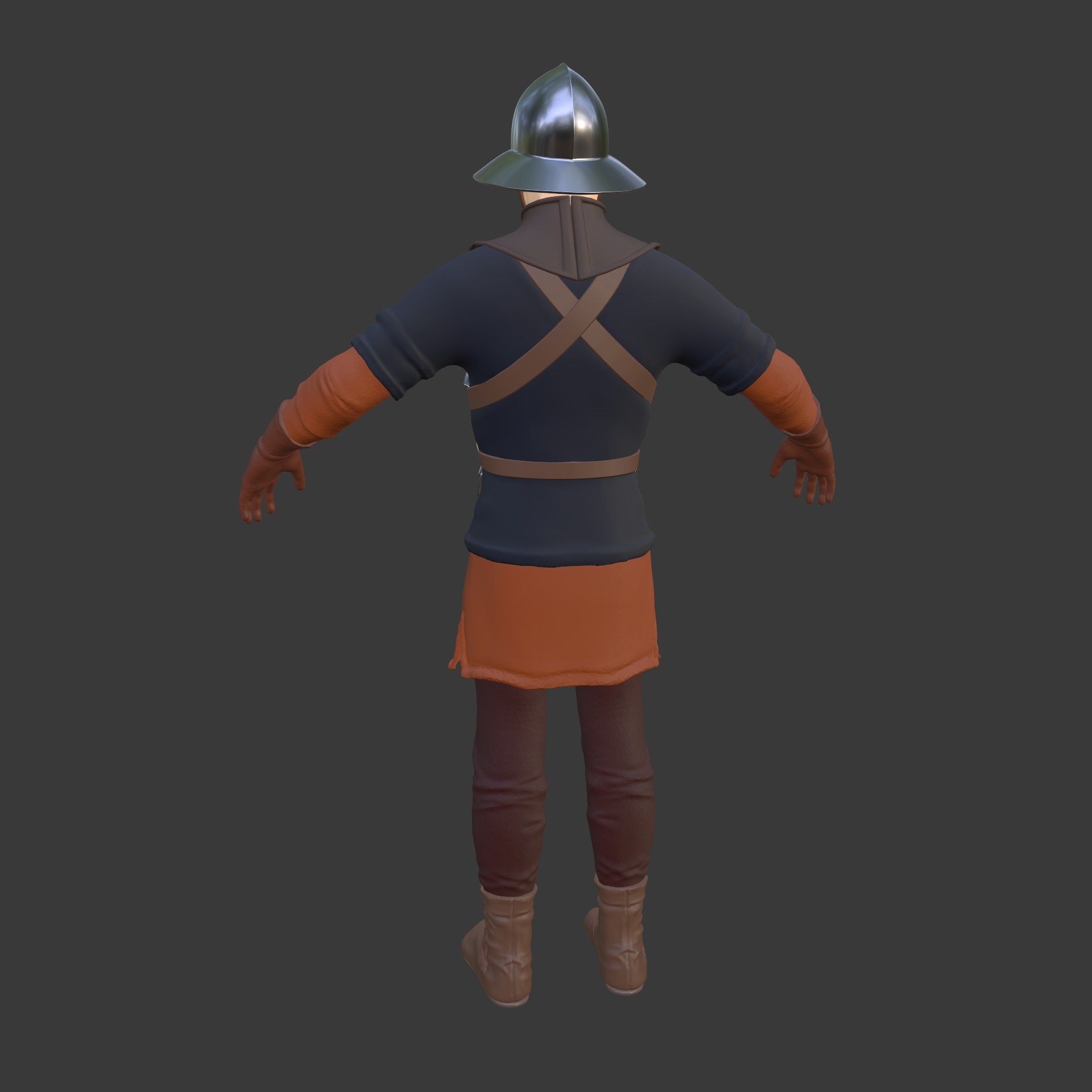
I haven't created a gallery entry as this is obviously a WIP. Hope that's alright.
EDIT
Really sorry but I'm shamelessly pulling a sneaky on you and adding the sketchfab link of my current retopo on the day of the stream :D. I'll do some more polishing and even out the topology further tomorrow.
https://sketchfab.com/3d-models/man-at-arms-6690efae50d34fdf999b982b573f6c2b
https://cgcookie.com/u/spikeyxxx/projects/car-8d1e86cc-5b03-4d6d-813f-bc311cd135a2
I think it doesn't look too bad, but I personally wouldn't look twice at the picture. It doesn't get my attention. It just doesn't "pop". I've rendered with Cryptomatte on, so I can change just about anything, I just don't know what and how;)
Any critique on the car model also welcome of course!

I am still having problems with depth of field in Eevee. Is just not working for me :(. Also I was trying to add some motion blur with no luck. In cycles everything is working but it takes very long time.
Everything is done in blender and rendered in Eevee.
I wanted to make it look like from a children's cartoon.
My submission for live critique
Lots of submission so far, I hope there will still be time for mine 😅
As some people may know the next couple of years I'm working on a huge personal project to practice all the things I'm learning (and to fill my portfolio), which is creating my own game level 😊 My main character is the son of what you could call 'futuristic blacksmiths', (its sci-fi themed), so his weapon of choice will be a spiced up sci-fi blacksmiths hammer!
-> more context on the game in the first post of my dev log
It's my first time modeling a weapon and my first time modeling for games, so I could use some feedback on it before moving on.
The hammer weapon is based on the shape of a real blacksmiths hammer. I began with that shape based of reference and then gradually build up the sci-fi parts on top to emphasize the shape. I have been adding some details to the high poly model and have been beveling with the bevel modifier, but I am waiting with the rest of the details / mesh decal stickers until the feedback, since I might need to change some things.
I'm going for a slightly stylized style with my game. Cartoony looking but with real life scale (so no over excagarated weapons and stuff). I want to have enough details to make it look visually interesting (especially since this is the main characters weapon and it will be on screen a lot), but I don't want the design be too busy. The whole game will have just enough detail to look interesting, but the focus will be on character animation, combat and the story.
Example of the amount of detail I want to use: Front / Back
Some questions I have:
- Is it sci-fi enough, how can I emphasize it more? Does it fit the stylized feel?
- How does the overall shape look, do I need to change things to make it visually more interesting?
- Some parts look a bit empty to me, how can I spice those up without making it 'too busy looking'? I'm certain some parts needs some normal map details, but I also think in some areas it would be better to texture paint some extra interest. I haven't done any texture painting yet so I find it hard to decide what I should put where to make it look good but not overdone...
- I'm also not entirely happy with the big light in the middle of the hammer head, it's just a huge light and it look a bit boring to me... how to make this better??
- The game will be in third person view so the weapon has to look good from that angle, but I guess that all depends on how the character will hold it so how to test this out now?
- Any design flaws?
- Overall critique & tips?
I've uploaded all my WIP pics and a sketchfab embed to my gallery
Looking forward to some useful feedback! 😄
@theluthier hello kent ,as i told i want to go pro as a character artist, i was playing with blender for 4 years , and i started to take i seriously after the stylized character class , so i want to thank u
i feel comfortable with the Tools ( sculpting ,texturing ) and i know anatomy well .
i ll love to here ur critique , and if u have any advices ! my last character is on my polybook thread . the concept is from C Walton ( i did one legged Pete from his concept)

I'm attempting a Sketchfab challenge right now, and I thought it would be a good excuse to practice some female anatomy! So big question I'd like to know: how's my anatomy?
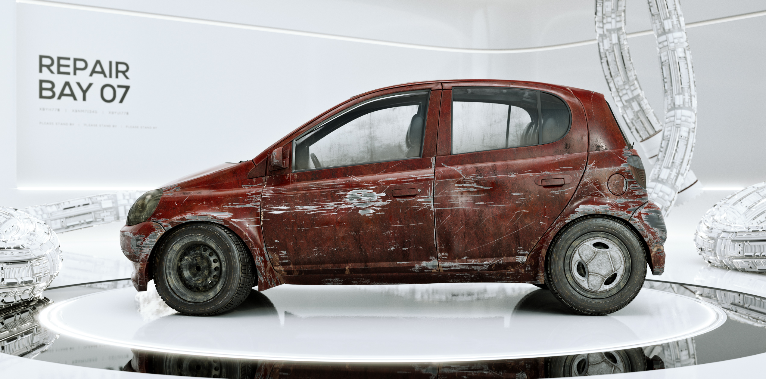
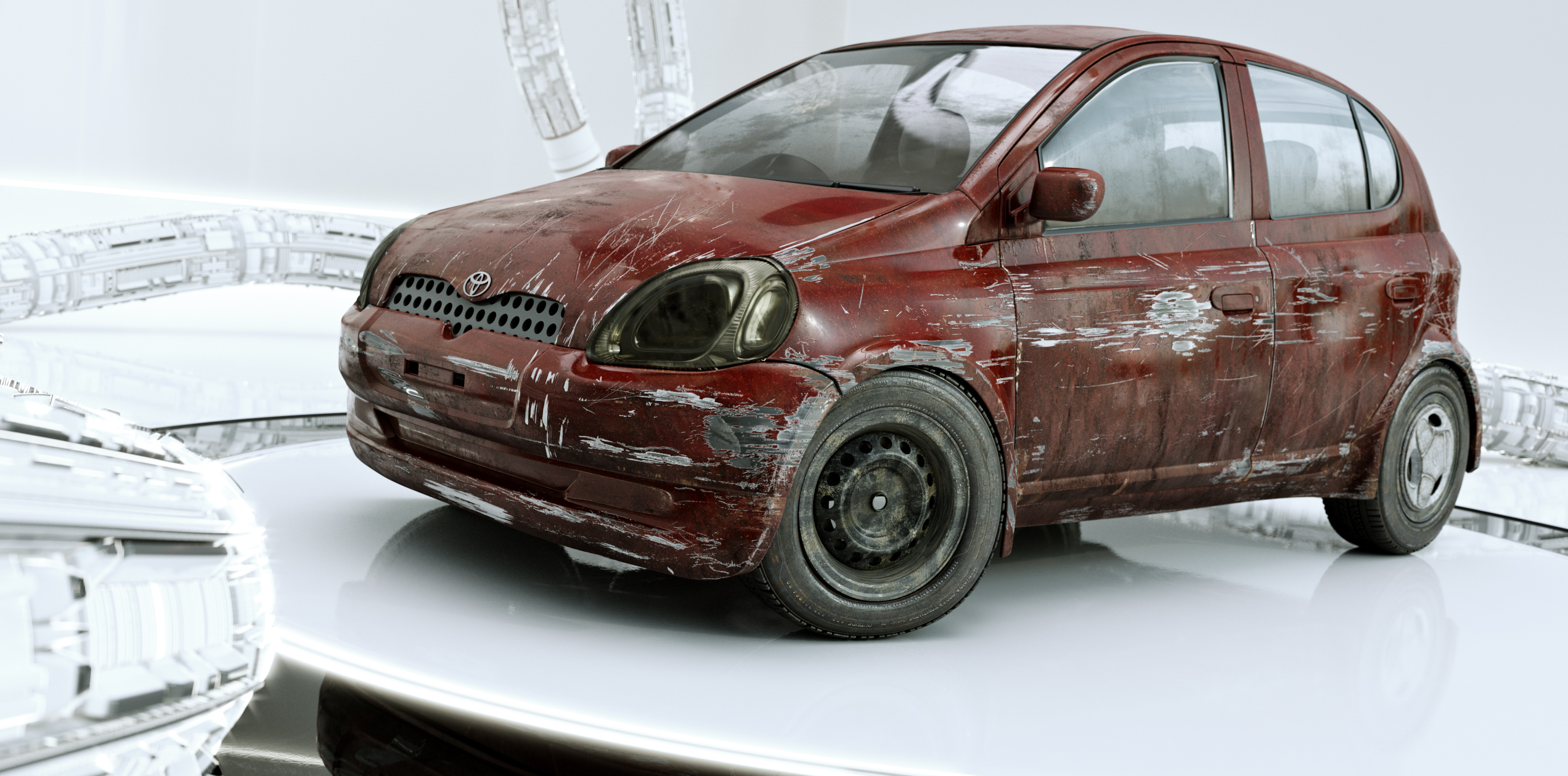
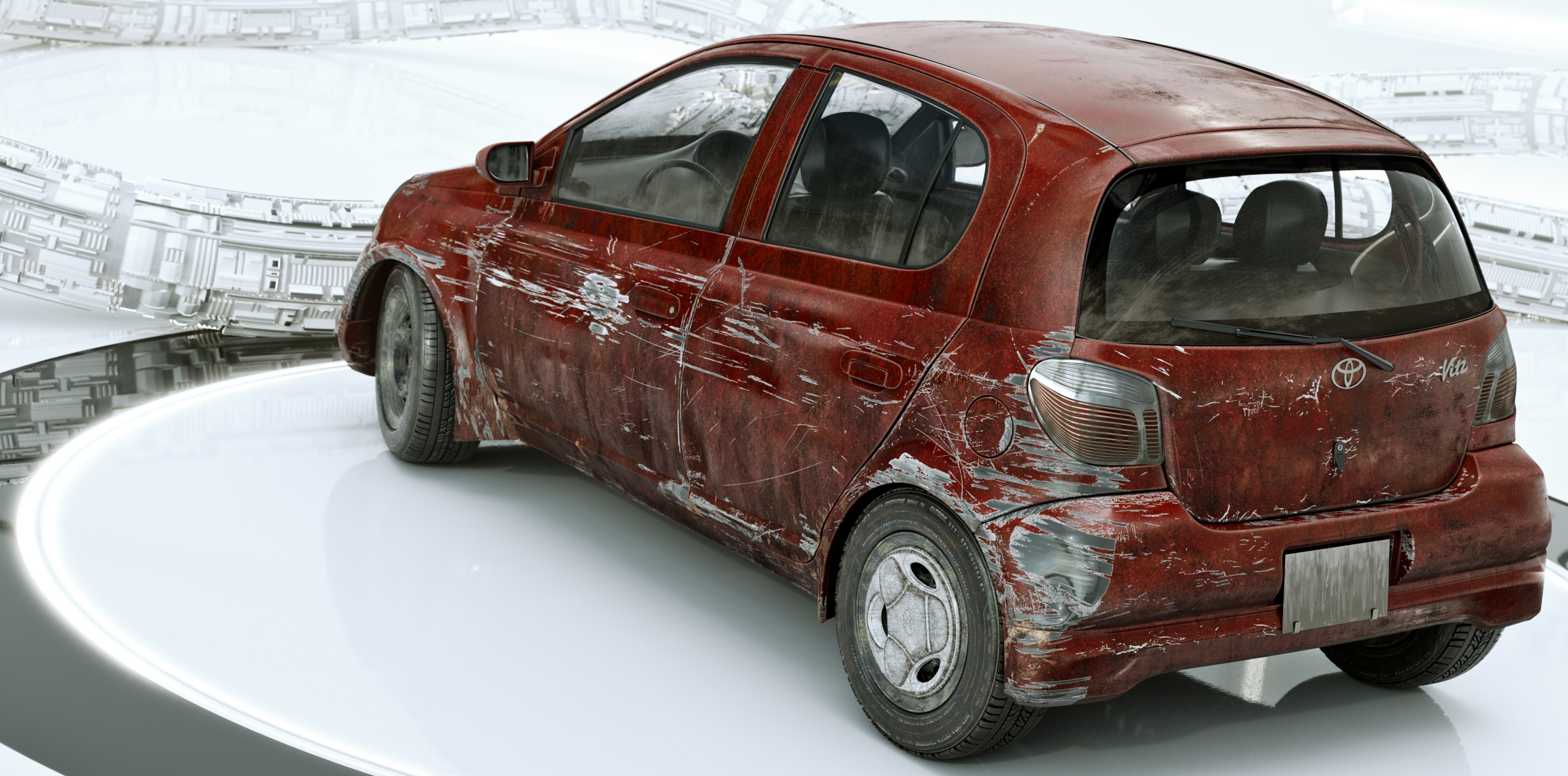
I've been updating some of my old renders and trying to get them to Portfolio quality. I modeled a Toyota Vitz for one of Kent's classes last year and here is my attempt in trying to get it to the next level. Also one of the advises people give is to try and make you renders tell a small story, so I also hope I kinda accomplished that.
https://cgcookie.com/u/dostovel/projects/toyota-vitz-repair
Here's my submission. It's a sculpt. It took me about 3 month to model (off and on). I posted it before, but I made a few little changes.
My main goal was to practice sculpting. It is ment as a kinda stylistic, but still rather realistic little statue. I modeled the cloth right on the model, because when I started I wasn't sure if I should model them this way, or separate, as it is a statue, and it's meant be look as a one piece model, even though it has different parts. The head, the hair and the left arm are separate from the rest of the body.
My second goal was shading the scene. First I went for a kind of copper statue, but then I found the print-resin tutorial in the Shader-Forge and I went for that, as I thought it would be more of a challenge. I'm not very good at shading, and I had to start over 2 times, before I had a bit of a decent result (I think).
Here's a download of the latest blendfile as a rather large zipfile.
I had only time to render 1 decent render so here it is: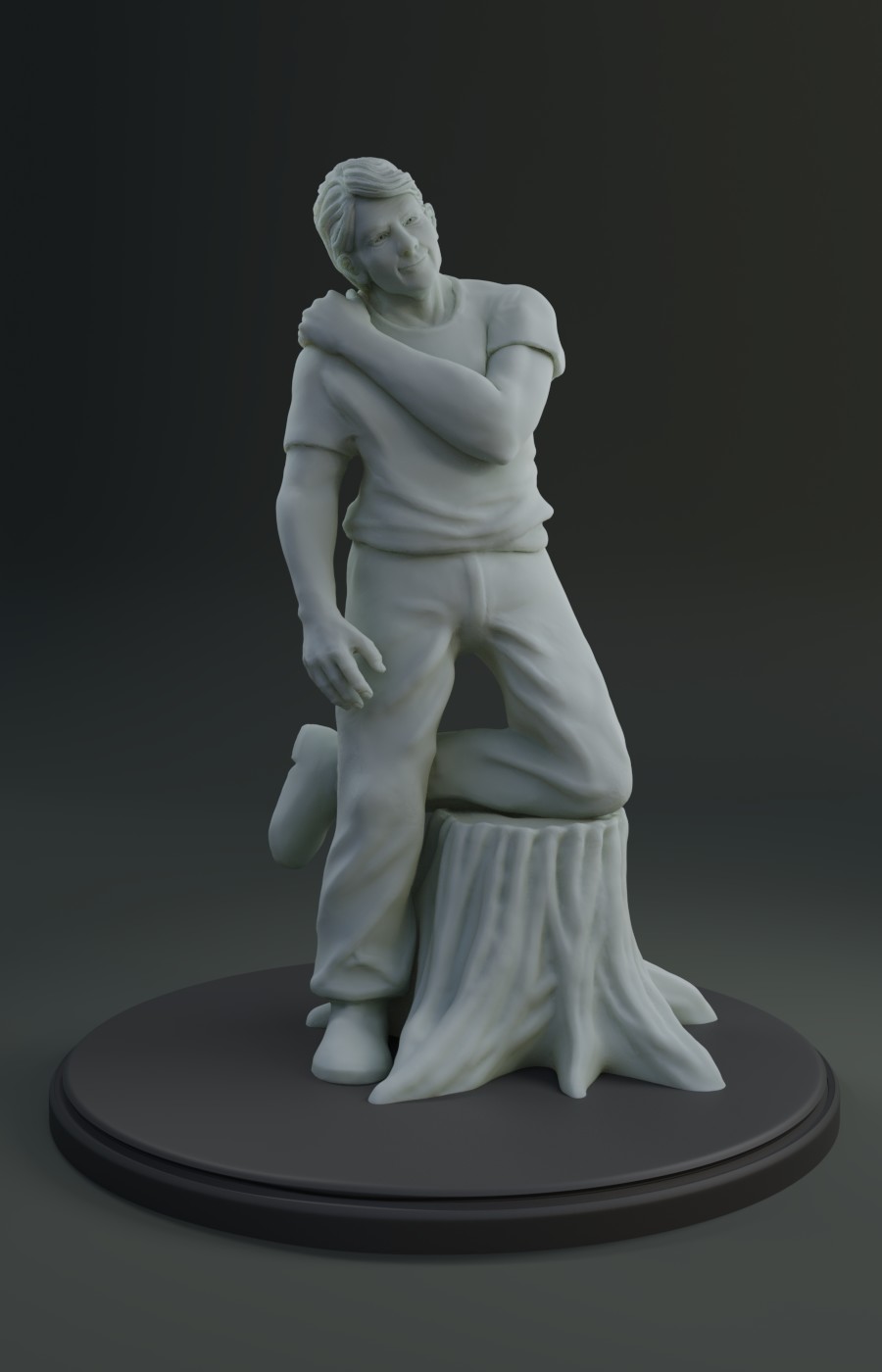
And here's a turntable YouTube video: (it's a bit older):
The video was edited in Adobe Premiere, not in Blender.
Here's a nature scene I am making to practice plants and texturing. I am going to photo realism. I would like advice on make the scene blend together and have more of a sense of a real place and less of the feeling of a bunch of different objects stuck together.
I have improved the short grass and will hopefully get a new render up tomorrow morning
https://cgcookie.com/u/train30/projects/forest-road-ed3d679a-5de2-4006-91d0-cbf0df72c65e
Why oh why is it that after you commit and post, it's then and only then that you start to see all of your mistakes. I need to do some re-rendering.
https://www.artstation.com/artwork/58146w
I know this is way too late (I just saw the live stream today) but here is a render anyway.
I am going for correct anatomy and proportions. Its seams to be a hit or miss on getting the face to look natural and good looking. I have a lot of trouble with lips feeling puckered and the the face not looking fleshy/soft.
Its hard to find good constructive criticism, so thanks for taking the time to critique everyone's work!
@theluthier and @jlampel
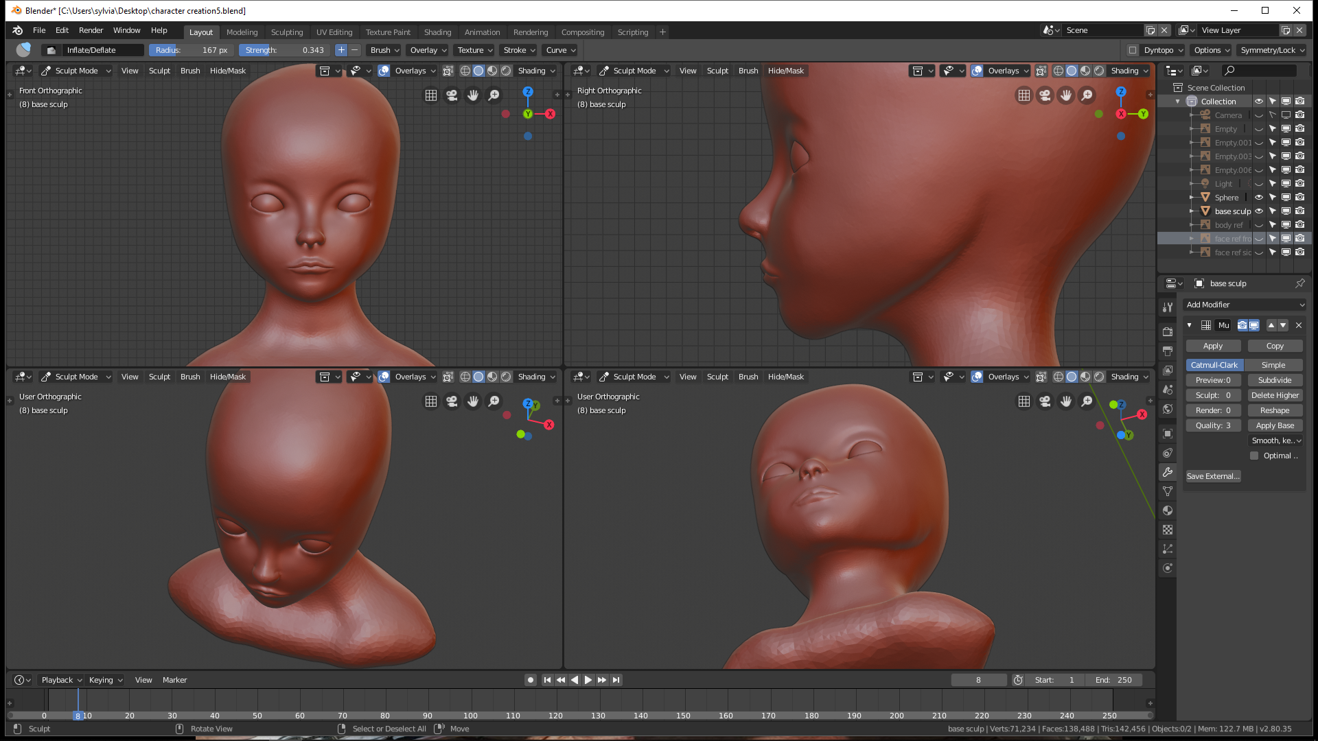

trying to make a stylized female character . i started out with the head since i think that would be the hardest part . still am not statisfied but i wonder where i should work on most to get a really nice face . still have to get to the ears sorry for that. i am not really used to human characters (more like to do creatures ) so i am kinda struggling with this
yyukinoh1989 Ahhhh I'm sorry I forgot! I'll critique you here. Can you share a link for me to download your .blend file?
@theluthier and @jlampel Forgot to ask you if i should put this character at my portofolio after i make the suggestions i got from yesterday stream? I am also searching to get hired in this industry, is actually my dream since i was a kid.
Thank you!
mmalhomsi Thank you for your words and support! It means alot!
![]() irinel0790 Yes you should definitely put your grave robber character in your portfolio 👍
irinel0790 Yes you should definitely put your grave robber character in your portfolio 👍