It's that time again: Time to get your Blender projects ripped to shreds by the best critics in town!

I mean....If you would like a critique from *humble* Blender heads, Kent Trammell and Jonathan Lampel , to help push your stuff to the next level, please submit one of your projects to this thread. It can be a model, environment, texture work, a shader, animation - anything created with Blender.
The stream will start at 2pm eastern US time on Tuesday, February 26th. It's ideal if submitters can participate in the stream. However if you want to get a critique but won't be able to participate in the stream live, that's OK. We'll still review your project and you can watch the recording later.
NOTE: All active Citizen members have access to watch this live critique stream and submit art to be critiqued.
Awesome to see this again. Maybe by then I have some short animation or a more complex model like character. Gonna see how things go :)
![]() az93 Sorry that was a bit vague. But like silentheart said, posting to this thread is the idea. I've updating the instructions to be more clear.
az93 Sorry that was a bit vague. But like silentheart said, posting to this thread is the idea. I've updating the instructions to be more clear.
@theluthier
anything created with Blender.
Critique candidate should be created entirely in Blender? What if, for example, it's a character sculpted in ZBrush, retopologized and have some accessories modeled in Blender and is textured in Substance Painter?
![]() nekronavt Weird - I have a distinct memory of typing an answer to this. Must have never sent it.
nekronavt Weird - I have a distinct memory of typing an answer to this. Must have never sent it.
Anyhoo, yes, it's totally fine if the project being submitted uses other software than Blender 👍
Hi,
This is my project:
https://cgcookie.com/u/tomaslapes/projects/jungle-da632877-c526-439b-819f-556303772c2f
I went for realism. First, I created the foreground, but then I didn't know what to put into the background. Finally, I tried to make a small canyon, a small clearing, and dense forest.
Something is off. I think the trees are too dense, but still, I think that isn't it.
This is one of my first attempts to create a large environment.
Thanks in advance!
Thomas Lapes
Here's my project:
https://drive.google.com/open?id=1u7fH_Em2uj5vetMOSQZ2eOVpQ3znleuV
The problem I have is with the material. I was trying to match the material on Kilo Ren's lightsaber. Thus, I would like to add wear and tear to the metal (scratches and heat stain, in particular). The thing I run into, however, is that I can't find a way to make it look right.
Thanks!
Nathan Foster
Well, I have a few projects to submit.
Bendifig: https://www.mecabricks.com/en/forum/topic/1110
Bigfig: https://www.mecabricks.com/en/forum/topic/1184
Dollfig: https://www.mecabricks.com/en/forum/topic/1203
Raptorfig: https://www.mecabricks.com/en/forum/topic/1215
Dilophofig: https://www.mecabricks.com/en/forum/topic/1265
By the way, all of these projects will be available on the Blender Market this fall. If any one is interested, I will be posting updates on these Mecabricks forums and on my Twitter (https://twitter.com/S_a_m_i_n_o) and Flickr(https://www.flickr.com/photos/145151320@N08/)
@stopmotionkid those are quite a lot of models and projects... maybe select one you're struggling with? It will also help Kent and Lampel if you tell them what kind of feedback you're after 🙂
ssmurfmier1985 True. :D I'll probably narrow it down to the Bendifig. That one was by far the most complex one, especially the rigging process.
 Hello guys,
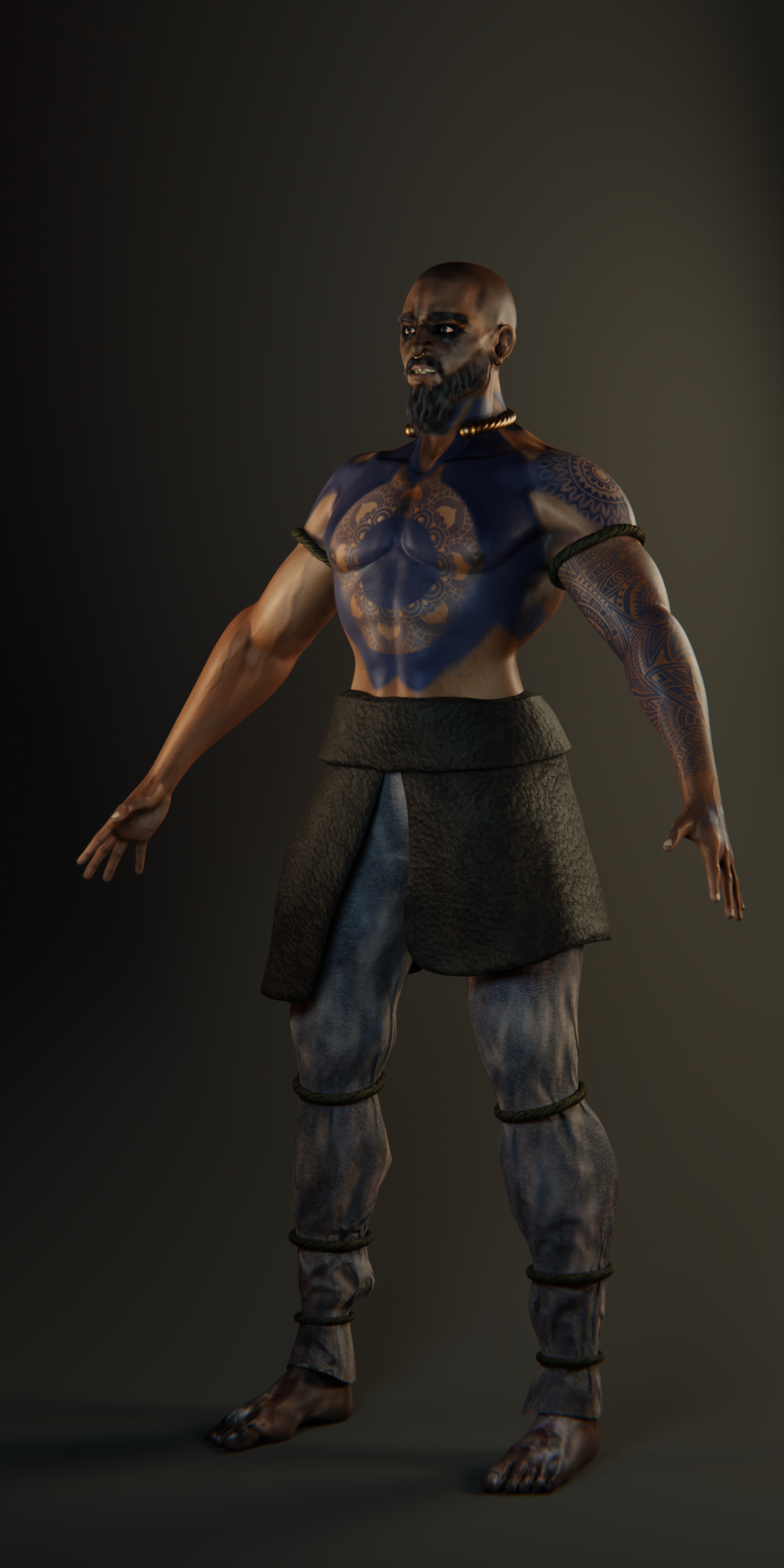
So i will post a link to my last personal project here in the hopes to get some feedbacks (good or bad doesn't matter).
Here are some things that i tried to accomplish:
a) - I wanted to study more the human anatomy, and also wanted to practice more the digital sculpting and blocking out general forms,
entire model was done from a polysphere so also a feedback in this perspective would be helpful for me.
b) - Making perfect skin or realistic was one of the main objective with this model + anatomy.
c) - Also wanted to practice more the lights scene and tried to make a good light enviroment for my character just so that it could simply "pop".
d)- Hair cards were a completely nightmare, bear, moustache and eyebrows were entirely done after i watched kent tutorial:) so thx.
And i would like to get near to Raf Grassetti style.
In other words i am eager to hear if i am selected for Blender Live Critiques!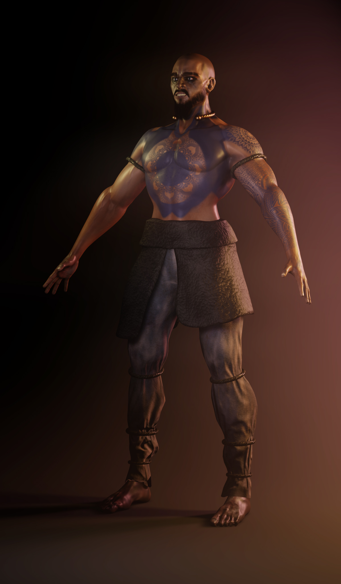 Link =>
Here is the project I'll submit, it's a final:
https://www.artstation.com/artwork/Z4xQx
I was trying to achieve a mix of realism and fairy styling. That was my first time trying to use Blender compositor to play with layers and different effects on them. What you guys think about it? Which things were good enough to maintain on next works and which were bad so I don't repeat the same mistakes later again?
I wanted something that is original, and looks good. I played with the texturing a bit to try to get something that looked nice. The idea came to me when I was teaching my little brother how to do blender. It was going to just be an hour glass, but then I wanted it to be something more.
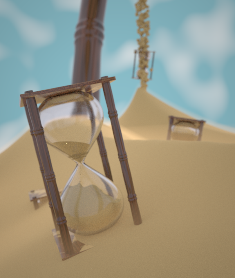
A little bit intimidating looking at the other people's artwork, but I think it's good to have feedback when I'm just beginning too.
@cgcookiedough I would recommend to add some post processing to it. Even simple vignette would make it a lot more interesting.
So... What I want to submit for a critique session is my final submission for Realistic Character course.
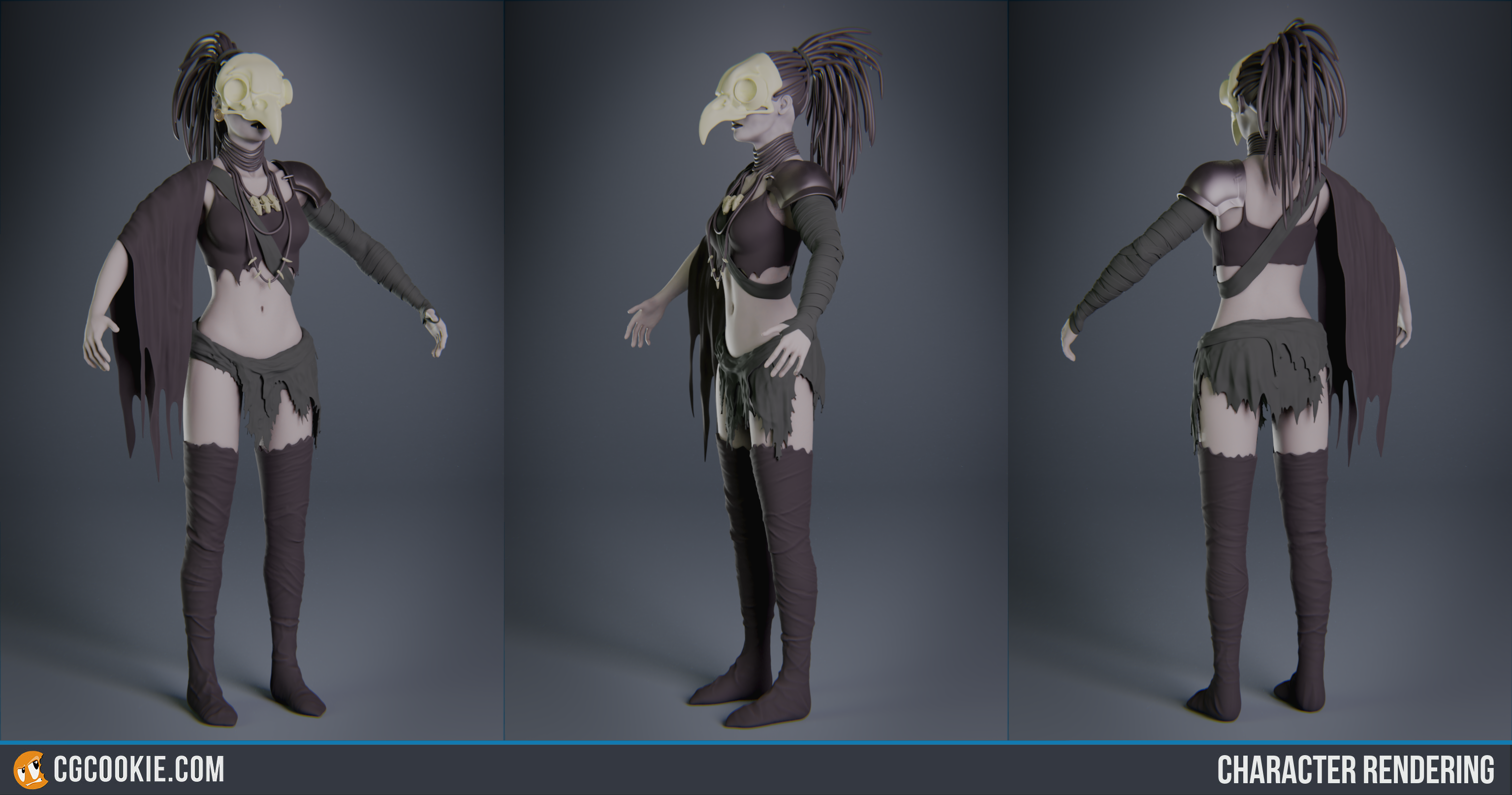
There a few things I want to know how to improve:
First one is about hair, I want to know a way to model this type of haircut without getting to much pain on placing all the separate dreadlocks.
The second one is about how to texture high poly characters, because 8kk of polygons is not something Substance Painter can handle in my machine. I understand how to do a realtime version, bake normals and stuff, but interested in highpoly texturing workflow.
And all the other feedback that comes in your mind will be great to hear!
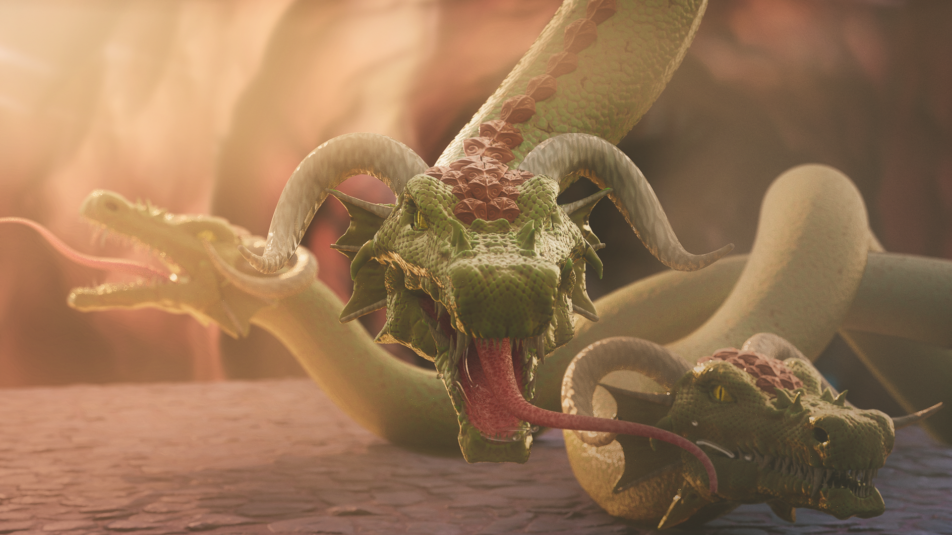
Here is my submission. I had another project in mind, but it's not going to be finished in time and I still would like to get feedback on something. I did this one last month, following Zacharias Reinhardt's Hydra tutorial on youtube. I was trying to imitate a fantasy-style painting that you might see on the cover of a D&D manual or board game box art. That's not really a genre I guess??, but that sort of not-quite realism and not super stylized either. As per the tutorial, the idea was to make an appealing image quickly and efficiently so the dragon heads are all linked objects with some re-positioning to avoid making them look too repetitive.
https://cgcookie.com/u/procyonlotor/projects/hydra
