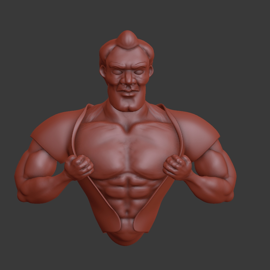
I've been inspired to start one of these. I am attempting to do one sculpt everyday for 90 days. I haven't participated in sculpt January before so I grabbed the calendars from the last 2 years and will be doing those this month and next and then participating come January. I am hoping this will be a good place to post for feedback. I won't post all of them probably, but the ones I really want feedback on I will. Here is the male portrait sculpt. Feedback definitely appreciated. Anatomy isn't my strong suit, and I am really trying to push my learning there especially:
pprocyonlotor Yeah babies are really difficult when you think about it. Just a blob of fat and tissue without many visible lines :D Cat look nice. One thing about the box though. It look very flat. Adding some creases or tears at the edge would make it so much better and it would fit in with the rest of it.
Lost power after about an hour of work. Hadn't saved :(
Got back to it, though. Day 3: Chest
"I'm especially good at expectorating..."
Well, as some of you may have surmised by now, I have fallen off the Sculpt January train. Life sort of got in the way. I was sick for a few days, then I was out of town for a few days, then we had a crew installing new flooring, and then I felt bad about not getting it done and lost motivation... By the time all was said and done, I was like 10 days behind. I am glad I joined the Facebook group, though; people are daily posting amazing stuff.
Anyway, I have abandoned the challenge, but am still plugging away. I joined a game dev meetup group at the beginning of the month; there are about 5-6 active members, and they try to make a game every month (a kind of absurd time frame). This month I was their only artist so I have been able to get some good practice in there. I hope to post the game somewhere when it's "done" so you guys can play.
I have also decided (finally... ... again?... for real this time) that it is time to tackle the realistic character course. I did the initial sculpts earlier this week. You can see the sketchfab here. I have decided to proceed with the female character, but would love feedback for either sculpt (though you can ignore the male's feet, I didn't put in the effort there). I hope to be around a bit more in the coming months, so keep being awesome everyone!
pprocyonlotor Well, hey, at least you tried. I feel you, though; I'm quite behind myself.
A new game every month is a challenge, for sure. I can't imagine the games are very complex, though. Maybe more like rough prototypes in that sort of time frame.
I'll take a look at those sculpts when I get the chance!
pprocyonlotor that game making group sounds like fun! Would love to see the games you create 😊
Also good luck with the realistic character course, I'm sure you make something nice. Keep us updated 😉 Enjoy!
pprocyonlotor I looked at your models and this is what I can say from my point of knowledge.
Disclaimer: I'm still learning anatomy myself, so take it with a grain of salt, some of this might not be correct. It's more like an observation than a real critique.
Girl's eyes are either too hight on a face, or the cranial section of the head is too small. I think the first one is more likely. The male character also has this problem, but in his case, I think it's about small cranial.
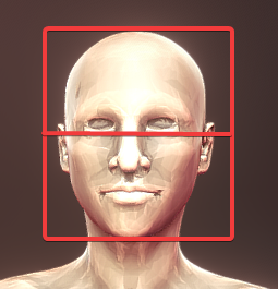 The nose can be a bit thinner too, at least at the bridge.
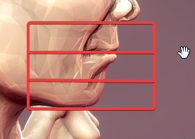
Mouth looks too high. Mouth line should be on the first third from a nose to chin.

Like on your male character for example:
Then, the head shape. On your male character its too even in thickness from the top view
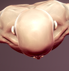
While it should be more like an egg shape. Your female character had it more correct:
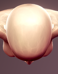
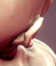
Something definitely looks wrong with the male ears. Conchal bowl is going way back than it should.
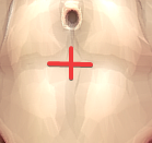
The belly button is usually placed on this tendinous intersection of m. rectus abdominis
Tricep on your male character. It looks like the long head is lying on the lateral. It doesn't look like this in reality.
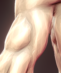
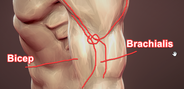
Your deltoid is ended up between tricep and brachialis, but it should be between brachialis and tricep. In some poses, it can be confusing, because it looks like tricep, bicep, brachialis and deltoid are meeting at the same point.
Sternocleidomastoid is ended up connected to clavicle by its sternal head, but it should be connected to sternum with it.
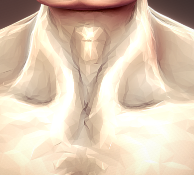
Clavicle on the bottom side can be so blurred with pectoralis major on a muscular human, but on a female with clearly visible ribs it's probably should be visible too.
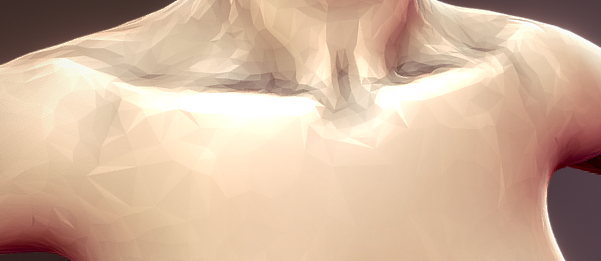
It looks like you just used subtract inflate to make the armpits. In reality, this cavity is formed by the space between pectoralis major and latissimus dorsi. On your sculpt it looks a bit of unnatural. Like some on just cut out the part of latissimus dorsi and serratus anterior.
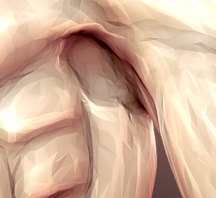
I guess you used CGCookie classic anatomy tutorials from youtube channel? (maybe no, because your results are better than tutorials finals) Never thought, that I would say anything bad about CGCookie tutorials, but well, I prefer to be honest. I can't recommend them. I can't even say that they are "outdated", because human anatomy doesn't really changed since then :D. I can recommend Rafael Grassetti (an awesome artist who worked on Kratos for latest God of War game) anatomy and design tutorials. He's doing his stuff in ZBrush, but that's not really matters.
There is propably some other places, but let it be all for now. Once again, take this with a grain of salt and do your own anatomy research. Have a good luck with a course! Looking forward to your works!
![]() silentheart00 Yes. They are very simple games (right now we have about a solid minute or two of actual gameplay), and it doesn't look like it will get super polished in the next week, but I've been a little surprised in how much we have been able to get done. And ssmurfmier1985 yes, it is a bunch of fun. Not having had people to work with before has definitely been something of a disadvantage for me. You learn so much more!! Even though most of them are just hobbyists and beginners, the contribution of ideas makes a big difference. Like I said, I hope to get the game posted at the end of the month, so you guys can play it.
silentheart00 Yes. They are very simple games (right now we have about a solid minute or two of actual gameplay), and it doesn't look like it will get super polished in the next week, but I've been a little surprised in how much we have been able to get done. And ssmurfmier1985 yes, it is a bunch of fun. Not having had people to work with before has definitely been something of a disadvantage for me. You learn so much more!! Even though most of them are just hobbyists and beginners, the contribution of ideas makes a big difference. Like I said, I hope to get the game posted at the end of the month, so you guys can play it.
![]() nekronavt Thank you for the critique! I will make those fixes. I did notice after posting that the conchal bowl on the male was absurdly far back. I really appreciate you taking the time and making the recommendation. I have been learning from this anatomy course on Udemy. I thought it was pretty good, though the instructor only really covers male anatomy, and really only the bodybuilder body type. A little disappointing that it didn't have more range, but it was nevertheless enlightening and cleared up a lot of confusion for me about how the bones and muscles all connect. Now I just have practice it a bunch!
nekronavt Thank you for the critique! I will make those fixes. I did notice after posting that the conchal bowl on the male was absurdly far back. I really appreciate you taking the time and making the recommendation. I have been learning from this anatomy course on Udemy. I thought it was pretty good, though the instructor only really covers male anatomy, and really only the bodybuilder body type. A little disappointing that it didn't have more range, but it was nevertheless enlightening and cleared up a lot of confusion for me about how the bones and muscles all connect. Now I just have practice it a bunch!
bodybuilder body type
Everyone has the same bones and muscles (if not considering pathological anatomy), it's just the proportions that are different. You need anatomy knowledge just to know what and where is placed and what forms it make. For the rest there are references.
I have been learning from this anatomy course on Udemy
Intro looks pretty good!
Though I can recommend not only videos but also the books. "Anatomy for Sculptors" by Zarins and Kondrats is a great way to start.
Some environment art for the game we are working on. It's supposed to be finished in a week 0_o :
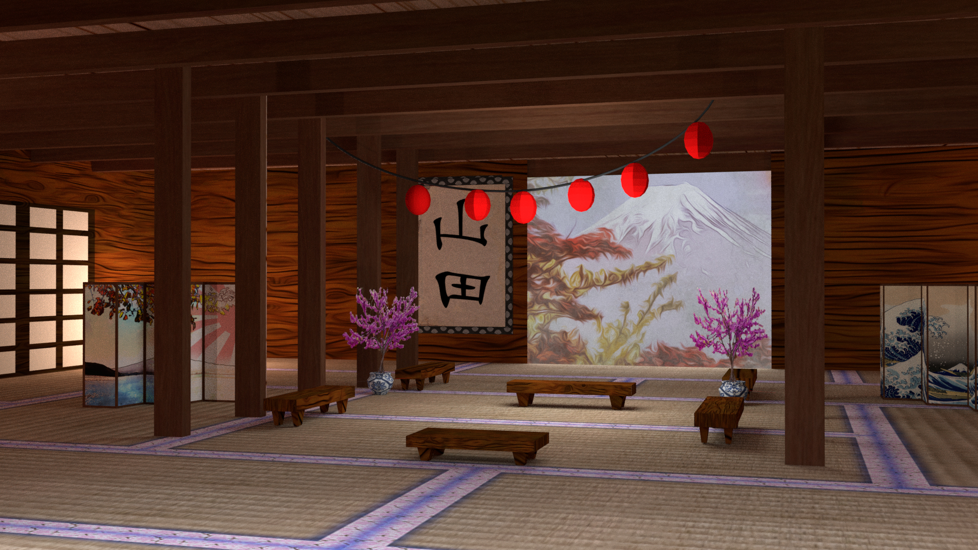
pprocyonlotor nice stuff. I should consider joining some gamedev jam too, probably. Sounds like fun.
pprocyonlotor Good job. However the trees in the middle are looking like growing from the lake and not from the ground.
Your sculpting stuff is really impressive :)
Another quick render using some of yesterday's techniques and an old model from the BC1-1801 class. Feedback welcome!
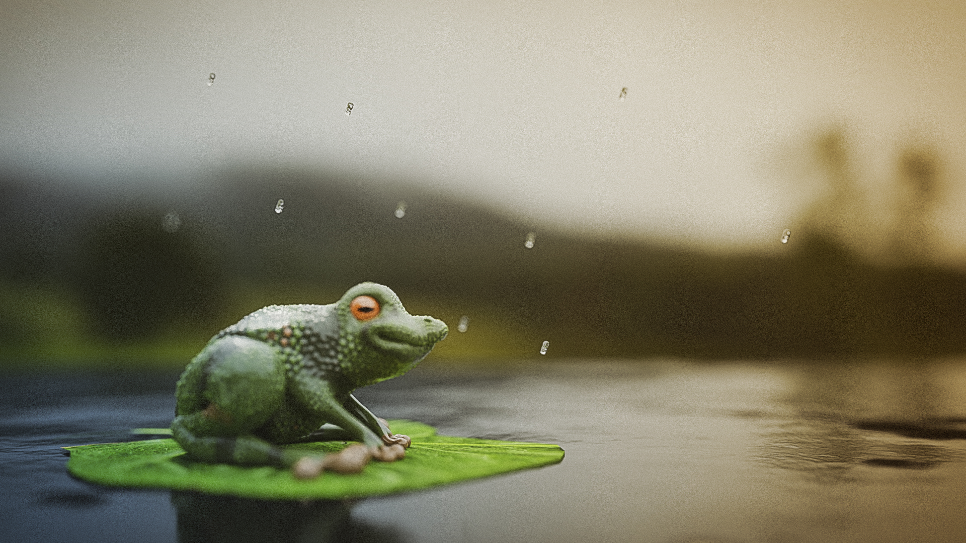
pprocyonlotor someone got inspired 😬 good composition and great looking depth of field!! The water droplets in the air look a bit uniform and out of place, but other than that I really enjoy this picture 😊 Good one John!
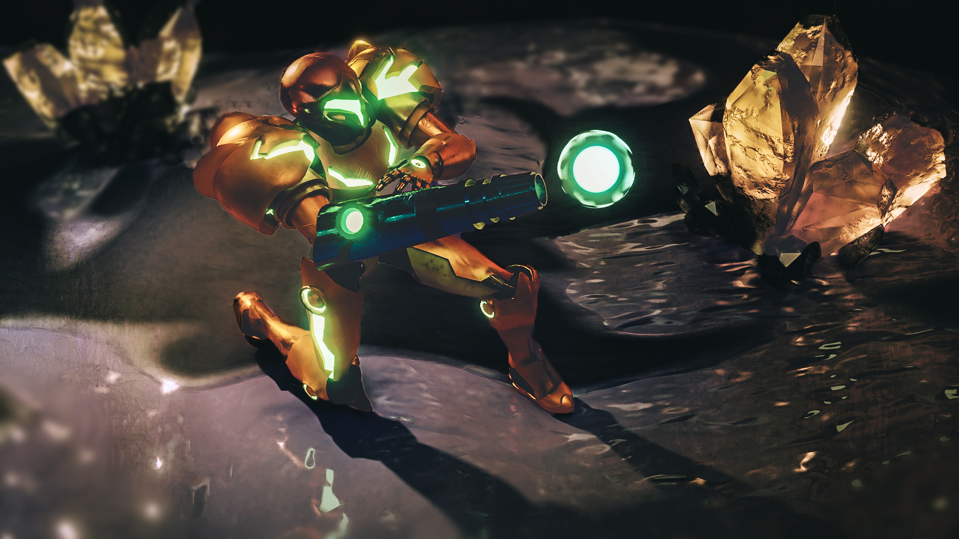
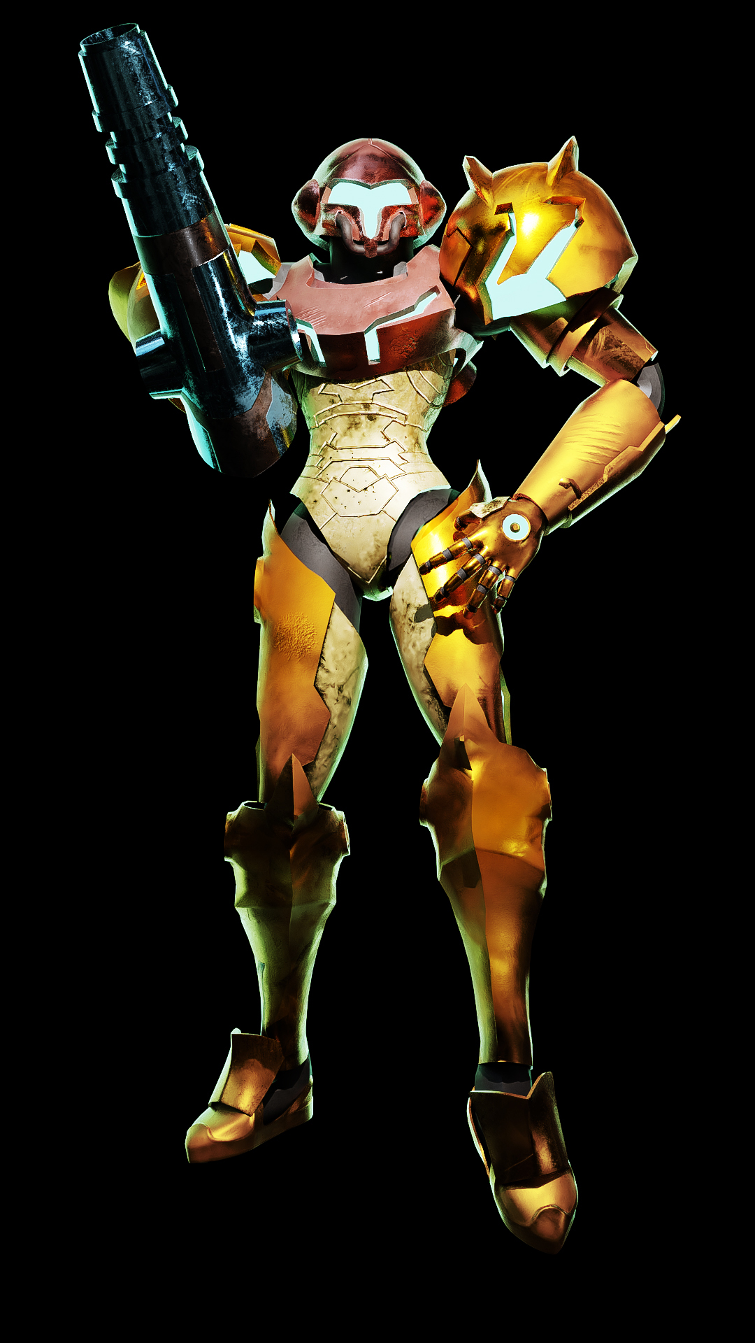
Spiffed up my old Samus model with some new renders today. Kudos to @theluthier for the gemstone tutorial.
Did another render today from a sculpt I made back in November. It's based on Zacharias Reinhardt's hydra tutorial on Youtube. Tell me what you think:
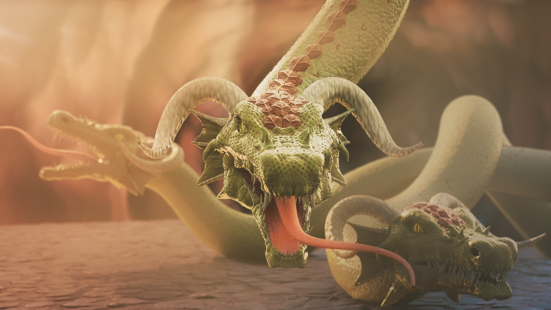
pprocyonlotor The hydra blends in with the background a bit. Playing around with the saturation and/or the value of the hydra should suffice. The mouth and the tongue could use a bit more detailing too. Their flatness sticks out. Otherwise it looks good.
@drgnclw Thanks man! I had some surface details on the mouth material that looked good on the model, but I think between the SSS and the low resolution they got wiped out. I agree they do look flat. Can you explain more what you mean about the hydra blending in? The one in the back was intended to blend in a bit. I was trying pull the front face out with the sharpness contrast. I actually thought it was too strong at first, so I dialed it back a bit. Also I saw your most recent character. He's looking real good!!