I've been inspired to start one of these. I am attempting to do one sculpt everyday for 90 days. I haven't participated in sculpt January before so I grabbed the calendars from the last 2 years and will be doing those this month and next and then participating come January. I am hoping this will be a good place to post for feedback. I won't post all of them probably, but the ones I really want feedback on I will. Here is the male portrait sculpt. Feedback definitely appreciated. Anatomy isn't my strong suit, and I am really trying to push my learning there especially:
Day 23 "Hand":
Another anatomy practice so please give feedback. Here is the sketchfab link so you can do a thorough inspection.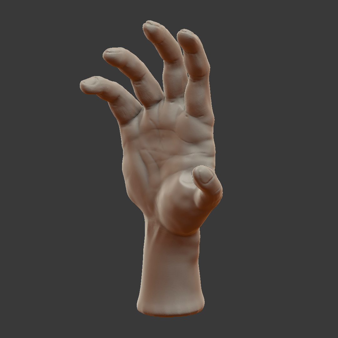
pprocyonlotor I tried drawing hands a while back but they're really difficult (sculpting is different, sure, but not any easier I'm guessing :)
At a first glance, the wrist is thin and there is a weird angle at the left side of it (left of the default view on sketchfab and your screenshot) The line on the left side of the hand should go up from the wrist in a smooth curve with little protrusion.
The fingers seem very long and the gaps between them are inconsistent. The gaps also should be a bit webbed (just a little bit, at the base, like duck feet but, obviously, not as extreme)
The part in between the thumb and the hand look meaty. That part should also be kind of webbed and thin.
@drgnclw Thanks for the feedback. The wrist is too thin and should have been pulled out to the left a little. I noticed that (and the long fingers. maybe not impossibly long, but abnormally long anyway) also after looking at it with fresh eyes. The gaps between fingers are supposed to be fairly abrupt on the palm side and much more graded on the back. I think that's what you mean about the webbing. I know this in theory, but it's surprising how much there is to think about and make work together. It didn't enter my head at all when sculpting, but you are correct.
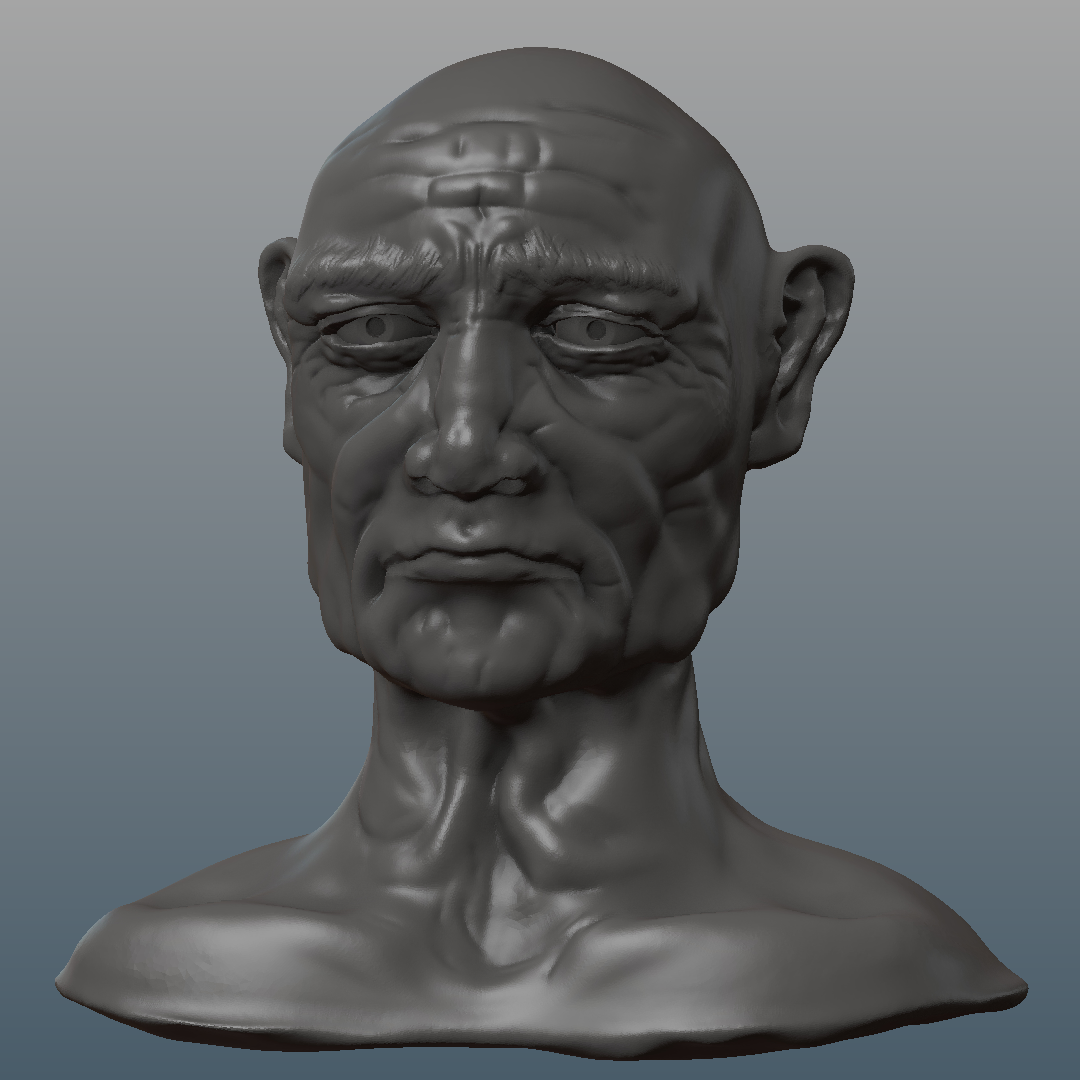
Day 24 "Worn Face":
Another anatomy sculpt. I have never really done an older person before, and just tried my best to copy reference. Feedback please. Here is the Sketchfab.
Day 25 "Griffin":
Sometimes you think it will be fun to take a majestic and intimidating creature and put them in a comical pose, and then you get in over your head and you don't have symmetry to help and you spend so much time trying to get you feathers to fit the wing only to realize after all that work you put them on backwards and then you don't have time to do body feathers at all and your creature and pose are not nearly as recognizable or comical as you would like... but you post it anyway :)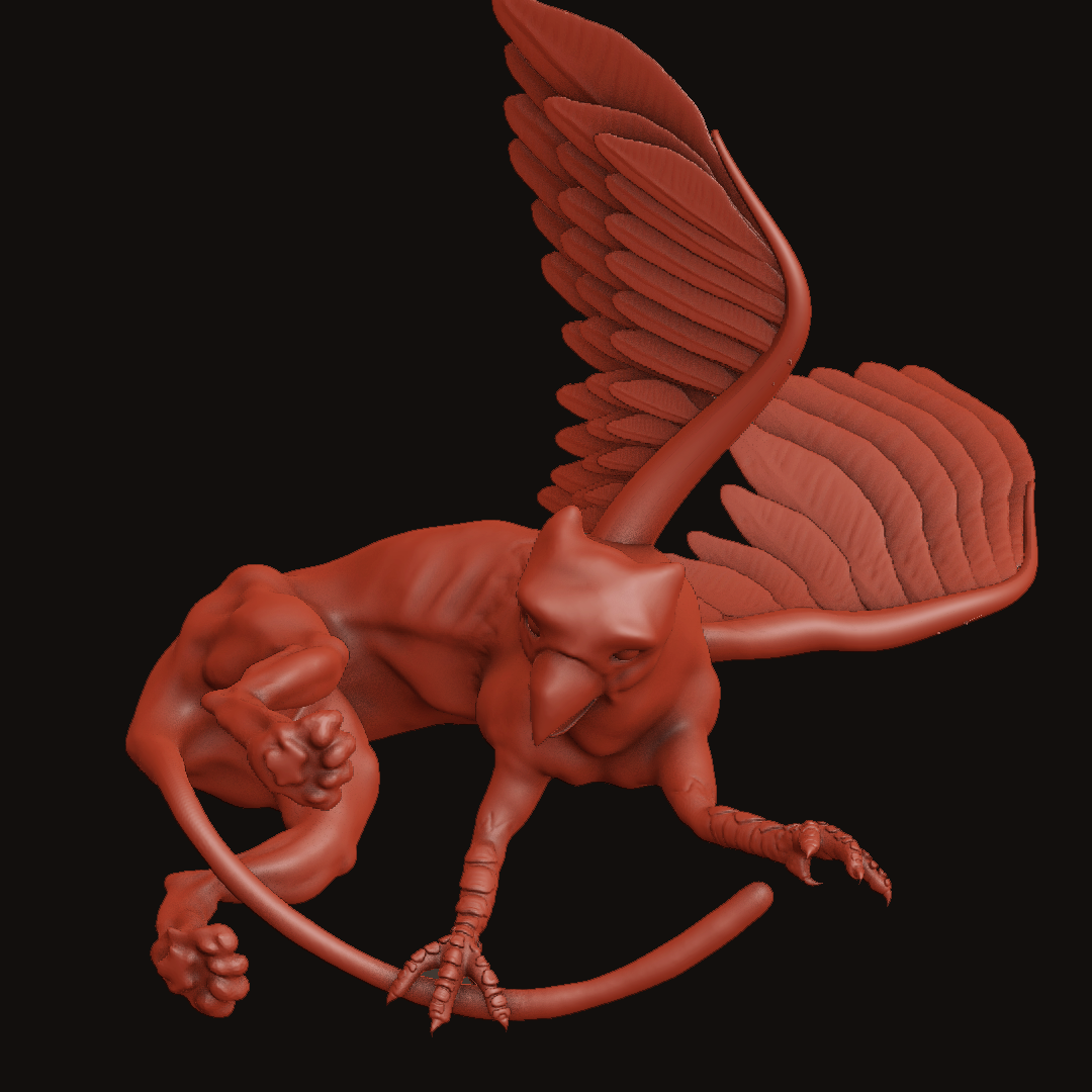
pprocyonlotor yeah that's the spirit! post it anyway 😬 I actually think it has potential, cute little critter 😊
As for your head, I'm not very good at anatomy, never looked into it, but since you really want feedback on it and no one has responded on it yet, I wanted to mention that the ears feel a bit... off. Maybe it's the position or the size, I can't put my finger in it... I like the wrinkles though! 😄
Keep up the good practice!
ssmurfmier1985 Thanks Miranda! I really appreciate the feedback. The ears are too high and there isn't a prominent enough crease where they connect to the head. I noticed after posting. And I definitely had ideas for that griffin... One of the biggest "challenges" with this sculpting challenge is abandoning the sculpt after a few hours, but I'm convinced that I will improve more by walking away and starting fresh the next day rather than attach myself to a single project for a month or two. There will be time for that when I have the chops (hopefully soon!).
pprocyonlotor I'd also like to mention the eyelids on the head look a bit thick to me. There is thickness, but not that thick.. Nice wrinkles, maybe some of them could be crisper just so it breaks up the overall fuzzy feel of the face and wrinkles, if that makes sense.
Nice griffin, definitely has potential to go somewhere.
Day 29 "Clothing":
https://sketchfab.com/models/b6b89593992d425a8d4f1c370b0e35d5
pprocyonlotor Good clothing sculpts. Some improvement would be for the woman's shirt, the bottom across her stomach wouldn't lay flat against her belly in that pose, but a little straighter out since gravity will also affect it. The different sized balls looks like the cloth is hovering over the smallest one, so it's not draping as expected. The pants are pretty good, although the wrinkles around the crotch aren't accounting for the male genitalia. There should be some room there to not crush the boys and the wrinkles based off that even though they are skintight pants. The butt could use some work, too. Overall, good work.
![]() silentheart00 Thanks again Silent! Agreed to all. For whatever reason, I found this exercise particularly difficult. I redid each exercise at least once because the first iterations were pretty awful. Appreciate your notes and will keep practicing on clothing.
silentheart00 Thanks again Silent! Agreed to all. For whatever reason, I found this exercise particularly difficult. I redid each exercise at least once because the first iterations were pretty awful. Appreciate your notes and will keep practicing on clothing.
Here is the submission for Day 27 "Cartoon Robot":
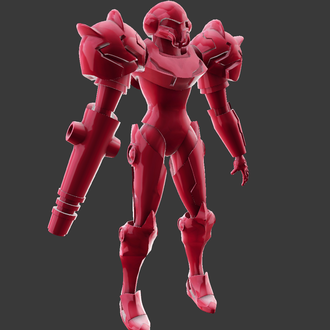
Samus isn't really a cartoon or a robot, but sometimes I just do what I want. I think she will serve as a good opportunity for me to start learning Substance so I went ahead and did a retopo :)
Day 28 "Canine":
Had a little fun with Jonathan Williamson's werewolf tutorial. Unfortunately it looks like the eye sockets used different vertices so they don't transform smoothly and eclipse the eyes, which is not only pretty gnarly looking, it pretty much breaks the illusion of transformation and totally looks like a computer averaging shapes. Oh well... it was fun anyway and I'll know better next time.
Here is the Sketchfab
pprocyonlotor Whoops. Well, sometimes we stumble, but if we learned something then stumbling wasn't a bad thing. Something to keep in mind for next time.
pprocyonlotor I keep coming back and these sculpts keep getting better. Can't really offer critiques on them considering they're waaaaay above my level but one thing I can say for certain is you're doing a fantastic job!
pprocyonlotor Nice mask. Definitely better than your first sculpt. Things feel smooth, well proportioned, nice wood texture. Nice progress!
Day 33 "Excitement":
Well... there is nothing exciting about T-pose... sigh. But Vanellope does sort of embody excitement. I mean, she IS a race car driver after all. I initially was just going to do these emotion one's as stylized busts, but decided it would be more fun to do them as characters, but of course, a whole character in a single day is beyond my ability for now, but I am toying with the idea of dropping the everyday nature of the exercise for December in favor of actually finishing stuff. Then I will pick it back up in January.
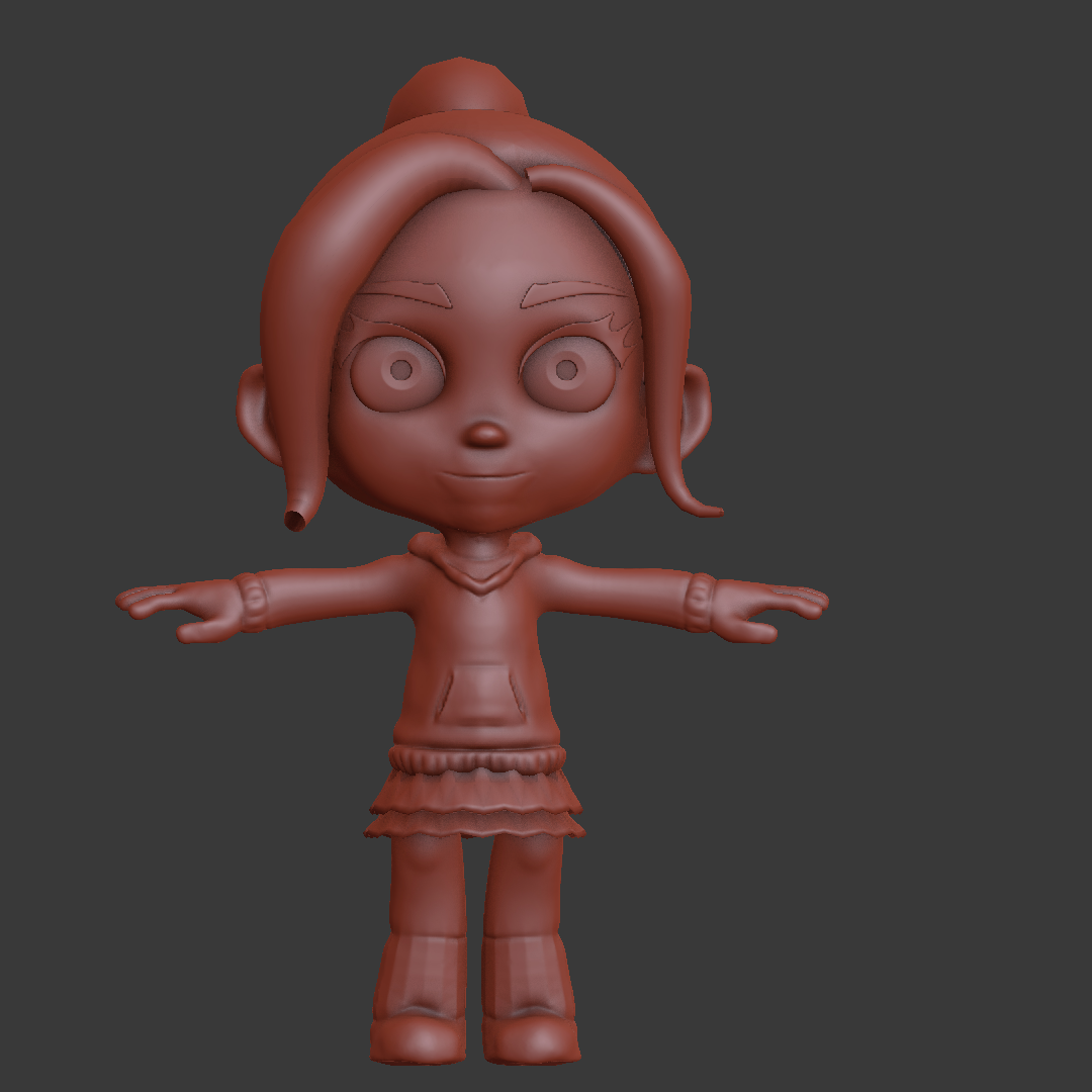
Also, I'm not quite sure I understand how people make these chibi-style characters cute and not just bug-eyed. It was a real challenge for me here, and I think I only marginally succeeded.