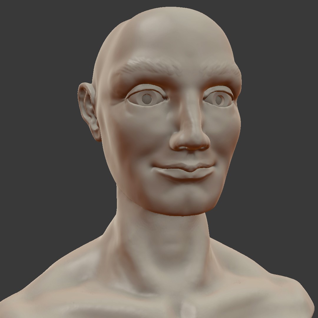
I've been inspired to start one of these. I am attempting to do one sculpt everyday for 90 days. I haven't participated in sculpt January before so I grabbed the calendars from the last 2 years and will be doing those this month and next and then participating come January. I am hoping this will be a good place to post for feedback. I won't post all of them probably, but the ones I really want feedback on I will. Here is the male portrait sculpt. Feedback definitely appreciated. Anatomy isn't my strong suit, and I am really trying to push my learning there especially:
It's great to be consistent and good luck with your 90 day challenge! May you not burn out while doing it :)
As for your sculpt: His eyes and brow ridge seem too big, the top of his skull is low and, he kind of looks like he's smiling ( I don't know if you intended it that way) which might be counterproductive if you're trying to study anatomy, although, I guess, facial expressions are part of it too :)
Keep in mind that I only know the bare basics of sculpting and anatomy.
@drgnclw Thanks man! Really helps to have that second pair of eyes. You were right on all counts. I went in and made those changes and he definitely looks better. The smile was intentional :)

pprocyonlotor Glad I could be of some help! It definitely looks better but feels like you can make the eyes even smaller. It might be because field of view is different between the turntable and the new screenshot.
@drgnclw Thanks again! I shrunk the eyes and made a few other slight adjustments. Please feel free to continue to critique, but I am abandoning this guy as it was a one-day sculpt. I will remember your critiques for next time though. Here is the "finished" result:
pprocyonlotor Hey, good for you for jumping in! It's a good start. The ear is a bit tall; typically it starts at the top of the eye and goes to the bottom of the nose, so it's a bit tall, unless intentional. The eyes are a bit big, too. I typically divide the face into 5 vertical sections for the eyes; the spacing usually works out about 5 eye lengths when looking from the front, hence 5 sections. Other than that, pretty good.
![]() silentheart00 Thanks
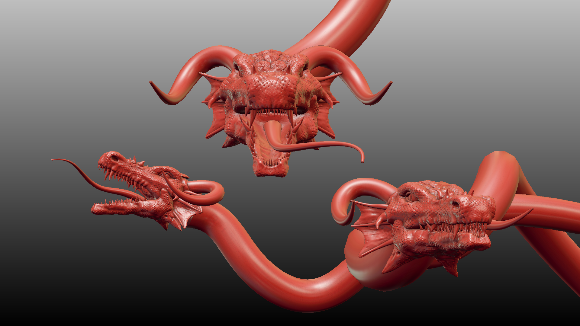
silentheart00 Thanks ![]() silentheart00 ! It's good to have metrics. I just eyeballed it on this one, next time I will be sure to check actual measurements. I'm wrapping up day 12 of the sculpting challenge with this. I feel like I am improving some and able to see it after just 12 days (of course, there was lots of improvement to be had). The theme was hydra. Obviously there is still some detailing to do (horns, tongue, and bodies), but this is where I leave it for now:
silentheart00 ! It's good to have metrics. I just eyeballed it on this one, next time I will be sure to check actual measurements. I'm wrapping up day 12 of the sculpting challenge with this. I feel like I am improving some and able to see it after just 12 days (of course, there was lots of improvement to be had). The theme was hydra. Obviously there is still some detailing to do (horns, tongue, and bodies), but this is where I leave it for now:

Day 14 "Cartoon Space Animal":
Was this close to doing Bucky O'hare, but went with Stitch in the end.
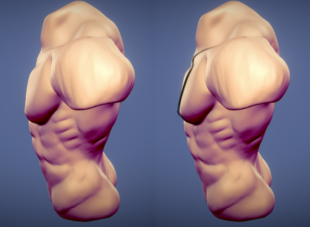
Day 16 "torso": More anatomy practice. Feedback please. This is where I am most trying to improve.
https://sketchfab.com/models/71ea2db048f84ffab50fa0cb454baa2f
pprocyonlotor Everything looks pretty good to me, except the top of the pec and the collar bone area don't look quite right. It looks like you cut in the definition for the collar bone instead of thinking how they work with the pec muscles. It's more of a smooth transition than a blobby one, if that makes sense.

pprocyonlotor Rhino looks great but I have one nitpick about it. The square-ish shapes formed by those very thin cracks or folds (I don't know what they're called specifically) kinda tend to follow the big lines on the body. Yours kinda looks like it's a stone statue with some craks on it.
Also two things about the torso. It looks the character is leaning forward a bit and the lower side of the torso looks a bit thin from the side. However, just like my previous feedback, take it with a grain of salt :)
Overall, every model seems good..
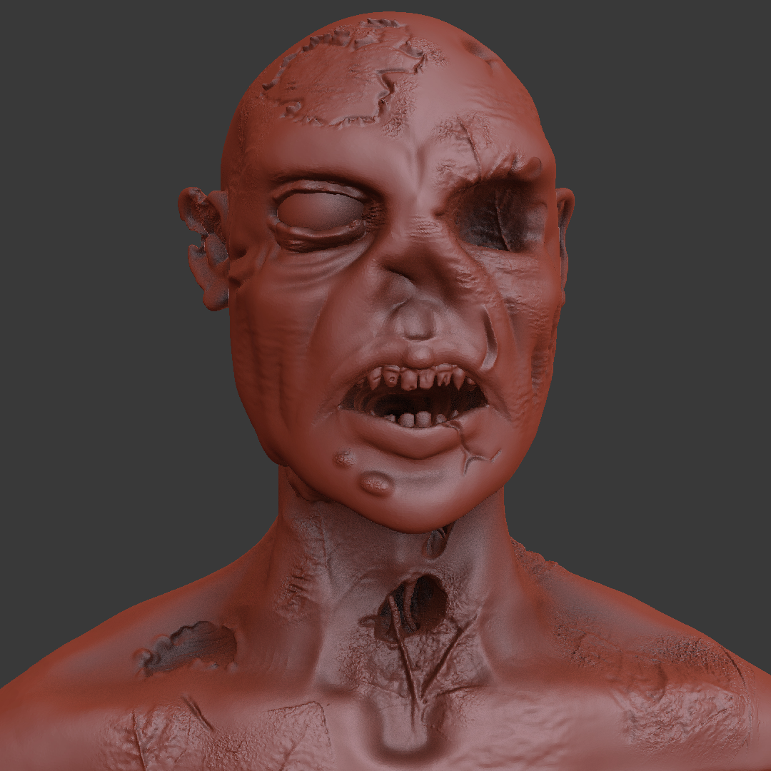
Day 17 "Zombie": This one didn't turn out exactly as I would have liked, though that's to be expected since I didn't go in with much of a plan. It was fun playing with all the textures though.
pprocyonlotor totally been missing some awesome sculpts! Love the Stitch 😄 The zombie is nice and gruesome 😬👍🏻
pprocyonlotor Those sculpts hnnnnng, how long have you been doing this? They look excellent!
![]() thecabbagedetective ssmurfmier1985 Thanks guys!! Aaron, I've been using blender for about 2.5 years now. Though I haven't really done much in the way of sculpting until the last couple of months. I started in October doing Kent's gestural sculpting tutorial every morning. Then at the beginning of this month I started the sculpt January calendars. I've been pleasantly surprised with my progress, though I still have a ways to go for sure.
thecabbagedetective ssmurfmier1985 Thanks guys!! Aaron, I've been using blender for about 2.5 years now. Though I haven't really done much in the way of sculpting until the last couple of months. I started in October doing Kent's gestural sculpting tutorial every morning. Then at the beginning of this month I started the sculpt January calendars. I've been pleasantly surprised with my progress, though I still have a ways to go for sure.
Here is Day 19 "Minotaur":
https://sketchfab.com/models/a178d31d61b84204ad2c53b3702b64bc
pprocyonlotor Damn, that's improvement right there. You've inspired me to pick up daily sculpting, or at the very least participate in ScupltJanuary. I think there are some great candidates to put into a critiquing session here at CGCookie when they have those again. Good work, dude.