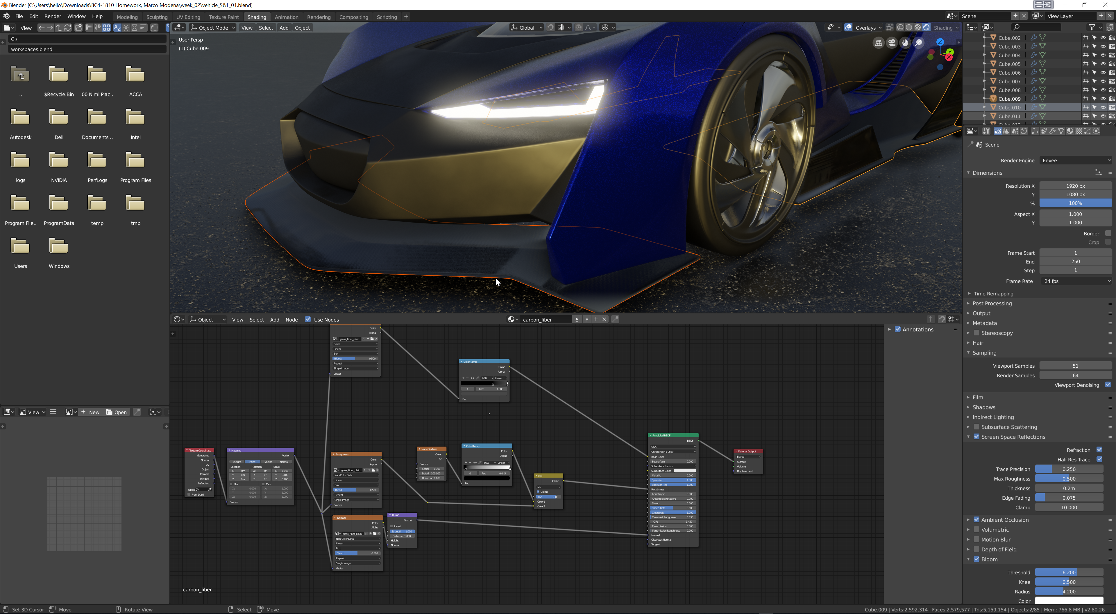
Truck looks good. Bedroom scenes look good. The night scene's lamps are quite bright compared to what I've seen, but I think it works. Good work.
Looking good ![]() mamo! I left some feeback on the exercises themselves. Also I remember I owe you 10 extra XP for knowing "cornell box" 😎
mamo! I left some feeback on the exercises themselves. Also I remember I owe you 10 extra XP for knowing "cornell box" 😎
![]() silentheart00 Thanks for your feedback. Probably as Kent underlined I should crank up the sunlight
silentheart00 Thanks for your feedback. Probably as Kent underlined I should crank up the sunlight
@theluthier Thanks for the feedback. I knew cornell box cuz last year in Italy I met one of the researchers Donald Greenberg.
Every year we have a conference in Turin called View Conference where there are famous speakers and tutors
@theluthier For week 2 Have I to create a new topic?
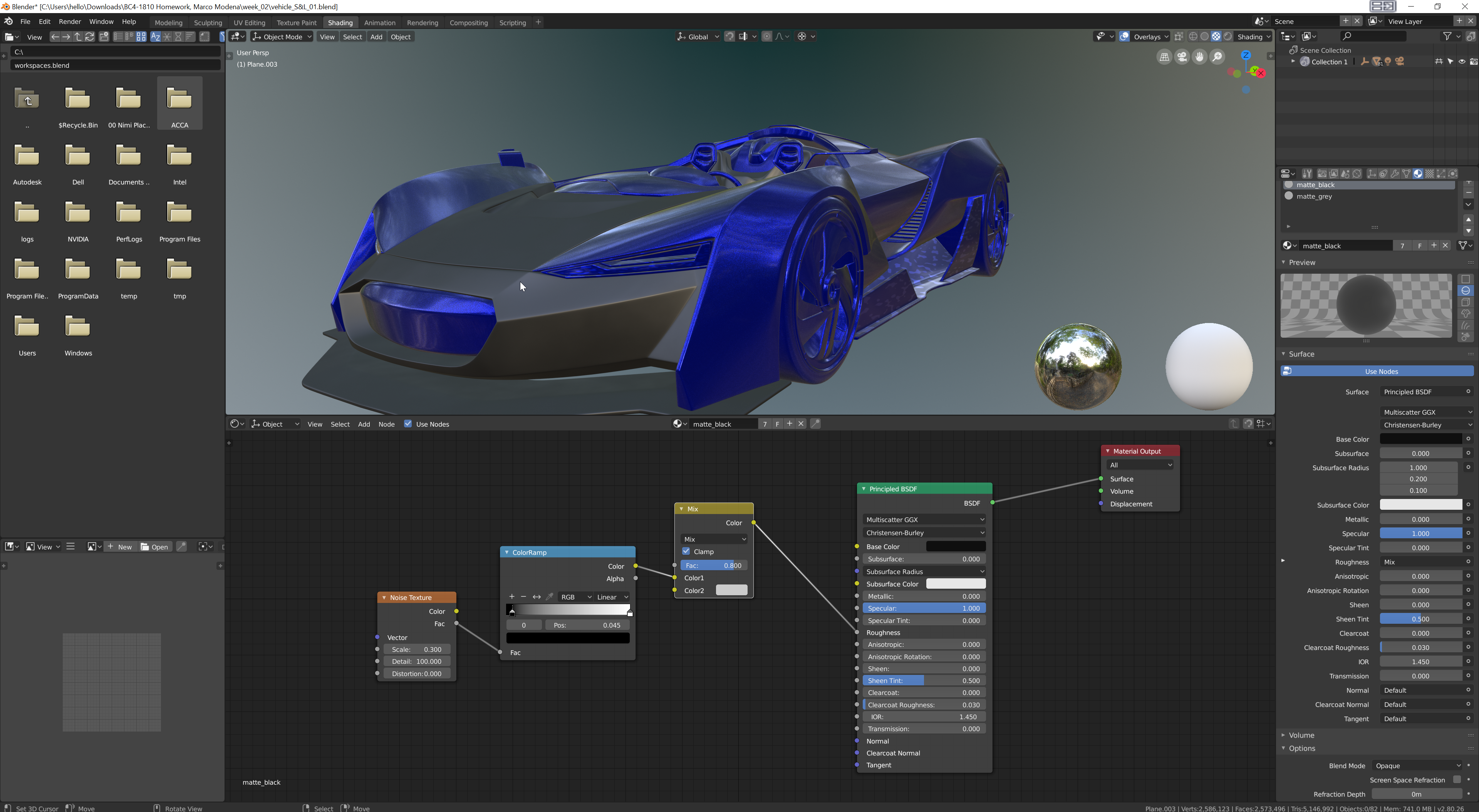
Moreover having some problem with Evee followed your lesson but black looks grey

![]() mamo Whilst I can't comment on the material just yet as I haven't experimented with Eevee much yet (maybe try adjusting the sliders? Or increasing the black one?) but I can say for certainty you don't need to create a new thread, everything you do this class should be condensed into one thread.
mamo Whilst I can't comment on the material just yet as I haven't experimented with Eevee much yet (maybe try adjusting the sliders? Or increasing the black one?) but I can say for certainty you don't need to create a new thread, everything you do this class should be condensed into one thread.
![]() mamo No need to create a new topic. Please continue posting to this thread and when you're ready to submit final homework, type "Week 2 Homework Submission" in bold at the top of the post.
mamo No need to create a new topic. Please continue posting to this thread and when you're ready to submit final homework, type "Week 2 Homework Submission" in bold at the top of the post.
Your black matte looking grey is perhaps due to the environment HDRI. Test out other HDRI's and see how the material behaves. Also keep in touch with photographic reference along the way. With a lot of light, like daytime outside, matte black does look a little like grey:
![]() mamo Like others have said, it's fine to keep posting everything in 1 thread. I prefer i thread so I can see your progress and it helps keep the clutter down on the forum.
mamo Like others have said, it's fine to keep posting everything in 1 thread. I prefer i thread so I can see your progress and it helps keep the clutter down on the forum.
That's a solid start on the car. Keep in mind color and light are relative to each other and influence each other, so changing the light to be lower intensity will make the black look more black in this case. I recommend reading this book about that.
@theluthier Thanks to everybody, I have seen now it's due to hdri, you switched to render mode I supposed you were still in look dev
![]() mamo Yesterday I stayed in LookDev I'm pretty sure. I like it better for quick visualization since it's faster for sifting through several HDRI's and it offers environment rotation. Currently render view doesn't support rotating the environment texture. Only downside is actual render (f12) doesn't render look dev mode.
mamo Yesterday I stayed in LookDev I'm pretty sure. I like it better for quick visualization since it's faster for sifting through several HDRI's and it offers environment rotation. Currently render view doesn't support rotating the environment texture. Only downside is actual render (f12) doesn't render look dev mode.
@theluthier are you sure that's still the case? Is that a mac only problem? 'Cause yesterday I turned a HDRI in 2.8 with a mapping node and it worked fine... I'm on windows
@theluthier I am with Miranda on this one. Have tried several HDRIs for my car and was able to rotate all of them (viewport AND final render). I am using Windows, too.
@theluthier I rewatched it from youtube pretty sure you switched https://youtu.be/KQQiRqROfN0?t=8427
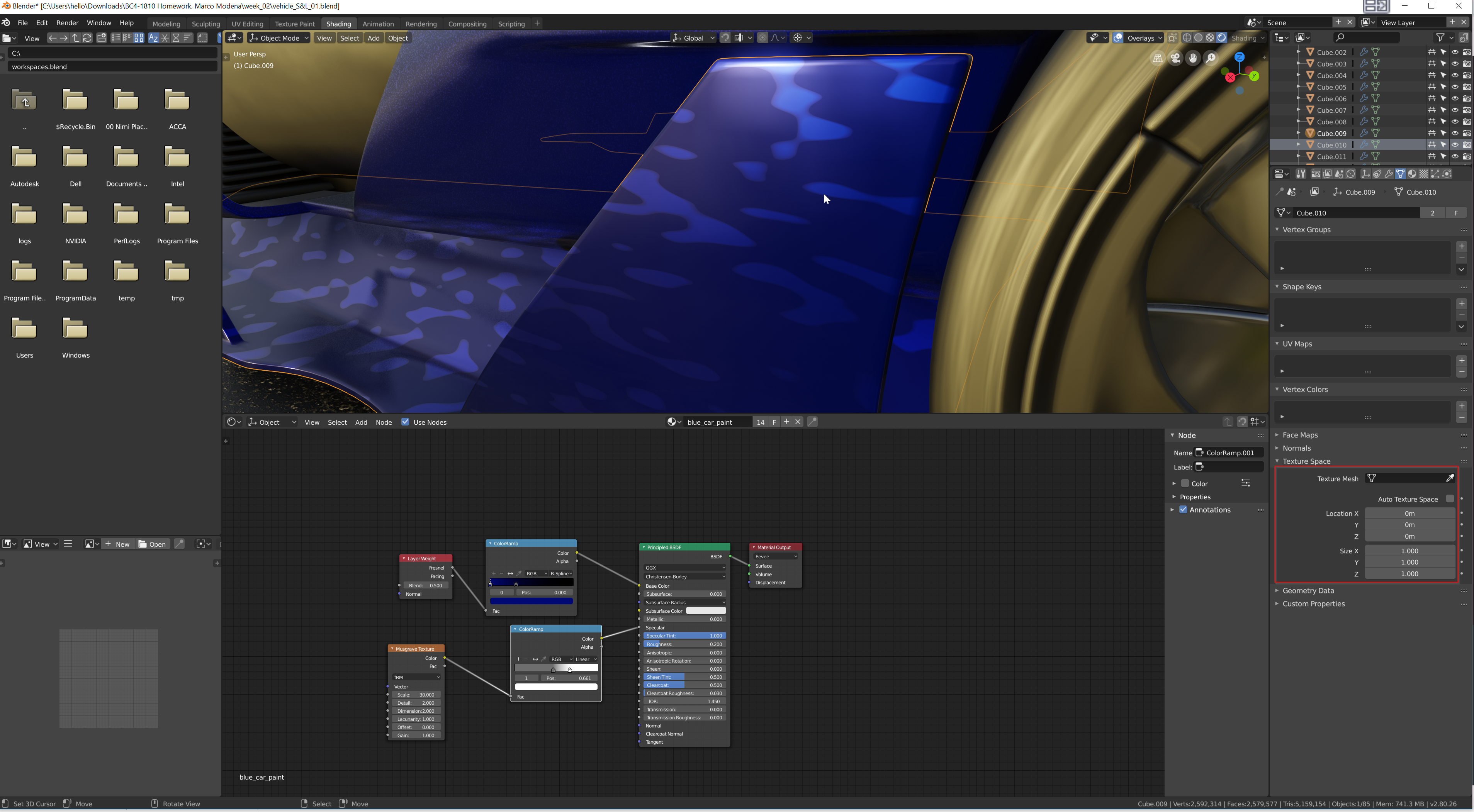
instead sorry to bother you but not understanding why texture behaves strangely on lateral bottom flaps

![]() mamo You're absolutely right. I can't remember why I was using that mode since I wasn't rendering images.. 🤔
mamo You're absolutely right. I can't remember why I was using that mode since I wasn't rendering images.. 🤔
It looks like your bottom lateral flap is tiling the textures at a small scale. I wonder if it's the auto texture space setting. With the flap selected, go to your object data properties and look under the Texture Space section. See if Auto Texture Space is enabled.
ssmurfmier1985 ![]() bun-bun Oh interesting. Maybe it is a Mac thing. [Goes to download the latest daily build...]
bun-bun Oh interesting. Maybe it is a Mac thing. [Goes to download the latest daily build...]
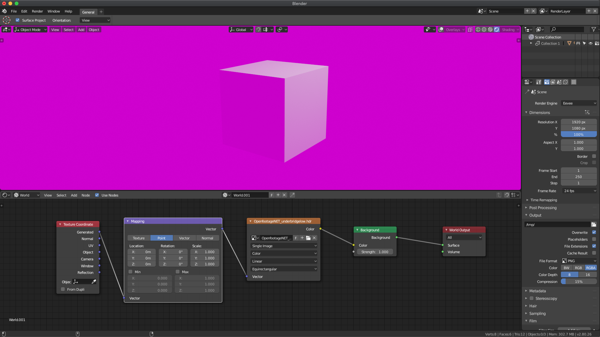
Yes I can confirm that even with today's build, the texture coordinate node breaks environment textures:

@theluthier No Auto tile is disabled could be scale and rotation not applied to the object. In this case I can't use ctrl+A cuz it says it's not single user object
![]() mamo Ahh yes I ran into this same problem. My guess is it's a scale issue that needs to be applied but we can't apply scale because it's a multi-object user, BUT we can't make it a single object user because the tool seems broken.
mamo Ahh yes I ran into this same problem. My guess is it's a scale issue that needs to be applied but we can't apply scale because it's a multi-object user, BUT we can't make it a single object user because the tool seems broken.
Whew. What I recommend is duplicating the car paint shader for that flap object specifically. Then adjust the musgrave texture scale accordingly.