There was an Indian sorcerer in a village who decided to use his which craft for something other than medicine, he was hurting people. The people in the village forced him out. He swore that on the next blood moon, he would come back and destroy the village and everyone in it.
It's a good start. To answer some of your questions, what story do you want to tell with your render?
![]() silentheart00 I'm actually not sure. Can you give some examples of what kinds of stories an image can tell. I didn't really give story much thought in my creations. I haven't really gotten the concept of a story within an image.
silentheart00 I'm actually not sure. Can you give some examples of what kinds of stories an image can tell. I didn't really give story much thought in my creations. I haven't really gotten the concept of a story within an image.
![]() silentheart00 I think I might have it be like it's an urban legend. Have there be an offering circle that if you put a pumpkin in it on the night of a blood moon along with your blood and the head of a wolf, it comes alive and is your minion that will do what every you tell it to, until the moon is full gain.
silentheart00 I think I might have it be like it's an urban legend. Have there be an offering circle that if you put a pumpkin in it on the night of a blood moon along with your blood and the head of a wolf, it comes alive and is your minion that will do what every you tell it to, until the moon is full gain.
@cgcookiedough Take a look at Aaron's stuff. He's all about the single image as a story. This and this are his strongest work. Hell, hit him up for advice. I'm sure he'd be happy to help.
That's an interesting idea. Try doing some quick blockouts, see what looks good. Hit up Aaron, too.
Hey, ![]() thecabbagedetective do you have any advice for making single frame render stories?
thecabbagedetective do you have any advice for making single frame render stories?
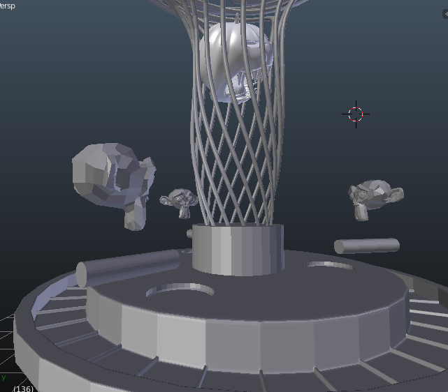
![]() silentheart00 I blocked basically everything out. I'm not sure if this is storytelling telling or not, but I kinda made this based on what you told me.
silentheart00 I blocked basically everything out. I'm not sure if this is storytelling telling or not, but I kinda made this based on what you told me.
The monkey heads just show there will be people there. They will have cloaks on. The cylinder is there to show that their arm will be out. I'm not sure if I should have them all have blood dripping or not.
@cgcookiedough Cheers for informing me ![]() silentheart00, and thanks for the recommendation too! Right, now lets get down to business.
silentheart00, and thanks for the recommendation too! Right, now lets get down to business.
Now I find there are two ways you can go about starting a story based render. Either A) You have a story in mind before you begin and start blocking out your scene or B) You have a focal object/character in mind which you then proceed to model, and then build the scene around them (that was the process I went through for the renders Silent mentioned).
It's safe to say you fall in category B, because I'm assuming you're going to want this possessed pumpkin head to be the focus of the render. This means that naturally you're going to want to focus on it using DoF, making sure that *that* is what draws peoples' eyes the most.
Seeing as you're struggling to think of a story, my biggest advice to you is simple: be bored. I find my creativity spurs the most when I'm either bored out of mind or otherwise in some kind of autopilot mode where I extensively daydream. Showers are the most common place where this takes place, there's a reason there's a subreddit based around it haha. Whenever I'm occupied playing games or whatever I just think about what's in front of me as opposed to what I can be doing. Also music. I spend a lot of my time listening to music and just letting my mind drift away.
But lets assume you use the premise you've been thinking of - some kind of blood sacrifice causes demonic entities to bow to your every whim until the next full moon - you've then got to think exactly what you're going to portray in your render. It's a balancing act between appeal and realism, and I don't mean realism as in good looking textures and effective lighting, I mean realism as in what you can realistically achieve. There are a lot of projects of mine that were way more ambitious then they came out to be due to lack of skill, time etc, and that can kill both your render and your morale, due to wasted time, energy and a sense of not being good enough. Be smart.
So think of the basic premise of your story and think about what you could make within the confines of the narrative. Maybe a crazed but desperate man slicing his hand open over a pentagram in a desperate attempt to grab a smidgen of power from dark entities so that he may protect his family from some other unsightly horror? Maybe show the demonic beast being summoned but things go awry, which cause the creature to turn on it's summoner? Or maybe do a "lost footage" esque narrative, with the Blender camera set up to look like a real camcorder, in which an unwitting, imminent victim stumbles across the foul monster in an abandoned building? There are many possibilities, it's all down to what you want to do.
There are also other things, such as lighting, in which you can use to help tell your story, mainly by using them to focus on something important. Conversely darkness can be just as efficient at storytelling, masking unseen horrors and only giving a hint as to what may be lurking within its shadows. Be sure to use them effectively!
I hope this gives you an inkling as to where you should go next, but if you have any other questions feel free to ask!
![]() thecabbagedetective Thank you for taking the time to reply. I think I know what I should do.
thecabbagedetective Thank you for taking the time to reply. I think I know what I should do.
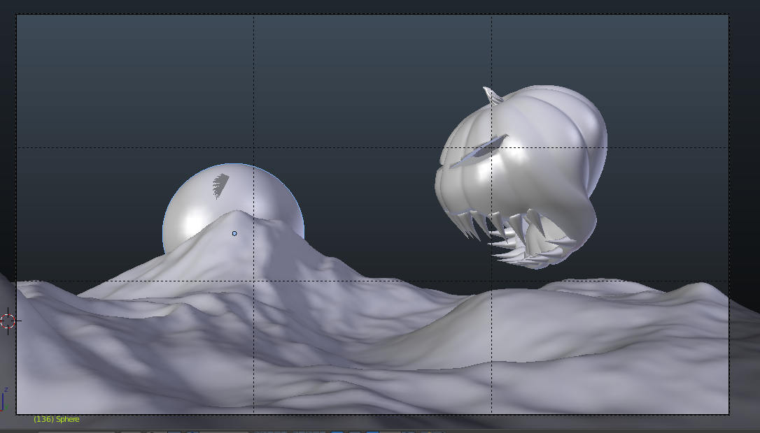
There's an Indian sorcerer who has been ran out of the village. The village is behind a hill. The sorcerer ponders up the demonic pumpkin to destroy the village. On top of the hill is the chief of the village, with his sphere pointed to the air telling the tribe to attack. The sorcerer is behind the giant pumpkin pointing towards the village. The Indians from the tribe are charging at the pumpkin with their spheres and shooting their arrows at it with their bows. I'm going to dupe the Indians, and have them in the dark. The chief will have a black texture, so you only see his silhouette. This will be happening under a blood moon. I'll probably make the Indians be out of focus and have the focus be on the pumpkin. Do you think there's a way I can improve the scenario?
@cgcookiedough Sounding good! Naturally we can think deeper than this, such as what the pose is the pumpkin going to be in? Is it going to be leaping in the air?, Maybe it's merely snarling at its enemies? Or maybe it's already started chewing on one of the Indians who got too close? There's a lot of possibilities there. I'd wholeheartedly recommend blocking your scene out first with basic shapes (which you seem to already know about) as this can make the work ahead seem a lot less daunting, like how making your bed somehow makes doing the housework feel easier, or maybe that's just me?
Duplicating the Indians is a good idea to save time, though it may be a good idea to put variations in clothes, hair etc just so they're not a pack of clones. Nothing major necessarily, just enough to tell the difference. Also the silhouette is a good idea to save time as well, I'm not sure how you intend the black texture to work out though? I guess that's what a silhouette is so I'll have to wait and see on that one.
Overall you have a pretty damn good start and I look forward to what you create, just hmu if you need more advice!
@cgcookiedough Oh jeez I thought it was a normal-sized pumpkin for whatever reason that makes a lot more sense to me now lol. I do see a bit of a problem here, namely composition. I'm going to assume that the moon is going to be in focus, yeah? If so both the moon and the pumpkin and kind of battling for power in the same area. Whilst I'm not recommending you blur the moon out but maybe try out the Rule of Thirds for your composition? Could really help.
@cgcookiedough I would suggest maybe putting the moon higher in the composition to help with the competing for attention thing. Since it's on the same plane as the pumpkin head, it's a bit static, so putting it higher in the composition will set it at an angle and make it more dynamic in the overall composition.
![]() silentheart00 I think I might actually put it lower. I want the silhouette to be against the moon. Do you think it looks good like this?
silentheart00 I think I might actually put it lower. I want the silhouette to be against the moon. Do you think it looks good like this?
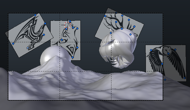
I made my own constellations :)
 I'm going to hide the images and just have it be the stars showing. By the way, behind the pumpkin is a deer.
@cgcookiedough really nice work. I love how you're doing it. I wonder if my pumpkin shapes are too Strang xd.
Really good so far keep up the good work
yyukinoh1989 Thanks. Makes me feel good when people say anything along the lines of good job. To be honest, I don't know what I'm doing. I have guidelines on what I'm going to do, but as far as getting there, I have no clue. I think it's a win if I learn stuff as I'm going, even if I don't win the prize. So far, I'd say my knowledge as increased at least 10% that means I've already won :) Do your best, then go a little bit farther.
Ha! I don't even know if what I'm saying makes any sense.
@cgcookiedough Dont worry i do get it . but you sure did great already . i love how to pumpkin looks (looking like one hungry pumpkin :D) i think those constellations will also looks great .
@cgcookiedough That's the spirit! Learning something and having fun doing it is much more important than winning, at least that's my opinion 😊
You're off to a great start, you got a good story and the block out is getting better. I like the position of the moon behind the mountain, but I also like ![]() silentheart00 suggestion to put it higher. I think you should go for what like best, it's your art piece after all 😉 you can always change the position later when your block out is finished or even after shading/lighting your scene if it doesn't turn out the way you like.
silentheart00 suggestion to put it higher. I think you should go for what like best, it's your art piece after all 😉 you can always change the position later when your block out is finished or even after shading/lighting your scene if it doesn't turn out the way you like.
Keep up the good work!