Nice day scene. I like the touch of orange in the light. The night scene has a lot of yellow-green, which is making it feel more like a creepy mad scientist vibe than a comfortable place to sleep, but that's more of a stylistic thing. It's lit nicely.
mmjans Love the daytime scene! I agree with silent that the touch of warmth in the sunlight is very appealing. The night time looks great aside from the yellowy-green hue of the lamps - also like silent said. Typically a warmer lamp light is common, toward orange more than yellow/green.
All things considered, that's a small note. The quality of the lighting and render is great.
nice work done. I do love the morning bedroom lightning more but good job on it. I also like the toy truck. Good shading
mmjans Truck looks good! Like a toy 👍 I like the noticeable difference in glossiness between the wheels and the cab. Overall it's an A from me this week.
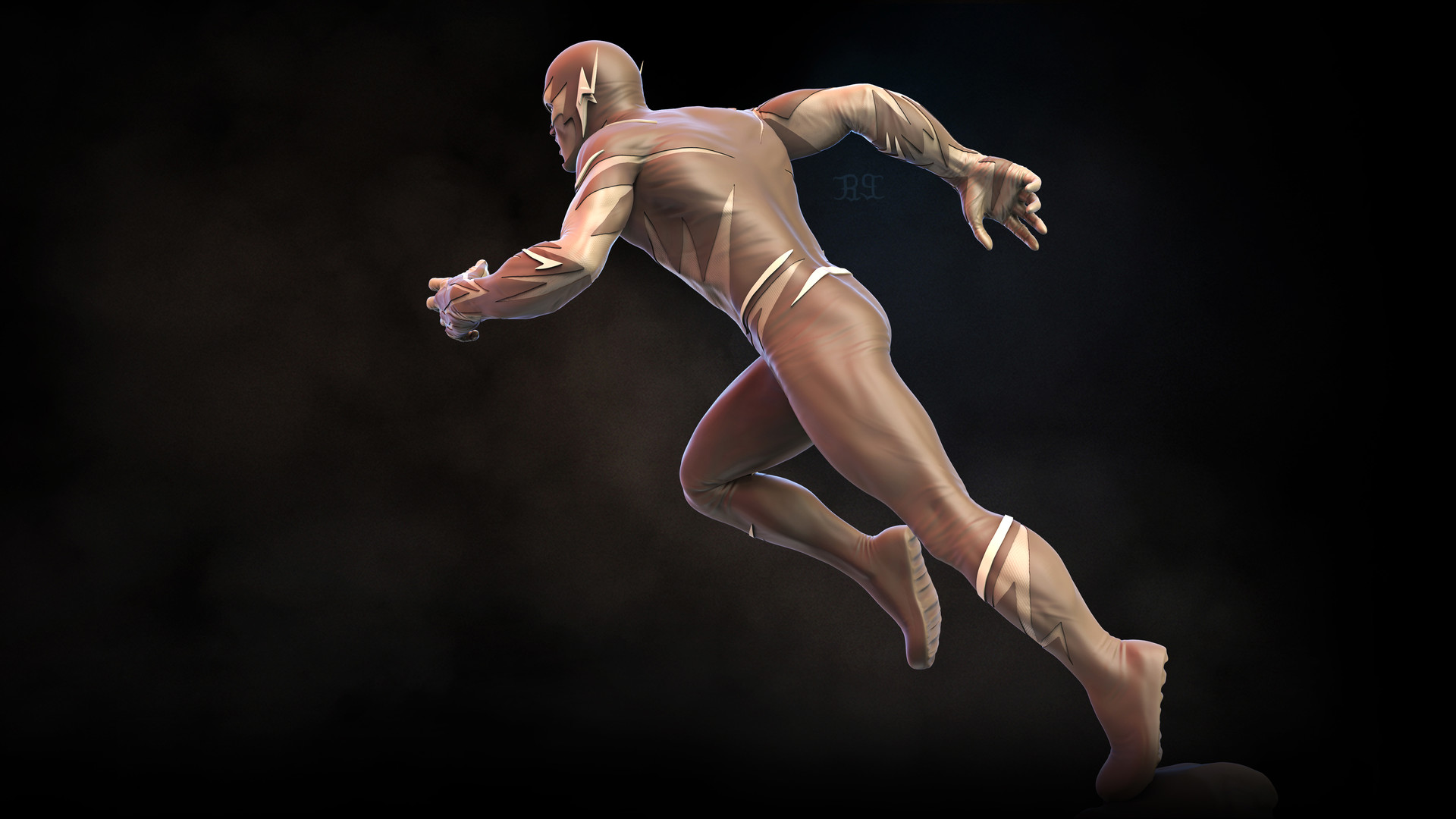
mmjans Yes that's a good goal to match. It's got a strong blue rim light to make the character pop off the background and overall the light + shadows showcase the shapes very well. Good choice 👍
Week 2 homework. I ran out of time as life got in the way but wanted to submit what I have
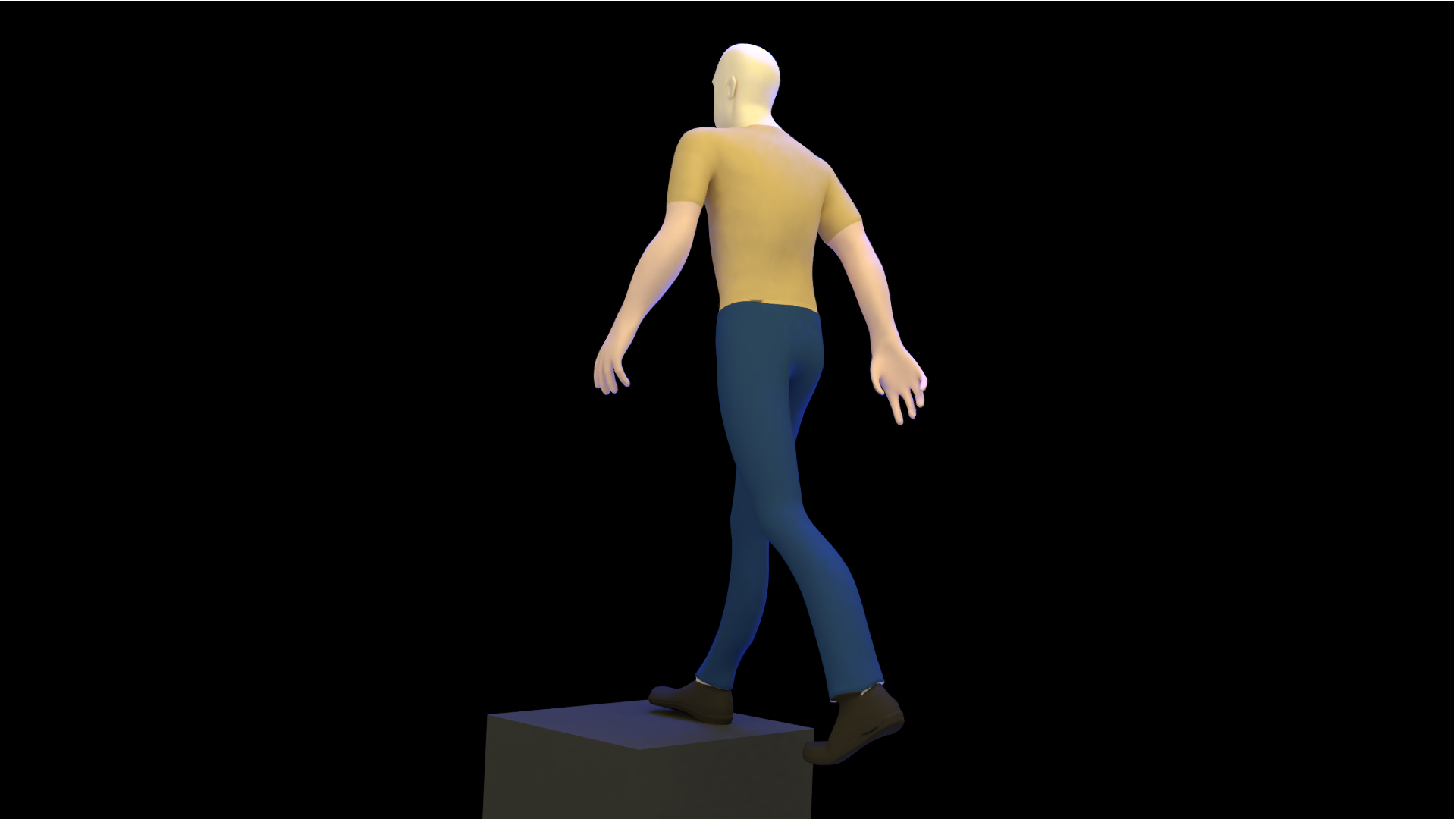
Light match Original picture is the flash example. I used a model from Blendswap "Rigged Man With Walk Cycle" by brightonpiers and tried to match it


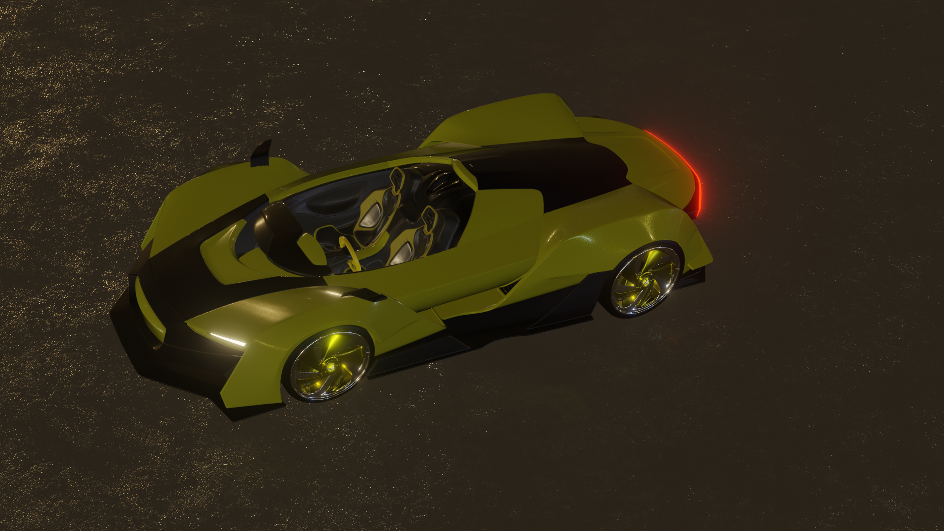
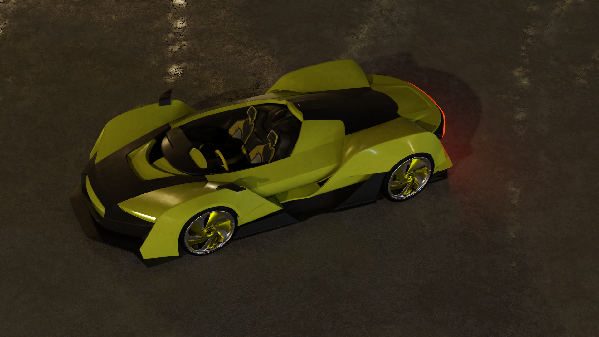
For my car I rendered with both eevee and cycles
eevee

cycles

mmjans Yeah we just gotta wait and Kent will grade them all, no worries.
mmjans The lighting match is almost there, but I think the light hitting the back of the person is too much; the shadows are pretty much gone. Or that could be the simplicity of the model. I see the blueish rim light, but it's a bit hard to see since the other light is dominating.
The car looks pretty good in both engines. If you had more time, messing with the shadows in Eevee would help with the "floating car" in your render. But that aside, looks good. Spokes might be a bit on the shiny side, but good effort overall.
mmjans First, again, I think you picked a great lighting example to match. Your match looks close but the biggest difference to me is the camera angle. In line with what Silent said, it looks to me like the camera is simply rotated around to face your character's back more directly, whereas the source image's camera is face more the side/back angle.
Aside from the camera angle, I kinda wish you'd left your model without the various colors of shirt/pants/shoes/skin. With these matches I recommend keeping the material as close to the source as possible. It's just an immediate disconnect when comparing.
Still the lighting itself looks close as far as I can tell. I give it a B 👍
Your vehicle renders are solid. I like that you did a Cycles Vs Eevee comparison. With the Eevee render my biggest note is that the AO seems to be missing. If you don't have Ambient Occlusion enabled in the render settings, I strongly recommend you enable them. If they are enabled, I recommend increasing the strength (factor I think it's called). Without it we don't have a feeling of proximity between objects, especially close to one another, like car to ground. I give it a B+. Good work this week!