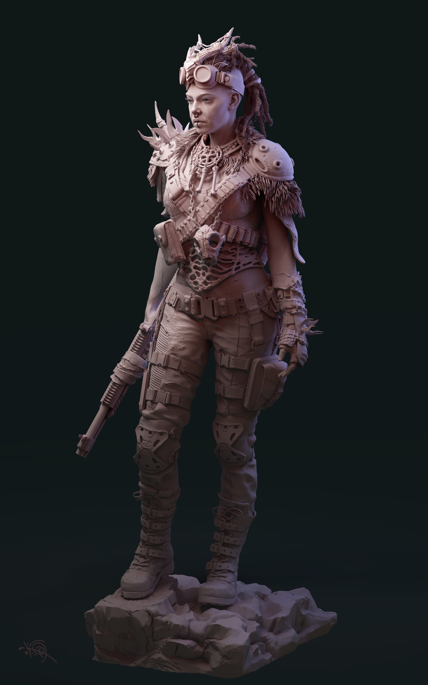
@theluthier Thanks for the feedback, I do have ao and on my reload with eevee it came up. I might have accidentally kicked it off during the render. It does increase the image appeal.
The model shirt and pants came default with the model from blendswap. Next time, I might re due the materials... There is always more to do next time
@theluthier Quick question for light match this week how is this as a match? As one of the critiques from my match last week was that the model coloring didn't allow for a connection to the match. Be trying to match this one I feel like the lighting will now be the focus. Is it a good one to match or should I keep looking?
mmjans maybe it's good to change the basic material color of the model to match even more with the model to. Match. But good work already :)
mmjans I agree you might need a more mid grey material than the whitish material. The top light looks more reddish than yellow. The rim light looks fairly close. It could be more lights than you think, too. Your blue light looks like it's too far forward; focus it more towards the edges of your model than the side, if that makes sense. Good start.
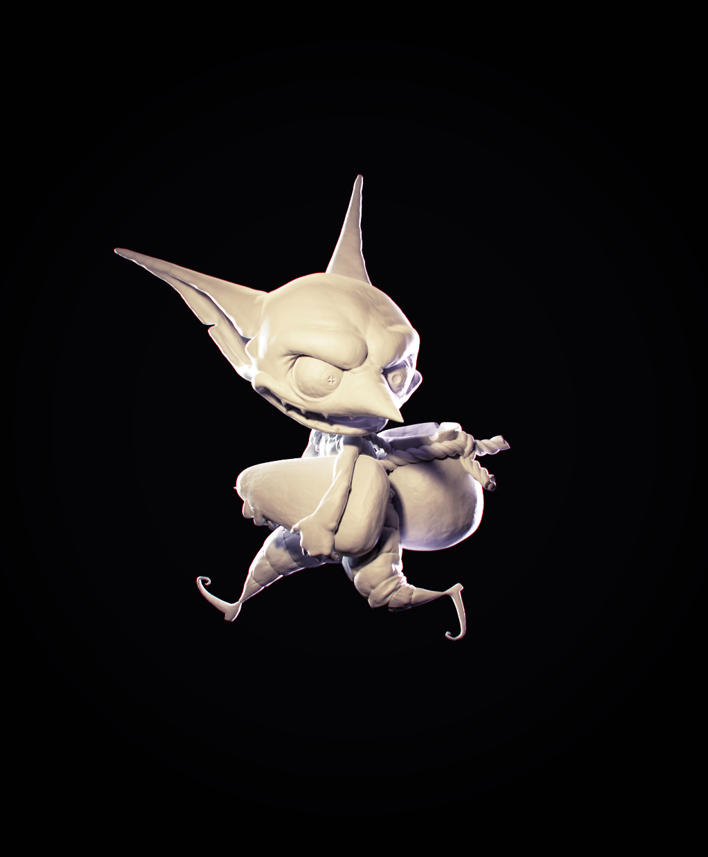
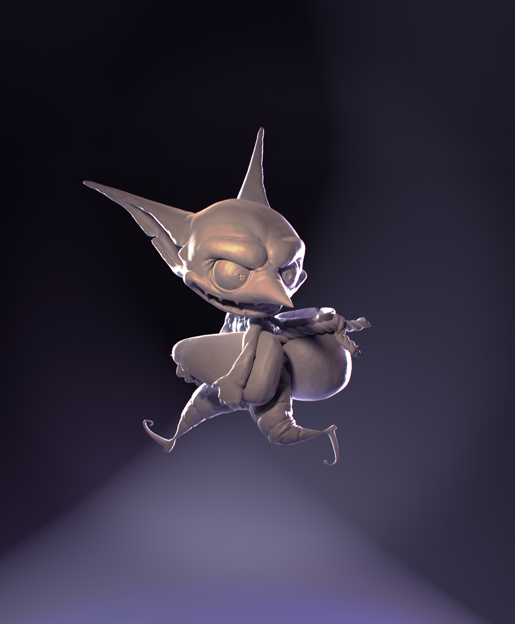
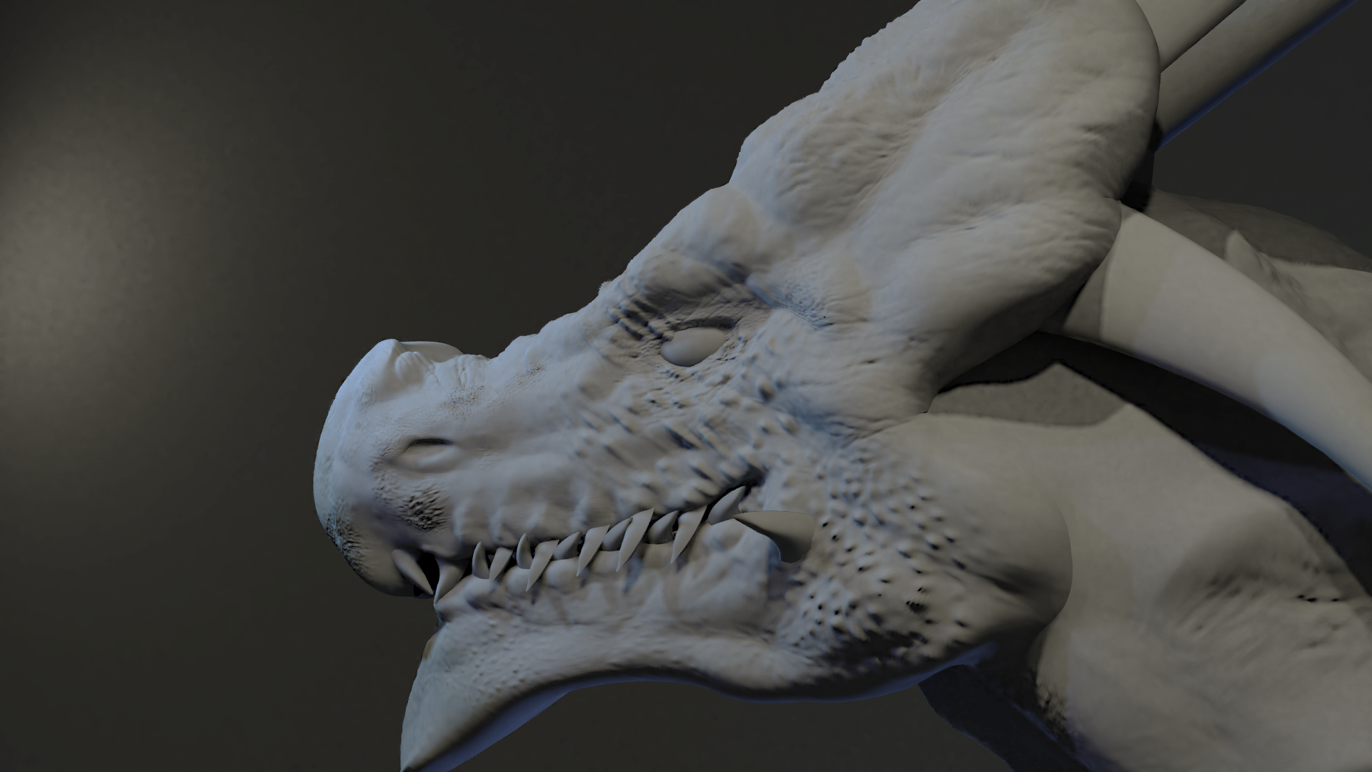
mmjans On the goblin character itself, I think I like the lighting. I think you could have done more of a backdrop for him for a little more interest than a solid black.
on the color match, I think you have the right idea with the color and placement, but I think the strength is a little too high, which is doing 2 things.. one, too much light bleed as it goes further down the character (and that could be too much front fill as well) and also causes the start of the transition to be lower down on your character than in the source. Needs either lower strength or a sharper falloff somehow.
Still, overall, solid work.
mmjans The LM is definitely getting closer. The second goblin looks more interesting, too. I kind of wish there were shadows to help ground the character, but it's more interesting visually than the black background. Good work.
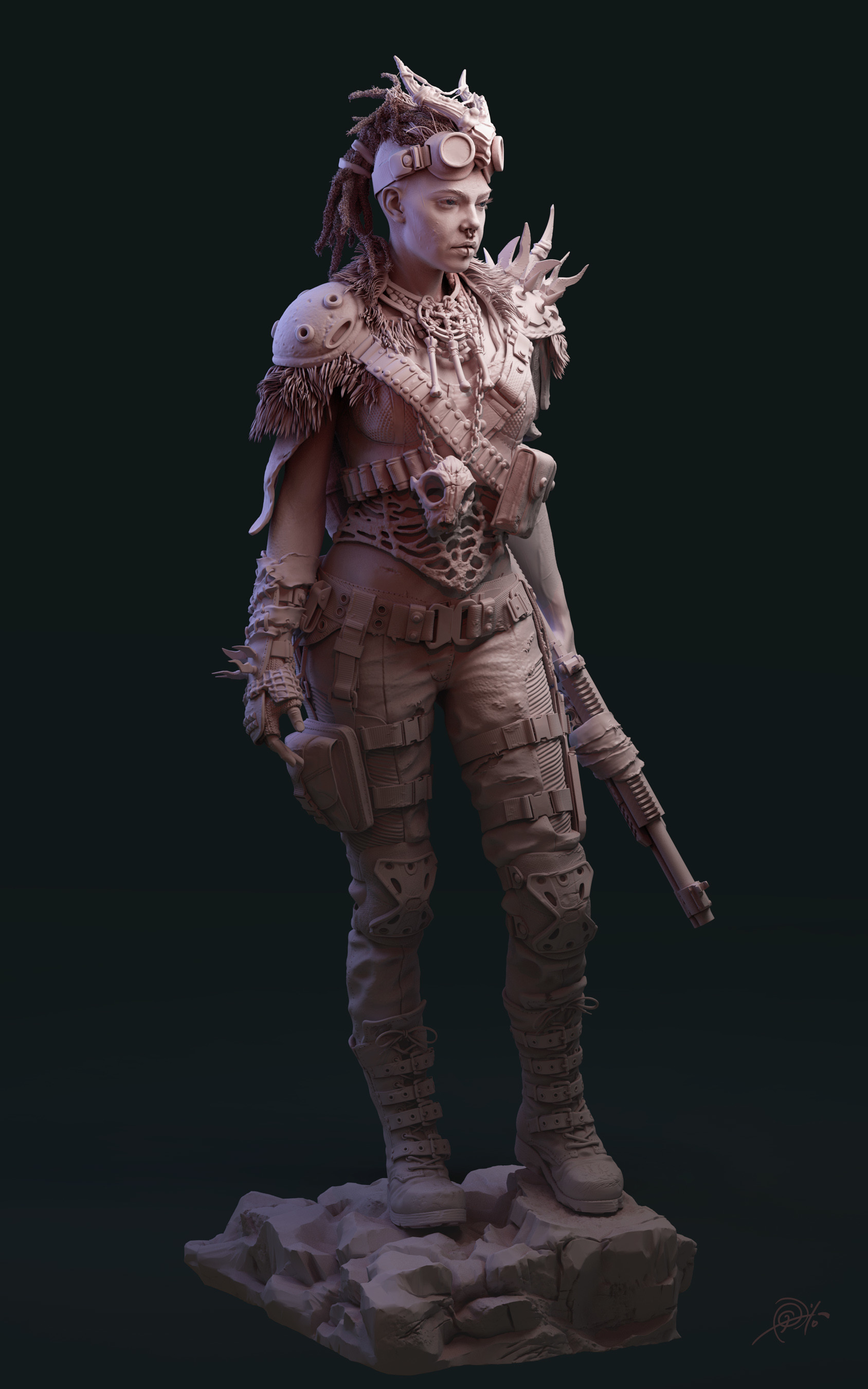
mmjans Silent gave you some good advice. Dialing down your material's value brings your render much closer to the source. My one note is that I'd like to see a slight amount of glossy reflection on the model. I mean real subtle, like 0.4 on the roughness and 0.1 or 0.2 for the amount of specular (assuming your using the principled shader). B+ from me.
As for your character, it was a good choice - like your light match - to darken your material from white to more of a mid grey. It avoids blowing out much better. Great job on the strong rim light; The purple and orange work well together too. The background is definitely more interesting than black but it's also kinda random. Almost like it's some sort of log that's been highly blurred. I'm finding myself slightly distracted by it..I'd recommend a simpler gradient: Dark on the outside corners and fading to a slightly brighter purple in the middle.
Another B+ from me.
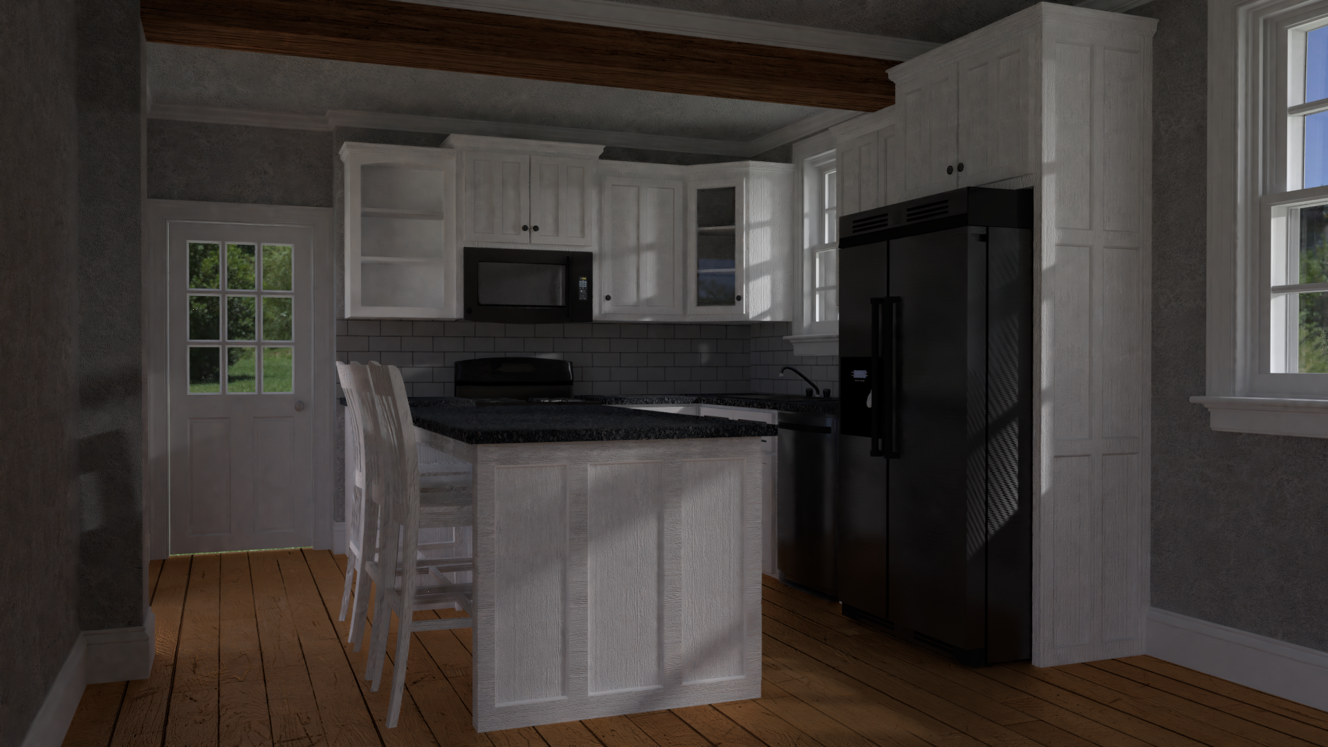
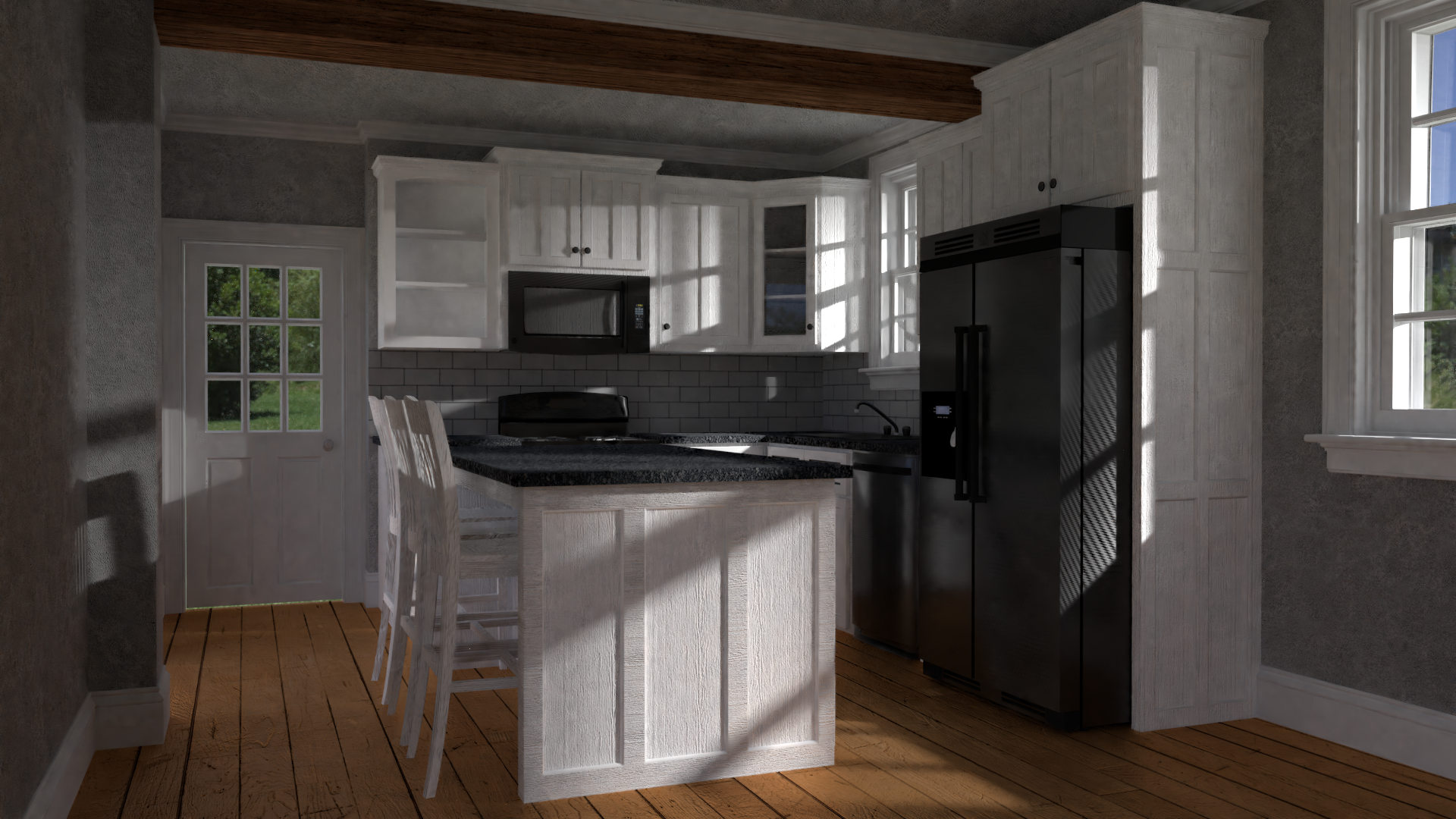
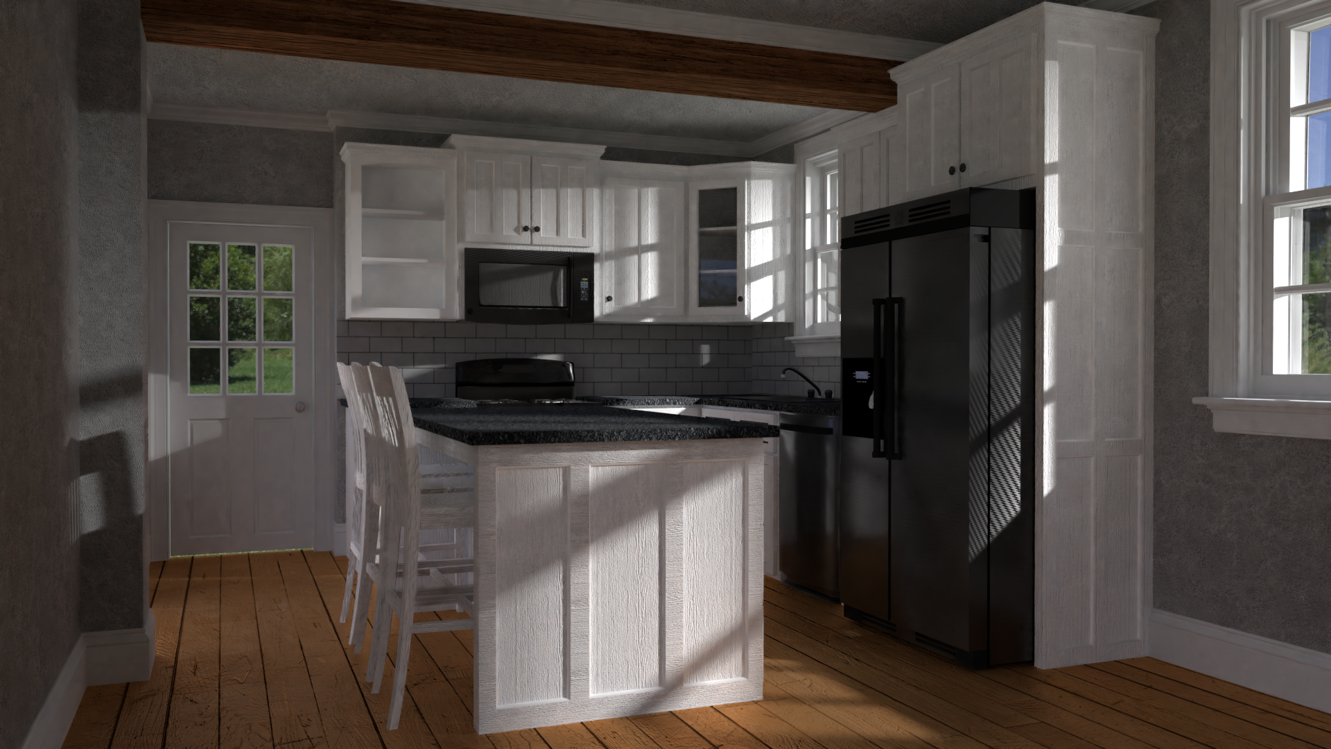
mmjans I'd say the main thing is just to crank up the lights. That will help you see what is going on. They can always be dialed back down later if you're going for a crepuscular feel. Other than that, a few of the textures you have look worn and ragged (particularly the island; looks like plywood that only got a single coat of paint). I'm not sure "old and beat up" suits the model, but at least that look isn't consistent with the rest of the textures. You will want to commit your texturing to a specific direction eventually, but first I would make the whole scene brighter.
mmjans the arch viz looks really great. The light match I think you have more of a yellow brons tint in you're art while it's more light Grey with a blue tint. Also you have harsh shadows while in the reference this isn't happening. The background should also be a bit darker. Still great work done
yyukinoh1989 Thanks Yukino, I def spent more time on the arch vix, and good notes on the light match