My homework submissions for the lighting and shading course.
Homework, Week 1
(Cycles)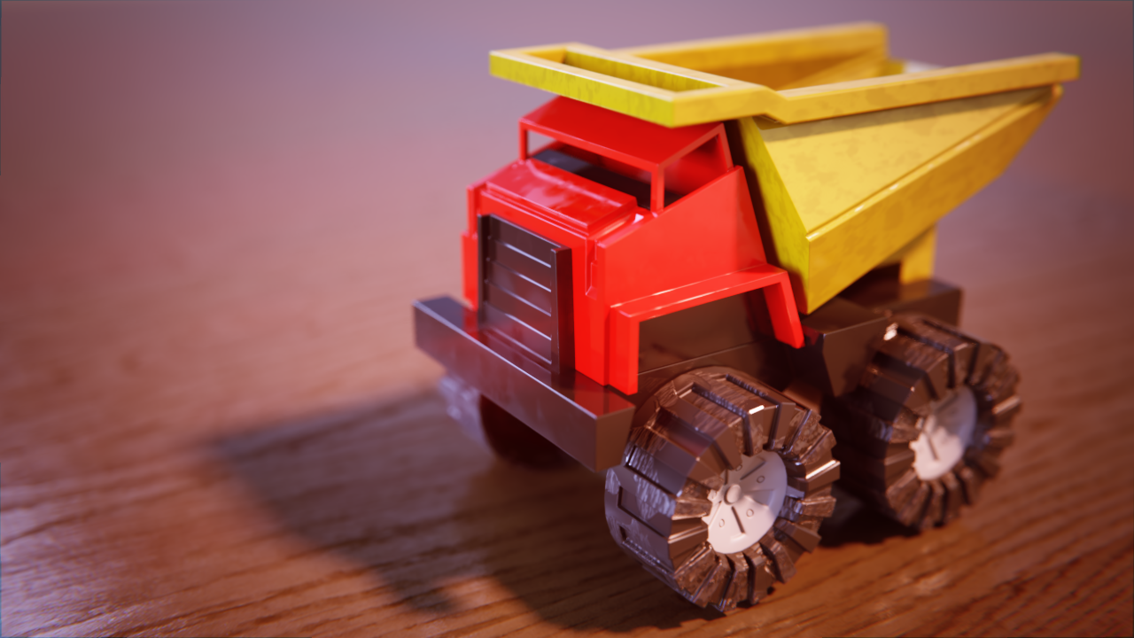
(Eevee)

(Day scene)
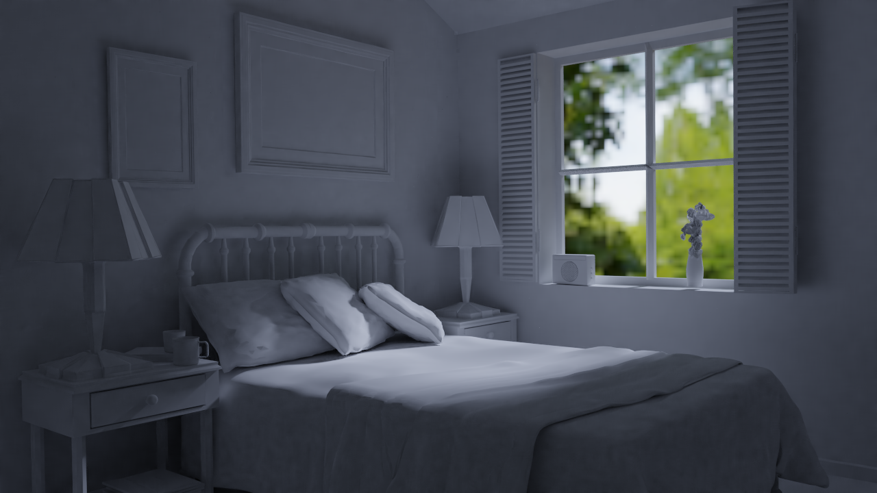
(Night scene)
Homework, Week 2
Car paint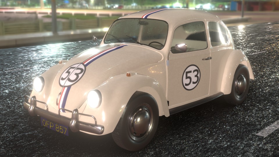
Color Match
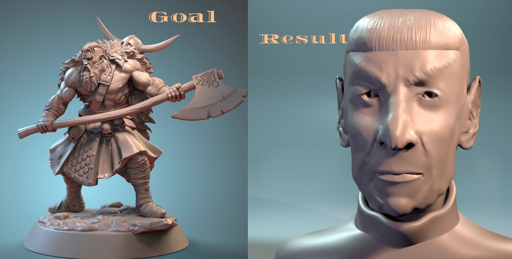
Week 3 Homework -- Characters
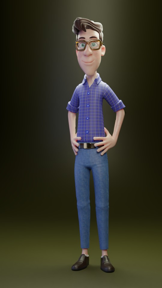
Character lighting
Light Match

I'd done this a while back, so this was nothing new to me. Though I think when I did this before, I don't remember if we had the Principled BSDF shader. And with keeping in a spirit of experimenting, I did use 2.8 Alpha to do this. This version here is in Cycles.
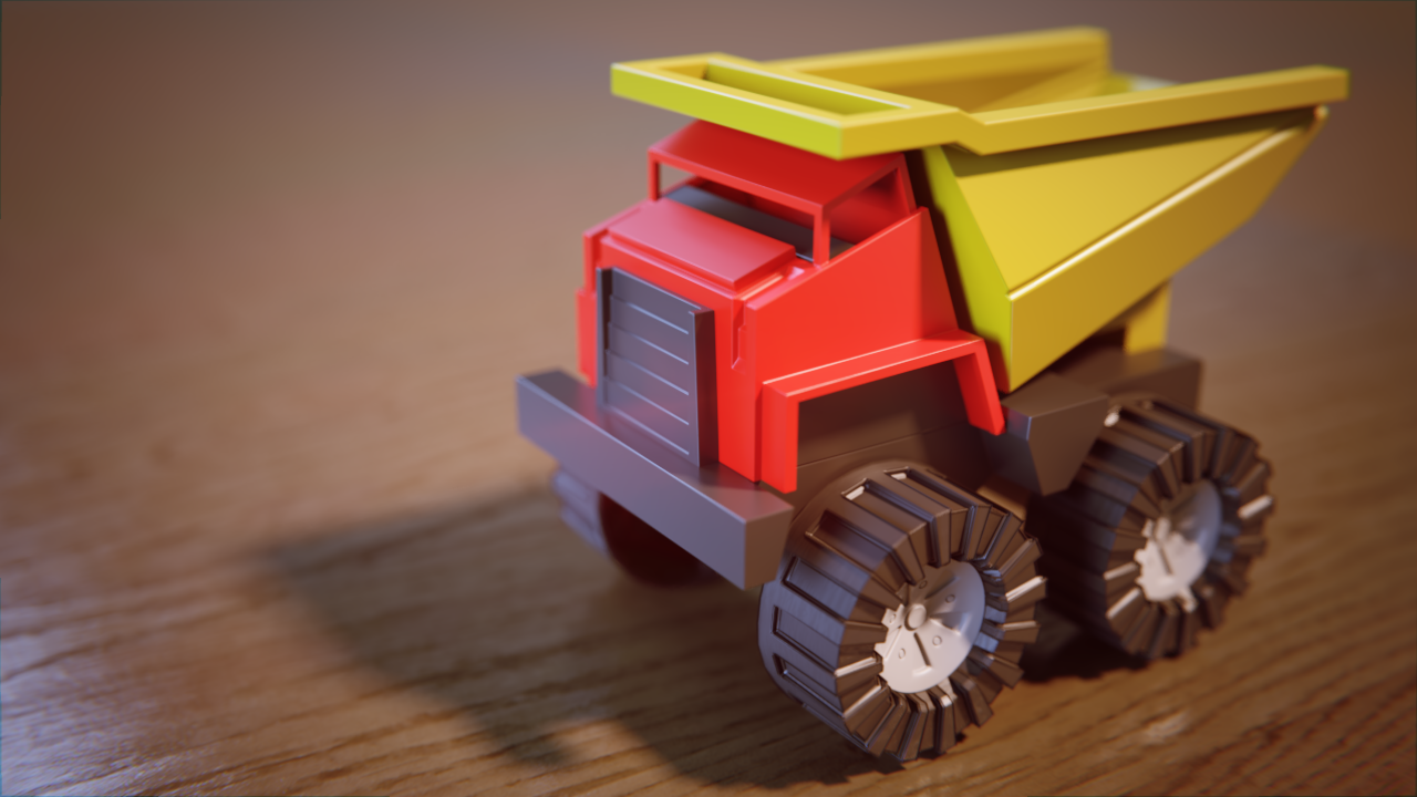
Since I was doing this in 2.8, might as well play with Eevee too, just to see the differences :D
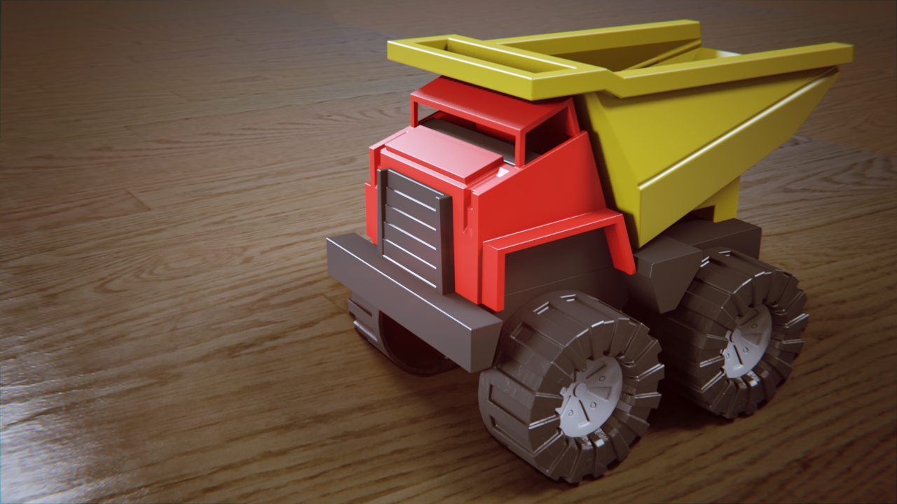
First thing I notice right away is the camera DoF blur and some subtle color differences (even though nothing was changed between switching to Eevee).
Took me a minute, too, to figure out how to get the contact shadows in Eevee, and in looking at it now, I see a huge difference in the light intensity, particularly the shadow spread.
![]() gradyp good work Grady! 😎 Wow so much difference between render engines, guess eevee needs special treatment to make it look more alike
gradyp good work Grady! 😎 Wow so much difference between render engines, guess eevee needs special treatment to make it look more alike
ssmurfmier1985 That's what I'm noticing... though I feel I could use more understanding of Eevee to get them to look even closer.
Yeah, Eevee will take some adjustment, but it's good to know. On the Cycles render, there's a really weird outlining of the tires. Don't know what's up with that.
![]() gradyp Looking nice! Maybe come back to this next week to take the Eevee render to the next level? Could be an awesome result.
gradyp Looking nice! Maybe come back to this next week to take the Eevee render to the next level? Could be an awesome result.
Did this as a color match exercise to practice lighting. (Here's the image(s) on Artstation I was using as the base... Dragon's Lament by Ed Abreu Van )
Here, I used a dragon I'd sculpted a few years ago during a 30 day sculpting challenge I did for myself.
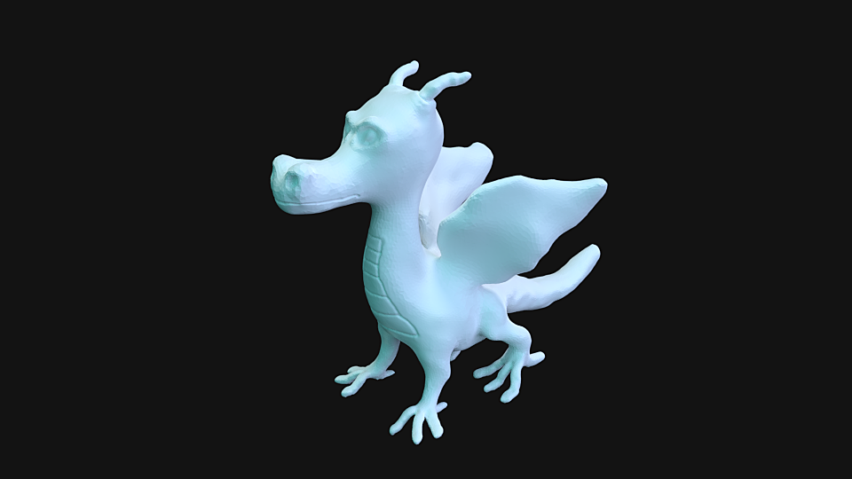
And tried another with the same lighting with my longhorn diamondback rattledillo I did last year.
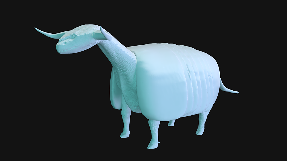
![]() gradyp Huh, I'd said you nailed the lighting pretty well! Cute sculpts, too.
gradyp Huh, I'd said you nailed the lighting pretty well! Cute sculpts, too.
![]() thecabbagedetective Thanks :D The first I hear people tell me it reminds them of Spyro, though it really is coincidence. And I'd hate to meet that second one in the wild :D
thecabbagedetective Thanks :D The first I hear people tell me it reminds them of Spyro, though it really is coincidence. And I'd hate to meet that second one in the wild :D
![]() gradyp It's a good start, but I think you could increase the saturation of the blue more. What you have looks a little more green-blue while the reference is more towards the cyan side.
gradyp It's a good start, but I think you could increase the saturation of the blue more. What you have looks a little more green-blue while the reference is more towards the cyan side.
Homework, Week 1
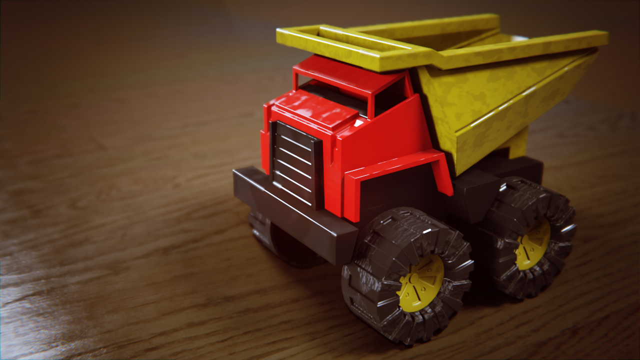
Felt like my truck was too clean so tweaked my submission. Also, I think I may have worked out one or two of the things I had on the Eevee version with the DoF. I'd previosly done these two assignments and passed them, though not sure where to locate those exercises. But I redid them for practice if nothing else.
(Toy Truck, Cycles)

(Toy Truck, Eevee)
(Day scene)

(Night scene)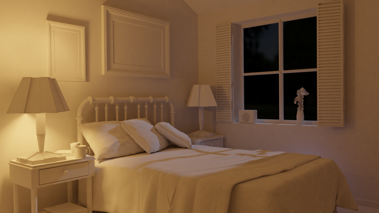
With the night scene, I really cranked down the strength on the HDRI in the background to give just a subtle something out the window. I also put a night light (hidden by the bed, but you see the glow). I deleted one of the "default" lamps in the scene and duplicated it so that the two weren't sharing the same settings so that I could turn one of them off.
![]() silentheart00 I think you're right.. just needs a subtle shift towards cyan. Still, I like how this looks.
silentheart00 I think you're right.. just needs a subtle shift towards cyan. Still, I like how this looks.
This is just a WIP shot.. So far, just got the base material/colors in. Still have to work on the car paint texture, and some decals, but some good progress tonight on this week's assignment I debated between doing this one and a 1957 Chevy BelAir Sedan. I went with this one because I plan on going back and doing the Bel Air while going through the vehicle course I missed a few months back (and this one was free, compared to the other :D )
Model is by Natman on BlendSwap,
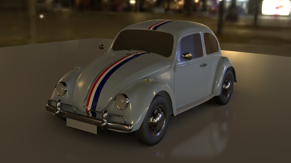
One thing I'm noticing is Eevee isn't doing transmissive materials.. Either that, or I'm doing it wrong.
![]() gradyp It can! You just need to enable some settings.
gradyp It can! You just need to enable some settings.
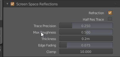
First of all, you should enable Screen Space Reflections and check the "Refraction"
The second - you should go to your materials tab and enable "Screen Space Refraction" checkbox. You can also set the approximate "glass" thickness here (refraction depth).
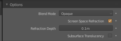
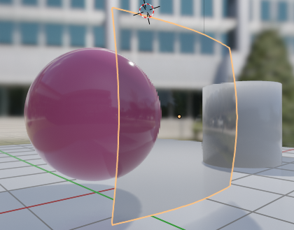
And then you can tweak your principled bsdf node transmission and IOR values to get what you want.
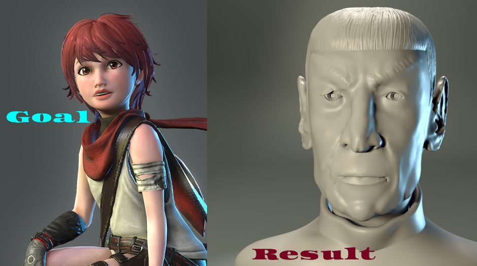 Not as happy with the matching aspect of this one, but I do like the result. I may keep looking for a better one to work from and/or trying to match this closer.