Well lets get ready for the class then, now to keep on wathcing videos and followingthe homeworks
Homework week 4
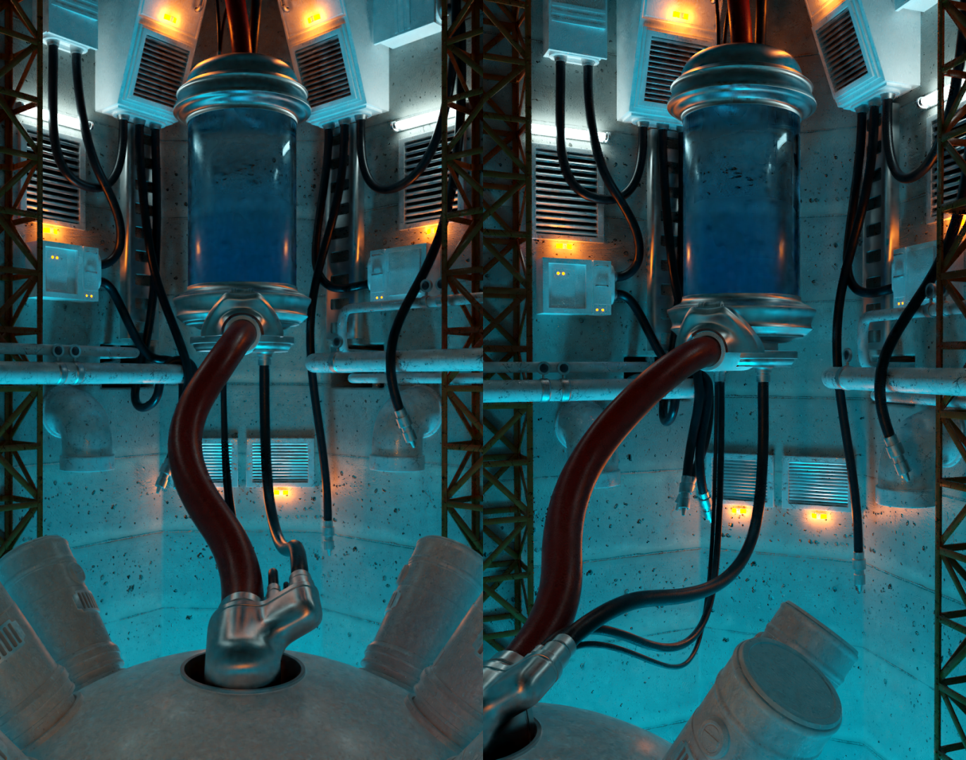
Ok I may have gone slighly off rail with this for the archvoz, but was a interesitng challenge, wonder how realistic does look to you, even tough the scene itself is not that gorunded in reality, based on FF7 jenova room in nibel, no light match this week already ran out of time with other stuff to do sadly
Homework week 3
Lighting a character
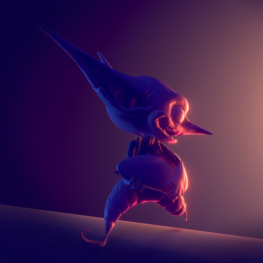
Well no time to explain hope in, tried to go for a dramatic lighting i nthis one, shaded the goblin using EEVEE and ended up using AO only in a few lights inatead of all of them
Match lighting
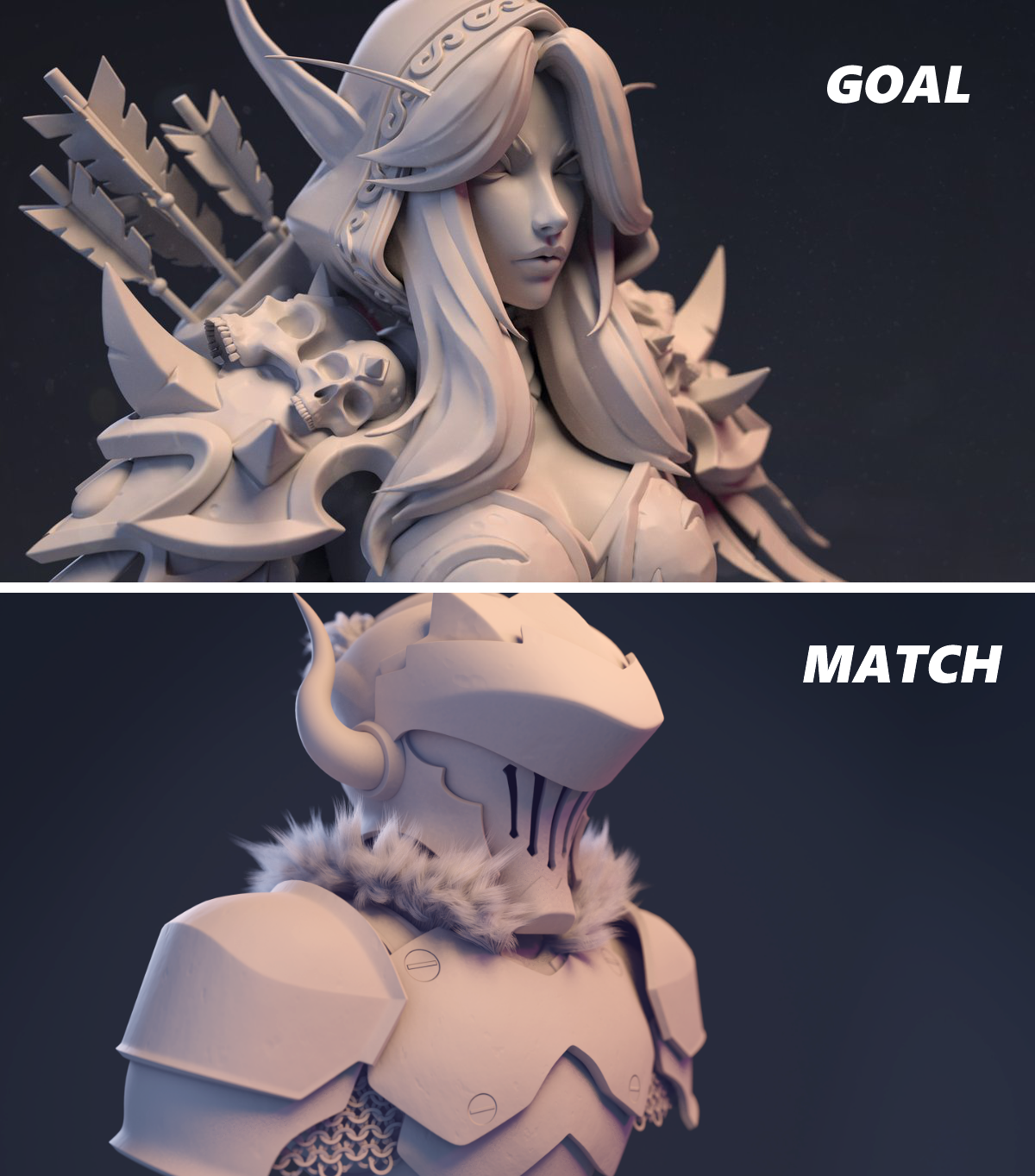
Tried to match the light of a bust from https://twitter.com/FemCharlesArt, not sure its 100% but tried to get close as possible
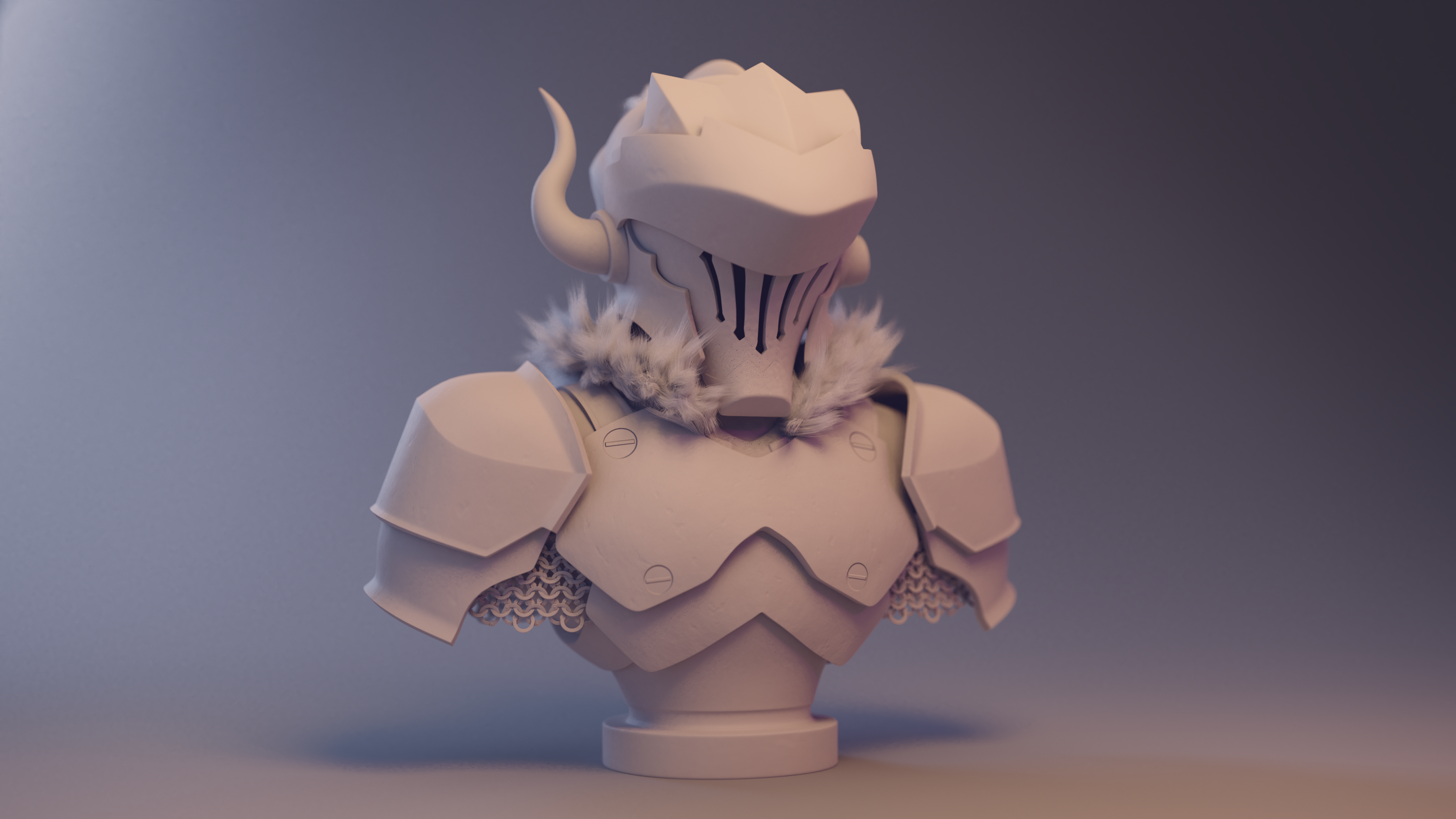
Also playing a bit with the depht of field there also did a second render with the same light but another camera view, both rendered on cycles, due to the fur
Homework Week 2
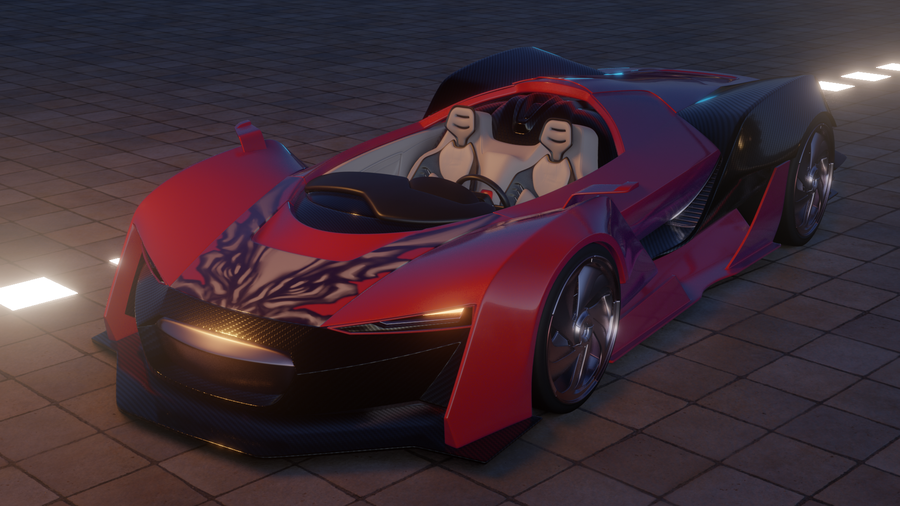
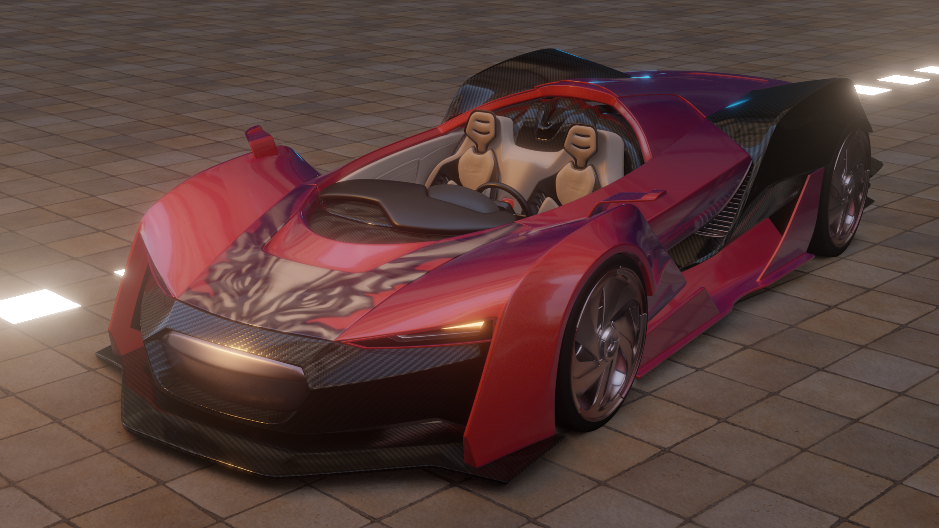
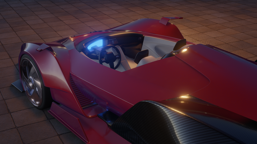
Light scene for a carand add materials to it using EEVEE
Was a fun excercise, got to try some stuff, and sadly EEVEE still fells a bit limited in someregards but the speed to work on it is sjut such a nice trade.
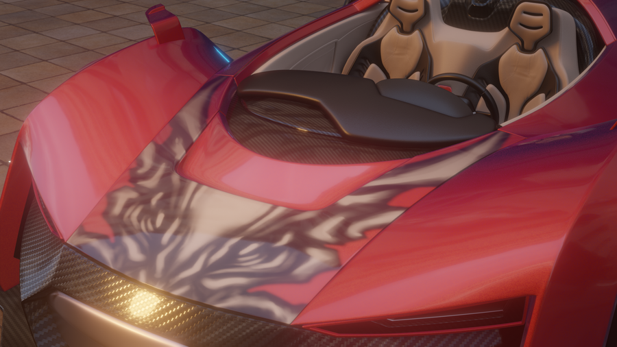
For the materials, I used substance designer to make the carbon fiber texture, on the hood I added a old drawing I made to the hood to make it more interesting
render using 2 different HDRMI
Match lighting
Ok a bit late but got the match lighting part done, sadly did not had time to sculpt more detail on the model, but still has some interesting shapes I think, used one of the examples of the class since I really liked this lighting.
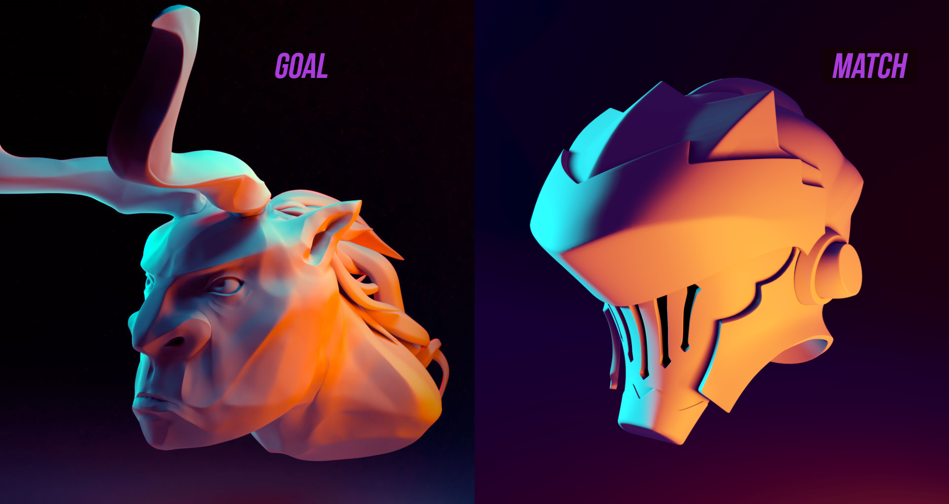
Render with EEVEE
Homework week 1:
Toy truck
https://cgcookie.com/exercise_submissions/16511
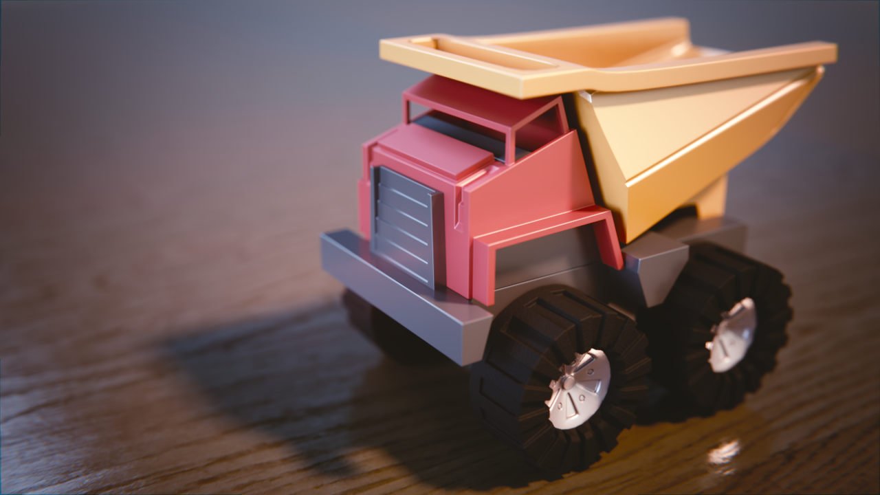
Avoided using thep rinciple shader to practice a bit with the more traditional nodes
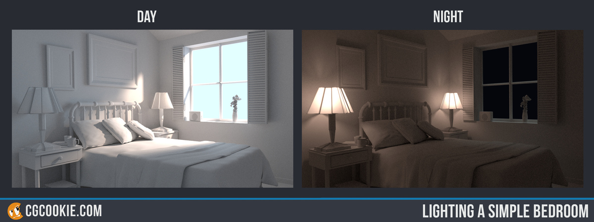
Lighting a room
https://cgcookie.com/exercise_submissions/16573
Extra
Since I had done this excercise before I tried to model a littlescene and try match the lighting to a reference photo.
Reference
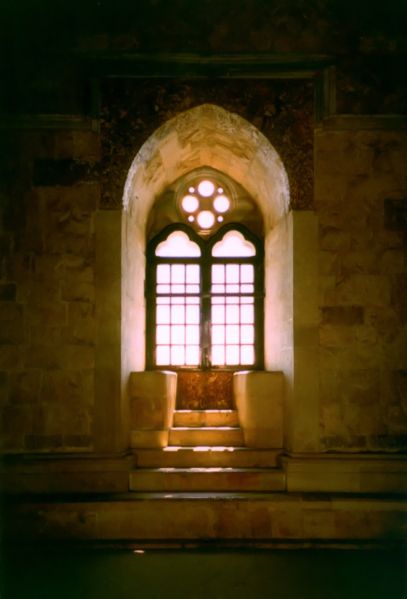
Render scene
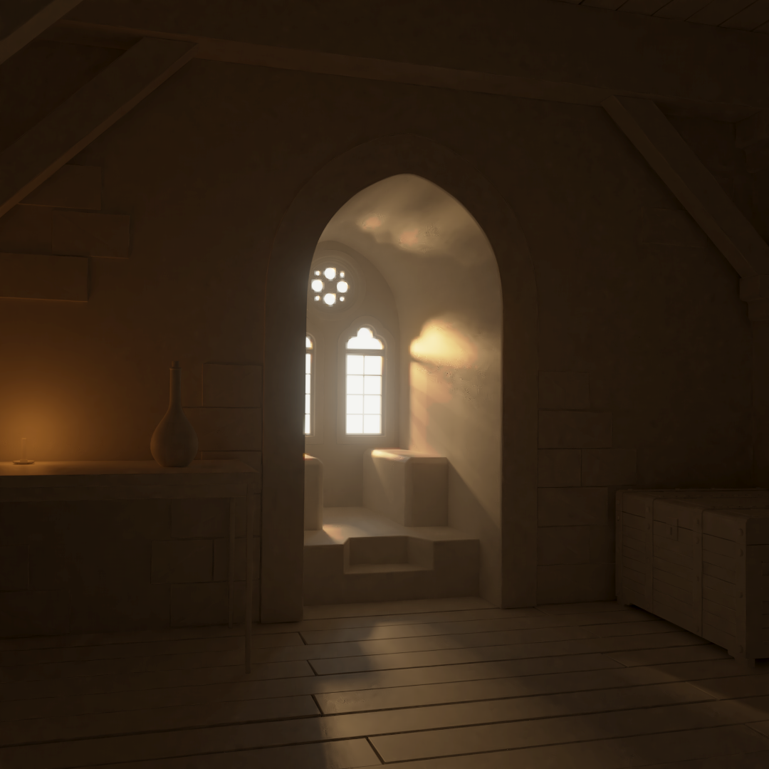
Tried to match the light the best I could and make the scene a bit more interesting adding some props and a candlelight, aimign for getting close to sunset, did some small composite for a slight vignette and add some glare on the window
Nice color choice on the truck 😊 Just out of curiosity, did you use fresnel? Since you're using the old shader method it doesn't do that automatically.
EDIT: asked this mostly because of the wheels they are very dark and don't seem to reflect much.
Truck looks good. Something funky with the wheels, though. They look like a different material, if that's what you were going for.
ssmurfmier1985 thanks, and yea, firsdt I made a mix of diffuse and glossy shader to control the base reflectivity of the material and then I used the fresnel node as a factor for a mix shader to add another glossy shader for the reflections of the fresnel.
all the materials o nthe truck are a variaiton of the roughnes and shader mix variation even the whells
as for the wells I wanted to make them more subber like, so made them less reflective and added a noise texture as a height/bump map, maybe should have made it a bit moresubtle there
![]() n647 ah that would explain why the wheels are darker. Good that you're experimenting though, that's the best way to learn! 😊
n647 ah that would explain why the wheels are darker. Good that you're experimenting though, that's the best way to learn! 😊
![]() n647 Liking your stuff so far, I have to agree with
n647 Liking your stuff so far, I have to agree with ![]() silentheart00 that the wheels do look a tad off, like there's not enough gloss? Though if you going for a rubber look I'd say it actually looks rather great, but it appears you seem to have discovered what you'd like to do so I wish you the best of luck!
silentheart00 that the wheels do look a tad off, like there's not enough gloss? Though if you going for a rubber look I'd say it actually looks rather great, but it appears you seem to have discovered what you'd like to do so I wish you the best of luck!
![]() n647 Ah, rubber wheels. Cool. They kind of do remind me of rubber, so you're headed in the right direction there.
n647 Ah, rubber wheels. Cool. They kind of do remind me of rubber, so you're headed in the right direction there.
Good submission ![]() n647! I like that you went for something different with the wheels. Rubber is a valid choice though I wish it was a touch more reflective. Certainly less both in value and roughness than the plastic but more than what it is currently.
n647! I like that you went for something different with the wheels. Rubber is a valid choice though I wish it was a touch more reflective. Certainly less both in value and roughness than the plastic but more than what it is currently.
@theluthier Thanks, I went and adjusted the wheels materials a little makign the noise more fine and increasing the reflectivity a bit for the image on the topic
ok started wiht the car homework, working with the lighting and the car paint material, instead of juat doing the car paint fade to black with facing I went for a hue shift from red to purple and a lower value. but not sure is showing properly in the render, also the sparkle effects maybe is a bit too small will see to adjust that
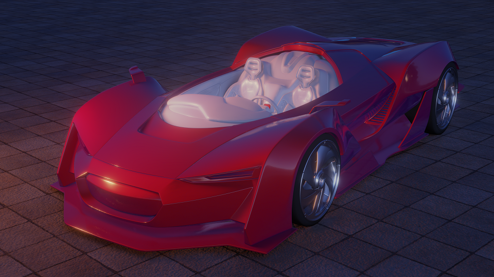
One thing I noted one piece betwen the engine hood and the dashboard has the mirror modifier not showing on render, I struggle to find what the problem was there.
Any ideas to improve the scene
Also working on a model for mathcing lights and maybe for week 3 if I can make it in time, just need to get done wiht some extra work came in my way at the worst time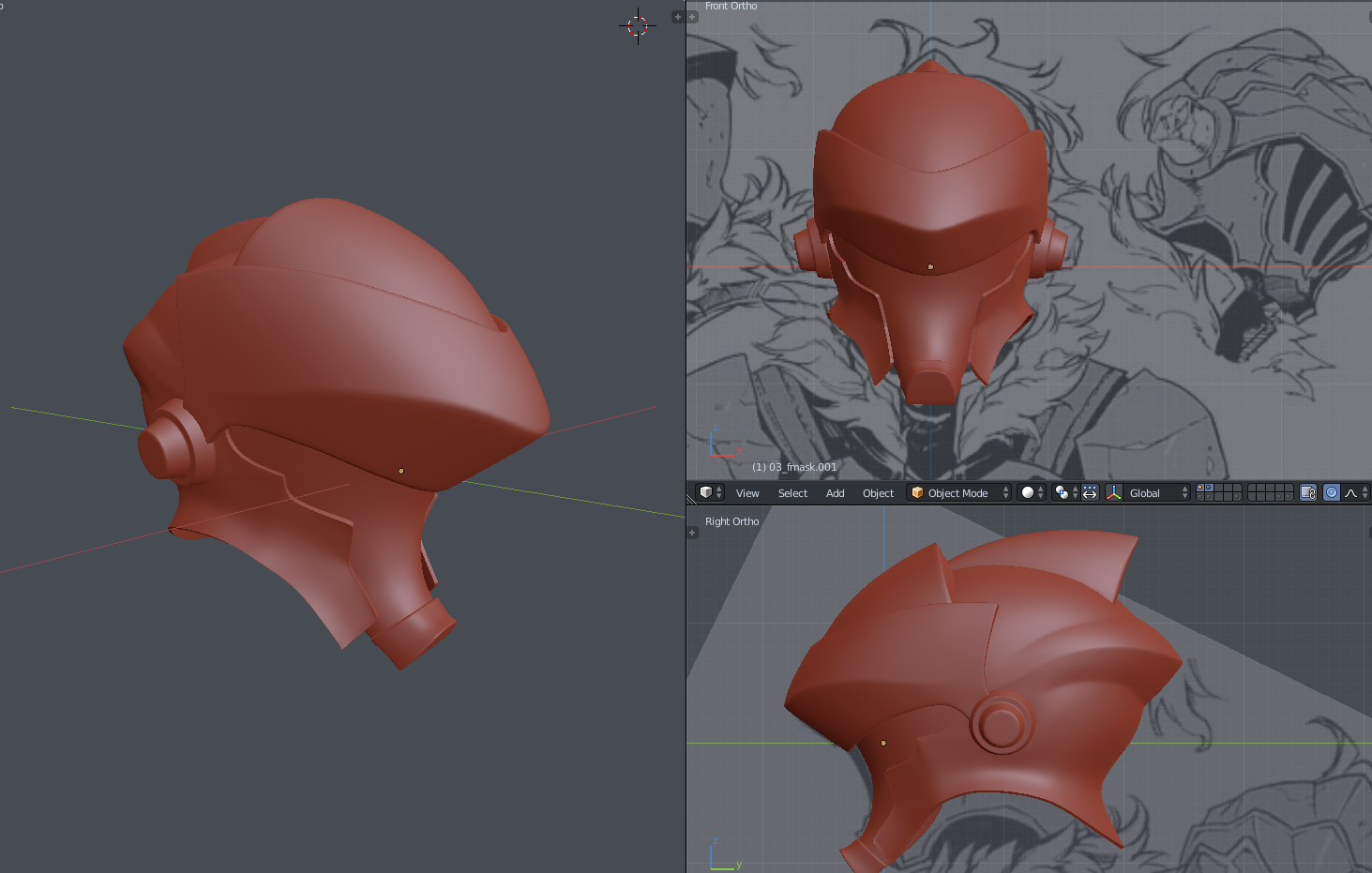
![]() n647 Woo Goblin Slayer, that is a lovely looking helmet so far.
n647 Woo Goblin Slayer, that is a lovely looking helmet so far.
I'm also liking your car so far, gives me the sudden urge to listen to synthwave. I thiiiink I can just make out the sparkle effect, but yeah, it's probably too small, so give that a try. Overall though, great!
![]() n647 I like the color choices for the car! Great start 😊 I think the bump on the floor is pretty strong though..
n647 I like the color choices for the car! Great start 😊 I think the bump on the floor is pretty strong though..
Nice start on your other model too!
![]() n647 The car looks great so far. Loving the hue shift. I agree the sparkles area maybe a touch too small, and the bump on the ground is a bit strong.
n647 The car looks great so far. Loving the hue shift. I agree the sparkles area maybe a touch too small, and the bump on the ground is a bit strong.
![]() thecabbagedetective ThanksI hope I can make it in time with the helmet and the rest of the character
thecabbagedetective ThanksI hope I can make it in time with the helmet and the rest of the character
I adjusted the bump map o nthe gorund and the sparkles a bit and added another materials
I ended using substance designer to make the carbon fiber texture, to make my life a bit easier, and added a small vignette
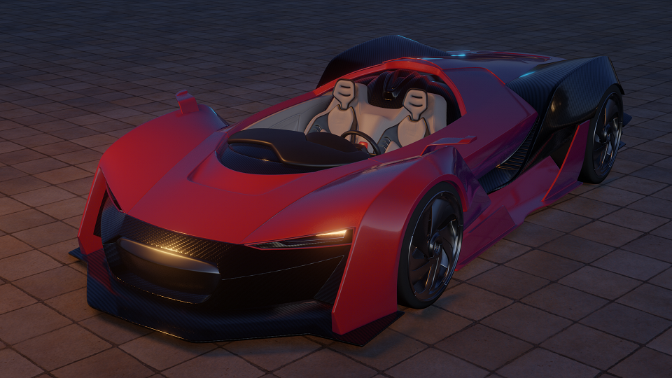
Will leave it at this for now see if I can work a few of the materials a bit more but at this distance for the render should do
![]() silentheart00 Thanks, I like the car paints that do that hue shift, and think I fixed those 2 details, now ... need to do some other work before workign on the helmet sadly
silentheart00 Thanks, I like the car paints that do that hue shift, and think I fixed those 2 details, now ... need to do some other work before workign on the helmet sadly
![]() n647 Look at that car! Love what you've done so far. I was hoping someone would go for carbon fiber. And I like the hue fade from red to purple. Thinking outside the box 👍
n647 Look at that car! Love what you've done so far. I was hoping someone would go for carbon fiber. And I like the hue fade from red to purple. Thinking outside the box 👍
My only critique at the moment is the AO is disappearing under the car too quickly. I recommend toying around with toying with those settings to see if you can make that less noticeable:
And I *love* the helmet. Such cool shapes going on. Great choice.