Here's my homework thread for October Live Class - Shading & Lightning in blender.
Have a great time everyone!


Homework - Week 2 - Part 1:
@theluthier:
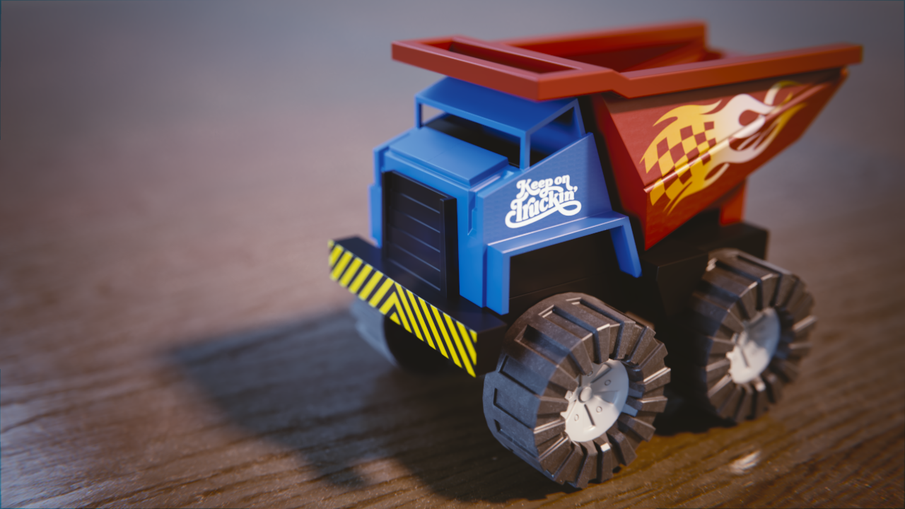
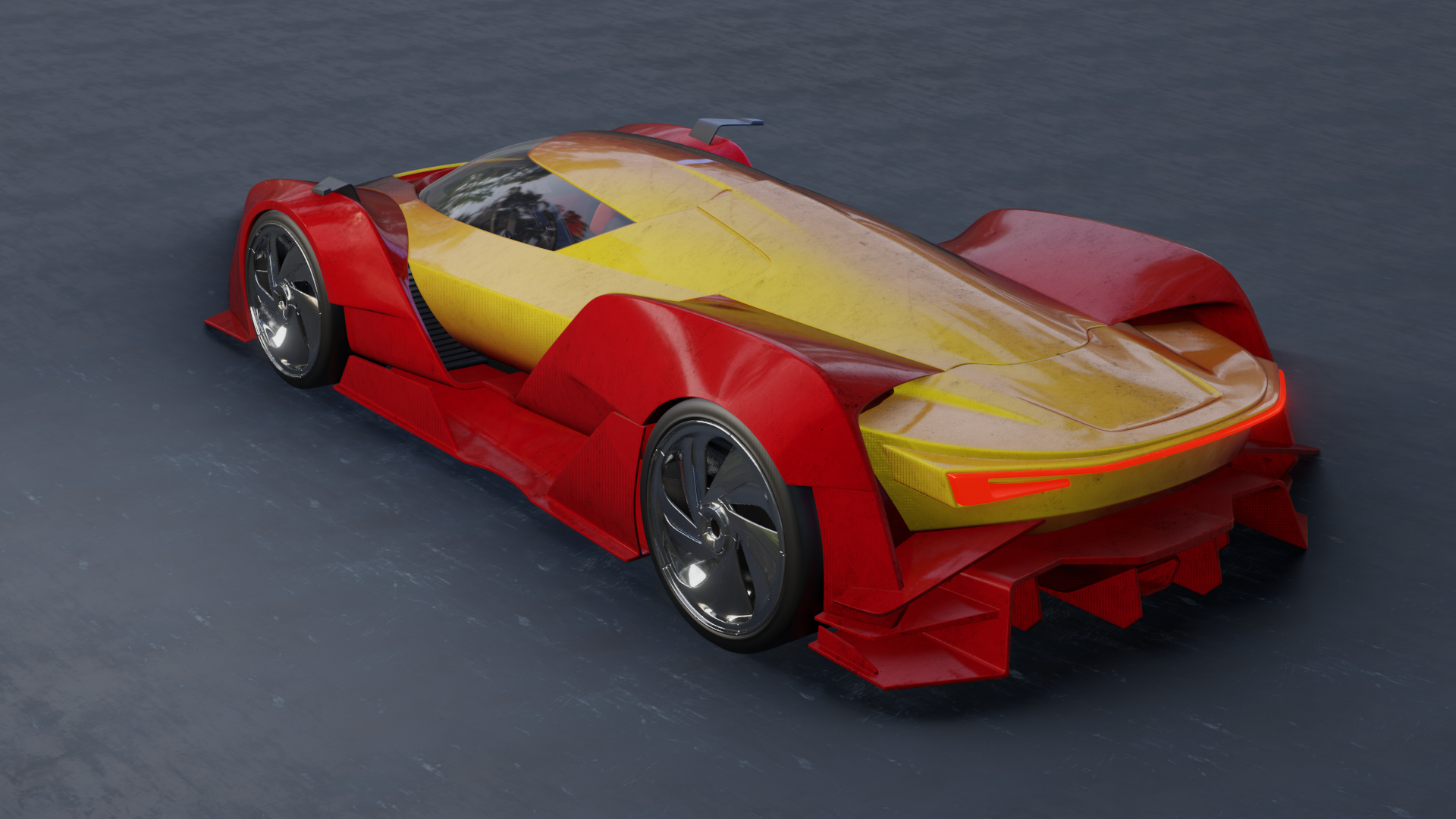
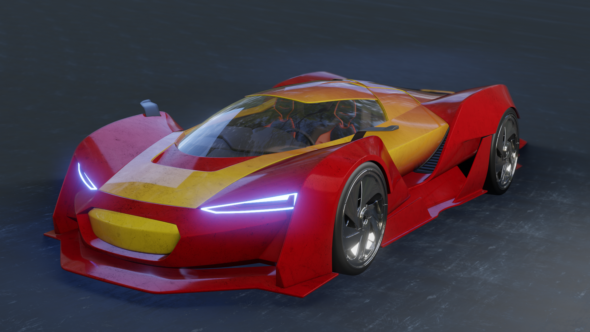
I almost gave up on the dirt texture, but after a full day of tweaking, I finally got a result I could live with. Here's the renders:


Any questions, remarks, tips & tricks, let me know.
-edit- I did a re render after a few remarks. A comparison is shown in my following post.
ccarrotnl Hey Bud, very impressive. I like the colour. Are some of the lights too strong. I feel a little too much firefly type artifacts. Would you mind posting the node layout for the windshield. I couldn't piece it together
Edit : I a second look, maybe it's the grim/reflection mix
ccarrotnl Looks great. Makes me want to do mine over again... I see sparkles983 is with me having trouble with the glass to come out like yours. I would would love to hear what you did there.
I'm not much on critique as I don't know enough to be useful, but I really like it. Having said that, the speckles are throwing me off a bit... just not sure what they are. If they are dirt, then the car looks too clean otherwise. If they are paint speckles, then I think they are too big.
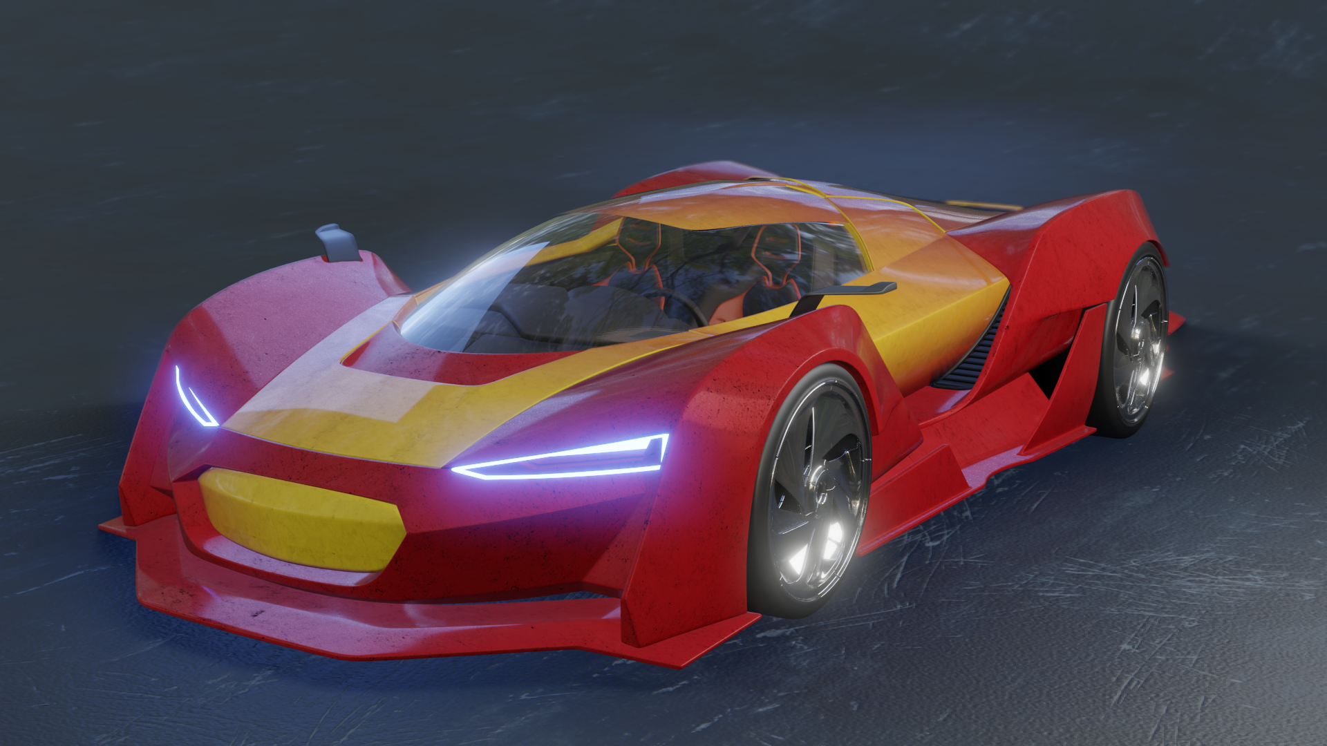
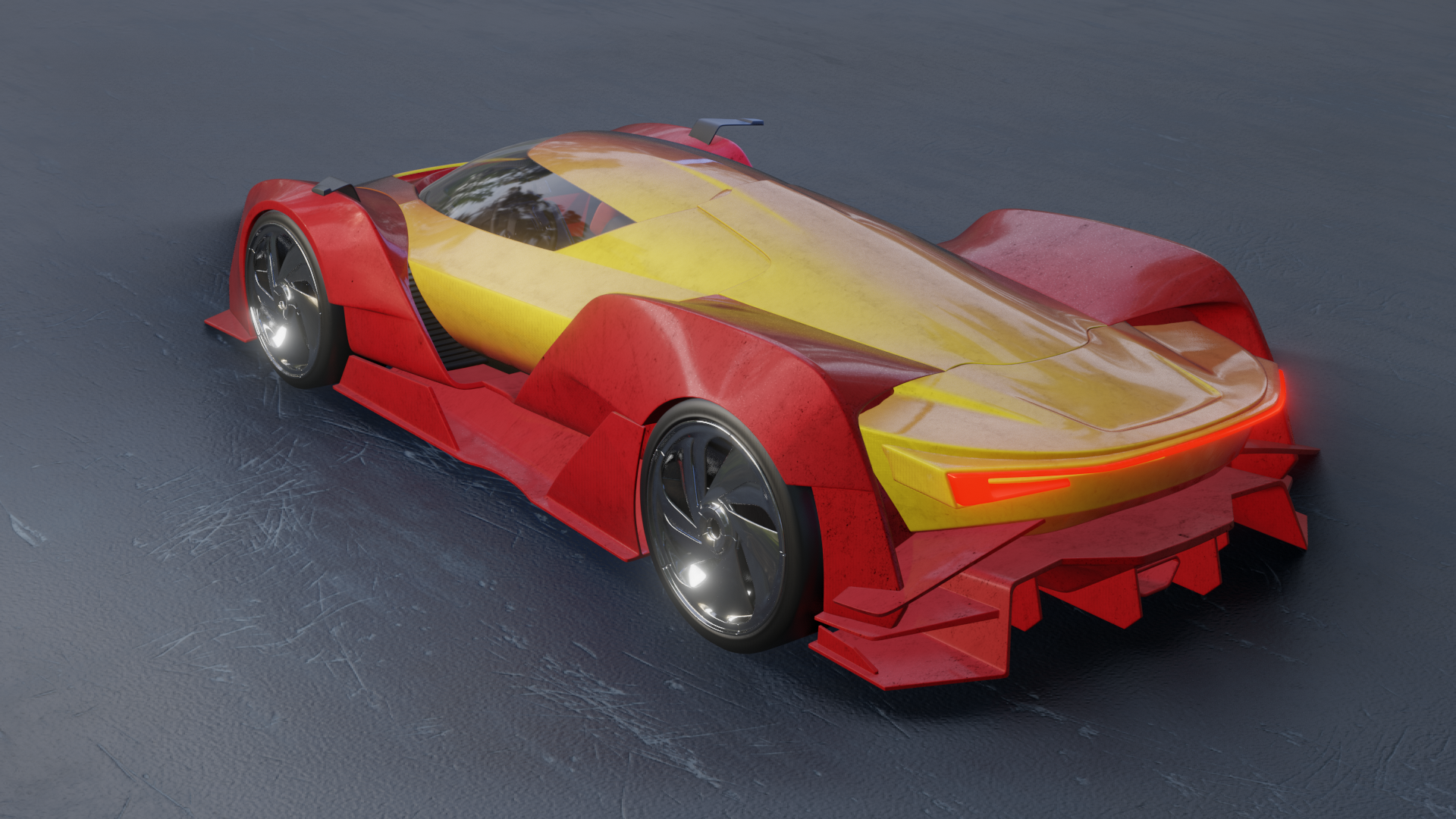
ddiggndeeper ssparkes983 Thank you for your remarks. I did a re-render this morning as I still wasn't content with it.
Here's a comparison:
 old
old
 new
new
 old
old
 new
new
The black specles are supposed to be bits of mud. I made a little bit big, otherwise the tiling of the texture is far to obvious.
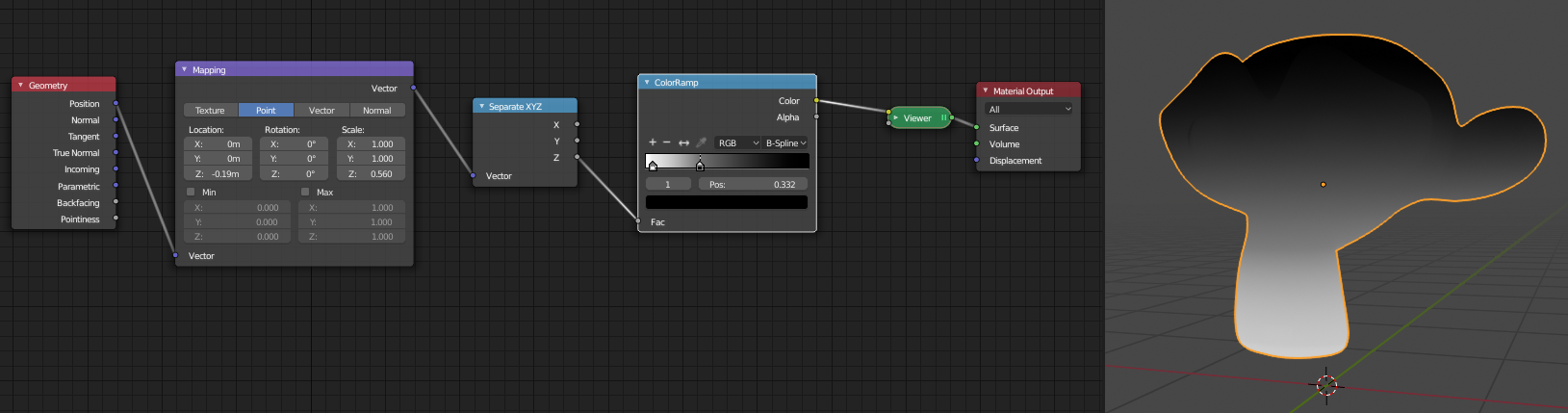
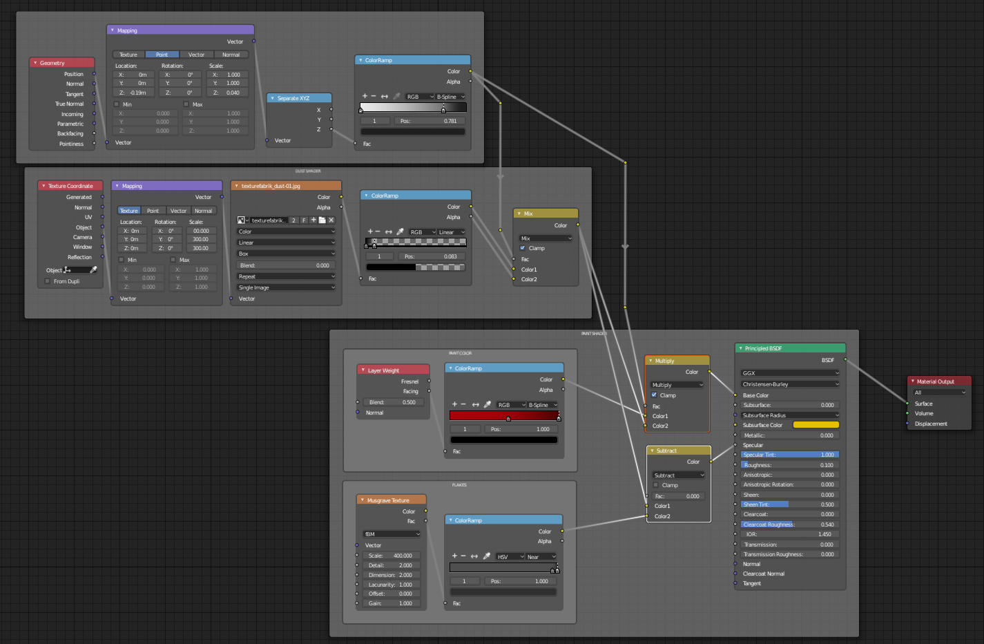
Here's the node setup for the windshield:
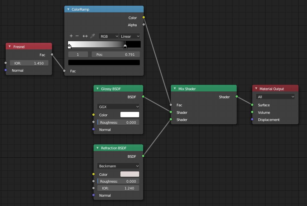 node setup for glass windshield
The glass is also dependent on the lightning, so here's the camera and lighting setup. (I used the forrest.exr that comes with blender for the hdri setup):
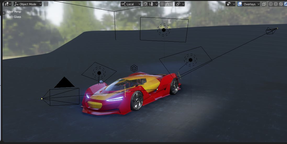 cams & lightning setup
ccarrotnl That's great! I appreciate that. Did you intend to leave the IOR values different for the Fresnel and Refraction?
I think your new render looks much improved and I like you old one in the first place. Nice work.
Did you intend to leave the IOR values different for the Fresnel and Refraction?
Well, you know, I completely missed that! I played with it a bit. When I set the Fresnel nodes both to 1.240 (the standard) the glass get a bit to clear for my tast in the middle, so a decided to leave the top one just the way it was, with just a bit more reflection all over the glass. 😊
![]()
ccarrotnl Hey Bud, The Grime in the new render looks super cool. Great job. Thanks for posting the windshield nodes, much appreciated.Just had to change the blend mode to additive to take effect
Homework - Week 2 - Part 2:
@theluthier:
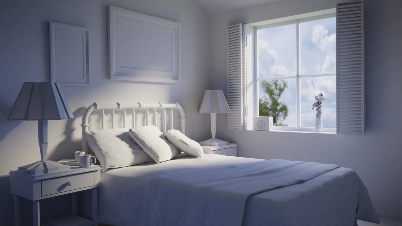
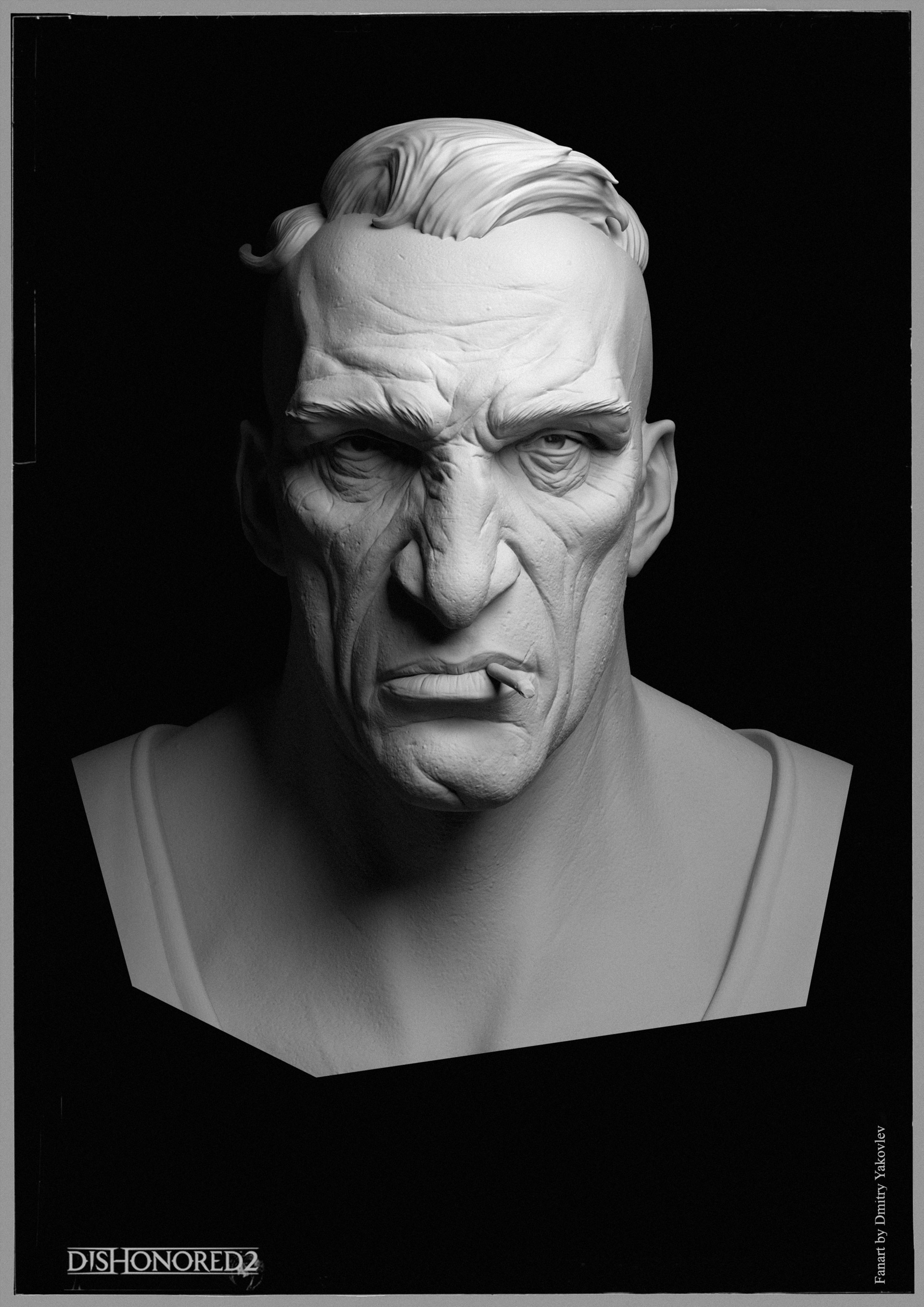
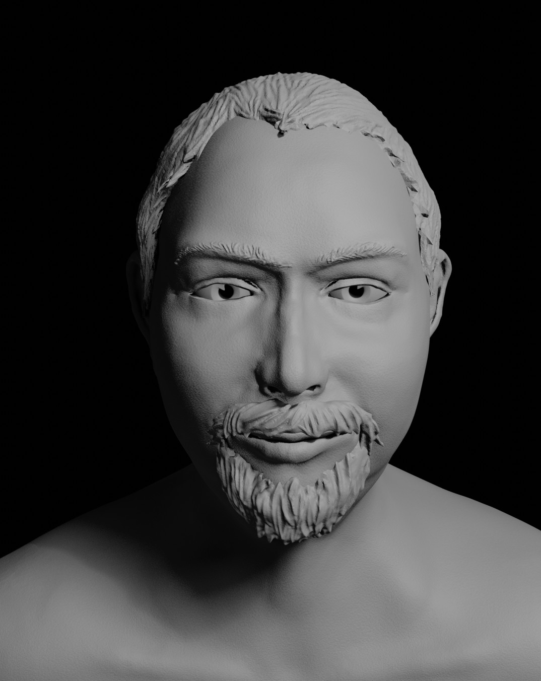
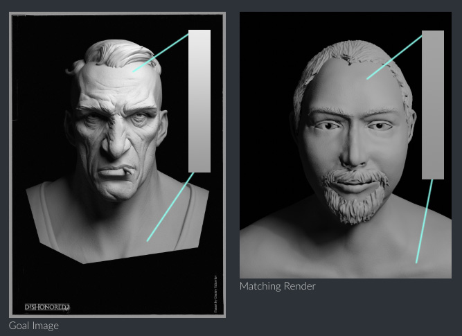
And here's the Lightning Match exercise #1. Here's as close as could get it. My goal image has a lot of pores and creases, and mine has not. So every time I wanted to make the image brighter, like the goal image, mine would turn out to flat, so I had to dim it down a little.
The goal image I got from ArtStation and is from Dmitry Matt Yakovlev. The model I used is the head sculpt I did for the last beginners live class.
Here it is. All remarks or critiques are welcome.
 Goal Image
 Matching Render
ccarrotnl For some reason I get a space theme feeling out of the sports car and wouldn't say that is a bad thing. The reflections and the colors of the lights do look nice
ccarrotnl The lighting match is matching but my eye doesn't catch any blue color in the reference. There is just a hint of it on temple of your bust. At least on my screen, it can be different on yours of course.
I totally agree with the difficulties if there are more details in the reference. Makes it so much harder to figure out the lighting.
ccarrotnl That dirt reads excellently, it makes me want to find a bucket and a sponge. :)
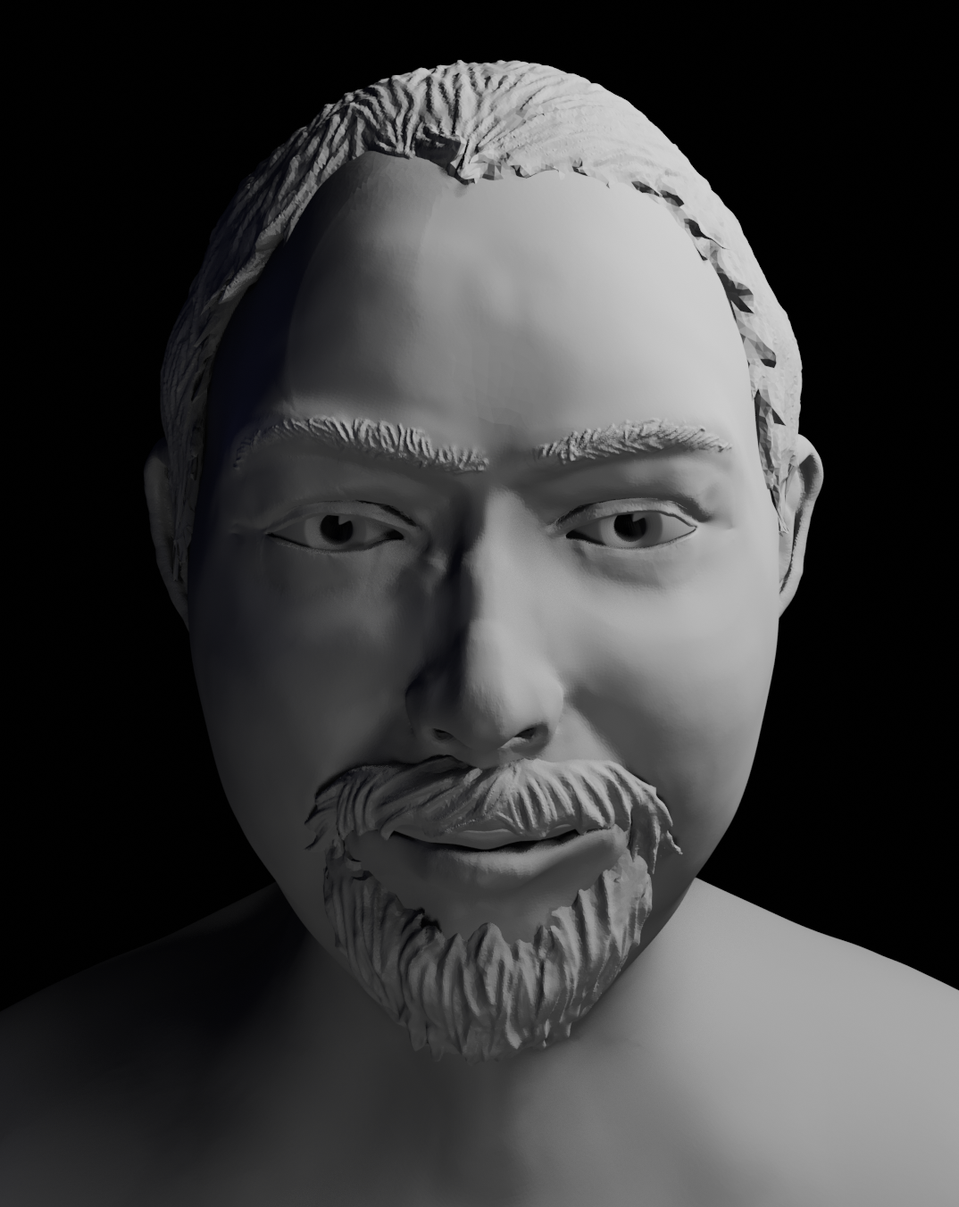
I re-rendered the head. Maybe this one is a little bit better:
 old
old
 new
new
Really nice work this week ccarrotnl. Love the mud / grime layer you added to the car shader and the headlights! I too like the iron-man-esque color scheme. Very cool to see your progression. A couple things knock the render down a bit though:
Overall it's still very good work: A B+ from me.
As for the light match I only have one note. You've done a good job with light position and overall aesthetic of the source image. But the light intensity gradient is stronger with the source:
This one is a B+ also. Nice job this week, Wilco 👍
ccarrotnl Wilco och I am still at Week1 because just have seen your sticker mini tutorial now, thanks a lot for the sharing
@theluthier Sorry for the late reply. Thanks for the remarks. I've been playing around with it this morning, but I didn't have enough time to finish, but here's what I have so far. I guess it's to late for the grading, but I'm here to learn first of all.
I always have much trouble with overlaying textures. I can't figure out how to layer the black and white dust layer (without transparency) over the paint layer correctly. As you see the specular pass goes much further then the actual color if the dust map. Could you have a look at my node setup? I have a feeling that I'm making it to complex.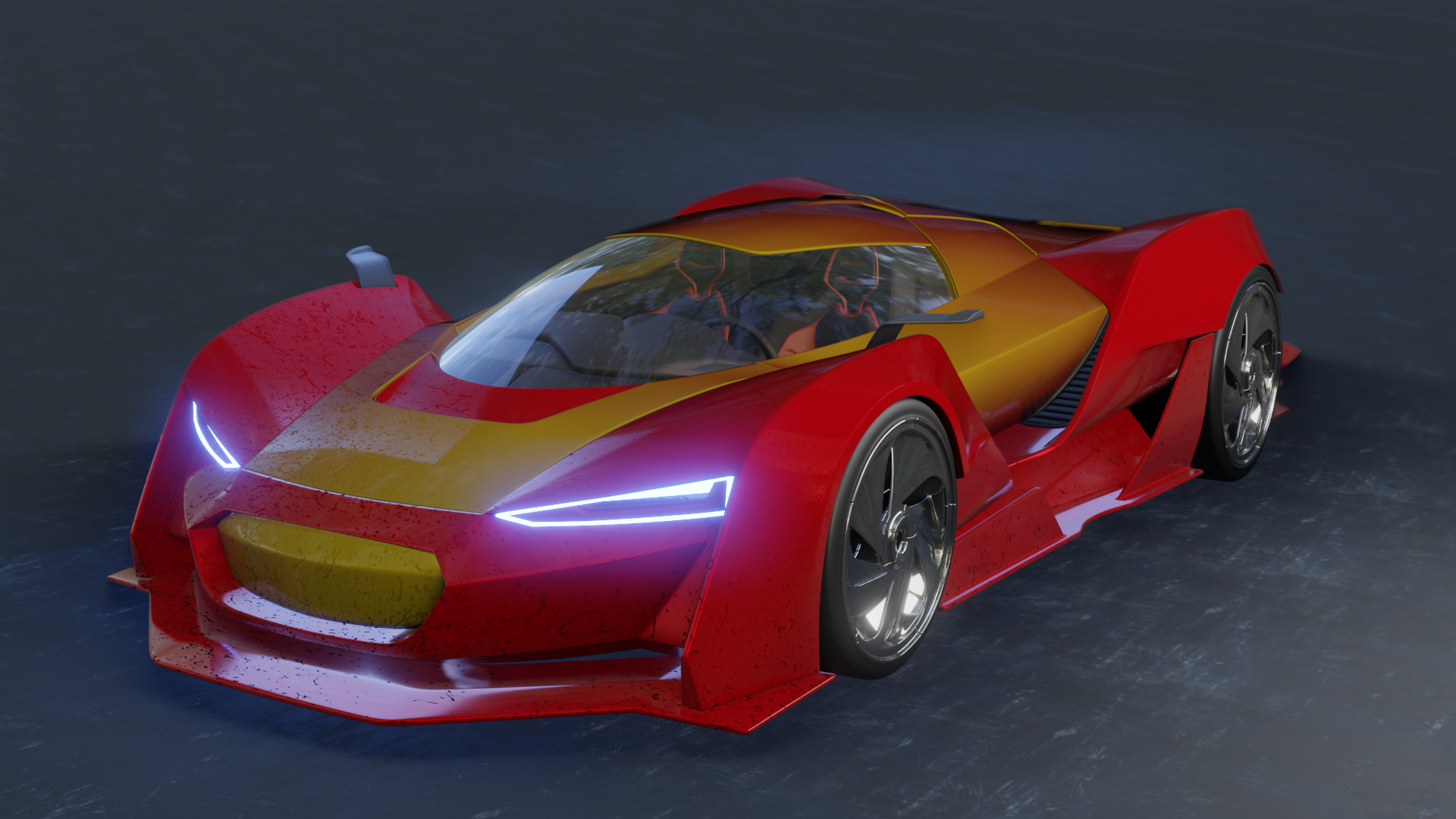
sorry, I'm out of time. I hope you can work with this. :) See you this evening.
ccarrotnl Already it looks better to limit the mud layer toward the bottom of the vehicle! Nice job. As for the dust layer, I would use the black and white output of that texture as a mix factor for your car paint shader and a separate dust material.
So I would add another pricinpled bsdf (or simply diffuse bsdf), make it a medium-dark brownish-grey color (dust) no reflectivity. Then add a mix shader node, plugging in your dust bsdf and your car paint bsdf. Then use that black and white dusk texture as a factor to blend the two bsdf's together.
Does that make sense?