Here's my homework thread for October Live Class - Shading & Lightning in blender.
Have a great time everyone!
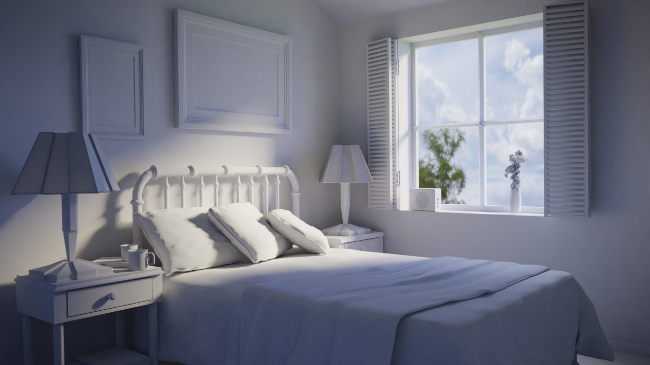
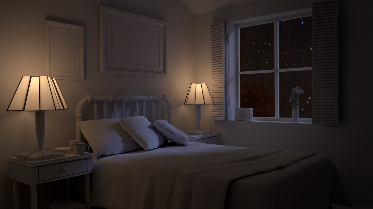
ccarrotnl Very nice day scene. I love the orange lighting and the blue shadows. Lovely. The night scene is nice, too. Great reversal of the colors. The right side of the image is getting maybe a touch dark, but that's a small thing.
ssmurfmier1985 Thank you! It does speed thing up indeed 😉
![]() silentheart00 I see get what you meen with the right being a bit darker. But I don't know yet if I'm gonna change it, as it is a bit intentional. With the right being a bit darker the eye is being directed to the left, where the accent's are.
silentheart00 I see get what you meen with the right being a bit darker. But I don't know yet if I'm gonna change it, as it is a bit intentional. With the right being a bit darker the eye is being directed to the left, where the accent's are.
Also I have 4 screens in my setup. I noticed on 1 screen it was really to dark, but the rest was fine (to my taste), so that can play a role to. Maybe some other could give there opinion if it is to dark or not? But thanks for the input. Critiques are welcome, keep em coming! 😃
ccarrotnl Kudos for updating your previous exercises! I really like the additional blue tones of the daytime shadows. The warm-vs-cool contrast in the nighttime scene is quite appealing. Nice work 👏
ccarrotnl It looks dark to me on my good monitor, but if that was your intention, then no prob.
Homework - Week 1 - Part 3 (extra):
@theluthier:
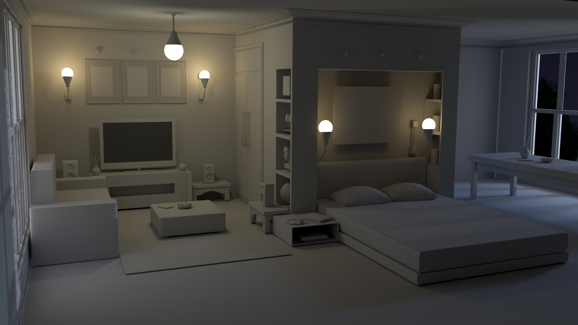
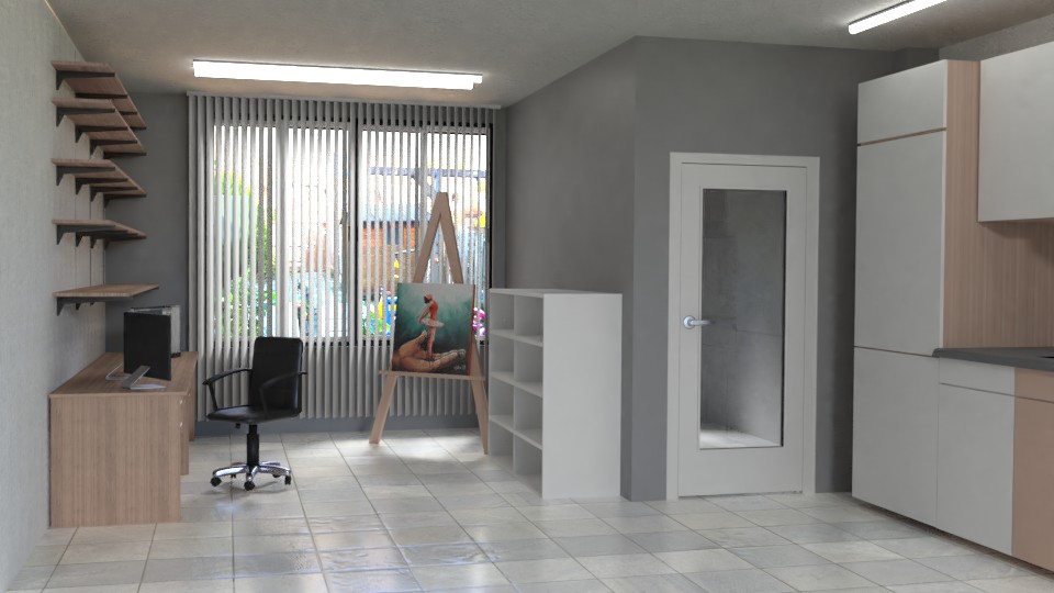
I wanted to practice some more lightning. I downloaded the 'Bachelor's Quarters' living room/bedroom scene from Blend Swap (from user 'Rendars'. I deleted all materials in blender and gave all objects a new uniform clay material. I added a few extra materials later on (like the tv-screen, and the picture frames for example) so the render wouldn't look so flat. I also made a simple table, because it looked so empty in the back.
I added a HDRI, an area light for the moonlight in the back, and I gave all the lamps a Emit Shader. I tried to do some Ambient Occlusion, but I cant really get the hang of that. I just don't get completely how it works, even though I watched some tutorials about it.
Then in tried to composite the image to give it some more contrast, and again tried to do a AO pass to get the creases a little bit darker.
This was one of the more heavy scene's I had to render until now. It took my computer round about 20 minutes at 2000 samples. Halfway the project I switched to 2.8, because it handled the scene a bit better (despite a few crashes here and there).
Here's the result:

Let me know what you think of it. All critiques (about the lightning) are welcome. If I have time I will pointed out problems. :)
Here are the blend files of the final render and te composite.
ccarrotnl Nice work. I like the warmer left side going towards the cooler right side. The corner on the right side is leaking some light, but other than that, there's not much for me to critique. Good work.
Hey very cool to see an extra submission, Wilco. I too like the contrast of warm to cool light. To me this reads like a believable light setup but could use some more appeal. This isn't specifically lighting or shading, but the camera placement is kinda awkward right now. It feels higher than eye-level but not quite to the corner of the room (as if it were a security camera placement) - in other words it's not a natural perspective for humans to perceive a room like this.
I'd try to lower the camera to at least eye-level if not lower for dramatic effect.
![]() silentheart00 Thanks for pointing that out. Strange I missed that. I addressed it immediately.
silentheart00 Thanks for pointing that out. Strange I missed that. I addressed it immediately.
@theluthier Thanks for your remark.
I think the scale of the scene isn't quite right (it's a bit high), so I couldn't just enter a good hight. I hope this is better than it was. It's not a big change, but I didn't want to go to low.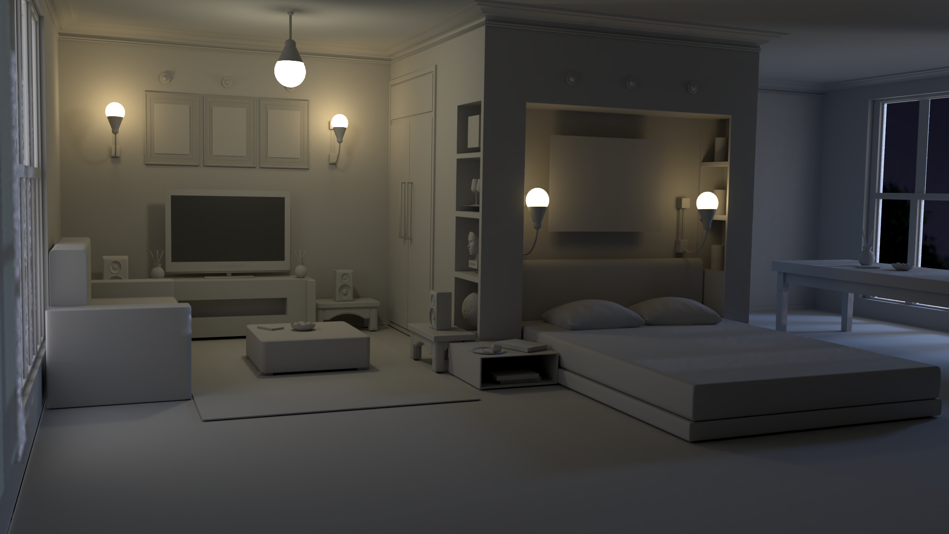
ccarrotnl hello I like to say you did a great job. Really cool. Truck and nice lightning. At first I didn't see anything wrong with the extra lightning room but after I readed Kent's notice I do indeed agree with the camera angle. But you really did a great job here :)
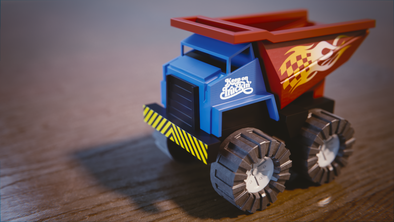
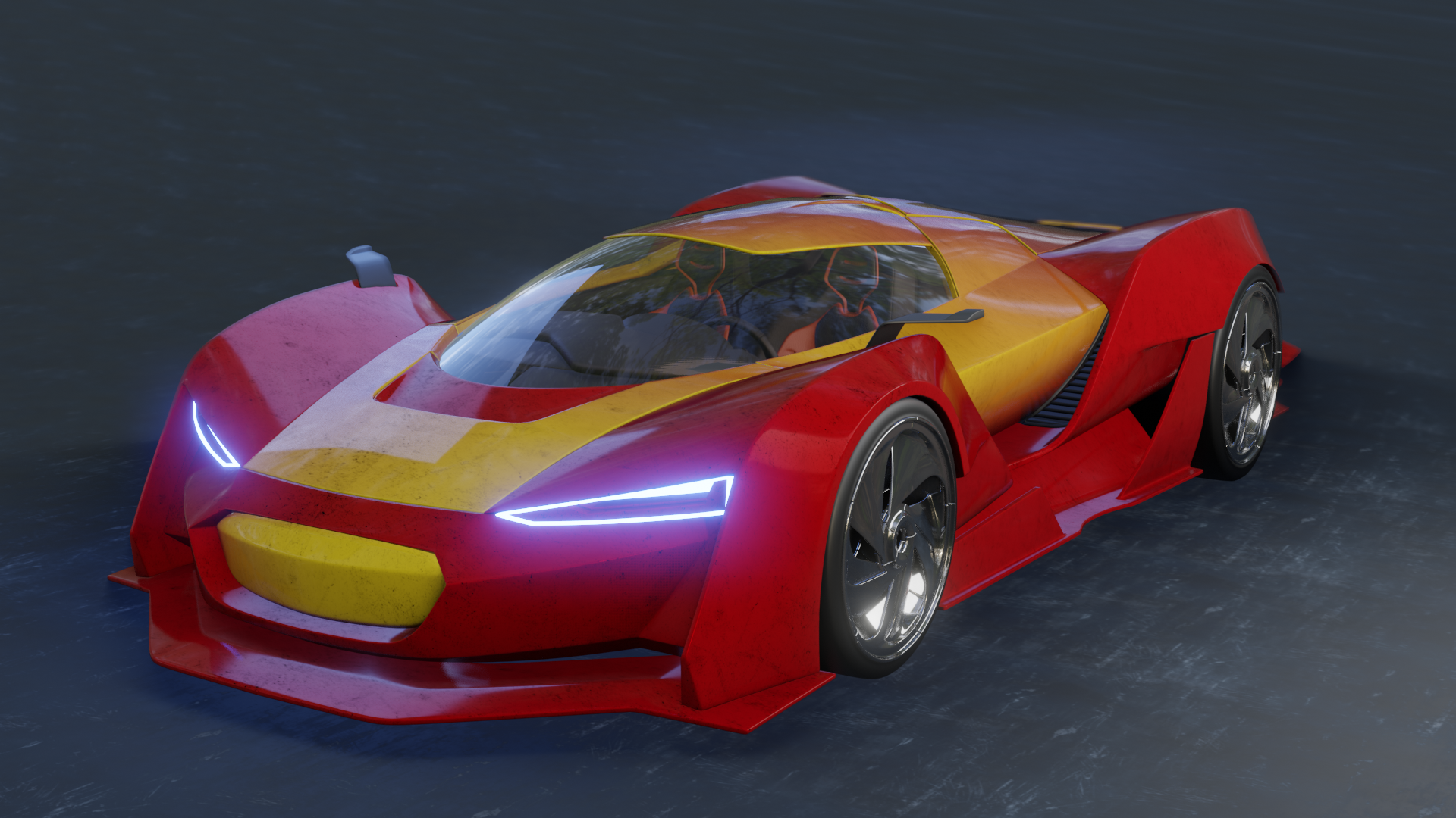
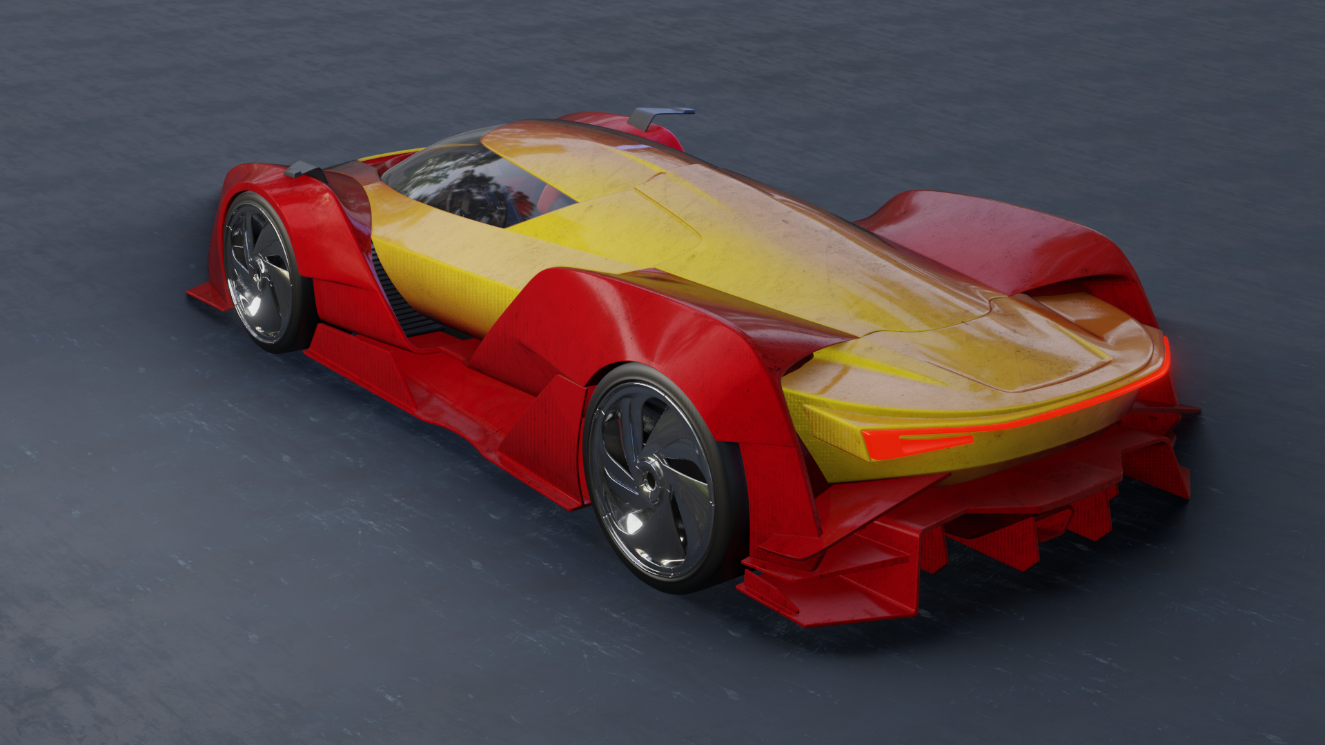
Work in progress -1:
Here's my progress so far. Don't look at the floor, as I think it's gonna change completely. Any tips, tricks, remarks, critiques, questions?
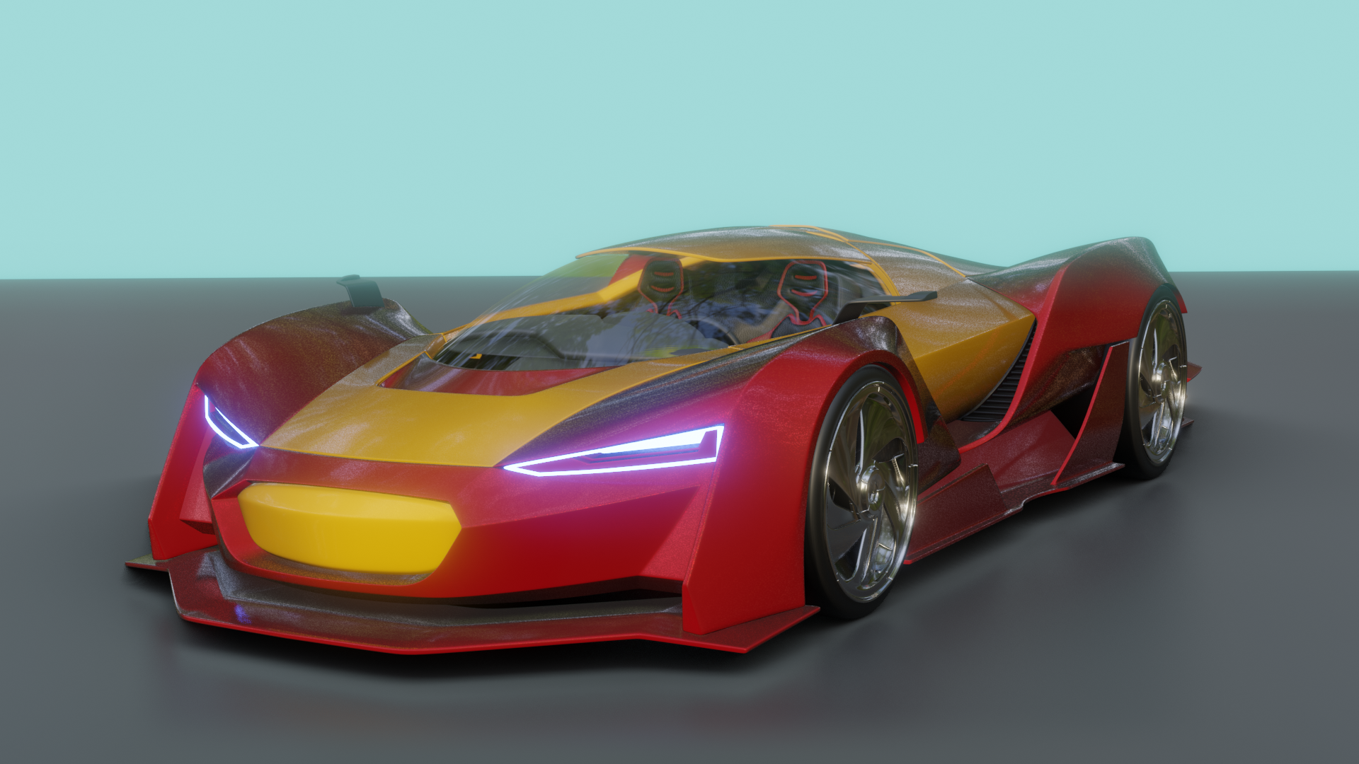
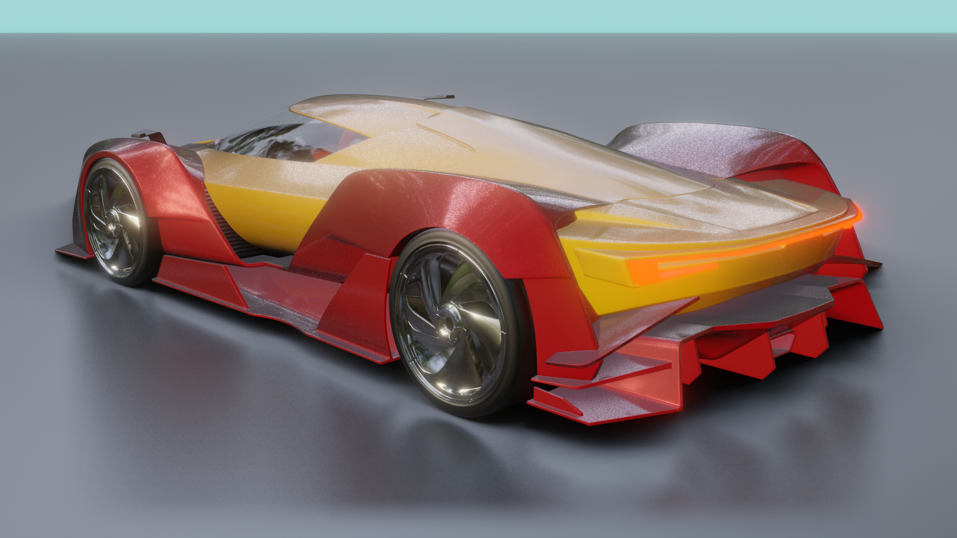
@theluthier QUESTION: I get these white, grayish reflections on the floor and part of the car for reasons unknown to me. Can you or anybody tell me why they don't reflect the correct color?
ccarrotnl Oh cool!!! Looks like Iron Man 😄
Love the front light! The rear light doesn't stand out much from the car, so maybe you can tweak that? Also the speckles in your paint are very noticeable, they could be a bit more subtle I think.
Did you use a reflection plane light probe on the floor? That should help with getting the right reflections and colors in your render.
Great work so far Wilco! 😬👍🏻
ssmurfmier1985 Thank you! 😃 I'll have a look at it after work. I'll have to take a look at those light probes. I've been putting them off. I don't know if that will help against the strange reflections on the car itself though.
ccarrotnl yes in my experience that helps tremendously! Add Irradiance light probe and reflection cube light probe (scale till the inner part of it fits nicely around the car) and reflection plane on floor -> then bake the indirect light in the render tab. Also make sure AO and SSR is turned on, and 'cast shadows' is ticked on in the lamp properties. I found that a little bit of volumetrics also helped a lot (works super fast in eevee even on my not too best laptop). And bloom will help with the front and rear lights. Lots of settings to play with, I had a lot of fun with them! 😄
ssmurfmier1985 Lucky you! Well I'm home now to. So I can got at it now... if the kids let me work.😉 It'll be a couple of hours before I can really get going.