Oh right....guess I need one of these!
Homework follows.
WEEK 1:
WEEK 2:
WEEK 3:
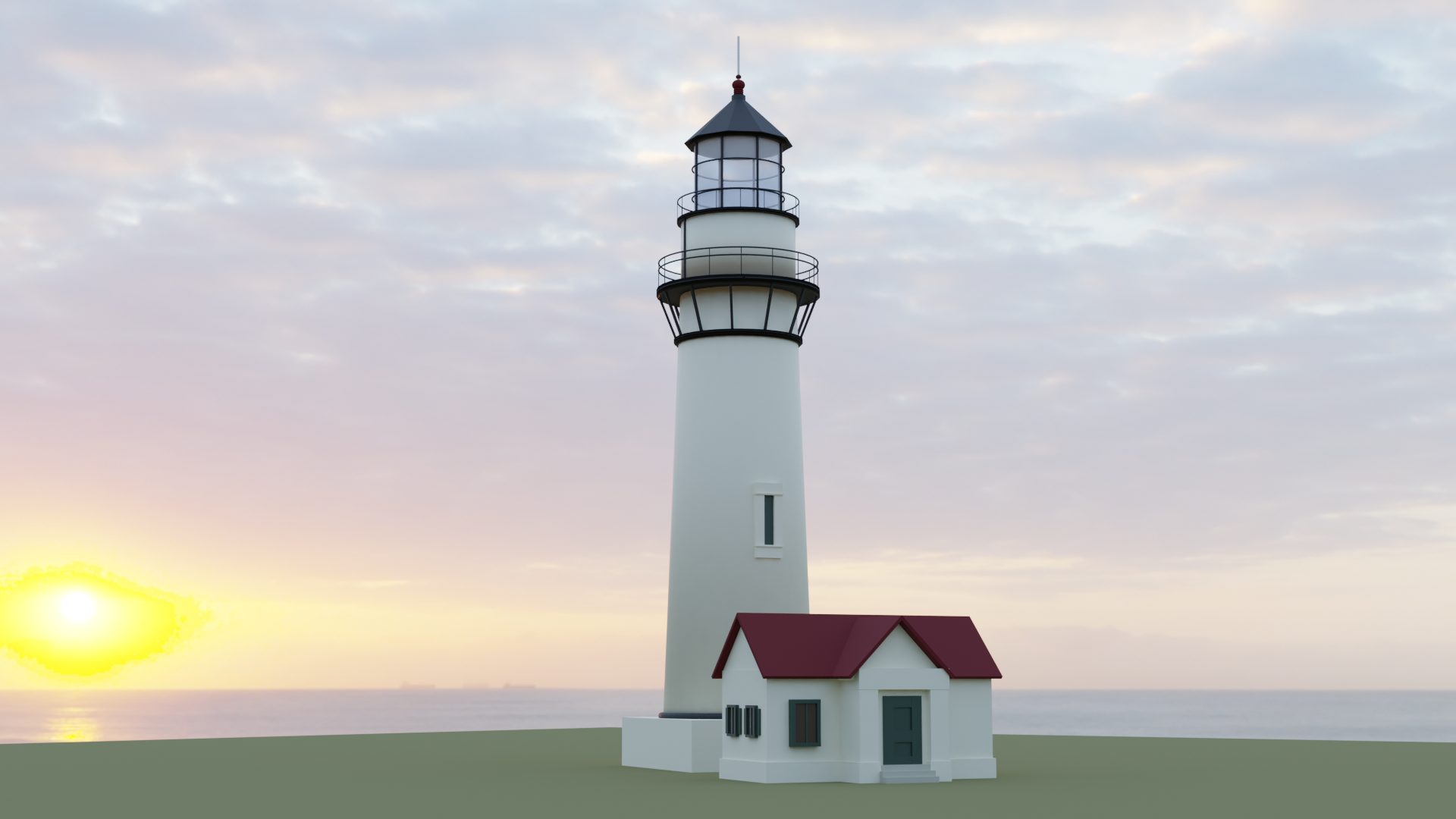
First week's homework. I kind of wish I had been keeping tabs on everyone's submissions - some of you guys went all out, it's pretty amazing! I went with something kind of simple and understated, as I didn't want to get too crazy or complex for the new folks; but if I'd known what some of you guys had done I probably would've done something a little more showy and complicated, ha - this seems a little underwhelming now.
I created this scene in EEVEE, but rendered in in Cycles, as the Cycles lighting showed off my (simple) details a bit better, considering the glancing primary light source.

Here is (I hope!) a link to my shared OneDrive folder with the blend file in it, along with a full size render. The blend file won't have the HDRi packed - it's just the mesh. That HDRi is like 100MB!
![]() jakeblended I think this looks amazing, you call it simple but I see lots of great details, especially on the top side of the lighthouse :)
jakeblended I think this looks amazing, you call it simple but I see lots of great details, especially on the top side of the lighthouse :)
![]() jakeblended I love the atmosphere. And the railing on the lighthouse. Hard to believe that it was made only with primitives. :-)
jakeblended I love the atmosphere. And the railing on the lighthouse. Hard to believe that it was made only with primitives. :-)
Jake... my goodness. As I panned down the pic, my eye of course caught the top of the lighthouse and I thought "Whoa... where are the primitives?" That's how realistic it looked. Obviuosly the shading and texture of the windows does that - for me anyway. Awesome. Definitely captured the atmoshpere.
I think you achieved what you wanted well! Yes, it's simple, but has enough detail to keep my eye wandering. Good work!
Thanks everyone!
This is one case where the HDRi seems to do more of a job than just provide light and a pretty background. If you look far in the distance, there's actually a few ships on the horizon. I think it actually adds to the scene very well, if only by coincidence!
No booleans in this one by the way. Can't wait til we're able to use edit mode, ha.
this is really Nice done. simpel can be good too :) this scene really is beautifull love the building . dont know how its called . also Nice work on the sea sunrise/sunset and lightning
![]() jakeblended While I agree that your lighthouse appears simplistic at first glance, it didn't take long before I was thinking, "woah check out that hand rail..and the glass top, the spire, the window in the tower, the trim around the house.." Not so simplistic after all.
jakeblended While I agree that your lighthouse appears simplistic at first glance, it didn't take long before I was thinking, "woah check out that hand rail..and the glass top, the spire, the window in the tower, the trim around the house.." Not so simplistic after all.
Great job, Jake. A+ from me.
yyukinoh1989 Thank you!
It is known as a "lighthouse". The specific lighthouse I used for inspiration was the lighthouse at Pigeon Point in California.
Kinda falling behind on this one over the week; but I think I will be able to pick it up and finish during the weekend. It will be shaded, but it may not be textured....I think we're not supposed to be using textures anyway?
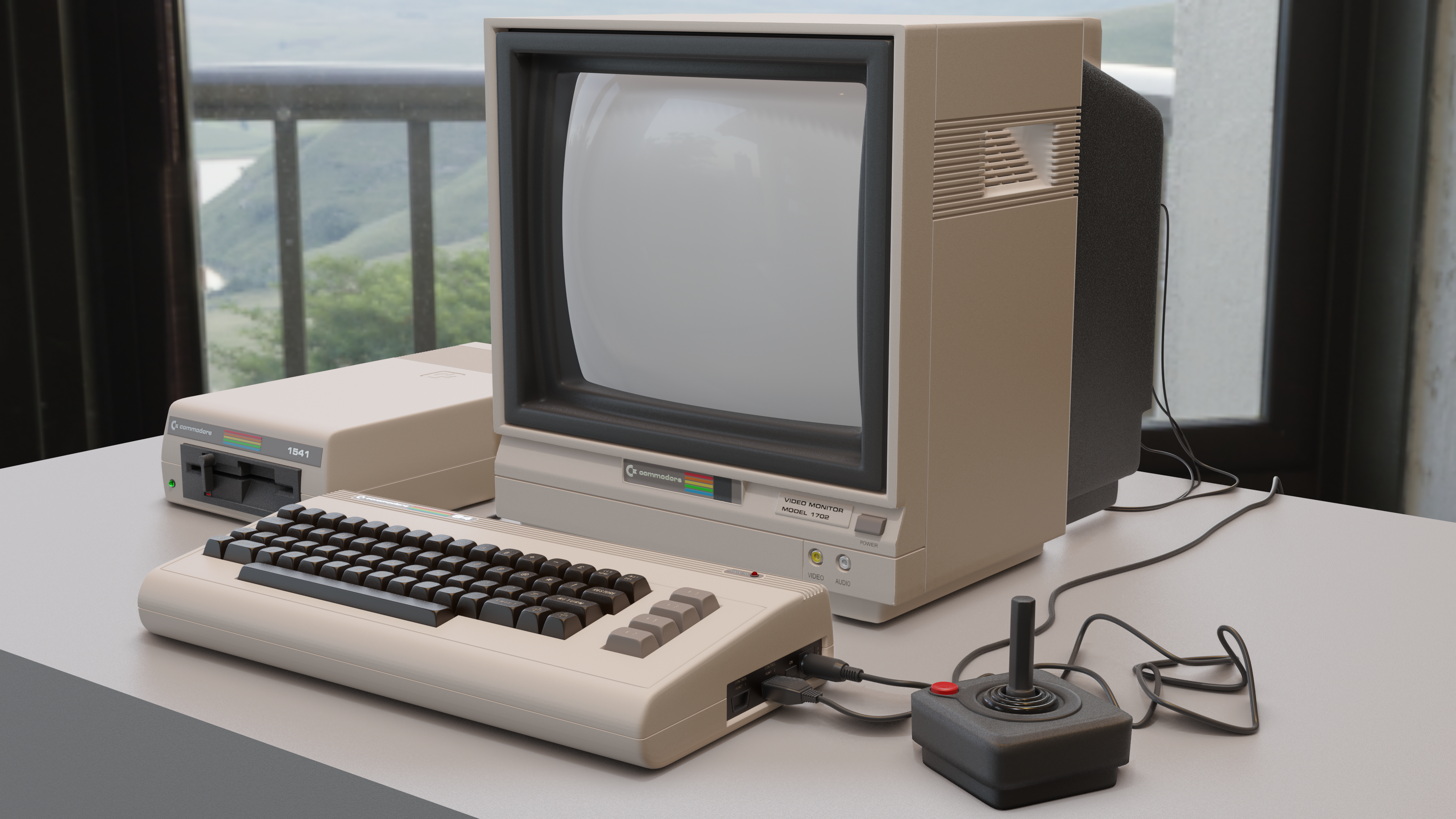
Here's a couple of blocks.


Still need to work on the port and interface detail; and I want to add -at least- a monitor, we'll see how much I can get done before Sunday night.
![]() jakeblended Ay, Commodore 64 keyboard, good choice and good modeling! Texturing is fine by the way, as long as it doesn't take up the majority of your homework, the model should still be the focus.
jakeblended Ay, Commodore 64 keyboard, good choice and good modeling! Texturing is fine by the way, as long as it doesn't take up the majority of your homework, the model should still be the focus.
![]() jakeblended That is a great idea to use modifiers on repeating elements like the keyboard buttons, interesting one
jakeblended That is a great idea to use modifiers on repeating elements like the keyboard buttons, interesting one
Okay, made a fair bit more progress today, caught most of the way up, I think. Although in order to finish on time I decided to leave off extremely fine details in the backs of the monitor and disk drive. Usually I am really OCD about finishing all of these kinds of details, even when I don't plan to frame a shot from that angle. The only details I will not actually bother doing are ones that will be covered up by other mesh. For instance, I didn't model the inside of the power jack on the C64 because I know it will be covered with the power cord plug, so there's no point in that case. But, I only have one more day to finish everything so I have to save time where I can now.
Tomorrow I should be able to model all the cables (cables are fun and easy), maybe some desk detail to make a good shot, and then shading.
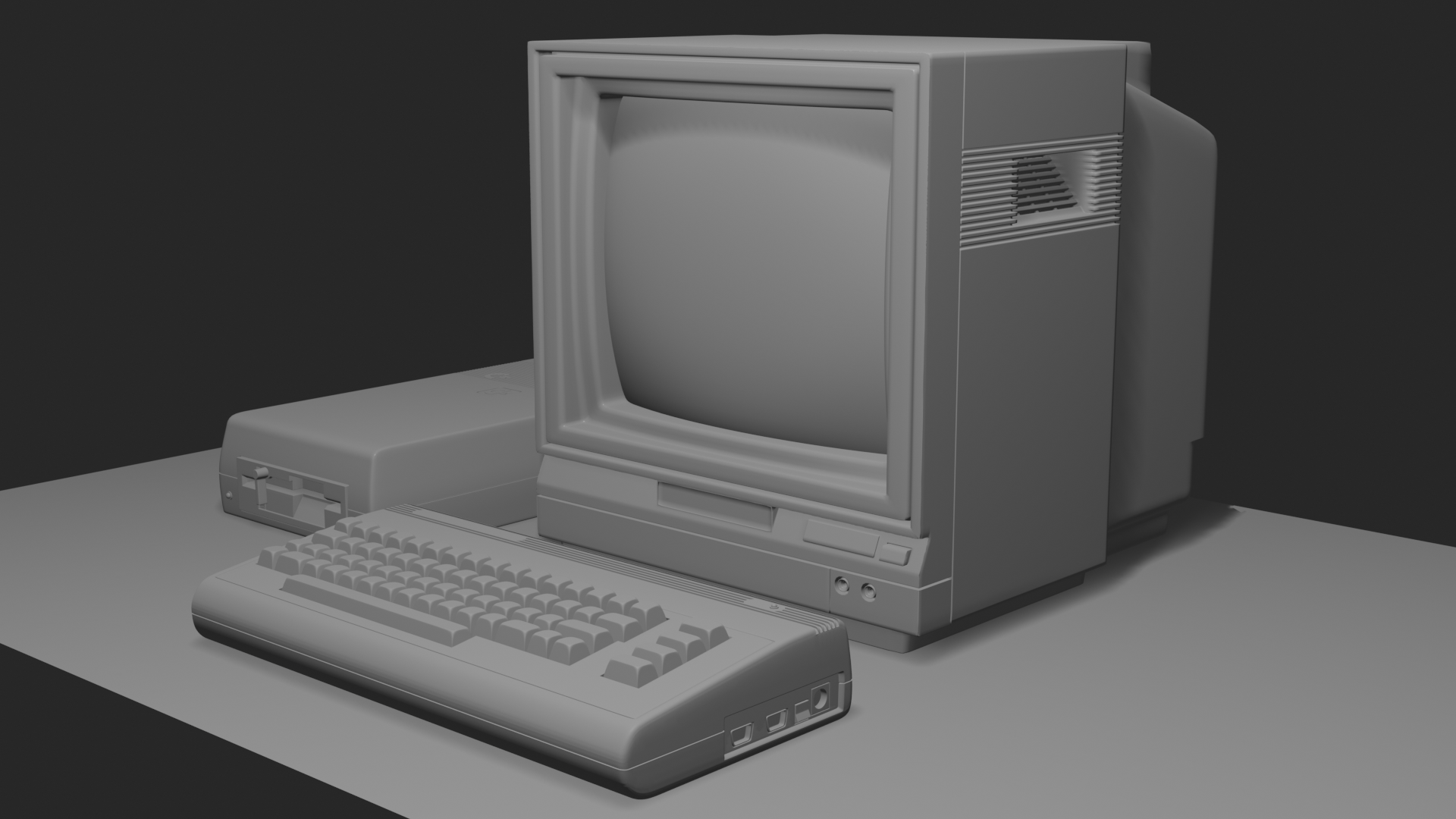
![]() csehz Thanks! Although it was only really useful for modeling. Turns out I'm going to have to apply those array modifiers on the keys; I need them all separate so I can texture the different characters on them. That's a whole lot of textures to make and apply. I think I can swing it, but I sure wish I had more than just one more day to do it all.
csehz Thanks! Although it was only really useful for modeling. Turns out I'm going to have to apply those array modifiers on the keys; I need them all separate so I can texture the different characters on them. That's a whole lot of textures to make and apply. I think I can swing it, but I sure wish I had more than just one more day to do it all.
![]() jakeblended I know how you feel. I have great ambitions, but then when the deadline gets closer, I have to think what I can realistically handle in the time left and do it.
jakeblended I know how you feel. I have great ambitions, but then when the deadline gets closer, I have to think what I can realistically handle in the time left and do it.
![]() jakeblended Beautiful job! I love all of the details. Brings back memories; my family used to have its competitor the Atari 800 home computer a long, long, long time ago.
jakeblended Beautiful job! I love all of the details. Brings back memories; my family used to have its competitor the Atari 800 home computer a long, long, long time ago.